10,000 search results
(0.032 seconds)
- Bastina Sindey by HansCo,
$17.00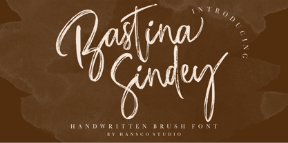 Bastina Sindey is a natural handbrush font. This texture is very detailed. You can get also the swash brushes include in this font pack. This font is suitable for logos, shirts, fashion, blogs, websites, product branding, posters, flyers, any print template or for text overlay to any background image. Comes with a full uppercase, lowercase, numbers and punctuation + standard multilingual support. It’s great for branding, logo designs, lettering, logotype, craft, posters, packaging and much more. We recommend using Adobe Illustrator or Photoshop. Tutorial how to Install & use Alternate / Special Character : https://hanscostudio.com/tutorial/ Enjoy!
 - Traveller by Holland Fonts,
$30.00A geometric design, published in Rick Poynor’s Typography Now 1 (Booth-Clibborn Editions, London UK,1991). Discussing these kinds of angular styles, the critic Rick Poynor noted that "fate has overtaken the angular post-constructivist type design of Neville Brody, Zuzana Licko and Max Kisman". Poynor described a process by which typefaces, once “fresh, unexpected, precisely attuned to the moment”, get used increasingly often in less and less appropriate contexts and end up looking "irredeemably passé". (Poynor, Rick, ‘American Gothic’ in Eye Magazine, 6/1992) - Narevik by ParaType,
$30.00 Narevik consists of 7 styles -- 4 uprights (including black) and 3 italics. It’s a type of dynamic low contrast design with slightly rounded triangle serifs and drops which conveys to it a certain peculiarity. The vertical strokes have gentle intasis that brings additional softness to the shapes. The family was created by Armenian designer Manvel Shmavonyan and got its name after his daughters Nare and Arevik. It can be used in text composition as well as in display matters. Released by ParaType in 2011.
 - Courtroom JNL by Jeff Levine,
$29.00 Erle Stanley Gardner’s beloved lawyer “Perry Mason” first appeared on screen in a series of six films with Warren Williams starring in four of them. The hand lettered opening title for 1935’s “The Case of the Lucky Legs” is a classic Art Deco sans serif design, and is now available as Courtroom JNL in both regular and oblique versions.
 - ITC Medea by ITC,
$40.99The designer of ITC Medea , Silvio Napoleone said: “I've always had an interest in early letter shapes, particularly how they influenced modern typographic designs. While I was on vacation in Greece, I had a chance to see, first-hand, examples of early letterforms and typography. They really made an impression on me.” The idea of combining the ancient and the modern to create something new was the primary inspiration behind ITC Medea. ITC Medea is essentially a careful blending of the modern sans serif with the elegant forms of the uncial. At first glance, Medea appears to be constructed of geometric shapes. However, closer inspection reveals many calligraphic subtleties. Stroke terminals are flared slightly in characters like the 'e' and 'c.' The top curve of the 'd' is more pronounced than the bottom, and characters like the 'o' are elliptical rather than round. “I gravitated towards the simplicity and legibility of the uncial and half-uncial,” Napoleone recalls. “I thought it would make a great titling font, and I was surprised at how attractive ITC Medea looked in a body text.” - Benton Sans RE by Font Bureau,
$40.00 A redesign of drawings of News Gothic from the Smithsonian, Cyrus Highsmith and the Font Bureau studio created Benton Sans, one the most popular and versatile families in this genre. This version of the family is part of the Reading Edge series of fonts specifically designed for small text onscreen, having been adjusted to provide more generous proportions and roomier spacing, and having been hinted in TrueType for optimal rendering in low resolution environments.
 - Fully Automatic by Hanoded,
$15.00 I raise chickens for eggs and meat. I usually buy fertilised eggs online and place them in my incubator, which says that it is 'fully automatic'. Of course I added that rather random introduction to tell you how I came up with the name for this new font... Fully Automatic is a handmade cartoon font: I used a sharpie pen to draw the glyphs onto rough paper. The result is a wobbly, yet quite clean cartoon font. Fully automatic comes with extensive language support and two sets of alternates for the lower case glyphs that cycle as you type.
 - ITC Jambalaya by ITC,
$29.99The talented designer of the well-known Formata typeface, Bernd Möllenstädt was born on February 22, 1943 in Germany. He has lived in Westfalia, Berlin and Munich, Germany, and now permanently resides in Munich. From his earliest years he was interested in typography, first studying as a typesetter (1961-64) and then a student of graphic design (1964-1967). In 1967 Möllenstädt joined the Berthold typefoundry and his career as one of the leading type personalities began. One year after joining Berthold, he became the head of the type design department. For 22 years he worked as the head of that department, under the leadership of Günter Gerhard Lange. Upon Lange’s retirement in 1990, Möllenstädt ascended to the type directorship of Berthold where he was responsible for type design and font mastering. Möllenstädt designed two typeface for the Berthold Exklusiv Collection, Formata (1988) and Signata (1994). Under license from Berthold, Adobe marketed Formata as part of the Adobe Type Library. Formata is now one of the most successful sans serifs in the world, used both in American and European magazines, as well as newsletters in the Far East (Gulf New Kuwait). Formata also was chosen as the corporate typeface of Postbank, Allianz, VW Skoda, Infratest Burke, etc. In addition to his work for Berthold, Möllenstädt has lectured at local Munich schools on typography and graphic design, and designed corporate type identities and diverse logos for major corporations, including Allianz, Commerzbank, Mauser Officer and Hoepfner. Möllenstädt continues his association with Berthold as a designer. He most recently completed small caps and fractions for Formata. He also has substantially contributed to Berthold's Euro symbol program (e.g. adding the Euro symbol design-specific to the most popular families). Möllenstädt currently is working on a new Berthold Exklusiv design. - Mihaly Display by Alfab,
$55.00 Mihaly is a geometric sans serif with a low contrast. It was designed with care to conserve the feeling of geometric rigor, referring to the constructivist ideal of the 20s. But the homogeneity of its proportions gives it a very modern neutrality, making Mihaly an interesting alternative to classic low-contrasted sans-serif like Din or Interstate. Designed for display setting, Mihaly Display is the first in a family of fonts, with the rest to be completed in the coming future.
 - ATF Brush by ATF Collection,
$59.00 Oh, Brush … beloved script emblem of plumbers, mechanics, bodegas, lunch counters, and other low-rent concerns. Since 1942, you have given faceless apartment buildings a name, brought life to the badges and banners of otherwise tedious trade conventions, and lent excitement to the postcards of middle America’s unsung travel destinations. We have seen so much of you … but not enough! We need more weights: how about five, extending beyond humdrum Medium? We want swash alternates, too, plus lively ligatures and sporty underline tails! Give us cleaner curves and smoother connections, but stay true to your frisky self! Like a nail salon that offers cucumber water, the new ATF Brush is one step classier than the rest.
 - Amellisa Ink by HansCo,
$15.00 Amellisa Ink is a beautiful, elegant and natural handwritten font. This font is perfect for creating logos, watermarks, branding, wedding invitations, quotes, or anything else you wish to design. This font is PUA encoded which means you can access all of the glyphs and swashes with ease!. Highly recommended to use it in OpenType capable software - there are plenty out there nowadays as technology catches up with design. The OpenType features can be accessed by using programs such as Adobe Illustrator, Adobe InDesign, Adobe Photoshop Corel Draw X version, Afinity and more. Tutorial how to Install & use Alternate / Special Character : https://hanscostudio.com/tutorial/ Enjoy!
 - Urbanchrome by Vintage Voyage Design Supply,
$15.00 • Introduce you the first SVG font in Vintage Voyage collection. • Trendy all-caps cinematic sans in four styles. Inspired by 80s multimedia era typographic like your old VHS cassette package design in your mama's house attic. Perfect choice for your movie titles, party flyers, exhibition identity or action style advertisement. • Four styles: Clean, Roughen, Outline and SVG textured. SVG was made with Hand Made grunge texture. • Multilingual. • If you don't know how to use SVG fonts Jeremy from The Hustle Supply has a useful video about it here: https://youtu.be/Qed4f2UAChU Please, Pay Attention: Myfonts.com doesn’t support the heavy svg files. After purchase this family just send me your order number to contact@vintagevoyagedesign.com and i’ll send you the link to download the OTF SVG file within 24 hours.
 - Toiban by Sealoung,
$20.00 Toiban is a classy modern sans serif font. Each Toiban glyph has been modernly drawn and designed for this expansive new edition, which maintains the Swiss mantra of clarity, simplicity and neutrality for the demands of contemporary design and branding. The larger View version is drawn to show off Toiban's subtlety and is spaced with the headline in mind, while the Text size focuses on readability, using strong strokes and comfortable loose spaces. The Toiban struggles to be legible at a small size because of its compactness and closed aperture. The Toiban Micro's design is simplified and exaggerated to maintain impression in small, loosely spaced type, providing excellent legibility at microscopic sizes and in low-resolution environments.
 - STCO Prescissa by Shaltype Co,
$15.00 Prescissa is inspired by Textualis, also known as textura or Gothic bookhand, which was the most calligraphic form of blackletter, and today is the form most associated with “Gothic”. Written manually by hands, and reform into clean Typeface. Natural stroke from original handwriting. It can be used for just Title or even writing. In this font, you will get : Over 449 Glyphs 12 OpenType features Multilingual languages. Get Prescissa now! It will best use for any design requirement, many fonts will coming with a unique concept. Thank you! Best Regards, FM-STCO.
 - Neacademia by Rosetta,
$70.00 Neacademia is a Latin and Cyrillic type family inspired by the types cut by 15th century punchcutter Francesco Griffo for Venetian printer Aldus Manutius. Beyond the letterforms themselves, however, the digital fonts themselves are based on the techniques and methods Griffo employed. The family comprises four distinct variants optimised for specific point sizes, as was traditional in metal type. While the display sizes maintain a visual link to calligraphic roots, text sizes exhibit more typographic qualities, following the hand of the carver. Likewise, Neacademia maintains its even colour on the page by carefully employing alternative letterforms, rather than leaning on a multitude of kerning pairs. A geeky little detail you’ll likely need to point out with a magnifying glass to your type friends, but creating a neat texture that works in readers favour nonetheless. Neacademia’s historically sensitive eye is put to work for modern typographers’ needs. It incorporates Griffo’s italic capitals and harmonizes them with the lowercase and the romans — where the original Aldine italics had no capitals of their own and simply re-used the uprights. It was designed with specific allowances for letterpress photopolymer printing. Printed digitally, it can tolerate – and even benefit from – low resolution, rough paper, and low-grade presswork. In many ways, it feels like using metal type again!
 - Marlino by Nathatype,
$25.00 Do you want to achieve more? Marlino makes your work got even easier. Marlino is a sans serif font family. It's simple, modern yet purposely function and definitely helps you achieve favorable design results. There are 8 different styles in this family. This variety in styles and character availability gives you some flexibility in terms of where and when you decide to use it. Features: Multilingual Supports Numerals and Punctuations PUA Encoded It can be used for many design projects, such as poster, logo, book cover, branding, heading, printed product, merchandise, quotes, social media campaign, etc. Learn more about how to use it by seeing the font preview. Thank you for purchasing our fonts. Please don’t hesitate to contact us, if you have any further question or issues. We’re happy to help. Happy Designing.
 - LTC Archive Ornaments by Lanston Type Co.,
$24.95 Unlike previous dingbat fonts released from Lanston Type Co., Archive Ornaments derives from a unique collection of brass ornament plates that were originally used in creating the matrices for casting metal type. Using the plates as a reference point allowed for a more precise rendering of the ornaments. Letterpress prints were made directly from the brass plates, which were then re-drawn and digitized. Each character has been optimized for the combination of decorative borders and patterns as well as individual accentuation. The completed digitized font contains over 100 glyphs, ranging in style from geometric to organic designs.
 - Bookseller Bk by Cyanotype,
$20.00 Bookseller Bk is a typeface designed for books and legible text at a small sizes, with an old book feeling. This typeface is the reinterpretation of a sample found in a French book, published between 1882 and 1893 and its author —Ernest Michel— lived between 1837 and 1896. This sample has influence from Didot, Scotch Roman and Clarendon (typefaces which were in use at that time). This reinterpretation expands the basic set for the contemporary era. Bookseller Bk includes small caps, old style figures, lining figures, fractions and basic Cyrillic alphabet. Everything in 3 different optical widths. You can save some lines with Reduced weight or fill some lines with Ample weight. All of them with italics, bold and bold italics. Bookseller Bk is also available in Caption size. 12 fonts for legibility at smaller sizes. Subhead & Title sizes are now in development. Finally this typeface was the result of the course Digital Reinterpretation of Classic Typography by Oscar Guerrero Cañizares at Domestika. Do you require additional glyphs? Please contact me to consider your request in order to expand Bookseller in further updates.
 - Bookseller Cp by Cyanotype,
$20.00 Bookseller Cp is a typeface designed for books and legible text at a smaller sizes, with an old book feeling. This typeface is the reinterpretation of a sample found in a French book, published between 1882 and 1893 and its author —Ernest Michel— lived between 1837 and 1896. This sample has influence from Didot, Scotch Roman and Clarendon (typefaces which were in use at that time). This reinterpretation expands the basic set for the contemporary era. Bookseller Cp includes small caps, old style figures, lining figures, fractions and basic Cyrillic alphabet. Everything in 3 different optical widths. You can save some lines with Reduced weight or fill some lines with Ample weight. All of them with italics, bold and bold italics. Bookseller Cp is also available in Book size. 12 fonts for legibility at small sizes. Subhead & Title sizes are now in development. Finally this typeface was the result of the course Digital Reinterpretation of Classic Typography by Oscar Guerrero Cañizares at Domestika. Do you require additional glyphs? Please contact me to consider your request in order to expand Bookseller in further updates.
 - Hexa by Hexa,
$19.00 The font HEXA is inspired by the Hexagon. The HEXA fonts are dynamically and uniquely designed typefaces based on the grid systems of the hexagon that extends infinitely. From this image, we have created the HEXA font. Hexa is Latin-based and a completely crafted font that consists of 3 typefaces. Each typeface contains 190 sets of characters. This font family is in all-caps fonts, and we provide different styles of uppercase and lowercase glyphs with the exception of letters c, ç, and comma/ single low-9 quotation mark. In lowercase glyphs, we emphasize the image, character, and identities of Hexa. The font family includes regular, black, and thin. We created the witty expression with Hexa’s regular identity; thin emphasizes the lines; black fills in the blanks. Hexa is a monospaced fonts. So kerning is not applied. We recommend using our fonts for big-sized uses. This typeface is a display font and looks more attractive in larger formats than on main texts. Features: -190 characters -Monospaced fonts -All-caps fonts (different styles provide uppercase and lowercase)
 - Coffee and Danish JNL by Jeff Levine,
$29.00 In the collection of vintage and historic images available online from the Library of Congress is one of the exterior of the Town Talk Diner in Minneapolis, Minnesota. Regrettably, on May 28, 2020, the Town Talk Diner was damaged by vandalism, and subsequently destroyed by a fire that engulfed the building early on the morning of May 29th due to civil unrest following the death of George Floyd. The restaurant first opened in 1946, closed in 2011 and subsequently re-opened under new ownership in 2014 with French cuisine, then from 2016 until its demise as an American bistro. While this was not known at the time of selecting the image for a typographic model, subsequent research on the diner turned up these facts. The large vintage sign above the entrance was in big, bold Art Deco letters with rows and rows of bulbs for illuminating the name at night. Coffee and Danish JNL, modeled from the image of that sign, is available in both regular and oblique versions. Perhaps, in a way, the type design will serve as a bit of historic recognition for a popular eating spot.
 - Journal Hand by Typadelic,
$9.95 Journal Hand was inspired by a 45-year-old travel diary I bought at an estate sale. The carefully constructed all-uppercase letters indicated that this traveler cared about style and legibility. Each picture, postcard and brochure that was glued into the diary had a neatly written caption and I admired the care this day tripper took to record his European trek. While the pages are now yellowed and falling apart, the handwriting is still legible and stylish. Because his handwriting totally suits today's uses, I re-created it in modern journalistic style that looks like it was written with a technical pen. Use this typeface when you need a neatly handwritten style. Uppercase only!
 - Cantarell - 100% free

- Parks Department JNL by Jeff Levine,
$29.00 A WPA (Works Progress Administration) sponsored Water Carnival taking place in Central Park in the 1930s had "Department of Parks, City of New York" in the thin Art Deco hand lettering which is now available as Parks Department JNL.
 - Royale Italic by Resistenza,
$39.00 With Royale, Resistenza reinvented the bifurcated Tuscan genre in a contemporary, warm and playful form. Now our aim was to complete this decorative family with an italic version of the font. Rounded terminals, fabulous fancy fun spurs with elegant and extravagant flourishing - Royale italic comes in 8 weights which can also be layered to create polychromatic effects in another nod to the Victorian era these styles were popularised. While inspired by days gone past this Royale is far from a revival as unlike the classic Tuscans which inspired its structure Royale is monoline and sophisticated in its simplicity. Perfect for display and emphasis, Royale will command attention and leave a memorable impression wherever it is used. Check out also Royale
 - Foreign Tourist JNL by Jeff Levine,
$29.00 A 1929 German travel poster had the caption “Wer schlafwagen reist spart zdeit und geld” (“Whoever travels in a sleeping car saves time and money”) hand lettered in an Art Deco sans serif style. This is now available as Foreign Tourist JNL, in both regular and oblique versions.
 - Circulo by MMD Fonts,
$6.29 Bound to rules, unbound in the usage. Hyper geometric, and minimal contrast. Circulo V1 is based on a font project I originally started because of a client I had. I wanted to create a display and text font for their product design brand, which is all about reducing the amount of necessary materials and production steps. Before I started the course at tipo-g it was called -“REDUCE“ and was more or less finished. The concept was based on the name. How far can letter shapes be reduced to their core geometric concepts and still be identified as letters? But in a way, it lacked a unique approach and was just a generic geometric Sans Serif with a lack of finesse. There was already a glimpse of characteristics visible which would later define Circulo V1. The high focus on geometric shapes was not of the same severity, and the angle on the stems was less intense. Those, as I call them, fake serifs turned out to be a significant factor in legibility and the characteristic of the font. Besides those changes and improvements, I decided to implicate a new feature to the concept, a condensed style. I quickly realised that it is impossible to keep my perfect circles and half-circles in this style without breaking my rules for the font. This „problem“ turned out to be the most crucial feature of the condensed set. Circular-based Letters will ignore the rules and boundaries of the condensed style and stay as they are. This feature allows the user to create a unique rhythm in their texts, and if you use the variable font, you can decide how intense this rhythm will be. In this situation, the user can choose which letters are allowed to keep their shapes and which will be put in their condensed corset. All, some or none of them, you decide.
 - Facility Signage JNL by Jeff Levine,
$29.00 A famous 1971 photo shows boxing champ Muhammad Ali making faces through a window at Joe Frazier at the challenger’s training facility. A small sign sits in the window that says “Joe Frazier Training Headquarters” and is lettered in a simple sans serif condensed typeface. This is now available as Facility Signage JNL in both regular and oblique versions.
 - Humblest Pro by Gleb Guralnyk,
$15.00 Hi. Introducing a new version of my one of the most popular fonts. Now Humblest Pro includes much more characters and has west european multilingual support. This font has a smooth and clean shape without any grain unlike the original one. Almost all of the capital leters has two version, for the begining and for the ending of the word. The final alternative letter will be automatically replaced if you type a big last letter in the word (check out if the "contextual alternates" opentype feature is activated). Decorative swashes are now a part of the font. To use this decorative lines just type an underscore character and the corresponding number from _00 to _39 (make sure that “standard ligatures” opentype feature is activated). Also a lot of ligatures for small letters are available, please check out the previews with all available glyphs. Thank you and have fun!
 - Fontella by Canada Type,
$24.95 Italian type design master Aldo Novarese was not famous for making calligraphic designs, nor had he any interest in them. He is much better known for his text faces, and quite innovative sans serif and decorative designs which became the definition of what we now know as techno and modern. But in 1968, Novarese surprised everyone with a fantastic flowing deco script entitled Elite. Novarese's formula of simple soft curves and toned-down swashes makes for one of the most unique alphabets ever seen, not to mention one of the best flowing and most legible scripts. This is now its digital incarnation, named Fontella. Fontella's applications are virtually limitless. This is the sort of script that can feel at home pretty much anywhere; a sign, a fridge magnet, a bumper sticker, a greeting card, a movie poster, a book cover, music artwork, magazine ads, newsletter headlines, etc. Digitized from original specimen and expanded with a few built-in alternates and ligatures by Rebecca Alaccari, the font was named after the famed jazz singer Fontella Bass. These letters are just so sweet they had to be called Fontella.
 - Linotype Atlantis by Linotype,
$29.99Lutz Baar was born in Berlin, now living in Gothenburg, Sweden. He is an art director at his own advertising and Web design studio Miraculus. Among his typeface designs you find the award winning Linotype Pisa, the hand tooled looking Linotype Atlantis, and the strictly Linotype Ordinar, designed for Web usage. - Karlo by The Northern Block,
$28.95 Karlo is a super family of several branches, originating in the same lightweight skeleton. The lightweights are based on a pen of an even stroke-width. Inspired by the writings of calligrapher Edward Johnston, the family moves on in two directions in the heavier weights. Johnston demonstrated that the broad nib pen can produce different writing styles. Following this, one heavy weight has a humanistic low stroke contrast (KarloSerifBold and KarloSansBold), and another has a high stroke contrast of vertical axis with references to the 19th century jobbing typefaces (KarloOpen). The latter is inspired by Johnston’s demonstration of the broad nib pen, where he suggested fastening two pencils together. With each pencil representing an edge of the pen, it becomes more evident how the pen works in writing. The friendly informal look makes KarloSans and KarloSerif usable for both running text and for display sizes. KarloOpen, on the other hand, is solely designed for display purpose showing few words at a time. In Denmark, a guy named Karlo would typically be an old fellow with a slick hairstyle that makes an effort with his appearance. He is a handyman who can do a bit of this and that when needed. He is a happy go lucky kind of guy that takes one day at a time. To me, the typeface family has some of the same qualities. Check out Pyke which is a great pair for Karlo.
 - Stencil Chamfer JNL by Jeff Levine,
$29.00 The packing information stenciled on an antique wooden crate included a slab serif type style with chamfered corners. This design has now been re-drawn as the digital typeface Stencil Chamfer JNL, which is available in both regular and oblique versions.
 - Wine Vat Stencil JNL by Jeff Levine,
$29.00 An image of a vintage metal stencil for the French wine region Côteaux du Tricastin [now Grignan-Les Adhemar] served as the inspiration for Wine Vat Stencil JNL. This condensed sans serif design is available in both regular and oblique versions.
 - MFC Zulu Monogram by Monogram Fonts Co.,
$69.00 The inspiration source for Zulu Monogram is a vintage publication called “Bibliotheque D.M.C: Alphabets et Monogrammes 2nd Series”. This wonderful design is an alternative to the diamond shape monogram that dominated monogram at the time. A Zulu shield-like form, this monogram style is now digitally recreated and revived for modern use in Zulu Monogram, with two letter monograms and a selection of additional frame styles for a final classy touch! Download and view the MFC Zulu Monogram Guidebook if you would like to learn a little more.
 - Vintage Monograms by Intellecta Design,
$16.00 A Monogram is a lettering character made up of the main letters of a name and sometimes all of them. It is a kind of design which dates from the earliest times of our history. It is a distinctive mark that everyone could have themselves, to apply to documents and many purposes. The signatures of ancient Kings were Monograms. Today this brand, for the people of taste, must have the cachet of this era or the evocative feelings of ancient times. Our predecessors knew how to create it by using the capital that preceded Gothic and the other characters. The Vintage Monograms collection contain hundreds of ready to use in alarge of shape of the letters, with styles from Victorian, to Art Nouveau and to mediaeval like in the old manuscripts. Ready to use fonts, Vintage Monograms collection is a classic that features elegant and intricate monograms perfect for branding and personalization. Its ornate designs evoke the timeless style of vintage logos and can be used to add a touch of sophistication to invitations, stationery, and packaging. Monogram brings an air of refinement and exclusivity to any project.
 - Mr. and Mrs. Peter by Khaito Gengo,
$23.00 Mr. Peter is a warm and friendly handwritten san-serif font which has two weights, Regular and Bold. He also features multi languages, some alternative letters, and 35 ligatures. He is good for an eye catching title, display as well as small text. Mrs. Peter is a handwritten script font based on Mr Peter. She also provides two weights, Regular and Bold, and features multi languages, automatic ligatures, and beginning and end-changing effect. It will be in good taste if you combine and use Mr. & Mrs. Peter together. Jr Peter consists of around 100 unique icons and ornaments. Also you can simply create multiple faces by using this font. The description of how to make a face is on the promotion poster.
 - Culoare v.2 by Luxfont,
$19.00 Introducing Culoare V2.0 is the second version of the space bright color gradient font. (The first version is here - Culoare) This is a new set with completely new color combinations, bright and saturated like neon. 3 types of stylization in 9 different color gradient combinations with soft transitions. Letters seem to be backlit and it looks very original in addition to stylish minimalist glyphs. Lots of design use cases. Ideal for promotional illustrations, headlines and covers. Font family is based on the Regular font Boldini - which means that if necessary you can combine these two families and they will be absolutely stylistically identical and complement each other. Check the quality before purchasing and try the FREE DEMO version of the font to make sure your software supports color fonts. P.s. Have suggestions for color combinations? Write me an email with the subject "Culoare V2 Color" on: ld.luxfont@gmail.com Features: - Free Demo font to check it works. - Uppercase and lowercase the same size but different colors. - Transparency in letters. - Kerning. IMPORTANT: - Multicolor version of this font will show up only in apps that are compatible with color fonts, like Adobe Photoshop CC 2017.0.1 and above, Illustrator CC 2018. Learn more about color fonts & their support in third-party apps on www.colorfonts.wtf -Don't worry about what you can't see the preview of the font in the tab "Individual Styles" - all fonts are working and have passed technical inspection, but not displayed, they just because the website MyFonts is not yet able to show a preview of colored fonts. Then if you have software with support colored fonts - you can be sure that after installing fonts into the system you will be able to use them like every other classic font. Question/answer: How to install a font? The procedure for installing the font in the system has not changed. Install the font as you would install the classic fonts. How can I change the font color to my color? · Adobe Illustrator: Convert text to outline and easily change color to your taste as if you were repainting a simple vector shape. · Adobe Photoshop: You can easily repaint text layer with Layer effects and color overlay. ld.luxfont@gmail.com
 - Sticky Fingers by Comicraft,
$19.00 LOOK OUT! It's kinda creepy, we know, but we're convinced that this font does whatever a spider can -- in fact, we believe it can actually spin a web of pretty much any size, and even catch thieves as if they were bugs of some sort -- let's say flies. In fact we'd almost go so far as to say that, in the chill of night (perhaps at the scene of a crime) this font may just arrive like a streak of light in the nick of time. We're releasing this font now not for wealth or fame, we ignore those things, action is our reward. Here at Comicraft we think of life as a great big bang up, and whenever there's a hang up, you won't find us climbing -- or crawling -- the walls... well, not without STICKY FINGERS anyway. Find yourself a pair of webshooters and this font is the perfect complement to any Halloween costume.
 - Spy Stencil JNL by Jeff Levine,
$29.00 Dean Martin starred in four movies as Matt Helm, the titular character in a series of spy novels by Donald Hamilton. Martin’s version of the government counter-agent followed his TV persona – a fun-loving ladies man who (in this case) just happened to be a spy. The movie poster for 1966’s “The Silencers” has its title hand lettered in an extra bold sans serif stencil style. This is now available as Spy Stencil JNL in both regular and oblique versions.
