10,000 search results
(0.068 seconds)
- Baroque Mortale by Letterhead Studio-YG,
$45.00 Letterhead Studio makes both fonts and design with own fonts. The studio is started in 1998 by Yuri Gordon, Valery Golyzhenkov and Olga Vassilkova. We work in graphic design, branding and type design. Our collection of Cyrillic fonts includes more than 330 faces, generally it is display fonts. Letterhead is one of leading developers of custom-made fonts, lettering and digital calligraphy in Russia. Among clients of studio are magazines like Rolling Stone, Esquire, GQ, Empire, Interni, Harpers Bazaar. Also we develop corporate fonts, more often for banks. Letterhead co-operated with Gazprombank, Rosbank, the Alpha-group, Trust, Menatep, Orgres-Nordea and others.
 - Pollock by ParaType,
$25.00 An experimental type family designed at ParaType in 1995 by Alexander Tarbeev. Based on PT Hermes, 1993, by Tagir Safayev. Inspired by the art of Jackson Pollock. For use in advertising and display typography.
 - Phorfeit BRK Pro by CheapProFonts,
$10.00 Part futuristic + part rounded = totally psychedelic. This font is perfect for that 70s hippie look. I have totally redrawn the outlines, and redesigned a couple of glyphs that were too "mechanical". the slanted version has a 20 degree slant, and this speedier variant of Phorfeit BRK Pro is ready for use (for those who use software where you cannot slant the upright version yourself). ALL fonts from CheapProFonts have very extensive language support: They contain some unusual diacritic letters (some of which are contained in the Latin Extended-B Unicode block) supporting: Cornish, Filipino (Tagalog), Guarani, Luxembourgian, Malagasy, Romanian, Ulithian and Welsh. They also contain all glyphs in the Latin Extended-A Unicode block (which among others cover the Central European and Baltic areas) supporting: Afrikaans, Belarusian (Lacinka), Bosnian, Catalan, Chichewa, Croatian, Czech, Dutch, Esperanto, Greenlandic, Hungarian, Kashubian, Kurdish (Kurmanji), Latvian, Lithuanian, Maltese, Maori, Polish, Saami (Inari), Saami (North), Serbian (latin), Slovak(ian), Slovene, Sorbian (Lower), Sorbian (Upper), Turkish and Turkmen. And they of course contain all the usual "western" glyphs supporting: Albanian, Basque, Breton, Chamorro, Danish, Estonian, Faroese, Finnish, French, Frisian, Galican, German, Icelandic, Indonesian, Irish (Gaelic), Italian, Northern Sotho, Norwegian, Occitan, Portuguese, Rhaeto-Romance, Sami (Lule), Sami (South), Scots (Gaelic), Spanish, Swedish, Tswana, Walloon and Yapese.
 - Hello Seoul by Ditatype,
$29.00 Hello Seoul is a striking display font that is inspired by the vibrant energy of Seoul. With Hello Seoul, you have a display font that says "hello" with a contemporary flair; it's a celebration of Korean style and modern design. The characters in Hello Seoul stand tall with a sleek, non-thick weight, offering a refined and contemporary look. The rectangular shapes and sharp corners lend a structured and modern vibe to each letter, reflecting the architectural and cultural landscape of Seoul. Hello Seoul is more than a font; it's an invitation to explore the dynamic spirit of the city. In addition, enjoy the features here. Features: Alternates Multilingual Supports PUA Encoded Numerals and Punctuations Hello Seoul fits in headlines, logos, posters, flyers, branding materials, greeting cards, print media, editorial layouts, and many more designs. Find out more ways to use this font by taking a look at the font preview. Thanks for purchasing our fonts. Hopefully, you have a great time using our font. Feel free to contact us anytime for further information or when you have trouble with the font. Thanks a lot and happy designing.
 - Hesse Antiqua by Monotype,
$21.99 Hesse Antiqua is the very first typeface designed by Gudrun Zapf von Hesse. It was a pioneering project originally created by her over 70 years ago as a set of brass punches to stamp into leather book covers and spines at the Bauer Type Foundry in Germany. In celebration of her 100th birthday on 2 January 2018, Ferdinand Ulrich and the Monotype Studio team collaborated with her to bring her brass punches to live as a digital font. Hesse Antiqua was developed with careful considerations and decisions to capture the nuance of the beautiful letterforms as they originally appeared in gold and blind stampings. We are pleased to introduce this modern OpenType typeface featuring a proper set of capitals and small capitals, figures, punctuation and some ornaments as well. Hesse Antiqua is best used at 36 points and above, as the designer intended.
 - Obla by LetterPalette,
$20.00 The Obla font family is a modern serif typeface accompanied by appropriate italic in seven weights. Sketches of letters were drawn manually, using thick marker for creating shape and pencil for finishing details. Calligraphic origin of shapes is revealed beneath strained curves drawn on computer. All of the weights were carefully adjusted to each other. Obla is equipped with some basic OpenType features and supports Cyrillic and Latin script. Using Obla in small sizes is very convenient, because of its large x-height, and Obla is a very readable typeface. It seduces the reader with its vivacious character. The typeface is also suitable for usage in large sizes. The best choice for headlines is using the heaviest (Black) and the lightest (Thin) weight. There are two smaller family packages in offer: Obla Basic Set contains Regular, Italic, Bold and Bold Italic, while Obla Light Set contains Light, Light Italic, SemiBold and SemiBold Italic. These two sets are the most appropriate for working with small text. Other weights can be bought separately, or within the whole family. Obla is an awarded typeface. It got Special Mention in Cyrillic Typefaces category in Granshan 2016 competition and it was chosen as a Merit Winner in Print’s Typography and Lettering Awards competition. At that time, before publishing, the typeface was named Petra.
 - Nakilla by Nurrontype,
$14.00 Hello, i'm Nakilla, a contrast, yet beautiful display serif font. In some vocal both in uppercase and lowercase, my designer made some tweak alternate to give me modern feeling, along with ligature, it would make your next project outstanding. You can see me in action, kindly swipe my preview image. I can be headline, i can be body, my Uppercase lookin cool right ? Modern, classic and minimalist. I'm ready for your next project, buy me now. Peace out!, Nakilla.
 - Samba by Linotype,
$29.99The Samba family was inspired by the lettering art of J. Carlos, a Brazilian illustrator during the early 20th century. Turned into a workable series of fonts by the contemporary Brazilian designers Tony and Caio de Marco, Samba is especially recommended for use in logos, flyers, posters, and tattoos! This family offers the user a chance to mix three different styles of lettering into one coherent design, which can be very useful in solving certain design problems. While the regular Samba face is made up of mono-line letters, the style of Samba bold offers much more of a thick to thin contrast. The Samba Expert set displays lavish swash endings, which were inspired by Brazilian metal work. The Samba family was one of the winners selected during the 2003 International Type Design Contest, sponsored by Linotype GmbH. - Armorel Script by Gatype,
$12.00 Armorel script is a romantic, bold, elegant and fun vintage script font. It can be used for various purposes such as logos, wedding invitation, t-shirt, letterhead, signage, news, posters, badges, and more. To enable the OpenType Stylistic alternates, you need a program that supports OpenType features such as Adobe Illustrator CS, Adobe Indesign & CorelDraw X6-X7. There are additional ways to access alternates/swashes, using Character Map (Windows), Nexus Font (Windows), Font Book (Mac) or a software program such as PopChar (for Windows and Mac). How to access all alternative characters, using Windows Character Map with Photoshop: https://www.youtube.com/watch?v=Go9vacoYmBw Need help? If you need help or advice, please contact me by e-mail "chaidirgata@gmail.com" Thank you for your purchase!
 - Best Street by Gatype,
$12.00 Best Street is a new variant of handcrafted script typeface. present to you to complete your collection of script fonts.This typeface has been enriched with additional alternative characters for up to 403 glyphs. Hope it helps to capture the soul of any design. Finally, there are no words to say other than "Succeed and enjoy." Best Street is coded with PUA Unicode, which allows full access to all additional characters without having to design any special software. Mac users can use Font Book, and Windows users can use Character Map to view and copy any additional characters for pasting into your favorite text editor / application. How to access all alternative characters using Adobe Illustrator: https://www.youtube.com/watch?v=XzwjMkbB-wQ https://www.youtube.com/watch?v=Go9vacoYmBw
 - Kobely by Partnrz,
$15.00 Kobely is a reproduction of a local broadcaster's real handwriting. My daughter thought her boss's handwriting was so neat and uniform, it would make a great font and asked if I would be willing to create it. I agreed. She had him write out all the basic characters, which he gladly did with both a standard ink pen and a Sharpie¨ marker. I then turned it into a three weight family, perfect for use on post-it notes, shopping and to-do lists - anywhere you need the natural feel of real handwriting. I created it in various weights to spare you from adding a stroke to make it bolder. Adding a stroke can often compromise the small details of a font. Kobely is designed to be readable in even the boldest weight!
 - ASM by Extratype,
$40.00 The initials ASM represent the acronym of the Santa Monica Arts cultural center located in Barcelona, Spain, where this typeface, with the same name, has served as the custom corporate typeface since 2008 till today (2013). ASM is an energetic monospaced with extreme legibility consisting of two original weights, with an underlined version – used on some of corporate applications – all with their corresponding italics.
 - 1902 Loïe Fuller by GLC,
$45.00 This script font was inspired by the 1900s Art Nouveau style, in tribute to the well known American dancer Loïe Fuller. This font is specially developed for the OpenType possibilities. The TTF and OTF versions contain, besides all accented Western European Latin characters and ligatures, small caps, contextual alternates, more than seventy titling alternates, and others... It is used as variously as web-site titles, posters and fliers design or greeting cards, all various sorts of presentations, menus, certificates, letters. This font supports very strong enlargements as well as small sizes. When printed, it remain perfectly legible and elegant from 7 pts even if using an ordinary inkjet printer .
 - Train Of Thought by Pesic,
$29.00 Train of thought is a decorative font based on vintage and retro posters of the 19th and 20th centuries. Contains all Latin and Cyrillic glyphs. It is very modern, and it is intended for the use of creating logos and T-shirt designs as well as highlighting the essential elements on billboards, magazines, etc. Today's digital designers can use these stencil patterns to embellish text set in other alphabet stencils or by themselves to evoke the feeling of rustic Americana. Train of the thought is extremely detailed, and looks good in both small and large dimensions. It also contains a set of symbols, which you can use to further emphasize the essential elements.
 - Sableklish by Mokatype Studio,
$25.00 Hello Introducing **Sableklish** - Unique Ligatures Connected Serif is an elegant and font that uses ligatures to smoothly link letters. Perfect for adding a unique twist to word-mark logos, monograms or pull quotes. **Sableklish** has 16 ligatures as well making it super fantastic.Ligature can be turned off if required standard writing needs. What's Included : + Standard glyphs + Ligatures + Web Font + International Accent + Works on PC & Mac + Simple installations Accessible in the Adobe Illustrator, Adobe Photoshop, Adobe InDesign, even work on Microsoft Word. PUA Encoded Characters - Fully accessible without additional design software. Fonts include multilingual support + Image used : All photographs/pictures/vector used in the preview are not included, they are intended for illustration purpose only.
 - Bufallo by ryan creative,
$11.00 Bufallo is a style of handwritten script with a simple hand stroke that makes this font look simple. It can be used for various purposes such as greeting cards, business designs, product designs, quotes etc. FEATURES; -Uppercase, Lowercase, Foreign Support, Numbers and Punctuation. -Works on PC. -Simple installation. -Accessible in Adobe Illustrator, Adobe Photoshop. Adobe InDesign, it even works in Microsoft Word. -Fully accessible without additional design software. Buffalo encoded with Unicode PUA, which allows full access to all additional characters without having to design special software. Mac users can use the Fontbook, and Windows users can use the Character map to view and copy any extra characters to paste into your favorite text editor/app. See you again ;)
 - Walt Disney Script - Personal use only

- Kenta by 4RM Font,
$12.00 Unique and funny are the hallmarks of a kenta font, this font is made with a wider width to make it look unique, and is combined with lazy hand strokes to make it look funny. suitable for use in casual themed graphic designs.
 - Hands Up by Huy!Fonts,
$15.00 Hands Up is a useful collection of hand designs, with or without shirt. It has from pointing hand to annoying hands or happy hands and some give-the-finger hands. They are drawing in a clear cartoon style, suitable for modern designs.
 - MBF Archita by Moonbandit,
$17.00 MBF Archita is a creative font by moonbandit. This typeface takes a funky angle on a digital theme design giving it a non linear flowing dynamic in the overall feel. Archita best use as a title, headline, branding and even typography poster.
 - Arbuz by Justyna Sokolowska,
$19.00 Arbuz is sans serif and distressed font. It has lowercases and three options for every letter. All of the characters have a high resolution so they can be used in a large size. Every variety contains 3 alternative characters with automatic replacement.
 - RMU Omega by RMU,
$30.00 Friedrich Kleukens font design, influenced by the then prevailing Art Deco style, and released by Stempel in 1926, has been revived for modern use. To get access to all ligatures, it is recommended to activate both OT features standard and discretionary ligatures.
 - AZ Hello by Artist of Design,
$25.00 AZ Hello font was inspired from old auto repair signs. This font utilizes an "old look" to the line work which is designed to have a "worn feel" to it. Ideal for use as headline or sub-head text in you design.
 - TOMO Sponge by TOMO Fonts,
$15.00 A Sponge is an useful thing, as much as this cute typeface. TOMO Sponge is great for communicating messages to the young peeps in a friendly, yet legible, way. Comes with a lot of diacritics, plus a handful of cute stylistic alternates.
 - Lightover by Sakha Design,
$12.00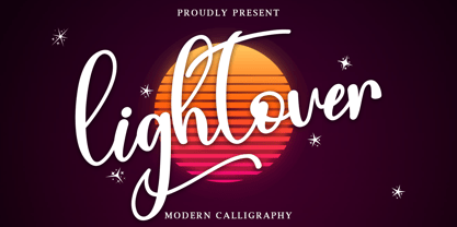 Lightover is a modern handwritten font. Lightover will look outstanding in any context, whether it’s being used on busy backgrounds or as a standalone headline! This font is PUA encoded which means you can access all of the glyphs and swashes with ease!
 - Holy Ornaments by Gerald Gallo,
$20.00 Holy Ornaments was inspired by the religious motifs used to embellish altar cloths, crosses, and church vestments in the Middle Ages. There is an assortment of 47 ornaments located under the character set keys.
 - Kira by Eurotypo,
$35.00 Kira is a modern hand-painted script with an irregular baseline. Rough edges and imperfect lines give to this brush font a unique and trendy look. All glyphs have been carefully painted giving your words a wonderful flow. Fat and thin stroke in this font impresses the harmony. Want to give your projects an organic, hand-painted look? Kira font contains 717 glyphs, with inky lines, and “perfect or imperfect” painted edges, including a few extra character alternates, stylistics and contextual alternates, swashes, stylistics sets, ligatures for a genuine hand-lettered effect. This font includes OpenType features that may only be accessible via OpenType-aware applications, a Central European language support. To activate the optional glyphs you may click on Swash, Contextual, Standard Ligatures and Discretionary, Titling, or Stylistic sets buttons in any OpenType savvy program or manually choose the characters from Glyph Palette. Bonus: 40 useful ornaments and a lot of catchwords that you use for the most demanding design project! Kira looks lovely on wedding invitations, greeting cards, logos, business cards and is perfect for using in ink or watercolour based designs, fashion, magazines, food packaging and menus, book covers and more!
 - Gabriel Sans by Fontfabric,
$45.00 Gabriel Sans is a font family inspired by the original Sans Serif fonts of the Transitional age like Futura and Grotesk, but with a modern twist. It is clean, elegant and straight-to-the-point. It has features similar to the classic Helvetica - like the endings of the capital C - but goes one step further. It also has a quadratic look, which makes it easily distinguishable and easy to use - the height is nearly as long as the width. It is professional and equally suited to your business or your personal lifestyle; it can be used in logotypes as well as in typeset text. It’s an all-purpose font offering the best of both worlds! Gabriel Sans comes in six weights, italic and normal.
 - Heavenly Bodies by Aah Yes,
$0.25 All 6 fonts use the characters A - K and a - k to show two planets/stars/moons moving across each other. Nice and simple. There's a different number of points on the stars, or they're different sizes, and some appear to pass left-to-right, and some appear to pass the other way. Just type in ABCDEFGHIJK or abcdefghijk and you'll see. Two fonts have all the characters on the same level, (All-Black and Black+White). The Offset font has the 'sun/moon' with one slightly above the other and in black and white, and Half has them all-black. Partial has them even further separated in 2-tone. NearMiss is a very close shave. Comma, hyphen, and full stop/period give just a single symbol; there's a Space, and that's it.
 - Retromax by Debut Studio,
$15.00 Debut Studio Presents The Retromax.... This Script is a special script or typeface in which the emphasis is reversed from the norm: instead of the vertical lines being wider or thicker than the horizontal lines, which is normal in Latin alphabet writing and especially printing, horizontal lines are the thickest. It's quirky and fun, you can use for any project. Retromax is also a Layered Fonts, Layered fonts have letters that appear raised, or stacked in multiple layers of different shades or colors. Some layered fonts actually include multiple files for each layer. With layered font families, we can create novel combinations of 3D with Shade. Features: Uppercase & Lowercase Number & Punctuation Multiple Language & Stylistic Alternate Files Included: Retromax Regular Retromax Offset Retromax 3D Retromax Shade I hope you like my latest product, This collection will be perfect for creating posters, art prints, apparel and t-shirt designs, Instagram and other social media posts, and many more. if you have questions and problems when using it, please leave a message in the comments or via direct message, I will be very happy to reply, Happy Designing!
 - Massif by Monotype,
$57.99 “Designers can’t help but be inspired by the things that surround them,” says Massif’s designer Steve Matteson. An avid mountain climber, Matteson found his inspiration for his text face family in the dramatic granite formations of North America’s Sierra Nevada Mountains. Most of Matteson’s type designs are custom projects designed with an end use or customer in mind. Massif, which had no customer or specific purpose, was probably his most personal typeface to date. “My goal was to embody, in Massif’s two-dimensional letterforms, the angular tension and smooth curvature characteristic of the rugged terrain of Yosemite National Park’s Half Dome, which was formed by eons of glacial and tectonic activity,” Matteson explains. The typeface’s striking design echoes the faults and fissures that define a massif formation, resulting in a rich texture when used for body text and revealing distinctive shapes and proportions at display sizes. The Massif family comes in six weights, from Light to ExtraBold, each with an italic companion. The OpenType Pro suite contains small caps, ligatures and old style figures, and offers a small set of decorative ornaments. Pro fonts also include an extended character set supporting most Central European and many Eastern European languages.
 - Magma Cracks by Yumna Type,
$25.00 People often have trouble finding a perfect, prominent font to express the project values. You need an instantly attractive font that is able to stand out your designs for something unique and special without consuming a lot of time and costing some money. For that reason we have everything you need. Magma Cracks is a capitalized display font in a visually attractive design along with the big, round, high contrast, cracking letter designs as its unique characteristics. It is suitably applicable for any unique, different font designs to help you emphasize your messages in the graphic designs. This font’s cracking designs can express dramatic, prominent nuances and give unique textures resulting in the artistic displays. Magma Cracks provides a clipart in accordance with the font theme as a bonus and features you can enjoy. Features: Multilingual Supports PUA Encoded Numerals and Punctuations Magma Cracks fits best for various design projects, such as brandings, headings, magazine covers, quotes, printed products, merchandise, social media, etc. Find out more ways to use this font by taking a look at the font preview. Thanks for purchasing our fonts. Hopefully, you have a great time using our font. Feel free to contact us anytime for further information or when you have trouble with the font. Thanks a lot and happy designing.
 - Amudi by Arabetics,
$39.00 The Amudi type family follows the guidelines of the Mutamathil Taqlidi type style. It has one glyph for every basic Arabic Unicode character or letter and one additional, final-position, glyph for each Arabic letter that is normally connected with other letters from both sides in traditional cursive Arabic strings. Amudi employs four fixed x-height values, two above and two below the x-axis.. Values are high to give a slight vertical overall look. Amudi family includes all required Lam-Alif ligatures and uses ligature substitutions, and marks positioning but it does not use any other glyph substitutions or forming. Text strings composed using types of this family are non-cursive with stand-alone isolated glyphs. It employs our “natural Arabic input” method where first glyph is displayed in its non-isolated form. Tatweel (or Kashida) glyph is a zero width space. Keying it before any glyph will display that glyph isolated form. Keying it before Alif Lam Lam Ha will display the Allah ligature. it Amudi family includes both Arabic and Arabic-Indic numerals, all required diacritic marks, Allah ligature, in addition to all standard English keyboard punctuations and major currency symbols. The fonts in this family support the following scripts: Arabic, Persian, Urdu, Pashtu, Kurdish, Baluchi, Kashmiri, Kazakh, Sindhi, Uyghur, Turkic, and all extended Arabic scripts.
 - Sydonia Atramentiqua by Wardziukiewicz,
$20.00 Sydonia Atramentiqua is a strange creation. The inspiration was the first releases of "Malleus Maleficarum" (actually the typography used there). I decided I wanted something strange, so Sydonia came into being. Like a blood of all witches who were being hunted down by Malleus Maleficarum's "fans" for their skills and beliefs. Why Sydonia? Sydonia von Borck was a witch from my area. It was probably the last woman executed for witchcraft. The genesis of the name. Sydonia was THE WITCH, and by the name I added "Atramentiqua". It is a combination of the words "Ink" (polish "ATRAMENT") + "Antiqua". The idea of spilling a font is historical. The former Zecer composition was not perfectly sharp. As it was a "wet job", there were always light exits behind the lines. Who supported me? The GENEALOGIA project has been carried out for several years in cooperation with the Academy of Art in Szczecin and the National Museum in Szczecin. The project's supervisors are prof. Waldemar Wojciechowski and MA Patrycja Makarewicz, who runs the Visual Communication Studio. Some information: Sydonia was like that! This is not an everyday font. It is a stylized font, used to imitate old prints made by Zecer. The first version of Sydonia Atramentiqua was created in 2018 for the purposes of the exhibition at the National Museum in Szczecin. Base inspiration: Malleus Maleficarum & Caslon.
 - HS Alwajd by Hiba Studio,
$50.00 Hs Alwajd is an Arabic display typeface, under “titles” category. It is useful for book titles, creative designs and modern logos. Also, it is used when a contemporary and simple look is desired that can fit with the characteristics of Kufi fatmic where horizontal parts are equal than vertical ones. It is a new style based on HS Almajd but without swirling round forms terminating in ball. The font is based on Kufi Fatmic calligraphy along with some derived ideas of decorative fonts, maintaining the beauty of the Arabic font and its fixed rates. Undoubtedly, the insertion of curved ornament in some parts adds more beauty and fascinating diversity in the flow line between sharp, soft and curved parts. This font supports Arabic, Persian, Pashtu, Kurdish Sorani, Kurdish Kirmanji and Urdu, consisting only one weight which can add to the library of Arabic Kufic fonts contemporary models that meet with the purposes of various designs for all purposes and all tastes.
 - NEON CLUB MUSIC by TypoGraphicDesign,
$19.00 The typeface Neon Club Music is designed in 2011 for an Logo-Design of a electronic music label from South Germany. 324 glyphs incl. decorative extras like arrows, dingbats, emojis, symbols, geometric shapes, decorative ligatures (type the word #SMILE for ☺ or #LOVE for ♥ as OpenType-Feature dlig) and stylistic alternates (as OpenType-Feature salt. For use in logos, magazines, posters, advertisement plus as webfont for decorative headlines. The font works best for display size. Have fun with this font & use the DEMO-FONT (with reduced glyph-set) FOR FREE! CONCEPT/CHARACTERISTICS The geometric and rounded character of the typeface is a very unique futuristic sci-fi atmosphere. The sans-serif monoline letter-forms looks very modern, clean, fresh and fancy. APPLICATION AREA The fancy, geometric & round party, music & movie font “NEON CLUB MUSIC” would look good at display size for party flyer & movie poster, music covers or headlines in magazines or websites…
 - Lemon Lies by PizzaDude.dk,
$20.00A square but fair font, or as they say in Germany "kradratisch, praktisch, gut". Because of the simpleness in this font, I decided add two styles less square to the family: funky and zit. - Gineso Soft by insigne,
$29.99 Handcrafted signs line the stoned walkways of old Italy. Some a century old, these often forgotten works of unknown artists remain etched across cities and villages. But now, they make their inviting impressions once again as the inspiration for insigne design’s Gineso Soft typeface. Gineso Soft absorbs the personality of northern Italian posters, headlines and logotypes, providing a type especially nice for signs and titling with its condensed qualities. The font contains matching italics for the the eight weights and three widths. We’ve also included small features along with fractions and superior / inferior characters to broaden your options. Even more, Gineso Soft is ready for all applications and features a large character set for the languages and literature of Europe. So add a soft touch the next time you’re in a tight spot. Add Gineso Soft and make your project a work to be remembered.
 - Fast Rewind by Wing's Art Studio,
$20.00 Fast Rewind: A Timeless Handwritten Script Font A handwritten brush script with a versatile, relaxed and nostalgic feel. This illustrative brush script owes its inspiration to the 1950s art direction typical of mainstream magazines and book covers. A relaxed hand-lettered title was often paired with illustrations of handsome couples or escapist scenes, encouraging readers to settle into the latest gripping story from authors such as Ray Bradbury, Donald Westlake or Arthur Miller. Fast Rewind aims to repurpose this vintage look for contemporary designers with two handwritten fonts, drawn in ink and brush, and then digitally mastered to maintain those all-important human imperfections. Included are the Regular and Alternative designs, with a complete set of uppercase and lowercase characters, along with numbers, symbols and language support. Also included are a variety of underlines and illustrations as seen in these visuals. Each style also comes with its own selection of extra glyphs to helps you achieve the perfect flow between characters and avoid tell-tale repetition. Thanks to all the great photographers who provided images for these visuals.
 - Mayonez by Sardiez,
$29.00 Mayonez is a typeface with rational structure and axis but softened with rounded contours and cupped serifs, getting as result a balance between seriousness and friendliness. The shapes have a soft appearance but without lacking definition. A more fluid structure influenced by calligraphy is proposed for the italic variants, in this case the uppercase letters adopted a simplified semiserif structure that works better with the lowercase letters. Also the figures are very different from the roman version and follow more faithfully the italic style. In an attempt to give Cyrillic lowercase romans a fresh look, symmetrical serifs inherited from the versal tendency are mostly avoided thus getting simpler structures closer to the latin forms. This type is good for commercial and editorial uses like advertising, packaging and pages with showy headlines where a warm touch wants to be given. The character set includes a group of figures and currency symbols with standard height and another suited to match better with lowercase letters. Mayonez was selected to be part of the Communication Arts Typography annual in 2015.
