10,000 search results
(0.033 seconds)
- Cedi by Typogama,
$25.99 The Cedi Typeface is a single weight display font that is based on the fluid handwritten style of a work colleague. This design is a fast flowing script that is both lively and original yet equally legible due to it's defined letterforms and open forms. Despite working well in a regular format, during the design process I started to look at ligatures as a solution for solving some problematic combinations. However, this small implementation soon got vastly expanded as I started to focus on the rythm of the letterforms and how best to convey the hand drawn feature in the design. A common problem in most script fonts is the repeating letterforms that would be particularily un-natural for this manual typeface, therefore hinting at it's digital source. The ligature concept soon evolved into over 2400 ligatures, trying to cover all repeating glyphs as well as finding more harmious combiations. This design was created for use in short text settings and use at large point sizes suiting titles, screen use or logo designs.
 - Royalite by Sarid Ezra,
$13.00 Royalite Script is classic script font that contain stylistic alternate, swash, etc to create your own customized signature. You can feel the elegant and luxury from this font. It's time to try a new classic script. Use this font for your fashion brand now! Also Royalite support multi language. This font available in OTF and TTF. Also Support PUA. Royalite contain start and end swash that you can use only by activate opentype. You can try this feature with copy and paste to the font testing -- -3royalite+3
 - Sassoon Book by Sassoon-Williams,
$48.00 Semi-Serif Roman and Italic for typefaces for setting legible children’s reading books. A gentle introduction for young readers to seriffed letterforms they will encounter. Free to download resources: How to access Stylistic Sets of alternative letters in these fonts
 - Amoresa by Andrey Sharonov,
$22.00 Amoresa script was handwritten under inspiration of traditional calligraphy and the wonderful mystic soundtrack of Wojciech Kilar. This font comes with a clean and aged version, beautiful uppercase and lowercase alternates, ligatures and end-swashes. You can easy get alternate characters just by adding number 2, 3, or 4 after any uppercase. Each of them has from one to four stylistic alternates. Lowercase has alternates too. Aurora has eight lengths of end-swashes. Just add underscore and a number from 1 to 8 after any letter at the end of the word ( _1 _2 _3 ... _8). Amoresa has multi-lingual support (Western European characters) for the following languages: English, Danish, Dutch, Estonian, Faroese, Filipino, Finnish, French, German, Hungarian, Icelandic, Irish, Italian, Norwegian, Polish, Portuguese, Spanish, Swedish. In my examples I show how this script can be used. It's very well suited for logotypes, wedding invitations, alcohol labels, romantic cards and others. Recommended to use in Adobe Illustrator or Photoshop. The special features don't work in Microsoft Word.
 - Koelle Ornaments by insigne,
$21.99The Koelle Ornaments series is based on the etchings of Chris Koelle of Portland Studios. This is the second collaboration between insigne and Portland Studios; the first yielded the inky and active script Blue Goblet. Chris has a unique style where he "frames" his work with small icons related to the story or subject. These are now available as Koelle ornaments. Koelle Ornaments have a gritty, used appearance, and have a late 70's stylistic feel to them. There are 145 highly detailed illustrations in the entire pack, separated into four different fonts. These illustrations can be resized without any loss of quality, and can be easily converted to outlines and modified. Some of the ornaments have a Christian theme, while others are more generic. To view what ornaments are available and the keys they map to, please view the sample .pdf. The sample .pdf is an excellent reference guide, and we encourage you to print it out to quickly refer to your favorite ornaments. - Madeni by Twinletter,
$12.00 Madeni, our newest sanserif typeface, is now available. In the end, this brand is a typeface that may be used in a variety of styles. You can choose from a large range of flying machines, each of which is meticulously crafted to create a gorgeous appearance. Madeni features a number of on-trend features, such as precisely produced and balanced display fonts and characters. Use this beauty in your work, and you will undoubtedly get the greatest results possible. of course, your various design projects will be perfect and extraordinary if you use this font because this font is equipped with a font family, both for titles and subtitles and sentence text, start using our fonts for your extraordinary projects.
 - Sending by Din Studio,
$29.00 Does your project need something that makes people going WOW? Have you thought about how you can add that touch of something to your branding and projects? What if we told you that we have a solution to maximize your designs? Introducing Sending-A Handwritten Brush Font This font can bring your projector branding to another level. It encapsulates the essence of simplicity but elegance. With elegance and passion edged into every curve and twist of this brush font - you’ll be sure to boost your sales and make the best impressions. Use it for headings, logos, business cards, printed quotes, invitations of all sorts, cards, packaging, and your website or social media branding. Sending includes Multilingual Options to make your branding globally acceptable. Features: Beautiful Ligatures Multilingual Support PUA Encoded Numerals and Punctuation Thank you for downloading premium fonts from Din Studio
 - CCS Monterio by Creative Corner Studio,
$29.00 CCS Monterio sans is a all-caps sans serif contemporary Art Deco typographic style , If you're into classic/vintage letter designs, then this typeface suits best for you. Packed with 300+ glyphs (alternate and multilingual characters included), now it’s your time to go crazy and explore the uniqueness of this typeface!
 - Dastine Script by Youngtype,
$14.00 Dastine is a hand brushed script created with a bold look and an irregular baseline. It contains a complete set of lowercase, uppercase, alternates, ligatures, punctuation, numbers, and multilingual support. Get some inspiration from the preview images. This font is ideal for use in watercolor design or lettering, blog headers, posters, wedding elements, t-shirt, apparel, book covers, business cards, greeting cards, branding, merchandise, invitations and handmade quotes and more. How to access all alternative characters, using Windows Character Map with Photoshop: https://www.youtube.com/watch?v=Go9vacoYmBw How to access all alternative characters using Adobe Illustrator: https://www.youtube.com/watch?v=XzwjMkbB-wQ Thank you!
 - Adelle Mono by TypeTogether,
$36.00 The Adelle family continues its stylistic expansion with the release of Adelle Mono and Adelle Mono Flex by Veronika Burian and José Scaglione. Monospaced typefaces are the default choice for developers and programmers and are also an aesthetic choice for many designers and communicators. The Adelle Mono font family has two widths to serve both breeds and a variable font for the flexible spectrum in between. Monospaced typefaces are born of necessity rather than purely aesthetic values. Each glyph is constrained to a strict box, making the naturally smaller ones the same width as the naturally wider ones. While this serves the functional purpose of keeping text aligned in vertical and horizontal rows, it is completely unnatural in terms of readability. A monospaced ‘l, i’ are overblown compromises while ‘m, w’ become compressed mutations. The Adelle Mono family was therefore designed with both the developer and the aesthete in mind. Adelle Mono respects its necessary constraints while still being visually appealing and easily read. Activate it for use in Sublime, Swift, Terminal, or your IDE of choice and see how well it performs. Clarity will lead to less developer mistakes, and its aesthetic appeal will make your work enjoyable. Adelle Mono Flex is the proportional width version that works for any kind of normal text reading or a design intended to invoke “system or information aesthetics”. Opposite the demands of the monospace family, Flex is reader friendly and intended for branding, annual reports, paragraphs, UI, logos, posters, screens, tables, captions, and more. Employ the Mono version where monospace is needed and the Flex version where reading or coherence is priority. Adelle Mono’s experimental 20-style design explores the space between proportional and monospaced types. It boosts creativity and coherence by providing flexible options in the same family, including italics and the variable font format with an axis of weight and a spectrum axis between multi-width and monospaced characters. Combining Adelle Mono with either Adelle or Adelle Sans adds more layers and adaptability to your work.
 - Bosterina by Gatype,
$12.00 Bosterina is a script typeface with a noble, vintage look., this font has a model Trendy, natural and gentle, with this font you can take advantage of the opportunity in every moment of one wonderful way to highlight the celebration of the feast of your best, because this font will be advocates for purposes such as wedding invitations, party, graduation, birthday, gathering, etc. you need a program that supports Adobe Illustrator CS, Adobe Indesign & CorelDraw X6-X7, Microsoft Word 2010 or a later version. How to access all alternative characters using Adobe Illustrator: https://www.youtube.com/watch?v=XzwjMkbB-wQ Bosterina is coded with PUA Unicode, which allows full access to all additional characters without having to design any special software. Mac users can use Font Book, and Windows users can use Character Map to view and copy any additional characters for pasting into your favorite text editor / application. How to access all alternative characters, using the Windows Character Map with Photoshop: https://www.youtube.com/watch?v=Go9vacoYmBw
 - Hexa by Hexa,
$19.00 The font HEXA is inspired by the Hexagon. The HEXA fonts are dynamically and uniquely designed typefaces based on the grid systems of the hexagon that extends infinitely. From this image, we have created the HEXA font. Hexa is Latin-based and a completely crafted font that consists of 3 typefaces. Each typeface contains 190 sets of characters. This font family is in all-caps fonts, and we provide different styles of uppercase and lowercase glyphs with the exception of letters c, ç, and comma/ single low-9 quotation mark. In lowercase glyphs, we emphasize the image, character, and identities of Hexa. The font family includes regular, black, and thin. We created the witty expression with Hexa’s regular identity; thin emphasizes the lines; black fills in the blanks. Hexa is a monospaced fonts. So kerning is not applied. We recommend using our fonts for big-sized uses. This typeface is a display font and looks more attractive in larger formats than on main texts. Features: -190 characters -Monospaced fonts -All-caps fonts (different styles provide uppercase and lowercase)
 - Methalia by Romie Creative,
$15.00 Methalia modern script typeface. Contains a complete set of lowercase, uppercase, alternative, ligatures, punctuation, numbers and multilingual support. Work in sync with Methalia to create awesome calligraphic creations. You can use it for a variety of purposes: logos, wedding invitations, titles, signatures, t-shirts, letterheads, signage, labels, posters, etc. How to access all alternative characters, using the Windows Character Map with Photoshop: https://www.youtube.com/watch?v=Go9vacoYmBw How to access all alternative characters using Adobe Illustrator: https://www.youtube.com/watch?v=XzwjMkbB-wQ thank you
 - Fathoni by Letterfreshstudio,
$14.00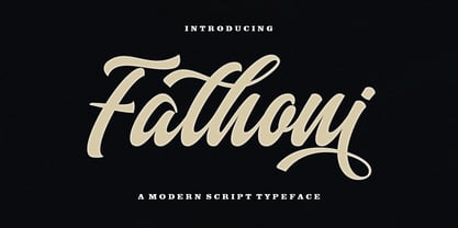 Fathoni is a modern handwritten calligraphy script. It contains the complete set of lowercase, uppercase, alternative, ligature, punctuation, numbers, and multilingual support. Work in harmony with Fathoni to create extraordinary calligraphy creations. You are welcome to use it for various purposes: logos, wedding invitations, titles, signatures, t-shirts, letterheads, nameplates, labels, posters, and more. How to access all alternative characters, using Windows Character Map with Photoshop https://www.youtube.com/watch?v=Go9vacoYmBw How to access all alternative characters using Adobe Illustrator: https://www.youtube.com/watch?v=XzwjMkbB-wQ
 - Konya by 38-lineart,
$12.00 Konya is a signature script-style font with a very luxurious look. It can look very soft and very firm in an elegant frame, high but not too towering, and flat but not too low. Its appearing with a balance like dervish whirling around in ‘Konya town’ with two hands stretched, one hand facing to the sky and the other hand facing to the earth. This font is perfect for branding, as we equipped it with a number of alternatives that allow you to make it a feminine and masculine logo, and some swash to add to the firmness of signature. This font also has ligatures to present a natural handwritten impression.
 - Shaky Kane by Comicraft,
$39.00 He sees you! He can see everything YOU do! He wears X-Ray Spex! He glows in the dark! Top Pop Cult Comic Artist Shaky Kane pushes at the limits of taste, dragging a scalpel down the veil of your illusions to make you see the world as it really is, as HE sees it. You've wondered at his work in the pages of ELEPHANTMEN! THE BULLETPROOF COFFIN! CAP'N DINOSAUR! THAT'S BECAUSE YOU'RE A ROBOT! MONSTER TRUCK and DEADLINE! You've worn the HATEFUL DEAD t-shirt and drawn blood with the SHAKY KANE FAN CLUB pins. Now Shaky Kane isn't just a disaffected punk rock way of looking at the world, it's a font too. A little Shaky, a little Stirred, best served with a purple eyeball spiked on a cocktail stick.
 - Baluno by Luxfont,
$22.00 Introducing is a fun and playful pouty Baluno font. Font has embodied the graphic trend of cartoon flat illustrations and will successfully complement modern designs. The font has 2 types of faces, which can be used both independently and together by alternating letters in one word to avoid repeating letters, creating a unique heading. Family is ideal for children's themes, because the font resembles inflated balloons. Creates a relaxed mood and has fun. Set comes in many different carefully selected colors and gradient color options. Check the quality before purchasing and try the FREE DEMO version of the font to make sure your software supports color fonts. P.s. Have suggestions for color combinations? Write me an email with the subject "Baluno Color" on: ld.luxfont@gmail.com Features: Free Demo font to check it works. 2 types of faces. Lots of ready-made matched colors. Gradient color variants. Kerning. IMPORTANT: - Multicolor OTF version of this font will show up only in apps that are compatible with color fonts, like Adobe Photoshop CC 2017.0.1 and above, Illustrator CC 2018. Learn more about color fonts & their support in third-party apps on www.colorfonts.wtf -Don't worry about what you can't see the preview of the font in the tab "Individual Styles" - all fonts are working and have passed technical inspection, but not displayed, they just because the website MyFonts is not yet able to show a preview of colored fonts. Then if you have software with support colored fonts - you can be sure that after installing fonts into the system you will be able to use them like every other classic font. Question/answer: How to install a font? The procedure for installing the font in the system has not changed. Install the font as you would install the other fonts. How can I change the font color to my color? · Adobe Illustrator: Convert text to outline and easily change color to your taste as if you were repainting a simple vector shape. · Adobe Photoshop: You can easily repaint text layer with Layer effects and color overlay. ld.luxfont@gmail.com
 - Dez Squeeze by Dezcom,
$29.00 When you don't want to speak softly, Squeeze can shout above the crowd. Say it loudly and proudly, this face does not have a weight problem. The Dez Squeeze Pro Family is also now available from Dezcom in seven widths. http://www.myfonts.com/fonts/dezcom/dez-squeeze-pro/ Dez Squeeze has 483 glyphs with uppercase, lowercase, proportional lining figures, unicase, stylistic sets, alternates, ordinals, and case specific punctuation. It has a full range of diacritics and covers all European languages using the Latin script.
 - Shake by Comicraft,
$29.00 Shake it DOWN! Shake it UP! Shake it OFF! Shake a LEG! You can even shake it like a polaroid picture now that Comicraft has the font that allows you to do just that, in comic book form! Shake is the ideal partner to our font, SHIVER, and yet it does not preclude rattling OR rolling if you're getting ready to RUMBLE! CAUTION: This font may cause you to move to and fro with jerky movements. See the families related to Shake: Shiver.
 - Social Networking Icons by Matt Grey Design,
$26.00The Social Networking Icons font family has been designed to simplify the process of routinely loading and pasting social icons around, for both print and on the web – reducing server load and saving time. They are great for embedding in webpages or for use on product packaging, posters, flyers and other marketing materials. Comes with a PDF guide and an interactive symbol sheet with labelled icons for reference. v4.0 Is out now with multiple improvements and updates on most icons. - Keks by Hubert Jocham Type,
$29.90 And now something completely different. Keks has broken elements like a blackletter typeface, but the actual forms are roman. That keeps it very legible although there is no curve at all. What was the inspiration for designing the font? Blackletter has an interesting history here in Germany. We need to find contemporary interpretations for this tradition. What are its main characteristics and features? Legible roman blackletter Usage recommendations: any usage that needs a black letter athmosphere where legibility is important.
 - Linotype Inky Script by Linotype,
$29.99Linotype Inky Script is part of the Take Type Library, chosen from contestants of Linotype’s International Digital Type Design Contests of 1994 and 1997. This fun fon was designed by the German artist Thomas Schnaeble as a handwriting font with little stroke contrast. The lower case letters are broad with a low x-height. Texts presented in Inky Script have a light, personal touch. Linotype Inky Script is well-suited to headlines as well as short to middle length texts. - Hunter Rising by Arendxstudio,
$15.00 Hunter Rising - Brush Font a relaxed and flowing handwritten script font. Incredibly versatile, this font fits a wide pool of designs, elevating them to the highest levels. Add this font to your favorite creative ideas and notice how it makes them come alive! Feature A-Z Character Set Numerals & Punctuations (OpenType Standard) Stylistic Alternates Swash Multilingual Ligatures
 - Flying Dutchman by FontMesa,
$25.00 In nautical folklore, the Flying Dutchman is a ship that can never go home and is doomed to sail the seas forever as a ghost ship. The story of the Dutchman appeared in print in the 1820s. With different versions written over the years, some date the legend to the 1640s or the early 1700s. The Flying Dutchman font is a revival of an 1876 font from MacKellar, Smiths & Jordan Co. The Truetype and OpenType formats include a larger extended character set with Central and Eastern European accented letters. Extra characters in this font are left and right pointing hands in place of the less than and greater than keys and a pirate flag is on the bracket keys. New to this style is the distressed version where the letters look like they've been hacked by a cutlass.
 - Vine Street by Proportional Lime,
$9.99 VineStreet a place somehow familiar to everyone in the English speaking world. It might be just around the corner or the next town over. This font gives that aged feel of comfort and familiarity and the authority of tradition. The example for this font was derived from a ecclesiastical history published by the Caxton Press of the Sherman & Co. of Philadelphia and was originally developed prior to 1867. This font has over 1000 defined glyphs and small caps included.
 - Saylove by Sinfa,
$18.00 Something beautiful does require extra energy to realize it !!! This Saylove font is very tiring in its work but now you only need a few minutes in an instant to make various crafts that you are working on, which allows you to work on various types of typography you need to get beautiful hands made in a short time. With some interesting initial and final forms, the Saylove font suits your needs in creating logos, invitations, cards, product packaging, headers, and whatever you want. You will be very satisfied with the presence of attractive replacement letters, where you can make according to the shape you expect, Saylove is equipped with a number of small letters including swash that you can use to realize a hand job that suits your imagination. I really hope you will get special satisfaction in using this font.
 - Sheridan Gothic SG by Spiece Graphics,
$39.00 Sheridan Gothic, also known as Grant Antique, is a quaint design produced in the late nineteenth century. Its proportions are in keeping with extra condensed faces of the times. Its uppercase letters are quite narrow. Its lowercase letters are equally narrow and tall. This pleasant and enduring design contains a touch of novelty, too. Swelled terminal flourishes on such characters as C, J, S, c, e, r, and s help add interest and warmth to what is basically a friendly old soul. Sheridan Gothic is now available in the OpenType Std format. Some new stylistic alternates have been added to this OpenType version. Advanced features work in current versions of Adobe Creative Suite InDesign, Creative Suite Illustrator, and Quark XPress. Check for OpenType advanced feature support in other applications as it gradually becomes available with upgrades.
 - Ongunkan Arkaic Greek by Runic World Tamgacı,
$45.00 Many local variants of the Greek alphabet were employed in ancient Greece during the archaic and early classical periods, until around 400 BC, when they were replaced by the classical 24-letter alphabet that is the standard today. All forms of the Greek alphabet were originally based on the shared inventory of the 22 symbols of the Phoenician alphabet, with the exception of the letter Samekh, whose Greek counterpart Xi (Ξ) was used only in a sub-group of Greek alphabets, and with the common addition of Upsilon (Υ) for the vowel /u, ū/.[1][2] The local, so-called epichoric, alphabets differed in many ways: in the use of the consonant symbols Χ, Φ and Ψ; in the use of the innovative long vowel letters (Ω and Η), in the absence or presence of Η in its original consonant function (/h/); in the use or non-use of certain archaic letters (Ϝ = /w/, Ϙ = /k/, Ϻ = /s/); and in many details of the individual shapes of each letter. The system now familiar as the standard 24-letter Greek alphabet was originally the regional variant of the Ionian cities in Anatolia. It was officially adopted in Athens in 403 BC and in most of the rest of the Greek world by the middle of the 4th century BC.
 - Things by PizzaDude.dk,
$20.00 OMG! I never thought I'd finish this font! Actually, the idea came to me in the late 1990-ies, but the sketches lied at the bottom of the "fonts I will complete one day In the future" pile ... also called "fonts I most likely won't complete...EVER" pile! :) Anyway, I started up with letters for both upper and lowercase, no numbers or punctuation. I figured if people ever purchased this font, all they would need were upper- or lowercase letters. But the rest of the glyphs seemed to miss out, so I made the numbers and some punctuation. But I still found the font incomplete...therefore I redid all the punctuation (from "standard" punctuation to "picturish" punctuation) and added two additional sets of letters. Meaning that there is 4 different versions of letters to choose from: 2 different lowercase, and 2 different lowercase. I had a lot of fun drawing this font, and some fun doing the detective work finding out how the MANY lettershapes should look! I hop you too have fun using this font! :)
 - Between Century by Adam Fathony,
$12.00 Between Century, A Display Font Duo. Between Century is a combinations between modern and classic look. Basically this is a Modern Sans with slightly geometric, combined with italic serif that can match perfectly to any design project. You can explore how to mix and match between letters, words or in the headers. Just Combine it and create your design more outstanding. Between Century is great for Poster, Headlines, Logotype, Branding, Social Media Post, Website and etc. What's you'll get on a Between Century : Language Support : Afrikaans, Albanian, Asu, Basque, Bemba, Bena, Catalan, Chiga, Cornish, Danish, Dutch, English, Estonian, Faroese, Filipino, Finnish, French, Friulian, Galician, Ganda, German, Greek, Gusii, Icelandic, Indonesian, Irish, Italian, Jola-Fonyi, Kabuverdianu, Kalenjin, Kinyarwanda, Low German, Luo, Luxembourgish, Luyia, Machame, Makhuwa-Meetto, Makonde, Malagasy, Malay, Manx, Morisyen, North Ndebele, Norwegian Bokmål, Norwegian Nynorsk, Nyankole, Oromo, Portuguese, Romansh, Rombo, Rundi, Rwa, Samburu, Sango, Sangu, Scottish Gaelic, Sena, Shambala, Shona, Soga, Somali, Spanish, Swahili, Swedish, Swiss German, Taita, Teso, Vunjo, Welsh, Western Frisian, Wolof, Zulu
 - Empirelines by Haksen,
$19.00 Empirelines are the family of blackletter style with Uppercase and Lowercase feel nice balanced. Provide alternates font in lowercase variant style make the design letter looks incredible. Honestly it works perfectly for headlines, logos, posters, packaging, T-shirts and much more. Recommended to use in Adobe Illustrator or Adobe Photoshop with opentype feature. How to access Alternates Character? Open glyphs panel : In Adobe Photoshop choose tool Window >> glyphs In Adobe Illustrator choose toolType >> glyphs If you have questions, just send me a message and I’m glad to help. Have a great day, Haksen
 - New Letter Gothic by ParaType,
$30.00 New Letter Gothic was designed for ParaType by Gayaneh Bagdasaryan based on monospaced Letter Gothic font by Roger Roberson, 1956–62. Due to clear and easy-to-read lettershapes of Letter Gothic the font is rather popular now for display and advertising matters. The idea was to create a font similar to Letter Gothic in lettershapes but with proportional widths of letters. For use in both display and text setting. New Letter Gothic has been adjudged an Award for Excellence in Type Design at Kyrillitsa ’99 International Type Design competition in Moscow, 1999.
 - RAN by URW Type Foundry,
$35.99 RAN Reformed Typeface for Beginners by Georg Salden - a headstrong and courageous approach to an improved handling of handwriting. Diverse and sometimes irreconcilable theories exist about how beginners are supposed to learn writing and reading. This has led to fierce discussions among experts already. We don’t want to pour more oil on the fire, but hope to create a new awareness for this topic, which is important to everyone of us. For beginners the combination of single characters (sounds) to whole words is essential during the acquirement of reading and writing. In this process they develop the skill to recall entire terms from memory. Therefore, after current practice, every word shall be written in a single stroke without lifting the pen in between. Georg Salden contradicts this postulate and warns, that coercively holding the pen down within a word can easily lead to exaggerated loop formations and a general meandering of the written text. The intellectual process in connecting single sounds to words while writing would happen anyway and the prohibition to lift the pen would often lead to tensions. To still support the necessary connections in general and to simplify the connecting, he teaches to write all round letters like a, e, g, o with inclusion of the connecting stroke, so that the spacing and combining with the next character arise by themselves. By settling the stroke at certain points and with a clear and logical writing method, a conscious and careful contact with the various strokes arises. All this automatically leads, together with a certain deceleration, to an increase of beauty and readability in the handwriting. The repeatedly discussed topic »connected or unconnected« appears to be solved in the most comfortable way as, depending on the particular character combination, both solutions are possible.
 - Billion Laughter by Haksen,
$20.00 Billion Laughter is a Bold serif display style with unique anatomy every letter. Provide variant alternates and ligatures make the design letter looks incredible. Honestly it works perfectly for headlines, logos, posters, packaging and much more. Recommended to use in Adobe Illustrator or Adobe Photoshop with opentype feature. Ligatures feature is default setting in Adobe Illustrator or Adobe Photoshop in Uppercase character. So when you want not to use the ligatures. Open glyphs panel : In Adobe Photoshop choose tool Window Character and then please click fi symbol In Adobe Illustrator choose tool Window Type Open Type and then please click fi symbol How to access Alternates Character? Open glyphs panel : In Adobe Photoshop choose tool Window glyphs In Adobe Illustrator choose tool Type glyphs If you have questions, just send me a message and I’m glad to help. Have a great day, Haksen
 - Fan Script by Sudtipos,
$99.00 A friend of mine says that sports are the ultimate popular drug. One of his favorite things to say is, “The sun’s always shining on a game somewhere.” It’s hard to argue with that. But that perspective is now the privilege of a society where technology is so high and mighty that it all but shapes such perspectives. These days I can, if I so choose, subscribe to nothing but sports on over a hundred TV channels and a thousand browser bookmarks. But it wasn't always like that. When I was growing up, long before the super-commercialization of the sport, I and other kids spent more than every spare minute of our time memorizing the names and positions of players, collecting team shirts and paraphernalia, making up game scenarios, and just being our generation’s entirely devoted fans. Argentina is one of the nations most obsessed with sports, especially "fútbol" (or soccer to North Americans). The running American joke was that we're all born with a football. When the national team is playing a game, stores actually close their doors, and Buenos Aires looks like a ghost town. Even on the local level, River Plate, my favorite team where I grew up, didn't normally have to worry about empty seats in its home stadium, even though attendance is charged at a high premium. There are things our senses absorb when we are children, yet we don't notice them until much later on in life. A sport’s collage of aesthetics is one of those things. When I was a kid I loved the teams and players that I loved, but I never really stopped to think what solidified them in my memory and made them instantly recognizable to me. Now, thirty-some years later, and after having had the fortune to experience many cultures other than my own, I can safely deduce that a sport’s aesthetic depends on the local or national culture as much as it depends on the sport itself. And the way all that gets molded in a single team’s identity becomes so intricate it is difficult to see where each part comes from to shape the whole. Although “futbol” is still in my blood as an Argentinean, I'm old enough to afford a little cynicism about how extremely corporate most popular sports are. Of course, nothing can now take away the joy I got from football in my childhood and early teens. But over the past few years I've been trying to perceive the sport itself in a global context, even alongside other popular sports in different areas of the world. Being a type designer, I naturally focus in my comparisons on the alphabets used in designing different sports experiences. And from that I've come to a few conclusions about my own taste in sports aesthetic, some of which surprised me. I think I like the baseball and basketball aesthetic better than football, hockey, volleyball, tennis, golf, cricket, rugby, and other sports. This of course is a biased opinion. I'm a lettering guy, and hand lettering is seen much more in baseball and basketball. But there’s a bit more to it than that. Even though all sports can be reduced to a bare-bones series of purposes and goals to reach, the rules and arrangements of baseball and basketball, in spite of their obvious tempo differences, are more suited for overall artistic motion than other sports. So when an application of swashed handlettering is used as part of a team’s identity in baseball or basketball, it becomes a natural fit. The swashes can almost be visual representation of a basketball curving in the air on its way to the hoop, or a baseball on its way out of the park. This expression is invariably backed by and connected to bold, sleak lettering, representing the driving force and precision (arms, bat) behind the artistic motion. It’s a simple and natural connective analysis to a designer, but the normal naked eye still marvels inexplicably at the beauty of such logos and wordmarks. That analytical simplicity was the divining rod behind Fan Script. My own ambitious brief was to build a readable yet very artistic sports script that can be a perfect fit for baseball or basketball identities, but which can also be implemented for other sports. The result turned out to be quite beautiful to my eyes, and I hope you find it satisfactory in your own work. Sports scripts like this one are rooted in showcard lettering models from the late 19th and early 20th century, like Detroit’s lettering teacher C. Strong’s — the same models that continue to influence book designers and sign painters for more than a century now. So as you can see, American turn-of-the-century calligraphy and its long-term influences still remain a subject of fascination to me. This fascination has been the engine of most of my work, and it shows clearly in Fan Script. Fan Script is a lively heavy brush face suitable for sports identities. It includes a variety of swashes of different shapes, both connective and non-connective, and contains a whole range of letter alternates. Users of this font will find a lot of casual freedom in playing with different combinations - a freedom backed by a solid technological undercurrent, where OpenType features provide immediate and logical solutions to problems common to this kind of script. One final thing bears mentioning: After the font design and production were completed, it was surprisingly delightful for me to notice, in the testing stage, that my background as a packaging designer seems to have left a mark on the way the font works overall. The modern improvements I applied to the letter forms have managed to induce a somewhat retro packaging appearance to the totality of the typeface. So I expect Fan Script will be just as useful in packaging as it would be in sports identity, logotype and merchandizing. Ale Paul
 - Lemony by Din Studio,
$29.00 Lemony is a serif font family in 8 different volume options expressing formality and elegance in your designs. Its family character is that it has small lines in horizontal or vertical forms on the letter body, easing readers to read the letter as the lines guide readers’ attention to the reading directions. As a result, you may use this font on any text sizes. In addition to the font weight variations, you will have freedom of how and where you should use the font. Enjoy the available features here. Features: Ligatures Multilingual Supports PUA Encoded Numerals and Punctuations Lemony fits for various design projects, such as posters, banners, logos, magazine covers, quotes, invitations, greeting cards, merchandise social media, etc. Find out more ways to use this font by taking a look at the font preview. Hopefully, you have a great experience using our font. Feel free to contact us if you require more information when you are dealing with a problem. Thank you. Happy designing.
 - Radiant Extra Condensed CT by CastleType,
$59.00 I was commissioned by the Emporium (now Macys) to digitize Radiant Bold Extra Condensed (originally designed by Robert Middleton in 1940) for use in their Sunday supplement to the San Francisco Examiner. For several years, I stubbornly refused to add the lowercase letters to the font, because I thought it looked best just used with caps, but finally relented, added the lowercase letters and at the same time created two more weights as well: Light and Medium. Used very large and carefully, these faces can be quite elegant.
 - Morgan Font Duo by Silverdav,
$15.00 Introduce “Morgan” is a duo font, consisting of Serif and Script fonts, a very fitting combination, of course making your design more elegant and very charming Morgan was created to fulfill your need to create a charming and cool design. Equipped with many unique ligatures in serif fonts that will make your designs different from other designs, and also equipped with many Alternates in Script Fonts that will add a luxurious impression to your designs. How to use special characters in serif fonts for the letters “A, I, U, E, O” please select one of the letters above then use the dot 2 times (A..), then you get a special character, and to get a special character on letters K, R & L, use one of the letters above, then add a hyphen (-) once or twice. What's Includes: Morgan Serif Morgan Script Special Ligatures in Serif Font Special Alternates in Script Font Multilingual Support If you have any questions, please contact us
 - Aziga by Eclectotype,
$40.00 In a typeface category that has been sorely under-represented until now, Aziga is a high (occasionally reversed) contrast, postmodern, deconstructed-reconstructed, serifless (mostly), fashion didone! Aziga lends itself to being set loud and proud, and the consistent angles throughout the glyphs make it a good candidate for more abstract typographic compositions. For the really graphically inclined (excuse the pun) a rotation of 66° will make the main diagonals in the font horizontal and vertical. Cool right? Features include stylistic and contextual alternates, ligatures and case sensitive forms. This is an unusual font, that’s for sure, but give it a try and you'll be rewarded with layouts that really stand out from the crowd.
 - Toothpaste Two by Eclectotype,
$20.00 Toothpaste Two is a reworking of Toothpaste . The new font has all the features of the original Toothpaste, but is now even crazier, with the line twisting and turning over and under itself, making a tangled string of text bordering on the edge of legibility. As in Toothpaste, every letter and number connects and there are numerous contextual alternates and ligatures to keep it all running smoothly. This is a fun, decorative font. It would look good on kids' websites, scrapbooks, party invitations and the like. It works best in brighter colors on darker backgrounds, which give the characters a neon light quality. Also, try it with a stroke for a cool cartoony effect.