10,000 search results
(0.107 seconds)
- KG How Many Times - Personal use only

- Eat your face now - Unknown license

- How To Consume Oxygen by Vic Fieger,
$8.99How To Consume Oxygen was created with the plan of emulating words written on a fluted-steel 'warehouse'-type door in advanced state of rusting. - Collect Em Now BB by Blambot,
$10.00 Collect Em Now BB is the sentence-case companion typeface to the uppercase Collect Em All BB! It includes four fonts: regular, italic, bold and bold italic, double letter opentype ligatures, contextual alternate barred-I correction, manga glyphs, and more!
 - Futura Now for Leica by Monotype,
$53.99For nearly 90 years, Paul Renner’s Futura has been as popular as it is versatile—from children’s books to fashion magazines to the plaque on the Moon. Futura is a typographic icon. Futura Now offers designers a chance to see Futura with fresh eyes. It’s more truly Futura-like than any digital version you’ve ever worked with. “It brings some much-needed humanity back to the world of geometric sans serifs,” says Steve Matteson, Monotype’s Creative Type Director who led the design team. “Despite its reputation as the ultimate modern typeface, Futura Now is surprisingly warm,” he explains. “It’s just as at home set next to a leafy tree as it is next to a stainless-steel table, because it skillfully navigates the border between super-clean geometry and humanist warmth.” Futura Now—the definitive Futura—contains 102 styles, including: new Headline and Text weights; new Script and Display weights and styles; and new decorative variants (outlines, inlines, shadows, and fill). Its contemporary alignment of names and weights makes the family easier to understand and use, and its comfortable Text and judicious Headline subfamilies provide instantly refined spacing. With a large Latin, Greek, and Cyrillic character-set, Futura Now serves a wider international creative community. Futura Now is available both as individual OpenType fonts and as a set of Variable fonts, delivering limitless styles in a tidy digital footprint. - F2F El Dee Cons by Linotype,
$29.99The Face2Face (F2F) series was inspired by the techno sound of the mid-1990s, personal computers and new font creation software. For years, Thomas Nagel and his friends formed a unique type design collective, which churned out a substantial amount of fresh, new fonts, none of which complied with the traditional rules of typography. Many of these typefaces were used to create layouts for the leading German techno magazine of the 1990s, Frontpage. Nagel and his fellows would even set in type at 6 points, in order to make it nearly unreadable. It was a pleasure for the kids to read and decrypt these messages! F2F EI Dee Cons one of 41 Face2Face fonts included in the Take Type 5 collection from Linotype. Nagel designed nine of these himself." - KG How Many Times by Kimberly Geswein,
$5.00 A cute, markered skinny font that is tall and neat with plenty personality to spare.
 - Captura Now Core Edition by TypeThis!Studio,
$50.00 Carefully refined shapes and sensitively balanced spacing and kerning create the gentle rythm that grants Captura its warm-hearted face, perfect in form and shape. www.typethis.studio This version covers all the essentials of Captura 265 Characters 8 Styles, including Italics Western European Language Support Numbers Symbols Punctuation If you need more features like small caps, special symbols, Cyrillic or Vietnamese language support, you may review the expert version of CapturaNow.
 - Dont Walk Run - Unknown license

- Scriptissimo Forte Swirls by Wiescher Design,
$39.50 Scriptissimo-Forte-Swirls is the bold version of Scriptissimo but with lots of swirls. Sometimes a job just calls for lots of embellishments, that's what this version is good for. Yours very swirly, Gert Wiescher.
 - Front Page Pro by Jonahfonts,
$45.00 A heavy slab face for many applications.
 - Conte Script Plus by Ingo,
$61.00 A personal handwriting done in pencil. Conté Script is a computer font but has the extraordinary look of handwriting. The typeface is exceedingly lively, diversified and distinct thanks to more than 300 different ligatures, i.e. letter combinations. In addition to the letter combinations in Conté Script, there are also double letters and figures included (aa, ff, AA, MM, 22, 66…) as ligatures with stylistic alternates. Type set in Conté Script appears remarkably similar to a text actually handwritten with a pencil. The typical style of the pencil — crumbliness where pressure lessens and the deep darkness where the pressure of the graphite in it's fullest denseness smudges — is another earmark of Conté Script. The font appears to be written quickly, fleetingly, casually, as if not really to be taken seriously, and as if it would be written one minute and erased the next. Conté Script looks most ”authentic“ around the point size of 18 to 22.
 - Fort Courage JNL by Jeff Levine,
$29.00 Fort Courage JNL is a bold slab serif wood type in the French Clarendon genre, taking its name as a tongue-in-cheek reference to the cavalry fort populated by a number of post-Civil War misfits in the 1960s television comedy "F Troop".
 - The Abrown Monte by The Ocean Studio,
$14.00 The Abrown Monte is a elegant handwritten font. It brings a beautiful and attractive typeface. Made for any professional project branding. It is the best for logos, branding, wedding and quotes. Features: Standard Ligatures Multilingual Support PUA Encoded Numerals and Punctuation Thank you for downloading premium fonts from Ocean Stud
 - Monte Casino NF by Nick's Fonts,
$10.00Adapted from lettering found on a poster by an Italian artist with the unlikely name of Marcello Dudovich, this ultrabold Art Deco font, with its graceful curves, commands attention. Primarily an uppercase only font, there's a variant lowercase m with a strong design element. - Fonce Sans Pro by Ryan Ford,
$10.95 Fonce Sans Pro is a mono-weight, Swiss-style typeface with influences from great typefaces like Din, Helvetica, Interstate, and Trade Gothic. Its form is unique and sophisticated with an unmistakable Dutch style. It’s subtle and enjoyable, and works beautifully in both display and body copy.
 - Ponte Vecchio NF by Nick's Fonts,
$10.00An elegant typeface from the turn of the last century named "Venezia", issued by Karl Brendler and Son of Vienna, provided the inspiration for this little gem, with hints of the exotic. Both versions of this font include the complete Unicode Latin 1252 and Central European 1250 character sets. - Big Foot Forest by RodrigoTypo,
$30.00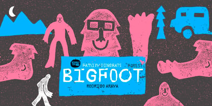
- My Left Foot by Rocket Type,
$14.00 Don’t let the name fool you! My Left Foot was made by hand. Alts, ligatures and Vietnamese all included in this whimsical typeface. Go ahead and dip your toes in!
 - Pappo's Blues Band Official Font - Unknown license

- Font in a Red Suit - Unknown license

- The Font With No Name - Unknown license

- Exit font (for a film) - Unknown license

- Nanncie Fancy Groovy Display Font by Maulana Creative,
$15.00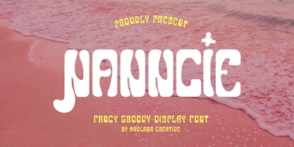 Nanncie fancy groovy display font. Bold stroke, fun character with a bit of ligatures and alternates. To give you an extra creative work. Nanncie font support multilingual more than 100+ language. This font is good for logo design, Social media, Movie Titles, Books Titles, a short text even a long text letter and good for your secondary text font with script or serif. Make a stunning work with Nanncie font. Cheers, Maulana Creative
 - Sister Pamella Font Cyrillic Duo by Ira Dvilyuk,
$18.00 Sister Pamella font duo Cyrillic is a pair of script and sans serif fonts, which perfectly complement one another. With a handwritten script font and a modern sans serif Sister Pamella font duo Cyrillic will be perfect for use in all your design projects be it logos, signatures, labels, packaging design, blog headlines. Also, it will look great on mugs, cards, gorgeous typographic designs, wedding stationery and much more. The Cyrillic part of the font contains the uppercase letters and lowercase letters and 17 ligatures, giving a realistic hand-lettered style. Sister Pamella script Cyrillic includes a full set of uppercase 2 sets of lowercase letters, numerals, a large range of punctuation and 38 ligatures, giving a realistic hand-lettered style. Sister Pamella sans serif containing uppercase only characters, numerals and a large range of punctuation. Creates a perfect contrast with the Sister Pamella script font. Multilingual Support for 32 languages: Afrikaans, Albanian, Basque, Bosnian, Catalan, Danish, Dutch, English, Estonian, Faroese, Filipino, Finnish, French, Galician, Indonesian, Irish, Italian, Malay, Norwegian Bokmål, Portuguese, Slovenian, Spanish, Swahili, Swedish, Turkish, Welsh, Zulu. And Cyrillic glyphs support for Russian, Belorussian, Bulgarian, Ukrainian and Kazakh languages. Works perfectly on the Canva platform. For Cricut & Silhouette recommended.
 - Reprizo Condensed Sans Display Font by Maulana Creative,
$17.00 Reprizo is a modern condensed sans display font. Bold stroke, fun character with a bit of ligatures and alternates. To give you an extra creative work. Reprizo font support multilingual more than 100+ language. This font is good for logo design, Social media, Movie Titles, Books Titles, a short text even a long text letter and good for your secondary text font with script or serif. Make a stunning work with Reprizo font. Cheers, Maulana Creative
 - Emorical Typeface Western Display Font by Maulana Creative,
$17.00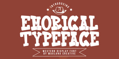 Emorical typeface western display font. Bold stroke, fun character with a bit of ligatures and alternates. To give you an extra creative work. Emorical typeface western display font support multilingual more than 100+ language. This font is good for logo design, Social media, Movie Titles, Books Titles, a short text even a long text letter and good for your secondary text font with script or serif. Make a stunning work with Emorical typeface western display font. Cheers, Maulana Creative
 - KG A Teeny Tiny Font by Kimberly Geswein,
$5.00 The handwriting of A Teeny Tiny Teacher, Kristin Oldham.
 - Happy Go Lucky Display Font by Goldfish Girl Creative,
$9.00 A Feel Good Kinda Font This playful and light-hearted, sans serif, display font includes uppercase letters, numbers, and punctuation. Great for carefree, boho, and fun designs like stationery, logos, wall art, stickers, patterns, and products. Use the font styles separately or try layering them! Built for easy use in Canva too. Includes: Happy Go Lucky font in 3 styles: Regular, Outlined, and Rounded
 - Portilla Rounded Bold Sans Font by Maulana Creative,
$15.00 Portilla is a modern round sans serif font. Bold stroke, fun character with a bit of ligatures and alternates. To give you an extra creative work. Portilla font support multilingual more than 100+ language. This font is good for logo design, Social media, Movie Titles, Books Titles, a short text even a long text letter and good for your secondary text font with script or serif. Make a stunning work with Portilla font. Cheers, Maulana Creative
 - Pollet Signature Script Sans Font by Maulana Creative,
$14.00 Pollet is a fancy signature script and sans serif font duo. With light contrast stroke, fun character with a bit of ligatures. To give you an extra creative work. Pollet font support multilingual more than 100+ language. This font is good for logo design, Social media, Movie Titles, Books Titles, a short text even a long text letter and good for your secondary text font with sans or serif. Make a stunning work with Pollet font. Cheers, MaulanaCreative
 - Is Not A Brazilian Font by Intellecta Design,
$17.95 an art deco font based on brazilian Rio's lettering old publish lettering style
 - KG I Need A Font by Kimberly Geswein,
$5.00 A neat handwritten font in 2 styles- one with hearts and one without hearts.
 - THE BOLD FONT (FREE VERSION) - Personal use only

- Kis Antiqua Now TB Pro by Elsner+Flake,
$99.00 In the course of the re-vitalization of its Typoart typeface inventory, Elsner+Flake decided in 2006 to offer the “Kis Antiqua” by Hildegard Korger, in a re-worked form and with an extended sortiment, as an OpenType Pro-version. After consultation with Hildegard Korger, Elsner+Flake tasked the Leipzig type designer Erhard Kaiser with the execution of the re-design and expansion of the sortiment. Detlef Schäfer writes in “Fotosatzschriften Type-Design+Schrifthersteller”, VEB Fachbuchverlag Leipzig, 1989: No other printing type has ever generated as far-reaching a controversy as this typeface which Jan Tschichold called the most beautiful of all the old Antiqua types. For a long time, it was thought to have been designed by Anton Janson. In 1720 a large number of the original types were displayed in the catalog of the „Ehrhardische Gycery“ (Ehrhardt Typefoundry) in Leipzig. Recently, thanks to the research performed by Beatrice Warde and especially György Haimann, it has been proven unambiguously that the originator of this typeface was Miklós (Nicholas) Tótfalusi Kis (pronounced „Kisch“) who was born in 1650 in the Hungarian town of Tótfal. His calvinistic church had sent him to the Netherlands to oversee the printing of a Hungarian language bible. He studied printing and punch cutting and earned special recognition for his Armenian and Hebrew types. Upon his return to Hungary, an emergency situation forced him to sell several of his matrice sets to the Ehrhardt Typefoundry in Leipzig. In Hungary he printed from his own typefaces, but religious tensions arose between him and one of his church elders. He died at an early age in 1702. The significant characteristics of the “Dutch Antiqua” by Kis are the larger body size, relatively small lower case letters and strong upper case letters, which show clearly defined contrasts in the stroke widths. The “Kis Antiqua” is less elegant than the Garamond, rather somewhat austere in a calvinistic way, but its expression is unique and full of tension. The upper and lower case serifs are only slightly concave, and the upper case O as well as the lower case o have, for the first time, a vertical axis. In the replica, sensitively and respectfully (responsibly) drawn by Hildegard Korger, these characteristics of this pleasantly readable and beautiful face have been well met. For Typoart it was clear that this typeface has to appear under its only true name “Kis Antiqua.” It will be used primarily in book design. Elsner+Flake added two headline weights, which are available as a separate font family Kis Antiqua Now TH Pro Designer: Miklós (Nicholas) Tótfalusi Kis, 1686 Hildegard Korger, 1986-1988 Erhard Kaiser, 2008
 - Kis Antiqua Now TH Pro by Elsner+Flake,
$99.00 In the course of the re-vitalization of its Typoart typeface inventory, Elsner+Flake decided in 2006 to offer the “Kis Antiqua” by Hildegard Korger, in a re-worked form and with an extended sortiment, as an OpenType Pro-version. After consultation with Hildegard Korger, Elsner+Flake tasked the Leipzig type designer Erhard Kaiser with the execution of the re-design and expansion of the sortiment. Detlef Schäfer writes in “Fotosatzschriften Type-Design+Schrifthersteller”, VEB Fachbuchverlag Leipzig, 1989: No other printing type has ever generated as far-reaching a controversy as this typeface which Jan Tschichold called the most beautiful of all the old Antiqua types. For a long time, it was thought to have been designed by Anton Janson. In 1720 a large number of the original types were displayed in the catalog of the „Ehrhardische Gycery“ (Ehrhardt Typefoundry) in Leipzig. Recently, thanks to the research performed by Beatrice Warde and especially György Haimann, it has been proven unambiguously that the originator of this typeface was Miklós (Nicholas) Tótfalusi Kis (pronounced Kisch) who was born in 1650 in the Hungarian town of Tótfal. His calvinistic church had sent him to the Netherlands to oversee the printing of a Hungarian language bible. He studied printing and punch cutting and earned special recognition for his Armenian and Hebrew types. Upon his return to Hungary, an emergency situation forced him to sell several of his matrice sets to the Ehrhardt Typefoundry in Leipzig. In Hungary he printed from his own typefaces, but religious tensions arose between him and one of his church elders. He died at an early age in 1702. The significant characteristics of the “Dutch Antiqua” by Kis are the larger body size, relatively small lower case letters and strong upper case letters, which show clearly defined contrasts in the stroke widths. The “Kis Antiqua” is less elegant than the Garamond, rather somewhat austere in a calvinistic way, but its expression is unique and full of tension. The upper and lower case serifs are only slightly concave, and the upper case O as well as the lower case o have, for the first time, a vertical axis. In the replica, sensitively and respectfully (responsibly) drawn by Hildegard Korger, these characteristics of this pleasantly readable and beautiful face have been well met. For Typoart it was clear that this typeface has to appear under its only true name “Kis Antiqua.” It will be used primarily in book design. Elsner+Flake added these two headline weights, which are available besides a separate font family Kis Antiqua Now TB Pro. Designer: Miklós (Nicholas) Tótfalusi Kis, 1686 Hildegard Korger, 1986-1988 Erhard Kaiser, 2008
 - Born This Way FONT (lady gaga) - Unknown license

- Crash Waves Lead To Skinny Font - 100% free

- You Can Make Your Own Font - 100% free

- Whitelisa Script And Sans Font Duo by Maulana Creative,
$16.00 Whitelisa is a complete script and sans combine font. With light and catchy display sans. fun character with some of ligatures, alternates script and extra swash. To give you an extra creative work. Whitelisa font support multilingual more than 100+ language. This font is good for logo design, Social media, Movie Titles, Books Titles, a short text even a long text letter. Make a stunning work with Whitelisa font. Cheers, Maulana Creative


