8,767 search results
(0.035 seconds)
- Chopper by Canada Type,
$24.95 In 1972, VGC released two typefaces by designer friends Dick Jensen and Harry Villhardt. Jensen’s was called Serpentine, and Villhardt’s was called Venture. Even though both faces had the same elements and a somewhat similar construct, one of them became very popular and chased the other away from the spotlight. Serpentine went on to become the James Bond font, the Pepsi and every other soda pop font, the everything font, all the way through the glories of digital lala-land where it was hacked, imitated and overused by hundreds of designers. But the only advantage it really had over Venture was being a 4-style family, including the bold italic that made it all the rage, as opposed to Venture’s lone upright style. One must wonder how differently things would have played if a Venture Italic was around back then. Chopper is Canada Type’s revival of Venture, that underdog of 1972. This time around it comes with a roman, an italic, and corresponding biform styles to make it a much more attractive and refreshing alternative to Serpentine. Chopper comes in all popular formats, boasts extended language support, and contains a ton of alternate characters sprinkled throughout the character map.
 - Fontella by Canada Type,
$24.95 Italian type design master Aldo Novarese was not famous for making calligraphic designs, nor had he any interest in them. He is much better known for his text faces, and quite innovative sans serif and decorative designs which became the definition of what we now know as techno and modern. But in 1968, Novarese surprised everyone with a fantastic flowing deco script entitled Elite. Novarese's formula of simple soft curves and toned-down swashes makes for one of the most unique alphabets ever seen, not to mention one of the best flowing and most legible scripts. This is now its digital incarnation, named Fontella. Fontella's applications are virtually limitless. This is the sort of script that can feel at home pretty much anywhere; a sign, a fridge magnet, a bumper sticker, a greeting card, a movie poster, a book cover, music artwork, magazine ads, newsletter headlines, etc. Digitized from original specimen and expanded with a few built-in alternates and ligatures by Rebecca Alaccari, the font was named after the famed jazz singer Fontella Bass. These letters are just so sweet they had to be called Fontella.
 - Comenia Sans by Suitcase Type Foundry,
$75.00Comenia Sans was designed in the framework of a unique typographic project for all types of schools. It is a complementary face for Comenia Serif, released by our friends at Storm Type Foundry. Comenia Sans has a lot in common with its serif sister: the height of both upper and lower case, the length of ascenders and descenders, and the general weight. This makes the two perfect partners which work well even when set side by side in a single line of text. Comenia Sans does, however, lack all serifs, ornamental elements and stroke stress variation. All these elements freshen up the feel of long texts, but for shorter texts use, they are not necessary. Despite that, Comenia Sans retains the soft, friendly character of its big sister, as well as a few tiny details which lend it its unique character without compromising legibility or utility. Open counters give all letters an airy feel and permit enough variation in construction. This is why the face works well even in multiple-page texts. All its letters are easily distinguished from each other, so the reader's eyes are not strained. Diacritics and punctuation harmonize with both upper and lower case. As usually, all diacritical marks fully respect conventional shapes of accents and they are perfectly suitable for Czech, Slovak, Polish and other Central European languages, where a lot of diacritics abounds. Similarly to the renaissance italics which refers to the cursive forms, Comenia Sans introduces novel shapes of some characters drawing from the hand-written heritage. This is most apparent in the single-bellied a, the simplified g, and the stem of f which crosses the baseline and ends with a distinct terminal. In the text, emphasized words are thus distinguished not only by the slant of letters, but also by the shapes of the letters themselves. All twelve styles contain set of small caps, suitable for the names, in the indexes or the headlines in longer texts. Legibility in small sizes under 10 points was at the center of designers' attention, too. This is why the counters of a, e and g are large enough to prevent ink spread in small sizes, both on-screen and in print. After all, the font was specifically optimized for screen use: its sober, simple forms are perfectly fit to be displayed on the computer screen and in other low-resolution devices. When used in the context of architecture, the smoothness of all contours stands out, permitting to enlarge the letters almost without limit. A standard at the Suitcase Type Foundry, each style of Comenia Sans boasts a number of ligatures, an automatic replacement of small caps and caps punctuation, a collection of mathematical symbols, and several types of numerals which make it easy to set academic and other texts in an organised, well-arranged way. For the same purpose, fractions may come in handy, too. Apart from the standard emphasis styles, the family also contains six condensed cuts (each set has the same number of characters), designated for situations where space is limited or the need for striking, poster-like effect arises. Comenia Sans is the ideal choice for the setting of magazines, picture books, and navigation systems alike. Its excellent legibility and soft, fine details will be appreciated both in micro-typography and in poster sizes. Although it was designed as a member of a compact system, it will work equally well on its own or in combination with other high-quality typefaces. - Protipo by TypeTogether,
$35.00 Protipo helps information designers work smarter. Veronika Burian and José Scaglione’s Protipo type family is an information designer’s toolbox: a low-contrast sans of three text widths with a separate headline family, accompanied by an impressive two-weight icon set, and working with the advanced variable (VAR) font format. From annual reports and wayfinding to front page infographics and poster use, designers consistently turn to the simplicity and starkness of grotesque sans fonts to get their point across. Protipo is made for such environments. When designing information you may start with the headline, which in the case of this family is called Protipo Compact and comes in eight weights. From Hairline to Black, set it large, overlap it, or let it run off the page. Protipo Compact was made to hit hard and attract attention with a different character set and different proportions than the three text fonts. It sets the stage for what’s to come. Great information designers are aces at melding form and function, so we’ve stacked the Protipo family with Narrow, Regular, and Wide versions as a way of organising your information and directing the reader. Each width has seven distinct weights (light to bold) and italics, while maintaining the round-rect shapes of its DNA. Subtle details amplify its place in the typographic universe, like an ‘a’ and ‘e’ that go from solid to supple when italicising, an ‘f’ that gains an italic descender, two versions of the lowercase ‘r’ and ‘l’, and clipped corners on diagonals to keep the tight fit inherent to this kind of design work. Protipo is not meant to be loudmouthed, but stakes its claim through refinement, breadth, and impact. Some changes at first don’t seem substantial, but the Protipo family doesn’t handle text like most in its category. Protipo helps readers find and process data in a clear and unequivocal way and accounts for the complexity involved in rendering large amounts of information while still appealing to aesthetics. Protipo is ideal in all informative situations: apps, infographics, UI, wayfinding, transport, posters, display, and even internet memes. Add to all this the icon sets and upcoming variable font capability, and you’re assured a level of creativity, productivity, and impact on a much greater scale.
 - Bigfoot by Canada Type,
$24.95 Bigfoot is the fattest font ever made. It began as a simple exercise given to students in a design course: Most people don't appreciate type because they don't really know what it actually is. One way to understand it is looking at it like a combination of sculptures that have to work together to achieve a certain harmony, where each letter form is one of those sculptures. Most people understand and appreciate that a sculpture starts from a rock of an incomprehensible form, which is manipulated by someone into becoming the recognizable or abstract work of art it eventually is. Consider type design a kind of two-dimensional sculpting. You have a rectangle. Take away as a little as possible from it until it is recognizable as the letter A. Repeat to get the letter B, and so on. After all 26 minimal letters are made, do they actually function as an alphabet to build words and sentences that are recognizable to the human eye? This exercise can trigger thoughts and theories about the overall subjective nature of identifying abstract yet somewhat familiar shapes. It can go into the psyche of art in general. But one thing for certain, this exercise has so far helped a few people find a new appreciation for finely crafted typefaces. If you are a design educator, your students' typographical perspective and arguments would benefit from it. And if you are a designer, well, fat faces are all the rage these days, and this is as fat as it can get. Please note that that this typeface, due to its minimalistic nature, does not include accented characters. It does however support the full C0 Controls and Basic Latin Unicode set. All proceeds from this font go to support the Type Club of Toronto.
 - Text Tile by Tetradtype,
$25.00 TextTile is a system of heavy sans titling faces which can be utilized to carry a repeating chromatic pattern across words and letters. It stands apart from other chromatic faces, where layered effects typically interact only within each letter and do not carry through from one letter to another. The pattern repetition across letters of varying widths is achieved through OpenType substitution, using conditional alternates for each successive letter to allow for a seamless appearance across words, regardless of letter combinations. Though the pattern exists on a strict grid and the letters' widths and spacing must be highly regular in order to preserve the pattern repeat, the letterforms themselves are not rigid; rather, they appear organic, lively. The initial release includes patterns inspired by a classic buffalo plaid, separated into its horizontal and vertical components to maximize the creative possibilities for layering one-, two-, three-, and even four-color plaid patterns. Kits are available to produce the plaid pattern in detail—with overlapping diagonal hatching fully visible—or as a simplified version in which transparency can be used to simulate plaid or to create a checkered or striped effect. The TextTile family of fonts is a flexible canvas for mixing and matching a broad array of patterns to create a unique look. Check back for more pattern releases and take a look at the online specimen to see what is possible with the current offerings. Usage Notes For best results use an OpenType aware program. Enabling Contextual Alternates will ensure pattern alignment. For patterns that are made up of vertical stripes or columns using the Stylistic Alternate/Stylistic Set 1 will shift the columns. Stylistic Set 2 will change 1-0 into blocks of patterns.
 - P22 Monumental Titling by IHOF,
$24.95 Based on Transitional Roman forms, this tasteful and well crafted Humanist display face exudes an air of authority along with a subtle playfulness. Narrow proportions allow for space conservation. Alternate letterforms & ligatures give this caps-only font expanded possibilities for any given text setting.
 - TOMO Joseph by TOMO Fonts,
$12.00 Joseph is a slab-serif face designed by TOMO. With a wood type look - letterpress print, this fatty comes in handy when is time to design an informal —yet strong—looking communication piece. Imagine this typeface on a T-shirt, even a mug! Sweet.
 - Dusky Pub by Gleb Guralnyk,
$14.00 Introducing a vintage typeface named Dusky Pub. It's a layered font set made in classic western style. Bold shape with slab serifs makes it perfect for various labels and product designs. Wide range of languages support is available, including west european and cyrillic characters.
 - California Sans by BA Graphics,
$45.00 California Sans designed as a beautiful easy reading text face also works great in Headlines. It also has a matching drawn Italic which makes a great combination for all your needs. Even as a stand alone Italic font it works in so many designs.
 - Salad Bar JNL by Jeff Levine,
$29.00 Hand-cut wooden letters belonging to a long-defunct salad bar's signage were offered for sale in an online auction. The casual look of the lettering, the hand crafted feel and the rounded ends made for the perfect inspiration for designing Salad Bar JNL.
 - Imprint by Monotype,
$29.99 In 1912 Gerard Meynell, with J.H. Mason, Ernest Jackson and Edward Johnston, commissioned this large x-height typeface modelled on Caslon’s designs from Pierpont and the Monotype Corporation as the text face for The Imprint, a short-lived magazine about fine printing and typography.
 - Preferred Shares JNL by Jeff Levine,
$29.00 A bold, condensed slab serif face A July 9, 1935 trade paper ad for Paramount Pictures’ 1st quarter film releases sported hand lettering with chamfered slab serifs. This condensed type design is now available as Preferred Shares JNL in both regular and oblique versions.
 - JustTall by OneSevenPointFive,
$10.00 JustTall is an ultra condensed typeface with open type features, 400+ characters with 80+ languages support made for tight spaces. Useful for - Logos for companies with really long names Different texts with very little space available Very tall design types Give feedback: https://bit.ly/3FlmhDS
 - Authenticity by Doehantz Studio,
$20.00 Authenticity is an authentic signature font. It made with a neat touch making it easy to read. This font is suitable for use as web logos, signatures, invitation, prints, headers, magazines, book covers, t-shirt prints, craft, product brand, business card, logo, and gift card
 - Bistro by Letterhead Studio-YG,
$29.00 Bistro and Hot Sauce have been prepared quickly. In Bistro you will find 10 fine traces from coffee cups, and in HotSauce 10 pleasant-for-eyes stains from sauce. Both fonts are created in the 1998. OpenType revision, with extended Latin characters, made in 2009.
 - Copacabana by Alan Meeks,
$45.00 Copacabana is heavily based on one of my favourite typefaces Goudy Old Style Italic. It is sharper and more clearly defined than Goudy yet still retains it old style characteristics. The face is slightly angled so is basically upright whilst still retaining Italic characteristics.
 - Kingdrops by Letterhend,
$19.00 Kingdrops is a cool script typeface. This font perfectly made to be applied especially in logo, and the other various formal forms such as invitations, labels, logos, magazines, books, greeting / wedding cards, packaging, fashion, make up, stationery, novels, labels or any type of advertising purpose.
 - Wolvercote by Greater Albion Typefounders,
$14.50 Wolvercote is one of two new ‘Masthead’ typefaces from Greater Albion. This Victorian inspired face makes the construction of ribbon or cartouche banners and mastheads the simple work of a few moments. Wolvercote is also particularly designed to complement our Wolverhampton and Mexborough families.
 - 9 Months by Tkachev,
$25.00 9 months is a decorative face with two font styles. It would look nice on candy and food package, in children's books and magazines. This work is devoted to the period in my wife's life when she was pregnant during 9 months with our daughter.
 - Heaternia by MJB Letters,
$16.00 Heaternia is a very natural handwritten font, made with a very careful touch to get the natural impression of each character. This font is very suitable for use in various needs such as business cards, invitation designs, brochures, stationery, packaging, branding, handicrafts, and others.
 - Back And Forth by A New Machine,
$10.00 This all cap, bold, sans serif font features one face that slants backward ("Back") and one that slants forward ("Forth"). Use in combination to create headlines and designs that call for a sense of speed, motion and power. Uppercase and lowercase letters are the same.
 - Tubby by Suomi,
$19.00 Tubby came about when I made a book with Cooper Black as a headline font. I started playing with heavy forms, and as a result was Tubby. It has a fat and friendly feel, and with swash italics it is fairly versatile in use.
 - Eloisse by Yumna Type,
$16.00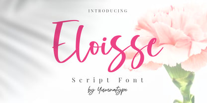 Eloisse is a beautiful handwritten font. Made for any professional project branding. It is the best for logos, branding and quotes. Every letter has a unique and beautiful touch. Includes: Eloisse (OTF) Features: Standard Ligatures PUA Encoded Multilingual Support Numerals and Punctuation by Yumnatype
 - Penelope by Solotype,
$19.95This was originally brought out as a caps-only font, but later the foundry scrounged up a lowercase that wasn't our idea of a very good match. So we cleaned up the caps and made them a bit bolder, then drew a harmonizing lowercase. - This Man This Monster by Comicraft,
$19.00 Half Man, Half Monster, Comicraft’s latest variable font hybrid is not only your burly, hard-edged, upfront and blunt buddy, it’s also your rough-hewn, tough and grim, rocky-featured pal! Not just Two-in-One, our latest offering brings together Four Fantastic Faces!
 - Ballpoint Marker by Crumphand,
$18.00 Introducing the new handwriting font Ballpoint Marker. Ballpoint Marker is made 100% ballpoint. Still looks fun, cute. make your design looks better. What's Included Inside The Font ? Uppercase Lowercase Numbers Symbols European Multilingual Stylistic Alternates 1 Stylistic Alternates 2 PUA Encoded Thank You, Regards!
 - Tallahassee Chassis JNL by Jeff Levine,
$29.00Tallahassee Chassis JNL was modeled from a toy alphabet rubber stamp set made in Japan and imported to the U.S. during the late 1950s and early 1960s. The lettering style somewhat resembled that found on the side of old railroad cars, buses or trolleys. - Veronica by Miller Type Foundry,
$29.00 Veronica is a fun and playful script font with matching caps. Perfect for headlines, logos or display purposes; Veronica is sure to put a smile on the face of everyone who sees it. Veronica comes with opentype features like oldstyle figures, ligatures and stylistic alternates.
 - Furuhashi by Phoenix Group,
$10.00 Furuhashi font is a unique font that is made in a Japanese style adapted to the letters of the alphabet. basically, this font is used for needs displays and headlines. but the user is given the ease of customization as it is alternative letters.
 - Cellosia by Bluestudio,
$20.00 Cellosia is made to resemble hand scratches, so it looks like a natural style like your own hand scratches. Cellosia offer beautiful typographic harmony for a variety of design projects, including watermark, logos, branding, wedding designs, social media posts, advertisements, product designs, magazines and others.
 - Pen Moderne JNL by Jeff Levine,
$29.00 A classic example of Art Deco lettering made with a round nib ink pen was found within the pages of “Lettering” by Harry B. Wright (circa 1950). Now available as a digital type font, Pen Moderne JNL is available in both regular and oblique versions.
 - Gitchgitch by Weknow,
$5.00 Give a simple rounded fun groovy, fancy, to any text project. Also good for a logotype or brand name. This is a gift to my graphic designer friend Gita from Indonesia, I call her gitch gitch, so I made it the name on this font.
 - Slabserif Grotesk JNL by Jeff Levine,
$29.00 Slabserif Grotesk JNL was modeled from an example of a wood type design called Antique Light Face, and is available in both regular and oblique versions. The numerals (although an odd fit to the overall design) make this vintage font quite unusual and charming.
 - Bettendorff by Greater Albion Typefounders,
$14.50 Bettendorff is one of two new ‘Masthead’ typefaces from Greater Albion. This 1900’s inspired face makes the construction of ribbon or cartouche banners and mastheads the simple work of a few moments. Bettendorff is also particularly designed to compliment our Spargo and Mexborough families.
 - What A Night JNL by Jeff Levine,
$29.00 The hand lettered title on the cover of the 1934 sheet music for "What A Night" not only acted as a design model for What A Night JNL but also as its namesake. The digital type face is available in both regular and oblique versions.
 - Hinelka by Awan Senja,
$14.00 Introducing our newest cute serif typeface, Hinelka Unique Script. This font perfectly made to be in poster funny, and the other various formal forms such as invitations, labels, logos, magazines, books, packaging, fashion, make up, stationery, novels, labels or any type of advertising purpose.
 - Adolf William by Wildan Type,
$10.00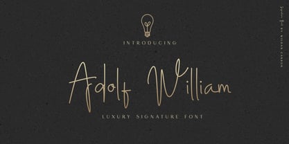 Adolf William is a handwritten signature script with a natural & stylish flow. This collection of scripts is perfect for personal branding. It was made with the intention to be used by Photographers as a watermark for Photography Business,personal branding & wedding invitations to advertising
 - Astoria Sans by Alan Meeks,
$45.00 The Sans serif companion to Astoria. Based heavily on Gill especially in the mid weights and with a consistant series of condensed weights. Designed specifically as a text face it still works very well as a headline font. There are 6 weights with accompanying Italics.
 - Brandzet by ahweproject,
$14.00 Brandzet is a unique display font. Its random shape makes it outstanding and great for titles. This type of font is perfectly made to be applied to logos, headlines, labels, logos, magazines, books, packaging, fashion, makeup, stationery, novels, labels, or any type of advertising purpose.