8,767 search results
(0.021 seconds)
- You Suckin' Thief - Unknown license

- Ayres Mono by Ayres,
$5.00 The Ayres Mono font is a clear and geometric mono-spaced font. It is easily legible and has Regular and Bold variants. It has keyboard friendly characters for drawing curved boxes and tables from the 'curly brackets' characters. These can be laid out in the text with the even spacing. It also features easy to use simple maths and music symbols. Some punctuation marks are made half-spaced along with a half-space key for more layout options. It supports many languages including English, French, Spanish, Italian, Portuguese, German, Dutch, Norwegian, Icelandic, Welsh, Finnish, Polish, Danish, Swedish, Hungarian, and Mauri. It includes symbols such as a tick, card suits and smiley face. The geometric layout is ideal for guitar tablature and text art.
 - Ezekiel by MYSTERIAN,
$9.00 Ezekiel Script is the font become flesh—mythic gesture imposed upon forms of mechanical medium. Typography has changed the internet; our phasing mimetic desires tend toward posture rather than rationale, and the face is a concept that explores that concept. Obviously some reading of McLuhan has infliunced this concept of analysis. The script has ample diacritic extensions, as well as an alternative for the ampersand (characteristic of MYSTERIAN type) and the eszette: an upper and lower case. The upper and lower case alphabets are diverse in that the majuscules do not have linking strokes while the miniscules do. This was the first script that I've made, and great attentiveness was taken to ensure that links were set accurately, and spacing harmonious throughout.
 - President by Linotype,
$29.99In 1952, Charles Peignot made a bold and fortuitous move: he invited a young Swiss designer to Paris to be the art director of the Deberny & Peignot type foundry. This started the professional type design career of Adrian Frutiger; and since then he has designed an astonishing range of masterful typefaces. One of the earliest for Deberny & Peignot was Président, a sharp-seriffed Latin titling face. Latin" is a typographic designation for roman typefaces with wedge or triangular-shaped serifs, a stylistic form that Frutiger would return to later with his beautiful typeface Méridien. Président™ has wide, solid shapes; very little contrast between thick and thin strokes; and an air of assurance. Use this titling font for business cards, announcements, or artistic signage." - Didot Headline by Canada Type,
$24.95 In spite of its name, this font family embodies the ultimate classic modern advertising typeface, rather than concern itself with revivalism or Didone authenticity. Naturally the spirit of the original Didot faces still exists in this family, but over twelve years of work on it have made it more fitting to the luxurious expression of our day and age, rather than nineteenth century Europe. Upscale and stylish, Didot Headline is an essential tool for any designer involved in magazines, books, tasteful music, or overall luxury packaging that requires clean and large classic typography with an unmistakable modern spin. We recommend the use of Didot Headline between 12 and 48 points. For larger display use, check out its sister family, Didot Display.
 - P22 Garamouche by P22 Type Foundry,
$24.95 Think of Garamouche as Garamond's drunken cousin. This font replicates a long lost document ravaged by time and the elements (with a little sloppy printing for good measure.) Unlike the fake bolding option found in software programs, Garamouche Bold is a variant with more appropriate thick and thin features. The "dancing along the baseline" that has made Garamouche a favorite, is also a feature in Garamouche Bold, but the letters align and tilt in on their own terms. Using the two Garamouche fonts together can produce much more expressive results than just hitting "bold". P22 Garamouche Ornaments is a set of 72 ornamental embellishments designed to complement the Garamouche fonts but can be used with almost any layout that calls for historical decoration.
 - Didot Display by Canada Type,
$24.95 In spite of its name, this font family embodies the ultimate classic modern advertising typeface, rather than concern itself with revivalism or Didone authenticity. Naturally the spirit of the original Didot faces still exists in this family, but over twelve years of work on it have made it more fitting to the luxurious expression of our day and age, rather than nineteenth century Europe. Upscale and stylish, Didot Display is an essential tool for any designer involved in magazines, books, tasteful music, or overall luxury packaging that requires clean and large classic typography with an unmistakable modern spin. We recommend the use of Didot Display at 48 points and over. For 12-48 pt. use, check out its sister family, Didot Headline.
 - P22 Founders by IHOF,
$24.95 Based on turn-of-the-century advertising type. A condensed, fat-faced display font with a touch of the medieval. The influence of art nouveau is also present in the high-waisted caps and flowing lines, putting the face into the early 20th century.
 - Pallada by ParaType,
$25.00 A decorative face of freestyle flowing letterforms, it is stylized a little under wide brush calligraphy. Its letterforms are characterized with one-side serifs. For use in book heading, advertising and display matter. The face designed by Natalya Vasilyeva and licensed by ParaType in 2007.
 - CrEAtOR CamPotype by Campotype,
$15.00 So far the Creator Campotype standard version known in the form of free font (published on several websites by license: free for personal use). The font takes the basic form of modern typography, but some user feedback consider it in the medieval look. Whatever it is, the inspiration of the font was originally set off from the logotype of internal student magazine where the designer had studied in the late 80s. Creator Campotype is a pure display font. This fonts do not have faces lowercase, but all caps. Nevertheless forms of different characters can be accessed by pressing the uppercase and lowercase on the keyboard. Maximum usage can be made by combining them as necessary. Some forms of characters were made more stylistic such as slash and backslash which “out of” the conventional form. In addition, the circle effects on several glyphs were created by default (as found on the free version) so that the glyph was enough to generated with the keyboard access as usual. Information for those who have access to the free version, there are significant changes in this version (2001) as described in the file “creator ct pdf” (gallery)
 - FF Cocon by FontFont,
$65.99 FF Cocon’s designer, Evert Bloemsma (1958—2005) described it as a “serious typeface”. Despite first impressions, the description holds up well. Since its 2001 release, FF Cocon has been used in an astoundingly wide variety of design applications. At large sizes, FF Cocon works as a display face, with beautiful detailing. And at small sizes, it remains surprisingly readable. The lowercase letters a, b, d, g, h, m, n, p, q, r and u, were drawn without spurs, as Bloemsma made an attempt to erase every trace of handwriting; even “normal,” neutral sans serif typefaces still retain elements in their letterforms like this. Bloemsma wanted none of it. Although a difficult starting point for a typeface, this proved successful. Bloemsma’s design is a family of rounded yet rather asymmetrical forms with details reminiscent of brush-strokes, but that were not made with a brush in hand. In spite of its claim to seriousness, FF Cocon is a family of seductive, voluptuous styles. The original FF Cocon had two widths—normal and condensed. Later, a more compact Extra Condensed version was introduced, as well as italics.
 - Originator by TEKNIKE,
$39.00 Originator is a display modular monospace font. The typeface has a distinct technical geometry using sharp angled corners. "Originator" name is derived from Latin and means 'one who first creates or initiates something into existence.' Originator is recommended for display work, branding, logos, technical writing, team sports, aerospace, aviation, automotive, racing, fashion, cinema, architecture, invitations, posters and headings.
 - Mono Amono NF by Nick's Fonts,
$10.00Here’s a techno typeface with a difference. Its monoline stroke and sharp terminals are softened by rounded corners, and its perceptual monospaced widths have been subtly altered and strategically kerned to improve the visual flow. This font contains the complete Latin language character set (Unicode 1252) plus support for Central European (Unicode 1250) languages as well. - Schoolyard Blues JNL by Jeff Levine,
$29.00 Schoolyard Blues JNL is based on the hand lettered title found on the sheet music for the 1938 song "I Was Late for School". A condensed sans serif with chamfered corners, it reflects the Art Deco influences of the day in some of the letter forms. This type design is available in both regular and oblique versions.
 - Theater Tickets JNL by Jeff Levine,
$29.00 Theater Tickets JNL was inspired by a photo of the marquee signage for Detroit’s Majestic Theater (built in1934), and is available in both regular and oblique versions. The theater was renovated and restored in 1987 and its marquee replicated the original one. What’s interesting is that the signage actually resembles squared pen lettering with rounded corners.
 - Yerk by That That Creative,
$15.00 Yerk is another modern Y2K inspired font. This retro font comes in 3 styles regular italic and slanted. Its bold weight, squared-off letters with slightly rounded corners make it perfect for adding big impact and a bit of personality to your design. It is perfect for logos, branding, magazines, Instagram, and whatever project you are looking for.
 - Allerton by Jeff Levine,
$29.00 Presenting a condensed Art Deco sans serif font with rounded corners and squared inner lines, based on the hand lettered title on the cover of the sheet music for 1944’s “Just A Little Fond Affection”. Allerton JNL is available in both regular and oblique versions, and was named after a neighborhood in the Bronx, New York.
 - Ingvaeonic Oldestyle NF by Nick's Fonts,
$10.00The pattern for this classic typeface was originally called "Viking Oldstyle", from the 1909 H.C. Hansen Type Foundry catalog. To enhance its weathered look, the inside corners have been rounded to simulate ink buildup on metal typeforms. Both versions of the font include 1252 Latin and 1250 CE (with localization for Romanian and Moldovan) character sets. - Klop by Invasi Studio,
$19.00 Klop is a display typeface with a bloated and fat appearance. Combining this with round corners and a natural shape, Klop has a quirky and endearing appearance. You can use alternative glyphs to create a different appearance for your design. The Klop font is ideal for branding projects or packaging that need a modern and playful feel.
 - Hybrid Deco JNL by Jeff Levine,
$29.00 Squared letters with rounded corners – Deco stylized letter forms – some characters with ‘hook’ semi-serifs – such is the mixed styles that comprise the hand lettered title “United We Stand” on a 1940s-era piece of sheet music. This unusual conglomeration of character shapes inspired the aptly named Hybrid Deco JNL, which is available in both regular and oblique versions.
 - Personnel JNL by Jeff Levine,
$29.00 The hand lettered title found on the 1938 sheet music for "I Haven't Changed a Thing" is a condensed Art Deco thick-and-thin sans serif with rounded corners. Reminiscent of office door and similar signage, this classic bit of lettering from the past is now available as Personnel JNL in both regular and oblique versions.
 - Maybrook JNL by Jeff Levine,
$29.00 One of the type examples found within the pages of “Lettering” by Harry B. Wright (1950) is a bold hand lettered serif typeface with a unique twist – the slab serifs had rounded corners, looking very much like show card lettering of the early 1900s. This design is now available digitally as Maybrook JNL, in both regular and oblique versions.
 - Road Work JNL by Jeff Levine,
$29.00 The October 5, 1935 issue of “Universal Weekly” (a publication detailing current film releases from Universal) was promoting the film “Remember Last Night”. Hand lettering used for this advertisement was an ultra-bold sans serif design with chamfered corners and some stylized characters. This is now available digitally as Road Work JNL in both regular and oblique versions.
 - ASTRALYS by Cerri Antonio,
$37.00 Astralys is a linear decorative font, works very well as a type of identity logo, poster and 3d works. It continues the tradition of precedent Xova but with a hard linear impact. Its interesting to note that with it its possible to play with straight corners to create endless couplings geometric styles and beyond. Caps only fonts.
 - Kornasoft by OJR Design,
$20.00 Kornasoft is a typeface with hard corners, straight lines and smooth curves. The typeface is influenced by dance, movement and music culture. Kornasoft is a combination of a simple looking font, yet with personality and edge to it. Kornasoft is mainly designed to be a display font, but it can also be used as quantity text.
 - Elite Sport Distressed by Alphabet Agency,
$10.00 Alphabet Agency presents Elite Sport Distressed, a super bold sans serif font design for use in extreme sport, combat sport and fitness themes. The font has a strong character defined by the straight edges and corners and expresses toughness with the harsh distressed effect. Elite Sport Distressed is an all caps font. The font contains Latin Simple characters.
 - Tadao by The Northern Block,
$19.30 A precise rounded typeface with a clean and linear appearance. The simple compact nature of the design allows for great economy of space across layouts. Also deliberate consideration has been paid to inner corners to ensure no dark areas are produced within texts. Details include 6 weights, an extended European character set, manually edited kerning and Euro symbol.
 - Futo Sans by HB Font,
$25.00 Futo Sans family is a modern & soft sans-serif family has 8 weights upright with matching italics. Its corners and shape give a soft feeling but straight strokes and solid structure make it strong. Each font includes opentype features such as Proportional Figures, Tabular Figures, Numerator, Superscript, Subscript, Case-Sensitive, Denominators, Scientific Inferiors, Ordinals, Ligatures and Fractions.
 - Gilton by Jolicia Type,
$19.00 Gilton by Jolicia Type is a display font inspired by retro playful style writing.This font comes with a unique shape where every corner and There are 16 font family for the choice of the desired letter design, Support for 93 languages This font suitable with your projects such as poster, user interface, magazine, logo, apparel design, etc.
 - Adlibitum by Zetafonts,
$29.00 Adlibitum is a display typeface designed as a contemporary restyling of old textura medieval script characters. It features a strong vertical accent and a geometric design, with 45 degrees angles and soft round corners. It comes in three weights and features an extended character set with support for European languages, and open type support for ligatures.
 - Lincoln Electric by Canada Type,
$30.00 Lincoln Electric started its life as an in-house experimental film type Thomas Lincoln drew shortly after concluding his work as part of Herb Lubalin’s famed crew in the late 1960s,. The master alphabet was drawn on illustration boards using pen and ink and press-type lines. The typeface was initially made for use in the branding and promotional material of Lincoln’s new design outfit. This alphabet’s forms are a spin on Bifur, the all-cap deco face designed by Adolphe Mouron (known as Cassandre) in 1929, and published by the Deberny & Peignot foundry in France. Lincoln Electric evolves Cassandre’s idea further by constructing new shapes more in line with minimalist principles rather than art deco geometry — something clearly evident in Lincoln’s minuscules, which exhibit a clear connection to Bauhaus ideas More than 50 years after the typeface’s design, Thomas Lincoln found the original film alphabet tucked away in his archives and brought it over to Canada Type for digital retooling. The result is a modern and thoroughly elaborate set of fonts that belonging prominently in a 21st century designer’s toolbox. The following features are included in Lincoln Electric: • Three fonts for chromatic layering. • More than 1900 glyphs in each font. • Expanded Latin and Cyrillic character sets. • Small caps and Caps-to-small-caps. • Six different sets of stylistic alternates. • Ordinals and case-sensitive forms. For a showing of the stylistic set variations and a sample of demonstration of chromatic layering, please consult this PDF.
 - Xena - Unknown license

- Empty Streets by PizzaDude.dk,
$15.00 Empty Streets is a brush made font with loads of attitude!
 - Slowhand by Zang-O-Fonts,
$25.00Loose and irregular, Slowhand is an easy display face to implement. - Stencilla by Otto Maurer,
$15.00 Stencilla is a Sanserif Stencil Font made for cutting by Plots.
 - Fringe by La Boîte Graphique,
$20.00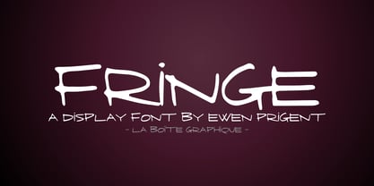 Fringe is a hand made font ideal for your graphic project.
 - Bear by La Boîte Graphique,
$16.00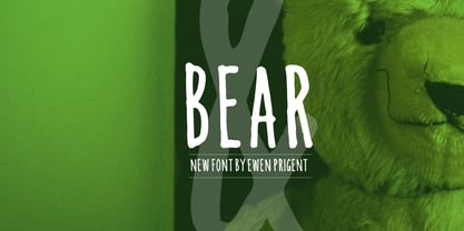 Bear is a hand made font ideal for your graphic project.
 - Kikster by La Boîte Graphique,
$29.00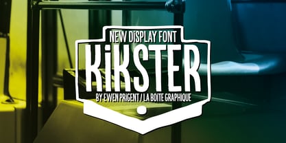 Kikster is a hand made font ideal for your graphic project.
 - Altemus Roughcuts by Altemus Creative,
$11.00 A collection of 174 rough, hand-made and rough-looking designs.
 - Jannon Pro by Storm Type Foundry,
$55.00 The engraver Jean Jannon ranks among the significant representatives of French typography of the first half of the 17th century. From 1610 he worked in the printing office of the Calvinist Academy in Sedan, where he was awarded the title "Imprimeur de son Excellence et de l'Academie Sédanoise". He began working on his own alphabet in 1615, so that he would not have to order type for his printing office from Paris, Holland and Germany, which at that time was rather difficult. The other reason was that not only the existing type faces, but also the respective punches were rapidly wearing out. Their restoration was extremely painstaking, not to mention the fact that the result would have been just a poor shadow of the original elegance. Thus a new type face came into existence, standing on a traditional basis, but with a life-giving sparkle from its creator. In 1621 Jannon published a Roman type face and italics, derived from the shapes of Garamond's type faces. As late as the start of the 20th century Jannon's type face was mistakenly called Garamond, because it looked like that type face at first sight. Jannon's Early Baroque Roman type face, however, differs from Garamond in contrast and in having grander forms. Jannon's italics rank among the most successful italics of all time – they are brilliantly cut and elegant.

