3,937 search results
(0.029 seconds)
- Neue Kurier by RMU,
$35.00 Typoart's popular script font in a new, completely remastered version.
 - Altemus Corners by Altemus Creative,
$11.00 A collection of 174 corner deco, geometric, fan, palm and arc designs.
 - Polytype Corners by Prime Graphics,
$45.00 - Corner C by CarnokyType,
$20.00 Corner C is a part of Corner type family. This subfamily is designed with rounded shapes in the corners. The concept of the typeface Corner is based on variation of corner shapes in font characters, from what is also its name derived. The basis is a bitmap modular principle, to which by simple addition of “the missing pixels” in corners of the characters ( Corner A ) to the shape of diagonal ( Corner B ), curvature (Corner C), or inversion curvature ( Corner D ), three more font variations are created. The basic monolinear bitmap weight is supplemented by two more extreme thicknesses – hairline and fat weight. The character set supports the complete Latin, while the x-height of lowercase is drawn at the same height as in the uppercase characters. Corner is a strong display typeface, which allows you to easily experiment and to combine it with its mutual font variations.
 - Limit Corner by Storictype,
$15.00 Introducing new serif display typeface its called Limit Corner. Inspired by victorian style with classic style .OpenType features some characters that allows you to mix and match pairs of letters to fit in your designs. It’s an all caps typeface, with strong and sleek letters. It features over 50 stylised alternatives, offering an infinite opportunity to customise and create logos, headlines, titling, product packaging, labeling, logo, classic shop, badges, movie title, t-shirt, posters, label, greetingcard, letterhead, book cover, etc. To access the alternat glyphs, you need a program that supports OpenType features such as Adobe Illustrator CS and Adobe Indesign Features : Character Set A-Z Numerals & Punctuations (OpenType Standard) Accents (Multilingual characters) Thanks and enjoy designing.
 - Inferno Corner by Sipanji21,
$15.00 "Inferno Corner" is a 3D layered graffiti font characterized by sharp corners. Fonts like this incorporate multiple layers to create a three-dimensional effect and emphasize angular or pointed edges, often enhancing the font's dynamism and visual impact. This font is particularly fitting for various street-related projects where a bold and edgy typographic style is desired. Whether used in posters, street art, or any design endeavor aimed at the urban environment, "Inferno Corner" can lend a striking and attention-grabbing aspect to your text, contributing to the overall street-style aesthetics of your project.
 - Cutting Corners by Just My Type,
$20.00 Cutting Corners is all about letters made of squares that also suggest circles. That’s it. This is one of several fonts I’ve created based upon a strictly geometric form; in this case, a round-cornered square. The width is equal to height (except for i, I and most punctuation). Usage recommendations: logos, samplers.
 - Exec Corners by Wiescher Design,
$35.00 I created the »EXEC« sans font during the years 2018 to mid 2020. The »EXEC«-Corners-family is a very special, unusual design. »EXEC«-Corners has 7 weights, ranging from Thin to Bold (plus 7 italics). This exceptional font is suited for editorial, book text, advertising and packaging, logo, branding, small text as well as web and screen design. »EXEC«-Corners has advanced typographical support including ligatures, small caps, alternate characters, case-sensitive forms, fractions, super- and subscript characters. »EXEC«-Corners comes with a range of figures—oldstyle and lining figures, each in tabular and proportional widths. »EXEC«-Corners supports Basic-, Western-, and Central-European Latin-based languages including Turkish.
 - Curled Corner by Kaer,
$14.00 I’m here for you with my new colored font Curled Corner! Alphabet made of letters with curled corner. It’s looks like negative space style icons. Colorful gradient note paper. Modern clean vector origami font for your stickers, crypto app, nft identity, and tags. All the letters in this font are colored brightly and vividly with corner overlay. --- *You can use color fonts in PS since CC 2017, AI since CC 2018, ID since CC 2019, QuarkXPress since 2018, Pixelmator, Sketch, Affinity Designer Since macOS 10.14 Mojave, Paint.NET Windows only.* *Please note that the Canva doesn't support color fonts!* --- What's included? * Colored and B&W styles * A-Z & Numbers * BONUS icon (ligature) set If you have any questions or issues, please contact me: kaer.pro@gmail.com Best, Roman.
 - Corner Deli by Fenotype,
$25.00 Corner Deli is a layered script & sans pack inspired by American commercial sign culture. Corner Deli has three base fonts and four layer options for each + there is a set of extra end swashes for Corner Deli script and layers for them too. Corner Deli is easy to use, just write the same text with different layer-fonts and colors and stack them on top of each other: check the gallery for more detailed instructions. Corner Deli is a great family for any display use, especially for branding, packaging, menus & posters from print to online and it works stunning even without the layers.
 - Corner D by CarnokyType,
$20.00 Corner D is a part of Corner type family. This subfamily is designed with inverse rounded shapes in the corners. The concept of the typeface Corner is based on variation of corner shapes in font characters, from what is also its name derived. The basis is a bitmap modular principle, to which by simple addition of “the missing pixels” in corners of the characters ( Corner A ) to the shape of diagonal ( Corner B ), curvature ( Corner C ), or inversion curvature (Corner D), three more font variations are created. The basic monolinear bitmap weight is supplemented by two more extreme thicknesses – hairline and fat weight. The character set supports the complete Latin, while the x-height of lowercase is drawn at the same height as in the uppercase characters. Corner is a strong display typeface, which allows you to easily experiment and to combine it with its mutual font variations.
 - Corner A by CarnokyType,
$20.00 Corner A is a part of Corner type family. This subfamily is designed with square shapes in the corners. The concept of the typeface Corner is based on variation of corner shapes in font characters, from what is also its name derived. The basis is a bitmap modular principle, to which by simple addition of “the missing pixels” in corners of the characters (Corner A) to the shape of diagonal ( Corner B ), curvature ( Corner C ), or inversion curvature ( Corner D ), three more font variations are created. The basic monolinear bitmap weight is supplemented by two more extreme thicknesses – hairline and fat weight. The character set supports the complete Latin, while the x-height of lowercase is drawn at the same height as in the uppercase characters. Corner is a strong display typeface, which allows you to easily experiment and to combine it with its mutual font variations.
 - Horier Time by Letterhend,
$17.00 Unveil the depths of terror and embrace the macabre with our latest font creation,Horier Time - – a bloody mesmerizing horror display font. Prepare to embark on a spine-tingling journey into the darkest realms of design, where fear and fascination intertwine. Features : Uppercase & lowercase Numbers and punctuation Alternates/Ligatures Multilingual PUA encoded
 - Corner B by CarnokyType,
$20.00 Corner B is a part of Corner type family. This subfamily is designed with diagonal shapes in the corners. The concept of the typeface Corner is based on variation of corner shapes in font characters, from what is also its name derived. The basis is a bitmap modular principle, to which by simple addition of “the missing pixels” in corners of the characters ( Corner A ) to the shape of diagonal (Corner B), curvature ( Corner C ), or inversion curvature ( Corner D ), three more font variations are created. The basic monolinear bitmap weight is supplemented by two more extreme thicknesses – hairline and fat weight. The character set supports the complete Latin, while the x-height of lowercase is drawn at the same height as in the uppercase characters. Corner is a strong display typeface, which allows you to easily experiment and to combine it with its mutual font variations.
 - Ps Willy Small But Fine by Fontopia,
$13.99 Willy small but fine is a typeface with a wink. This display font is based on existing piquant form from the immediate vicinity. It is sexy, if you have an eye for. But it also should not be taken too seriously, especially because it has a humorous slant. The font has its origins in an art project. It is now made available for design around festifals, parties, invitations, etc.
 - Times New Roman PS Greek by Monotype,
$67.99In 1931, The Times of London commissioned a new text type design from Stanley Morison and the Monotype Corporation, after Morison had written an article criticizing The Times for being badly printed and typographically behind the times. The new design was supervised by Stanley Morison and drawn by Victor Lardent, an artist from the advertising department of The Times. Morison used an older typeface, Plantin, as the basis for his design, but made revisions for legibility and economy of space (always important concerns for newspapers). As the old type used by the newspaper had been called Times Old Roman," Morison's revision became "Times New Roman." The Times of London debuted the new typeface in October 1932, and after one year the design was released for commercial sale. The Linotype version, called simply "Times," was optimized for line-casting technology, though the differences in the basic design are subtle. The typeface was very successful for the Times of London, which used a higher grade of newsprint than most newspapers. The better, whiter paper enhanced the new typeface's high degree of contrast and sharp serifs, and created a sparkling, modern look. In 1972, Walter Tracy designed Times Europa for The Times of London. This was a sturdier version, and it was needed to hold up to the newest demands of newspaper printing: faster presses and cheaper paper. In the United States, the Times font family has enjoyed popularity as a magazine and book type since the 1940s. Times continues to be very popular around the world because of its versatility and readability. And because it is a standard font on most computers and digital printers, it has become universally familiar as the office workhorse. Times?, Times? Europa, and Times New Roman? are sure bets for proposals, annual reports, office correspondence, magazines, and newspapers. Linotype offers many versions of this font: Times? is the universal version of Times, used formerly as the matrices for the Linotype hot metal line-casting machines. The basic four weights of roman, italic, bold and bold italic are standard fonts on most printers. There are also small caps, Old style Figures, phonetic characters, and Central European characters. Times? Ten is the version specially designed for smaller text (12 point and below); its characters are wider and the hairlines are a little stronger. Times Ten has many weights for Latin typography, as well as several weights for Central European, Cyrillic, and Greek typesetting. Times? Eighteen is the headline version, ideal for point sizes of 18 and larger. The characters are subtly condensed and the hairlines are finer." - Buongiorno Rastellino Cyrl by Ira Dvilyuk,
$20.00 The enchanting sweepy of fast handwriting of script font Buongiorno Rastellino will be the perfect complement for all your projects. The font pair Buongiorno Rastellino Cyrillic is the best option for branding, logos, social media, packaging, business cards, DIY projects, social media, and many others. Buongiorno Rastellino Symbols is the font with 62 lovely hand-drawn flourishes and illustrations. Buongiorno Rastellino Cyrillic script font contains the Cyrillic glyphs too. Buongiorno Rastellino script Latin part contains a full set of uppercase letters and 3 full sets of lowercase letters, (standard, initial and final forms with flourishes or teils. To make a needed form just type a letter with a number such as a1, b1, c1...after that selecting the word and apply the Open Type Features in programs such as Adobe Illustrator, Photoshop, and others) And 43 ligatures - which can be used to create a handwritten calligraphy look. The Cyrillic part of the font contains the uppercase letters and 3 full sets of lowercase letters, (standard, initial and final form. To make a needed form just type a letter with a number such as a1, б1 в1... After that select the word and apply the Open Type Features in programmes such as Adobe Illustrator, Photoshop, and others) Buongiorno Rastellino Symbols is a font with over 36 hand-drawn elements, floral illustrations, and swashes and can help to make your design unique and matchless. Combine and merge swashes and illustrations to create your own designs and make borders, frames, dividers, logos, and more (just use A-Z or a-z and 0-9 keys in the included Buongiorno Rastellino Symbols font). A different symbol is assigned to each uppercase or lowercase standard character, so you do not need graphics software, just type the letter you need. Multilingual Support for 32 languages: Latin glyphs for Afrikaans, Albanian, Basque, Bosnian, Catalan, Danish, Dutch, English, Estonian, Faroese, Filipino, Finnish, French, Galician, Indonesian, Irish, Italian, Malay, Norwegian Bokmål, Portuguese, Slovenian, Spanish, Swahili, Swedish, Turkish, Welsh, Zulu. And Cyrillic glyphs support Russian, Belorussian, Bulgarian, Ukrainian, and Kazakh languages.
 - Sister Pamella Font Cyrillic Duo by Ira Dvilyuk,
$18.00 Sister Pamella font duo Cyrillic is a pair of script and sans serif fonts, which perfectly complement one another. With a handwritten script font and a modern sans serif Sister Pamella font duo Cyrillic will be perfect for use in all your design projects be it logos, signatures, labels, packaging design, blog headlines. Also, it will look great on mugs, cards, gorgeous typographic designs, wedding stationery and much more. The Cyrillic part of the font contains the uppercase letters and lowercase letters and 17 ligatures, giving a realistic hand-lettered style. Sister Pamella script Cyrillic includes a full set of uppercase 2 sets of lowercase letters, numerals, a large range of punctuation and 38 ligatures, giving a realistic hand-lettered style. Sister Pamella sans serif containing uppercase only characters, numerals and a large range of punctuation. Creates a perfect contrast with the Sister Pamella script font. Multilingual Support for 32 languages: Afrikaans, Albanian, Basque, Bosnian, Catalan, Danish, Dutch, English, Estonian, Faroese, Filipino, Finnish, French, Galician, Indonesian, Irish, Italian, Malay, Norwegian Bokmål, Portuguese, Slovenian, Spanish, Swahili, Swedish, Turkish, Welsh, Zulu. And Cyrillic glyphs support for Russian, Belorussian, Bulgarian, Ukrainian and Kazakh languages. Works perfectly on the Canva platform. For Cricut & Silhouette recommended.
 - Le Monde Courrier Std by Typofonderie,
$59.00 A rounded slab in 4 styles In our age, since the arrival of microcomputing, the majority of professional letters have been composed in quality typefaces. Typewriters & the typestyles they used have become antiques. A letter set in Times or Helvetica & printed with a laser printer at 600 dpi or more are of such quality that one can no longer distinguish it with a document produced by offset printing. But letters composed in this way appear overly institutional when a bit of informality is needed. Le Monde Courrier, designed by Jean François Porchez, attempts to re-establish a style halfway between writing and printing. Informal neo-tech style This rounded slab serif returns the informal character of “typewritten” fonts to letters and suit well all bad conditions, from inkjet printed memos to webfonts use. With a unique typographic colour, it integrate itself with the rest of the Le Monde family with effective contrast. The verticals metrics and proportions of Le Monde Courrier are calibrated to match perfectly others Typofonderie families. Bukva:raz 2001 Type Directors Club .44 1998 European Design Awards 1998
 - Digital Counter 7 - Personal use only

- LED Counter 7 - Personal use only

- 1786 GLC Fournier by GLC,
$38.00This family was inspired by numerous documents and books printed in Paris during the end of the 1700s. Mainly, documents printed by P.G. Simon & N.H. Nyon, “Printers of the parliament” were used for the Normal and italic styles and “Caps”. “Titling” characters were coming from a collection of hymns printed by Nicolas Chapart. In France these Fournier characters, as Baskerville in Great Britain, were the most often in use in the late 1700s, just before the Didot designs. This font supports strong enlargements, specially the capitals of “Caps” file and “Titling”, remaining very smart, elegant and fine. - Perfume Counter JNL by Jeff Levine,
$29.00 Perfume Counter JNL was based on the hand lettered song title found on the 1938 sheet music for "At A Perfume Counter (On the Rue de la Paix)" from Billy Rose's New York revue "Casa Mañana", and is available in both regular and oblique versions.
 - Counter Service JNL by Jeff Levine,
$29.00 The hand lettered name “Chickland” from a 1958 restaurant menu cover was actually a throwback to the Art Deco style with its condensed thick and thin sans serif design. With just a few available letters to work with, it has been turned into Counter Service JNL; available in both regular and oblique versions.
 - Lefferts Corners 2 - Unknown license

- KR Corners 2 - Unknown license

- Corner Store JF by Jukebox Collection,
$32.99
- EF Copier Pi by Elsner+Flake,
$35.00 - Street Corner Racing by Sipanji21,
$15.00 "Street Corner" is a display font with a Racing and futuristic theme, perfect for design projects such as sports jerseys, athletic shoes, helmets, and other sports-related products. With its dynamic appearance, this font brings a sense of energy and movement to your designs. The clean lines and modern feel of "Street Corner" make it an excellent choice for projects that require a sleek and contemporary look. Whether you're designing for a sports team or creating an athletic product, "Street Corner" will help you create a strong and memorable brand identity that embodies the spirit of sports and the future.
 - Inglenook Corner NF by Nick's Fonts,
$10.00This whimsical wonder is based on the lettering of Laurence Schall, as presented in Lewis F. Day's 1910 classic, Alphabets Old and New. The typeface radiates a charm reminiscent of the works of many talented artists (including Howard Pyle and Arthur Rackham) who illustrated children's books around the turn of the twentieth century. The Opentype version of this font supports Unicode 1250 (Central European) languages, as well as Unicode 1252 (Latin) languages. - Conners Corners NF by Nick's Fonts,
$10.00 Here's another collection of ornate border elements gleaned from the 1888 specimen books of James Conner's Sons United States Type Foundry in New York City. Refer to the PDF guide for detailed, yet simple, instructions for constructing nine delightfully different border patterns.
 - VLNL Tp Kurier by VetteLetters,
$35.00 VetteLetters is proud to bring you the TpKurier-family. It is cooked up by our German chef Martin Lorenz currently living in lovely Barcelona! Chef Lorenz about the TpKurier recipe: “TpKurier is the second redesign we did of Courier. The first redesign in 2000, although based on a five-unit grid, was drawn completely by hand. Six years later we designed another grid version of Courier, and the TpKurier family was born. This version is completely constructed up till its last detail. We didn't want to correct ‘mistakes’ deriving from the use of the grid, but instead make them visible (see “S”). TpKurier is based on a very simple grid, composed a proportion of four units high by two units wide. A series of other links between them make it possible to form a font from this grid. We felt it was important to consistently work within these limitations so that any unexpected asperities would help provide the font with its character. Even though it is a rough constructed typeface it was important to us to design real italic lower case letters and not just a sloped roman (see “a”, “g” or “s”). The first family published contained a serif and sans-serif version of the TpKurier, with italic and bold.”
 - Kremlin Samovar - Unknown license

- LTC Fournier Le Jeune by Lanston Type Co.,
$24.95 Based on the all caps decorative face Fournier le Jeune of 1768 by Pierre Simon Fournier for the Peignot Foundry. This version uses more elaborate "Vouge Initials" caps which were offered by ATF in 1920s. Because of the decorative nature of this design, a full character set is not included, but accented characters and basic punctuation are included.
 - Antique Borders & Corners 2 by Aerotype,
$29.00 Hand selected from multiple sources, the 60+ glyphs of Antique Borders & Corners 2 can be mixed and matched to make authentic 18th and 19th century borders of any length. Flip the orientation for 'bottom' borders with the shift key.
 - MFC Bruce Corners One by Monogram Fonts Co.,
$19.95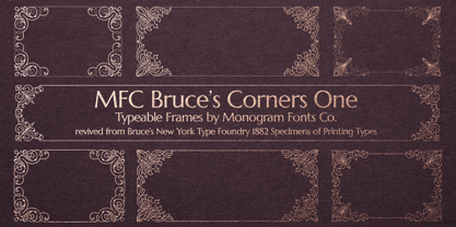
- MFC Franklin Corners Four by Monogram Fonts Co.,
$19.95
- Just Around The Corner by Armandop,
$10.00 - MFC Franklin Corners Two by Monogram Fonts Co.,
$19.95
- Antique Borders & Corners 1 by Aerotype,
$29.00 Hand selected from multiple sources, the 60+ glyphs of Antique Borders & Corners 1 can be mixed and matched to make authentic 18th and 19th century borders of any length. Flip the orientation for 'bottom' borders with the shift key.


