7,454 search results
(0.028 seconds)
- Courier Now is a refined version of the classic Courier font, which has long been a staple in the realm of typewriters and early computer systems. It embodies the spirit of the traditional Courier fo...
- Palmona Plus by Ingo,
$46.00 A rustic black letter from the 1930ies — with stylistic alternates. The high degree of abstraction of this typeface allows it to appear modern, even though its shapes clearly show an origin from Fraktur and Gothic. The letters present the effect of woodcarving or silhouette cuttings as they are defined exclusively with straight lines and sharp corners. By doing without any bowls, the typeface becomes a stylistic entity with a decorative effect. Palmona is especially appealing in combination with bold illustrations. Some of the characters of Palmona are available in one or more alternate forms which can be accessed manually or automatically. Use of these alternates is most easily operated with OpenType-Functions Standard-Ligatures and Discretional Ligatures in the user program. With Standard Ligatures activated, problematic letter compositions are substituted with appropriate ligatures. Likewise, in certain letter combinations the alternates are inserted. The Discretional Ligatures include additional alternatives. Configuration of the characters of the Palmona font is according to Unicode ISO 8859-1 (Latin1). Consequently all characters for all European languages with Latin type are covered — including Turkish, the Baltic languages, East European and Scandinavian languages. Congruent with the time of its origin and typical for black letter typefaces, Palmona also includes a long s as well as — uncommon but definitely reasonable — a capital ß. Both characters are automatically applied with the activation of Discretional Ligatures, and the associated ligatures appear automatically as well. When using ”long s,“ you must ensure the correct use of the rules for the Fraktur font: ”round s“ is always at the end of the word, also in compound words. For those of you who want to be even more correct, read the corresponding >> article in Wikipedia.
 - Consilio by Throndsen,
$9.00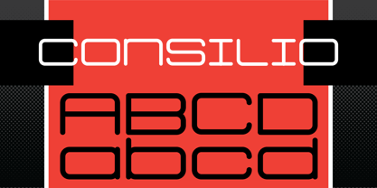 Consilio is latin for design.
 - Grotesk Remix Monospace by bb-bureau,
$65.00 GroteskRemix monospace is the monospaced version of the GroteskRemix - Grotesk revisited, notably used for the (Latin) communication of Typojanchi 2019. It availabe in 3 different weights: light, regular and medium. Language: latin glyphs
 - Magnum Sans by FontMesa,
$19.00 Magnum Sans is a strong neutral sans serif consisting of eleven weights with true Italic, Oblique and an alt upright set called Alfa. The definition of Magnum is a large wine bottle that's twice the capacity of one 750ml bottle, today the name is used in any product offering double the capacity, Magnum Sans achieves this by offering two slanted and two upright versions plus a standard and pro set. Designed to be highly readable Magnum Sans is ideal for text, signage, headlines and media broadcasting or anywhere else quick readable lettering is needed. This standard version supports characters sets for central and eastern European countries with code-pages of 1252 Latin1, 1250 Latin 2, 1257 Baltic and 1254 Turkish. Note: for additional language support, please see our Magnum Sans Pro family, which includes Vietnamese, PinYin and Greek.
 - Huai by Positype,
$29.00 Huai and Huai Thai marks the first professional typeface release by Potch Auacherdkul and represents the culmination of research into the duality of influences between handwritten, vernacular Thai lettering and Latin typefaces. The result is a warm, expressive typeface that doesn’t abandon the human hands and the language that produced them. With Thai script, there are two different terminal styles—the Loop terminal style, associated with the original forms of Thai glyphs; and the Loopless, which has evolved to best coordinate with Latin sans serif typefaces. In recent years, this Thai Loopless style has continued to influence and even change to become ‘more Latin.’ One would go so far as to define these heavily Latin-influenced typefaces as Thai Latinized. This curiosity with shifting influences, turns the idea around and explores what would happen if the vernacular Thai scripts actually influenced their Latin counterparts instead. An Inversion of Thai Latinized is the result. The street signs of Bangkok, local vernacular writing, quick, fluid strokes… these influences form the DNA behind the Huai Thai typeface. Refining and systematizing those natural, handwritten strokes into a Thai typeface and then using those solutions to serve as the pioneer proportions behind the development of its Latin script companion was the product. Huai adopted the essence of these Thai glyphs into the Latin and uniquely embraced the contemporary writing system (and soul) of the Thai people in its letterforms.
 - Joe Cool by Studio K,
$45.00 Joe Cool is a bold geometric sans with minimal counters designed to achieve the maximum weight, solidity and impact on the page. Joe Cool Extended was actually created first, then it seemed like a good idea to add progressively more compact versions for added variety and versatility. See also Gravitas, my Bauhaus inspired font family which explores similar territory.
 - SavoryPaste by insigne,
$14.95SavoryPaste is a grungy sans serif from insigne. SavoryPaste includes 64 discretionary ligatures of the most common letter pairs for a more natural look without distracting repeating characters. The typeface family also includes OpenType small caps, old style figures and alternates without filled counters. The SavoryPaste family also includes a completely interchangeable and more restrained alternate. - Bricola by K-Type,
$20.00 Bricola (rhymes with Nicola) is a condensed display face that contrasts soft curved outlines with sharp cuts and counters. Sturdy and idiosyncratic, Bricola is an eye-catching blend of functional and funky, appropriate for headlines, labels and branding. The licensed family includes Regular and Bold weights that both pack a punch, and also two handy italics (obliques).
 - Lisa Bella by Wiescher Design,
$39.50 Lisa is an elegant script family in the tradition of early Italian type designers like Bodoni. I added counter strokes and floral embellishments to the font. Lisa comes in three variations: the beautiful Lisa Bella, the flowery Lisa Fiore and the extra swinging Lisa Piu (which means more in Italian). Enjoy! Your elegant script designer Gert Wiescher
 - Sadi Sans by Koray Özbey,
$19.00 Sadi Slab is designed to be used on small scales like book texts, newspapers, magazines etc. Also its large counters make the font suitable for digital screens. The anatomy of the typeface gives a formal appearance which is a more fitting choice for subjects like law, finance, medical science etc. Another member of Sadi family is Sadi Slab.
 - Casual Nouveau JNL by Jeff Levine,
$29.00 Free-flowing pen lettering of the Art Nouveau period took letter forms into interesting curves and angles. The style was embraced and revived by the 1960s counter-culture in its rock concert posters and record album covers. However, the source for Casual Nouveau JNL is a 1911 piece of sheet music entitled "Back to the Carolina You Love".
 - Charlotte Sans by ITC,
$29.99Although designer Michael Gills was influenced by 18th century French type designer Pierre-Simon Fournier, Charlotte is best described as a modern roman typeface. Its clean cut style, accentuated by a strong vertical stress and unbracketed serifs, exudes an authoritative tone, guaranteeing its effectiveness for almost all text setting applications, but especially where a formal unmannered appearance is desired. - TKT Kate by TKT,
$35.00 TKT Kate is a new interpretation of elegant sans serif display font with a modern touch. It inspired from Optima and Humanist font. The overall look is round, open counters and with a large x-height, geometrically constructed which is intentionally meant to be used in branding projects such as packaging, corporate design to on line applications.
 - Lisa Fiore by Wiescher Design,
$39.50 Lisa is an elegant script family in the tradition of early Italian type designers like Bodoni. I added counter strokes and floral embellishments to the font. Lisa comes in three variations: the beautiful Lisa Bella, the flowery Lisa Fiore and the extra swinging Lisa Piu (which means more in Italian). Enjoy! Your elegant script designer Gert Wiescher
 - Doll by FaceType,
$30.00 Who needs counters? Although this typeface is bold as hell, it is still absolutely legible. If You are looking for fat curves, this is may be Your choice! There are also extra letters (A, V, v) to let You make better logos and headlines. Please take also a look at Dollbats for suitable Arrows, Symbols and Numbers.
 - Lisa Piu by Wiescher Design,
$39.50 Lisa is an elegant script family in the tradition of early Italian type designers like Bodoni. I added counter strokes and floral embellishments to the font. Lisa comes in three variations: the beautiful Lisa Bella, the flowery Lisa Fiore and the extra swinging Lisa Piu (which means more in Italian). Enjoy! Your elegant script designer Gert Wiescher
 - Charlotte Serif by ITC,
$29.99Although designer Michael Gills was influenced by 18th century French type designer Pierre-Simon Fournier, Charlotte is best described as a modern roman typeface. Its clean cut style, accentuated by a strong vertical stress and unbracketed serifs, exudes an authoritative tone, guaranteeing its effectiveness for almost all text setting applications, but especially where a formal unmannered appearance is desired. - Tarquin AT by Akufadhl,
$15.00 Tarquin is a All-Caps sanserif typeface, inspired by the beautiful hand-painted sign. It has a strong personality, high contrast stem, and widely opened counter to improve the readibility as it designed for display purposes. It's available in 3 different style, REGULAR, STENCIL, and SHADOW designed for display purpose design Crafted beautifully and carefully with hand.
 - Toronto Gothic by E-phemera,
$12.00Toronto Gothic was developed from a headline in a 1920s issue of the Toronto Star. In a previous life, it was probably Condensed Titling Gothic #11, but in this form its rounded corners and irregular lines are meant to make it look worn from years of use. - Designer by Artyway,
$12.00 I suggest you to pay attention to the "Design" font. It's bold, with softened corners and some slope for dynamic effect. "Design" font has a unique charm and easy visual readability, so it's perfect for headlines, whether for sports events, automotive posters, logo or monograms designs.
 - Beround by NicolassFonts,
$35.00 Beround is a modern family based on Willgray font family with redesigned and improved glyphs for the rounded font. It comes in 16 weights, 8 uprights, and matching italics. Beround have softly rounded corners. This family is ideally suited for packaging, headlines, advertising, and corporate identities.
 - Edgewater Serif by cm5dzyne,
$16.00Edgewater Serif, the companion font for cm5dzyne's Edgewater, is suited for various projects requiring anything from refined titling to a futuristic theme. Its rounded corners reduce the rigid visual impact of normal slab-serif fonts and give it a more casual feel than its sans-serif counterpart. - FP Elsinore by Fontpartners,
$29.00 FP Elsinore was custom made for street name signs in the city of Elsinore. The font has a straightforward and very classic expression, that blends harmoniously with the architecture of this old coastal city. The corners are gently rounded, because the font is mainly used in signage.
 - Triorange by Ef Studio,
$10.00 Introducing Triorange, a retro display font with rounded and smooth corner. Comes with 3 weight : Regular, Medium, and Bold. Simple letter form make this font looks nice either in body text or headline. Perfect for logo, branding, surface design, editorial design, and so many design needs.
 - The Main by NicolassFonts,
$25.00 The Main is a modern sans-serif font family. It comes in 16 weights, 8 uprights, and matching italics. The Main has separate softly beveled corners, which gives it a unique look. Each weight includes OpenType features. Completely suited for graphic design and any display use.
 - Speed by Artyway,
$16.00 I suggest you to pay attention to the "Speed" font. It's bold, with sharp angles corners, spurs and slope for dynamic effect. "Speed" font has a unique charm and easy visual readability, so it's perfect for headlines, whether for sports events, automotive posters, logo or monograms designs.
 - Abstract Style by Putracetol,
$24.00 Abstract Style is a abstract display font. This font has abstract and irregular shapes, sharp corners and messy shapes that characterize it. Abstract Style would be perfect for Logo, title, logotype, cover, headline, apparel, comic, cover books, cards, posters, or anything that requires a abstract creativity!
 - Mister Twiggs by Type Innovations,
$39.00 Mister Twiggs is a comtemporary modern sans created by the American type designer Alex Kaczun. There are absolutely no curves in this elegant typeface. It has sharp corners with extra tall capitals and a narrow waistline. Mister Twiggs comes in 3 flavors: regular, thin and heavy.
 - Hello Darling by Nk Studio,
$14.00 Your purchases include the Hello Darling Script, conjunctive handwritten script, and printed, handwritten, and printed script fonts. Hello Darling is made side by side to work together. All lowercase letters are placed to receive a connecting tail from Hello Darling. You can mix and match the same words to your heart's content! Hello Darling is also made with the crafter in mind: there are no closed counters on either type, meaning they can easily be used for stencils and electronic cutters such as the Cricut line and the Silhouette. The Hello Darling package includes: - More than 300 glyphs in the Hello Darling font, designed to work together! - No closed counters - useful for stencils and vinyls! - More than 200 accented characters in each font. - Double letter binder staggered for a hand drawn look! - PUA-encoded for easy character map access! Enjoy and thank you.
 - Stretto by Canada Type,
$29.95 Stretto (Italian for narrow) is a revival, correction and expansive update of an Aldo Novarese reverse-stress font called Sintex, which he did for VGC in 1973. Openly idiosyncratic and playfully rebellious in its design, this alphabet fuses the straights and rounds in an unusual manner, riffing on the idea of hand-made sign and wood type forms while adhering to its odd grid’s parameters. In spite of its counter-stress, its legibility is high and even, helped by its unicase forms and very distinct counters. First released in 2007, it became quite popular with film studios and nostalgia designers (Sintex was the font used for David Bowie’s Hunky Dory album and Life on Mars? single). A dozen years later we revisited it for an update. Stretto now comes with over 660 characters and includes Pan European language support.
 - Disforia Inersia by Skinny Type,
$15.00 Introducing Disforia Inersia! Your purchase includes Disforia Inersia Script, conjunctive handwritten script, and Print, handwritten, printed script typeface. Disforia Inersia created side by side to work together. All lowercase letters are placed to receive a connecting tail from Disforia Inersia. You can mix and match in the same word to your heart's content! Disforia Inersia was also created with the crafter in mind: there are no closed counters in either type, meaning they can easily be used for stencils and electronic cutters such as the Cricut line and the Silhouette. Disforia Inersia Package includes: - Nearly 300+ glyphs in Inertia Dysphoria font, designed to work together! - No closed counters - useful for stencils and vinyls! - More than 200 accented characters in each font. - Double letter staggered ligatures for a hand-drawn look! - PUA-encoded for easy character map access! Enjoy and thank you. Skinny Type
 - Structia by Typodermic,
$11.95 As you consider the words you need to convey, it’s clear that you’re looking for something that feels just as precise and intentional as the message you’re promoting. Structia is a typeface that does not shy away from its influence—it leans into the hard edges and geometries that are typically associated with brutalist architecture. And yet, even as it draws inspiration from an austere and somewhat daunting aesthetic, Structia also possesses a sense of control and discipline that is undeniably alluring. At the core of Structia’s appeal is its mechanical precision. Every line, every curve, is carefully calculated and crafted to create a sense of mathematical accuracy that is difficult to resist. There is no room for error or imperfection in Structia—every stroke is sharp and precise, with chamfered corners that add an extra layer of texture and visual interest. This is not a typeface that allows for ambiguity—it demands clarity and specificity, and it delivers both with remarkable consistency. But Structia is more than just a collection of angular shapes and precise lines. It is a typeface that conveys a sense of scientific accuracy and chilly logic—a kind of elegance and refinement that is unexpected. There is a beauty in the way that Structia balances the hard-edged geometries of brutalism with a sense of control and finesse that is undeniably modern. It is a typeface that feels at once futuristic and timeless—a design that can be used in a wide variety of contexts and still feel fresh and relevant. And then there are the two effect styles—Structia Panel and Structia War—which take the basic geometry of the typeface and push it even further into the realm of science fiction. Structia Panel feels like something you might see on a spacecraft or in the architecture of an alien planet, with thin, laser-like struts that give it a futuristic edge. Structia War, meanwhile, takes the concept of Structia Panel and adds a layer of battle damage, as if the letters have been through a cosmic conflict and emerged victorious. In the end, Structia is a typeface that demands attention and respect. It is not a typeface that will fade into the background or blend in with the crowd—it is a design that is meant to be noticed and admired. And yet, even as it draws your eye with its hard-edged geometries and precise lines, it also possesses a sense of elegance and refinement that is undeniably alluring. Structia is a typeface that balances the old and the new, the hard and the soft, the mechanical and the human—and the result is something truly remarkable. Most Latin-based European, and some Cyrillic-based writing systems are supported, including the following languages. A Afaan Oromo, Afar, Afrikaans, Albanian, Alsatian, Aromanian, Aymara, Bashkir (Latin), Basque, Belarusian (Latin), Bemba, Bikol, Bosnian, Breton, Bulgarian, Cape Verdean, Creole, Catalan, Cebuano, Chamorro, Chavacano, Chichewa, Crimean Tatar (Latin), Croatian, Czech, Danish, Dawan, Dholuo, Dutch, English, Estonian, Faroese, Fijian, Filipino, Finnish, French, Frisian, Friulian, Gagauz (Latin), Galician, Ganda, Genoese, German, Greenlandic, Guadeloupean Creole, Haitian Creole, Hawaiian, Hiligaynon, Hungarian, Icelandic, Ilocano, Indonesian, Irish, Italian, Jamaican, Kaqchikel, Karakalpak (Latin), Kashubian, Kikongo, Kinyarwanda, Kirundi, Komi-Permyak, Kurdish (Latin), Latvian, Lithuanian, Lombard, Low Saxon, Luxembourgish, Maasai, Macedonian, Makhuwa, Malay, Maltese, Māori, Moldovan, Montenegrin, Ndebele, Neapolitan, Norwegian, Novial, Occitan, Ossetian, Ossetian (Latin), Papiamento, Piedmontese, Polish, Portuguese, Quechua, Rarotongan, Romanian, Romansh, Russian, Sami, Sango, Saramaccan, Sardinian, Scottish Gaelic, Serbian, Serbian (Latin), Shona, Sicilian, Silesian, Slovak, Slovenian, Somali, Sorbian, Sotho, Spanish, Swahili, Swazi, Swedish, Tagalog, Tahitian, Tetum, Tongan, Tshiluba, Tsonga, Tswana, Tumbuka, Turkish, Turkmen (Latin), Tuvaluan, Uzbek (Latin), Venetian, Vepsian, Võro, Walloon, Waray-Waray, Wayuu, Welsh, Wolof, Xhosa, Yapese, Zapotec Zulu and Zuni.
 - Geisha Boy AOE by Astigmatic,
$19.95A bouncing offbeat latin poster font. - PR Vanaheim by PR Fonts,
$10.00 This is a perfect font for historical or fantasy titles. It is influenced by ancient Nordic runes. the strokes flare slightly, to a concave terminal for a finely carved appearance. There are two sets of capitals in PR-Vanaheim-DC (Dual Capitals); one set of narrow letters, more closely related to Runic forms, and one set which includes wider and circular letters, which can be freely combined with the narrow letters for the variety associated with hand lettering. There is one version with dots placed in the centre of large counters and one version without the dots. The broad caps character set includes characters which allow for tight spacing; a dropped L, and a tall T. There are also two different lowercase sets, one modern, and one archaic, all of which can be freely mixed to fine tune the appearance of your text. Here is the brief description of the available faces: PR-Vanaheim-Med-DC-01 Duplex Caps PR-Vanaheim-Med-DC-02 Duplex Caps, Dotted counters and dot space PR-Vanaheim-Med-DC-03 Duplex Caps, Dotted counters PR-Vanaheim-Med-LC-04 Broad Caps, with modern style lower case. PR-Vanaheim-Med-LC-05 Narrow Caps, with modern style lower case. PR-Vanaheim-Med-LC-06 Broad Caps, with archaic lower case. PR-Vanaheim-Med-LC-07 Narrow Caps, with archaic lower case.
 - Kubrick by Quadrat,
$25.00 Kubrick is an experiment in extremes. The Light font is very tall and slender, the Black font is very massive, and Kubrick's slender counters push some of its glyphs to the edge of recognition. The thin counters and negative spaces also give text set in Kubrick a definite visual sparkle, especially in all-uppercase settings. Because of its extreme letterforms, Kubrick is recommended only for large display use. The default letterspacing is set fairly wide to keep text legible. Kubrick was a double-experiment. One part of it was to see how heavy and massive a typeface I could make while still keeping it legible. The other part was to develop a Multiple Master font. Multiple Master fonts were a format developed by Adobe that allowed the user to change things like the weight and width of a typeface. Monollith started as just such a Multiple Master typeface, but when Adobe discontinued the Multiple Master format, I stopped work on the typeface. Later I decided to continue work on it, but as five separate font weights: Light, Medium, Bold, ExtraBold and Black. Very rectilinear letterforms with extremely narrow counters and negative spaces. The five fonts go from very thin and condensed to very heavy and extended. Use in large display settings where unornamented high visual impact is desired.
 - Glengary NF by Nick's Fonts,
$10.00Although the pattern for this typeface, originally named Glenmoy, was released by Stephenson Blake in 1932, the letterforms can be more aptly described as pure 1950s retro. With beatniks, Brando and blue suede shoes all rolled up into one, this typeface is definitely a contender. The Opentype versions (OTF and TTF) of this font contain the complete Unicode Latin, Latin 1 and Latin Extended-A character sets. - Finador by Julien Fincker,
$24.00 Finador is a modern, soft geometric sans family. The functional style of a geometric sans has been soften by open apertures and rounded corners. This makes it functional and friendly. The default version has open, modern apertures. Stylistic Set 2 includes the whole set with closed, classic apertures. A slightly different look. It´s like having a second font in just one font. So it´s up to you to choose the right look for your projects. The Finador family includes 8 weights, from thin to heavy + their matching italics. With 900+ glyphs per style it supports over 200+ latin based languages, includes an extended currency symbol set and a lot of Open Type Features like small caps, ligatures, fractions, alternates and many more. The lightest and boldest weights are good for display usage, while the middle weights can be also used for body text. As a versatile allrounder Finador supports almost every of your needs. It has the ability to become your next favorite workhorse family.
 - Mreyboll by Twinletter,
$17.00 The ideal display font for sporting goods is MREYBOLL. This amazing sports typeface is available in a range of styles, and the little contemporary cutouts that are highlighted at each corner give it a dynamic tilt. Perfect for games, titles, sports designs, logos, and car projects. This typeface can also be used for contemporary text or a monogram. Unlike other sports fonts, Mreyboll is superior and has a highly manly, crisp feel that gives it more force and speed effect. Check it out and purchase it soon for a distinctive design experience. It was created to be a strong, dynamic font with a little different font style. What’s Included : - File font - All glyphs Iso Latin 1 - Alternate, Ligature - Simple installations - We highly recommend using a program that supports OpenType features and Glyphs panels like many Adobe apps and Corel Draw so that you can see and access all Glyph variations. - PUA Encoded Characters – Fully accessible without additional design software. - Fonts include Multilingual support
 - Monograf by Milan Pleva,
$10.00 Monograf was originally designed as fixed-width monospaced font which has 2 weights (Regular and Bold). Monograf Text is a derived style of Monograf with proportional spacing and well-balanced kerning to make the text easier to read and look optically balanced. So in the total bundle you get 4 pieces of this font: Monograf Regular, Monograf Bold, Monograf Text Regular and Monograf Text Bold. This versatile font with clean geometry and slightly rounded corner elements works great in digital space, as well in print. It also retains its legibility at smaller sizes. Typographic features include old-style figures, directional arrows and four types of asterisks. The entire font is suitable for purposes such as tabular layout, coding, website, but also for magazines, logos, signs, products, and others. Features: Basic latin alphabet A-Z 116 Accented characters Numbers, Punctuation, Currency, Symbols, Math symbols & Diacritics Old style figures, Directional arrows and 4 asterisks