10,000 search results
(0.057 seconds)
- Overseas by Hanoded,
$15.00 I traveled a lot: in the beginning on my own, later as a tour guide. I always used the English word ‘abroad’ to describe a trip to a foreign country, but I noticed that the English, Australians and New Zealanders preferred the word ‘overseas’. I then realised that they all lived on an island, so most of the foreign countries for them were across the sea. I had to think of that when I made this font! Overseas is a brush font with a certain rough elegance to it. I made it using poster paint and a brush. Use if for posters, product packaging and book covers.
 - Octagon Calligraphy by Slex Studio,
$18.00 Octagon Calligraphy is calligraphy font with a classic style and a touch of elegance, inspired by the handwriting of women and ancient manuscripts. Carefully designed to work together in harmony that makes it very suitable for wedding media, book covers, greeting cards, logos, branding, business cards and certificates, even for any design work that requires a classic, formal or luxurious. Try Octagon Calligraphy, enjoy the richness of OpenType features and let her fun and elegant excitement make you happy and enhance your creativity! You can use this font very easily. multilingual support and ligatures Your download will include OTF & TTF format files. If you do not have programs that support OpenType features like Adobe Illustrator and CorelDraw X Versions, you can access all alternative flying machines using Font Book (Mac) or Character Map (Windows): Do not forget to see, buy, like and share my other great products. And feel free if you have a question, please contact me : slexs515@gmail.com Thank you for purchases.!
 - Riposte by Scholtz Fonts,
$15.00 Riposte is a powerful and carefully-integrated handwriting font. You should use it where you want to create a strong impact but want to avoid heavy, boxy, formal fonts. The characters were designed for excellent letter-spacing without kerning, but you can switch kerning on to add some subtle enhancements to the letter-spacing. Riposte is readable, even at quite small sizes. It was designed to be used as a mix of upper and lower-case letters. Do not make text using only uppercase letters since the spacing of the uppercase letters was optimized for use together with lowercase letters. So remember, when you want your text to have the powerful impact of the master swordsman with his balanced stance and vigorous movement -- try Riposte. The font is fully professional: carefully letterspaced and kerned. It contains over 235 characters - (upper and lower case characters, punctuation, numerals, symbols and accented characters are present). It has all the accented characters used in the major European languages. Riposte works well in professional layout application packages as well as in word-processing packages such as Microsoft Word® that do not support professional kerning.
 - FS Split Sans by Fontsmith,
$80.00 Quirky and irregular FS Split is no ordinary typeface. Its irregular proportions make it unique, with round letters appearing wide, and straight letters narrow. Other quirks include its eclectic crossbars – the uppercase ‘A’ has an unusually low bar, while the bar on ‘G’ is particularly long. The uppercase has many interesting features in fact, including large counters, closed terminals on certain letters like ‘J’, and a cap-height that lines up with ascenders. The lowercase also holds surprises – the dots on ‘i’ and ‘j’ are unusually large, and some characters, such as ‘g’, feature double-storey counters. An extreme but stylish italic The italic versions of FS Split Sans and Serif are particularly striking. While similar in style to their upright, Roman versions, they take on a larger-than-usual 18-degree angle, making the forward-slant more dramatic. Although the main purpose of any italic is to help words and phrases stand out, this unique execution helps to make the italic variants of FS Split stylish fonts in their own right – they would work brilliantly on magazine covers, in titles and headlines, pull quotes, and even used commercially in logos and corporate branding. Serif and sans: a split personality FS Split Sans and Serif have their differences but also their similarities, contrasting and complementing each other perfectly. This ‘love hate’ relationship inspired the name of the typeface family, and means the two variants provide a versatile, typographic palette for use in graphics and branding. While its proportions are similar to the sans, the serif has a bigger contrast between its weights of bold, regular and light, bracketed serifs, and different styles of terminals, some being straight and others ball-shaped. FS Split Sans has more subtlety and simplicity, with a smaller weight contrast, less flamboyant terminals, and more consistent counter sizes. The two variants are distinct yet alike, so can be used successfully either in isolation or together.
 - FS Split Serif by Fontsmith,
$80.00 Quirky and irregular FS Split is no ordinary typeface. Its irregular proportions make it unique, with round letters appearing wide, and straight letters narrow. Other quirks include its eclectic crossbars – the uppercase ‘A’ has an unusually low bar, while the bar on ‘G’ is particularly long. The uppercase has many interesting features in fact, including large counters, closed terminals on certain letters like ‘J’, and a cap-height that lines up with ascenders. The lowercase also holds surprises – the dots on ‘i’ and ‘j’ are unusually large, and some characters, such as ‘g’, feature double-storey counters. An extreme but stylish italic The italic versions of FS Split Sans and Serif are particularly striking. While similar in style to their upright, Roman versions, they take on a larger-than-usual 18-degree angle, making the forward-slant more dramatic. Although the main purpose of any italic is to help words and phrases stand out, this unique execution helps to make the italic variants of FS Split stylish fonts in their own right – they would work brilliantly on magazine covers, in titles and headlines, pull quotes, and even used commercially in logos and corporate branding. Serif and sans: a split personality FS Split Sans and Serif have their differences but also their similarities, contrasting and complementing each other perfectly. This ‘love hate’ relationship inspired the name of the typeface family, and means the two variants provide a versatile, typographic palette for use in graphics and branding. While its proportions are similar to the sans, the serif has a bigger contrast between its weights of bold, regular and light, bracketed serifs, and different styles of terminals, some being straight and others ball-shaped. FS Split Sans has more subtlety and simplicity, with a smaller weight contrast, less flamboyant terminals, and more consistent counter sizes. The two variants are distinct yet alike, so can be used successfully either in isolation or together.
 - Chemre by Dora Typefoundry,
$16.00 Chemre is a serif font filled with a modern and classy atmosphere. This font is complementedwith a mix of all caps. which is the same height and allows for unlimited combinations to give a unique style to your typography. The high contrast between thick and thin strokes gives Chemre a luxurious look. This font comes in two styles, Regular and Italic Version. Chemre is suitable for posters, packaging, branding, logotypes, headlines, titles and editorial designs. Features: 48 Ligatures - Standard Multi-Language Support Alternative Characters A, C, S, T, V, W, Y Unicode PUA Encoded This type of family has become a work of true love, making it as easy and enjoyable as possible. I really hope you enjoy it! I can't wait to see what you do with CHEMRE! Feel free to use the #Dora Typefoundry tag and the # Logo CHEMRE font to show what you've been up to!
 - Scala Pro by Martin Majoor,
$49.00 The award-winning Scala family (1990-1993) is a worldwide bestseller and has established itself as a ‘classic’ among digital fonts. It was one of the first serious digital text fonts to support small caps, ligatures and different set of numbers. In fact Scala and Scala Sans (1990-1993) are two different typefaces sharing a common form principle: the skeletons of both Scala and Scala Sans are identical. Scala’s dark colour and low contrast works to prevent the thin parts from breaking up. The generous length of Scala italic’s serifs gives it a strong rhythm. The bold weight has the same character widths as the normal weight, so changing a text from normal into bold does not affect the set width. Another part of Scala is very popular among its users: Scala Hands, containing more than one hundred decorative hands and pointers, is a free bonus. Scala Jewels is a set of four highly decorative typefaces, based on the bold capitals of Scala.
 - Vanities by Solotype,
$19.95A Victorian type which, like so many others, was originally offered without a lowercase. As we do so often, we designed a matching lowercase for it. We also added a shaded version of the caps, figures and points of our earlier Vanities font. A nice companion face. - Roronoa by Gienlee,
$15.00 Yo! Welcome to gienlee cartoon, design, and other artworks Roronoa is Japanese Font. Commonly used for communication in the Japanese or Chinese language for Universal Words. Item Description Standard Glyphs (Uppercase, Lowercase, Numeral & Punctions) Works on PC & Mac No Special Software is required Do enjoy your download
 - Coliseu by Hanoded,
$15.00 Coliseu is a gorgeous, all caps Art Deco style font. Clean lines, rounded edges and an appealing style make Coliseu a very useful font. It was named after the beautiful Coliseu do Porto - an art deco landmark in that Portuguese city. Coliseu font comes with all diacritics.
 - Sancoale Slab by insigne,
$32.00 The contemporary feel of the Sancoale superfamily takes a bolder turn with this futuristic slab. Built from Sancoale's successfully simple geometry, Slab's serif elements and tall x-height give the face an energetic, yet clean figure that easily complements its cousins: Sancoale Softened--a sans with blunted terminals; Sancoale Narrow; and, of course, the original Sancoale itself. The weights of each member have been balanced carefully to ensure compatibility with the others, and when used together, the combination creates a powerful design that is easy to identify. With weights ranging from the classier Thin to the authoritative Black, Slab opens the door to a range of applications. Used in different text sizes, its tech image is legible and neutral enough for longer bodies of copy--both in print and on the web. Have a more prominent need? The web font also stands out well in a headline or even as a display face. Slabís great personality puts a strong foot forward without giving its reader a kick in the teeth. Whatever the task, this font's one to capture the Zeitgeist into your work. All Insigne fonts are fully loaded with OpenType features. Sancoale Slab is also equipped for complex professional typography, including alternates with stems, small caps and plenty of alts, including "normalized" capitals and lowercase letters. The face includes a number of numeral sets, including fractions, old-style and lining figures with superiors and inferiors. OpenType-capable applications such as Quark or the Adobe suite can take full advantage of automatically replacing ligatures and alternates. You can find these features demonstrated in the .pdf brochure. Included are small caps, fractions, old-style and lining numbers, scientific superior/inferior figures, complete ordinal and inferior alphabet, and a set of symbols and arrows. The Sancoale family also includes the glyphs to support a wide range of languages, including Central, Eastern and Western European languages. In all, Sancoale Slab supports over 40 languages that use the extended Latin script, making the new addition a great choice for multi-lingual publications and packaging.
 - SST Japanese by Monotype,
$236.99 Designed for global branding and supporting 93 languages, the SST® typefaces blend the organic readability and controlled structure of modern sans serif designs. In combining these attributes, the SST family is understated, versatile – and sure to be a timeless design. The SST Japanese Pro family has 6 fonts in total. It spans four weights from ultra light to bold, and has two condensed weights to further expand the family’s vast range of uses. SST’s subtle design traits provide a quietly handsome and consistently friendly typographic presence that can be used for just about any typographic application. Broad range branding applicability, combined with coverage for almost a hundred languages, makes SST one of the most widely accessible and usable typefaces available. Originally designed in partnership with the global consumer brand, Sony, the SST family is one of the most comprehensive type families available. Since extensive multi-lingual support was a critical design goal from the beginning, Akira Kobayashi, Monotype type director and primary designer on the project, turned to a network of local designers around the world for their individual language expertise. As a result, the details – which could be as subtle as stroke curvature and width – are consistent across Latin, Greek, Cyrillic, Arabic and multiple Asian languages. SST performs equally well in print and on-screen and the designs can be used at very small sizes in packaging and catalogs; while massive print headlines – even complicated wayfinding projects — pose no stumbling blocks to the family’s typographic dexterity.
 - Anziano Pro by MAC Rhino Fonts,
$59.00 Anziano follows the direction staked out with Delicato. When creating traditional typefaces, it is inevitable to be influenced by earlier designs. Anziano does show touches of another classic typeface – Weiss (by Emil Rudolf Weiss, 1926). Weiss is often misjudged and overlooked. Perhaps the most well known Swedish typeface – Berling (by Karl-Erik Forsberg, 1914–1995) is actually based largely on Weiss. MRF have appreciated the design of Weiss uprights for a long time. When Stefan Hattenbach bought the first Swedish edition of The Lord of the Rings (1959–61), in 2004, he was amazed by the excellent flow of the text presented on each page. Despite the very original character that Weiss has, it was a pleasure to read a book set in such a typeface. MRF realized that several major foundries had already done interpretations of Weiss, more or less true to the original. MRF didn’t want to add on to that list! Instead Stefan tried to find his own path. Anziano consists of three core styles, Regular, Italic and Bold; each with small caps, ornaments, stylistic ligatures, and extended Latin accents. Lining, tabular, oldstyle and smallcap numerals help round out Anziano’s typographic range and function.
 - LFT Etica Mono by TypeTogether,
$35.00 Milan-based Leftloft studio has produced a third leg to its hit Etica font family: LFT Etica Mono. Meant to be a coder’s go-to font for everyday use as much as a designer’s way to invoke a certain genre, it is part of a broader and more versatile family that already contains almost 80 sans and serif fonts. LFT Etica Mono’s ten weights carry the same modern, recognisable DNA of the Etica family while hewing to the defined requirements of a coding typeface: space, density, distinct forms, and clarity. It uses the same instroke on the ‘c’ and open form of the ‘a’ for which the Etica family is famous, but adds something new in the form of an additional italic style. Monospaced fonts usually incorporate slanted letters as italics, as does LFT Etica Mono, but its default italics have warmer, cursive shapes while the alternate italics are simply slanted. The default ‘a’ is a simplified bowl and stem instead of a two storey shape; the ‘d, f, i, l, t, y’ and others gain an outstroke tail; the ‘e’ is one smooth stroke; and the default ‘k’ is looped. These characters have basic, slanted alternates if the cursive look isn’t desired, and includes a set of arrows and geometric shapes. The monospaced design, by nature, makes the typeface useful in coding and in low readability situations. And how does LFT Etica Mono work from the designer’s perspective? The starting point was the need for a monospaced Etica companion intended for technical applications: captions in graphic layouts, small text, confined or predefined space, and overall tone. Flat terminals and counters maintain the colour and versatility of the original typeface, but choosing between the organic cursive or blunt slanted alphabet will give every layout its own character. Of particular aesthetic interest may be the & and % symbols. Designed to be applied to the common visual environment, the new LFT Etica Mono font family completes a more complex system. One benefit is to give an expressive tone — less serious and more friendly — to something inherently technical, to bytes and bots, to encode the beautiful life.
 - Open-Dyslexic - Personal use only

- Tibet - 100% free

- 1871 Victor Hugo by GLC,
$42.00 The famous French poet and novelist Victor Hugo (1802-1885) used several handwriting styles, sometimes almost illegible. His manuscripts designated to be published was written using a script style, to be legible clearly. We have used script style manuscripts from the final part of his life (from 1859 to 1881) to reconstruct this present font, as one exemple of the Victor Hugo's hands. It is a "Pro" font containing Western (including Celtic) and Northern European, Icelandic, Baltic, Eastern, Central European and Turquish diacritics. The numerous alternates and ligatures allow the font to look as close as possible to a real hand. Using an OTF software, the features allow to vary automatically, almost every character of a word without anything to do but to select contextual alternates and standard ligatures and/or stylistic alternates options.
 - Glaciar by TripleHely,
$16.00 Glaciar is a script typeface based on brush handwriting and inspired by old-style bas-reliefs. All contours were carefully cleaned of brush roughness, but at the same time, minor imperfections were left to create the unique character of this font Glaciar has a built-in auto replacement for lowercase letters without connecting strokes (in the case of word ends) and for ligatures (in the case of letter pairs that do not fit well together). In addition, there are alternates glyphs with starting and ending swashes - the last ones can be used with any OpenType software. And finally, the font has wide multilingual support and can be used in texts in 195 languages Glaciar is a good choice for branding and design projects as well as a cute text overlay to any background image
 - Textus Receptus by Lascaris,
$60.00 Textus Receptus is a historical revival based on the Roman and Greek types used by Johann Bebel (and later also Michael Isengrin) in Basel in the 1520s. The Roman is a low-contrast medium-to-heavy Venetian reminiscent of Jenson or Golden Type. The unusual polytonic Greek, not previously digitized, is lighter in weight and supplied with all the ligatures and variants of the original. Yet when used without historial forms the Greek has a surprisingly contemporary feel: it’s quirky and playful as a display face, but still easily legible in running text. Bebel’s Greek extended and refined the one used for the first printed Greek New Testament, Desiderius Erasmus’ Novum Instrumentum Omne, published in Basel in 1516 by Johann Froben. The name of the font was chosen in honor of this edition, which was so influential that it was later called the Textus Receptus (the “received text”), serving as the basis for Luther’s German Bible in 1522 and much subsequent scholarship for over 300 years. Following 16th century practice, Textus Receptus contains 130 ligatures and stylistic alternates for Greek, accessible either with OpenType features or with five stylistic sets. The Greek capitals, often printed bare in early editions, have been equipped with accents and breathings for proper polytonic or monotonic typesetting. The Roman includes both standard and historical ligatures along with the abbreviations and diacritics typically employed in early printed Latin. For expanded language coverage it has the entire unicode Latin Extended‑A range and part of Latin Extended-B. The capital A is surmounted by a horizontal stroke, as in some 16th century Italian designs, and the hyphen and question mark have both modern and historical form variants. Mark-to-base positioning correctly renders fifty combining diacritics, and with mark-to-mark positioning the most common diacritics may be stacked, permitting, for example, accents and breathings on top of length-marked vowels. Numerals include old-style, proportional lining and tabular lining. For further details, please download the 31-page Textus Receptus User Guide.
 - Tropical Punch by Missy Meyer,
$12.00 I am shocked to my very core that the name "Tropical Punch" hasn't been used for a font yet. What a delight, that my very first name choice is available, and I can grow my collection of fonts named after delicious food and drink! Tropical Punch is a retro-tropical font with a ton of variety: I've included nearly 200 multi-letter ligatures with nesting letters, to add quirky and fun variety to all of your projects. There are also a few alternate vowels, plus a few dingbats to add jazzy pizzazz; and 10 smaller catchwords like THE, AND, WITH, and more! I've also made an outline version--Tropical Punch Outline--which surrounds the solid letters beautifully, so you have even more options! Of course, both versions have my usual 300+ extended Latin characters for language support. And I've included a set of uppercase Greek letters as well! And everything, as always, is fully PUA-encoded so all characters are easy to access.
 - Brown Hunter Vic by Alit Design,
$15.00 Brown Hunter Inspired by the design style of the 1830s, the elegant Victorian style design is full of charming sharp curves. Designs with a classic Victorian style from the cruel era, people always use it for redesigning needs or creating new designs. The Brown Hunter typeface is designed in an elegant Victorian style which contains many font characters which when combined will make an attractive design and of course very cool. Included in the download package are: Brown Hunter Vic, which is a classic Victorian serif style and contains swash and alternatives, there are two types of Brown Hunter Vic, the standard one and the hold one, which contains ornaments on the inside of the body. Brown Hunter Script is an elegant street writing style made with spontaneous and sharp brush strokes giving a bold impression. Brown Hunter Dis is a Serif display style font that is intended for subtitles in designs, besides this font has 13 families from thin to heavy. Brown Hunter Black is a font with a charming black letter style and is still comfortable to read when used for body text in a classic Victorian style. This font also has 13 families from thin to heavy so it can be used for headers or body text. Brown Hunter Ornament is a font made with a unique orament shape in the classic Victorian style, besides that there are also border frames, animal vectors, silhouette logos, flowers and many more. With 4 styles and 30 different fonts, the Brown Hunter typeface when combined will create a cool design and a Victorian concept. By collecting Brown Hunter Typeface you can easily create classic, Victorian and elegant themed designs. Brown Hunter is perfect for designing vodka labels, beer, pomade, logo tattoos, book covers, t-shirts and so on.
 - Tacky Shoes by PizzaDude.dk,
$18.00 May I present to you: Tacky Shoes. Actually there's nothing tacky here - just liked the sound of that :) Just like the letters may look quite straight-forward, but here and there the lines are a bit off, which enhances the handmade look - which makes it great for work like posters, invitations, flyers, stickers or something that has to do with creativity. Each letter has 6 variants (in all 6 versions!) which makes the text look more natural and random - because these variants cycle as you type!
 - ITC Gema by ITC,
$29.99ITC Gema is the work of Brazilian graphic designer Claudio Rocha. It was first written in a small size to keep the surface irregularity of a non-coated paper when enlarged for use as a display font," says Rocha. Many strokes do not quite join, giving Gema the visual effect of a stencil typeface, the distinguishing characteristic of the font. "Some characters have my own handwriting gestures," says Rocha, like elongated endings and angular shapes. Gema comes complete with an unusual variety of ligatures and alternate characters." - Reba Samuels by Samuelstype,
$24.00 Reba Samuels is based on the 2007 release Rebecca Samuels. While Rebecca was largely intended for text use Reba aims to be more versatile with an extended weight scope and added cut varieties. While Rebecca’s slab character is developed in the Reba serif, the ’seriffed’ italic of Rebecca is abandoned in favor of a simple italic sans, better matching the serif in plain text. The weight extremes are very useful for headlines while the middles do better in text. The robust and angular shapes of the serif matches the straightforward sans. The extreme contrast between the thin and the black cuts opens up great opportunities in any design project.
 - Micfloral by Nathatype,
$29.00 Do you have dream to delve into the rich depths of history? Are you ready to make your branding bold? Then, we've got what you want to. Micfloral-A Display Font Micfloral is designed with perfectly balanced between playfulness and refinement, this display font delivers your message with style. Use it for social media branding projects, book cover, fashion designs, printed quotes, packaging, or even as a stylish text overlay to any background image. Our font always includes Multilingual Support to make your branding reach a global audience. Features: - Ligatures - Stylistic Sets - Swashes - PUA Encoded - Numerals and Punctuation Thank you for downloading premium fonts from Nathatype
 - Dynatype by Alphabet Soup,
$60.00 Suddenly...it’s the World of Tomorrow! With the push of a button Dynatype automates your typesetting experience. Dynatype is actually Two fonts in One–without switching fonts you can instantly change from Dynatype’s “regular” style to its alternate connecting version with the simple push of a button. For more details download “The Dynatype Manual” from the Gallery Section. What is Dynatype? Dynatype is the upright, slightly more formal cousin of Dynascript. It shares many of the characteristics of it’s slightly older relation, but is drawn entirely from scratch and has it’s own unique character. Dynatype may be reminiscent of various mid-century neon signage, and of sign writing, Speedball alphabets and even baseball scripts. Its design also takes some cues from a historical typographic curiosity that began in Germany in the ‘20s and which lasted into the ‘60s—when Photo-Lettering gave it the name "Zip-Top". Basically it was believed to be the wave of the future—that by weighting an alphabet heavier in its top half, one could increase legibility and reading speed. The jury’s still out on whether or not there’s any validity to this notion, but I think you’ll agree that in the context of this design, the heavier weighting at the top of the letters helps to create some uniquely pleasing forms, and a font unlike any other. Typesetters across the planet will also be able to set copy in their language of choice. Dynatype’s 677 glyphs can be used to set copy in: Albanian, Basque, Catalan, Cornish, Croatian, Czech, Danish, Dutch, Esperanto, Estonian, Faroese, Finnish, French, Galician, German, Hungarian, Icelandic, Indonesian, Irish, Italian, Kalaallisut, Latvian, Lithuanian, Malay, Maltese, Manx, Norwegian Bokmål, Norwegian Nynorsk, Oromo, Polish, Portuguese, Slovak, Slovenian, Somali, Spanish, Swahili, Swedish, Turkish, and Welsh—and of course English. Sorry! Off-world languages not yet supported. PLEASE NOTE: When setting Dynatype one should ALWAYS select the “Standard Ligatures” and “Contextual Alternates” buttons in your OpenType palette. See the “Read Me First!” file in the Gallery section.
 - Cat e Poultry by Proportional Lime,
$19.99 Love them or hate them Cats are one of the most successful animals on the planet. If they had thumbs we would all be in trouble. Fortunately for us these four legged sharks have managed to domesticate us and we are able to coexist peacefully. So this font is to share the joy of being blessed with the presence of such noble animals be it those of the Pantherinae Felidae or the not so humble Felis Catus (Domestic Cat). Why the Turkey? Well... you will have to buy the font to find out.
 - Fnord by Monotype,
$23.99 Fnord is a contemporary humanist serif typeface, it is ideally suited for display purposes, titling, headline copy and branding. The family has been designed to be highly versatile, containing a total of 23 fonts. Each font features discretionary ligatures, swash alternates and true small caps. The overall design is clean and simple with a little bit of rebelliousness thrown in for good measure – Fnord does not conform to the traditional serif blueprint. Fnord’s design has been strongly influenced by the complex, thought-provoking and mischievous works of authors Robert Anton Wilson and Robert Shea from the 1970s. I was re-reading their work while sketching the initial letterforms and realised that some of the proportions and angles were coinciding with some themes that run through the books – particularly the numbers 5, 17, 23, 40 and 93, which are key to this font family’s spacing and geometry. I found it both very interesting and enjoyable to play with a specific theme and purpose for creating this typeface. I am sure you will enjoy working with it in your own design projects. Key features: • 5 Weights in 4 Styles – Roman, Italic, Condensed and Extended • 3 Additional Display Styles in 1 Weight – Engraved, Inline and Woodcut • Small Caps, Alternates, Swashes and Discretionary Ligatures • Full European character set • 680 glyphs per font.
 - Hansplatz Grotesk by Heypentype,
$20.00 Hansplatz Grotesk is a sans serif type family of nine weight. Influenced by Akzidens Grotesk, Hansplatz typeface bring a new approach to this utilitarian style of grotesk. With more square proportions rather than geometric style, Hansplatz grotesk aimed to ease typesetting job when arranging a words or paragraph easily. A wide range of weight gives flexibility to every design project, hansplatz fit nicely to grid-system because of proportions. Furthermore Hansplatz Grotesk supplied with smart Opentype scripting to assist typesetter and designer very easily to Hansplatz feature. Hansplatz Grotesk truly a utilitarian, workhorse, neutral, and of course faceless. But, it makes the work done quickly. For display use, Hansplatz Grotesk Black to Semi-Bold is recommended, for paragraph heavy design, use regular and light weight. To spice up, adding Hairline or extra-light weight will make a design execution looks great and catchy but not intimidating.
 - Diego - Unknown license

- Model by Lián Types,
$49.00 When designing a typeface, one has to be conscious of superfluous details. Although I am always tempted to add little personal touches, experience taught me that the phrase -less is more- is totally true. In Model, the letters (like models do) participated of a contest: An event in which models engage in competition against each other, often for a prize or similar incentive. The prize was staying in the font! yay! Tall, delicate, refined, the right amount of elegancy: These were some of the aspects to be chosen. Typographically speaking, these things were achieved thanks to a tall x-height (which leaded the font to be somehow condensed), a subtle contrast between thicks and thins, and just the right amount of decorative swirls. The result is a nice script that can be used in magazines, invitations, posters, book-covers and works very well when used over photographs. Get Model and let it be the star of the catwalk. STYLES Model Pro and Model Small Pro are the most complete styles of the font. Both have all the ligatures and decorative glyphs seen in posters above (OT programmed). Model Std One, Std Two and Std Three are reduced versions of Pro. This means they have less glyphs inside. TIP If you are planning to print the font in small sizes, it’s highly recommended to purchase Model Small Pro. Its thins are thicker so they will be better printed.
 - Source Code Pro - 100% free

- Hollow Roachian Futhark - 100% free

- Diamant Handwriting by 38-lineart,
$14.00 Diamant Handwriting is an upright handwritten font, which looks like a thick pen stroke. Form orientation is generally flowing horizontally, this is a reflection of composure in writing, we set the rhythm of each glyph so that the combination of high and low letters is very soft, try it, whatever you type with this font looks very calm. Activate the OpenType feature, because this font is equipped with ligatures (liga), Stylistic(salt), Contextual(calt) and initial alternates. We present all of this so that your writing is automatically setup, we also provide access to all alternates (aalt) features, this allows you to choose the glyph you like manually. We designed this font only for brand identity. Your brand will look different from other brands. You can also use it for short slogans to further amaze views and attract more customers to see you closer. 'Diamant' is another word of diamond that is often used in Europe, we give this name as a representation of the whole font as a symbol of luxury, brilliance and stability and comfort. We do not extend the theory and philosophy of this font, you better try it yourself, and you will be amazed. thank you
 - Averta Standard by Intelligent Design,
$10.00 Averta Standard is the basic version of Averta. Bringing together features from early European grotesques and American gothics, Kostas Bartokas’ (Greek: ‘αβέρτα’ – to act or speak openly, bluntly or without moderation, without hiding) Averta is a geometric sans serif family with a simple, yet appealing, personality. The purely geometric rounds, open apertures, and its low contrast strokes manage to express an unmoderated, straightforward tone resulting in a modernist, neutral and friendly typeface. Averta Standard is intended for use in a variety of media. The central styles (Light through Bold) are drawn to perform at text sizes, while the extremes are spaced tighter to form more coherent headlines. The dynamism of the true italics adds a complementary touch to the whole family and provides extra versatility, making Averta Standard an excellent tool for a range of uses, from signage to branding and editorial design. Averta Standard comes with alternate glyphs, case sensitive forms and contextual alternates, in eight weights with matching italics and supports over two hundred languages with an extended Latin, Cyrillic (Russian, Bulgarian, and Serbian/Macedonian alternates), Greek and Vietnamese character set. It ships in three different packages offering different script coverage according to your needs: Averta Standard PE (Pan-European: Latin, Cyrillic, Greek), Averta Standard CY (Latin and Cyrillic), and Averta Standard (Latin and Greek). Averta's Cyrillic have received the 3rd Prize in the 2017 Granshan Awards in the Cyrillic Category.
 - Black Scratch by Blankids,
$23.00 Hello, Are you looking for a strong bold font? Do you want of creating Something that stand out and inspire creativity, imagination, and endless fun? Wait no more, we will give you the best choice. Black Scratch a Strong Bold Font Black Scratch a Strong Bold Font, Inspiring from strong bold typography. This font is perfect for a design that makes it more attractive and playful. made with a very good level of aesthetics making this font suitable for book cover, poster, packging, merchandise, logotype and much more.
 - Schramberg by Runsell Type,
$19.00 Schramberg is a new typeface inspired by vintage labels and combining with modern design. This font come with sans serif. Schramberg features with stylistic alternate, contextual alternate and stylistic set. This font come with script and match your vintage design, t-shirt, logo, labels, badges, posters and etc. To access the alternate glyphs, you need a program that supports OpenType features such as Adobe Illustrator CS, Adobe Photoshop CC, Adobe Indesign and Corel Draw. If you have any question please do not hesitate to contact me. Happy creating! Runsell Studio - Magelang - Indonesia
 - Starwall by Blankids,
$18.00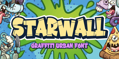 Hello, Are you looking for a graffiti urban font? Do you want of creating Something that stand out and inspire creativity, imagination, and endless fun? Wait no more, we will give you the best choice. Starwall a Graffiti Urban Font Starwall a Graffiti Urban Font, Inspiring from graffiti typography. This font is perfect for a design that makes it more attractive and playful. made with a very good level of aesthetics making this font suitable for book cover, poster, packging, merchandise, logotype and much more. FEATURES : Uppercase Lowercase Number Punctuation Multilingual PUA Encode Opentype
 - Mybela by Scratch Design,
$9.00 Mybela is a beautiful brush script font with a super-sexy-casual vibe! This font is incredibly versatile in use cases ranging from street urban, to styled fashionista, to hearty food branding - whatever the weather, and also for invitation wedding or quote text! Mybela comes with a set of upper and lower case letters, and ligatures so you can write one word in a different ways - and keep things natural looking. Also this font has support for multiple languages. Do your magic with Mybela font, be creative and keep beautiful. Enjoy it!
 - Stevens Titling by Linotype,
$29.99 Stevens Titling refers to the classic Roman alphabet as it appears on the Trajan column and numerous other monuments. With its realistic brush strokes, it shows the letterforms as they might have been sketched on the marble before the stonecutter reached for his hammer and chisel. The four fonts that constitute the Stevens Titling suite are named after animals — badger, boar, sable and wolf –, each known for the specific character of its hairs when used to make painting brushes. Sable Brush is the most formal and elegant, with solid forms which show no obvious trace of the handdrawn brush stroke; it comes with a set of small capitals for those classical titles preferred by Hollywood. In fact, each of these fonts would do a great job as a film title and poster font. The Badger Brush variant is compact and firm; Boar Brush is dramatic, and in Wolf Brush each part of the letter is made up of realistic, dry strokes.


