3,566 search results
(0.016 seconds)
- ITC Airstream by ITC,
$29.00Timothy Donaldson creates letterforms anywhere using anything: he is just as happy making letters with pens and brushes, many of which he makes himself. Applying his personal commitment to the beauty of hand-drawn letterforms to modern type design methods has ensured that his fonts frequently reveal the presence of a joyful creativity behind the design. Airstreams alphabet is composed of consciously irregular handwriting characters and the overall tone is set by the emphasized vertical strokes. The erratic Airstream with its cheerful, unconventional character is intended for shorter texts and headlines and should be used in point sizes 10 and larger. - Centim by Tour De Force,
$25.00 Centim is contemporary sans with sharp top endings of stems that give a bit technical charm to typeface. With a squarish look, it can be used widely in all modern publications or become a part of an corporate identity. In smaller sizes, Centim offers good readability due to its simple and good balanced lines. Centim is available in Regular and Bold weights, as an ideal high-contrasted combination where all characteristics of the typeface are purely effective. Centim is the archaic Serbian word for Centimeter, a word that was mostly used in tailoring during XIX and XX century.
 - Mahardika by Lemon Studio Type,
$10.00 Mahardika is a Retro Sport sans Serif family with variable font technology, and its axis weight range spreads from Light to black forms. Flexible and adaptable, it is 100% Latin Plus, Supporting 219 Latin-based languages, which are spoken in different 212 countries. This font is suitable for any project. Great for graphic design and any display use. It can easily work for web, signage, corporate as well as editorial designs. Jantur Type has 9 weights with a total of 9 styles. and legibility makes it suitable for any kind of text application, from brand design to extensive text layouts.
 - Excessa by DePlictis Types,
$33.00 Meet EXCESSA!! a new futuristic and modular typeface family directly evolved from my previous released, AREON FLUX. Comparing it to his cousin, EXCESSA inherit most of the glyphs but a certain large group of letters are designed with a more obvious curvature that creates a slightly different visual dialog. It cames also in the same 3 styles as it’s predecessor: Athletic, Medium and Heavy. His more dynamic and modular structure makes it an excellent choice for designs that needs a futuristic, technical, unusual and sci-fi touch. It also supports most of the latin based languages, kyrillic and greek as well.
 - Hogar Slab by Latinotype,
$39.00 Hogar Slab, based on the Hogar typeface, is the result of combining a script and a slab serif into a single type system. The system has a monolinear style composed of a slab serif and a script slab serif version that share similar proportions, weight interpolations and details. Hogar Slab is basically a slab serif with script gestures and a script with slab serif shapes. In order to make the system more complete, I included an italic version, which represents a transition between both main styles. Additionally, I developed a set of patterns including some furniture designs by well-known architects.
 - Montix by Linotype,
$49.00Montix is a narrow, constructed type family that developed by the German designer Diana Fischer in 2003. With five weights (light, light italic, regular, regular italic, and bold), Montix is a particularly effective small family, especially when used for headline or display purposes. Montix's letterforms have relatively long ascenders and descenders, which compared with its horizontally compact body gives it its unique style. Words or lines of text set in Montix would look best when some amount of white space is left around them. Because of this, the faces are well suited for logos and corporate identity uses. - Umberland Slab by Sharkshock,
$115.00 Umberland Slab is an attractive family available in 3 different weights with italics. There’s a particular emphasis on simple geometric shapes and the way they interact with tall vertical strokes. Smooth curves and sharp angles blend together in a pleasing symmetry. Stroke widths are given variable degrees of contrast but serifs are consistent and heavy handed. Spacing is on the tight side with some lowercase pairs quite snug against each other. Umberland Slab would work well in small blocks of text, corporate logos, menus, or signage. This family is equipped with European accents/diacritics for international support, fractions, alternates, and ligatures.
 - PGF Dinos by PeGGO Fonts,
$29.00 “PGF Dinos” is a low contrast round typeface that resembles handmade American ‘Sign Painting’ in such the upper portion of the characters is bigger than the lower one, what gives the font a more playful and friendly personality. Another remarkable feature is its hooked terminals in characters such as C, G or S, heightening the differences between similar characters. “PGF Dinos” Family is composed of 10 different weights ranging from Hairline to Extra Black plus Italics and a full set of Dingbats. Early version was originallly called as “Globa” and was developed under the supervision of the Latinotype Team. Designer: Pedro González.
 - Neue Frutiger Arabic by Linotype,
$79.00 Neue Frutiger Arabic was created by Nadine Chahine and a team of designers and font engineers from the Monotype Studio, under the direction of Monotype type director Akira Kobayashi. The family is available in 10 weights from Ultra Light to Extra Black. Neue Frutiger Arabic embodies the same warmth and clarity as Adrian Frutiger's original design, but allows brands to maintain their visual identity, and communicate with a consistent tone of voice, regardless of the language. It is part of the Neue Frutiger World collection, offering linguistic versatility across environments – suited to branding and corporate identity, advertising, signage, wayfinding, print, and digital environments.
 - Showcase by Latinotype,
$40.00 Showcase, the new typeface of Daniel Hernandez and Paula Nazal is a handmade font consisting of a set of types that are composed of four styles, one script, one sans, a slab, sans mini and finally a set of ornaments and dingbats, all made to work together in the same language. It’s inspired by a pen that writes different typefaces and ornaments, and casually reaches into a harmonious family. Showcase is very easy to use and allows great versatility, can be used both in a magazine as a restaurant, through windows, cafes, and really anyway you can think of! Photography by Mauro Andrés
 - Copperplate Gothic by Linotype,
$40.99This American original was designed in 1901 by Frederic W. Goudy for the American Type Founders in Jersey City. Copperplate Gothic is an all caps font which looks like a sans serif at first glance. But closer examination reveals tiny, pointy serifs which almost seem to round off the letters. Designers rely on this font’s lofty and sublime impression and it is often seen in advertisements, but it has also made a place for itself in private and business correspondence and corporate design. The AB and BC designations in the style names refer to the relative sizes of the capitals and small capitals. - Coda Loop by Slex Studio,
$25.00 Coda Loop is a Sans Serif font created with balanced line sizes, this font is inspired by Logo which uses block letters. Coda Loop comes with uppercase, lowercase, numbers, punctuation and so many variations on each character including common ligatures as well as additional strokes to allow you to customize your designs. This font is perfect for Logotypes, Letterheads, Formal Letters, Newspapers, Posters, Clothing Designs, Labels, and more. Also supported is PUA encoded. Simply copy and paste alternative characters using the Character Map (Windows), Font Book (Mac) or a software program such as PopChar (for Windows and Mac).
 - Prospera by Alphabets,
$17.95Prospera was designed without reference to existing roman faces. In its initial form, development was partially supported by a grant from the National Endowment for the Arts (Design Project Grant), as a design for use on 'low-res' digital output devices. Early releases had simplified detail in cross-bars and serifs, and hand-tuned bitmaps. As an original design, Prospera draws on principles of letterform developed during my studies of lettercarving (in Wales with Ieuan Rees) and Roman proportion. The design is idiosyncratic, perhaps more akin to Gill's Perpetua than to the monotonous corporate flavors so prevalent today. - Print Shop Parts JNL by Jeff Levine,
$29.00 Print Shop Parts JNL has a nostalgic assortment of blank sign panels, a pointing hand, decorative embellishments and even an assortment of "Made in U.S.A.", "Made in America" and "Made in United States" emblems located on the 1-9 keys. All are from vintage type catalogs and sign painting instruction books from the early 1900s. When scaled up, the blank sign panels can be used for small signs or price tags as originally made in years past. During the early part of the 20th Century, it was common to create show cards in attention-getting shapes matched with beautiful hand lettering.
 - Riga by Ludwig Type,
$45.00 Riga is a space-saving and legible typeface designed to work equally well on paper and on the computer screen. Its personality is clear and practical, yet warm and polite. Riga is suitable for a wide range of typography such as editorial, websites, packaging and corporate design. Economical proportions, high x-height and open letter forms guarantee good performance in narrow columns and tight headlines. Riga is exceptionally readable at small point sizes and elegant at larger ones. Riga comes in 18 styles and weights and contains a large number of OpenType features. For small sizes on screen Riga Screen is also available.
 - Linotype Not Painted by Linotype,
$29.99Linotype Not Painted is part of the Take Type Library, chosen from the contestants of Linotype’s International Digital Type Design Contests of 1994 and 1997. This fun font from German designer Robert Bucan grabs attention immediately. The forms are made up of multiple layers. The upper case’ alphabet forms, numerals and punctuation are two different styles of the same character, one over the other, and the lower case’ letters are composed of the lower case and upper case of the same letter superimposed. Linotype Not Painted is particularly good as a headline font in larger point sizes. - Brimley by Chank,
$49.00This slinky number will seduce you with its linking letters and special ligatures. Brimley's strokes are tight and sharp, and its characters are tied together with slender, whispy hooks. Although its elegance is timeless, this is a style that typifies lettering of last century's late '50s and early '60s. Chank Co. intern Tim Drabandt created Brimley with inspiration from antique type books. He named the font after Wilford Brimley. You know... the chubby old guy who tells you to check your blood sugar and eat your Grape Nuts and Quaker Oats. Haven't you ever seen Cocoon? - Simplo Soft by Durotype,
$49.00 Simplo Soft is the soft companion of Simplo. In Simplo Soft, Simplo’s original sharp geometrics have been tempered by the moderate rounding of the edges of its characters — creating a softer and friendlier geometric typeface. Simplo Soft is ideal for use in display sizes. It is also quite legible in text, and is well suited for graphic design and corporate identity design. Simplo Soft has sixteen styles, extensive language support, eight different kinds of figures, sophisticated OpenType features — so it’s ready for advanced typographic projects. Free demo font available. For more information about Simplo Soft, download the PDF Specimen Manual.
 - Ultimatum by Comicraft,
$19.00 FINALLY! We’re telling you for The Last Time! This is not a Threat! This is not a Negotiation! Refusal to cooperate with the terms of this font will be considered an Act of War! There can be no Dispute! The Crisp, Sharp hooks and corners of this typeface are Not To Be Reasoned With! Gosh Darn it, we have grown tired of asking and this is merely a formality precedent to the outbreak of hostilities. It’s a little corporate, it’s a little bureaucratic, but our lawyers insisted that we propose a settlement of compromise. Ipso Facto.
 - Malaguena Stencil JNL by Jeff Levine,
$29.00 Malaguena Stencil JNL was derived from hand lettering found on an Art Deco-era piece of vintage sheet music for this familiar tune. According to Wikipedia: “Malagueña is the feminine form of the Spanish language adjective malagueño/ malagueña, ‘pertaining to Málaga’, a Spanish port city.” Additionally: "Malagueña", is a song by Cuban composer Ernesto Lecuona; written in 1928 it was originally the sixth movement of Lecuona's Suite Andalucia, to which he added lyrics in Spanish. The song has since become a popular, jazz, marching band, and drum corps standard and has been provided with lyrics in several languages.
 - Pinch Remix by sugargliderz,
$15.00 Pinch Remix is a recreated version of a typeface I made in 2007. The form hasn’t changed at all, but I composed the family by increasing the number of weights and revising the spacing and kerning. At first it was created from randomly drawing an alphabet offhand on paper with a drawing pen. Then I figured that perhaps it had the framework for a typeface. Originally because it was just a memo, I had already thrown in the trash once. Yet something about it caught me, and when I turned to look down at it, I couldn’t throw it away.
 - Yekuana Pro by Neo Type Foundry,
$28.50 Yekuana Pro is a typeface whose design is based primarily on the study of certain geometric ethnic ancestral Venezuelan signs, visually rich and originally used in the enrichment of various utilitarian objects with high symbolic and cultural content. It’s a family that is composed of 330 glyphs y of two weights, including Inline and Outline versions, Stylistic Alternates, Fractions, Ordinals and Ligatures. The combination of their styles through the use of layers by contrasting colors application of allows to obtain new interesting results. Its use is recommended for titles or short phrases and elements of oversized visual communication.
 - Aravis by AravisFonts.com,
$39.89 Amazingly easy on the eye; it draws the reader in with minimal brain bandwidth use. Designed to enable more focus on the content. Good for web pages. Very Dyslexia friendly. Our mission has been to create a font that scientifically designed to be dyslexia friendly while also being attractive and useful. Dyslexia features: Each letter is unique even if reversed or flipped. The spacing is carefully designed using scientific evidence to help all readers from those who read via word shapes to those who read using phonemes and syllables. The visual stress caused by contrast pattern glare is minimised and has fared well when measured by professionals against other common fonts. Usefully mid-sized to make it easy to transfer artwork from common fonts to Aravis. This is very helpful when providing reasonable adjustments for people with Dyslexia. Based on algorithms found in nature. Range of use: Ø 72 Latin based languages Ø Greek and Coptic Ø IPA extensions Ø Good Maths symbols provision with OT support for vulgar fractions Ø Innovative OT support for creating boxes for forms Ø Small Capitals with some accents also supported (Czech) Ø Subscripts and sups: Complete alphabet upper and lower case and numbers Ø Customers can request additional symbols and characters within reason, or add an accent /shape unique to their country if it fits with the overall mission of the font.
 - Fushar by Mikołaj Grabowski,
$19.00 Fushar is a bold comic color font family which comes in 5 layer-styles easy to compose in a multicolor manner and 3 OpenType-SVG color styles to make the work faster and easier. Character set covers Latin alphabet of European languages, Vietnamese and Pinyin with standard ligatures, digits, punctuation, currencies and other symbols - the total of 555 glyphs. The idea came from a custom logotype I made several years ago for a local charity organisation that helps children. The logotype was based on bold letters with light that make the "balloon" effect visible in "Holes" style. Later I expanded the family with "Cuts" and all the derivative fonts that make the whole color family. The purpose was to create a funny, friendly and playful script that would embrace the beauty of the Arabic script which is available in Fushar Arabic. The Latin character set is a useful addition and is available in multilingual bundles. Solid, Cuts and Holes are classic one-color styles which can be used separately to compose a simple text. With Shadows and Lights they can produce a multicolour design, as shown on the images above. To save the time, there are three already prepared combinations in the new OpenType-SVG color format. The features include contextual alternates, standard ligatures, fractions, ordinals, case-sensitive forms, proper mark attachment, superscript (1, 2, 3) & localizations.
 - Etelka by Storm Type Foundry,
$49.00 Etelka was designed for purposes of corporate identities, branding, product package design and outside lettering. It works anywhere an extremely legible typeface is needed. Package and label design often requires a wide choice of weights and widths: light and narrowed fonts to fit huge amount of mandatory informations onto a small box, or to squeeze text lines around a bottle, fat and wide styles to emphasize information on a poster or vehicle. The regular styles will serve well for business card, small texts and for your website. Etelka’s design idea is wide, open rounded square. Some details are extremely minimized: lower-case “a, n” or “u” lack their typical spur. The typeface has a distinctive industrial expression with all diagonals slightly softened, and her overall strict mono-linear principle is exceptionally broken only for fine optical adjustments in joints. Cyrillic and Greek scripts are present for international business, as well as rich latin diacritics. Etelka is actually very well suited for all kinds of visual communication, especially orientation systems in modern architecture. The first drawing of the font, which was later named “Etelka”, was submitted in 2004 for the Czech Television identity competition and was rejected by the jury. We later concluded that the design was worth extending to the current superfamily of 42 fonts. It is a reliable typeface for corporate identities and websites.
 - Allrounder Antiqua by Identity Letters,
$40.00 Timeless Renaissance looks, gently updated. For novels and billboards alike. Allrounder Antiqua is an old-style serif member of the Allrounder superfamily. A timeless typeface based on classical proportions, Allrounder Antiqua is perfectly suitable for advanced book and editorial design well as packaging and branding. True: its main purpose is to set flawless body copy and to generate an evenly textured page—but its refined shapes work fantastically in display applications, too. Some details, such as the small and sharp bowl of the lowercase a, are fully appreciated in large sizes only. If you need a sophisticated serif typeface for packaging, food, fashion, consumer goods, or lifestyle branding, Allrounder Antiqua is up for it. It's also apt as an outstanding corporate typeface, be it for a more conservative venture or the latest hipster start-up. This classy serif typeface comes in four weights with corresponding true italics. Just like its sans-serif counterpart, Allrounder Grotesk, Allrounder Antiqua is equipped with plenty of Opentype Features like small caps, six sets of figures, case-sensitive forms, superiors, fractions and many ligatures. You will find alternate letters with swashes within this extended character set, as well as all the accented glyphs necessary to support more than 200 Latin-based languages. Historical Background The (French) Renaissance-influenced typeface started as Moritz Kleinsorge's graduation project within the "Expert Class Type design" course of the Plantin Institute for Typography, located in the famous Museum Plantin-Moretus in Antwerp, Belgium. There, Moritz Kleinsorge decided to create a revival of Robert Granjon's "Ascendonica Romain", described as "a beautiful face; typical of Granjon's mature style" in the inventory list of available material. "To touch punches and matrices cut by Robert Granjon back in 1567 was an invaluable inspiration", Moritz explains. Over time, the typeface moved away from being a true revival. Rather, it evolved into a Granjon-inspired typeface. That typeface is now available as Allrounder Antiqua. Perfect Pairing: Allrounder Antiqua + Allrounder Grotesk Allrounder Grotesk is the ideal complement to Allrounder Antiqua. They both share common vertical metrics and a common color. This allows you to pair both typefaces within the same layout—even within the same paragraph—without creating visual disruption. Head over to the Family Page of Allrounder Grotesk to get more information about this typeface. Design Trick: Bilingual Design With the Allrounder Superfamily Combining Allrounder Grotesk with Allrounder Antiqua is an ideal approach for bilingual designs, wherein both languages get the same emphasis yet are distinguished with two different typefaces. It's also best practice to set headlines in a different typeface than the body text if they harmonize with each other. Allrounder Grotesk and Allrounder Antiqua provide you with the perfect pair for this purpose.
 - RoyHand RP by BluHead Studio,
$25.00RoyHand RP is a new OpenType font family release by BluHead Studio, LLC from the wonderfully talented English designer and illustrator Roy Preston. RoyHand, as the name would suggest, is based upon the handwriting of Roy himself. The family has three weights and is suitable for many everyday uses. - Churchward Supascript by BluHead Studio,
$25.00Churchward Supascript Unplugged is a new OpenType font release by BluHead Studio, LLC from the exciting and unique type design library of Joseph Churchward. The design is based upon Churchward's original Supascript drawings but with a little added edginess in the form of some scanner-induced rough outlines. - Faber Gotic by Ingo,
$21.00 A ”modern“ Gothic – designed according to principles of modern form in three variations Faber Gotik is a reminiscence of Gutenberg’s first script from around 1450. The heavily broken forms allow further development in the direction of a modern, strongly geometric and less formal type. It should be possible to push the principle of design so far to the limit that a type is created which, from the very start, extinguishes reminders of a dark past. The characters are composed of squares which are lined up straight or in a more or less slanted manner. The resulting corners similar to serifs were removed so that a sans serif type in the true sense without up and down strokes was created. The principle of ”breaking“ was applied according to the historical model. Even the form of the characters is based on the model from the Middle Ages. Only the characters which cannot be created with the principle described were modeled on today's forms. Faber Gotik includes three variations: - Faber Gotik Text — most similar to the historical model - Faber Gotik Gothic — pushes the applied principle of form the furthest - Faber Gotik Capitals —; a Gothic upper case font, contrary to tradition. 555 years after Gutenberg, interest in black-letter typefaces is nearly extinct. They are especially looked down upon in German-speaking countries because they are still associated with ”Nazi“ scripts. But yet, the very forms of blackletter, Gothic, Schwabacher and especially cursive have enormous potential with regard to the development of new advanced font forms.
 - Exo - 100% free

- Andron 2 EIR Corpus by SIAS,
$34.90 SIAS opens a new chapter in Irish vernacular typography: the Andron-2-Irish font family. The genes of the insular typographic heritage have been blended with the timeless classical style of the versatile Andron series. Whereas most Irish-style fonts available more or less stick to ancient designs, Andron-2-EIR is different: it’s an entirely new design in which Irishness meets the beauty of a matured Venetian Roman text face. Envision a new horizon for setting Irish text in its own visual mode! Now you can utilize Italics, Semibold and Small capitals for Irish just as you have been doing in other languages for a long time. But the icing on the cake is the fifth font: Andron Irish Middlecase honours the rich medieval tradition of Ireland by a special uncial-style glyph set. It corresponds to the Andron MC series. Last but not least the Irish type connoisseur will relish this font package for it’s unique utilization of Opentype functionality. In Opentype-aware applications, by just ticking a box you can switch to the special insular forms of s and r. By ticking another box you can transform the text from modern-day orthography to the traditional spelling with lenited consonants. This built-in intelligence has never been implemented in any Irish font before. Briefly, the Opentype substitution features are: [Ligatures] – default basic f-ligatures; [Descretionary Ligatures] – more ligatures for typographic reason, mainly t- and long-s-combinations; [Style set 1] – turns all lowercase r and s into their insular glyph variants; [Style set 2] – replaces all consonant-h digraphs by dotted consonants (ḃċḋḟġṁṗṡẛṫ, ḂĊḊḞĠṀṖṠṪ), works for lowercase, uppercase and upper-lowercase alike; [Style set 3] – provides another range of additional special ligatures (for Regular and Italic only); [Oldstyle figures] – turns the default lining figures into proportional oldstyle figures. Andron Irish will also perfectly combine with every other Andron product in mixed settings. For an overview please go to the SIAS main page. For a quick reference go to Andron Latin, Andron Greek, Andron English or Andron MC. For more wonderful new Irish fonts look at Hibernica and Ardagh!
 - Patriot by Barnbrook Fonts,
$30.00 Patriot is the sans-serif version of Exocet and, like Exocet, is based upon early Greek and Roman stone-carving, yet it adheres more closely to the shared historical source material. Patriot was developed to include unique forms and alternative characters, becoming a striking original typeface in its own right.
 - RMU Gong by RMU,
$30.00 Based upon an Arno Drescher design for Schriftguss, RMU Gong was freshly redrawn and redesigned and is intended for being a splendid font for headlines, subtitles, ads, posters etc. It comes with full sets of superior and inferior numbers, and even a long s can be accessed by typing [alt] + b.
 - 24 HRS by Design is Culture,
$39.00 A font designed by Christian Acker (2002), based upon neon signage in downtown New York. 24Hrs was an exercise in creating flat artwork from the inspiration of neon's three dimensional forms. All of the tubing's overlapping and twisting is documented and taken into account in the design of the letterforms.
 - Garden Bed by Hanoded,
$15.00 A couple of weeks ago, I found my ink well, which I thought I had lost. I decided (there and then) to create a bunch of inky brush fonts, which resulted in Dirrrty and Scrawny Cat. And now, needless to say, Garden Bed. It is named after a strophe from one of my favorite Soundgarden songs: Just Like Suicide. Garden Bed is a hand made didone-ish font, with a very irregular baseline, some interesting glyphs and a secret garden filled with diacritics.
 - Futurum Parqez by Parquillian Design,
$19.00 Futurum Parqez is the first collaborative font for Parquillian Design. The idea for this font first came to the creator, Jose V Lopez, almost 40 years ago. A couple years ago he shared his concepts and we were gradually able to collaborate on editing the designs and turn them into a working font. The philosophy behind the font is to use a standardized frame format and the fewest strokes possible, while maintaining legibility, to create an original minimalist and modern style.
 - SK Nagot by Shriftovik,
$32.00 SK Nagot is a decorative typeface at the junction of industrial and classical graphic design. It is inspired by 3D printing technology that combines the reality we know with the future. The typeface is built on geometric shapes, which creates a unique appearance of the characters. Despite the apparent complexity of the font, it perfectly emphasizes various design solutions. SK Nagot supports the Latin Pro and Cyrillic Pro alphabet, which, coupled with an extensive character set, gives freedom for creative experiments.
 - Montly Cloudy by Maulana Creative,
$12.00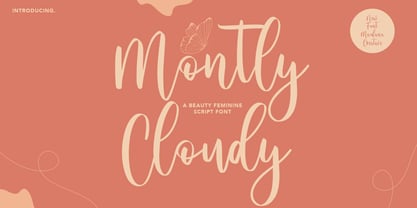 Montly Cloudy is a Beauty style script font. With clean stroke and fun character. It has Opentype features a couples of ligature, To give you an extra creative work. Montly Cloudy script font support multilingual more than 100+ language. This font is good for logo design, Social media, Movie Titles, Books Titles, a short text even a long text letter and good for your secondary text font with sans or serif. Make a stunning work with Montly Cloudy beauty script font. Cheers, MaulanaCreative
 - Pixel Arcade by Comicraft,
$19.00 GAME OVER, MAN, GAME OVER! Time to grab your joystick, turn to channel 3 and level up, Player One, or you'll never beat the high score on your new game cartridge. Or bring a stack of quarters and a couple of friends to the mall, and we'll play some Rick Astley and Kajagoogoo over the PA while you scope out hotties near the food court. Either way, eight bit lettering has never looked more eighties than it does in our new PIXELARCADE font!
 - Eksja by Protimient,
$29.00 Eksja is a modern slab serif available in four weights, each with a corresponding italic. All the fonts in the family have small caps, the extended latin character set, diacritical f-ligatures, enclosed numerals (numbers in circles) and case-sensitive punctuation. The general design of the typeface has been with a strong human touch in mind. The ends of the serifs have been given a subtle rounding, just enough to take the edge off which, when coupled with the largely humanist structure of the design, creates an open, friendly and approachable design, abandoning the usual geometric severity commonly associated with slab serif typefaces. Eksja contains quite a comprehensive numerals system. Obviously, each font has the standard proportionally and tabularly spaced lining and old-style figures but, crucially, the tabular numerals share the exact same width in each font variant. That means that you can choose to use the thin, regular, bold, black and their italic forms all in the same setting and they will always line up. In addition to the 'normal' numerals there are super-script and sub-script numerals and OpenType fractions that can be automatically composed as you type. There are also the enclosed numerals, numbers inside a circle, that are useful for numerically listing items and, thanks to the wizardry of OpenType, they can contain any number of digits (typically, enclosed numerals are precomposed single digits, only encompassing the 0–9 range, the enclosed numerals in Eksja can go to double digits, triple digits or, in fact, any number of digits*). *The automation of the enclosed numerals is accessed via either "Stylistic Set #1" or "Stylistic Alternates" which requires the use of an application that supports OpenType stylistic sets or stylistic alternates, such as Adobe's InDesign or Photoshop.
