10,000 search results
(0.044 seconds)
- Leaf by Journey's End,
$12.00This "Leaf" font has been swirling in my head for years - I remember my sister and I making letter formations like these when I was young. It was exciting to see the lettering look even better on paper than it did in my mind! "Leaf" surprised me by having two distinct looks: in size 24 or smaller, the look is delicate, because your eye doesn't see any space in the letters. In size 28 or larger, the eye can discern spaces, which gives a different facet to its personality. As much as I like this font when viewed on a monitor screen, it really shines when printed. The "Leaf" font is a perfect blend of quaint hand-written style mixed with crisp letter formations. This font has a very "happy" quality to it. May using it bring a little more happiness to your day! - Cafe De Paris by Studio K,
$45.00 Café de Paris is, clearly, inspired by all things French, especially the quirky typefaces that adorn French shopfronts from cafes to charcuteries and bistros to boulangeries. My intention was a fresh, crisp, modern take on a classic theme, with just a soupcon of Art Nouveau, which is characteristic of so much of French typography (See also Studio K’s Paris Metro font) C'est chic - n'est-ce pas?
 - Frozen Memory by Hanoded,
$15.00 Frozen Memory is a heavy-boned cartoon display font. Even though it was completely made by hand (using a roller ball pen and some quality paper), it has a clean look, crisp lines and generous curves. Frozen Memory comes in three distinct styles, helping you to create versatile designs. Frozen Memory urges you to eat more ice-cream, but just beware of that brain freeze!
 - Marshmallow Hot Chocolate by Nicky Laatz,
$17.00 Say hello to Marshmallow Hot Chocolate Brush - A super-casual, super-versatile all caps brush font. Great at both Small and large sizes : Fine texture details on its edges make it pop at larger sizes, and at smaller sizes its stays crisp, neatly balanced and nicely legible. Perfect for making a statement - use it in quotes, punchy headers, posters, flyer design, packaging, in your illustrations that need legible handwritten captions - and so much more. Although Marshmallow Hot Chocolate is an all caps font, you will find uppercase and lowercase keystrokes have alternate characters. Opentype Ligatures are included to make it look more naturally handwritten in your designs. Four extra swashes are included in the glyphs set - open your glyphs panel to access them. Play with the letter spacing to get different looks and effects.
 - Goudy Text by Monotype,
$29.99The word Text" in Goudy Text™ is short for Textura, and textura is the style of blackletter or gothic writing developed in Northern Europe in the middle ages. The use of space in blackletter is quite different from what we know about Roman letterforms. Lowercase forms in blackletter writing and typefaces must be evenly textured with black and white elements, like the texture of weaving or fabric. Capital letters can provide either an integration of the even texture (by the use of decoration in their construction) or, if they are wide and open and filled with white, they provide bright spots of visual emphasis. Goudy, despite being an American in the twentieth century, understood well the fundamental texture of medieval blackletter and the importance of both density and light. He designed Goudy Text in 1928 for Lanston Monotype after studying the type in Gutenberg's 42-line bible; still one of the best models for designers of blackletter typefaces. The lowercase of Goudy Text has impact and medieval authenticity. The standard caps have some Victorian eccentricities but are mostly well drawn. The alternate, or "Lombardic" caps are spectacular - they set beautifully with the lowercase letters, providing the proverbial shafts of light through the Gothic cathedral's stained glass windows. Use this potent font in sizes 14 point or larger, for Christmas greetings, certificates, wedding invitations, advertising, or music collateral pieces." - Vida Pro by Storm Type Foundry,
$55.00 The new typeface family Vida was specifically designed for Czech Television in the framework of a competition for a new logo in summer 2006. The drawing of each letter form differs finely in its logic, which is a feature invisible at first. It is constructed on a puristic base, but it doesn't reject the natural anomalies already known from ages of experience with latin alphabet. That's why e. g. upper left section of 'n' is constructed differently from that of 'r', similarly as 'd' doesn't repeat right-bottom ending after 'u', '9' is not inverted '6'. Such details improve reading in continuous text. The behavior of all weights is consistent on CRT, plasma or LCD screens due to monolinear design; the lightest weight doesn't fade, the darkest isn't blurred, all is legible and clear in smallest sizes. Stem connections and endings were adjusted to avoid undesirable optical darkening. The goal we desired was to achieve balance appearance in both electronic and printed form.
 - Newsprint JNL by Jeff Levine,
$29.00 Newsprint JNL has its origins in an online auction image of wood type. Only the lower case a-z were shown and the type design included an extra-wide 'g' and 's'. Expanding on this idea but narrowing the 's' a bit, Jeff Levine created a capitals set and all of the necessary additional characters - even adding a generous selection of accented characters not usually found in his display fonts. Regular, oblique, narrow, narrow oblique, wide and wide oblique versions are available. All styles offer crisp, clean lettering for headlines, window signage and other display text applications.
 - Editors Note by Jen Wagner Co.,
$17.00 Say hello to the Editor's Note Family, an editorial serif display that includes 16 fonts, regular and italic, from Hairline weight to Bold, and still has all the clean lines, tight curves, and trendy minimalist vibes! I've been loving the clean, editorial type trend happening in design right now (let's be real, there's always a place for timeless editorial type). Editor's Note is a stunningly crisp upper and lowercase typeface that looks incredible in both large settings as a display text (think big headers, pretty quotes, calls to action, etc.). I've been loving combining the regular and italic, especially in big, bold quotes.
 - Plaquette by FaceType,
$24.00 ‘Plaquette’ is a collection of retro typefaces ranging from victorian to bauhaus to the sixties. They are all equipped with a load of OpenType features such as alternates, catchwords, stylistics sets and others. Plaquette 3D A chromatic set of fonts including gradient and outline layers. Crisp and precise. Plaquette Lovecraft A vintage typeface with some sweet discretionary ligatures to make your typography exciting. Take a look at the many alternates. Plaquette Sittl A clean geometric style with many alternative letters, some inspired by Paul Renner’s original Futura. Plaquette Labels This set provides you with 220 different shapes ideal for logos, plates and… labels.
 - Ultimatum by Comicraft,
$19.00 FINALLY! We’re telling you for The Last Time! This is not a Threat! This is not a Negotiation! Refusal to cooperate with the terms of this font will be considered an Act of War! There can be no Dispute! The Crisp, Sharp hooks and corners of this typeface are Not To Be Reasoned With! Gosh Darn it, we have grown tired of asking and this is merely a formality precedent to the outbreak of hostilities. It’s a little corporate, it’s a little bureaucratic, but our lawyers insisted that we propose a settlement of compromise. Ipso Facto.
 - Brasika Display by Nurrontype,
$14.00 Hello my name is Brasika Display, a fun, funk and swirly font. I was designed with versatility, easy to adapt to your needs. I'm playful enough to make you happy. Just look my styistic and anatomy, it's cool, isn't it ? You can put me in your logo project. Or your magazine title. In your Christmas greetings card, wedding invitation, perhaps use me in your Instagram feeds, Youtube title, and many more, you name it. All my friends called me Polyglat, because I'm speaking and understand many languages. I'm Brasika, buy me now, and I will help you to ignite your next project.
 - Canned Whale by Hanoded,
$15.00 Each year whalers from Japan kill more than 1000 whales. Japan says that the killing of whales is a 'cherished Japanese tradition', and that it is taking 'scientific data'. A portion of the whale meat is canned and marketed as 'traditional food'. How sad is that? A huge whale being reduced to a chunk in a can… Canned Whale is a hand drawn, outline style font with a cartoonesque twist to it. It can be used in ads and posters, it can be filled in with color, or kept as an outline. Canned Whale comes with extensive language support.
 - Magista Winter by Agny Hasya Studio,
$12.00 Magista Winter Is a Fun Holiday Typeface With a Concept of the End of the Year Events Such as Christmas, New Year, and Winter. It Comes in 2 (Two) Styles (Regular & Slant) and Is Created With Some Alternate and Ligature. Featured with Uppercase and lowercase, Numeral and punctuation, Multilingual Support, and Opentype Features Perfect for Your Design Projects Like Advertising, Branding, Posters, Sale Signs, Product Designs, Special Events, Book Covers, Cards, Merchandise, Labels, Product Packaging, and More. Have Fun Creating and designing with Magista Winter Thank you! agnyhasyastudio
 - Gulmer Cottage by Jinan Studio,
$12.00 Gulmer Cottage Font Duo embodies the essence of charm and whimsy, designed to infuse your creations with a delightful touch. This font duo features both a regular and slanted version, offering versatility for a myriad of designs. The script version boasts engaging ligatures while the display version is adorned with playful swashes, allowing for endless creative possibilities. Perfectly suited for quote designs, celebrations like Christmas and birthdays, heartfelt valentines, as well as branding endeavors and product packaging, Gulmer Cottage Font Duo radiates love, cute, and joy. Its multi-language support ensures its usability across diverse cultural landscapes, while its inherent cuteness and fun-loving nature elevate any project it graces. Infuse your designs with a dash of affectionate personality and spirited vibes using this endearing font duo." Features A set of uppercase and lowercase glyphs, Allcaps (display version) Number, symbol, and punctuation Multilingual Support Ligatures (script version) Swashes (display version) Slanted Version Type j_1 until j_12 to features swash, ligatures will automatically replace the standard letter pairs whenever available, when using any OpenType capable software.
 - Hua by YXType,
$14.99 Hua type family is a sans-serif with very humanist details to represent the essence of nature. It features 14 weights from the very thin to the very bold, generously covering a wide range of the natural spectrum. Aiming to represent the soft and elegant side of nature, Hua features very unique italics that have their own take on the identity. The letterforms of the italic fonts are inspired by the lineage of both traditional calligraphic approaches for serifs and much simpler forms for sans-serifs. Hua provides very crisp performances on screens and its large x-height combined with fine-tuned proportions help it retain legibility very well on smaller sizes. Features: • Support for 200+ Latin languages • Double & single storie “a” & “g” • Unique italic letterforms • Low contrast with unique details • Small caps with symbols • Arbitrary and defined fractions • Support for superscript & subscript in normal & scientific alignments • Proportional lining, proportional old-style, tabular lining, tabular old-style
 - Bodiam by Hanoded,
$15.00 Two years ago I went on a camping holiday in England with my wife and (then two) small children. The first stop was a nature campsite near the village of Bodiam in East Sussex. My son wanted to see a real castle, so I figured Bodiam Castle was the 'realest' of them all! He loved it, as the castle had a moat, crenellated walls, a bunch of towers and a guy dressed up as a knight. Bodiam font is a rough didone-ish affair. It is all caps, but you can freely mix upper and lower case. It would be ideal for book covers, posters and maybe even for castles. Comes with a treasure chest of diacritics.
 - Rosenbaum by SIAS,
$34.90 The design of Rosenbaum started with the idea of an eclectic merger of didone stroke pattern and contrast, uncial letterforms and blackletter appearance. It was a destillation experiment. It happened around christmas in 2011. The result is a unique typeface which strongly evokes a peculiar pastiche mood without being any historical in the strict sense of the word. It’s all about the fun to mix ingredients and to freely create reminiscences in a new way. Rosenbaum is a typeface like a fairytale – one of a kind, strangely poetic and incredibly true at once… Use Rosenbaum for emotional typographics, for fairytale books and stories, for headings and invitations, for distinctive labels or menu cards, for Wave Gothic publishing … you will know best! Both Rosenbaum Eins and Rosenbaum Rose contain all characters needed for any European language. They both contain the same range of additional symbols and ornaments, some of them are zero-width calligraphic embellishments designed for direct combination with the letters, even inside of words.
 - Didonesque Stencil by Monotype,
$31.99 Less is More. This stencilled version takes away some of Didonesque’s structure while adding another level of distinguished style and supreme elegance. The Elegante fonts epitomise the style required for high-end fashion and beauty applications with their crisp curves combined with tapered serifs and terminals – instantly creating a polished and fashionable aesthetic. Didonesque Stencil was designed for large display purposes, branding, corporate identities, headlines, advertising, wedding invitations and the like. Of particular note are the minimal ball terminals which are available by activating Stylistic Set 2 – they’re perfect for adding that extra bit of magic to your typographic designs. Key Features: • 4 Stencil weights in Roman and Italic styles • 4 Stencil Elegante weights in Roman and Italic styles • 4 weights in Condensed style • Small Caps, Petite Caps, Alternates, Ligatures and Contextual Alternates • Full European character set (Latin only) • 780 glyphs per font.
 - SG Scratter by Studio Gulden,
$30.00 SG Scratter is a dynamic and eye-catching display font that is sure to make any design stand out. With its sharp and crisp edges, this font exudes a sense of boldness and confidence that is perfect for headlines, logos, and branding projects. This font is available in six distinct styles, each with its own unique personality and character. From the sleek and sophisticated SG Scratter Regular to the more daring and adventurous SG Scratter Bold, there is a style to suit any design need. With its clean lines and modern aesthetic, SG Scratter is versatile enough to be used in a variety of design applications, from print to digital media. Its legibility and clarity make it a great choice for everything from posters to websites. So if you're looking for a font that combines elegance and edge, look no further than SG Scratter. With its sharp angles and bold lines, it's sure to make your design pop and stand out from the crowd.
 - Death Angel by ryan creative,
$12.00 Death angel has a strong and aggressive look with crisp, sharp lines. This font has hard angles and leans slightly towards the vertical, giving it a sharp, scary feel. accompanied by additional ornaments that you can custom style yourself. can be applied like, t-shirt design, product design group name, quotation etc. Note: For how to use this font, you can visit Ryan creattive youtube, or the link below; https://youtu.be/8XxjuAcXlbk FEATURES; -Uppercase, -Support Foreign, Numbers and Punctuation. -Ornaments. -Works on PC. -Simple installation. -Accessible in Adobe Illustrator, Adobe Photoshop. Adobe InDesign, it even works in Microsoft Word. -Fully accessible without additional design software. Death angel is coded with Unicode PUA, which allows full access to all additional characters without having to design any special software. Mac users can use the Font book, and Windows users can use the Character map to view and copy any extra characters to paste into your favorite text editor/app. thank you for visiting ;)
 - ITC Needlescript by ITC,
$29.99It's been said that creativity requires ten parts to perspiration to one part inspiration. But not always. According to its creator, Mira Vucko, ITC Needlescript was designed in one breath." An accomplished lettering artist, Vucko was sketching letters one afternoon. "I was using a calligraphy nib and was drawing the alphabet without much thought," she recalls. "When I allowed the down strokes of a couple of letters to fall below the baseline, I realized that I had created the impression of movement. I kept drawing letters in this fashion and did the same with horizontal lines. I added a firm ending to the descenders. Instead of dots above the 'i' and 'j,' I placed strokes in the opposite direction." In this way, the first characters that were to become ITC Needlescript emerged. The finished design is a lively, distinctive alphabet that produces a striking texture on the page. Letters intertwine and overlap to create a sense of movement and graphic intensity, especially when reversed out of a dark background. Vucko lives, works and was educated in Zagreb, Croatia. She lived in France and Sweden while in her twenties, but then returned to Croatia to work as a graphic designer for the country's largest newspaper. It was here that her passion for type and typography was born. Vucko has since gone on to become one of Croatia's leading graphic designers, and has won many awards for her advertising and packaging design. Vucko recommends that ITC Needlescript be used for "titling, lively but 'thorny' content, and anywhere that a little typographic drama is called for."" - Soft Serve by Sentinel Type,
$24.90Looking like happy frosting on a cupcake at a twiddle bug party, this bouncy food entry from Canadian designer Haley Fiege turns the original Jellybrush type into organic happiness you can spread on pancakes, ice-cream, sorbets, sauces and condements, oh peanut butter! Yeah, all kinds of sandwich fillings. Anything really. What else? People who own rubber factories. Anybody in the food business, like green grocers or your local bakery. Thrift stores. Falling somewhere between cushions and cat food, this flexible and inviting letter mixes simplicity with organic character and humor for a wide range of uses. Soft Serve’s compact cursive forms and bouncy friendliness draw on artbrush scripts and the typo-italic model of Renaissance Vatican scribe Ludovico Arrighi. A versatile workhorse ideal for: * Dairy & beverage * Sweets & soft drink * Five minute food & sauces * Pet food & accessories * Bathroom & kitchen * Cushions, pillows, rubber & swimming pool, etc. - Kunire Grotesk by IbraCreative,
$17.00 Kunire Grotesk – A Modern Grostesk Sans Serif Font Kunire Grotesk is a contemporary sans-serif font that seamlessly blends classic grotesque design elements with a modern twist. Exhibiting a refined balance between simplicity and intricacy, Kunire Grotesk features clean lines, geometric shapes, and a distinctive grotesque aesthetic that exudes a sense of sophistication. The font’s letterforms are characterized by their sharp, angular terminals and well-defined strokes, lending a crisp and professional appearance to any text. With a versatile range of weights and styles, Kunire Grotesk caters to diverse design needs, from editorial layouts to branding and digital applications, making it a go-to choice for those seeking a harmonious fusion of timeless elegance and contemporary flair in their typographic endeavors. Kunire Grotesk is perfect for branding projects, logo, wedding designs, social media posts, advertisements, product packaging, product designs, label, photography, watermark, invitation, stationery, game, fashion and any projects. Fonts include multilingual support for; Afrikaans, Albanian, Czech, Danish, Dutch, English, Estonian, Finnish, French, German, Hungarian, Italian, Latvian, Lithuanian, Norwegian, Polish, Portuguese, Slovak, Slovenian, Spanish, Swedish.
 - Combine by Andinistas,
$49.00 Combine, designed by Carlos Fabian Camargo G, is powerful and attractive, multi-layered chromatic type family that consists of 12 fonts, typographically grouped in two logics: “Script and Caps”, so that they could be colored separately or in group. Both designed with contrasting optical techniques and combinable at the same time. The unforgettable central idea of Combine was inspired by unique types of speedball letters designed by ancient artists in Canadian posters of shows and fairs in 1930. This is why its Typographical tools work independently or in group, resulting in highly polished designs that need fonts with coupled effusiveness. Their combined resources offer guaranteed distinguishing letters with shadow effects and worn, in order to help enhance their expressiveness. Combine is excellent in any project on paper or screen as it has more than 2100 glyphs and features of OpenType distributed strategically in fonts easy to use. SEE BELOW THE MAIN ADVANTAGES: • Combine Script & Shadow: It offers incredible case sensitive fluency and eloquence drawn with vertical cursive letters with ornamental non-stop excitement and complementation. It also has a variety of significant upward and downward, alternative strokes combined with its vintage ties that also give authenticity to their designs. • Combine Caps 1,2,3 & Shadow1,2: Guarantees you a colorful horizontal area of narrow case with 2 types of shadows, sound and other shade with diagonal stripes. Its geometric uniformity gives a friendly, open and subtle character by Typographic and special resources and visual properties coloring layers separately or in groups. In addition, its 2 layers of skeletal illuminations, adding internal lines and simultaneously contributing to play perfect confrontation and contrast with their geometric ideas and aesthetics for special attention. • Combine Words & Shadow: It can be used to design a perfect tone in each one of the 50 slogans written diagonally, making a brilliant feeling suggestive seductive style. Compatibility and flexibility works by monoline thin cursive strokes ideal for featured items with and without shade. Combine was selected at the Bienal Tipos Latinos 2016
 - Kandidat by Fontroll,
$30.00 Imagine being printer in the early nineteenth century, your stock isn’t the finest, your lead characters are worn out: Voilá Kandidat Rough. But wait, Kandidat isn’t the usual scan-an-old-book,-put-the-glyphs-in-a-font-and-you’re-done-font. Kandidat Rough has a variety of whopping 14 alternates for most characters. Our algorithm changes the letters automatically. All you have to do is turn on Contextual Alternates in your layout app. The algorithm is the best we’ve seen so far, and it’s so good that even same words appear in different forms. And should by coincidence words have the same glyphs, just assign a different Style Set to the first letter, and all other letters in the word will change as well (well, it depends a bit on your software). The mechanism isn’t perfect and maybe we stretched OpenType capabilities a bit over the top, but we yet haven’t seen any better routine for switching letters on the fly. Is it worth to mention that Kandidat Rough not only speaks English, but also German, French, Spanish, Dutch, Danish, Norwegian, Swedish, Croatian, Turkish and most likely some other languages? Maybe. To be sure whether your language is supported, this is the typeset of all letters: ABCDEFGHIJKLMNOPQRSTUVWXYZÀÁÂÃÄÅÆÇÈÉÊËÌÍÎÏÑÒÓÔÕÖØÙÚÛÜÝĆČĐĞ݌ފŸŽ abcdefghijklmnopqrstuvwxyzàáâãäåæçèéêëìíîïñòóôõöøùúûüýÿćčđğıœşšž Apart from that we also included the following punctuation and currency symbols: !"#$%&'()*+,-./:;?@[\]_{|}¡©«®°±¶·»¿×–—‘’‚“”„†•…‹›⁄≠☞ €¢$£¥ This sums up to nearly 3000 glyphs per font, and we have three of them: Regular, Italic and Bold. All neatly kerned. All in all a great repertoire for even the most demanding book or advert jobs with a look of old times. And now imagine you are sick of the rugged print experience Kandidat Rough delivers: go for Kandidat. This is our Scotch-ish ancestor the Rough version was made from. A sturdy, friendly, round, warm friend from the beginning of the nineteenth century. A bit dark, maybe. You will like it. Kandidat has the aforementioned type set plus complete Baltics, Eastern Europe and Cyrillic. Plus a couple of gimmicks like fleurons, stars, circled numbers, arrows, and, and, and… Kandidat Regular additionally has small caps for Latin based scripts (not Cyrillic). The spick and span Kandidat font set also consists of Regular, Italic and Bold cuts. The bold cut is on the very bold side and can nicely be used for headings, whereas Italic is a great companion for Regular. It took us some time and trouble to finish this project, but after all we are very proud of our little feat and hope you will enjoy Kandidat as much as we do. Enjoy!
 - Santa Day by Hatftype,
$15.00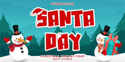 Santa Day - Christmas Display Font is a font with distinctive handwritten characters perfect for branding projects, logos, wedding designs, media posts, advertisements, product packaging, product designs, labels, photography, watermarks, invitations, stationery, and any project who need handwritten dishes. Features : • Character Set A-Z • Numerals & Punctuations (OpenType Standard) • Accents (Multilingual characters) • Ligature Multilingual Support : Afrikaans, Albanian, Asu, Basque, Bemba, Bena, Catalan, Chiga, Cornish, Danish, English, Estonian, Faroese, Filipino, Finnish, French, Friulian, Galician, German, Gusii, Icelandic, Indonesian, Irish, Italian, Kabuverdianu, Kalenjin, Kinyarwanda, Low German, Luo, Luxembourgish, Luyia, Machame, Makhuwa-Meetto, Makonde, Malagasy, Malay, Manx, Morisyen, North Ndebele, Norwegian Bokmål, Norwegian Nynorsk, Nyankole, Oromo, Portuguese, Romansh, Rombo, Rundi, Rwa, Samburu, Sango, Sangu, Scottish Gaelic, Sena, Shambala, Shona, Soga, Somali, Spanish, Swahili, Swedish, Swiss German, Taita, Teso, Vunjo, Zulu There it is! I really hope you enjoy it
 - Santa On Duty by Hatftype,
$15.00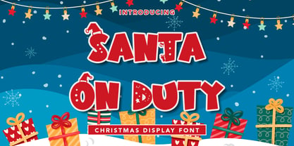 Santa On Duty - Christmas Display Font is a font with distinctive handwritten characters perfect for branding projects, logos, wedding designs, media posts, advertisements, product packaging, product designs, labels, photography, watermarks, invitations, stationery, and any project who need handwritten dishes. Features : • Character Set A-Z • Numerals & Punctuations (OpenType Standard) • Accents (Multilingual characters) • Ligature Multilingual Support : Afrikaans, Albanian, Asu, Basque, Bemba, Bena, Catalan, Chiga, Cornish, Danish, English, Estonian, Faroese, Filipino, Finnish, French, Friulian, Galician, German, Gusii, Icelandic, Indonesian, Irish, Italian, Kabuverdianu, Kalenjin, Kinyarwanda, Low German, Luo, Luxembourgish, Luyia, Machame, Makhuwa-Meetto, Makonde, Malagasy, Malay, Manx, Morisyen, North Ndebele, Norwegian Bokmål, Norwegian Nynorsk, Nyankole, Oromo, Portuguese, Romansh, Rombo, Rundi, Rwa, Samburu, Sango, Sangu, Scottish Gaelic, Sena, Shambala, Shona, Soga, Somali, Spanish, Swahili, Swedish, Swiss German, Taita, Teso, Vunjo, Zulu. There it is! I really hope you enjoy it
 - Xmas Bells by Hatftype,
$15.00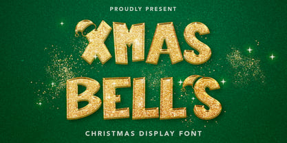 Xmas Bells - Christmas Display Font is a font with distinctive handwritten characters perfect for branding projects, logos, wedding designs, media posts, advertisements, product packaging, product designs, labels, photography, watermarks, invitations, stationery, and any project who need handwritten dishes. Features : • Character Set A-Z • Numerals & Punctuations (OpenType Standard) • Accents (Multilingual characters) • Ligature Multilingual Support : Afrikaans, Albanian, Asu, Basque, Bemba, Bena, Catalan, Chiga, Cornish, Danish, English, Estonian, Faroese, Filipino, Finnish, French, Friulian, Galician, German, Gusii, Icelandic, Indonesian, Irish, Italian, Kabuverdianu, Kalenjin, Kinyarwanda, Low German, Luo, Luxembourgish, Luyia, Machame, Makhuwa-Meetto, Makonde, Malagasy, Malay, Manx, Morisyen, North Ndebele, Norwegian Bokmål, Norwegian Nynorsk, Nyankole, Oromo, Portuguese, Romansh, Rombo, Rundi, Rwa, Samburu, Sango, Sangu, Scottish Gaelic, Sena, Shambala, Shona, Soga, Somali, Spanish, Swahili, Swedish, Swiss German, Taita, Teso, Vunjo, Zulu There it is! I really hope you enjoy it
 - Loli Pop by Hatftype,
$15.00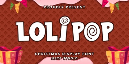 Loli Pop - Christmas Display Font is a font with distinctive handwritten characters perfect for branding projects, logos, wedding designs, media posts, advertisements, product packaging, product designs, labels, photography, watermarks, invitations, stationery, and any project who need handwritten dishes. Features : • Character Set A-Z • Numerals & Punctuations (OpenType Standard) • Accents (Multilingual characters) • Ligature Multilingual Support : Afrikaans, Albanian, Asu, Basque, Bemba, Bena, Catalan, Chiga, Cornish, Danish, English, Estonian, Faroese, Filipino, Finnish, French, Friulian, Galician, German, Gusii, Icelandic, Indonesian, Irish, Italian, Kabuverdianu, Kalenjin, Kinyarwanda, Low German, Luo, Luxembourgish, Luyia, Machame, Makhuwa-Meetto, Makonde, Malagasy, Malay, Manx, Morisyen, North Ndebele, Norwegian Bokmål, Norwegian Nynorsk, Nyankole, Oromo, Portuguese, Romansh, Rombo, Rundi, Rwa, Samburu, Sango, Sangu, Scottish Gaelic, Sena, Shambala, Shona, Soga, Somali, Spanish, Swahili, Swedish, Swiss German, Taita, Teso, Vunjo, Zulu There it is! I really hope you enjoy it
 - Martian Grotesk by Martian Fonts,
$35.00 Martian Grotesk is a large typeface family originally designed for the screen which consists of a variable font with 2 axes of variation and 63 styles: Condensed to Ultra Wide, Thin to Ultra Black. Aesthetics The font style is characterized by some brutality and assertiveness. Overhanging terminals, a closed aperture, and an almost complete lack of contrast lead to this effect. Additionally, some elements of the letters are especially enlarged. This font gives any text the impression of being a “signature” style. Nevertheless, we still maintain the golden mean between its rebellious nature and readability. Perfect for web development We created Martian Grotesk for the web and digital project world. When laying out web pages, frontend developers are constantly faced with the fact that uneven metrics do not allow text to be evenly placed on some design element, for example, on a button. Instead, they have to compensate in some way, like making the top padding smaller and the bottom padding larger in CSS. This little deal really hurts. Also, if your project adheres to design system principles, you might be unable to stand a lack of systematic approach when working with fonts. We researched and calculated vertical metrics and set them up in a way that guarantees equal space above the cap height and under the baseline. This enables the text labels to be evenly placed on buttons, inputs, lists, and forms. In addition, we found a proper ratio of the letter heights, so, with commonly used font sizes—10, 15, and 20 pixels—the glyph heights stick to the pixel grid. As a result, the letter shapes become sharper, which reduces the load on the reader's eyes and simply looks much better. The typeface also comes equipped with OpenType and TrueType hinting, and Martian Grotesk appears legible on most platforms, even when being rendered in small sizes. When coupled together, all the above features make Martian Grotesk a reasonable choice for any user interface design. Roadmap Martian Grotesk right now is a work-in-progress product. The font is completely ready for professional use, however, many great features are still ahead! For example, support for Extended Cyrillic characters, and italics. Pricing Purchasing an early version of the font presents the opportunity to get it at a very attractive price! That’s because with every new version, costs will go up to reflect the additional value that comes with every release. But after purchasing Martian Grotesk, all its future updates are included for free!
 - Codelia by Tabular Type Foundry,
$- No matter if you're professional or beginner, your work should be fun. And if you are a coder/programmer, your coding font should be something you enjoy looking for very long time. Square and crisp coding fonts might be easy on the pixels, but are they easy on your eyes? Do they keep you entertained at work? Codelia is a monospaced humanistic typeface designed for coding with focus on comfort and fun without sacrificing legibility or coding functionality. It's fun but not a joke. Its round shapes are easier on the eyes and make the code look less intimidating. It is not designed to make maximum use of every pixel on screen, but to make you forget about pixels. The italic is full of personality but sober enough to not draw unnecessary attention. Codelia works great for coding, but also in presentation, education as well as packaging and branding. Codelia is available in two families, one with coding ligatures and one without; ligatures in the latter are still present in Diescretionary Ligatures feature (dlig).
 - Boxed Round by Tipo Pèpel,
$18.00 Boxed Round is a rounded version of the popular Boxed font, a typeface whit 18 weights, brightly conceived and designed to look good on small screen devices, but offering also enlightened looks on paper. The semi-modular geometric font shapes seek to be fully responsive to the grid of screen’s pixels to deliver a crisp, fluid reading rate. The rounded version offers a more warm, sweet, edible appearance that will give more freshness to your texts. Due to its extensive range of weights and subtle difference in thickness, compensating for the stain of characters between different CSS styles is really easy. It offers an extensive set of Latin characters, even the Cyrillic.
 - Milafleur by ParaType,
$25.00 Milafleur presents the second member in the series of pictorial fonts with calligraphic miniatures by Lyudmila Mikhailova. The first font of the series, Milanette, was released one month earlier. Milafleur contains more than 60 pictures -- mostly flowers which define the origin of its name. In contrast to Milanette the pictures in Milafleur are less abstract and thus can be used as small illustrations in greeting texts, postcards, intimate notes, diaries and even in Christmas cards because some of the pictures show strobiles instead of flowers and coniferous branches instead of leaves. Released by ParaType in 2011.
 - Clocko by upirTYPO,
$7.00 Clocko automatically turns the time stamp text into an analog clocks using the OpenType ligatures. Even when the ligatures are turned off, the time is still visible and readable, and it does not change or ruin the layout. Perfect for web usage and even for small sizes. For a crisp look, please use sizes divisible by 30, for example 30pt or 60pt. To make a custom analog clock, type any uppercase or lowercase letter to have a border (see previews for examples), and then type the time in 12 hour or 24 hour format with or without seconds. Use colon, comma, semicolon, hyphen, period or plus as a separator. Few examples: 12:45 9:25:46 10.50 13:30.10 The borders can be mixed together for more interesting look, please see the screenshots above. An additional background shape can be added to the clocks by typing a symbol (! # $ % & ( ) < = > ) as a first character, for example %A12:40:55. Please note that in order to keep the clocks visible, the background shape and the clocks need to have a different colors.
 - MVB Celestia Antiqua by MVB,
$39.00Mark van Bronkhorst designed MVB Celestia Antiqua at a time when font choice was limited. Design was characterized by overuse of the few fonts that came with laser printers. A rustic typeface, recalling the roughness and irregularity of pre-digital printing, was a response to the cold crispness of DTP. MVB Celestia Antiqua holds its own among a large group of other “weathered” serif fonts, in part due to the size of the family: three weights, small caps, italics, and two titling styles. But it's also successful because it's simply drawn well, the contours only as rough as they need to be, enabling text at any size, large or small. - Peking Duck by Hanoded,
$15.00 I used to be a tour guide and I traveled to China numerous times. Usually, the itinerary mentioned going to a restaurant in Beijing and eating ‘Beijing Roast Duck’ (北京烤鸭), a famous dish that has been prepared since the Imperial era. Typically, the whole duck is sliced at your table. The skin is crisp, glazed and thin and you should eat it with thin pancakes and thinly sliced spring onion. Of course, if I had to guide several ‘China tours’ in a row, I would often eat something else (there is only so much Beijing Duck you can eat). Peking Duck is a nice, handmade, Chinese Ink font. Use it for your restaurant menu, your book covers or your posters, advertising oriental food!
 - Cajoun by Linotype,
$29.99Cajoun is a bold serif face from German designer Hans-Jürgen Ellenberger. The letters sit visually low on their baseline, in part due to their small x-height. Also, the curved portions of the letterforms have an old-style distribution of weight, which pulls the eye downward. This font has a contemporary feel, however, with crisp edges, and some pointy terminals. The typeface also contains old style figures. Cajoun is recommended for use in larger applications, where the eye can get a change to dance along its wide curves. Cajoun was designed in 2002, and is part of the Take Type 5 collection from Linotype GmbH." - Liza Pro by Underware,
$50.00 Lettres d’amour! Flirting, fashionable, provocative, emotional, casual, moderate, extremely sensible & beautiful - Liza Pro covers it all. Liza Pro, Underware’s dear creation, is a live-script typeface. Thanks to its extremely intelligent OpenType architecture, she approaches human hand lettering as closely as technically possible. Liza Pro deeply analyzes the text. Out of a stock of 4000 hand crafted characters, Liza creates the most optimal combination. All of this works automatically. All you need to do is start typing your lettres d’amour, and Liza makes the text always look different. She gives your creative piece the impression par excellence. Erotique mais intelligent. She is as clever as we could imagine. She kept all folks at Underware busy for a couple of years. It all started one rainy night back in May 2004 but quickly changed into a fatal affair exceptionnelle. But now, 5 years later we are quite sure: this is something serious. Yes, we are talking about real love. L’amour pour la vie. Liza Pro has Underware’s world-dominating Latin Plus character set, supporting a total of 219 languages (Latin 1 + 2 and beyond). Liza Pro is a package of 4 fonts which work together. Liza Display Pro rocks the script lettering to the max. The build-in Out-of-ink feature, LetterSwapper and Protoshaper makes this font a realtime-digital-calligrapher. She’ll swash up your text drastically, giving long strokes, loops and swashes to letters if their context allows. Liza Text Pro has a more silent, moderate character - she’s well behaving sister of Liza Display Pro, designed to walk long pieces of text in a lively script style. Liza Caps Pro adds more possibilities and functionality to these two script fonts. It bridges the gap in case running script lettering doesn’t do the job, but it also works perfectly on its own. Every capital letter appears in various shapes to obtain the manual lettering feeling. Liza Ornaments Pro is for extra delicatesse et est plus charme. Four heart winning fonts, pour la langue l’amour!
 - Komikaze - 100% free

- Lancelot Pro by Canada Type,
$39.95 When type historians look back on Jim Rimmer, they will consider him the last type designer who just couldn't let go of metal type, even though he was just as proficient in digital type. Lancelot is one definite case in point: A face designed and produced in digital as late in the game as 1999, only to spring onto the new millenium a couple of years later as a metal type cast in three sizes. That was Jim, a time traveler constantly reminding the craft of its origins. This particular time machine was originally designed as a simple set of attractive caps that emphasize the beauty of the variable conventional dialogue between the drawing tool and the intended final form, and the one exchanged within the totality of the forms themselves. Jim designed two weights, with contrast and counterspace being the main difference between them. In 2013, the Lancelot family was remastered and greatly expanded. Lancelot Pro is now a wonder of over 840 glyphs per font, including smaller versions of the caps in the minuscule slots, and alternates and ligatures that can transform the historic spirit of the original design into anything from half-uncial to outright gothic. Language support goes beyond the extended Latin stuff, to cover Cyrillic and Greek as well. 20% of the Lancelot Pro family's revenues will be donated to the Canada Type Scholarship Fund, supporting higher typography education in Canada.
