10,000 search results
(0.031 seconds)
- KS Roam by Kreuk Type Foundry,
$16.00 KS Roam is a handmade display font with fun thick brush impression at a glance. Brush inspired display with strong, catchy & striking form display. KS Roam ideally suited for headline title, logo, branding, posters etc.
 - Black Ocean by Fargun Studio,
$14.00 Introducing Black Ocean!! Handwritten font with quick dry strokes and a signature style. perfect for branding projects, home ware designs, product packaging or simply as a stylish text overlay to any background image or posters.
 - Khat Jannah by Motagadeda Type,
$40.00 Introducing Khat Jannah, a captivating and unique font that breaks away from traditional design conventions. This exceptional typeface pushes the boundaries of Arabic typography, offering a distinct and visually striking display font unlike any other.
 - Amila Cuties by Prioritype,
$14.00 Introducing. Amila Cuties: Cheerful and funny font with a natural impression from hand strokes. Great for design projects like quotes, posters, merchandise, social media posts, covers, and more. Features: Uppercase, Lowercase, Numeral, Punctuation & Multilingual. Thanks!
 - Summer Morning by Seemly Fonts,
$12.00 Summer Morning is a striking, bold display font. It can easily be matched to an incredibly large set of projects, so add it to your creative ideas and notice how it makes them stand out!
 - Sackers Square Gothic by Monotype,
$34.99Sackers Roman is an engraver, all-capitals family for invitations and stationery. The letters have strong contrast between thin and thick strokes. See also Sackers Gothic, Sackers Square Gothic, Sackers Script, and Sackers Classic Roman. - Pageu by Realtype,
$14.00 Pageu is a handmade font written with a real brush pen. Written with quick movements using a brush pen. It's Handwritten with quick dry strokes. Suitable for those who need a font with real textures
 - Sackers Roman by Monotype,
$29.99Sackers Roman is an engraver, all-capitals family for invitations and stationery. The letters have strong contrast between thin and thick strokes. See also Sackers Gothic, Sackers Square Gothic, Sackers Script, and Sackers Classic Roman. - HU Ketchup KR by Heummdesign,
$25.00 In HU Ketchup KR, the consonant and vowel strokes are naturally connected to add writing power to the thick headline, and the vowels are shaped like 'ㅅ', adding personality and cuteness at the same time.
 - Bubol by Hipopotam Studio,
$19.00 Typeface designed for award winning website www.bubole.pl. To be able to change fills and stroke color separately we created 3 fonts. Each glyph has an alternative version so it can give a more handmade impression.
 - Sign Display Casual JNL by Jeff Levine,
$29.00 A vintage hand lettered sign for a carnival game was the basis for Sign Display Casual JNL, a classic example of the "one stroke" casual text lettering that sets sign painters apart from sign manufacturers.
 - Barclay Outline by Monotype,
$29.99Barclay Outline is a headline font in the style of a modern typeface. The letters of the Barclay Outline font are like a bold modern face with a fine outline contrasted and strong shadow strokes. - Holywings by Fargun Studio,
$12.00 Introducing Holywings Font!! Handwritten font with quick dry strokes and a signature style. perfect for branding projects, home ware designs, product packaging or simply as a stylish text overlay to any background image or posters.
 - Easter Meadow by Seemly Fonts,
$14.00 Easter Meadow is a striking, bold display font. It can easily be matched to an incredibly large set of projects, so add it to your creative ideas and notice how it makes them stand out!
 - Sackers Solid Antique Roman by Monotype,
$29.99Sackers Roman is an engraver, all-capitals family for invitations and stationery. The letters have strong contrast between thin and thick strokes. See also Sackers Gothic, Sackers Square Gothic, Sackers Script, and Sackers Classic Roman. - PIXymbols Signet by Page Studio Graphics,
$29.00Font with elegant cursive script initials to create two-letter monograms for letterheads. Includes 37 borders, each accessed by a single key-stroke on the computer keyboard.The borders will automatically line up with the initials. - KampFriendship by Ingrimayne Type,
$9.95 KampFriendship is a casual, informal typeface family with serifs. The circular letters have an odd triangular shape. Because it has no contrast in the strokes, it appears to be neat but somewhat peculiar hand lettering.
 - Sackers Script by Monotype,
$40.99Sackers Roman is an engraver, all-capitals family for invitations and stationery. The letters have strong contrast between thin and thick strokes. See also Sackers Gothic, Sackers Square Gothic, Sackers Script, and Sackers Classic Roman. - Aetherline by Hazztype,
$20.00 Aetherline is a captivating vintage monoline script font that gracefully marries the nostalgia of the past with the sleekness of modern design. With its carefully crafted, unbroken strokes, Aetherline evokes the essence of classic handwriting.
 - Lotape by Hurufatfont,
$29.00 "Lotape" was designed by calligraphy artist Mustafa Eren and digitized by Oğuzhan Cengiz. It is striking with its unusual ligature structure. Ideal for creating special and unique header texts with swashes and rich ligature alternatives.
 - Sackers Classic Roman by Monotype,
$29.99Sackers Roman is an engraver, all-capitals family for invitations and stationery. The letters have strong contrast between thin and thick strokes. See also Sackers Gothic, Sackers Square Gothic, Sackers Script, and Sackers Classic Roman. - Mountisa by Lemonthe,
$15.00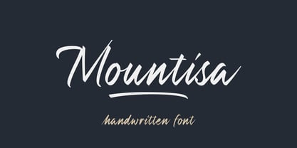 Mountisa is a script font with a dynamic and energetic style. It’s perfect for signature, stationery, photography, social media posts, product packaging, greeting cards, and every other design that needs a unique and striking font.
 - Peperoncino Vintage by Resistenza,
$29.00 Peperoncino is a sans serif font. Designed first with a marker, the irregular strokes create a fresh handmade feeling. After the big success of Peperoncino Family, we create its vintage version adding some "rusted" elements.
 - Posh by Lián Types,
$49.00 I've always been in love with fat didones. That’s the reason of Posh. In search of something unique, I started this family back in 2013 with the aim of creating the fattest yet readable bodonian typeface in the market: It was a challenge, because roman fonts need generous counters (or what some call white spaces) and taking them to the extreme of inexistence attempted against the construction of many glyphs. Ears, dots, terminals and serifs always need some extra space so I had to find the exact point of boldness to make characters which have those attributes work well in the middle of those which haven't. (1) After a while, I felt I was again ‘in my element’: Big contrasted letters, sexy and elegant curves, and that Lubalinesque feeling that characterise my fonts. (2) Words written with Posh are a explosion of elegance and sensuality due to the fact that its didone attributes were exaggerated. Since it’s full of alternate glyphs, one can change and choose them until a nice block of ‘‘black’’ is achieved. (3) To accompany the regular style, I designed Posh Inline, a font with the same quantity of glyphs than the regular one; an all caps style called Posh Capitals, and also a really playful Italic version. I hope you find this one delicious like I do! This font is dedicated to all who understand letters are not just meant to be read, but also to be appreciated in group and individually. Enjoy it. NOTES (1) In example, it can be easy to design a fat letter ‘n’ with almost no counter, but really tough to make a satisfactory letter ‘s’ with serifs to match that ‘n’. (2) Also, it wasn't my first attempt in fat didones. Take a look at my font Reina, made in 2012. (3) Posters above show many words with ball terminals that seem to dance above and below the words in order to fill those “undesired” blank spaces.
 - Stevens Titling by Linotype,
$29.99 Stevens Titling refers to the classic Roman alphabet as it appears on the Trajan column and numerous other monuments. With its realistic brush strokes, it shows the letterforms as they might have been sketched on the marble before the stonecutter reached for his hammer and chisel. The four fonts that constitute the Stevens Titling suite are named after animals — badger, boar, sable and wolf –, each known for the specific character of its hairs when used to make painting brushes. Sable Brush is the most formal and elegant, with solid forms which show no obvious trace of the handdrawn brush stroke; it comes with a set of small capitals for those classical titles preferred by Hollywood. In fact, each of these fonts would do a great job as a film title and poster font. The Badger Brush variant is compact and firm; Boar Brush is dramatic, and in Wolf Brush each part of the letter is made up of realistic, dry strokes.
 - ITC Hedera by ITC,
$29.99ITC Hedera's roots can be traced to a suite of initials intended for book design. Olivera Stojadinovic, the face's designer, made the first sketches for the initials with a handmade tool consisting of two flexible metal strips tied to a wooden handle. This makeshift pen created the distinctive uneven double strokes of the letterforms. Stojadinovic says that she tried to keep the original flavor of the sketches in the finished font. Stroke roughness has been preserved in final execution, though the characters had some cleaning and polishing," she notes. Based on Renaissance letterforms, ITC Hedera has a classical quality that complements its calligraphic exuberance. The name Hedera? According to Stojadinovic, "It's the name of a common ivy. I chose it because of the organic image of the character strokes, which, to me, resemble shapes from nature's leaves or stems of plants." Rough-hewn yet elegant, ITC Hedera is an exceptional display design." - Austin Antique by HiH,
$10.00 “More is better” may have been the motto of Richard Austin of Austin and Son’s Imperial Letter-Foundry on Worship Street at Finsbury Square in London when he designed and cut his Antique typeface. The year it was created is uncertain, but it is known to have appeared in a specimen book produced in 1827. At first glance, the upper case letters of Austin Antique look very much like Figgins Antique. But, upon examination, one will note that the Austin face is much darker. In general, the letters designed and cut by Richard Austin have fatter strokes, larger serifs and smaller counters -- more metal and less daylight. The premise was that the darker the letter, the more attention an ad using the typeface would receive. In old pictures of London and Paris one may see walls crowded with posters and “bills” -- competing for the attention of the passerby. Morris and Updike aside, the early nineteenth century marked the beginning of a commercial as well as industrial revolution. Patterns of commerce were changing. With new methods of marketing came the need for new typefaces to support the new methods. Foundries found the display types were very profitable and competed most energetically and creatively for the trade. There was a lot of trial-and-error. Some ideas faded away. Others, like the Antiques or Egyptians, were refined and developed. From them came the Clarendons that were to prove both popular and long lasting -- because they worked. Their job was to sell goods, not please the aesthetic sensibilities of the critics. They did their job well. Austin Antique has a full Western European character set, plus the following ligatures: ct, st, fi, fl, ff, ffi and ffl. Tabular numbers. Surprisingly readable.
 - Veto Sans by Monotype,
$50.99 Veto® Sans is both highly legible and handsomely distinctive – a rare blend in a typeface. It’s a design that stands out and fits in. Veto Sans is equally competent on screen and in print. It’s four carefully determined weights in both normal and condensed proportions, each with an italic complement, give the family an exceptionally deep range of applications. All the designs in the family are valuable design tools. None are superfluous. Advertising, brand, corporate, editorial and interactive design are all in Veto Sans’ wheelhouse. It also shines in wayfinding and other signage projects. And to all these, it brings a warmth and personality. An ample x-height, open counters, vertical stroke endings and subtly condensed capital letters enable Veto Sans fonts to perform with grace in print and digital environments while being space efficient. An added benefit is that all-capital typography set in Veto Sans is not only space saving, it’s also easy to read. Drawn as a complete reimaging of his earlier Veto design, Swiss designer Marco Ganz worked to create character shapes distilled to their purest forms while maintaining a relaxed and natural demeanor. Ganz, who is also a three-dimensional artist, is acutely aware that the negative space between letters and the internal space within letters is as important as the positive shape of the letters themselves. This dynamic balance between the negative and positive aspects of character forms gives Veto Sans a sense of immediacy without looking hurried. Ganz also took great care to draw a suite of italic designs that not only complement the roman weights perfectly, but also give the family a dynamic verve. A large international character set also ensures ease of localization. “Veto Sans,” says Ganz, “is a typeface for designers that search for a new and different solution to age-old typographic challenges.”
 - Ebony by TypeTogether,
$35.00 Some typefaces need time to ripen; Burian and Scaglione made the first sketches for Ebony back in 2008, but it took a few years of maturing in a drawer to be developed into a multi-functional type family. While keeping in tune with TypeTogether’s focus on complex typographic structures needed for magazine, newspapers and books —whether printed or digital—, Ebony goes far beyond editorial use and promises great performance in branding and advertising. The range of dark weights with taut and powerful curves can boost any headline, while the lighter styles create an approachable and clean feel in blocks of continuous text. Ebony does not fall short on aiding legibility either; letterforms have a distinct direction of ductus and features like the top serif on ‘l’ help making them clearly distinguishable from each other. It is a type family that cleverly seeks a balance between the openness and legibility of humanist sans serifs and the striking and more regularised character of grotesques. The letter-shapes feature generous counters and open terminals with crisp angles, and daringly grow both in colour and width as the fonts get bolder. Infused with this strength, Ebony also shows a quirky side in some of her shapes; the vertical fractions, the at-symbol, the old-style numbers, … The predominantly slanted style of the italics is broken up in some letterforms, such as ‘a e f l’, that are more in line with a classic cursive appearance. This, together with a forceful italic angle, ensure a change in texture within a block of text, despite sharing the same letter weight and width with the uprights. With 18 styles, tending towards the heavier part of the weight-spectrum, this face has a powerful quality!
 - Guhly by Ingo,
$35.00 A modern Sans Serif — prosaic, designed geometrically, beautiful in large sizes All the dimensions of the font are based on Factor 10. The general principle of construction leads to slim forms and nearly equally wide characters. So the font appears very solid but is actually difficult to decipher in longer texts. Along with the ”normal“ Guhly Regular there are also the two versions Guhly Light and Guhly Bold, whereas in each only the vertical strokes [Guhly Light] or horizontal [Guhly Bold] have been changed in strength. The result is a very individual decorative effect which slightly reflects old circus and western scripts. The lower case characters in the version Guhly Book are, therefore, optimized to be suitable for longer texts in smaller font sizes — because after all, sometimes you should read a bit more than just the headline… The design of a shampoo bottle stands behind the creation of this sans serif display font. Prominent, clearly constructed forms with circular arcs define its appearance. This is a font primarily designed for use with capital letters — for all sorts of advertising purposes, headlines and titles. But lower case letters also belong to a good functional font; so, of course, Guhly includes them and ligatures for the more ”critical“ letter combinations as well as stylistic alternates for the letters K (or k), V (v) and o. As a decorative “encore”, the Guhly family also contains the “normal” weight in two variants: on the one hand the Guhly Cutout – these are letters without counter, as if the letters were cut out and the internal surfaces fell out; and on the other hand the Guhly stencil – as the name suggests, a stencil font with the typical bars that give a stencil the necessary cohesion.
 - Sennit by AType,
$29.95It is not simple sennit. You know that such Russian lapti? It is footwear plaited of stripes a bark of a linden. My font too all is made from stripes. From the first up to last letter. Funny isn't it? - Leifa by Identity Letters,
$39.00 A flare-serif socialite. Elegant and affable at once. Leifa is a flare-serif typeface that strikes a balance between elegant and affable. It’s pleasant to read in text sizes yet takes center stage in headlines and display applications. With its higher-than-usual contrast, Leifa might evoke Didone typefaces at first. However, it differs from strictly Didone designs in the details: flattened serifs and deeply incised, tapered spurs provide an organic effect. These humanist elements are restrained and almost inconspicuous in body copy. It’s in display sizes that they realize their full potential. Set your message in Leifa, set it large, and it will get noticed. A true socialite, Leifa is a most welcome guest on any party. With its dual character and a range of weights that allow for fine-tuning the desired visual voice, it’s a brilliant choice for branding and editorial design. Its good-natured yet sophisticated character makes Leifa the perfect typeface for fashion, sports, lifestyle, social media, food and cooking, health, beauty, architecture, interior design, art, literature, theater, and travel. (And any other topic that you’d love to talk about at a dinner in good company.) The entire font family consists of eight weights. Each comes with an italic counterpart, totaling 16 styles. Leifa’s italics are oblique, optically corrected versions of the upright styles. Each style comprises a character set of 883 glyphs that includes small caps, a set of ligatures, tabular and old-style figures, case-sensitive forms, fractions, symbols, and many other features. Four stylistic sets allow you to adjust the appearance of the Leifa fonts: a single-story a (SS01), a simple f (SS02), a triple-story g (SS03), and thin punctuation marks (SS04) are at your disposal. If you’re looking for a typeface with some debonair spirit, look no further than Leifa.
 - Quarzo by Corradine Fonts,
$39.95 This script font is inspired by the flexible nib strokes to create a concatenation of refinement with character mixing the contrast with pronounced but rounded angles. This angles along with the inktraps give the font a better performance when printing. Texts will have a very even rhythm due to its consistency on the stroke’s angle and spacing. The words can receive a dramatic touch by using the wide range of glyphs with curly and refined ornamentation. There are lots of caps and number variants dressed up with a variety of swashes. Also, two sets of versatile ornaments will be found: a first set of ending flourishes that match with any lowercase letter and a second set of independent flourishes to be placed around the words. Quarzo will give a great sophistication level to invitations, cards, tags, menus, advertising and packaging. Its character map covers Western and Central European characters.
 - Cloudbuster by K-Type,
$20.00 Cloudbuster is K-Type’s take on the mid twentieth century style of extra condensed slabs/moderns inspired by Imre Reiner’s Corvinus Skyline of 1934. Unusually, Cloudbuster has a printed-look softness, courtesy of very slightly rounded corners throughout, so it looks a little less harsh than similar typefaces. The font is an imposing display face with elegant, unfussy letterforms and a generous x-height.
 - Popten Display by Saffatin.co,
$10.00 Popten is a modern minimalist design typeface with semi condensed conture and include alternative character also some ligature. It is inspired by hype and urban design, freestyle and brutalism. Popten typeface suited for anything lifestyle project with trend design. It was designed to be versatile, to blend in your design with light or dark through thin to black weights can add a lot of touch of personality.
 - Brasilica by CAST,
$45.00 Brasílica is a robust design, with wide proportions, that assimilates influences both from old style and modern types. This wide shapes, as well as the moderate contrast and sturdy serifs make it suitable to different conditions of printing. The sharp corners, as well as the abrupt connections and terminals are remarkable features of this typeface, that renders a sturdy and crisp texture, with a distinct aspect.
 - Nouveau Standard JNL by Jeff Levine,
$29.00 The hand lettering found on the cover of the 1912 sheet music for "Somebody Else is Getting It" featured a blockish Art Nouveau style with rounded corners and a very lurid title [although it likely had a more innocent meaning in those days than the casual observer might interpret today]. Now available as Nouveau Standard JNL, it is available in both regular and oblique versions.
 - Toska by Locomotype,
$20.00 Toska is a geometric sans serif font. This font has a strong but friendly impression because the rounded corners make the eyes feel comfortable. Suitable for headings, poster titles, logotypes, signage, packaging and Toska can even be used for interesting paragraphs. Comes in eight weights, each weight having an italic version so you are free to pair various weights to make your typography more attractive.
 - Board Deluxe by Katatrad,
$29.00Display block letters inspired by train station LED board. Board Deluxe is a humanist version of previously release Board based on bitmap diamond cells pixel font. Original Board (released by T.26) provided rounded corners diamond shape cells deliver surprisingly nice texture when use in extra large size. Board Deluxe gives you solid headline letters that spell out the midpoint between Digital and OldStyle. - Nouveau Moderne JNL by Jeff Levine,
$29.00 The cover of the 1904 sheet music from the Tibetan comic opera “The Forbidden Land” had the title hand lettered in an unusual Art Nouveau style. Mostly squared with rounded corners, many of the characters twisted, turned and extended in ways that took on the look of the Far East. This became the design model for Nouveau Moderne JNL, which is available in regular and oblique versions.