10,000 search results
(0.029 seconds)
- MM Cruella by MM Fonts,
$39.00 MM Cruella is a monolinear display typeface well suited for magazines headlines, posters, catalogs, branding and packaging. The round, large counters combined with the rounded terminals gives it a very fluid look and a warm character while the straight lines establishes a nice rhythm. It comes in 5 weighs and is loaded with discretionary ligatures and contextual alternates that will give your next project a very distinctive look.
 - BOXDON Titling by TYDTYP,
$15.00 BOXDON is an extra heavy expanded typeface which was especially designed for VERTICAL layout. Each shape looks like a box and has minimum graphical treatment to distinguish each character. It means that the counter space is not enough to use this typeface for small font sizes, however, for titles this typeface should give incredible effects. I highly recommend using it with software that is compatible with vertical layout. (e.g. Adobe illustrator)
 - Kenwyn by Talbot Type,
$19.50 Kenwyn is a bold, geometric, Egyptian style slab-serif display font. It comes in two variations — Single Dot and Double Dot — each with an accompanying Stencil variation. Essentially a blend of circles and squares, Single Dot features a circular counter at the centre of each character, while Double Dot uses a lower and upper circle. Although the two variations are similar in principle, the results are visually quite different.
 - Cobe by Stawix,
$39.00 The result of reducing elements of letterforms to only its necessity in lowercase is mostly influenced by the ideal of Aerodynamics. The true intention behind the design of Cobe is to construct a fluid typeface while maintaining a strong structure of uppercase that possessed distict forms, shapes and corners, resulting in an eye-pleasing texture when forming a sentence. Cobe comes in 9 consecutive weights with italics and standard features.
 - Golden Beach JNL by Jeff Levine,
$29.00 Art Deco monogram initials on a vintage business card from the Miami area inspired Golden Beach JNL. The font was named for a small upscale South Florida residential community located between Sunny Isles Beach in the Northern part of Miami-Dade County and Hallandale Beach in Southernmost Broward County.
 - Magallanes Condensed by Latinotype,
$29.00 Say hello to the new Magallanes Condensed Family, a contemporary neo-humanist sans serif font designed by Daniel Hernández. Its strokes and terminals are related to the calligraphic strokes from humanist typefaces. It comes with 8 styles, from Ultra Light to Black, each with its true italics. Every weight comes with alternative glyphs for a more dynamic use. Magallanes is the perfect titling font to complement text faces in magazines, logotypes, etc. Languages supported include Basic Latin, Western European, Euro, Catalan, Baltic, Turkish, Central European, Romanian, Pan African Latin.
 - Decize by Eurotypo,
$36.00 Decize font is a classic “Didona”, characterized by extreme contrast in thick strokes and thin strokes, by the use of very short serifs, and by the vertical stress of the letters. This version, designed by Carine de Wandeleer, is slightly condensed and is also enriched by a full set of OpenType features of tails, ligatures, alternates and swashes. Decize Italica is a true "italic" This font was designed and carefully drawn to combine with Decize Regular, it has 652 glyphs and the same OpenType features than the regular version.
 - Magallanes by Latinotype,
$29.00 Say hello to the new Magallanes Family, a contemporary neo-humanist sans serif font designed by Daniel Hernández. Its strokes and terminals are related to the calligraphic strokes from humanist typefaces. It comes with 8 styles, from Ultra Light to Black, each with its true italics. Every weight comes with alternative glyphs for a more dynamic use. Magallanes is the perfect titling font to complement text faces in magazines, logotypes, etc. Languages supported include Basic Latin, Western European, Euro, Catalan, Baltic, Turkish, Central European, Romanian, Pan African Latin.
 - Cashback by AVP,
$15.00 A rounded geometric font of uniform stroke weight. All strokes have rounded ends and with the exception of the math symbols, there are no diagonal strokes.
 - Baedar by Craft Supply Co,
$20.00 Introducing Baedar – Bold Rounded Sans Serif Font Baedar – Bold Rounded Sans Serif, a font designed to captivate your attention, is both inviting and approachable. Its rounded corners create a warm and friendly vibe that instantly draws in readers. Eye-Catching Appeal Baedar’s boldness immediately grabs your eye, making it perfect for headlines and attention-grabbing text. Whether it’s a poster, website, or marketing material, this font ensures your message unequivocally stands out. Versatile Usage Furthermore, with its rounded edges, Baedar exudes friendliness. Consequently, it suits a wide range of projects, from branding to social media posts, adding a touch of approachability to your content. Readability and Impact Moreover, Baedar combines readability with visual impact, making it ideal for conveying important messages with flair. Its boldness ensures crystal-clear clarity, while the rounded corners gently soften the overall look. In Conclusion Baedar – Bold Rounded Sans Serif Font strikes the perfect balance between eye-catching design and friendliness, making it an excellent choice for various creative endeavors. Therefore, seize your audience’s attention and convey your message effectively with this versatile font.
 - Easy Living JNL by Jeff Levine,
$29.00 Easy Living JNL is a bold Art Deco type face modeled from the name of a 1930s magazine entitled "Country Living".
 - Out Back by chicken,
$17.00 A twice-painted sign in Tobago's back country was the seed for this weird grab-bag of chunky, slightly sleazy letterforms.
 - Donut - Unknown license

- Le Be MF by Masterfont,
$59.00 Revival of typographer and punch cutter Guillaume LeBe’s Hebrew typeface from the 1580.
 - American Spirit STF by Altered Ego,
$30.00American Spirit STF is a glorious collection of contemporary patriotic symbols: US Flags (traditional and contemporary), a variety of stars, eagles, torches, and combinations of them all. Designed for print and web, this collection is useful for embellishing your designs with a subtle (or not-so-subtle) patriotic touch. The flags have been designed for easy ungrouping in a drawing program, in order to colorize the union and stripes. And as a special feature, American Spirit™ splits the flags into two characters (the union and the stripes) that can be separately colored and will kern together based on the character chosen. Suggestions for doing this are included in every package. This versatile collection also contains a special contemporary version of the US Flag, with rounded corners on the union and stripes, and a five-pointed asterisk-like shape as the stars. (This allows the stars to appear as stars at smaller sizes.) Show your American Spirit! Sign up today for this contemporary collection of patriotic symbols! - Chronosfer by Anomali Creative,
$19.99 The concept of this font are Inspired by stories of space travel, interstellar war. social life in the galaxy. So we chose the name Chronosfer, which was said to be similar to Chromosphere. The chromosphere is the second most outer layer of the Sun. Several thousand kilometres thick, it resides above the photosphere and beneath the corona. Due to its low density, it is relatively transparent, resulting in the photosphere being regarded as the visual surface of the Sun. What Featured on this font? Glyphs count is 281 glyphs each style. Have some alternate characters International Language Support Best to use on Hi-Tech Style design Space or cosmos theme design
 - Aistoria by Black Studio,
$29.00 New from Black Studio, presenting Aistoria is a typeface that is feminine, adaptable, aesthetically contemporary and creates limitless variety for your creative needs. Its striking contrasts and subtle details, together with luxurious strokes and voluptuous curves, create a beautiful and powerful statement for any typographic composition, blending glamor with contemporary aesthetics. Aistoria really helps you create unlimited variations for your creative needs in making your project titles: such as Books, fashion, magazines, logos, branding, photography, invitations, wedding invitations, quotes, blog headers, posters, advertisements, postcards, books, websites, etc. WHAT IS INCLUDED; • Aistoria – Regular This typeface of has become the work of true love, making it as easy and fun as possible. I can't wait to see what you do with Aistoria! Feel free to use the #Black Studio tag and the #Aistoria font to show what you've done, I really hope you enjoy it! Thank you!
 - AB Ticena by Andres Briganti,
$20.00 Elegant and idiosyncratic, AB Ticena is a display and extended typeface inspired by the ancient forms of Lombardic capitals. The sometimes quirky and capricious letterforms take their inspiration from medieval forms found in inscriptions and manuscripts where latin Roman capitals were taken to new stylistic and even extreme expressions. The ultra-wide horizontal proportions and its modulated, humanistic strokes gives it a more refined and contemporary edge. AB Ticena works best for logotypes, short and striking headlines, and editorial purposes. A set of ligatures and stylistic alternates is also available for selected characters and pairings.
 - Mocacino by Arkalandara,
$120.00 The elegant handwritten font for this brand exudes sophistication and timeless charm. Its strokes are fluid and graceful, reminiscent of a skilled calligrapher's penmanship. The letters are carefully crafted with a balance of curves and straight lines, creating a harmonious and refined look. The font maintains a moderate size, allowing for readability without sacrificing the delicate details that make it elegant. Each letter flows seamlessly into the next, creating a sense of continuity and grace. The spacing between characters is thoughtfully considered, striking the right balance between openness and cohesion.
 - Winter Beast by Figuree Studio,
$18.00 Winter Beast is a captivating winter brush font that unleashes the untamed spirit of the season. With its bold, brisk strokes, this font encapsulates the raw beauty and power of winter, making it the perfect choice for projects that demand a rugged, cold, and untamed aesthetic. Whether used in winter-themed designs, holiday graphics, or any project that seeks to embody the frosty allure of the season, Winter Beast adds a chilly and visually striking element to your typography, making your text stand out like fresh snow on a moonlit night.
 - Mikhael Handwritten by Letterara,
$16.00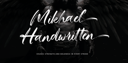 Introducing Mikhael Handwritten, an authentic brush script font that brings a raw and energetic vibe to your designs. With its dynamic strokes and natural brush texture, this font is crafted to make a bold statement in logos, posters, packaging, and various design projects. Its striking appearance and smooth flow make it an ideal choice for conveying a strong and stylish impression. PUA encoding ensures effortless access to all the expressive glyphs. Elevate your projects with Mikhael Handwritten, a font that effortlessly infuses vigor and character into your creative endeavors.
 - Ludwigon by IbraCreative,
$17.00 Ludwigon is a contemporary serif typeface that seamlessly melds timeless elegance with a modern sensibility. With its gracefully elongated serifs and refined letterforms, Ludwigon exudes sophistication and readability, making it a versatile choice for a wide range of applications. Its clean lines and balanced proportions lend an air of classic refinement, while subtle design nuances, such as tapered stroke endings and graceful curves, infuse it with a touch of contemporary flair. Ludwigon strikes a harmonious balance between tradition and innovation, making it a compelling choice for projects seeking a timeless yet fresh typographic aesthetic.
 - Hesperides by Scriptorium,
$18.00Hesperides is based on samples of Colonial period calligraphy. Rather than being directly derived from any one sample, some common characteristics have been emphasized to give it a more coherent and distinctive look, with the accentuated single-looped strokes on many of the characters suggesting a fully flourished style, but showing a bit of restraint. The ultimate effect is really striking, in the tradition of our Queensland and Allegheny fonts, but even more distinctive. The full version includes alternate versions of many of the key characters designed to reduce loop interference and add variety. - Hiragino Serif by SCREEN Graphic Solutions,
$210.00 Hiragino Serif (Mincho) is a font adapted for the digital age. It was designed to permit finely detailed tuning that allows the sizes of both kanji and kana to be adjusted for greatest visibility. It also broadly satisfies the needs of modern graphic design in advertising, posters, pamphlets, magazines, and other such uses. The font makes the counters comfortably wide while gracefully raising the text's center of balance, ensuring that the typeset characters will be smooth and well-defined. It gives each line a modern impression thanks to a judicious balance of light and shade and draws out a vivid readability that makes it possible to comfortable push forward with one’s reading. Latin alphabet and numbers have all been originally designed so that the weights of typeface and the flow of the baseline between Japanese and Latin characters are extremely consistent. Of particular note, vertically formatted text that mixes both Japanese and Latin characters can be beautifully rendered using only this typeface. Thanks to the use of authentic and sophisticated basic design , it creates a different atmosphere by combination of optional unique kana typefaces.
 - Franklin Gothic by Linotype,
$45.99Franklin Gothic was designed by Morris Fuller Benton for the American Type Founders Company in 1903-1912. Early types without serifs were known by the misnomer "gothic" in America ("grotesque" in Britain and "grotesk" in Germany). There were already many gothics in America in the early 1900s, but Benton was probably influenced by the popular German grotesks: Basic Commercial and Reform from D. Stempel AG. Franklin Gothic may have been named for Benjamin Franklin, though the design has no historical relationship to that famous early American printer and statesman. Benton was a prolific designer, and he designed several other sans serif fonts, including Alternate Gothic, Lightline Gothic and News Gothic. Recognizable aspects of Franklin Gothic include the two-story a and g, subtle stroke contrast, and the thinning of round strokes as they merge into stems. The type appears dark and monotone overall, giving it a robustly modern look. Franklin Gothic is still one of the most widely used sans serifs; it's a suitable choice for newspapers, advertising and posters. - Engravers' Gothic BT by Bitstream,
$29.99 Gothic capitals of the same form as Copperplate Gothic, lacking only the oversharpened corners.
 - Curtain Up JNL by Jeff Levine,
$29.00 The 1937 sheet music for the tune "Sweet Stranger" has the title hand lettered in a round cornered Art Deco sans with an inline featuring square corners. Now available as Curtain Up JNL, it is available in regular, oblique, solid and solid oblique versions (for those who prefer a version without the inline).
 - Klone by Linecreative,
$12.00 Klone is a slab-serif font that gives the impression of being clean and very elegant. This font supports Latin and Western European languages. It is also equipped with ligatures, so you can design without limits. The Regular style has traditional square edges and corners, the Stamp style features rounded edges and corners.
 - Maga by DSType,
$40.00 Maga shares the skeleton with one of our first typefaces (Quaestor, from 2004), but we didn't want to simply expand an existent design, so we took a step forward—not just with improved features and new weights, but also making the italics more usable than its predecessor. The balance between the counters and the space between letters makes this a very space-saving typeface with plenty of legibility, yet stylish enough for contemporary magazine design.
 - Espect Retro by Mans Greback,
$59.00 Espect Retro beckons to the discerning eye with its harmonious blend of the modern and the classic. Its wide, yet hairline-thin structure gracefully extends into elongated serifs, giving it a poised and elegant stance. The extended x-height isn't just noticeable; it's a celebration of design that evokes charm and cuteness in every curve and counter. Espect Retro's lightness radiates a fashion-style sophistication, making it a go-to for classy projects.
 - Graffix by Studio K,
$45.00 Graffix is best described as a modern classic. A crisp geometric sans serif with just a hint of Art Deco in the roll of the capital A, D & R, and the curvaceous lines of the capital M, V & W. The distinctive tear shaped counters of the lower case a, b, d, p & q give it its essential character, together with such quirky features as the angular descenders of the lower case g and j.
 - Decutto by Michael Rafailyk,
$15.00 Decutto is a neo-grotesque that packs the Marionette formula and some blackletter ideas into a low-contrast sans serif design. Its name plays on the phrases “off cut” and “cut to” which express the key feature – the contemporary legible letter shape is decorated with cut carved edges and counters, giving the typeface crisp and simplistic look, like that of an old minted coin. Scripts: Latin, Greek, Cyrillic, Hebrew. Hinting: Manual PostScript.
 - Aribau Grotesk by Emtype Foundry,
$69.00 Born from the intersection of the geometric and grotesque typefaces. Aribau Grotesk combines low contrast and generous width proportions with typical traits of american gothics from the early 20th century, like the counters aperture and a double story ‘g’. Driven by the process, some details that come from the geometric style arose, like the clean-shaped figures and the circular dots that convey a more affable and contemporary look. Aribau Grotesk PDF.
 - ND Gestalt by NeueDeutsche,
$9.00 If you watched ND Gestalt glitter in the dark near the Tannhauser gate. You know all these sans serifs will be lost in time, like tears in rain… If you like circles you will like ND Gestalt just as much. The unconventional stem to counter bridge in the lowercase gives this one its rather unique appeal. Fonts like this are unlike any other font – they’re either a benefit or a hazard. Beware!
 - Foundry Form Sans by The Foundry,
$90.00 Foundry Form Sans and Serif were drawn concurrently with matching proportions for harmonious use. Although designed to complement each other both families function independently. The Foundry Form Sans characters have a strong horizontal emphasis for readability; open counters to improve legibility at small sizes; and slightly condensed proportions to ensure economic use of space. Foundry Form Sans has a simplicity of design approach balanced with just enough character to achieve a unique, timeless look.
 - Solemnis by Berthold,
$67.99 Solemnis was designed by Günter Gerhard Lange in 1953 and is a uncials-based typeface.
 - Brion by The Northern Block,
$12.80 An elegant typeface with rounded corners influenced by the work of Visual Graphics Corporation ( VGC ).
 - VT Showcard by VarsityType,
$15.00 This condensed block is a true knockout. VT Showcard is a heavy-hitting headliner with presence. Inspired by the boxing showcards of the 60’s and 70’s, VT Showcard towers over body copy and demands attention. This tall and mighty athletic display typeface features chiseled corners and subtle embellishments that reinforce a steady rhythm across its dramatic letterforms. With 7 weights, VT Showcard provides a versatility for sports headlines and similar projects.
 - Stovepipe Stencil JNL by Jeff Levine,
$29.00 Stovepipe Stencil JNL was not directly designed from a vintage source, but it does draw its influences from classic sans serif lettering of the past. Even its name borrows (somewhat gratuitously) from the "stovepipe" lettering so popular with sign painters. True stovepipe letters tend to be squarer with rounded corners, but the name has also been loosely associated with some tall, condensed type styles. The typeface is available in both regular and oblique versions.
 - Dexa Round by Artegra,
$29.00 Dexa Round is the round cornered version of the Dexa Pro superfamily. It has 18 fonts with thin to black weights, along with their true italic counterparts. With more than 770 glyphs per font, It supports all the Latin languages as well as the Cyrillic ones. OpenType features: small caps, caps to small caps, alternates, old style figures, tabular lining, old style tabular lining, language localizations, ligatures, superscript, subscript, numerators, denominators, fractions, historical forms.
