10,000 search results
(0.034 seconds)
- Star Kids by Rockboys Studio,
$23.00 Star Kids is a display font that embodies fun, quirkiness, and authenticity. This enchanting display font will turn any creative idea into a true standout. Get inspired by its childlike playfulness, and use it to brighten up any kids and school project!
 - Organic Benefit by Bogstav,
$15.00 Say hello to my new organic monospaced unicase font! It's handmade and has this true organic look to it! Choose between 5 different versions of each letter, or just type ahead and let the Contextual Alternates do their cycling of letters automatically!
 - Zhivanii by Sipanji21,
$15.00 Zhivanii is a handwritten and modern display font. This enchanting font will turn any creative idea into a true standout. Get creative with its unique look, and use it to brighten up any crafting project! This includes both Latin and Cyrillic characters.
 - Valkids by Letterara,
$12.00 Valkids is a cute and sweet handwritten font with an incredibly friendly feel. This font will turn any creative idea into a true piece of art! This font is PUA encoded which means you can access all of the cute glyphs with ease!
 - LD Dear Diary by Illustration Ink,
$3.00If you've got a secret to tell, or just crave a unique font for cool scrapbook journaling, "Dear Diary" will fit the bill. This true type font looks handwritten with tall uppercase letters, and small, narrower lowercase script. Have some fun with it! - Higher Wevil by Aldedesign,
$25.00 The Higher Wevil is a crafty and distinctive display font. With a combination of pixel-art and scary horror themes. Masterfully designed to become a true favorite, this font has the potential to bring each of your creative ideas to the highest level!
 - Staly Home by IbeyDesign,
$17.00 Staly Home Handwritten Script Font is an exquisite handwritten font, masterfully designed to become a true favorite. It maintains its classy calligraphic influences while feeling contemporary and fresh. Fall in love with Stay Home and bring your projects to the highest levels.
 - Andina by Nissa Nana,
$23.00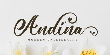 Andina is an exquisite handwritten font, masterfully designed to become a true favorite. It maintains its classy calligraphic influences while feeling contemporary and fresh. This font is PUA encoded which means you can access all of the glyphs and swashes with ease!
 - Andalusia Signature by Letterena Studios,
$9.00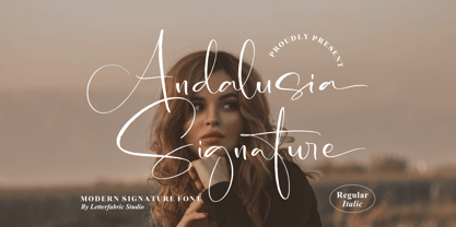 Andalusia Signature is an exquisite handwritten font, masterfully designed to become a true favorite. It maintains its classy calligraphic influences while feeling contemporary and fresh. This font is PUA encoded which means you can access all of the glyphs and swashes with ease!
 - Mansions Brush Script by Joelmaker,
$16.00 Mansions Brush Script is a handwritten font, which is so soft and modern, perfect for those who like logo designs, printed T-shirts, quotes, branding, stickers, and posters. Get this package right away, make your graphic imagination come true with Mansions Brush Script.
 - Cerellia by Illushvara,
$12.00 Cerellia is a bold script font, carefully handcrafted to become a true favorite. Its casual charm makes it appear wonderfully down-to-earth, readable and, ultimately, incredibly versatile. Fall in love with its incredibly versatile style and use it to create spectacular designs!
 - Vallisa by Letterara,
$12.00 Vallisa is a cute and sweet handwritten font with an incredibly friendly feel. This font will turn any creative idea into a true piece of art! This font is PUA encoded which means you can access all of the cute glyphs with ease!
 - MACIZA, designed by Pedro Pan, stands as a robust and striking display font that commands attention. Its design embodies a solid, heavy presence that suggests it's built for impact and emphasis, maki...
- Kremlin Chairman, crafted by the innovative minds at Bolt Cutter Design, is an evocative typeface that plunges deep into the heart of Soviet-era typography yet carries a modern twist that makes it re...
- Barrio 30 is a distinct and vibrant font that seems to encapsulate the spirit of the street and community, evoking a sense of togetherness and local flair. It's a font that doesn't just speak; it sho...
- EURONEW, created by the talented designer Pedro Pan, is a modern and versatile font that seamlessly blends contemporary aesthetics with functional design principles. At its core, EURONEW is a sans-se...
- Barchowsky Fluent Hand by Swansbury,
$24.00Swansbury, Inc. provides handwriting instruction to all ages, accompanied by two exemplar fonts, Barchowsky Fluent Hand.otf and Barchowsky Dot.otf. The basis for the design of the characters is the italic of the Renaissance. With the advantage of contextual alternates, Barchowsky Fluent Hand automatically joins lowercase letters so it can be used in any venue where a clean and elegant appearance of handwriting is desired. The fonts allow maximum instructional flexibility. Aside from their use in lesson plans, educators can customize pages for specific student interests, studies and needs. Included are all math symbols that one typically encounters in school curricula. Nan Jay Barchowsky, designer of this font, believes that children should hone their handwriting skills as they learn all subjects, reading, math, history and foreign languages. Both fonts support all Western European languages and Turkish. Barchowsky Dot is for young children or others who need remediation. The letterforms are identical to those in Barchowsky Fluent Hand. Used at a large point size open dots appear within the lines that form the characters indicating where one should start each stroke in a letter or number. Once formations are learned Barchowsky Fluent Hand can be used with the contextual alternates turned off until students are ready to write in the joined-up manner of a true cursive. Specifications: The technology for fonts that automatically join letters, or allow them to be unjoined is relatively new. At present, both fonts work on Windows XP with Service Pack 1 or later (or Vista), using AbiWord, a free word processor (go to abisource.com). They also work well with InDesign 2. Currently there is an unknown factor in later versions of InDesign for Windows that disallows joining. Macs completely support the fonts using InDesign 2 and later, PhotoshopCS and IllustratorCS. If you do not have these applications, there is an inexpensive word processor for Macs. - Barchowsky Dot by Swansbury,
$17.00Swansbury, Inc. provides handwriting instruction to all ages, accompanied by two exemplar fonts, Barchowsky Fluent Hand.otf and Barchowsky Dot.otf. The basis for the design of the characters is the italic of the Renaissance. With the advantage of contextual alternates, Barchowsky Fluent Hand automatically joins lowercase letters so it can be used in any venue where a clean and elegant appearance of handwriting is desired. The fonts allow maximum instructional flexibility. Aside from their use in lesson plans, educators can customize pages for specific student interests, studies and needs. Included are all math symbols that one typically encounters in school curricula. Nan Jay Barchowsky, designer of this font, believes that children should hone their handwriting skills as they learn all subjects, reading, math, history and foreign languages. Both fonts support all Western European languages and Turkish. Barchowsky Dot is for young children or others who need remediation. The letterforms are identical to those in Barchowsky Fluent Hand. Used at a large point size open dots appear within the lines that form the characters indicating where one should start each stroke in a letter or number. Once formations are learned Barchowsky Fluent Hand can be used with the contextual alternates turned off until students are ready to write in the joined-up manner of a true cursive. Specifications: The technology for fonts that automatically join letters, or allow them to be unjoined is relatively new. At present, both fonts work on Windows XP with Service Pack 1 or later (or Vista), using AbiWord, a free word processor (go to abisource.com). They also work well with InDesign 2. Currently there is an unknown factor in later versions of InDesign for Windows that disallows joining. Macs completely support the fonts using InDesign 2 and later, PhotoshopCS and IllustratorCS. If you do not have these applications, there is an inexpensive word processor for Macs. - Charpentier Renaissance Pro by Ingo,
$42.00 A very legible Renaissance Antiqua This typeface is based on the desire to create an Antiqua like those which might have existed at the beginning of the »printing age« — the basic form oriented on the classical Roman and early Middle Ages models, the ductus defined completely by writing with a wide pen and much individual expression in detail. In the spring of 2005 I had the opportunity to closely examine a few pages in the famous book »Hypnerotomachia Poliphili« from 1499. The script used here from Aldus Manutius is exemplary. Most of the book, however, is not very carefully printed. The characters do not stay on the line; the print is at times too strong and at times much too weak. And on these imperfect pages the true character of the letters is recognizable; that is, that they are cut with lively detail which is a result of the patterns provided by full-time writers. After all, around 1499 script was written as a rule and the printed type was oriented on this pattern. I prefer the typeface on the lightly printed pages. The characters are not placed neatly on the line, but the distinct and emerging lively ductus of the individual characters automatically presents harmonious word formations in the eye of the beholder, with the non-perfect line stepping into the background. Also in Charpentier Renaissance, the strokes of the wide pen are still noticeable. The font has very defined softly bent serifs. The forms are powerful and stand solidly on the baseline. Charpentier Renaissance is very legible and yields a solid and yet still lively line formation. The accompanying italic, like its historical models, has almost no inclination. The lower case characters of Charpentier Renaissance Oblique have such idiosyncratic figures that they can also form a font of their own. Please visit www.ingofonts.com
 - The Brontoburger font, designed by Sharkshock, is primarily classified as a Display Sans-Serif and Hand Display typeface. The font family is defined by a loose and laid-back appea...
- The Hundo font is an extremely heavy and impactful display sans typeface. The font is characterized by its substantial visual weight, featuring wide, blocky characters that are slightly rounded at th...
- Jaunty Gent NF by Nick's Fonts,
$10.00In 1936, Erich Mollowitz designed a typeface named »Rheingold Kräftig« for the German type foundry J. D. Trennert & Sohn (Hamburg-Altona). The original letterforms have been extended and beefed up a bit, and the result is a rollicking, righteously retro romp…a perfect choice when you want to strut your stuff. The PC Postscript, Truetype and Opentype versions contain the complete Latin language character set (Unicode 1252) plus Central European (Unicode 1250) languages as well. - ITC Franklin by ITC,
$40.99 The ITC Franklin™ typeface design marks the next phase in the evolution of one of the most important American gothic typefaces. Morris Fuller Benton drew the original design in 1902 for American Type Founders (ATF); it was the first significant modernization of a nineteenth-century grotesque. Named in honor of Benjamin Franklin, the design not only became a best seller, it also served as a model for several other sans serif typefaces that followed it. Originally issued in just one weight, the ATF Franklin Gothic family was expanded over several years to include an italic, a condensed, a condensed shaded, an extra condensed and, finally, a wide. No light or intermediate weights were ever created for the metal type family. In 1980, under license from American Type Founders, ITC commissioned Victor Caruso to create four new weights in roman and italic - book, medium, demi and heavy - while preserving the characteristics of the original ATF design. This series was followed in 1991 by a suite of twelve condensed and compressed designs drawn by David Berlow. ITC Franklin Gothic was originally released as two designs: one for display type and one for text. However, in early digital interpretations, a combined text and display solution meant the same fonts were used to set type in any size, from tiny six-point text to billboard-size letters. The problem was that the typeface design was almost always compromised and this hampered its performance at any size. David Berlow, president of Font Bureau, approached ITC with a proposal to solve this problem that would be mutually beneficial. Font Bureau would rework the ITC Franklin Gothic family, enlarge and separate it into distinct text and display designs, then offer it as part of its library as well. ITC saw the obvious value in the collaboration, and work began in early 2004. The project was supposed to end with the release of new text and display designs the following year. But, like so many design projects, the ITC Franklin venture became more extensive, more complicated and more time consuming than originally intended. The 22-font ITC Franklin Gothic family has now grown to 48 designs and is called simply ITC Franklin. The new designs range from the very willowy Thin to the robust Ultra -- with Light, Medium, Bold and Black weights in between. Each weight is also available in Narrow, Condensed and Compressed variants, and each design has a complementary Italic. In addition to a suite of new biform characters (lowercase characters drawn with the height and weight of capitals), the new ITC Franklin Pro fonts also offer an extended character set that supports most Central European and many Eastern European languages. ITC Franklin Text is currently under development.
 - Ah, Squareroque! Picture this: It's as though the straight-laced geometry of squares decided to throw a wild party with the ornate swirls and twirls of the Baroque period. Squareroque is one heck of ...
- Structia by Typodermic,
$11.95 As you consider the words you need to convey, it’s clear that you’re looking for something that feels just as precise and intentional as the message you’re promoting. Structia is a typeface that does not shy away from its influence—it leans into the hard edges and geometries that are typically associated with brutalist architecture. And yet, even as it draws inspiration from an austere and somewhat daunting aesthetic, Structia also possesses a sense of control and discipline that is undeniably alluring. At the core of Structia’s appeal is its mechanical precision. Every line, every curve, is carefully calculated and crafted to create a sense of mathematical accuracy that is difficult to resist. There is no room for error or imperfection in Structia—every stroke is sharp and precise, with chamfered corners that add an extra layer of texture and visual interest. This is not a typeface that allows for ambiguity—it demands clarity and specificity, and it delivers both with remarkable consistency. But Structia is more than just a collection of angular shapes and precise lines. It is a typeface that conveys a sense of scientific accuracy and chilly logic—a kind of elegance and refinement that is unexpected. There is a beauty in the way that Structia balances the hard-edged geometries of brutalism with a sense of control and finesse that is undeniably modern. It is a typeface that feels at once futuristic and timeless—a design that can be used in a wide variety of contexts and still feel fresh and relevant. And then there are the two effect styles—Structia Panel and Structia War—which take the basic geometry of the typeface and push it even further into the realm of science fiction. Structia Panel feels like something you might see on a spacecraft or in the architecture of an alien planet, with thin, laser-like struts that give it a futuristic edge. Structia War, meanwhile, takes the concept of Structia Panel and adds a layer of battle damage, as if the letters have been through a cosmic conflict and emerged victorious. In the end, Structia is a typeface that demands attention and respect. It is not a typeface that will fade into the background or blend in with the crowd—it is a design that is meant to be noticed and admired. And yet, even as it draws your eye with its hard-edged geometries and precise lines, it also possesses a sense of elegance and refinement that is undeniably alluring. Structia is a typeface that balances the old and the new, the hard and the soft, the mechanical and the human—and the result is something truly remarkable. Most Latin-based European, and some Cyrillic-based writing systems are supported, including the following languages. A Afaan Oromo, Afar, Afrikaans, Albanian, Alsatian, Aromanian, Aymara, Bashkir (Latin), Basque, Belarusian (Latin), Bemba, Bikol, Bosnian, Breton, Bulgarian, Cape Verdean, Creole, Catalan, Cebuano, Chamorro, Chavacano, Chichewa, Crimean Tatar (Latin), Croatian, Czech, Danish, Dawan, Dholuo, Dutch, English, Estonian, Faroese, Fijian, Filipino, Finnish, French, Frisian, Friulian, Gagauz (Latin), Galician, Ganda, Genoese, German, Greenlandic, Guadeloupean Creole, Haitian Creole, Hawaiian, Hiligaynon, Hungarian, Icelandic, Ilocano, Indonesian, Irish, Italian, Jamaican, Kaqchikel, Karakalpak (Latin), Kashubian, Kikongo, Kinyarwanda, Kirundi, Komi-Permyak, Kurdish (Latin), Latvian, Lithuanian, Lombard, Low Saxon, Luxembourgish, Maasai, Macedonian, Makhuwa, Malay, Maltese, Māori, Moldovan, Montenegrin, Ndebele, Neapolitan, Norwegian, Novial, Occitan, Ossetian, Ossetian (Latin), Papiamento, Piedmontese, Polish, Portuguese, Quechua, Rarotongan, Romanian, Romansh, Russian, Sami, Sango, Saramaccan, Sardinian, Scottish Gaelic, Serbian, Serbian (Latin), Shona, Sicilian, Silesian, Slovak, Slovenian, Somali, Sorbian, Sotho, Spanish, Swahili, Swazi, Swedish, Tagalog, Tahitian, Tetum, Tongan, Tshiluba, Tsonga, Tswana, Tumbuka, Turkish, Turkmen (Latin), Tuvaluan, Uzbek (Latin), Venetian, Vepsian, Võro, Walloon, Waray-Waray, Wayuu, Welsh, Wolof, Xhosa, Yapese, Zapotec Zulu and Zuni.
 - Mayestica by Stringlabs Creative Studio,
$29.00 Mayestica is a luxurious script font with a sophisticated style. Use it to turn any design project into a true standout! The Mayestica font is a great choice to increase the prominence in your project. Although the typography is traditional, the basic elements are great.
 - AS Nerd by Ten Waffle Studio,
$6.00 AS Nerd is a contemporary brush script. AS Nerd is a beautiful typeface that mimics true handwriting closely. Use AS Nerd, and your documents will look stunningly beautiful from now on. Perfect for printing your personal thoughts be they silly, pensive or absolutely nonsense!
 - Brave Vintage by Rassht.dsgn,
$9.00 Brave is a stunning and fun vintage display font with a cool feel. It will turn any Western-themed design project into a true standout. This is suitable for your retro vintage design and this font is also suitable for posters, logos, t-shirts, etc.
 - Indy Italic by ITC,
$29.00Indy is the work of Chicago-based lettering designer Charles Hughes. The lowercase letters link together to evoke the look of true handwriting and complement a generous and graceful capital alphabet. Indy is a refined handwriting script ideal for anything needing a touch of elegance. - Modusa by Aqeela Studio,
$20.00 Modusa is a very fancy display font. Expertly designed to be a true favorite, this font has the potential to take your every creative idea to the highest level! Based on the Lunda typeface first created by Karl Erik Forsberg, in 1941. thank you
 - Begadul by Differentialtype,
$10.00 Begadul is an elegant serif font with a contrasting thickness, very suitable for displays such as titles, greeting cards, magazine covers, and many more. This font will be a great addition to your library, as it will make every design a true piece of art.
 - Coptek by ITC,
$29.00 Coptek is the work of David Quay and gets its name from the high tech look imposed on the design of copperplate script. The capitals are initials which fit well with a lower case alphabet whose letters join in the style of true handwriting.
 - Redmilk by Awan Senja,
$14.00 Redmilk embodies fun, quirkiness and authenticity. This enchanting handwritten font will turn any creative idea into a true standout. Get inspired by its authentic feel and use it to create gorgeous wedding invitations, beautiful stationary art, eye-catching social media posts, and cute greeting cards.
 - Alinea Sans by Présence Typo,
$36.00Alinea is a typeface in 3 styles (Sans, Incise, and Serif) conceived for being mixed in the same document. Alinea sans, with its neutral shapes, can be used everywhere. Like many recent sans serifs, its italic is a true italic and not a sloped roman. - Zeit by Fenotype,
$35.00 While fashions come and go, style is eternal. True to its name, Zeit is an ageless serif font family, distinct yet reassuringly familiar and trustworthy. From magazines to mobile apps, branding to advertising, Zeit covers everything with poise. The font family is equipped with many handy and carefully thought features. Small capitals and small capital figures, old style figures, subscript and superscript figures and fractions are intrinsic to the design. For a bit of flair, look for the swash alternates included in the italics – along with variants of the characters g and y. Look no further, Zeit is rigorously designed from head to toe – as only true quality can stand the test of time.
 - Rieven by Delve Fonts,
$29.00 Designer Steven Skaggs wanted a versatile uncial typeface that was not simply decorative. Traditionally, a true uncial is a majuscule form, entirely lacking in ascenders and descenders. However, by designing Rieven Uncial, Skaggs found a way to use the true uncial as inspiration but retained a lowercase look and feel. Typically, uncials do not have italic forms but in order for Rieven to be a truly versatile face, it was imperative that it should be accompanied by an italic. The italic form owes much to the historical roots in the letra antigua cursiva of the 15th century humanist masters. Rieven Uncial was awarded a Certificate of Excellence in Type Design in the 2010 TDC2.
 - PF Square Sans Pro by Parachute,
$79.00 Designer Panos Vassiliou created Square Sans Pro in his quest for a true square-like text typeface which could balance simplicity with vitality and enhance with its subtle power the identity of any product or service, without compromising its characteristics as a text typeface. The family consists of 12 fonts—from extrablack to thin—including true italics. It supports 19 special OpenType features like small caps, fractions, ordinals, etc. and offers multilingual support for all European languages including Greek and Cyrillic. Finally, every font in this family has been completed with 270 copyright-free symbols, some of which have been proposed by several international organizations for packaging, public areas, environment, transportation, computers, fabric care and urban life.
 - TT Lovelies Script by TypeType,
$29.00 TT Lovelies Script useful links: Specimen | Graphic presentation | Customization options About TT Lovelies Script: Without any false modesty we can say that TT Lovelies Script is one of the most complicated projects we have ever carried out – there are 1115 glyphs, more than 2000 contextual alternates, 10000 kerned pairs and a large number of OT features, including ligatures and Old Style numbers. The most important characteristic of this font is that it is really seamless. We've done the impossible: in TT Lovelies Script, even capital letters are connected to lower-case letters without any breaks. The base for our typeface is original calligraphy by Russian designer Alena Korobanova. The beautiful handwriting was painstakingly crafted into a fully functional font. TT Lovelies Script is a very lively and playful typeface with some unpredictable nuances. Turn on the use of OpenType features CALT & DLIG in your graphic editor and use the font to the full. Every lower-case letter has characteristic pen strokes which begin and end a word. The pen strokes are turned on automatically when you accordingly type two hyphens at the beginning and at the end of a word. For instance, type '- - apricot - -' and you'll see the beautiful pen strokes at the beginning and at the end of the word. TT Lovelies Script uses a great number of contextual alternates and ligatures which help maintain the handwritten impression. For each letter, a separate grapheme is created for the end of a line, and we've also integrated the Case Sensitive OpenType feature to make working with upper-case characters easier. We've enabled onum, sups, sinf, numr, dnom, frac, ordn as well in order to work with figures. To benefit from all of these wonderful options, you need to use software which supports OpenType features. TT Lovelies Script language support: Acehnese, Afar, Albanian, Alsatian, Aragonese, Arumanian, Asu, Aymara, Banjar, Basque, Belarusian (cyr), Bemba, Bena, Betawi, Bislama, Boholano, Bosnian (cyr), Bosnian (lat), Breton, Bulgarian (cyr), Cebuano, Chamorro, Chiga, Colognian, Cornish, Corsican, Cree, Croatian, Czech, Danish, Embu, English, Erzya, Estonian, Faroese, Fijian, Filipino, Finnish, French, Friulian, Gaelic, Gagauz (lat), Galician, German, Gusii, Haitian Creole, Hawaiian, Hiri Motu, Hungarian, Icelandic, Ilocano, Indonesian, Innu-aimun, Interlingua, Irish, Italian, Javanese, Judaeo-Spanish, Judaeo-Spanish, Kalenjin, Karachay-Balkar (lat), Karaim (lat), Karakalpak (lat), Kashubian, Khasi, Khvarshi, Kinyarwanda, Kirundi, Kongo, Kumyk, Kurdish (lat), Ladin, Latvian, Laz, Leonese, Lithuanian, Luganda, Luo, Luxembourgish, Luyia, Macedonian, Machame, Makhuwa-Meetto, Makonde, Malay, Manx, Maori, Mauritian Creole, Minangkabau, Montenegrin (lat), Mordvin-moksha, Morisyen, Nahuatl, Nauruan, Ndebele, Nias, Nogai, Norwegian, Nyankole, Occitan, Oromo, Palauan, Polish, Portuguese, Quechua, Rheto-Romance, Rohingya, Romansh, Rombo, Rundi, Russian, Rusyn, Rwa, Salar, Samburu, Samoan, Sango, Sangu, Scots, Sena, Serbian (cyr), Serbian (lat), Seychellois Creole, Shambala, Shona, Slovak, Slovenian, Soga, Somali, Sorbian, Sotho, Spanish, Sundanese, Swahili, Swazi, Swedish, Swiss German, Swiss German, Tagalog, Tahitian, Taita, Tatar, Tetum, Tok Pisin, Tongan, Tsonga, Tswana , Turkish, Turkmen (lat), Ukrainian, Uyghur, Vepsian, Volapük, Võro, Vunjo, Xhosa, Zaza, Zulu.
 - Bowling Script by Sudtipos,
$69.00 There is plenty of lyric and literature about looking over one's shoulder in contemplation. What would you have done differently if you knew then what you know now? This is the kind of question that comes out of nowhere. When it does and whether its context is personal or professional make very little difference. It's a question that can cause emotions to rise and passions to run hot. It can trigger priority shifts and identity crises. It's never easy to answer. Three years ago, I published a font called Semilla. My aim with that was to distill the work of Bentele, a lettering artist from early 1950s Germany. Picking such an obscure figure back then was my way of pondering the meaning and efficiency of objectivity in a world where real human events and existences are inevitably filtered through decades of unavoidably subjective written, printed and oral history. And maybe to pat myself on the back for surviving surprises mild and pleasant. Having been fortunate enough to follow my professional whims for quite some time now, I took another, longer look at my idea of distilling Bentele's work again. I suppose the concepts of established history and objectivity can become quite malleable when personal experience is added to the mix. I say that because there I was, three years later, second-guessing myself and opining that Bentele's work can be distilled differently, in a manner more suited to current cultural angles. So I embarked on that mission, and Bowling Script is the result. I realize that it's difficult to reconcile this soft and happy calligraphic outcome with the introspection I've blathered about so far, but it is what is. I guess even self-created first world problems need to be resolved somehow, and the resolution can happen in mysterious ways. Bowling Script is what people who like my work would expect from me. It's yet another script loaded with all kinds of alternation, swashing and over-the-top stuff. All of that is in here. These days I think I just do all that stuff without even blinking. But there are two additional twists. The more noticeable one is ornamental: The stroke endings in the main font are of the typical sharp and curly variety found in sign painting, while the other font complements that with ball endings, sometimes with an added-on-afterwards impression rather than an extension of the actual stroke. In the philosophical terms I was mumbling earlier, this is the equivalent of alternate realities in a world of historical reduxes that by their very nature can never properly translate original fact. The second twist has to do with the disruption of angular rhythm in calligraphic alphabets. Of course, this is the kind of lettering where the very concept of rhythm can be quite flexible, but it still counts for something, and experimenting with angular white space in a project of a very dense footprint was irresistible. After playing for a bit, I decided that it would interesting to include the option of using optically back-slanted forms in the fonts. Most scripts out there, including mine, have a rhythm sonically comparable to four-to-the-floor club beats. So the weirdly angled stuff here is your chance to do the occasional drumroll. Everyone knows we need one of those sometimes. Bowling Script and Bowling Script Balls fonts comes with 1600 characters and features extended Latin-based language support. There are also a basic version of both fonts without all the alternates and extra OpenType features. Bowling family ships in cross-platform OpenType format. We also want to present “Mute”, a visual essay narated by Tomás García and Valentín Muro, about digital life created specially to introduce Bowling Script.
 - Boncaire Titling by insigne,
$22.00 Inspired by the type elements of 17th century Dutch mapmaking, Boncaire Titling provides you with a historic yet adventurous look for your library. This addition from insigne found its muse in a map of Curacao by Dutch cartographer Gerard Van Keulen, a member of the prosperous Van Keulen family from Amsterdam, who were engaged in the manufacture of maps for seafaring. Much thanks on this project goes to The Norman B. Leventhal Map Center, housed at the Boston Public Library. Through the centers kindness, I was able to view a number of period maps in person and to meet with curators, who explained more about the Van Keulen family and the way maps of the period were created. While I studied the maps, I narrowed in on some of the original types unique idiosyncrasies. For instance, the long, exaggerated serifs, which give the forms a sense of stability, aid in the faces legibility--largely a byproduct of the engraving method that was used to create the metal plates for manufacturing these maps. In creating Boncaire Titling, I decided to capture these unique idiosyncrasies, embracing the character of the engravings rather than removing them entirely through over-refining the forms. The result is an elegant family with far more than seafaring potential. This font has a full range of six weights, from thin to black. It also includes a wide variety of OpenType alternates. All insigne fonts are fully loaded with OpenType features. Boncaire Titling is also equipped for complex professional typography, including alternates, smaller titling caps and plenty of alts, including normalized capitals and lowercase letters. There are over 30 autoreplacing ligatures, and the face includes a number of numeral sets, including fractions, old-style and lining figures with superiors and inferiors. OpenType capable applications such as Quark or the Adobe suite can take full advantage of automatically replacing ligatures and alternates. You can find these features demonstrated in the .pdf brochure. Boncaire Titling also includes the glyphs to support a wide range of languages, including Central, Eastern and Western European languages. In all, Boncaire Titling supports over 40 languages that use the extended Latin script, making the new addition a great choice for multi-lingual publications and packaging. Maps are fascinating; they come with the promise of treasure to be uncovered. Examining the map itself, too, you can find great wealth in the details so artfully condensed to that single piece of paper--details carried over into this new insigne font. For your next project, explore the imagination potential in Boncaire Titling.