10,000 search results
(0.03 seconds)
- Junius by Eurotypo,
$34.00 Are you looking for a new casual and organic script font? Please take a look at Junius! The Junius font is the perfect combination of sleek and casual that is best used in OpenType compatible software. This font contain 797 glyphs, equipped with plenty of OpenType features. Upper case letters can alternate between at least two different forms. Lowercase letters have at least six more options to avoid repetition. These effects include initial and final forms of lowercase letters. In addition, there is a set of 65 ornaments designed to support the font (accessing the ornaments through the Glyph palette). Some of these ornaments were specially designed to be combined with the letters for a "more calligraphic" effect. Junius font can be the option used to create titles, logos and posters for brand and packaging purposes. I hope you enjoy it.
 - Merimount by Rillatype,
$19.00 Introducing Merimount - Your Ultimate Layered Overlay Font Elevate your design game with Merimount, a versatile and innovative layered overlay font that allows you to create stunning typographic masterpieces effortlessly. With three unique styles—Merimount Regular, Merimount One, and Merimount Two—this font opens up a world of creative possibilities. What sets Merimount apart is its layered design, enabling you to stack the fonts for a dynamic and dramatic effect. Experiment with different combinations and take advantage of the blending mode feature to achieve the perfect look for your project. Whether you're going for a bold and impactful design or a subtle and sophisticated feel, Merimount has you covered. Ideal for a wide range of design projects, from posters to branding, Merimount adds a touch of creativity and flair. Unlock the full potential of your designs with this must-have layered overlay font. Uppercase
 - Jenna Sue Pro by Jenna Sue Design,
$20.00 The full extended version of the popular 'Jenna Sue' font. A casual handwritten font, handmade with care.
 - Peanutz by Matthias Luh,
$18.00 A cool font which is a bit like a comic font. It makes me remind of graffiti.
 - Lightspeed by Zang-O-Fonts,
$25.00Very light and italicized, this font was created as a somewhat futuristic interpretation of a modern font. - Monoron Sans by Fontron,
$30.00MonoronSans is the first family of fonts produced by Fontron. The weights are lighter than conventional fonts. - Linotype Game Pi by Monotype,
$29.00The Game Pi font volume contains four fonts of game symbols, including chess, dominoes and playing cards. - Pillowbiter by Zang-O-Fonts,
$25.00Messy and sloppy, Pillowbiter is one of the few grunge fonts that Zang-O-Fonts has produced. - Scripps College Old Style by Monotype,
$49.00The story of Scripps College Old Style is a heart-warming and inspiring chronicle about a young librarian, a handful of students, a wealthy grandmother, a dedicated educator -- and two eminent American type designers. The story begins in 1938, when Dorothy Drake, the newly hired librarian at Scripps College, a small women's college in southern California, became an impromptu dinner companion of the American type designer Fred Goudy. By the 1990s, the original fonts that Goudy had created for Scripps College in the 1940s had become prized -- but they were seldom-used antiques. Scripps needed digital versions of the metal fonts. This goal posed two immediate challenges: finding a designer familiar with letterpress printing who was skilled at creating digital fonts, and locating the money to commission the designer's services. The first challenge was the easiest to conquer. Sumner Stone was my first and only choice," recalls Kitty Maryatt, the current curator of the Scripps College Press. "I knew he had letterpress experience, was an accomplished calligrapher, and that his typeface designs were simply exquisite. The choice was easy."The second challenge was more difficult. It took the dedication, hard work and tenacity of Maryatt to bring the beautiful Goudy designs into the twenty-first century. While Stone was eager to begin work on the project, the college had no more money for new typeface designs in the 1990s than it did in the1930s. Years of lobbying, cajoling and letter writing were necessary to obtain the college's approval for the design project. Once she had the necessary funding, the design brief posed yet a third challenge. Goudy had provided two sizes of type to the Press: 14 point and 16 point. Which would serve as the foundation for Stone's work? In addition, the Goudy fonts were quite worn. Should Stone use printed samples as his design master, or base his work on the original Goudy renderings? The 14-point master drawings were the ultimate choice, with the stipulation that the finished fonts would provide both a seamless transition from the worn metal versions and a faithful representation of the original Goudy designs. Once the budget and design brief were established, the process of converting the original Goudy drawings into digital fonts took just a little over two months. Stone delivered finished products to Scripps in the fall of 1997. The first official use of the fonts was to set an announcement for a lecture by Stone at Scripps in February of 1998. But the story is not quite finished. Maryatt was so pleased with the new digital fonts, she wanted to share them with the graphic design community. At Stone's suggestion, she contacted Monotype Imaging with the hope that the company would add the new designs to its library. An easy decision! Now Monotype Imaging is part of the story. We are proud to announce the release of Scripps College Old Style as a Monotype Classic font. The once exclusive font of metal type is now available in digital form for designers around the world. " - Wasleyton by Uncurve,
$30.00 Introducing "Wasleyton," a vintage ephemera font that weaves the elegance of a bygone era into your modern design projects. Drawing inspiration from the timeless charm of elegant signage, gold leaf craftsmanship, and the artistry of old label products, Wasleyton is more than just a font—it's a journey into the aesthetics of the past. Unleash the power of nostalgia as Wasleyton offers a plethora of alternate characters, ensuring your designs are not just eye-catching but also uniquely authentic. The versatility of this font makes it a perfect choice for a range of applications, from authentic logos and elegant headings to the artistry of sign painting and captivating posters. Infuse your projects with a touch of vintage sophistication as Wasleyton lends its charm to letterheads, branding materials, magazines, album covers, and book covers. Watch as your designs come alive in movies, apparel, flyers, and label designs, each one telling a story of craftsmanship and timeless style. Combine Wasleyton with other fonts, be it a script for a touch of fluid elegance, a serif for classic appeal, or a sans serif for a modern twist. Add a few effects, and suddenly, your project transforms into a masterpiece—classic yet contemporary, elegant yet bold. Elevate your design game with Wasleyton's ability to transport your audience to a different era. Whether you're working on product packaging that demands attention or creating an atmosphere on a movie poster, Wasleyton brings that touch of vintage authenticity that turns your project from ordinary to extraordinary. In summary, Wasleyton isn't just a font; it's a time machine to the aesthetics of yesteryears. Perfect for logos, signage, posters, branding, magazines, album covers, and much more, Wasleyton is your key to infusing a timeless vintage charm into the modern design landscape. Add it to your toolkit, and let your creativity unfold in a tapestry of nostalgia and elegance.
 - Esperanto by Linotype,
$29.99Franko Luin, Esperanto's designer, on this typeface: Esperanto has a lot in common with classic typefaces, and newer interpretations of the classics. The italic reminds of the lettering idea of the Renaissance and their manuscripts. This typeface's name refers to the international language Esperanto, of course. The font is not compatible with the character set of the Esperanto language - Linotype Centennial by Linotype,
$29.99 Centennial appeared in 1986 in honor of Linotype’s 100th birthday. The roman and light cuts of the font are reminiscent of the Century typeface, particularly on that of Linn B. Benton and Morris F. Benton, designed around the turn of the 19th century for the American Type Founders. Like Century, Centennial too embodies a cool, reserved neutrality.
 - Songbook JNL by Jeff Levine,
$29.00 Songbook JNL is based on a promotional blurb from the back of a piece of vintage sheet music. Its interesting style of slab serif lettering with strong Art Deco influence was worthy of re-drawing into a digital typeface. This design is the 900th release from Jeff Levine Fonts since its inception in January of 2006.
 - Gigi by ITC,
$29.99Gigi is the work of California artist Jill Bell. Its informal features and abundance of surprises make it a charming font, with the spontaneity of handwriting. Tight curlicues on many of the letters, particularly the capitals, are reminiscent of a Parisian schoolgirl's script. Gigi is a delightful face, ideal for joyous events or for use in the fashion arena. - RM Hangle by Ray Meadows,
$19.00 This strong angular cousin of RM Hunky offers a bold display face. The distinctive nature of this design will be a welcome addition to any designers collection of useful fonts. Due to the nature of this design there may be a very slight lack of smoothness to the curves at extremely large point sizes (around 200 pt and above).
 - Eckhardt Poster Deco JNL by Jeff Levine,
$29.00Eckhardt Poster Deco JNL is a continuation of a series of sign painter's fonts, and was modeled from a lettering example found within the pages of an old sign design manual. It is named, as always, in honor of the late Albert Eckhardt, Jr., the owner of Allied signs in Miami, Florida and Jeff Levine's good friend. - Chessnota by AKTF,
$10.00 Chessnota is a font suitable for the design of chess schemes. It includes original graphic images of chess pieces as well as checkers. Smaller pieces are placed at the level of the text string in order to replace letters in chess notation. It can be used for printing of chess magazines, books, in any design of schemes on websites.
 - Annyeong by Ditatype,
$29.00 Annyeong welcomes you with a display font that captures the essence of Korean vibes. This display is a celebration of the dynamic and inviting nature of Korean design. It's a versatile tool that allows you to infuse your projects with a sense of cultural richness and visual impact. The characters in Annyeong are generously sized, ensuring a powerful and visually striking impact. The bold weight adds a sense of solidity, embodying the strength and confidence found in Korean aesthetics. Infused with Korean vibes, Annyeong brings a touch of cultural richness to every letter. In addition, enjoy the features here. Features: Stylistic Sets Multilingual Supports PUA Encoded Numerals and Punctuations Annyeong fits in headlines, logos, posters, flyers, branding materials, greeting cards, print media, editorial layouts, and many more designs. Find out more ways to use this font by taking a look at the font preview. Thanks for purchasing our fonts. Hopefully, you have a great time using our font. Feel free to contact us anytime for further information or when you have trouble with the font. Thanks a lot and happy designing.
 - Catenary by Active Depth,
$6.00 The Catenary typeface was designed with the goal of creating an extremely-readable sans-serif font that could weather the future. Inspired by the beauty of the catenary curve, it's a blend of the transitional and the geometric that allows it to be readable while keeping its forms precise and consistent. Every character in its set is unique, leaving no confusion between similar letter forms. Sixes and nines can be distinguished even when they're upside down or sideways. The number one, the lowercase-L, and the uppercase-I can never be confused with one another, even without context. Throw b, d, g, p, and q into a jumble and the challenge of distinguishing the characters can easily be overcome. The Catenary family consists of eight fonts, six of which, the standard light/italic, regular/italic, and bold/italic, work as both excellent text fonts and exceptional display fonts. The two bonus fonts, a stencil and a guerrilla grunge style, make for great additional display font choices. The Catenary family is extremely versatile and ready for your toughest design work.
 - Spectrum by Monotype,
$29.99Spectrum font is based on a design by Jan van Krimpen, who worked on his font from 1941 to 1943 for use in a Bible of the Spectrum publishing house in Utrecht. The bible project was later cancelled but the font was so beautifully formed and universal that the Monotype Corporation in London completed it. Distinctive are the reserved elegance and unmistakeable beauty of form. The italic was kept fine and is a wonderful complement to the other weights, making it perfect for emphasis in text. The form of the lower case italic g is reminiscent of van Krimpen's italic for Lutetia and Romanée. A similar font in form is the Perpetua from Eric Gill. It displays not only similar forms to those of Spectrum, both fonts also have uniquely designed old style figures. The 7 is particularly unusual with its slanted horizontal stroke and marked bend to the left in the lower third of the form. Spectrum is an extremely legible font even in smaller point sizes and is just as suitable for headlines as for long texts. - Quiller by Canada Type,
$24.95Quiller is another catch from the hot metal days, another one that managed to slip through the fingers of both the photo-typers and digitizers of last 4 decades. JJ Sierke’s Privat design from 1966 is now resurrected and heavily extended to be used by computer users everywhere. The original design was revived, and two whole new fonts were added to it - one with very unique swash caps and alternates, and one with many many ligatures and letter-combination ornaments. Quiller is a cross between brush calligraphy and very casual fast handwriting. It even has a slight Arabic simulation to it. Given such traits, the addition of a swash font and a multitude of ligatures comes in very handy to keep the natural flow of the font and maintain the elegance of its spirit. Those who like the auto-magic of OpenType’s intelligent substitution should like the fact that the OTF version is a single font with all the bells and whistles ready to go in the swash and discretionary ligatures features. If you use the latest versions of Adobe programs, the OTF version of Quiller is highly recommended. - TT Supermolot by TypeType,
$29.00 You are on the page of the old display version of the TT Supermolot font. In 2019, we released an entirely new, completely redesigned and significantly expanded version of the typeface called TT Supermolot Neue. In addition to 54 styles, TT Supermolot Neue has stylistic alternates, ligatures, old-style figures and many other useful OpenType features. Before you buy the old display version of the font, we suggest that you pay attention to the new superfamily TT Supermolot Neue and study it in more detail. - TT Supermolot Condensed is the narrow version of the TT Supermolot font family. Thanks to its open forms, TT Supermolot Condensed fits perfectly into any contemporary technological design and navigation systems. We've already seen this font family in the sports theme (as the main font for hockey teams branding), we've seen TT Supermolot as the main font inside the gameplay of a popular 3D-shooter. Information transfer in the high-tech areas is the ideal environment for this font family, also TT Supermolot Condensed fits well into army, space, and innovation themes. We've tried to create a maximum number of convenient weights (Thin, Light, Regular, Bold, Black) for you to be able to use this family anywhere, from mobile apps and web pages to big state fairs branding.
 - TT Supermolot Condensed by TypeType,
$29.00 You are on the page of the old display version of the TT Supermolot Condensed font. In 2019, we released an entirely new, completely redesigned, and significantly expanded version of the typeface called TT Supermolot Neue. In addition to 54 styles, TT Supermolot Neue has stylistic alternates, ligatures, old-style figures and many other useful OpenType features. Before you buy the old display version of the font, we suggest that you pay attention to the new superfamily TT Supermolot Neue and study it in more detail. - TT Supermolot Condensed is the narrow version of the TT Supermolot font family. Thanks to its open forms, TT Supermolot Condensed fits perfectly into any contemporary technological design and navigation systems. We've already seen this font family in the sports theme (as the main font for hockey teams branding), we've seen TT Supermolot as the main font inside the gameplay of a popular 3D-shooter. Information transfer in the high-tech areas is the ideal environment for this font family, also TT Supermolot Condensed fits well into army, space, and innovation themes. We've tried to create a maximum number of convenient weights (Thin, Light, Regular, Bold, Black) for you to be able to use this family anywhere, from mobile apps and web pages to big state fairs branding.
 - Victorian Orchid by Dharma Type,
$19.99 Victorian Orchid is a gorgeous vintage flower. Victorian Orchid is a beautiful, organic serif font family available for both text and display. Its bizarre serifs for A and other diagonal letterforms came from decorative types and letterings in old Victorian era. These unusual serifs support and enhance the horizontal flow of the eyes and vertical alignments. Very eye-catching lowercase g also came from the Victorian era and this is one of the most dramatic letterform of this font. Lowercase such like n and d also have horizontal serifs which designed in the same theory. Victorian Orchid is somewhat organic, humanistic and soft-impression font like Transitional Serif as typified by Times New Roman. But at the same time, this font has horizontal serif and vertical stressed letterform like Modern Serif. They make this font sharp, handsome and neat. In addition, Victorian Orchid has low contrast and the serifs are not too flat and not too coved. By them, Victorian Orchid create strong and casual impression like Slab Serif fonts. Victorian Orchid family consist of 5 weights from Light to Bold including about 500 glyphs, international accented letters, some OpenType features. Italics are "True" italics which designed very carefully to match Romans.
 - Wild Star by Set Sail Studios,
$18.00 🔥 NEW UPDATE - Uppercase characters are now included for the Wild Star blackletter font. Along with 11 new 'flourished' lowercase characters, and 8 new fun icons - that's 45 new glyphs in total! Wild Star is a font duo not to be tamed – this pairing of modern blackletter font & unrestrained script font aren’t afraid to make your message heard loud & clear. It’s a bold choice for merchandise, album artwork, logo designs, quotes & more. This family contains; Wild Star • A modern blackletter font containing upper and lowercase characters, plus numerals and a full range of punctuation. There are 17 alternate stylistic versions for letters g, l, y, p, k, f, h, n, t, m, b, r, h, j which contain a bottom or top flourish. To access these, simply turn on 'Stylistic Alternates', or access them via a Glyphs panel. Type the following characters to generate one of 8 fun icons { } [ ] ( ) . (The standard versions of these characters can be found in the Glyphs panel). Wild Star Outline • A second version of the Wild Star font with an outline effect added. Wild Star Script • A rough, hand-scratched font containing 2 sets of uppercase characters, numerals and a full set of punctuation. Simply turn your caps lock on & off to switch between the 2 sets of characters. Language Support • All Wild Star fonts support the following languages; English, French, Italian, Spanish, Portuguese, German, Swedish, Norwegian, Danish, Dutch, Finnish, Indonesian, Malay, Hungarian, Polish, Croatian, Turkish, Romanian, Czech, Latvian, Lithuanian, Slovak, Slovenian
 - Hostrange by Ditatype,
$29.00 Hostrange is a captivating handwritten font that brings a touch of authenticity and personality to your designs. With its brush-style letterforms and varying brush stroke thicknesses, this typeface captures the essence of handcrafted charm. The special feature of this handwriting lies in its dynamic brush stroke variations, where each letter showcases a range of thicknesses. This adds a sense of organic movement and visual interest to the font, mimicking the natural variations found in hand-drawn brush calligraphy. The result is a font that feels alive and full of character. The brush strokes create a natural and flowing appearance, as if they were crafted by hand with a brush. The varying thicknesses add depth and dimension, enhancing the font's authenticity and handcrafted feel. The letterforms of Hostrange strike a balance between legibility and artistic expression. While each letter maintains its distinctive shape, the varying brush stroke thicknesses bring a sense of uniqueness to each character. Features: Alternates Ligatures Multilingual Supports PUA Encoded Numerals and Punctuations Hostrange fits in headlines, logos, posters, invitations, packaging, branding materials, or any project that calls for a handwritten aesthetic. Find out more ways to use this font by taking a look at the font preview. Thanks for purchasing our fonts. Hopefully, you have a great time using our font. Feel free to contact us anytime for further information or when you have trouble with the font. Thanks a lot and happy designing.
 - Sears Tower - 100% free

- Raylig by Khaiuns,
$16.00 Raylig is a graceful serif but full of energy, Raylig is an experimental project full of selfishness in it, this project was designed by khaiuns in May 2021, he made it himself so it took about 4 months. Raylig is a desire to present the perfect font for your wide variety of projects so that this type of font can be selected for branding, especially in the UI / UX industry, also suitable for typographic layout for magazines, posters, books, etc. With hard work and spending a lot of time, comes the Raylig Serif font that has interesting things, such as: 10 styles: 5 Original, 5 Alternative 650 glyphs in each style Support for more than 190+ languages: Expanded Latin, and many other languages Each style has 33 really cool alternatives, and find something interesting Raylig also has classic characters, but it is also perfect for your modern design, you can see it on display, such as in thin body size (light), Raylig makes a neutral impression, but when the size is getting bigger (Bold), users are taken on a fun search to find interesting movements, graphic peculiarities, and unusual solutions. All letter patterns are perfectly adjusted. I hope you have a blast using Raylig. Thanks for use this font ~ Khaiuns X zelowtype
 - Majora by Latinotype,
$29.00 Majora is a slab serif typeface which derives its name from a Portuguese historical toy manufacturer. The font comes in 8 styles, ranging from a delicate Thin to a robust Black, with matching italics and an upright version of stencil fonts, resulting in a total of 24 weights. Majora is well-suited to a wide range of design projects which include packaging, editorial design, screen use, etc. Its humanistic features and moderate contrast between thick and thin strokes make it also suitable for long block of texts while having a high degree of legibility. The font includes a set of alternate glyphs which help give your compositions a different and unique look. The Stencil version was specially designed for use in signage, packaging, titles and headings. Majora contains a set of 520 characters that support over 200 Latin-based languages.
 - Buddies by Sudtipos,
$59.00 Buddies, designed by Guille Vizzari, is a script font that was initially born as a piece of lettering. It is the result of an experiment between brush pen and pencil, and in this way, Buddies takes the imprint of the brush, the freshness of sign painting, and some (or a lot) of quirks by the author. The font at times enjoys dancing in titles and short lines of text, pouring rhythm and movements through its lowercase various x-height sets. Buddies also has a vast uppercase set with daring and atypical shapes that surprisingly function beautifully for composing short all-caps texts; messages are brought to life with awesome personality, ideal for packaging, fashion or even editorial. Buddies is a friendly font, a humble invitation to the brush letters universe, but from an unpredictable point of view.
 - Bredagh by Tony Fahy Font Foundry,
$25.00 Bredagh (pronounced Braid-ah) is a happy font! It can bring a smile to your face, yet is at one with science and mathematics and the Arts. The first presentation is in a Poetry book. Overall, it is a strong and capable font. The organic nature of the font Breadgh is in Nature itself, with the roundels as found in the cross-section of a tree, for example, both circular and rounded oblong shapes, influencing. Accordingly, some of the characters are of a condensed nature and some are not. The lower case does not have the condensed aspects but the numerals do. In the creation of Bredagh, it was the dynamic between all of these that was part of the challenge. And to make them all work together subtly to be in overall harmony—was the ultimate challenge.
 - Police JNL by Jeff Levine,
$29.00Police JNL was modeled from one of the many fonts created by the late Alf Becker exclusively for Signs of the Times magazine during the 1930s through the 1950s. This was a bit of a difficult design to translate into a digital font file, because the individual characters did not follow a formal structure as to the width and length of the cast shadows or the letter shapes—such is the way of the hand-lettered alphabet. Special thanks to Tod Swormstedt of ST Publications (and curator of the American Sign Museum in Cincinnati) for providing the archival material to work from in creating this font. Police JNL has a limited character set. The basic A-Z character is on the upper and lower case keys, along with numbers, some punctuation and the dollar and cents signs. - Sinfonia by Intellecta Design,
$14.95fancy arrangements of a classic font in drop caps - Christianity BA by Bannigan Artworks,
$14.95This is a picture font of various Christian symbols. - TB Abacus by TrueBlue,
$9.00A creative dot matrix font reminiscent of Abacus counters. - Tissot by Intellecta Design,
$26.90Variations of a classic egiptian wood type font era - Quirkies by Fonthead Design,
$19.00Quirkies is a dingbat font full of whimsical illustrations. - Montada Clean by BRtype,
$18.00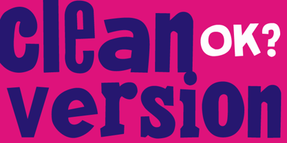 Is the clean version of the acclaimed font Montada.
 - Hebrew Frank Std by Samtype,
$59.00 This is The Classic font of the XX century.
 - SeriousSally by JOEBOB graphics,
$33.00 A handwritten script font with a lot of ligatures.
