10,000 search results
(0.054 seconds)
- Print Shop Parts JNL by Jeff Levine,
$29.00 Print Shop Parts JNL has a nostalgic assortment of blank sign panels, a pointing hand, decorative embellishments and even an assortment of "Made in U.S.A.", "Made in America" and "Made in United States" emblems located on the 1-9 keys. All are from vintage type catalogs and sign painting instruction books from the early 1900s. When scaled up, the blank sign panels can be used for small signs or price tags as originally made in years past. During the early part of the 20th Century, it was common to create show cards in attention-getting shapes matched with beautiful hand lettering.
 - Paradox Runa by Dawnland,
$13.00 Paradox Runa is based on the futhark, norse elder runes. “Missing” characters has been replaced with either other “real” runes, or “new” ones have been “invented” so that the font hold all characters for the latin alphabet (A-Z + swedish Å Ä & Ö) + “Numbers” 0-9. I do not claim that this rune alphabet is totally authentic nor correct! All upper and lower-case letters are the same except for the letter S. “Ligatures” have been created for the th, ng and eo sounds. These are accessed by writing TH, NG and EO (in upper case letters). Space is automatically replaced by a ‘colon’ (':') - if you want a “real” space, write an underscore! (open type version of the font and open type compatible layout application required). Paradox Runa goes perfect with the font Paradox X (regular yet enigmatic hand drawn latin letters)!
 - Lontara by Triden Works,
$21.00 PREFACE Lontara typeface shape is originally created by freehand technique, without modify other exist digital typeface. It purely inspired by traditional Lontara manuscript, South Sulawesi. Lontara typeface is dedicated for originality of Indonesian Cultural. ORIGINS The La Galigo that written in traditional Lontara script is widely believed by people Buginese as a bible of sacred and should not be read without a certain ritual preceded.It tells the story of hundreds of descendants of the gods who live at a time for 6 (six), hereditary generation, the various kingdoms in South Sulawesi and the surrounding islands. The Lontara script is an Brahmic script traditionally used for the Bugis language, Makassarese language, and Mandar languages of Sulawesi in modern Indonesia. It is also known as the Buginese script. It was largely replaced by the Latin alphabet during the period of Dutch colonization.
 - More Printing Helpers JNL by Jeff Levine,
$29.00More Printing Helpers JNL gathers another assortment of vintage printing embellishments and ornaments from the late 1800s. Within the standard twenty-six alphabet keys are pointing hands, corner pieces, border elements and decorative center and end pieces. On the lower case, certain elements have been flipped or inverted for matching effects. Some additional positions are available on the 1 through 9 keys and on the colon and semicolon. A bonus to this font: three expandable panels. the first (with decorative end caps) is attained by typing the left parenthesis for the left side, the hyphen for the center lines and the right parenthesis for the right side. The second one features ribbon ends, and the combination of the less than-equal-greater than keys creates this panel. The third design can be made by typing the left brace/vertical bar/right brace keys. - Anacostia NF by Nick's Fonts,
$10.00The 1923 Barnhart Brothers & Spindler specimen book called this typeface "Cardstyle", and suggested its use at small sizes for business cards. It also work quite well in large sizes when a warm, casual antique feeling is called for. Named for a river that flows through Washington, DC. Both versions of the font include the 1252 Latin and 1250 CE character sets (with localization for Romanian and Moldovan). - Fagetone by Prioritype,
$15.00 Dating back to the 60s 70s, this retro script font comes in bold bold and thin, perfect for your projects and supports multilingualism and other character additions. Can be applied to various print and digital media such as food packaging, clothing stores, accessories, clothing, creative goods, antique workshops, sports, entertainment and even logos. For reference, see preview. Features: -Uppercase -Lowercase -Numeral -Punctuation -Ligature -Multilingual
 - Conestoga by FontMesa,
$20.00 Conestoga was a challenge that I took on which was to take a logo from an old antique vegetable crate label and create a complete font based on its design. The original logo was curved on a path and was caps only. The new letters were drawn straight and a matching lowercase was created to turn this old custom logo into a working font.
 - Perigord by Scriptorium,
$18.00Perigord has mixed origins. It was inspired by Gutenberg’s capitals and by lettering developed by German designer Ernst Bentele, but its calligraphic antecedents go back to French initials of the Carolingian period. The result of this is a formal, attractive and antique look which we hope you'll like. The full version includes alternate forms for many of the letters, as well as numbers and punctuation. - Didgeree Doodle NF by Nick's Fonts,
$10.00The pattern for this delightful little font was originally released as Bernhard Heavy Antique Cursive by the Bauersche Geißerei of Frankfurt am Main and designed, of course, by Lucien Bernhard. Dippy, trippy, under the radar and over the top. The Postscript and Truetype versions contain a complete Latin language character set (Unicode 1252); in addition, the Opentype version supports Unicode 1250 (Central European) languages as well. - PR Scrolls 04 by PR Fonts,
$15.50 Inspired by food labels, signs and coats of arms, PR-Scrolls is a collection of images which can be used for framing text in contexts where antiquity, craftsmanship, or traditional quality are conveyed. There are several sets of glyphs which work together to make a variety of shapes, or banners of custom length. Most of the glyphs are presented in a range of four or more widths.
 - Wormwood Gothic by Device,
$39.00 Retaining all the imperfections and irregularities of wood type, Wormwood Gothic is a gothic sans with all the naive and uneven character shapes typical of the period. The ‘capitals’ feature extended characters, while the ‘lower case ’ features capitals of squarer proportions. Freely mix the two in word settings or colour in red and black for a Dada collage, billposter, urban grit or antique Americana atmosphere.
 - LC Merkén by Compañía Tipográfica de Chile,
$30.00 Merkén is a typeface inspired in the Slab Serif fonts designed by Vincent Figgins in the early 20th century: his famous designs; Antique and Egiziano, were the main references when developing this project. The typeface is perfect for headlines, medium length texts, branding and advertising. His original set is strong and spicy but it also has an alternative set which is cursive and kind.
 - Veneribe by Greater Albion Typefounders,
$10.95 Veneribe -the Venerable face- is an experiment in what many today might call 'grunge', though we at Greater Albion would probably prefer to talk of rustic (or if we're feeling really old-fashioned rustick) charm. It's a derivative of our Clementhorpe family, and aims to combine a battered antique look with the charm of that decorative Roman family. Regular and oblique forms are offered.
 - PR Scrolls 02 by PR Fonts,
$10.00 Inspired by food labels, signs and coats of arms, PR-Scrolls is a collection of images which can be used for framing text in contexts where antiquity, craftsmanship, or traditional quality are conveyed. There are several sets of glyphs which work together to make a variety of shapes, or banners of custom length. Most of the glyphs are presented in a range of three or more widths.
 - Spur Wide JNL by Jeff Levine,
$29.00 Spur Wide JNL was modeled from an example of hand lettering from the antique French alphabet book L'Art du Tracé Rationnel de la Lettre. Heavy Roman style letters with spurs (often referred to as Latin) were most popular with sign painters and show card writers in the early part of the 20th century. Spur Wide JNL is available in both regular and oblique versions.
 - Zebramatic by Harald Geisler,
$14.99 Zebramatic - A Lettering Safari Zebramatic is a font for editorial design use, to create headlines and titles in eye-catching stripes. Constructed to offer flexible and a variety of graphical possibilities, Zebramatic type is easy to use. The font is offered in three styles: POW, SLAM and WHAM. These styles work both as ready-made fonts and as patterns to create unique, individualized type. The font design’s full potential is unleashed by layering glyphs from two or all three styles in different colors or shades. Working with the different styles I was reminded of the late Jackson Pollock poured paintings—in particular the documentation of his painting process by Hanz Namuth and Paul Falkernburg in the film Jackson Pollock 51. In Pollock’s pictures the complex allure arises from how he layered the poured and dripped paint onto the canvas. Similar joyful experience and exciting results emerge by layering the different styles of Zebramatic type. Texture In the heart of the Design is Zebramatics unique texture. It is based on an analog distorted stripe pattern. The distortion is applied to a grade that makes the pattern complex but still consistent and legible. You can view some of the initial stripe patterns in the background of examples in the Gallery. Zebramatic POW, SLAM and WHAM each offer a distinct pallet of stripes—a unique zebra hide. POW and WHAM use different distortions of the same line width. SLAM is cut from a wider pattern with thicker stripes. The letter cut and kerning is consistent throughout styles. Design Concept Attention-grabbing textured or weathered fonts are ideal for headlines, ads, magazines and posters. In these situations rugged individuality, letter flow, and outline features are magnified and exposed. Textured fonts also immediately raise the design questions of how to create alignment across a word and deal with repeated letters. Zebramatic was conceived as an especially flexible font, one that could be used conveniently in a single style or by superimposing, interchanging and layering styles to create a unique type. The different styles are completely interchangeable (identical metrics and kerning). This architecture gives the typographer the freedom to decide which form or forms fit best to the specific project. Alignment and repetition were special concerns in the design process. The striped patterns in Zebramatic are carefully conceived to align horizontally but not to match. Matching patterns would create strong letter-pairs that would “stick out” of the word. For example, take the problematic word “stuff”. If Zebramatic aligned alphabetically, the texture of S T and U would align perfectly. The repeated F is also a problem. Imagine a headline that says »LOOK HERE«. If the letters OO and EE have copied »unique« glyphs - the headline suggests mass production, perhaps even that the designer does not care. Some OpenType features can work automatically around such disenchanting situations by accessing different glyphs from the extended glyph-table. However these automations are also repeated; the generated solutions become patterns themselves. Flip and stack To master the situation described above, Zebramatic offers a different programmatic practice. To eliminate alphabetic alignment, the letters in Zebramatic are developed individually. To avoid repetition, the designer can flip between the three styles (POW, SLAM, WHAM) providing three choices per glyph. Stacking layers in different sequences provides theoretical 27 (3*3*3) unique letterforms. A last variable to play with is color (i.e. red, blue, black). Images illustrating the layering potential of Zebramatic are provided in the Gallery. The design is robust and convenient. The font is easily operated through the main font panel (vs. the hidden sub-sub-menu for OpenType related features). The process of accessing different glyphs is also applicable in programs that do not support OpenType extensively (i.e. Word or older Versions of Illustrator). International Specs Zebramatic is ready for your international typographic safari. The font contains an international character set and additional symbols – useful in editorial and graphic design. The font comes in OpenType PostScript flavored and TrueType Format.
 - Aeterna by Dawnland,
$13.00 Hand drawn, sketchy antiqua that come in two font variants: Regular, Small caps with old style figures. Æterna was revised 2012 and now hold a full character set of basic english/latin letters and west european diacritics!
 - Spiraltwists by Aah Yes,
$0.75Spiraltwists is a family of 2 fonts giving assorted spiral shapes. In each font they're grouped in fours - the same basic spiral in 4 different orientations (N S E W almost), and Spiraltwists has solid lines making up the spirals, Spiraltwists Antique has dotted lines making up the spirals, giving them an antique or rustic appearance. Spiraltwists has heavier spirals on Upper Case, lighter spirals on lower case; plus a group of spirals with a straightened outer end and connecting lines so you get two spiral scrolls joined together by a long line at the top or bottom. (inputting UVWXYZ into the text-box on this webpage will show it). The big example on the webpage shows it all more clearly than any explanation. A fuller description, plus the above example, are included in the zipfile. Please note: for the avoidance of doubt, the font does not contain any letters, the text in these 2 examples is not Spiraltwists but Luzaine. - Fragrance by Scholtz Fonts,
$15.00 Fragrance was inspired by script styles of the twentieth century, and brought into the early 21st century with extravagant, sweeping, upper-case letters and smaller "x" height. Fragrance Antique is a new style for the delicate, feminine Fragrance font. Fragrance Antique retains its elegance, but has a deconstructed, grunged appearance, making it perfect for "ancient" manuscripts, medieval wedding stationery, greeting cards and graffiti style advertising material. The font has a delicate, feminine style reminiscent of elusive perfumes, its elegance emphasized by the contrast between upper and lower case characters. Upper case swashes extend outwards, slashing across or underlining more demure lower case letters. Fragrance is perfect for wedding stationery, greeting cards, lingerie, flowers, perfume and cosmetic advertising, book covers and magazine pages. The font contains over 272 characters - (upper and lower case characters, punctuation, numerals, symbols and accented characters are present). It also includes "open-type"characters to enhance the flow of the text. It has all the accented characters used in the major European languages.
 - Parchemin by Scholtz Fonts,
$19.95 The name “Parchemin” is derived from the word in old English for “parchment.” Our modern word “parchment” changed its spelling to conform with French spelling practices during the French occupation of England. The font was created to suggest an informal but antique form of handwriting written on parchment with a quill pen. The scratchiness of the old quill pen is conveyed in the roughness of the characters. The font was loosely based on the font Queen. Use this font whenever you want to suggest rough informality or antique handwriting. The characters have been letter-spaced and kerned in such a way that they join perfectly with one another giving a completely convincing imitation of genuine handwriting. The font is fully professional in terms of its character set. It contains more than 235 characters — (upper and lower case characters, punctuation, numerals, symbols and accented characters are present). In fact, it has all the accented characters used in the major European languages.
 - Cocomber by 4RM Font,
$15.00 Inspired by a unique food, Cocomber font is made with a unique and distinctive shape. Combining authenticity and unique form, this font looks casual and gives off a fun feel. This font will be suitable for use in graphic designs with a casual theme.
 - Port by Onrepeat,
$25.00 Detailed guided tour available here. Port is an experimental Didone typeface with a modern twist, inspired in the well known forms of typography masters such as Bodoni and Didot and the exuberance and elegance of calligraphy typefaces. Port melds the straight lines and strong contrasts of the Didone typefaces with the elegant lines of calligraphy in a geometric way, resulting in exuberant characters with geometric swashes that can be combined in countless ways. The result of this experiment is Port, an unique and rich display typeface meant to be used on big sizes and it’s main perk is the amount of alternative characters it features. Port is Open-Type programmed and includes hundreds of alternates, from swashes to titling alternates, ligatures and stylistic sets with each character having a thin version of itself, giving complete freedom to all your creative needs. Port is available in several flavours: Port Regular, being the base version and featuring the whole base character set; Port Regular Decorated, featuring richer forms and containing more ornamentated and more extravagant characters; Port Medium and Port Medium Regular, designed for the occasions you need a bit more thickness and the decoration variants: Port Ornaments, containing a wide set of elements meant for the creation of fillets, vignettes and fleurons, resulting in an almost infinite number of possible combinations to embellish your designs and Port Words, a set of some of the most common words used in English, Spanish, French, German, Italian and Portuguese. It’s strongly recommended that you use it on big sizes, for better performance you can also set the Photoshop text anti aliasing settings to Strong when you type, for a better understanding of all the uses of Port and the full character list I recommend the reading of the manual.
 - Ecuador by WAP Type,
$15.00 This font has a unique character and can be used for your logos, business cards and other projects for a unique vintage look.
 - Schnipsl by Dominik Krotscheck,
$6.50 Schnipsl is a playful font based on handicraft letterforms. It comes with a bunch of features to give it that extra organic look. Those features include alternates for the letters A-Z and a-z, ligatures, and filled letterforms. All the features are easily activated via Opentype. The four styles of the Schnipsl family can be layered to create colorful designs that always maintain a handmade and personal look. The Schnipsl works well for logos, headlines, illustrations, or short texts.
 - Alegria by Outras Fontes,
$24.00 Alegria is a font family for joyful communication. The family consists of Alegria Roman (with upper/lowercase and oldstyle figures), Alegria Caps (with uppercase, small caps and lining figures), Alegria Bright (a small caps version with a three-dimensional feel) and Alegria Fill (that can be used as a second layer with Bright or Caps faces to create multiple colors on the text). Alegria family is suitable for short display texts and can be used in many ways you can creatively think of.
 - BeneCryptine by Ingrimayne Type,
$10.00 BeneCryptine is not based on any particular calligraphic type style. It has exaggerated upper-case letters and hyperactive lower-case letters that give it a wild and undisciplined look. It comes in four styles: the base style, a decayed variant, a shadowed style, and a final style that looks much like the base style but which has the spacing of the shadowed style. This last style can be layered with the shadowed style to easily create lettering with two colors.
 - Positive Feature by PizzaDude.dk,
$15.00 Positive Feature is a handmade, layered font. All layers come with contextual alternates, which means you have 4 different versions of each lowercase letter to play around with. What's cool about the two layer versions is that they mix in a lovely way! Try typing your text with layer 1, copy/paste layer 2 on top in a different color - perhaps even alter the transparency a bit...and all of a sudden a nice effect sees the light of day!
 - Coffinated by Ingrimayne Type,
$9.00 Coffinated features letters on coffin shapes. This caps-only family has two sets of characters, with one on coffins that are flipped from those in the other set. The OpenType feature contextual alternatives (calt) prevents two characters from the same set being adjacent. The two styles, bold and regular, can be used in layers to add color. There are not a lot of uses for macabre lettering (horror? Halloween?) but Coffinated is available for those who do find a use.
 - Tiki by Pelavin Fonts,
$15.00 It's here, it's new and it's bamboo. Not to be mistaken for the lush magic of a read tropical rain forest, Tiki evokes more of a feeling of a tacky Hawaiian party or your weird friend's father's basement "Tiki" bar, with bamboo furniture , photos of Tahitian beauties, polyester grass mats and bobble head Hula dolls. Tiki comes as a family of two fonts, the basic outlined version and a solid version, which may be used separately or combined to produce multi-colored effects.
 - Zubilo by ParaType,
$25.00 An informal decorative sans serif was designed by Gennady Fridman and released by ParaType in 2004. Based on informal lettering. In Russian 'Zubilo' means 'Cold cutter' or 'Chisel'. Colorful letterforms seems to be cut by an amateurish but strong hand used to operate with rough metal tools, not with pen or pencil. The face is good for use in advertisements, posters and headlines, especally for comic editions and youth press. Decorative styles were added in 2011 by the same author.
 - Bombarda by ParaType,
$30.00 Bombarda is a big gun, and surely a font named like that must have specific dimensions in order to make the text sound loud and powerful. Due to extreme thickness of basic strokes and of maximum possible serifs it will look great on the cover of a comic book, colorful splash screens of computer games as well as other applications where the title should have particular weight. The font was designed by Alexander Lubovenko and released by ParaType in 2016.
 - Pattycake by Atlantic Fonts,
$26.00 Pattycake family is artsy and friendly. Pattycake is a 3D sketched block letter font with lots of hand-drawn energy and bounce. Pattycake Solid is a smooth and cheerful stand alone font that complements Pattycake, and works nicely as a loose fill under Pattycake so you can easily have fun with color! Both fonts have double-letter ligatures in upper and lower for plenty of movement, and are ready to brighten any fun project, especially those designed for young people.
 - Fingerz by Sergejs Kolecenko,
$19.95 This typeface was started as assignment in Academy, then the idea grew to develop into a font family with different styles for interesting combinations. Inspiration came from my own hands -- it is amazing how fingers can form letters, so each letter has it’s own personality. Fingerz font family is perfect to use in posters, booklets and other typographic elements also in all other media that needs to catch attention. This font comes in 5 different styles to combine in various color combinations.
 - Bene Crypt by Ingrimayne Type,
$10.00 BeneCryptine is not based on any particular calligraphic type style. It has exaggerated upper-case letters and hyperactive lower-case letters that give it a wild and undisciplined look. It comes in four styles: the base style, a decayed variant, a shadowed style, and a final style that looks much like the base style but which has the spacing of the shadowed style. This last style can be layered with the shadowed style to easily create lettering with two colors.
 - Magic Space by Flawlessandco,
$9.00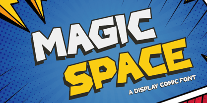 Magic Space is a Playful Comic Display Font. Embark on a whimsical journey through the cosmos with "Magic Space," a captivating comic display font that adds an enchanting touch to your designs. There's some connected letters and some alternates that suitable for any graphic designs. This font support for some multilingual. Also contains uppercase A-Z and lowercase a-z, alternate character, numbers 0-9, and some punctuation. If you need help, just write me! Thanks so much for checking out my shop!
 - Brushtones by PintassilgoPrints,
$29.00 Freely hand-painted with a flat brush, this font conveys spontaneity both through its typeface design and the numerous alternates it delivers. There are four different glyphs for each lower and uppercase letter and two variations for figures (and yet some punctuation marks). All these alternates are programmed to easily cycle at the click of a button - yes, the absolutely amazing Contextual Alternates one. Brushtones, a bold brush font, nice and handy, just perfect to color your message. Give it a try!
 - RNS Ahumada by RNS Fonts,
$9.00 RNS Ahumada comprises 3 versions, Regular, Slanted and Ornaments, and was drawn pattienly with the handmade blackboards from the supermarkets in mind. A mix between readable and a warm human touch, that definitely makes it a friendly and sweet shape. The main features and advantage of having a varied set of widths, makes it a source that can be mixed to achieve a greater variety in composition. We recommend the use of color, it gives a strong personality and makes more attractive.
 - Hillshort by Ergibi Studio,
$20.00 Hillshort is a font type brush with additional fonts as the outline and solid that you can adjust the color to make this font look more perfect. Hillshort is ideal for urban design, logos, apparel,T-shirt,Hoodie, graffiti,quotes, product packaging, or anything which needs a typographic turbo-boost. Hillshort features comes with All Caps Uppercase & Lowercase, Numeral, Punctuation, Stylistic/Alternate Characters, and also Support Multi Language. if you have any Question please Message Me. Thank you ERGIBI STUDIO
 - Bernhard Modern by URW Type Foundry,
$35.99 Bernhard Modern was designed by Lucian Bernhard and was first cut by American Type Founders. Bernhard Modern is an unusual face with small lowercase but very tall ascenders and short descenders. Bernhard Modern was intended to hold its color and contrast without depending on the spread of ink of the letterpress method. It has an attractive pen drawn quality which has made it a popular choice for invitations and greetings cards. The Bernhard Modern font is useful for advertising and display work.
 - Promethium by Mysterylab,
$17.00 Promethium is an elegant vintage-style condensed font with lots of ornate detailing. Ideal for western, cowboy and rodeo graphics, as well as circus & carnival themes. Additionally, Promethium can trace some of its design roots to the well established Argentine graphic style known as Fileteado, as well as to Victorian poster and book arts. The stacking & layering of the 4 different versions of the font can yield a great range of eye-catching diverse looks and color schemes that can fit many purposes.