3,556 search results
(0.029 seconds)
- Surreal PostIndian by Type-Ø-Tones,
$40.00 Surreal PostIndian by Laura Klamburg. OpenType, 2 styles According to its creator, Surreal Post Indian was inspired by the performance of an American Indian artist, but this typeface seems more connected with pop neon signs. Anyway, here is an amusing Laura Klamburg font. Enjoy it.
 - Cidrella by Gleb Guralnyk,
$12.00 Presenting an elegant calligraphic script font named "Cidrella". It's a cider brew themed typeface, perfectly suited for label design and stuff. This font has a lot of ligatures and multilingual support (check out the screenshots with available characters). Thank you and have a nice day!
 - Karine by Mightyfire,
$10.00 If you're looking for a simple, clean and modern font, here is Karine. We have three styles that can be used in any writings. The looks of the font is feminine yet tough since it has neat and clean style. Enjoy in using Karine! :)
 - Terje by Further Type,
$9.00 When you've got something big to say, but space is tight, the only way is up! Terje, an ultra condensed display font by Further Type, is here to help you create eye-catching, playful headlines, and logotypes that stand head and shoulders above the rest.
 - Parallone by Kulturrrno,
$- The great sans-serif for heading:) This is the big update of my font Parallone created in 2018. I needed the compact but not monospaced font with oversized caps. And here it is) Extended latin set Friendly glyphs design Stylistic alternates + ligatures 6 weights + italics
 - DECRYPT 01 by Type Innovations,
$39.00 Say hello to Decrypt—a geometric typeface that features highly stylized capitals with sharp corners, circular forms and generous proportions. Specifically created for visual impact—use Decrypt when you want your words to stand out from the rest of the crowd. The concept is modern, futuristic and non-traditional. Perfect for display text, logos and headings. The development of Decrypt started in 1997, inspired by Alex Kaczun’s best selling grotesque font family called Contax Pro. Decrypt is specifically introduced here as a bold weight, but Alex plans to expand the design to include many weights, styles and alternative design treatments. Stay tuned! If you like Decrypt—check out all of Type Innovations fonts here.
 - Thread Starter by Colllab Studio,
$19.00 "Hi there, thank you for passing by. Colllab Studio is here. We crafted best collection of typefaces in a variety of styles to keep you covered for any project that comes your way! Not being able to communicate trustworthiness, authority and professionalism? Is your brand lacking personality too? That’s where Thread Starter come in. Our fonts have been exclusively designed to communicate trustworthiness, authority, and professionalism. We are here to serve you with the right fonts to help your brand stand out. Use Thread Starter to communicate trustworthiness, authority and professionalism straight into your audience’s heads. Your ideal clients will love the unique and high perceived quality of your brand on its own merit. A Million Thanks www.colllabstudio.com
 - Maglift by suhadidesign,
$17.00 Maglift serif 200+ ligature collections Hi ladies and gentlemen! Due to the popularity of the market for modern fonts, I created a serif font that suits your needs. The Maglift font is a modern serif font with 200+ ligatures. is here to become a market favorite. We made this font look elegant, classy, easy to read, stylish, attractive and easy to use. Maglift Font is a great choice for magazine designs, newspapers, fashion, classy designs, newspapers, modern, books, brand names, branding and other projects. The Maglift font is here to enhance the quality of your designs. Follow us for the next classy font creation :) Feature: • Uppercase • Lowercase • Multilingual Support • Numbers and punctuation • 200+ Ligature collections
 - Sispectly Harmonies Italic by suhadidesign,
$15.00 Sispectly Harmonies classic and nostalgic serif Hi ladies and gentlemen! In accordance with market demand for classic retro design fonts, I created a serif font that suits your views. The Sispectly Harmonies font is a classic nostalgic serif font. is here to become a market favorite. We made this font look elegant, classy, easy to read, stylish, attractive and easy to use. Sispectly Harmonies Font is a great choice for retro designs, logos, magazines, classic, classy designs, newspapers, modern, books, brand names, branding, and other projects. The Sispectly Harmonies font is here to enhance the quality of your designs. Follow us for the next classy font creation :) Feature: • Uppercase • Lowercase • Regular version • Italicized version • Multilingual Support • Numbers and punctuation
 - Corporatus by Alex Rosario,
$60.00 The legendary retro-futuristic typeface returns, now in digital format! While there may be copycats of varying quality, none of them have taken the time and care to revive, reproduce, and expand the original Roc Mitchell “Corporate” typeface like Corporatus has. Made directly from scans of the original type specimens and expanded to include the full WGL4, Corporatus is YOUR solution for your retro, futuristic, and corporate design needs. Descended from Microgramma and originally designed to be the American competition to distant cousin Eurostile, Corporate and subsequently Corporatus is best known for being the typeface used by video game developer and publisher Nintendo for many NES-related media in the West, including its controllers, and by Colecovision for its logo. With the original Latin character set as well as Greek and Cyrillic lettering available, now you're playing with TYPOPOWER!
 - Oorrnnoott by sugargliderz,
$44.00 This is a series that takes unfinished typefaces that were either previously ideated but not realized or were close to completion but left incomplete due to dissatisfaction with certain aspects, and brings them to completion. "Oorrnnoott" was originally a project named "Petitgothiquemignon" or "Sangoth". In the process of refining "Kropotokin", several ideas were incorporated into the design. Well, I say "incorporated," but it was designed on a whim, as usual. After all, it was started around 2005, and I don't usually leave notes or anything (which isn't the best habit), so I don't remember the emotions or thoughts behind its creation. Please consider this typeface as a very typical sans-serif font, as that is what I was aiming for when I excavated it this time. Please use it for body text, headlines, eye-catching designs, or whatever you like.
 - Genre by Storm Type Foundry,
$26.00The official terseness and grey of Neo-Classical type faces will stand out when we narrow them. The consistently vertical shading of the letters suppresses one's desire for eccentricity, just like tea with bromine. It would, however, be wrong to consider Bodoni as the originator of this - vertically shaded - trend in type face production. In his Manual we can also find type faces with a slanted axis of shade, picturesque italics and a number of normal, more human type faces. It remains a mystery why his name is connected only with one of his many works. Genre's basic design is fairly light in colour, which is why it looks good in illustrated magazines and short texts and directly calls for graphically striking, contrasting headings. It shows off beautifully next to photographs, on diplomas and on printed materials connected with a person's death. - Karmina Sans by TypeTogether,
$49.00 Karmina Sans follows the steps of its successful award winner cousin, Karmina Serif. It shares the same technical excellence and it achieves similar stylistic features, but the new sans serif version proposes a much more versatile tool for editorial designers. Karmina Sans has six different weights with their matching italics, from light to heavy and from continuous text to headlines to small text. The heavy weight delivers one of the darkest and most powerful impressions out there while the text weights are perfect companions for Karmina Serif. The OpenType Pro package of Karmina Sans includes nearly 900 characters per weight, including small caps, fractions, old style and lining numbers, scientific superior/inferior figures, complete ordinal and inferior alphabet, and a set of symbols and arrows. It supports over 40 languages that use the Latin extended alphabet.
 - Sunshine Group by HiH,
$6.00 The Sunshine Group is a series of four closely related fonts that combine a visual rendition of a bright noonday sun with Page No. 508, a wood type designed by William Hamilton Page of Norwich, Connecticut in 1887. Page No. 508 was released in a digital version by HiH and is available from Myfonts.com. Woody Sunshine is the simplest. The name alludes to its wood type roots. The sun shines on the upper case letters only (and the ampersand, which is considered lower case). Double Sunshine has the sun on both upper and lower case. Smiley Sunshine adds a smiley face to the first font. Double Smiley adds it to the second font. Warning: immoderate use of Double Smiley may expose the user to charges of overly aggressive cuteness. Please be careful. The Culture Vultures are lurking in the treetops.
 - Senlot Sans by insigne,
$29.99 Senlot Sans defies convention. A follow-up to the elegant Senlot, Senlot Sans is anything but another sans serif font in search of character. This new member of the Senlot family, while slightly more traditional than its original cousin, confidently boasts more contrast than most sans serifs on the market and even strides smoothly ahead with some of the original Senlot’s calligraphic features. The rich appearance of Senlot Sans contains a complete set of small capitals and nine weights from thin to bold. Unlock its potential even more with titling capitals, superscripts and subscripts, and open style figures. With its broad palate of variables and options, the font covers over 72 Latin-based languages. Simple, elegant, and versatile, Senlot Sans now makes perfect more possible. Put the simplicity of this stunning font to work for you.
 - Pentathlon Pro by DBSV,
$80.00 Strait passages second part… I tried in this fifth (that's why she took the name "Pentathlon Pro”) consecutive font family to give her a character style with again a strait way of writing. Walking on the same considerations as the previous series (Khamai, Aeolus, Corset & Artios) I tried to give some sense of diversity for the strait passages of character: those fourteen style are the result. And in this family, the “Bold” with "Inlier" and “Bold Italic” with "Inlier Italic” engage in the same way as did the “Layered font families” in the previous series. Also I added a design statement for the twelve zodiac signs, only presented in the Bold, Inlier, Bold Italic and Inlier Italic style. This series is composed of fourteen styles with 628 glyphs each, with true italics and supports Latin, Greek and Cyrillic.
 - Shandy BF by Bomparte's Fonts,
$40.00 Shandy is a cheerful, free-spirited font that dances jauntily along an undulating baseline. Like Gene Kelly merrily cavorting through that rain-soaked street, in the famous dance scene from Singin’ in the Rain. Curiously, it’s got the liveliness of a bouncy brush script, with some elements of a robust Copperplate-style script, that appear to have been defined by a funhouse carnival mirror. In order to promote variety, no two letters are identical within most occurrences of typical lowercase double-letter pairings (bb, dd, ee, ll, nn, oo, tt, etc.) To enhance your typography, Shandy features many automatic OpenType ligatures, beginning and terminal lowercase forms and Stylistic Alternates for letters E, M and N which are accessible in OpenType-capable applications. Suitable for Branding, Logos, Product Packaging, T-shirts, Magazine headlines, Fashion Glossies, and Food Advertising to name a few arenas.
 - Franklin Gothic Raw by Wiescher Design,
$19.50 When drawing a new font, there is a time when the final form is found – almost – but the curves are not slick and clean yet, that's what I call the "raw" form. Raw – no sweeteners added! In this family I tried to redefine this moment in type development for the eternally beautiful "Franklin Gothic". I call the design "Franklin Gothic Raw", not to be confounded with "rough". The family can be used like any good normal typeface, you hardly see any difference to a conventionally cut "Franklin Gothic" in small sizes. The charm of the design becomes obvious the bigger it becomes, then it enhances your design with its imperfections in the outline. "Franklin Gothic Raw" is therefore an extremely versatile family. I created the cuts, that I considered necessary for the seasoned designer who knows what he's doing. Enjoy!
 - Geronimo by Canada Type,
$24.95Geronimo is a rough poster script done in the spirit of brush calligraphy experiments conducted by American calligrapher and historian, Professor Alexander Nesbitt. This particular approach to brush script uses a pointed brush. Although Nesbitt considered the pointed brush corruptive and not at all suited to present day western letter forms, he put forth that with enough control of the brush (keeping it upright, maintaining stroke evenness, etc) even an unexperienced letterer can easily draw current day letters, though the result will always show characteristics of the letterer's own handwriting. Geronimo is a great choice for entertainment design, like book covers, film poster and packaging, and CD inserts. It also is a great overall display design for anything that seeks to depict adventure or an environment with a rough human element. Many alternates are sprinkled throughout the font. - Budmo by Typodermic,
$11.95 Step right up, folks! Introducing Budmo, the font that’s always ready to party! This jubilant display typeface is inspired by classic light bulb marquee sign lettering and is perfect for all your festive needs. Whether you’re sending out dance invitations, announcing a gala, planning a parade, or just looking to add some pizzazz to your party, Budmo has got you covered. But that’s not all, folks! With Budmo Jiggler and Jigglish, you can really ramp up the carnival atmosphere. Layer the Bulbs, Honk, and Solid styles to create a truly carnivalesque effect. And don’t forget to try adding a glow effect to the Bulbs style for even more razzle-dazzle. But here’s the thing, friends. Even on its own, the Bulbs style is nothing short of snappy. Add your own special effects and watch it light up the night! So come on down and see Budmo for yourself. You won’t be disappointed! Most Latin-based European writing systems are supported, including the following languages. Afaan Oromo, Afar, Afrikaans, Albanian, Alsatian, Aromanian, Aymara, Bashkir (Latin), Basque, Belarusian (Latin), Bemba, Bikol, Bosnian, Breton, Cape Verdean, Creole, Catalan, Cebuano, Chamorro, Chavacano, Chichewa, Crimean Tatar (Latin), Croatian, Czech, Danish, Dawan, Dholuo, Dutch, English, Estonian, Faroese, Fijian, Filipino, Finnish, French, Frisian, Friulian, Gagauz (Latin), Galician, Ganda, Genoese, German, Greenlandic, Guadeloupean Creole, Haitian Creole, Hawaiian, Hiligaynon, Hungarian, Icelandic, Ilocano, Indonesian, Irish, Italian, Jamaican, Kaqchikel, Karakalpak (Latin), Kashubian, Kikongo, Kinyarwanda, Kirundi, Kurdish (Latin), Latvian, Lithuanian, Lombard, Low Saxon, Luxembourgish, Maasai, Makhuwa, Malay, Maltese, Māori, Moldovan, Montenegrin, Ndebele, Neapolitan, Norwegian, Novial, Occitan, Ossetian (Latin), Papiamento, Piedmontese, Polish, Portuguese, Quechua, Rarotongan, Romanian, Romansh, Sami, Sango, Saramaccan, Sardinian, Scottish Gaelic, Serbian (Latin), Shona, Sicilian, Silesian, Slovak, Slovenian, Somali, Sorbian, Sotho, Spanish, Swahili, Swazi, Swedish, Tagalog, Tahitian, Tetum, Tongan, Tshiluba, Tsonga, Tswana, Tumbuka, Turkish, Turkmen (Latin), Tuvaluan, Uzbek (Latin), Venetian, Vepsian, Võro, Walloon, Waray-Waray, Wayuu, Welsh, Wolof, Xhosa, Yapese, Zapotec Zulu and Zuni.
 - PORT118 - Unknown license

- Asbanur by Mightyfire,
$10.00 Hello! Asbanur is here. Asbanur brings modern, clean and neat looks. This font can be used as the logo of your brand, headline title, magazine title or many things. We have two versions: light and regular, but both of the versions is cool! Try them and enjoy!
 - LD Walt by Illustration Ink,
$3.00Know anybody named Walt? Ever seen his handwriting? Well, here it is (at least a similar style). You will enjoy using it for your theme park titles, invitations etc. (And it’s much cleaner and nicer-looking than any other version out there.) Font inspired from Walt Disney. - Theyriad Script by FallenGraphic,
$20.00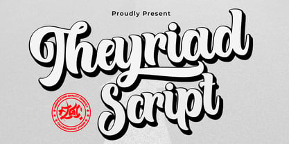 Theyriad Script is the great choice for watermarks on photography, logo designs, quotes, album covers, business cards, and many other design projects. Theyriad Script is here to elevate your work to the highest level. Features: -Accents (Multilingual Characters) -PUA encoded -Numerals and Punctuations (OpenType Standard) -Many alternates
 - Valentine's Fleurons by Greater Albion Typefounders,
$3.95 Valentine's Fleurons is a bit of romantic (the emotion, not the era) fun!. Need a few dingbats for that special card you're making for that special person-or for others to give to their special person(s)? You'll find them here in a charming hand-drawn style.
 - Home Grown by Studio K,
$45.00 Home Grown is a hand-drawn font that is fresh, immediate and informal. As the applications here show it is especially well suited to food packaging and natural or organic products in particular. However, it can be used wherever a friendly, approachable feel is sought after.
 - Chifully by Astageni,
$10.00 hi, here is Chifully, a handwritten font. started with writing, and I thought, well it's good to make a font, Chifully fonts are perfect for design needs with cheerful nuances, very suitable for use in t-shirts, for quotes on mugs, etc, develop your imagination, right?
 - Malibu by Solotype,
$19.95If you like thematic fonts, this is for you. It appeared in an old lettering book (from the 1930s, if memory serves) and later came out as a film font for photolettering machines. We cleaned it up and drew the missing characters, and here it is. Enjoy. - Trailer Park Numerals by Coniglio Type,
$9.95Trailerpark numbers 0-9 were rather old fashioned 1950's cut aluminum numbers, you've seen digitized nowhere else but here! Part of Market LTD, a collection of limited faces, mostly alpha-numeric and some just plain numeric, used primarily in retail and display situations and titling. - Big George NF by Nick's Fonts,
$10.00Here’s another gem by Ross F. George from the Speedball Text Book. It was originally entitled simply Bold Display (Modern Alphabets on Parade) and had a graduated spatter pattern. This version omits the pattern, but keeps the bold, brassy lines. Use it whenever you need an unusual and dynamic headline with a strong retro vibe. Both versions include the complete Unicode Latin 1252, Central European 1250 and Turkish 1254 character sets, with localization for Moldovan and Romanian. - Breitkopf Fraktur by profonts,
$39.99Breitkopf Fraktur was designed by Johann Gottlob Immanuel Breitkopf (1719-1794), the well-known type designer and printer of Leipzig. Breitkopf's high reputation is based on a system of printing musical notes which was developed by him. 1793, in the final stage of his life, he designed this beautiful broken script named after himself.Breitkopf Fraktur is classified as broken", something created by the German renaissance. Broken, because all round parts of the lower case characters in such typefaces look broken.Ralph M. Unger redrew and digitized this font exclusively for profonts in 2003. His work is based on artwork taken from old font catalogues." - Breaking Bread by Missy Meyer,
$12.00 This font came to be when I was creating a cake topper mockup (see the promo images) and didn't have a thick script font that I liked for it. So I got to work writing out some fun chunky cursive letters that could top a cake! The concept of breaking bread is an old one, often meaning two parties working together. In the Breaking Bread font, I've combined that heavy connecting script with a hand-lettered sans-serif uppercase set. It works in all lowercase, all uppercase, and title case with equal ease! I've also included a number of alternates and ligatures, so you can have a truly hand-written look when double-letter words show up, plus a few extra characters and swashes to add some pizzazz to your work. It's great for crafting a mug or t-shirt, creating a logo, or making product packaging! And all of those alternates are PUA-encoded, so they're easy to access in any character map. Breaking Bread also comes with over 300 extended Latin characters for language support, including but not limited to: Catalan, Czech, Danish, Esperanto, Estonian, Finnish, French, Gaelic, German, Icelandic, Irish, Italian, Latvian, Lithuanian, Norwegian, Polish, Portuguese, Romanian, Serbian (Latin), Slovak, Slovenian, Spanish, Swedish, Turkish, Welsh, and more!
 - Jazm by Arabetics,
$34.00 Jazm is an Arabetic typeface design with connected glyphs. Jazm was the earliest, pre-Islamic, script style of the modern Arabic script, before branching into Kufi and Naskh styles. The initial script had a lot less, position-dependent shapes and ligatures, and was not strictly connected. It occasionally included minuscule dots to distinguish identical shapes. This font family design is a modern visualization by the designer of the historical Jazm letter shapes following the guidelines of the Mutamathil Taqlidi type style with one glyph for every basic Arabic Unicode character or letter, as defined in Unicode Standards, and one additional final form glyph for each Arabic letter that can connect with other letters from both sides in traditional cursive Arabic strings. Jazm employs variable x-height values. It includes all required Lam-Alif ligatures and selected marks. Tatweel (or Kashida) glyph is a zero width space. Keying it before any glyph will display that glyph isolated form, if desired. Keying Tatweel before Alif Lam Lam Ha will display the Allah ligature. Jazm typeface family includes both Arabic and Arabic-Indic numerals; all required diacritic marks, in addition to Standard English keyboard punctuations and major currency symbols. Jazm is available in regular, bold, black, and corresponding italic (slated to the left) styles.
 - Praxis Next by Linotype,
$57.99 Praxis® Next has the same robust shapes and proportions as the original 1976 Praxis design. Its large x-height, substantial counters and open apertures guarantee high levels of legibility and reading ease in print and on screen. More weights, condensed designs and true cursive italics differentiate Praxis Next from the older design. Praxis Next shines where space is at a premium. The regular designs are modestly narrow while the condensed typefaces perform with grace in the most crowded of environments. The bold designs create powerful headlines and banners and the lighter weights are ideal for both long and short-form text copy. Because of its many weights and proportions, Praxis Next is also an ideal design to build a brand identity. Praxis Next Variables are font files which are featuring two axis and have a preset instance from Light to Ultra and Condensed to Roman. Pair Praxis Next with old-style designs like Bembo® Book and Stempel Garamond™ to create a dynamic typographic contrast. Or complement the design with its serifed counterpart, Demos® Next . Unger also drew ITC Flora® as an alternative italic design. Looking for something a little different? Pair Praxis Next with Masqualero™ .
 - Hazim by Arabetics,
$39.00 Hazim is a display font designed with isolated letters. It uses thin white slits positioned within extra bold black space glyphs emphasizing the main visual characteristics of the Arabetic letters in two positions: initial/medial and final/isolated. The spacing widths between glyphs match that of the slits to give a virtual cursive look and feel. The name Hazim was chosen to honor a friend of the designer, Hazim al-Khafaji. Hazim supports all Arabetic scripts covered by Unicode 6.1, and the latest Arabic Supplement and Extended-A Unicode blocks, including support for Quranic texts. It comes with one weight and a left-slanted “italic”. The script design of this font family follows the Arabetics Mutamathil Taqlidi style and utilizes varying x-heights. The Mutamathil Taqlidi type style uses one glyph per every basic Arabic Unicode character or letter, as defined by the Unicode Standards, and one additional final form glyph, for each freely-connecting letter in an Arabic text. Hazim includes the required Lam-Alif ligatures in addition to all vowel diacritic ligatures. Hazims’s soft-vowel diacritic marks (harakat) are only selectively positioned with most of them appearing on similar lower or upper positions to make sure they do not interfere with the letters. Kashida is enabled.
 - Sassoon Write by Sassoon-Williams,
$66.00 These fonts will join-as-you-type in your OpenType application as shown in the posters above. Choose Use Contextual Alternates option in your app to get basic recommended baseline joins for teaching. Additionally, use can choose from 7 Stylistic Sets of alternative letterforms that are so important for Teachers. Create 'pen-lifts' too! Fonts display unjoined by default on this website and are delivered that way - joining is controlled by you. A mature ‘joined-up’ hand is the result of correct instruction from an early age. Sassoon Write typefaces are a direct progression from the separate letters of Sassoon Infant or Sassoon Primary and were specially created for teaching cursive handwriting in a flexible way. Designed for older pupils and adults, rather than children. A family of 4 fonts than join, or enter " | " between letters for unjoined text. For use with OpenType compatible applications such as Word. Enables progressive pupil exercises for a smooth transition between separate letters and teaching joined handwriting. Free to download resources Stylistic Sets and how to access the alternative letters feature in these OpenType fonts Purchasers of this font package may use their Order Number to receive a free Copybook PDF by Rosemary Sassoon recommended for effective teaching
 - November Starlight by Set Sail Studios,
$14.00 Thanks for checking out November Starlight! A lovingly hand-painted script font, fantastically elegant & eccentric with a sprinkle of carefree fun. November Starlight doesn't play by the rules - with extra bouncy characters, long vertical brush strokes and authentic hand-painted edges, it's bound to make a bold statement on anything from greeting cards and invitations, to personalised logos and handwritten quotes. November Starlight consists of 4 fonts; November Starlight • A cursive font containing upper & lowercase characters, numerals and a large range of punctuation. November Starlight Alt • This is a second version of November Starlight, with a completely new set of lowercase characters. If you wanted to avoid letters looking the same each time to recreate a custom-made style, or try a different word shape, simply switch to this font for an additional layout option. November Starlight Clean & Clean Alt • Totally clean versions of each of the November Starlight fonts, with all rough brush textures removed. Perfect for specialised printing techniques such as laser & vinyl cutting, or simply for a silky smooth finish to your text. Special Characters are also available for several lowercase letters, with added beginning & end swashes - please see the character map image for a full list. These characters are accessible via software with a glyphs panel, e.g. Photoshop CC, Adobe Illustrator.
 - FS Blake by Fontsmith,
$80.00 Art deco The inspiration for FS Blake’s elegant, lightly geometric forms can be traced back to design of the 1930s; designer Emanuela Conidi was influenced by the typography of cool, European, art deco posters. FS Blake bears traits of the art deco style, from its thin weights to its heavy weights, giving a set of faces each with their own distinct character, but still with a strong family resemblance. Mechanical type Mechanical and organic shapes combine in FS Blake to create a harmonious whole of generous curves and cursive spikes. A strong, punchy contender in display sizes, it’s also got a gentle touch with small text in lighter weights. Lively, versatile and with plenty of character contrast between weights, the FS Blake family offers impact in whatever task it’s given.faces each with their own distinct character, but still with a strong family resemblance. Sketch book Great fonts still emerge from a combination of hand, paper and pencil. After filling her sketch book with ideas, Emanuela and Jason extracted the elements that both felt could work in a font. The process yielded a whole crop of starting points for future designs as well as a focus for FS Blake as a striking, characterful, almost industrial font.
 - Camille by Arabetics,
$45.00 Camille was designed with exaggerated emphasis on letter vertical characteristic, by virtually eliminating the typical Arabic horizontal line look. This font glyph weights and look and feel are heavily influenced by early Kufic Quranic calligraphy style. Camille supports all Arabetic scripts covered by Unicode 6.1, and the latest Arabic Supplement and Extended-A Unicode blocks, including support for Quranic texts. This font family includes two letter spacing flavors: isolated for small text and overlapped for large or display text. The two spacing flavors have one weight each with a normal and a left-slanted Italic version. The script design of this font family follows the Arabetics Mutamathil Taqlidi style utilizing varying x-heights. The Mutamathil Taqlidi type style uses one glyph per every basic Arabic Unicode character or letter, as defined by the Unicode Standards, and one additional final form glyph, for each freely-connecting letter of the Arabic cursive text. Camille includes the required Lam-Alif ligatures in addition to all vowel diacritic ligatures. Soft-vowel diacritic marks (harakat) are selectively positioned with most of them appearing on similar high and low levels—top left corner—, to clearly distinguish them from the letters. Tatweel is a zero-width glyph.
 - APF Lagoon Regular by Pomegranate,
$30.00 In 2007-8, Carolyn Puzzovio developed this OpenType typeface: Lagoon which is based on an Armenian model from the Mechitarist monastery, Venice, 1810. This project was supported by a grant from the AHRC (Arts & Humanities Research Council, UK) and won a first prize in the Granshan 08 type design competition. Oſten, Armenian digital types are designed to match the forms of Latin type characters and ‘Latinized’, by uprighting the forms; truncating ascenders and descenders and raising the x-height – but in this case the Latin characters in the OpenType font have been designed to blend in with the traditional Armenian proportions which are based on cursive forms – also incorporating some of the quirky shapes from the original model. Faithfully following the original created difficulties of ‘clashing’ characters, particularly those with long descenders, so the font contains over 100 alternative characters in the Armenian part, which will normally substitute automatically where necessary. The sloping lower case characters and upright capitals are traditional in Armenian – capitals are used less in the Armenian language. Three new characters for the Armenian unicode range are included: the Armenian dram (currency) symbol; the eternity symbol; and the index number symbol. This font which will be one of the first OpenType fonts to incorporate these newly unicoded characters.
