10,000 search results
(0.163 seconds)
- Handu by Alex Jacque,
$20.00 Handu, designed by Alex Jacque in 2012, is an affable hand-drawn sans-serif inspired by the hand-painted type and signage on the streets of Kolkata, India. Fitting then that it come to life with brush and paint. When used for display purposes the organic, painted texture of Handu's glyphs really shines. At smaller point-sizes the hand-drawn aesthetic still translates. Handu comes in two styles, regular and shadow. Use each independently or overlay them for a little youthful emphasis.
 - Rust Crowth by Maulana Creative,
$15.00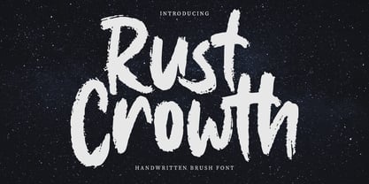 Rust Crowth is a handwritten brush font. With regular rough brush stroke, fun character with a bit of ligatures and alternates. To give you an extra creative work. Rust Crowth font support multilingual more than 100+ language. This font is good for logo design, Social media, Movie Titles, Books Titles, a short text even a long text letter and good for your secondary text font with sans or serif. Make a stunning work with Rust Crowth font. Cheers, Maulana Creative
 - Cafgone by Wildan Type,
$14.00 Cafgone is a modern display sans serif with modern and elegant style. This fonts is designed to pair harmoniously, and lend themselves to high end branding, logo designs, product packaging & invitation designs. With two fonts style (Regular and Oblique), Cafgone clean lines and subtle contrast give any project a touch of luxury and class. There are also decorative alternates and ligature available for uppercase letters and lowercase, so you can mix and match to add extra character and interest to logos and wordmarks.
 - Legal Eagle JNL by Jeff Levine,
$29.00 The lettering on the cover of the sheet music for 1919's "The World is Waiting for the Sunrise" was set in a decorative sans serif with an engraved line adorning each character. Reminiscent of the headlines of legal documents, way bills, stock certificates and the like, the digital version of the design was given the name Legal Eagle JNL and is available in both regular and oblique versions. A companion font without the engraved lines is also available as Junior Clerk JNL.
 - Heroliga by Yahya Type,
$18.00 Heroliga is an elegant & modern sans serif font with special alternative letters and with multilingual support. Heroliga is perfect for logo design, magazine headers, product packaging, branding projects, clothing or simply as a stylish text overlay to any images or websites. WHAT’S INCLUDED? • Comes with regular, italic, bold and bold italic font styles. • Uppercase & lowercase letters. • Numbers, punctuation. • Ligature & Huge Stylistic alternate. • Multilingual support. Still got a question? Send me a message and I’ll be happy to answer! qura.yahya@gmail.com
 - Pink by ITC,
$29.00Pink is the work of British designer Timothy Donaldson, a sans serif in a style typical of the 1990s. Capitals are slightly condensed and feature unusual variations in stroke widths and the lowercase has an even more irregular stroke pattern, yet an even texture is produced when used in word settings. - Giriton by Hazztype,
$18.00 Giritron is a modern geometric sans-serif typeface that effortlessly blends elegance with a contemporary aesthetic. With its precise, angular forms and minimalist design, Giritron offers a perfect balance between readability and visual impact. Giritron is the perfect choice for contemporary branding, editorial layouts, websites, and any design project where a sophisticated, modern look is desired. Its geometric sans-serif nature ensures a timeless quality, while its attention to detail sets it apart as a distinctive and visually pleasing typeface.
 - El Fonte Angelia by Gilar Studio,
$16.00 Hello Everyone.. Introducing a new Font " El Fonte Angelia " Beautiful Serif Type Family is inspired by the serif typefaces used in editorial media in the 70s and 80s.such as the soft and gentle shapes found in Cooper or the fluid, angled strokes in Windsor— mixed into one single design that features familiar, fresh, modern flavors. Designed to reflect nature, it creates a sense of natural softness and expressiveness. We pushed the concept into a usability focused direction, to work as a bold tool and beautiful communicator. El Fonte Angelia variable allows fluid design across 5 weights The font broadens its use by supplying weights all the way from Light to Bold. The natural curves, swells and sloping trunks, grow in character as the font gains weight. Whilst the thinner weights have lowered contrast and optical corrections to create a warm and gentle appearance. El Fonte Angelia character set incorporates additional symbols, stylistic alternates, unique ligatures and case sensitive punctuation - producing a stable workhorse family ready to tackle projects of any size.The type family melds organic curves and gentle repetition into powerful and harmonious type. At large point sizes you can appreciate the letter shapes, whilst the same restraint and focus creates an even texture for small point sizes and long reading. Its variety of weights provide a range of choices that will help you find the best typographic color for your project. Lighter weights are well-suited for body text while heavier ones are ideal for high impact headlines. The available stylistic alternates offer a number of different characters that give your logo or business card a unique look. Check my other Font here : https://gilarstudio.com/ Thank you Regards, Gilar Studio
 - Celestial Writing by Deniart Systems,
$10.00A magical alphabet used by secret societies in times past. It was based on the Hebrew alphabet. NOTE: this font comes with a comprehensive interpretation guide in pdf format. - Cedag by Product Type,
$15.00 Introducing Cedag, a stunning Display San serif font that exudes elegance and boldness. The font boasts two unique families, regular and round, both offering a modern twist to a classic look. With its sleek and stylish design, Cedag is perfect for any project that requires a confident and sophisticated aesthetic. The regular family features a classic San serif style with a modern twist, while the round family has a bolder, more playful look. And with multilingual support, you can use Cedag for projects around the world. Whether you’re designing a logo, branding materials, or any other creative project, Cedag is a versatile and impressive font that will elevate your work to the next level. Its bold and confident style is perfect for any modern design, making it a must-have for any designer or creative professional. What’s Included : - File font - All glyphs Iso Latin 1 - We highly recommend using a program that supports OpenType features and Glyphs panels like many Adobe apps and Corel Draw, so you can see and access all Glyph variations. - PUA Encoded Characters – Fully accessible without additional design software. - Fonts include Multilingual support
 - Dobro by Sudtipos,
$39.00 Strings vibrating against wood. Counterpoints. Strong beated rhythms and smooth flexible melodies. Repetitive sequences and syncopations. Sweeps and slides. Folk and tradition. That's how Dobro sounds. Inspired by the spirit of bluegrass music and the aesthetic of its wood type gig posters,this typeface explores certain concepts of rhythm and seeks to translate a piece of this universe into writing. Meant to be used in large sizes, Dobro is a 6-font set designed to work nicely together. It comes in 4 different weights, one color font with miscellaneous and connectors, plus frames and borders that pay tribute to vintage wood type catalogues. As an old company motto used to say: "Dobro means good in any language!" ––––––––––––––––––– IMPORTANT INFO ––––––––––––––––––– When you license Dobro you will download a pack with OpenType fonts but also a Color Font version of Dobro Drunk. (To use color fonts Photoshop CC 2017 /2018, Illustrator CC 2018 or QuarkXpress 2018 is required). If you create outlines in illustrator you can also modify the colors! Dobro Drunk BW OTF font (works like any font but is black & white.) Web files are only black and white until browsers support color fonts.
 - Broadside by Device,
$39.00 Broadside is a versatile, authoritative and functional family inspired by the sans serifs seen on ’40s and ’50s patriotic posters and period advertising. It is available in seven weights across condensed, normal and extended widths, each with reweighed italics. The type from this period was very often hand-drawn, and so differs considerably from poster to poster. Many American examples of this period use a Photo-Lettering style called Murray Hill and its derivatives, although their UK counterparts, designed by such luminaries as Abram Games or Tom Eckersley, are more stylistically diverse. Even though no single model is available to base a digitisation on, there are certain recurring stylistic quirks that give the type its unique flavour, and so the most interesting examples from several sources were be combined for the final family. Alternate short descenders, allowing for tighter line spacing, can be toggled on or off in the Opentype panel of Indesign or Illustrator. Tabular and lining numerals and a single-story ‘a’ are also available in all weights and styles.
 - FF DIN by FontFont,
$104.99 Dutch type designer Albert-Jan Pool created this sans FontFont between 1995 and 2009. The family has 20 weights, ranging from Light to Black in normal and condensed styles (including italics). It is ideally suited for advertising and packaging, editorial and publishing, logo, branding and creative industries, poster and billboards, small text, wayfinding and signage as well as web and screen design. Looking for the new Thin and Extra Light weights? They are available through fontshop.com, linotype.com and fonts.com. FF DIN provides advanced typographical support with features such as case-sensitive forms, fractions, super- and subscript characters, and stylistic alternates. It comes with a complete range of figure set options – oldstyle and lining figures, each in tabular and proportional widths. As well as Latin-based languages, the typeface family also partly supports the Cyrillic and Greek writing systems. In 2011, FF DIN was added to the MoMA Architecture and Design Collection in New York. This FontFont is a member of the FF DIN super family, which also includes FF DIN Round.
 - FF Meta Hebrew by FontFont,
$79.99German type designer Erik Spiekermann, created this sans FontFont between 1991 and 2010. The family has 28 weights, ranging from Hairline to Black in Condensed and Normal (including italics) and is ideally suited for advertising and packaging, book text, editorial and publishing, logo, branding and creative industries, small text as well as web and screen design. FF Meta provides advanced typographical support with features such as ligatures, small capitals, alternate characters, case-sensitive forms, fractions, and super- and subscript characters. It comes with a complete range of figure set options—oldstyle and lining figures, each in tabular and proportional widths. As well as Latin-based languages, the typeface family also supports the Cyrillic, Greek, and Hebrew writing systems. FF Meta Variable are font files which are featuring two axis and have a preset instance from Hairline to Black and Condensed to Roman In 2011, FF Meta was added to the MoMA Architecture and Design Collection in New York. This FontFont is a member of the FF Meta super family, which also includes FF Meta Correspondence , FF Meta Headline , and FF Meta Serif . - Mahamaya - Unknown license

- Certified - Unknown license

- CarnivalFest by Artyway,
$19.00 Introducing the "CarnivalFest" font, the perfect addition to any party or celebration! This colorful and playful font features rounded letters in a variety of bright hues, making it perfect for birthday invitations, carnival posters, and party headlines. Add a touch of fun and excitement to your event with "CarnivalFest"! Your download font file with: - Colored letters - Punctuation coverage - Alternate symbols with bubbles - Multilingual
 - Junge Holiday Cuts NF by Nick's Fonts,
$10.00A charming series of 26 holiday “type warmers” based on the works of Carl S. Junge for the Barnhart Brothers & Spindler type foundry in the 1920s. Single-color cuts are in the uppercase positions, while 13 of the cuts suitable for two-color usage occupy the lowercase in adjacent pairs; e.g., a and b, c and d, and so on. - Grafiker by Hanoded,
$15.00 Grafiker means 'Graphic Designer' in German. This fat, colored, uneven font with a 1001 uses was loosely based on the work of designers Oskar Kokoschka (1886 - 1980) and Jean Carlu (1900 - 1997). The glyphs were hand-drawn with a 0.5 roller ball and colored in with Chinese ink, using a stiff brush. The result is a lively, rather unusual font.
 - Bowling by Ingrimayne Type,
$14.95 Bowling has letters on bowling pins. On the upper-case keys, the bowling pins are white with black letters and on the lower-case keys the pins are black with white letters. The lower-case letters can be colored and placed behind the upper-case letters to give two-color lettering. (The letters on the pins are from the typeface InsideLetters.)
 - Amora by Jen Wagner Co.,
$19.00 Amora is a messy, feminine, carefree script that is perfect for logos, posters, signage, and more! Fonts I paired with in the samples are Adobe Caslon, Proxima Nova (both available through www.typekit.com) and Bebas Neue. Comes with 79 ligatures for a totally unique hand-written feel! Includes: Upper + Lowercase Letters w/ alternates Non-English support 79 Ligatures Best for: Logos Branding Large format writing Feminine look + feel Paired with sans serifs (Proxima Nova, Bebas) and classic serifs (Adobe Caslon, Baskerville) Web headers Signage Wedding invitations and decor (table numbers, signage, balloons, etc.) Not best for: Small printing Long quotes (generally flows better with just a few words) Patterned backgrounds
 - Silver Thread JF by Jukebox Collection,
$32.99 Silver Thread is a hairline thin geometric sans serif font with both art deco and 1970s elements to it. Perfect for any project that needs a typeface which evokes elegance and sophistication. Digitally revived from an older photo-typositing face, Silver Thread is named after a waterfall in eastern Pennsylvania. The font contains alternate versions of B, Q, W, &, a, e, k, n, s, t, u, w, y and 4 for added variety. They can be found under the Stylistic Alternates OT feature. Jukebox fonts are provided in OpenType .otf format and all fonts contain basic OpenType features as well as support for Latin-based and most Eastern European languages.
 - Impara by Hoftype,
$39.00 Impara was designed in 2010. It is a slightly contrasted sans serif with a lively stroke ductus and distinct humanistic characteristics. It represents a synthesis of linear coolness and classic elegance. It qualifies for informational text applications and, in display sizes, it reveals elaborate details. Impara comes in 10 styles in OpenType and TrueType format. Each font is equipped with an extended character set containing: standard and discretional ligatures, small caps, proportional lining figures, tabular lining figures, proportional old style figures, lining old style figures, matching currency symbols, fraction- and scientific numerals. Impara supports Western European as well as Central and Eastern European languages.
 - Wesley JF by Jukebox Collection,
$32.99 Wesley from Jukebox is a geometric sans-serif with a clean and streamlined look. Named after the designer’s paternal grandfather, this font is well suited to any design that needs a sophisticated look. The large x-height helps give the typeface a more approachable feel. The unique lowercase g with its open bowl is a distinctive feature in the font. Jukebox fonts are available in OpenType format and downloadable packages contain both .otf and .ttf versions of the font. They are compatible on both Mac and Windows. All fonts contain basic OpenType features as well as support for Latin-based and most Eastern European languages.
 - Codiga by Andinistas,
$19.95Codiga is perfect for titles and badges that need to show a futurist and space sensation. Its angles formed by straight lines and its san serif monolineal design allows its solid and rigid shapes stress its industrial and technology Look. Codiga consisting of 8 styles: Blanca, Gris, Negra, Super Negra, X1, X2, Stencil and Dingbats (Codiga Dingbats includes 26 illustrations characters). Codiga Blanca, Gris, Negra, Super Negra, X1, X2, Stencil include the complete character set with lower and upper case letters, numbers, accents, diacritics, puntuation and monetary symbols. All of the fonts included in this familily are available in the Open Type format and they are Mac and PC compatible. - Xcetera by Typogama,
$19.00 Work for the Xcetera typeface started with the desire to create a classical serif design but using the less contrasted stroke thickness found in a host of sans serif designs. My aim was to retain some of the clarity found in modern strokes yet use the serifs to aid in letter recognition and legibility. The result is a form of hybrid design that is surprising clear in small point sizes yet offer a lot of personality in larger formats. Suited for both display and text settings, Xcetera aims to be both functional and fun while looking to explore new possibilities for the classical typeface style.
 - Anglican - Unknown license

- Myteri Script PERSONAL USE ONLY - Personal use only

- Amurg - Personal use only

- TaitDemo - Unknown license

- Hooey by Ahmad Jamaludin,
$17.00 HOOEY - A fun Y2K - inspired monoline handwritten bubble font in two styles, regular and clean versions! I mixed a bit of texture and a bit of goopy-ness to create a wonderfully imperfect and unique font What's you get? Hooey Regular Hooey Clean Have alternate with all characters (Uppercase & Lowercase) Regular and Clean version Unique letterforms Works on PC & Mac Simple Installations Enjoy your day! Dharmas Studio
 - The Boodas.de | My | Regular font is a distinctive typeface with a lively and engaging personality. At first glance, its characters capture the eye with their smooth and clean lines, suggesting it's ...
- Nesobrite by Typodermic,
$11.95 The Nesobrite typeface is a striking representation of the modern, boxy design aesthetic. Its linear, mechanical structure is the perfect embodiment of clean and neutral, with an austere edge that adds a touch of sophistication to any design. This font has been inspired by classic square-sans fonts, such as Bank Gothic and Microgramma, but with a contemporary twist that sets it apart. One of the most remarkable aspects of Nesobrite is its ability to imbue your message with a clear, professional, and authoritative voice. Its scientific vitality is sure to make your text come to life, whether it is for a technical report, a research paper, or a business presentation. The font’s versatility makes it ideal for conveying complex data and analytical information in a concise, clear, and easy-to-read manner. Nesobrite is also packed with useful features that make it an invaluable tool for any designer. Its small caps function is a useful addition for those looking to create designs that exude an air of formality and elegance. The font comes in five different widths and weights, as well as italics, which allows designers to use it in various contexts and settings. But what truly sets Nesobrite apart is its boxy design. The typeface’s clean and geometric structure is an ode to the modernist design movement, with its minimalistic and uncluttered aesthetic. Its sharp corners, angular edges, and right angles give it a distinct and eye-catching appearance that is sure to capture the attention of anyone who sees it. In conclusion, the Nesobrite typeface is the perfect tool for designers looking to create a sleek, modern, and professional look for their projects. Its linear, mechanical design, scientific vitality, and boxy design make it a versatile and dynamic font that is sure to elevate any project to new heights. With its range of weights, widths, and italics, Nesobrite is the perfect font for any designer looking to make a statement with their work. Most Latin-based European writing systems are supported, including the following languages. Afaan Oromo, Afar, Afrikaans, Albanian, Alsatian, Aromanian, Aymara, Bashkir (Latin), Basque, Belarusian (Latin), Bemba, Bikol, Bosnian, Breton, Cape Verdean, Creole, Catalan, Cebuano, Chamorro, Chavacano, Chichewa, Crimean Tatar (Latin), Croatian, Czech, Danish, Dawan, Dholuo, Dutch, English, Estonian, Faroese, Fijian, Filipino, Finnish, French, Frisian, Friulian, Gagauz (Latin), Galician, Ganda, Genoese, German, Greenlandic, Guadeloupean Creole, Haitian Creole, Hawaiian, Hiligaynon, Hungarian, Icelandic, Ilocano, Indonesian, Irish, Italian, Jamaican, Kaqchikel, Karakalpak (Latin), Kashubian, Kikongo, Kinyarwanda, Kirundi, Kurdish (Latin), Latvian, Lithuanian, Lombard, Low Saxon, Luxembourgish, Maasai, Makhuwa, Malay, Maltese, Māori, Moldovan, Montenegrin, Ndebele, Neapolitan, Norwegian, Novial, Occitan, Ossetian (Latin), Papiamento, Piedmontese, Polish, Portuguese, Quechua, Rarotongan, Romanian, Romansh, Sami, Sango, Saramaccan, Sardinian, Scottish Gaelic, Serbian (Latin), Shona, Sicilian, Silesian, Slovak, Slovenian, Somali, Sorbian, Sotho, Spanish, Swahili, Swazi, Swedish, Tagalog, Tahitian, Tetum, Tongan, Tshiluba, Tsonga, Tswana, Tumbuka, Turkish, Turkmen (Latin), Tuvaluan, Uzbek (Latin), Venetian, Vepsian, Võro, Walloon, Waray-Waray, Wayuu, Welsh, Wolof, Xhosa, Yapese, Zapotec Zulu and Zuni.
 - Ghost Scepter by Forberas Club,
$16.00 This font inspired by scary movie. You can this font for your journal logotype or something about scary or horror and maybe hardcore style. Let's try and have fun with this font.
 - Nyctophobia by Hanoded,
$10.00 Nyctophobia - a pathological fear of the dark. Hopefully no fear for this font, as it will add that bit of horror to your projects. Comes with kerning and the most used accents.
 - Yanson by Younestype,
$99.00 This Arabic typeface family was created by Younes Alaboudi. Yanson proudly incorporates a timeless geometric style with humanistic nuances. Featuring three weights from Light to Bold, Yanson supports OpenType features for Arabic.
 - Zanoix by PizzaDude.dk,
$20.00 Zanoix is based on text from an old horror poster. Comes with ligatures for both double letters and numbers. You will need to use OpenType supporting applications to use the auto-ligatures
 - La Belman by Gleb Guralnyk,
$14.00 Presenting a vintage font set named La Belman. It is composed of a clean version and one with rough textured effects. Lots of ligatures will help you make your lettering more unique.
 - Lutfey by NamelaType,
$17.00 Lutfey is a chunky & cute typeface, visually featuring bold, firm and gentle characters. It’s has smooth lines on each side, especially on the outside, with subtle ink-trap details at every corner.
 - Spaza by Scholtz Fonts,
$15.00In parts of Africa, in the poorer, rural and peri-urban areas there are many small shops or convenience stores which are called "Spaza" shops. The owners of these shops often don't have access to commercial signwriting and write their signs themselves. The font "Spaza" is based on these hand-lettered signs. This lettering has a refreshing simplicity and spontaneity, yet retains great legibility. In the font "Spaza", there are three styles: - Spaza Regular - with normal upper and lower case; - Spaza Small Caps - in which the lower case is a true "small caps" and not a shrunken version of the upper case (generated by the operating system); - Spaza Double Caps - in which the lower case characters have been replaced by an alternate set of capital letters. The font thus contains two sets of differing upper case characters. You can use characters from both these sets to give a true feeling of randomness because if the same character occurs twice in a word, different versions of the character can be used. Spaza can be used with great effect in a great variety of applications such as advertisements, flyers, posters and in magazine pages. Spaza contains a full character set and has been carefully spaced and kerned.


