10,000 search results
(0.063 seconds)
- Linotype Fehrle Display by Linotype,
$29.99Erich Fehrle designed this robust alphabet for headlines and titles in 1976. The constructed figures of Linotype Fehrle Display were built on the geometric form of the rectangle. Lines of text look closed and compact. The letter forms are the result of fine open spaces. Design-specific characteristics of Linotype Fehrle Display are its serif-like additions to the strokes of the figures a, c, G or M, and the alternating rounded and angular outlines of the figures a, e, s and others. Typefaces similar to Linotype Fehrle Display: Bigband, Frutiger 95. - Parma Typewriter Pro by No Bodoni,
$35.00 PARMA is a type-writer style face with the form and elegance of a Bodoni. Functional beauty was the aim of mating the two disparate ideas in one type, creating a utilitarian face with graceful features. We�re even converting the keys on our beloved old Olivetti portable to type in Parma Typowriter. And then we�re going to get a Lambretta scooter to go zipping around in and maybe one of those front opening Fiat cars for drives in the countryside. Hey, waiter! Where�s my order of Giambotti? And more Sangiovese for everyone!
 - CA Slalom by Cape Arcona Type Foundry,
$40.00 The starting point for CA Slalom was the aspiration to create a contemporary interpretation of classics like Gill and Antique Olive in terms of aesthetics, flexibility and usefulness. The outstanding S soon became the visual hook and starting from the extra bold extended weight, CA Slalom evolved into a huge family with four widths. It’s rather round instead of squarely with stroke-ends pulled deep and a relatively low x-height. This gives CA Slalom a taste of its own, and although it is clearly contemporary, it has the potential to become a classic.
 - Spacepod by astroluxtype,
$20.00 astroluxtype’s Spacepod is a headline display font set. The font contains uppercase and lowercase letterforms with a minimum glyph set. The style suggests weird sci fi from the 1970’s or the far future... you decide? Is this the font for your sci fi western book cover title with a nod to The Matrix in the story or a poster for the movie remake of Westworld? Wherever your ship takes you in the universe Spacepod should be the letterforms on the side of your craft that states, “No rides for damn dirty apes!”
 - URW Akropolis by URW Type Foundry,
$39.99 The design of this display face is based on the hot metal typeface Acropolis, issued by the German type foundry Ludwig Wagner in Leipzig in 1940. To further increase its usefulness a Cyrillic was added to it: URW Akropolis, redrawn and digitally remastered by Coen Hofmann for the URW Font Forum, is a true display design that should not be set below 48 point if you want to preserve it's fine details like the open triangular sections, e.g. in L, G, S, T etc. and gain the full typographic splendidness of this beautiful typeface.
 - Chelsea by Red Rooster Collection,
$45.00 Designed by Les Usherwood. Chelsea is a ‘modern’ Old Style serif font family designed by Les Usherwood (Typsettra) in the early 1980’s. Steve Jackaman (ITF) digitally engineered the family exclusively for ITF’s Red Rooster Collection in 1993. Usherwood drew influence from Frederic Goudy’s 1911 creation ‘Kennerley Old Style’ when designing Chelsea; Chelsea, however, tends to be wider with a taller x-height. Chelsea has the clean and upscale feel that is present in all Usherwood creations, and its legible design lends itself to projects of any size.
 - Olive Village by Ivan Rosenberg,
$16.00 Olive Village is a stylish vintage font inspired by 70’s groovy vibe with a touch of modernity. It looks amazing at display sizes and is easily readable in text size. Olive Village comes with access to your OpenType features, large selection of alternate glyphs and ligatures. There are two versions of this font : REGULAR and ITALIC. Olive Village is a display font made mainly for headlines, titles, and other short texts and is well-suited for advertising, vintage mood board, branding, logotypes, packaging, titles, editorial design and modern and vintage design.
 - Pocatello JNL by Jeff Levine,
$29.00 The hand-lettered title, cast and crew credits for 1943's "Presenting Lily Mars" (starring Judy Garland and Van Heflin) inspired Pocatello JNL, but the name of this typeface has another Judy Garland connection. In the 1954 remake of "A Star is Born", Judy sings of being born in a trunk in a theater located in Pocatello, Idaho. The name of this Midwest town had such a great sound to it, so it was the perfect choice for the font's name. Available in regular, oblique, bold and bold oblique versions.
 - Fruitos by Fenotype,
$25.00 Fruitos is a funky font family with loads of interlocking ligatures. Fruitos is great for packaging, posters or any display use. Fruitos is divided into two families: Fruitos R (regular) is bouncy and has wider “serifs” whereas Fruitos S (straight) makes clear blocks and has straight forms. Both versions have a standard fill version, an Inline version and a Line version that can be used together with the standard version for colourful inline. Fruitos also has an underlined Titling Alternates for every basic character. Try Titling Alternates to spice up your words!
 - CA Slalom Compressed by Cape Arcona Type Foundry,
$40.00 The starting point for CA Slalom was the aspiration to create a contemporary interpretation of classics like Gill and Antique Olive in terms of aesthetics, flexibility and usefulness. The outstanding S soon became the visual hook and starting from the extra bold extended weight, CA Slalom evolved into a huge family with four widths. It’s rather round instead of squarely with stroke-ends pulled deep and a relatively low x-height. This gives CA Slalom a taste of its own, and although it is clearly contemporary, it has the potential to become a classic.
 - Rough Riders by FontMesa,
$35.00Rough Riders, along with our Rough Riders Redux font, got its start from a small sample of letters used in the logo for the Beach Creek Railroad Co. dating back to the early 1860’s. I studied the design for one year before drawing the letters. Rough Riders and the Redux version are simply the most Wildest Western looking fonts you'll find. The Rough Riders fill font is not meant to be used as a stand alone black typeface, the fill font is designed to be layered behind the regular Rough Riders font. - Milkista by Maulana Creative,
$13.00 Milkista is a vintage script font. Inspired by the retro print from the movies poster in the late 70's. With bold stroke, italic and fun character with a bit of ligatures and swashes. To give you an extra creative work. Milkista font support multilingual more than 100+ language. This font is good for logo design, Social media, Movie Titles, Books Titles, a short text even a long text letter and good for your secondary text font with sans or serif. Make a stunning work with Milkista font. Cheers, MaulanaCreative
 - Supaduper PB by Pink Broccoli,
$16.00 Supaduper PB is a font inspired by some wonderfully funky hand-lettered greeting cards from the 1980's. The delightfully awkward and animated playfulness of this lettering style was maintained throughout the fleshing out from the original specimens - and I think you're going to have a lot of fun typing with this. Even if you haven't seen these old greeting cards, the lettering style has a familiar visual to it. Bring back a little nostalgia, add a little wonkiness, or just have fun typing with Supaduper PB today!
 - Biscayne by JVB Fonts,
$39.00 Biscayne is inspired by the old and classic Art Deco art and architecture found in some building ads from the 1930's in the Art Deco District of Miami. The name of the font family is one of the most emblematic and representative places in Miami City. Biscayne can be used mainly in titles, display and short texts. This typeface family supports East Europe languages. It also includes standard and discretionary ligatures, alternative style of uppercase, fractions, numerators and denominators, end and/or terminal forms and other OpenType features.
 - Banshee by Adobe,
$29.00The wind howled, the night grew long, and British type designer and lettering artist Tim Donaldson created the typeface Banshee. This dramatic display face is modeled after one of Donaldson�s handwritten lettering styles. Banshee began as letters rapidly written by Donaldson with one of his homemade ruling" pens. The letterforms are firmly rooted in the tradition of classical chancery italics. With its ragged lines and counters, Banshee realistically captures the irregularity of pen and ink on paper, lending an immediacy to packaging, advertisements, posters, and invitations that few digital typefaces can match." - Argus by Red Rooster Collection,
$45.00 Designed by Les Usherwood. Argus is a flared serif font family. Its analog form was designed by Les Usherwood (Typsettra) in the 1980’s, and Paul Hickson (P&P Hickson) and Steve Jackaman (ITF) designed the digital version exclusively for the Red Rooster Collection in 1992. Argus is an expressive, graceful typeface that was inspired by Baroque typography. Its diamond-shaped punctuation shares similarities with other glyphic typefaces, such as Arthur Baker’s ‘Baker Signet.’ The font family gives a beautiful gravitas to any project, whether it be packaging, motion picture, or magazines.
 - Kopik by The Northern Block,
$49.50 Kopik is a modern hand-drawn script inspired by the 1960's architectural handwriting style practised by draftsmen. Originated using a Copic 1.0 Multiliner pen, then traced digitally using a stylus and tablet to help reduce imperfections. The result is a simple, readable, monolinear typeface with a marker pen quality suitable for a wide range of written applications. Details include 440 characters, three weights with matching italics, alternative a, g, and y four numerals variations. Opentype features inferiors, superiors, fractions and language support covering Western, South and Central Europe.
 - Thorowgood by Linotype,
$29.99Thorowgood was originally released by the Stephenson Blake typefoundry in the UK. The types were first cut by the English typefounder Robert Thorne, predecessor of William Thorowgood, and first shown in his specimen books in the early nineteenth century. The fat face was revived in roman (1953) and italic. The S and the C appear to be smaller than the other capitals. Most serifs are flat and thin horizontals. In the italic the main strokes of h, k, m, n, and r are curved inwards at the foot. - Heartwave by Shaltype Co,
$12.00 Heartwave is a handcraft display typeface that's inspired by old signs, 70's posters, and mixed with modern trend design. Build manually by hands, and reform into clean Typeface. Natural stroke from original hand-lettering. It can be used for just Title or even writing. In this font, you will get : Over 276 glyphs, 49 ligatures in 3 OpenType features, Support for 67 languages. Get HEARTWAVE now! It will best use for any design requirement, many fonts will come with a unique concept. Thank you! Best Regards, PUDJI PANGESTOE STUDIOS
 - Sanchez by Latinotype,
$- CHECK OUT Sánchez Niu (new, nova, neue, next) Sánchez, designed by Daniel Hernández, is a serif typeface belonging to the classification slab serif, or Egyptian, that bears a strong resemblance to the iconic Rockwell, but with rounded edges— offering contrast and balance to the square structure. Sánchez & Sánchez Condensed comprises 12 variants, ranging from extra light to black, each of the same x-height. Regular and Italic variants are available for free. Download specimen pdf
 - Metro Nova by Linotype,
$57.99 Metro Nova comprises seven weights, from ultra thin to extra black in regular proportions, and six weights as condensed designs. Each has an italic counterpart for a total of 26 fonts. The family is available as OpenType® Pro fonts, which provide for the ability to easily insert typographic features such as ligatures, fractions and alternate characters. Pro fonts also offer an extended character set to support most Central European and many Eastern European languages.
 - West West by Fenotype,
$25.00 West West is a high-contrast condensed display serif. West West has extra large x-height making it suitable for efficient choice for distinguishable display use such as headlines, packaging, magazines, posters and advertising, among any other. In large sizes, you can also try tighter tracking for maximum impact. With certain of Art Nouveau shapes and massive contrast West West is a great choice anywhere you need a stylish and fashionable touch.
 - Spindletop NF by Nick's Fonts,
$10.00One in the series of fonts called Whiz-Bang Wood Type, intended to be set large and tight. Spindletop’s ultra-condensed letterforms allow a lot of information to be packed into little horizontal space. Named for a famous East Texas oil field that made a lot of people rich in the early part of the twentieth century. Both versions of this font include the complete Unicode 1252 Latin and Unicode 1250 Central European character sets. - Clio XS by LeType,
$75.00 Clio, Clio XS and Clio Condensed is a big family of 72 fonts. They were designed by Gabriel de Souza in 2012. They are simple and stylish and they have the ideal appearance to your work. Furthermore, features such as italics, obliques, great language support and flexibility. They can be applied in many differents form but their primary use is indicated to display use and luxurious trade mark creation and also available for Clio Icons.
 - FF Market by FontFont,
$76.99 German type designer H. A. Simon created this script FontFont in 1996. The family contains 3 weights: Regular, Condensed, and Bold and is ideally suited for advertising and packaging, festive occasions, editorial and publishing, poster and billboards as well as software and gaming. FF Market provides advanced typographical support with features such as ligatures, alternate characters, case-sensitive forms, fractions, super- and subscript characters, and stylistic alternates. It comes with tabular lining figures.
 - Tenby by Paragraph,
$12.00 Tenby is a series of modular geometric display sans serif fonts with a hint of Art Deco combined with a 1980s finish. The fonts' underlying grid is ten squares high. Their widths correspond to condensed (Tenby Four), normal (Tenby Five) semi-extended (Tenby Six), extended (Tenby Seven), and extra-extended (Tenby Eight). Each contains two weights, light and regular. Although smaller text sizes are still quite legible, the fonts work better at large sizes.
 - Neato Serif Rough by Adam Ladd,
$25.00 Neato Serif Rough is a hand drawn, quirky serif font with a textured, letterpress appearance. It features stylistic alternates, standard and discretionary ligatures, and swashes to add options and flair. The typeface has a unique blend of sophistication with its high contrast of thicks and thins and also playfulness with the distinct ball terminal characters—especially evident in the lowercase “e”. It is slightly condensed and great for display headlines, titles, packaging, branding, and more.
 - Dom Casual by URW Type Foundry,
$89.99 Dom Casual is a very condensed script, almost monotone, with irregular vertical strokes ending at different heights, and which suggests a freehand effect. It was designed by Pete Dom in 1951 for American Type Founders. As its name suggests, the Dom Casual font gives the appearance of a quick brush-like lettering and is suitable for setting titles, subheadings and short copy. There is some variations of stress in the rounded letters.
 - Fashionable JNL by Jeff Levine,
$29.00 For years, the print ads for the Hickok Jewelry Company [renowned for their line of men's belts, suspenders, wallets, cufflinks, etc.] featured its name and related main line ad copy hand-lettered in a condensed monoline with Art Deco styling. This has been reproduced in Fashionable JNL, available in both regular and oblique versions. For those of you who are wondering: yes, the founder of the company was a distant relative of "Wild Bill" Hickok.
 - Pisak by Cuda Wianki,
$20.00How many times have you been looking for a handwritten yet not childish font without result? We have a nice solution for you-our brand new PISAK! :) Thanks to extra thin condensed letters PISAK is easy readable and ideal for text writing. Its subtle irregularity makes it warm and friendly good for unoficial designs. If you like the shape of the letters but you need a more official and regular version see our Lalalo font. - Boscha by Maulana Creative,
$17.00 Boscha is a condensed sans serif font. With medium tall stroke, fun character with a bit of ligatures. To give you an extra creative work. Boscha font support multilingual more than 100+ language. This font is good for logo design, Social media, Movie Titles, Books Titles, a short text even a long text letter and good for your secondary text font with sans or serif. Make a stunning work with Boscha font. Cheers, Maulana Creative
 - Decima Pro by TipografiaRamis,
$39.00 Decima – condensed geometric Sans Serif typeface, released back in 2009 and quite successful ever since (MyFonts Rising Star, February 2009). Decima Pro – an upgraded version of Decima, with careful refinements to glyph shapes and extension of glyph amounts, which enabled support of more Latin languages as well as support of Cyrillic. Six more alternate styles have been added to the original six styles. Typeface is released in OpenType format with some OpenType features.
 - Mavericks by BoxTube Labs,
$24.00 Maverick, noun, /ˈmæv.ɚ.ɪk/ a person who thinks and acts in an independent way, often behaving differently from the expected or usual way. Mavericks is a condensed small caps serif with focus on strength and power. It comes in two styles, Regular & Vintage, and features a fair amount of alternate characters to make each design a little more unique. It's perfect for logotypes, sports branding, posters, apparel design, magazine headlines, labels and so much more.
 - Tempo LT by Linotype,
$29.99The Tempo font family was designed by R. Hunter Middleton and released between 1930 and 1931. The instant success of Futura in 1927 led to many similar designs, and Tempo is the version produced by the Ludlow foundry for large headlines in newpapers. Like Futura, Tempo font is basically geometric, but shows some humanistic influence. Tempo is popular for newspaper and commercial printing, and the heavy condensed font is excellent for headlines. - TT Neoris by TypeType,
$39.00 The future of Neo-Grotesques is now! Introducing TT Neoris—a new ambitious font from TypeType. TT Neoris is an ideal sans with: 21 font styles: 10 upright, 10 italics, and 1 variable font; 1832 characters; 41 OpenType features; 14 stylistic sets with Soft character and Upright cursive in Latin and Cyrillic character sets; 230+ languages support; Special condensed italics designed to create a 'highlighting' effect when used in specific text segments.
 - Hipnouma by Arterfak Project,
$19.00 Introducing Hipnouma, an experimental condensed font that draws inspiration from psychedelic and brutalist styles. This unique typeface is designed with a consistent wavy effect, creating an elegant and attention-grabbing aesthetic, making it perfect for your design projects. Hipnouma comes with special characters that enable you to create typography variations effortlessly, and it also supports multiple languages. It's the ideal choice for headlines, posters, logos, websites, social media, apparel, quotes, packaging, and more.
 - Gratelos by Maulana Creative,
$11.00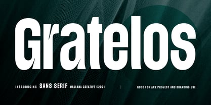 Gratelos is a modern sans serif display font. With condensed bold stroke, fun character with some of ligatures. To give you an extra creative work. Gratelos font support multilingual more than 100+ language. This font is good for logo design, Social media, Movie Titles, Books Titles, a short text even a long text letter and good for your secondary text font with script or signature typeface. Make a stunning work with Gratelos font. Cheers, MaulanaCreative
 - Calling Code by Dharma Type,
$- Calling Code — very nice monospaced font — 1. is a monospaced font family for coding and tabular layout. 2. simply consists of 4 style, Regular, Italic, Bold and Bold Italic. 3. is ready in both OpenType and TrueType formats. 4. has slightly condensed width for more useful space. 5. has good distinguishability and legibility and cute curly tails. 6. brings a fresh sensitivity to boring old existing monospaced fonts. You can try Regular style for free.
 - Armetica by Hsan Fonts,
$18.00 Armetica is an ultra condensed sans serif typeface with a unique personality. It comes in normal and display versions, with 9 weights, as well as italics totaling 18 fonts. Armetica is a modern elegant typeface that would be perfect for branding, logos, headlines or captions. The font could also work as a stylish text overlay on any background image you like, minimalist and warm while still being versatile enough to use anywhere!
 - Martley by Maulana Creative,
$15.00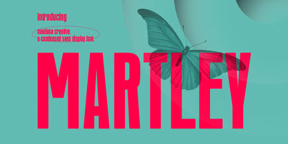 Martley is a Condensed sans Display font. Regular stroke, fun character with a bit of ligatures and alternates. To give you an extra creative work. Martley font support multilingual more than 100+ language. This font is good for logo design, Social media, Movie Titles, Books Titles, a short text even a long text letter and good for your secondary text font with script or serif. Make a stunning work with Martley font. Cheers, Maulana Creative