10,000 search results
(0.026 seconds)
- Battista by preussTYPE,
$29.00 The BATTISTA typeface stands in the long tradition of the designs developed by Giambattista Bodoni, who made his famous typefaces in the end of the eighteenth century. Similar designs can be found on various specimen books e.g. Alexander Wilson, John Bell, Edmund Fry and Alexander Thibaudeau. One of the best italics was available by Stephenson Blake & Co. foundry form Sheffield, England. In the end of the nineteenth century an unknown punch cutter at the German type foundry Schelter & Giesecke made an very bold cut of this Bodoni design. He brought both designs, the regular and the italic to an new level of harmony. Compared to the original Bodoni designs the new typeface was a lot bolder, which was well taken by the audience in this time. The BATTISTA typeface is an remarkable design, assembled of ultra bold and very fine shapes, but in all, the spirit of Bodonis design was well preserved. BATTISTA is a classic display design. The fine details are best shown on larger text sizes.
 - Prismatic Spirals Pro by MMC-TypEngine,
$182.00 PRISMATIC SPIRALS PRO FONT! The Prismatic Spirals PRO is a Decorative Type-System and ‘Assembling Game’, itself. Settled in squared pieces modules or tiles, embedded by unprecedented Intertwined Prismatic Structures Design, or intricate interlaced bars that may seem quite “impossible” to shape. Although it originated from the ‘Penrose Square’, it may not look totally as an Impossible Figures Type of Optical Illusions. More an “improbable” Effect in its intertwined Design, that even static can seem like a source of Kinetical Sculptures, or drive eyes into a kind of hypnosis. Prismatic Spirals Pro has two related Typefaces both more basic or easier to use versions, the Default Family plus its “bold” braided version Prismatic Interlaces… PRO provides a more advanced, complex, and twisted Design, plus requires to be typed alternating caps. Instructions: Use the Map Font Reference PDF as a guide to learn the 'tiles' position on the keyboard, then easily type and compose puzzle designs with this font! All alphanumeric keys are intuitive or easy to induce, you may easily memorize it all! Plus, often also need to consult it! *Find the Prismatic Spirals Pro Font Map Reference PDF Here! (!) Is recommended Print it to have the Reference or open the PDF to also copy and paste, when consulting is required or when it may be difficult to access, depending on the keyboard script or language. The 2 glyphs sets are separated in colors for facilitating. Also use the Map Font with key captions or switch to it for ensure that the characters are alternating between both uppercase and lowercase letters as other Keys as numbers, marks, and punctuation along the strings, holding Shift one by one or actually two by two. As a Tiles Type-System, the line gap space value is 0, this means that tiles line gaps are invisibly grouted, so the user can compose designs, row by row, descending to each following row by clicking Enter, same as line break, while advances on assembling characters. Background History: The first sketches of my Prismatic Knots or Spirals Designs dates back then from 2010, while started developing hand-drawn Celtic Knots and Geometric Drawings in grid paper, while engage to Typography, Sacred Geometry and the “Impossible Figures” genre… I started doing modulation tests from 2013, until around 2018, I got to unravel it in square modules or tiles from the grid, then idealized it as fonts, along with other Type projects. This took 13 years to come out since the first sketches and 6 months in edition. During the production process some additional tiles or missing pieces were thought of and added to the basic set, which firstly had only the borders, corners, crossings, nets, Trivets connectors or T parts and ends, then added with nets and borders integrations. Usage Suggestions: This type-system enables the user to ornate and generate endless decorative patterns, borders, labyrinthine designs, Mosaics, motifs, etc. It can seem just like a puzzle, but a much greater tool instead for higher purposes as to compose Enigmas and use seriously. As like also to write Real Text by assembling the key characters or pieces, this way you can literarily reproduce any Pixel Design or font to its Prismatic Spirals correspondent form, as Kufic Arabic script and further languages and compose messages easily… This Typeface was made to be contemplated, applied, and manufactured on Infinite Decorative Designs as Pavements, Tapestry, Frames, Prints, Fabrics, Bookplates, Coloring Books, Cards, covers or architectonic frontispieces, storefronts, and Jewelry, for example. Usage Tips: Notice that the line-height must be fixed to 100% or 1,0. In some cases, as on Microsoft Word for example, the line-height default is set to 1,15. So you’ll need to change to 1,0 plus remove space after paragraph, in the same dropdown menu on Paragraph section. Considering Word files too, since the text used for mapping the Designs, won't make any literal orthographical sense, the user must select to ignore the Spellcheck underlined in red, by clicking over each misspelled error or in revision, so it can be better appreciated. Also unfolding environments as Adobe Software’s, the Designer will use the character menu to set body size and line gap to same value, as a calculator to fit a layout for example of 1,000 pts high with 9 tiles high, both body size and line gap will be 111.1111 pts. Further Tips: Whenever an architect picks this decorative system to design pavements floor or walls, a printed instruction version of the layout using the ‘map’ font may be helpful and required to the masons that will lay the tiles, to place the pieces and its directions in the right way. Regarding to export PNGs images in Software’s for layered Typesetting as Adobe Illustrator a final procedure may be required, once the designs are done and can be backup it, expanding and applying merge filter, will remove a few possible line glitches and be perfected. Technical Specifications: With 8 styles and 4 subfamilies with 2 complementary weights each (Regular and Bold) therefore, Original Contour, Filled, Decor, with reticle’s decorations and 2 Map fonts with key captions. *All fonts match perfectly when central pasted for layered typesetting. All fonts have 106 glyphs, in which 96 are different keys with 2 versions of each of both caps and shift keys, plus a few repeated for facilitating. It was settled this way in order for exchanging with its Prismatic relative fonts which has only 48 different keys repeated twice. Concerning tiles manufacturing and Printed Products as stickers or Stencils, any of its repeated pieces was measured and just rotated in different directions in each key, so when sided by other pieces in any direction will fit perfectly without mispatching errors. Copyright Disclaimer: The Font Software’s are protected by Copyright and its licenses grant the user the right to design, apply contours, plus print and manufacture in flat 2D planes only. In case of the advent of the same structures and set of pieces built in 3D Solid form, Font licenses will not be valid or authorized for casting it. © 2023 André T. A. Corrêa “Dr. Andréground” & MMC-TypEngine.
 - Queulat by Latinotype,
$- Queulat is a hybrid typeface that combines two different styles, reflecting charm, freshness and, especially, a strong personality. The font is inspired by Modern and Grotesk styles. The former is shown in some characteristic features such as teardrop terminals, which give the typeface an attractive unique look, making it an ideal choice for logotypes and labelling. The latter, with its rationality, makes Queulat a stable and strong face for headings and subheadings. The combination of styles can be clearly seen by comparing the regular with the alt version. The regular version is more simple than the alt one. Differently, the alternative version possesses more features of the Modern style, like teardrop terminals in ‘k’ and ‘v’. Queulat also comes with a Unicase version, in which a higher number of shapes can be found, resulting in a unique colourful display.
 - Livory by HVD Fonts,
$50.00 Livory is a serif type family of four fonts including small caps, 25 ornaments & 50 ligatures in each style. It was designed by Hannes von Döhren & Livius F. Dietzel between 2005 and 2010. Livory is influenced by the French Renaissance Antiquas from the 16th century. It has an organic look with a warm touch and was especially developed for long texts. With its melted corners and individual serifs, Livory has also a smooth and handcrafted appearance in display sizes. With almost 780 glyphs in each font, Livory is equipped for complex, professional typographic work. The OpenType fonts have an extended character set to support Central and Eastern European as well as Western European languages. Each font includes small caps, fractions, old style-, lining-, tabular numbers, scientific superior/inferior figures, ligatures, ornaments and a set of arrows.
 - Buddies by Sudtipos,
$59.00 Buddies, designed by Guille Vizzari, is a script font that was initially born as a piece of lettering. It is the result of an experiment between brush pen and pencil, and in this way, Buddies takes the imprint of the brush, the freshness of sign painting, and some (or a lot) of quirks by the author. The font at times enjoys dancing in titles and short lines of text, pouring rhythm and movements through its lowercase various x-height sets. Buddies also has a vast uppercase set with daring and atypical shapes that surprisingly function beautifully for composing short all-caps texts; messages are brought to life with awesome personality, ideal for packaging, fashion or even editorial. Buddies is a friendly font, a humble invitation to the brush letters universe, but from an unpredictable point of view.
 - Comply Slab by Arkitype,
$12.00 Comply Slab is inspired by action and extreme sports, Comply gets it's name from the well known skate trick the “No Comply”. This type family doesn't mess about! With 9 weights from thin to black, Comply Slab will give you some great options to use. This font family will “kill it” in both print and digital, in headlines for editorial, posters, banners, websites, apparel, packaging, logos or magazines just to name a few. If you want to make a statement that gets the message across in a slick way with some cool looking glyphs Comply Slab is the font! There is an alternate R and S so you can choose to go with the cool default sharp glyphs or swap them for a more traditional chamfered corner version. Each of the 9 weights has an italic version to add even more action.
 - Queulat Soft by Latinotype,
$- The font is the soft version of the Queulat basic and condensed families, but keeping the same features as the original typeface. Queulat Soft is a hybrid font that combines different styles, reflecting charm, freshness and, especially, a strong personality. The font is inspired by Modern and Grotesk styles. The former is shown in some characteristic features such as teardrop terminals, which give the typeface an attractive unique look, making it an ideal choice for logotypes and labelling. The latter, with its rationality, makes Queulat Soft a stable and strong face for headings and subheadings. The combination of styles can be clearly seen by comparing the Regular with the Alt version. The Regular version is more simple than the Alt one. Differently, the alternative version possesses more features of the Modern style, like teardrop terminals in ‘k’ and ‘v’.
 - Merrivaux by Greater Albion Typefounders,
$18.00 Some time ago, when we were working on our Merrivale family, it occurred to us that an adaptation of the design, incorporating selected Blackletter elements, would be in the best traditions of 19th and 20th century blackletter revivals, which combine all the spirit of the middle ages with modern legibility-think of Goudy Medieval as an example. In the case of Merrivaux (best quality faux-medieval name there!) we've produced a typeface which has the ready legibility of Roman titling, but which gives a subtle blackletter feel. The regular form of Merrivaux is incised with a visible midline, a solid form with identical metrics is also offered. Both forms include a range of opentype features including ligatures, fractions, old style numerals and terminal forms. Merrivaux is ideal for posters, signage and design work, where a touch of that 'Olde-Worlde' feel is needed.
 - Raniscript by Stephen Rapp,
$59.00 Raniscript started out as an idea for a bold and strongly structured ronde style script with some contemporary touches. As I tinkered with various forms it took on a life of its own. Having an old world feel, it makes me visualize faded shop signs from India written in English. The name comes from a series of colorful vintage matchbook designs advertising the Flying Rani. You'll find Raniscript ideal for packaging, book titles, brochures or anything requiring a robust display treatment. It comes fully loaded for OpenType savvy applications. Three full sets of caps are included. By clicking the Titling button in Illustrator you can type using an all caps set that includes ligatures, case sensitive punctuation and language coverage. Other features include oldstyle figures, Central European language support, fractions, contextual letter substitution, swash characters, and ornaments.
 - Divine - Unknown license

- Alligators - Unknown license

- Gelion by Halbfett,
$30.00 Gelion is a large family of geometric sans serif fonts. It ships both as two Variable Fonts or as 16 traditional fonts. Those static fonts span eight different weights, ranging from Extralight to Black. Each has an upright and an italic font on offer. The italics are carefully crafted, with an 8° slope. Gelion is inspired by 20th-century geometric sans serifs and classic neo-grotesque designs from the late 19th century and the middle of the 20th century. Its forms remain true to the gracefully geometric look of its classic predecessors, which will surely tick off any client’s long list of branding requirements. Letters in all of Gelion’s weights are drawn with virtually monolinear strokes. Its lowercase letters have a tall x-height. Yet, that still leaves enough room for the fonts’ diacritical marks. Gelion’s default “a” and “g” each have single-storey forms by default. The dots on the ‘i’, ‘j’, and diacritics are round, as are the punctuation marks. Gelion is an excellent choice for both corporate design and editorial design projects, thanks to its range of weights and its legibility in text. The fonts include a lot of ligatures, some monochromatic emoji, a set of arrows, lovely Roman Numerals, and more. Thanks to Gelion’s stylistic alternates, if a project comes up where you do not need a geometric vibe, you can activate Stylistic Set 1. That will replace many of the fonts’ letters with more humanistic-sans alternates, giving your text the feeling of a whole other type design with just one click. Last but not least, the descending “f” available in Gelion’s italics is a nice typographic trait.
 - Cullens Shoes by Aboutype,
$24.99Decorative three-dimensional display font with cap and lowercase. Originally designed for a shoe company. Works with colors, gradients and filters. Cullens Shoes was designed for all media and works best at 30 point and above. Cullens Shoes requires subjective display kerning and compensation. - Mrs Berry by Hipopotam Studio,
$30.00 Mrs Berry is a hand drawn typeface designed for one of our books. You can use it as a regular monochrome typeface or layer different styles to achieve colorful combinations. Mrs Berry has upper and lowercase characters and supports both Latin and Cyrillic scripts.
 - MedicineShelf by Ingrimayne Type,
$7.95 MedicineShelf has old-fashioned looking letters on old-fashioned looking bottles. The letters are taken from the typeface NeuAltisch . The MedicineShelf-Blank and MedicineShelf-Outline styles can be used in layers with the base MedicineShelf font to increase the coloring possible with this typeface.
 - Cowboy Stories by Open Window,
$19.95 Cowboy Stories celebrates a landmark innovation for dingbat fonts. It's a 2 color layered-dingbat. Its complementing character set provides just the right amount of Spaghetti Western charm. Need assistance spinning a memorable fireside yarn? Grab your trusty spittoon and a copy of Cowboy Stories.
 - Comba by That That Creative,
$15.00 COMBA is a quirky all caps display font that is perfect for display type and contemporary branding. It has just enough eye-catching letters to pull the reader in and make them smile. COMBA also comes with 5 logo templates and a color palette.
 - Custard by Device,
$39.00 Playful and funky. The ideal choice for candy wrapping, teen magazines, toy packaging and the like. The reweighted condensed is useful where space is at a premium, and mixing the two weights freely leads to intriguing results. Use with bright fresh colors for added "bounce".
 - Max Stitch by Aboutype,
$24.99Similar to Erasurehead. Redrawn as in line, outline font for embroidery application. Works well with layers, colors, gradients and filters. Max was designed for all media and can be used in a wide range of point sizes. Max requires subjective display kerning and compensation. - Gersio by Rosario Nocera,
$16.00 Gersio is a revisiting of a lapidary typeface from the 19th century designed for the horror and thriller genre but thanks to its strong distinctiveness it’s also suitable for branding. Gersio is available in light, regular and bold weights in two versions: solid and Scratched, it also offers a large selection of alternative letters. Gersio is suitable for display works, posters and billboards.
 - Evil Spin by PizzaDude.dk,
$20.00 Evil Spin is inspired by some old horror poster. It has this eerie feeling to it, which leaves you with terror...no matter what you write!!! I've made 4 different versions of each letter, and they automatically changes as you type. And that goes for every layer if Evil Spin - mix and match the layers for even more creepy effects!
 - P22 Cage by P22 Type Foundry,
$24.95 Based on the handwriting and sketches of American experimental composer John Cage, this set was produced in conjunction with The Museum of Contemporary Art in Los Angeles and the John Cage Trust. This unique collection includes 52 graphic extras culled from the composer's notes and scores, as well as the "Cage Silence" font inspired by Cage's seminal work 4' 33".
 - 3D Blocky by Okaycat,
$29.50 3D Blocky is a hand-drawn 3-D font. Composed of friendly & fun letters, this font is sure to become a favorite for you. There is a sprinkling of dingbats scattered around the alternates, just there to make this font extra fun and useful . Check it out! 3D Blocky is extended, containing West European diacritics & ligatures, making it suitable for multilingual environments & publications.
 - The Hohoho by Avchi,
$12.00 Tho Hohoho is a font specially designed for christmas purposes. This font is a condensed sans serif, have a round corner, and have a happy concept. The main target is for Christmas design, but can be use for another purposes such as kitchen, nature, and other. This Font Include : Ligatures Latin Numbers & Punctuation We wish this font can bring customers to happiness.
 - Los Alamos by Red Rooster Collection,
$60.00 Although Los Alamos was originally designed as a complementary sister typeface to Grand Canyon, it evolved into a comprehensive and unique type family in its own right. It incorporates a unicase that is fully interchangeable with the caps, and vice versa, giving the user many different options and looks. Los Alamos Pro includes over 800 glyphs and ligatures, and supports 131 languages.
 - Necia by Graviton,
$20.00 Necia font family has been designed for Graviton Font Foundry by Pablo Balcells in 2014. It is a modular, geometric and slightly condensed typeface which has been conceived to be primarily a display typeface, but given its clarity it can also be used for composing short and intermediate length texts. Necia consists of 8 styles. Each containing small caps and several alternate characters.
 - Bubble Bloods by Hatftype,
$17.00 This is a blackletter display font with additional ornaments inspired by gothic and horror metal styles because its shape is very unique and very suitable for any project you will use with this theme. Features : Uppercase & Lowercase Multilingual support Number Symbol Ornament Punctuation Support in Mac and Windows OS Support in design application (photoshop, illustrator, and more) I really hope you enjoy it.
 - Jealous Radio by Bogstav,
$14.00 Each letter is handmade and drawn with a “blobbly” pen, leaving a wobbly and grungyline. The corners are rounded which adds a blurry look to the rough lines. All in all, Jealous Radio is kind-looking,soft, yet rough and really organic looking! Useful for a wide range of things: from kids products, comics, posters, invitations or even protest banners!
 - Dino Park by Yoga Letter,
$14.00 "Dino Park" is the most amazing font I've ever made. This font was carefully crafted by incorporating dinosaur into its writing. Very suitable for your projects. This font is also very easy to apply because it has been specially designed. You can create movie titles, book titles, magazine covers, animals, design logos, t-shirt logos, quotes, traveling, research, and more.
 - Basketto by Mike Zuidgeest,
$12.50 Basketto is a carefully crafted, handmade sans serif font. Completely built from scratch in Adobe Illustrator. The glyphs are nice and bold, with sharp corners. Use Basketto for your product packaging, out of home adverting, food truck posters, festivals or the travel industry. This is my official font debut, I would love to hear from you to see my font on your product!
 - Bodoni Elegant by Alan Meeks,
$45.00 Whenever I went to use Bodoni I could never quite find a version I was happy with, so I designed my own incorporating, hopefully, the best of all the others. I decided to make a slight curve on the uprights, rather like Optima, because I thought this added touch of elegance which many of the others lacked....hence the name.
 - Aguda by Graviton,
$20.00 Aguda font family has been designed for Graviton Font Foundry by Pablo Balcells in 2014. It is a modular, geometric typeface which has been conceived to be primarily a display typeface, but given its clarity it can also be used for composing short and intermediate length texts. Aguda consists of 8 styles. Each containing small caps and several alternate characters.
 - Scary Night by Trim Studio,
$12.00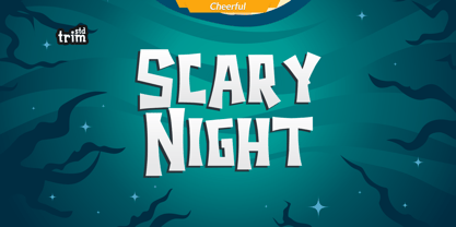 Scary Night is the perfect Halloween font: scary, weird and creepy. It will add a touch of horror to any design project! Its perfectly suited for crafter and graphic artist to complete their design such as invitation, Halloween Event, advertisement, poster, logo, birthday, product sign, and many more! Scary Night Font also Lightweight, even so contains All Standard glyphs and punctuations
 - Lonie Soft by Par Défaut,
$75.00 Lonie Soft is sans serif font family with rounded corners (include 5 weight, italic and variable) It contains more than 1200 characters including the Latin, Cyrillic and Greek alphabet There are also 15 OpenType features (Superior; Inferior; Numerator; Denominator; Fraction; Tabular Lining; ;OldStyle Figure; Small Capital; Small Capitals from Capitals; Contextual Alternate; Case Sensitive; Ordinals; Access All Alternates; Stylistic Set).
 - HUGS by Chank,
$99.00 HUGS is a font inspired by children at play and explorative good-natured spirit. With a bit of a bounce and a whole lotta whimsy this headline font has a hand-drawn charm and a wiggly lightheartedness. Originally created for a great American diaper company for use in coupons and packaging, HUGS also translates nicely to the screens of modern devices.
 - Ruby Lights by Bogstav,
$17.00 Say hello to Ruby Lights - a bold rounded font, made to bring fun and joy to your designs! Ruby Lights has no sharp edges, everything has gentle rounded corners and edges, leaving a soft yet vibrant look. Go ahead and use Ruby Lights for your children’s books, posters of any kind, invitations or maybe packaging - actually anything that needs a fresh handmade attitude!
 - Talisman Warrior by Hatftype,
$17.00 This is a blackletter display font with additional ornaments inspired by gothic and horror metal styles because its shape is very unique and very suitable for any project you will use with this theme. Features : * Symbol * Number * Alternate * Punctuation * Multilingual support * Support in Mac and Windows OS * Support in design application (photoshop, illustrator, and more) I really hope you enjoy it.
 - Death Party by Yoga Letter,
$15.00 "Death Party" is a special halloween font that will make your halloween party even more scary and will make you more total in welcoming the halloween party. This font is very easy to use because it has been specially designed. "Death Party" is also suitable for making Halloween greeting cards, horror movie titles, comic titles, magazines, posters, book titles and more.
 - Blackout by Blackout,
$20.00Blackout is the first and signature font to the Blackout Foundry. Inspired by gothic structures, but maintaining a constructive form. Everything in balance, simple, and straightforward. The font has hard corners on one end, and subtle curves on the other. It is intended for anyone wanting to have a moody appeal to their work, but still maintains a legible format. - Chancy JNL by Jeff Levine,
$29.00 A short-lived TV game show from 1977 called “Second Chance” has its logo lettered in a bold, block type style with slightly chamfered corners. This inspired Chancy JNL, which is available in both regular and oblique versions. While “Second Chance” only lasted one season, the show was re-tooled - and debuted in 1983 as “Press Your Luck” – which ran until 1986.

