10,000 search results
(0.027 seconds)
- Virus Cursed by Maulana Creative,
$14.00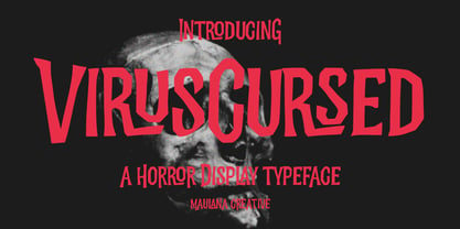 Virus Cursed is a Horror Vibe Decorative display font. With Bold Sharp stroke, Upright and fun character with a bit of ligatures. To give you an extra creative work. Virus Cursed font support multilingual more than 100+ language. This font is good for logo design, Social media, Movie Titles, Books Titles, a short text even a long text letter and good for your secondary text font with Script. Make a stunning work with Virus Cursed font. Cheers, Maulana Creative
 - Newake by Indieground Design,
$19.00 This sans-serif font made by the Indieground Team is perfect for titles, logos, editorial design, packaging and web design. It fits every graphic design or typography-related project. The slightly rounded corners of the letters give an elegant line to your text and quotes. A font with a minimal atmosphere that will give a cool style and weight to all your artistic compositions. This regular commercial version includes the full characters set shown in the preview.
 - Benghane Mastugan by Kartiny Type,
$12.00 Benghane Mastugan is a Modern Script font that comes with a very beautiful character change, a classic copper decorative script font with a modern touch, designed with great detail to present an elegant style. Benghane Mastugan is interesting because the typeface is pleasing to the eye, clean, feminine, sensual, glamorous, simple and very easy to read, because of the many luxurious letter connections.I also offer a number of decent stylistic alternatives for some of the letters. Thank You
 - Archaz Negras by Mans Greback,
$59.00 Archaz Negras strikes a chord with its rough rock band logo aesthetic. Its symmetric and captivating character makes it a fit for movie posters, Halloween invites, or a heavy metal t-shirt that demands attention. Dark, daring, and undeniably striking, Archaz Negras channels the raw energy of death metal and an eerie aura of horror. Designed with precision by Mans Greback, this destroyed font resonates with the rebellious spirit of punk and its haunting allure of the unknown.
 - MC Haunted Farmer by Maulana Creative,
$17.00 Haunted Farmer horror display font. Bold contrast stroke, fun character with a bit of ligatures and alternates. To give you an extra creative work. Haunted Farmer font support multilingual more than 100+ language. This font is good for logo design, Social media, Movie Titles, Books Titles, a short text even a long text letter and good for your secondary text font with script or serif. Make a stunning work with Haunted Farmer font. Cheers, Maulana Creative
 - Template Sans by Jeff Levine,
$29.00 The Wright-Regan Instrument Company (Wrico) was one of the leading manufacturers of lettering templates for many years. Aside from their own line of products, they also did custom manufacturing. A series of lettering guides called “Mimeostyle” for the A. B. Dick Company of Chicago (produced for use in making mimeograph machine printing stencils) featured an art Deco squared letter design with rounded corners. This is now available digitally as Template Sans JNL, in both regular and oblique versions.
 - Empire State Gothic by Comicraft,
$19.00 Empire State Gothic is, from basement to spire, an exultant, soaring skyscraper of a font, distinguished by its high arches, steel-framed construction and the glory and pride of Comicraft's fine woodwork and stonework! You might find it surprising, then, that this tall, lanky font was something of a loner during its teenage years, mingling with others of its kind in the shadowy corners of coffeehouses, nurturing feelings of belittlement while craving attention it may not have rightly deserved.
 - Happy Boy by Niznaztype,
$15.00 Happy Boy is a handwritten sans typeface that has a rounded corner in each glyph. Inspired from speech bubble for comics, illustrations and kid writing. Happy Boy is perfect for comics, illustrations, cartoons and very suitable for speech bubble text. It is fun, easy communication and an eye catching style. You can use it for cover book, tagline, poster, branding, advertising, wallpainting letter, graphic design, and more. Happy Boy comes in 4 styles, regular, italic, bold and bold italic.
 - Polate by Typesketchbook,
$55.00 Polate font is an extra large super family of 60 fonts! Polate has such a big abundance of contrast, styles, weights, X-Hight. Typesketchbook consists of a very usable, clean and modern sans typeface . The complete Polate type family includes 6 weights with italic and 5 X-Hights versions for each of them all in all 60 fonts for a multifunctional usage, especially for cooperative work, such as website, magazine, editorial, publishing , as well as packaging.
 - Fraxcrown by Maulana Creative,
$14.00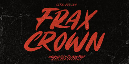 Fraxcrown is a modern horror vibes display font. With bold brush stroke, fun character with a bit of ligatures and alternates. To give you an extra creative work. Fraxcrown font support multilingual more than 100+ language. This font is good for logo design, Social media, Movie Titles, Books Titles, a short text even a long text letter and good for your secondary text font with sans or serif. Make a stunning work with Fraxcrown font. Cheers, Maulana Creative
 - Shining Holiday by Zeenesia Studio,
$15.00 Shining Holiday is a calligraphic script font that comes with a lovely alternative character. mix of copper calligraphy in a handlettering style. Designed to convey an elegant style. Shocking Script is attractive because it is smooth, clean, feminine, sensual, glamorous, simple and very legible. Its classic style is very suitable to be applied to all types of formal items such as invitations, labels, menus, logos, fashion, make up, stationery, letterpresses, romantic novels, magazines, books, greeting / wedding cards, packaging, labels.
 - Crossfit Core by TypeThis!Studio,
$50.00 Crossfit is a new headline font for great sizes, such as big movie posters, advertising or editorials. Matching topics might be adventures, sports, strong nature and all kind of challenging life events. Its bold stability transforms your creation into a non questionable design. It is bold, clear and also friendly thanks to its rounded corners. www.typethis.studio Thank you for checking out Crossfit font family. If you have any questions, please send us an email: hello@typethis.studio
 - Billsville by Chank,
$49.00Billsville is a fun font that mixes the casual sassy flair of an old Flintstone cartoon with the upright legible nature of a classic serif font to create something entirely new. Although based primarily on straight lines and simple letterforms, Billsville has got softly rounded corners that make everything seem softer. A friendly, versatile display font named after Williamstown, MA, home of a website called Tripod who originally commissioned this font for their members in 1997. - 26 Flowers by Celebrity Fontz,
$24.99 26 Flowers is a digital revival and restoration of a beautiful collection of 26 individually unique ornamental letters from historical texts. Each of the 26 letters of the alphabet are contained in a square frame with a different flower in the background and an antique letter in the top right corner; hence, the name 26 Flowers. This highly ornamented typeface is perfect for leading off paragraphs or in any text dealing with the subject of flowers.
 - Spooky Grave by Letterara,
$14.00 Spooky Grave is a chunky lettered and spooky display font. Add this font to your favorite Halloween-themed ideas: invitations, banner, advertising, logo, movie, poster, novel, app game scary or horror, and notice how it makes them come alive! No matter the topic, this font will be an incredible asset to your fonts’ library, as it has the potential to elevate any creation. This font is PUA encoded which means you can access all of the glyphs.
 - Rennie Mackintosh by CRMFontCo,
$35.00The Classic Charles Rennie Mackintosh Font. Created in 1993, the timeless beauty of Charles Rennie Mackintosh’s letterforms is now available at MyFonts for the first time. Often imitated, but never bettered, this font has been used in various projects all over the globe, enjoying the limelight of Hollywood when it was requested for use in Sam Raimi’s second “Spider Man” adventure. A form of this font has subsequently been used for the TV series “An American Horror Story”. - Rudge by Adam B. Ford,
$9.00 Rudge is an intentionally rough sans-serif font. It was designed to share the look and feel of many “antique” fonts, although it lacks the standard serif look of those fonts. The corners are slightly rounded, the edges are wobbly, and the kerning is tight. It could be used as a faux “sloppy printing” font or just a more regularized hand-drawn font. It comes in six flavors: Light, Regular, and Bold, with italic versions of each.
 - Grilock by Nathatype,
$29.00 Prepare to embark on a typographic journey through the past with Grilock, an uppercase display font that merges vintage looks. The thickness of each letter is uneven, giving them a reminiscent of vintage handcrafted signage. The relatively sharp corners of Grilock provide visual contrast against the uneven thickness, resulting in a font that is both striking and memorable. In addition, Grilock gives ornaments as a special bonus. Grilock fits in posters, logos, branding materials, and many more.
 - Vidocq by Typogama,
$19.00 Vidocq is a single weight typeface designed for use in headlines and titles, inspired by the woodcut styles of the 19th century. Its rounded forms and dark stroke translate into a bold yet friendly appearance coupled with a narrow proportion that let’s it set well in condensed settings. Thanks to an extended character set and wide range of Opentype features that includes arrows and fleurons, Vidocq was created to allow designers to play with various styles while composing layouts.
 - Fox Diane by Fox7,
$14.00 Fox Diane is a cute and fun color font. This font is your go-to for crafting cute greeting cards that express affection and warmth. Fall in love with its authentic feel and use it to create gorgeous invitations, beautiful stationary art, eye-catching social media posts, and cute greeting cards. 🌺🌺 Please note that the Canva do not support color fonts! 🌺🌺
 - P22 Posies by IHOF,
$24.95 P22 Posies is a six-font system for creating multi-colored initial caps in the spirit of illuminated manuscripts. Four layer fonts can be built upon each other to create any chromatic effect you desire. The Posies Initial font combines all four layers to allow easy one-color drop-caps, while the Solid font features the unadorned roman capitals for setting companion titling text.
 - Zubilo by ParaType,
$25.00 An informal decorative sans serif was designed by Gennady Fridman and released by ParaType in 2004. Based on informal lettering. In Russian 'Zubilo' means 'Cold cutter' or 'Chisel'. Colorful letterforms seems to be cut by an amateurish but strong hand used to operate with rough metal tools, not with pen or pencil. The face is good for use in advertisements, posters and headlines, especally for comic editions and youth press. Decorative styles were added in 2011 by the same author.
 - Bernhard Modern by URW Type Foundry,
$35.99 Bernhard Modern was designed by Lucian Bernhard and was first cut by American Type Founders. Bernhard Modern is an unusual face with small lowercase but very tall ascenders and short descenders. Bernhard Modern was intended to hold its color and contrast without depending on the spread of ink of the letterpress method. It has an attractive pen drawn quality which has made it a popular choice for invitations and greetings cards. The Bernhard Modern font is useful for advertising and display work.
 - Border PI 1515-9 by Monotype,
$29.00This font consists of individual pieces that can be combined to make a wide variety of borders. For each border design, the pieces generally include four corners, a vertical section, and a horizontal section. - Quarz 974 by Domenico Ruffo,
$40.00 Quartz 974 is a typology of font inspired by simple and geometric lines as triangle. It is very suitable for titles, logos, posters, that’s why it is composed by only capital letters and numbers.
 - Anniversary Seals by Gerald Gallo,
$20.00 Anniversary Seals is composed of a seal design reminiscent of the embossed foil seals used in commemorating company anniversaries. The font contains 100 consecutive characters from the first anniversary through the one-hundredth anniversary.
 - Sangkury by Stringlabs Creative Studio,
$29.00 Sangkury is a unique display font. It features a spooky feel that makes it perfect for any project that requires a horror-themed. Use it for movies, flyers, posters, Halloween’s craftings and much more!
 - Fab by Canada Type,
$24.95 It's 1984 and everything has sideburns. Shoulder-padded "dress for success" is in, with power suits for women, black and white layers for men, neon brights for the youngsters. Maggie's "enemy within" and "no society" speeches preface the arrival of shopping malls and corporate status symbols. The economy is a philosophy and accountants carry ambiguous but very sophisticated-sounding titles. Thousands of words and expressions are reduced to initials or monosyllabic sounds. Synthesizers are very refined and the music is very catchy. The Macintosh and MTV are making waves. Brands are lifestyles. "Yuppy," Yummy," "Bobo," "Dinky" and "Woopie" are standard consumer categories in advertising lingo. The Volkswagen identity, only 5 years old now, is all the rage in design. VAG Rundschrift, by all appearances a rounded and slightly condensed Futura, is everywhere. Tube design is king. Fast forward two dozen years. Replay, but bigger and much louder. Fab. Let's dance. Fab is Canada Type's tribute to the Eighties. It's a five-font unicase family that brings tube design into the 21st century. The main font is an all-in-one treatment of the shiny roundness that the 1980s were. Fab White is a tightly packed thick outline font that conveys luscious contentedness like nothing else. The Fab Trio package is very useful for layered and colorful design, with the Black style serving as a backdrop, the Bold style as the front forms, and the Fill style for inlining. Fab comes in all popular formats and contains support for Western, Central and Eastern European languages, as well as Baltic, Esperanto, Maltese, Turkish and Celtic/Welsh languages.
 - Alien League - Unknown license

- Umba Slab by TypeThis!Studio,
$29.00 The best thing about Umba Slab is its surprise! UMBA Slab is a clean but eye-catching typeface designed by Anita Jürgeleit. It adds an amazing touch to your corporate design and titling by developing a more dynamic shape from thin to bold. It’s especially designed for a wide range of variety and to create a highly recognizable branding and titling. Twenty styles from thin to bold and matching italics help you to create design with a strong essence. Separate styles for alternate and small caps will show up in your font menu, making sure that you always stay aware of the wide range of possibilities of your new favourite font. Finally, for all those who love caps, there are extra caps-only fonts added to the collections. Would you like to see more of how UMBA can improve your design? Let’s get in touch! INSTAGRAM @anitajuergeleit +++ FACEBOOK AnitaJuergeleitTypefaces
 - Irpin Type by Aronetiv,
$- Irpin Type is an original font dedicated to the city of Irpin. Intended for everyday use, for books, logos, corporate style. It can also be used in posters and presentations where a confident character is needed. This font suits a large size, but it has good readability even in a small one. This is a modern slab serif with geometric shapes, inspired by the Ukrainian avant-garde of the 20th century. It has characteristic alternates for "G", "a", "u", and "&". Irpin is a city of Ukraine in the suburbs of Kyiv. On March 24, 2022, by the Decree of the President of Ukraine in order to celebrate the feat, mass heroism and resilience of citizens, shown in the defense of their cities during the repulsion of the armed aggression of the Russian Federation against Ukraine, the city was awarded the honorary title "Hero City of Ukraine"
 - Ethos Nova by Designova,
$15.00 Ethos Nova is a minimalist neo-geometric sans-serif typeface family of 12 fonts featuring the finest design inspired by the simple and clean design approach of the modern era. The typeface is made with a special focus on minimalism and simplicity in typography, this typeface can transform your design projects to another level of visual appeal. Handcrafted and designed with powerful OpenType features in mind, each weight includes extended language support including Western European & Central European sets. A total of 312 glyphs are included. Ethos Nova is a perfect choice for graphic design, text presentation, web design, print and display use. The typeface can be an amazing option for branding, logo / logotype design projects, marketing graphics, banners, posters, signage, corporate identities as well as editorial design. Adding extra letter-spacing for the Caps will make this font perfect for minimal headlines and logotypes, as shown in promo images here.
 - Whiteblack by Fontador,
$24.99 Whiteblack is a slab serif with a soft touch, designed for contemporary typography and comes up with 6 weights for positive and negative settings plus handslanted obliques. In dark backgrounds, especially for signage and on screen, negative settings glow and appear heavier than positive settings. To avoid the „glow-effect“ the typeface contains special weights for an optimal balance between white and black. A large x-height and open apertures not only creates space for smaller sizes, but also lends Whiteblack a solid balanced and generous character for print and screen. Many OpenType features including 324 ligatures, contextuel alternates, and stylistic set built into all cuts. The font contains 1.076 glyphs with a wide range of flexibility for Latin language support for every typographical needs. Whiteblack brings elegance and a certain warmth wherever a contemporary slab serif typeface is needed, special for signage, brands, magazines and corporate design.
 - ITC Flora by ITC,
$40.99ITC Flora is the work of Dutch designer Gerard Unger, and is named for his daughter. He started by doing calligraphy experiments with felt-tip and ballpoint pens, and developed these drawings into a formalized script typeface. Swiss typographer Max Caflisch advised the Dr.-Ing Rudolf Hell GmbH technology firm to add a new round-nibbed script face to their Digiset type library, and in 1984, Flora was released by Hell. Unger used a chancery cursive skeleton in this design, which imparts grace and movement. Flora was also intentionally designed to be simple and sturdy, and with its minimal variation in thick/thin stroke ratio, it worked well on the early digital typesetting machines. In 1989, the International Typeface Corporation released the font. ITC Flora continues to work well on current printers and typesetters, and it has an enduring popularity for uses that range from short text passages to display headlines. - Swift by Linotype,
$30.99 Gerard Unger developed this newspaper font between 1984 and 1987 for Dr.-Ing. Rudolf Hell GmbH, Kiel. He was mainly influenced by William A. Dwiggins (1880-1956), the typographic consultant of Mergenthaler Linotype, who started to develop more legible, alternative fonts for newspaper printing as early as 1930. Swift was named after the fast flying bird. Austere and concise, firm and original, Swift is suited for almost any purpose. Swift has been specially developed to sustain a maximum of quality and readability when used in unfavorable print and display processes, e.g. newspapers, laser printing and low resolution screens. Its robust, yet elegant serifs and its large x-height provide an undeniable distinction to the typeface, making it suitable for corporate ID and advertising purposes as well. Swift 2.0 family was designed in 1995. It's an improved version with technical and aesthetic enhancements and new family members. The Cyrillic version was developed for ParaType in 2003 by Tagir Safayev. Please note that this family includes only basic latin characters; it does not include accented characters required for western and central Europe.
 - Shackle One by Christoph Reichelt,
$18.00 Shackle One is a geometric Sans Serif with a twist. As a modern classic that does not wear out visually it is suitable, for example, for luxury items, leather goods, watches and jewelry, high-class sports, documentation of historical technology or graphics in the field of art and design. It works excellently for huge headlines, but can also show particular strengths in continuous text – its gray value is almost flawlessly uniform. All line connections and terminations are perpendicular, which means that slopes or curves have a light bend at their ends, similar to the lordosis of the cervical spine. This makes the font look upright and straight and at the same time agile and dynamic, like an athlete with good posture – a typeface that is powerful and confident without appearing steely or violent. Shackle One is a classic but casual looking font with sophisticated details. It has a classy appearance without being pretentious. It can appear stern and serious as well as playful and humorous. Its strong character also makes it an excellent corporate font for certain branches. You will love it.
 - Tin Lizzie JNL by Jeff Levine,
$29.00 One of the most unusual sets of antique stencils spotted for sale online comprises a set of twenty-four classic logos of early 20th Century automobile companies. For whatever purpose that is now lost to time, these stencils represented the logos of many of America's finest auto manufacturers; most now just historical memories. The logos were painstakingly redrawn, maintaining the distinctive look of the hand made cutting, although it was an exacting process - some of the images were taken at an angle, and a bit of artistic license had to be used as a compensatory factor. It is to be noted that any and all of the logos presented in this font are the intellectual property of the companies, successors or assignees that may still hold the rights to these symbols. No endorsements by such corporate entities are either expressed or implied. Additionally, it is advised that any use of these logos be restricted to historical or hobby purposes, and they should not be used in a way that would construe any authorized reproduction of the logos in a commercial fashion.
 - Swift 2.0 Cyrillic by ParaType,
$100.00 Gerard Unger developed this newspaper font between 1984 and 1987 for Dr.-Ing. Rudolf Hell GmbH, Kiel. He was mainly influenced by William A. Dwiggins (1880-1956), the typographic consultant of Mergenthaler Linotype, who started to develop more legible, alternative fonts for newspaper printing as early as 1930. Swift was named after the fast flying bird. Austere and concise, firm and original, Swift is suited for almost any purpose. Swift has been specially developed to sustain a maximum of quality and readability when used in unfavorable print and display processes, e.g. newspapers, laser printing and low resolution screens. Its robust, yet elegant serifs and its large x-height provide an undeniable distinction to the typeface, making it suitable for corporate ID and advertising purposes as well. Swift 2.0 family was designed in 1995. It's an improved version with technical and aesthetic enhancements and new family members. The Cyrillic version was developed for ParaType in 2003 by Tagir Safayev. Please note that this family includes only basic latin characters; it does not include accented characters required for western and central Europe.
 - Sanseki by Hanoded,
$20.00 The term Sanseki (Japanese for Three [Brush] Traces) is used to describe three famous Heian period calligraphers: Yaseki, Gonseki and Saseki. Not that I would ever dream of comparing my messy brush-work with theirs, but the name stuck and I kind of liked it. I used Chinese ink and a high quality brush (which I got in a sale actually) to create this font. All glyphs were hand painted in one go! Sanseki is a very detailed brush font. Upper and lower case letters mingle and there’s even an alternate for every lower case glyph. Comes with an abundance of diacritics.
 - Rubber Stamp by ITC,
$39.00Created in 1983 by British artist Alan Birch, this dramatic design conveys all the immediacy, impact, and effect of a stencil or rubber-stamp on paper. With a corroded, rough-around-the-edges feeling, Rubber Stamp gives an impression similar to the old, beat-up looking typewriter fonts that were popular among designers during the 1990s. Rubber Stamp is an all caps font, and is primarily suited for many headline and display applications that use larger point sizes. Try out Rubber Stamp in magazines, newsletters, and any other work that would be enhanced by a stencil, branding, or rubber stamp effect.
