10,000 search results
(0.032 seconds)
- Wallet by Fontforecast,
$19.00 Wallet is an expressive handwritten font with loads of personality, suitable for many different projects. It comes in three styles: Felt, Felt bold and Chalk. Wallet has 391 glyphs and supports multiple languages. Opentype features, such as contextual alternates, for replacing beginning and ending glyphs as you type and double letter ligatures are also included. To make full use of its potential Wallet requires an opentype-savvy application.
 - Deco Drop Caps JNL by Jeff Levine,
$29.00 From the pages of the 1939 French lettering book “Modèles de lettres modernes par Georges Léculier” (“Models of Modern Lettering”) comes an attractive and unusual set of initial drop caps made from square letters adorned with multiple vertical lines. Originally designed as white letters on black backgrounds, an additional set with black letters on white backgrounds comprise Deco Drop Caps JNL; available in both regular and oblique versions.
 - Tavern by FontMesa,
$25.00 Tavern is a super font family based on our Algerian Mesa design, with Tavern we've greatly expanded the usability by creating light and bold weights plus all new for 2020 with the introduction of extra bold and black weights Tavern is now a five weight family. The addition of the bold weight made it possible to go further with the design by adding open faced shadowed, outline and fill versions. Please note, the fill fonts are aligned to go with the open faced versions, they may work with the outline versions, however you will have to apply them one letter at a time. The Tavern Fill fonts may also be used a stand alone font, however, the spacing is much wider than the regular solid black weights of Tavern. In the old days of printing, fill fonts rarely lined up perfect with the open or outline font, this created a misprinted look that's much in style today. To create that misprinted look using two different colors, try layering the outline fonts offset over the top of the solid black versions. Next we come to the small caps and X versions, for a font that's mostly seen used in all caps we felt a small caps would come in handy. The X in Tavern X stands for higher X-height, we've taken our standard lowercase and raised it for greater visibility in small text and for signage where you want the look of a lowercase but it needs to be readable from the street. In August of 2016 I started the project of expanding this font into more weights after seeing the font in use where someone tried creating a bold version by adding a stroke fill around the letters. The result didn't look very good, the stroke fill also caused the shadow line to merge with the serifs on some letters. This lead me to experiment to see if a new bold weight was possible for this font and I'm pleased to say that it was. After the bold weight was finished I decided to type the regular and bold weights together in a first word thin second word bold combination, however the weight difference between the two wasn't enough contrast. This lead me to wonder if a lighter weight was possible for this font, as you can see yes it was, so now for the first time in the history of this old 1908 type design you can type a first word thin second word bold combination. So why the name change from Algerian to Tavern? Since the original font was designed in England by the Stephenson Blake type foundry I decided to give this font a name that reminded you of the country it came from, however, there were other more technical reasons. During the creation of the bold weight the engraved shadow line was sticking out too far horizontally on the bottom right of the serifs dramatically throwing the whole font off balance. The original font encountered this problem on the uppercase E, L and Z, their solution was a diagonal cut corner which was now needed across any glyph in the new bold weight with a serif on the bottom right side. In order to make the light and regular weights blend well with the bold weight diagonal cut offs were needed and added as well. This changed the look of the font from the original and why I decided to change the name, additional concerns were, if you're designing a period piece where the font needs to be authentic then this font would be too new. Regular vs. Alt version? The alternate version came about after seeing the regular version used as a logo and secondary text on a major product label. I felt that some of the features of the regular version didn't look good as smaller secondary text, this gave me the idea to create an alternate version that would work well for secondary text in an advertising layout. But don't stop there, the alternate version can be used as a logo too and feel free to exchange letters between both regular and alternate versions. Where are the original alternates from Algerian? Original alternates from Algerian are built into the regular versions of Tavern plus new alternates have been created. We're excited to introduce, for the first time, all new swash capitals for this classic font, you're going to love the way they look in your ad layout, sign or logo. The best way to access alternate letters in Tavern is with the glyph map in Adobe Illustrator and Adobe InDesign products, from Adobe Illustrator you can copy and paste into Photoshop as a smart object and take advantage of all the text layer style features Photoshop has to offer. There may be third party character maps available for accessing alternate glyphs but we can't advise you in that area. I know what you're thinking, will there be a Tavern Condensed? It takes a lot of hours to produce a large font family such as this, a future condensed version will depend on how popular this standard version is. If you love Tavern we're happy to introduce the first weathered edge version of this font called Bay Tavern available in February 2020.
 - As of my last update in April 2023, "Math Donuts" appears to be a fictional or highly specialized font, not widely recognized in mainstream typography circles. However, inspired by the playful and in...
- Banknote 1948 by Ingo,
$39.00 A very expanded sans serif font in capital letters inspired by the inscription on a bank note Old bank notes tend to have a very typical typography. Usually they carry decorative and elaborately designed markings. For one thing, they must be practically impossible to forge and for another, they should make a respectable and legitimate impression. And in the days of copper and steel engravings, that meant nothing less than creating ornate, shaded or otherwise complicated scripts. Designing the appropriate script was literally in the hands of the engraver. That’s why I noticed this bank note from 1948. It is the first 20 mark bill in the then newly created currency ”Deutsche Mark.“ All other bank notes of the 1948 series show daintier forms of typography with an obvious tendency toward modern face. The 1949 series which followed shortly thereafter reveals the more complicated script as well. For whatever reason, only this 20 mark bill displays this extremely expanded sans serif variation of the otherwise Roman form applied. This peculiarity led me in the year 2010 to create a complete font from the single word ”Banknote.“ Back to those days in the 40’s, the initial edition of DM bank notes was carried out by a special US-American printer who was under pressure of completing on time and whose engravers not only engraved but also designed. So that’s why the bank notes resemble dollars and don’t even look like European currency. That also explains some of the uniquely designed characters when looked at in detail. Especially the almost serif type form on the letters C, G, S and Z, but also L and T owe their look to the ”American touch.“ The ingoFont Banknote 1948 comprises all characters of the Latin typeface according to ISO 8859 for all European languages including Turkish and Baltic languages. In order to maintain the character of the original, the ”creation“ of lower case letters was waived. This factor doesn’t contribute to legibility, but this kind of type is not intended for long texts anyway; rather, it unfolds its entire attraction when used as a display font, for example on posters. Banknote 1948 is also very suitable for distortion and other alien techniques, without too much harm being done to the characteristic forms. With Banknote 1948 ingoFonts discloses a font like scripts which were used in advertising of the 1940’s and 50’s and were popular around the world. But even today the use of this kind of font can be expedient, especially considering how Banknote 1948, for its time of origin, impresses with amazingly modern detail.
 - LFT Iro Sans by TypeTogether,
$49.00 Milan-based Leftloft studio developed LFT Iro Sans, an expansive family that solves the significant, wide-ranging challenges of branding, wayfinding, pictographic language, and complex editorial use. LFT Iro Sans began as the clear and welcoming wayfinding project of San Siro stadium in Milan. Over time many other styles and weights have been added. LFT Iro Sans never finds itself outmatched by the task at hand. The primary aim was to design a technical typeface that was readable in any low visibility condition, for instance in a poorly lit area with awkward wall shapes and overhangs. This worked well for stadium and large lettering use, but other problems also needed to be addressed, such as complementary iconography. A location developer was left mixing — clashing, really — one type family with a different family of icons, resulting in a cobbled-together look which diluted the brand and the experience. They set out to radically simplify and clarify each shape and its meaning, accepting uniqueness as part of the final visual language. LFT Iro Sans pictograms answers the need for having a consistent and large group of icons, perfectly suited to the text typeface. As it concerns public spaces, this didn’t exist before. LFT Iro Sans incorporated a branding project too, so they decided to let LFT Iro Sans go out on a limb and created a unicase style that demands attention. Each unicase letter is a combination of the lowercase and capital form, quite noticeable in the ‘i’, ‘m’, ‘t’, and unique ‘d’ and ‘b’, balanced by more restrained forms of ‘a’, ‘s’, ‘c’, and ‘e’. LFT Iro Sans is not only a technical typeface, but, thanks to letters’ proportions, can also be used for editorial purposes. Assertive and economical in stature, the text weights are clear and assured. And a display version for headlines in Ultralight and Heavy (with italics) was developed for stunning headlines. For enthusiasts of every stripe, LFT Iro Sans can be a brand’s rallying cry with its arresting unicase, be a developer’s go-to pictogram choice, or set the most demanding editorial text in digital or print. With its many OpenType features, simplified pictogram commands (even available in Apple’s Pages and Microsoft Word), and a total of 30 targeted family members, LFT Iro Sans is a brilliant, easy choice. As with the rest of the TypeTogether catalogue, the complete LFT Iro Sans family, designed by Lefloft and developed by Octavio Pardo, has been optimised for today’s varied screen uses.
 - Joanna Nova by Monotype,
$50.99 The Joanna® Nova design, by Monotype Studio designer Ben Jones, is an extensive update to Eric Gill’s original Joanna typefaces and brings this much admired – but underused – slab serif typeface into the 21st century. Joanna Nova features 18 fonts – more than twice as many as the original Joanna – with a wide range of weights including thin and ultra black, which were not available in the original design. Every glyph has been redrawn using a variety of reference sources, including Gill’s original sketches and the copper patterns used in Joanna’s initial production. When Jones set out to design Joanna Nova, he saw that the ‘real Joanna’ was not immediately evident. “Some of Gill’s original drawings have a sloped ‘M’; there is also a ‘K’ and ‘R’ with a curled leg and a letter ‘d’ without the flat bottom,” he explained. “Is this Joanna? Or is it the version used to print Gill’s Essay on Typography? Or is it the digital version with which most people are surely more familiar than any other version? Ultimately, I think, none of these and all of these were ‘Joanna’ because, as with any typeface, it is more the idea or concept behind the typeface that makes it what it is. My approach was to create a version of Joanna that appears in your mind when you think of Joanna.” Jones noted that one of the most distinguishing aspects of Joanna is the italics; and that, for reasons unknown, many of the characters in the current versions are much more condensed than those in the hand-set fonts of metal type., The newer designs being almost unusable at small sizes. The italics in Joanna Nova have been reworked to be more legible and closer to their original widths. Joanna Nova expands the original Joanna in several ways that open up new typographic possibilities, These additions include several new weights, support for Greek and Cyrillic scripts, small caps for all scripts in both upright and italic styles, several numeral options and a host of context-sensitive ligatures. The Joanna Nova typeface family is part of the new Eric Gill Series, drawing on Monotype's heritage to remaster and expand and revitalize Eric Gill’s body of work, with more weights, more characters and more languages to meet a wide range of design requirements. The series also brings to life new elements inspired by some of Gill’s unreleased work, discovered in Monotype’s archive of original typeface drawings and materials of the last century.
 - Albert Einstein by Harald Geisler,
$29.00 Harald Geisler wants to make you as brilliant as Albert Einstein. Or at least let you write like him. Or at least write in his handwriting. — The Wall Street Journal Imagine you could write like Albert Einstein. The Albert Einstein font enables you to do exactly that. In an joined effort, creators Harald Geisler and Elizabeth Waterhouse, spend over 7 years on finalising the project. It was made possible with the help of the Albert Einstein Archive, the Albert Einstein Estate, and funding by a successful Kickstarter Campaign of 2, 334 backers. The outcome was worth the effort: a font unprecedented in aesthetic technique and a benchmark for handwriting fonts. To create a result that is true to the original, Harald Geisler developed a method to analyse the movement of the famous writer. Letter by letter, every glyph was digitally re-written to create a seamlessly working font. It is the only font that holds 5 variations for each lowercase and uppercase-letter, number, and punctuation sign. Each based on meticulous detail to the original samples of Albert Einstein’s handwriting. The OpenType contextual alternates feature dynamically arranges the letters automatically as you type to ensure that no repeated letter forms are placed next to each other. Stylistic variants can also be accessed through stylistic sets. The font has 10 fine-tuned weights ranging from extra-light to fine and extra bold to heavy. The result is a vivid handwritten text true to the original. A PDF documentation, showing step by step how the font was made and comparing numerous original samples, is included with the font and can be downloaded here. The work has been recognised internationally, by press, Einstein fans, and designers. Some quotes used in images: “The font is beautiful“ — Washington Post “If you could write like Einstein, would it help you to think like Einstein?” — The Times (London) “Finally, if your colleagues aren’t taking you seriously, then perhaps you could start sending e-mails in a new font that mimics the handwriting of Albert Einstein.” — Physics World “Geisler and Waterhouse are really asking deeper questions about the diminishing (or evolving) role of our flawed, variable penmanship as a conduit of thought in today’s pixel-perfect landscape.” — QUARTZ “Your writing will look imaginative — which is exactly what Einstein would've wanted." — Huffington Post Arts & Culture "Forget Myriad Pro, Helvetica or Futura. The only font you’ll ever need" — Gizmodo “Capture a piece of Einstein's genius in your own writing." — Mashable
 - Corners 2 isn't one of the mainstream fonts that you'd find popping up in your everyday text editor or design program. It's more like a hidden gem tucked away in the vast world of typography, waiting...
- CNN - Unknown license

- Valuxe by Gholib Tammami,
$14.00 Valuxe — modern and minimalist sans serif. This font pairs well with a basic font like Arial and any script with an elegant style.
 - Grand Casino by Letteralle,
$17.00 Grand Casino is an uppercase sans serif font with a retro and minimal style. Grand Casino covers all kind of graphic design projects.
 - Patri LG by LGF Fonts,
$12.00 Patri is an original type LGtypes, modern with style that recalls the belle epoque, combines a wide and a thin line, elegantly finished.
 - Rollgates by Cotbada Studio,
$5.00 Rollgates - An Modern Sans Serif and minimalist character! it's perfect for logos, name card, magazine layouts, invitations, headers, or even large-scale artwork.
 - Koobler by Zang-O-Fonts,
$25.00Named in homage of Toronto writer and spoken word performer Monica S. Kuebler, Koobler is an interesting interpretation of the classic roman font. - Chinese Herbs JNL by Jeff Levine,
$29.00Chinese Herbs JNL gives an outline and cast shadow treatment to the lettering found in Chinese Menu JNL. Based on some old signage. - Dead Inside by Nantia.co,
$13.00 Is it Halloween yet? Dead Inside Chilling Font is an adorable hand-made typeface with 13+1 chilling icons, for the upcoming Halloween.
 - Ultimate Victory by Epiclinez,
$18.00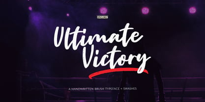 Ultimate Victory is an authentic handwritten brush typeface. This textured script font is suitable for posters, magazines, apparels, movie headlines, packaging and more.
 - Japan Knees by PizzaDude.dk,
$19.95How much more multi-cultural can you get, than a Japanese-style Roman font from Denmark? Looks like an LCD font gone awry! - Commercial Script by Bitstream,
$29.99 A bold weight of a moderately flourished script designed for ATF by Morris Fuller Benton in 1908, and an industry standard since then.
 - Arrowman by ZetDesign,
$15.00 Arrowman is a strong and bold decorative font with a Gothic feel. It will surely turn any design project into an eye catcher.
 - Ivy Ivy by Daylight Fonts,
$150.00 This is a groundbreaking font that combines Caslon Italic and script. You can achieve an advanced typography that is elegant, delicate and powerful.
 - Claim Check JNL by Jeff Levine,
$29.00A page from an old manual for sign painters yielded the hand-lettered alphabet that served as a model for Claim Check JNL. - Ript Cure by insigne,
$19.99RiptCure is a futuristic, but usable typeface for everything from logotypes to magazine headlines. Several weights are included, including an interesting Ultra Light. - Blooming Ornaments by Gerald Gallo,
$20.00 Blooming Ornaments was inspired by patterns of the Middle Ages. There is an assortment of 47 ornaments located under the character set keys.
 - Gathenbury by Viswell,
$14.00 Gathenbury is a playful and fancy script font with a serious vibe. Use it to add an authentic charm to any design project!
 - Anything Okay by Aldedesign,
$13.00 Anything Okay is a simple, yet classy signature typeface. It includes beautiful swashes, that will add an organic feel to any design project.
 - Carols Night by Maulana Creative,
$12.00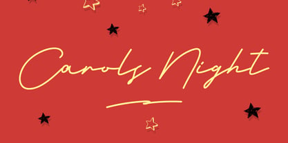 Give your designs an authentic handcrafted feel. �Carols Night Christmas Theme Font� is perfectly suited to stationery, logos and much more. Many Thanks!
 - Sunfort by Maulana Creative,
$14.00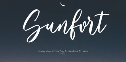 Give your designs an authentic handcrafted feel. Sunfort Signature Script Font is perfectly suited to stationery, logos and much more. Many Thanks! MaulanaCreative
 - Buttersoy by Maulana Creative,
$15.00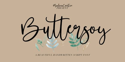 Give your designs an authentic handcrafted feel. Buttersoy Beautiful Handwritten Script Font is perfectly suited to stationery, logos and much more. Maulana Creative
 - Antique Sans by Wooden Type Fonts,
$15.00A modified remake of one of the popular wooden type fonts of the 19th century. An extra bold sans serif suitable for display. - Bronc Stomper by FontMesa,
$20.00 Introducing Bronc Stomper; Bronc Stomper got its start from an old logo design used by the New York and Harlem Railroad in 1904.
 - Go West by FontMesa,
$25.00Go West is a spurred version of the FontMesa Red Dog Saloon font which is a revival of an old 1800s woodtype font. - PL Brazilia by Monotype,
$29.99PL Brazilia from Albert Boton is an elegant extended sans serif face in two weights. Usable in headlines on books, journals and posters. - Frankenberg Pro by RMU,
$35.00 A treasure trove of typographic rarity, found in an old print shop in the Saxon town of Frankenberg, now revived and carefully extended.
 - Continental Gothic JNL by Jeff Levine,
$29.00Continental Gothic JNL is elegant and sophisticated... perfect for an Art Deco project needing a font that is not too bold or overpowering. - Slab Four Rounded Ext by Wooden Type Fonts,
$15.00 An original slab serif design inspired by the slab serif designs of the 19th century, with a modern geometric look, bold version, extended.
 - Diversal Brush by ijemrockart,
$10.00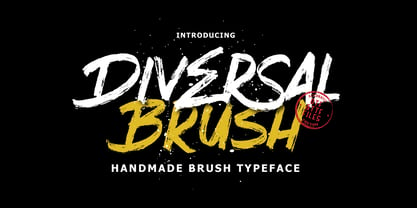 Introducing Give your designs an authentic brush handcrafted feel. “Diversal Brush Font” is perfectly suited to stationery, logos and much more. Thank you,
 - No Parking JNL by Jeff Levine,
$29.00 No Parking JNL was inspired by a hand-cut stencil of those words painted in an area of a department store's parking lot.
 - Venture by Michael Hill Design,
$6.00Venture is an all caps typeface inspired by the great outdoors. Also comes in 2 extra styles, great for that vintage print look!
