10,000 search results
(0.044 seconds)
- Al Lonely Bridges by Aluyeah Studio,
$125.00 Hello Aluyeaholics! Lonely Bridges a stunning display font inspired by the soul of solitude. Lonely Bridges carries an italic style giving the impression of an unstable, rebellious, and indecisive soul. Make your design project more emotional to convey. Coming with 150+ stunning and super easy to use alternates and ligatures. To get results like the preview just type L.4onel.4y B.3r.idges.2
 - Twang by ITC,
$29.00Twang is the work of British designer Timothy Donaldson, who says its appeal lies in its ugliness. Its irregular, craggy features give it an aggressive, eye-catching edge. The font comes wiht an extra set of small caps which add more zest to this cutting edge style. Twang is ideal for retail promotions and fashion-related publications as well as large poster and signage applications. - Mitona Script by Letterfreshstudio,
$19.00 Mitona Script Font is an urban retro font with the style like a logotype lettering. was created to help you designing logotype or lettering style for your Brand or your clients. it has an extensive lingual support, covering European and Asian Latin scripts. The font contains all characters you'll ever need, including all punctuation and numbers. Multilingual Support Alternates, Regular/Extrude/Outline/Shadow Thankyou
 - Halavah Twist JNL by Jeff Levine,
$29.00Halavah Twist JNL is a casual serif font designed by Jeffrey N. Levine and modeled after an early-1960s display font that was quite popular in its day. This new interpretation takes on an entirely different look from the original, creating a modern-yet-retro design. Light, playful and fun-loving, Halavah Twist JNL is perfect for any project that exudes a bubbly warmth and enthusiasm. - Hostage Script by Letterfreshstudio,
$25.00 Hostage Script Retro Font is an urban retro font with the style like a logotype lettering. was created to help you designing logotype or lettering style for your Brand or your clients. it has an extensive lingual support, covering European and Asian Latin scripts. The font contains all characters you'll ever need, including all punctuation and numbers. Multilingual Support Alternates, Regular/Extrude/Outline Thankyou
 - Randu Sans by Yukita Creative,
$14.00 Randu Sans Serif Display Font Family is a sleek, modern font family with an elegant typography style. Created with clarity and boldness in mind, this font offers a variety of bold and italic styles, providing flexibility in its use. Whether used for titles, headings, or poster designs, the Candied Sans Serif Display Font Family provides the clarity and appeal needed to hold an audience's attention.
 - Folio by Linotype,
$29.99Folio was designed by Konrad F. Bauer and Walter Baum and appeared with the Bauer font foundry (Bauersche Gießerei) in 1957. The designers based their ideas on Helvetica but Folio did not turn out to pose the competition they had hoped. The font has the same applications as Helvetica and is an extremely legible font. Folio is particularly good for text and has an objective, neutral character. - Chemicalife by IKIIKOWRK,
$15.00 Proudly present Chemicalife - Hand Drawn Letterpress Type, created by ikiiko Take advantage of "Chemicalife," a stunning hand-drawn letterpress typeface created to take your poster designs to new heights, and embrace its retro appeal and aesthetic attraction. The distinctive "Regular" and "Rough" forms of this typeface, each with its own compelling personality, provide your projects an unsurpassed degree of versatility. Discover the world of purposeful imperfection with Chemicalife's "Rough" aesthetic. This variation celebrates the natural flaws of handcrafted artwork and is inspired by the genuine charm of vintage letterpress prints. Every word and character exudes an artistic rawness that gives your posters a sense of true craftsmanship. These imperfections and uneven edges are the telltale signs of an artist's touch. This typeface is perfect for an vintage poster, movie title, packaging, food & beverages, magazine design, fashion brand, classic stuff, quotes, or simply as a stylish text overlay to any background image. What's Included? 2 Weight : Regular & Rough Uppercase & Lowercase Numbers & Punctuation Multilingual Support Works on PC & Mac
 - BlackHand by JOEBOB graphics,
$39.00 Finally the time has come to publish our new ‘BlackHand’ font. It is a bold and upright handwritten font featuring 150 ligatures, which make for a credible handwritten look and feel. The ligatures will appear quasi random without the user having to search for the right alternate character in a list of glyphs. As you will notice, the font does well in both headers (it even has an ‘instant logo’ quality) and in plain text. The font finds it’s origin in handwritten notes which were done without paying attention to aesthetics. The regular characters and the ligatures were handpicked to form an organic and natural, very readable result. The original writing was done with an Edding 1340 brushpen, giving the font frivolous thick/ thin strokes. We hope you enjoy using the font as much as we did creating it. As an introduction offer, you can get it now at 50% off in the first month after publishing.
 - Manwriting by Miller Type Foundry,
$39.00 Manwriting is an extensive typeface with hundreds of ligatures used to simulate human handwriting. Perfect for forging papers and love-letters!
 - Free Money by Jeremy Woods,
$10.00 Free money is an organic-looking display font. It was inspired by gig poster art, alternative comics and b-grade movies.
 - Mories by MlkWsn,
$15.00 Mories is an elegant display serif with unique letter shapes to complete any designs, especially in fashion, branding, and for logos.
 - Fervent by Gerald Gallo,
$20.00 Fervent is an all caps ultra condensed serif font. It is ideal for headlines, titles, branding, and small blocks of text.
 - Valeria Script by Lián Types,
$7.00Valeria Script is an experimental font, calligraphy based, with attractive results. Go for Valeria Script Cola pen for more ink explosion! - Paihuen Rough by RodrigoTypo,
$25.00 It is an Alternative version of "Paihuen Pro" containing 3 styles that can be combined and all in a rough style.
 - Bagunsa by Turto Studio,
$10.00 Bagunsa is a multilayer fun party play sans font. It intend to be an ongoing family with maybe infinite possible styles.
 - BD Telegraph by Typedifferent,
$25.00 BD Telegraph is a heavy uppercase titling font with various alternatives and an architectural approach, great for logotype creation and titling.
 - Luxerie by MlkWsn,
$15.00 Luxerie is an elegant display sans with unique letter shapes to complete any design, especially in fashion, branding, and for logos.
 - Type Vendor JNL by Jeff Levine,
$29.00 Type Vendor JNL gives a solid treatment to the dual-line Type Catalog JNL, and offers an oblique version as well.
 - Poor Richard by Red Rooster Collection,
$45.00 Based on the Keystone Type Foundry design, circa 1919. The l/c ‘g’ appears as an alternate character in our font.
 - Bilanthy by Maulana Creative,
$13.00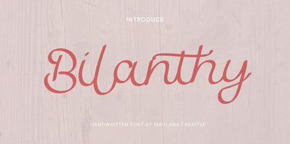 Give your designs an authentic handcrafted feel. � Bilanthy Handwritten Font� is perfectly suited to stationery, logos and much more. Many Thanks!
 - Octagon French by Intellecta Design,
$16.90Originally compiled by George Nesbitt (1838) this font has newer lowercase designs. Probably comes from an earlier French font, never acknowledged. - 57 Rodeo by Baseline Fonts,
$24.00A practical yet unique display face designed to offer attention-getting headlines and an alternative to the normal wild west faces. - Illustrious by Gerald Gallo,
$20.00 Illustrious is an all caps, bold, sans serif font. It is ideal for headlines, titles, branding, and small blocks of text.
 - Saddle Hitch JNL by Jeff Levine,
$29.00 Saddle Hitch JNL is a Western font inspired by a few words set in a decorative typeface from an 1887 publication.
 - Marc Anthony by Zang-O-Fonts,
$25.00An imperfect mix between a Roman and a Modern font, Marc Anthony can be used easily for display or body text. - Chinese Menu JNL by Jeff Levine,
$29.00Modeled after an old sign on a building in New York City, Chinese Menu JNL is a modular style Oriental typeface. - Hollywood MF by Masterfont,
$59.00 High legibility at small sizes. An extended sans serif typeface with rounded endings that provides unique softness appearance without losing legibility.
 - Tant Lilian by Cercurius,
$19.95 A thin, very elegant caps-only cross-stitch font, based on an embroidery pattern from the end of the 19th century.
 - Elongated Roman by Aboutype,
$24.99An ultra light thins all caps Victorian design with a slight stroke contrast. Elongated Roman requires subjective display kerning and compensation. - Sturdie by Gerald Gallo,
$20.00 Sturdie is an all caps condensed sans serif font. It is ideal for headlines, titles, branding, and small blocks of text.
 - Rough Marker by XTOPH,
$22.00 Rough Marker is an uppercase handwritten typefaces. It comes with 2 letter-variations, swashes & lines and a variety of bonus symbols.
 - Pudgie by Gerald Gallo,
$20.00 Pudgie is an all caps, bold, sans serif font. It is ideal for headlines, titles, branding, and small blocks of text.
 - Story by Suomi,
$25.00 Story font is an experiment to convert the script-style calligraphy into bitmap format. Made alongside Tale fonts, with different design.
 - Molor by Sons Of Baidlowi Typefoundry,
$8.00 Molor Font is a sans serif font with an amazing feel. It will turn any design idea into a stand out.
 - Rotulona Hand - Personal use only

- Arable by Heyfonts,
$18.00 Arable Font Is "Unique Display Font" refers to a specific type of typography that is characterized by its distinctive, one-of-a-kind design, and it is typically used for eye-catching and decorative purposes. Here's a detailed explanation of what a unique display font is: -Distinctive Design: Unique display fonts stand out because of their distinct and unconventional design. They often deviate from traditional letterforms and can take on a wide range of creative and artistic shapes. Unlike standard, legible fonts used for body text, display fonts prioritize aesthetics over readability. -Specialized Use: Display fonts are not intended for extended reading. Instead, they are used in small quantities for headlines, titles, logos, posters, banners, invitations, and other design elements where visual impact is essential. Their unique and attention-grabbing design makes them ideal for drawing attention to specific text. -Creative Freedom: Designers have creative freedom when creating unique display fonts. This allows for a wide array of styles, from whimsical and ornate to futuristic and abstract. Some display fonts may be inspired by art movements, cultures, historical periods, or nature, leading to highly original and thematic designs. -Limited Character Set: Display fonts often have a limited character set compared to standard fonts. They typically include uppercase letters, numbers, and basic punctuation marks, but may lack lowercase letters or extended characters. This limitation is due to their specialized use and focus on visual impact. -Customization: Some unique display fonts are custom-designed for specific projects or brands. Designers work closely with clients to create a font that aligns with the brand's identity or the project's theme, ensuring a truly unique and tailored result. -Combination with Other Fonts: In many design projects, unique display fonts are paired with more standard, legible fonts to achieve a balance between visual impact and readability. This combination allows for a harmonious and effective overall design.
 - Boule Plus by Ingo,
$33.00 CAPITALIZED, geometric, bold and round. If the typographer sees a font like that, it's enough to make his toes curl. But sometimes it just has to be that way. Geometrically constructed fonts do not necessarily have to be pointed and angular; It also works consistently around. And if I say it consistently, then in this case, that's done consistently. The basis for the BOULE is the circle. The letters are drawn with constant line width, the “corners“ and endings all have the same radius, the lines are all the same thickness. The BOULE consists only of capitals. There is only one difference in the use of uppercase and lowercase letters: in the uppercase letters, the round letters are circular, while the lowercase letters are narrow. The character set of the Boule contains all letters and accents to support the Western, Northern, Central and Eastern European languages with Latin alphabet. The BOULE is not only very fat, it also runs very tight; that is, the glyphs are very close to each other. To avoid "holes" due to unfortunate letter combinations, the BOULE contains ligatures for FT, ST, TT and TZ. There are also other versions of the font: BOULE Brillant on the one hand. In this version, simple highlights simulate a light incidence from the top right. These light edges give the font a decorative effect that makes it easy to think of wet sausages or balloons in some shapes. And finally the BOULE Contour. As the name implies, it is the outer contour of the letters, combined with a shadow at the bottom left. The name BOULE (French for ball) says it already: this font is globated. Therefore, it is also very suitable for all three-dimensional alienation effects. With simple light and shadow you can achieve a very convincing 3D effect with little effort.
 - Hughetta by Hrz Studio,
$16.00 Hughetta is the font of choice for writing things beyond words. This typeface is designed with great detail to convey stylish elegance. So, it can be said, the character of the transformation is very beautiful, a kind of classic ornamental copper script. Hughetta provides alternative variants of most fonts, binders and many calligraphy tips, ideal for elegant labels, high-end packaging, stationery and composition for select brands, beautiful titles, paragraphs, fonts and short text, meant to be read only with eyes or meant to whisper into someone's ear. Hughetta has 368 , including multiple language support. It features OpenType with alternative styles and elegant binding. The OpenType features don't work automatically, but you can access them manually and for best results your creativity will be required in combining variations of these Glyphs. And also a touch of ornament makes this font look elegant. To enable the OpenType Stylistic alternative, you need a program that supports OpenType features such as Adobe Illustrator CS, Adobe Indesign & CorelDraw X6-X7, Microsoft Word 2010 or a later version. (Windows), Font Book (Mac) or a software program such as PopChar (for Windows and Mac). How to access all alternative characters using Adobe Illustrator: https://www.youtube.com/watch?v=XzwjMkbB-wQ How to use the font style set in Microsoft Word 2010 or later versions: https://www.youtube.com/watch?v=NVJlZQ3EZU0 There are additional ways to access alternatives/swashes, using the Character Map (Windows), Nexus Font (Windows) Font Book (Mac) or a software program such as PopChar (for Windows and Mac). How to access all alternative characters, using the Windows Character Map with Photoshop: https://www.youtube.com/watch?v=Go9vacoYmBw If you need help or advice, please contact me by email Thank you for watching!
 - European Soft Pro Variable by Bülent Yüksel,
$99.00 EUROPEAN SOFT PRO VARIABLE ABOUT FAMILY: What makes "European Soft Pro Variable" elegant, friendly and contemporary is its very rounded curves with very open terminals. "European Soft Pro Variable" has been designed with a higher "x-height" than other fonts in its class to make tiny readability more obvious in any use situation. It will be ideal for use in small sizes such as business cards or mobile applications. This typeface is also equipped with powerful OpenType features to satisfy the most demanding professionals. It has solid features like case sensitivity, small, true capitals, full ligatures, tabular figures for tables, old style figures to elegantly insert numbers into your sentences and more alternative characters to give personality to your projects. The extended, "European Soft Pro Variable" supports around 85 languages in the Latin, Cyrillic and Greek scripts, and its non-Latin components were developed with native consultants. With over 1200+ glyphs per style, "European Soft Pro" cares about localised letterforms and has the OpenType features to match. FEATURE SUMMARY: - 9 weights: Thin, ExtraLight, Light, Book, Regular, Medium, Bold, ExtraBold, and Black. - 4 widths: Normal, Narrow, Condensed, and Extra Condensed. - Matching italics (12º) for all weights and widths . - Matching small caps for all weights and widths. - Lining and old style figures (proportional and tabular). - Alternate characters (A, G, M, N, R, U, a, g, l, m, n, u, y). - Unlimited fractions. - Automatic ordinals (1st, 2nd, 3rd, etc.). - 24 Dingbats + 19 Social Media and Block Chain icons. - Extended language support: Most Latin-based scripts (including Vietnamese), Cyrillic, and Greek. - Extended currency support. You can contact me at buyuksel@hotmail.com, pre-purchase and post-purchase with questions and for technical support. You can enjoy using it.
