6,280 search results
(0.021 seconds)
- Vampetica - Personal use only

- Bleeding Freaks - Unknown license

- DuerersMinuskeln - 100% free

- Dark11 - Unknown license

- KlingonBlade - Unknown license

- Haunt AOE - Unknown license

- Magnum - Unknown license

- Gamera - Unknown license

- Graffito - Unknown license

- Skeleton Sketched - 100% free

- TRUEblood - Personal use only

- Celtic Spiral by Kaer,
$19.00 Hi! This is a new classic Celtic font. With spirals, knots and animals’ faces. СelticSpiral font is perfect for printing of graphic arts, posters, packaging and t-shirts. The font is presented in usual and color versions. Only uppercase letters from A to Z and numbers set (36 characters)
 - Saddlery by FontMesa,
$25.00Saddlery includes the first font that you can use alone or add the optional second fill font behind the first using different colors for a more decorative look. You will need an application that works in layers in order to use the fill fonts that come with FontMesa fonts. - Blow Up by HVD Fonts,
$25.00 Type designer Hannes von Döhren created a display typeface called "Blow Up". A bubbly, sweet font with nice light effects. Perfect for use in big sizes on posters or flyers. You can use Blow Up Sans & Blow Up Bling together to influence the color of the light effects.
 - Little Sooner by Dumadi,
$25.00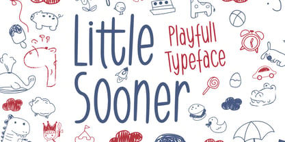 Little Sooner is a special handmade font using the Brush tool. This font is specially designed for children with a full-color style that will enhance the quality of your designs. very suitable for the design of children’s t-shirts, children’s youtube titles, children’s quotes, children’s web, and others.
 - AndrewAndyCollege by Ingrimayne Type,
$13.95 AndrewAndyCollege is an outlined font derived from the Ingrimayne font AndrewAndreas, a san-serif face. In 2018 the inside and the middle ring were separated out and made independent fonts. They can be used alone, or layered with the original to produce letters with two or three colors.
 - Baby Magpies by Sipanji21,
$10.00 this baby magpies font, Made with love and joy. Comic look, Bold, Thick, so it will make your design more beautiful, cute, fun, and colorful. you can use this font for any design, such as logo, poster, advertise, packaging, and much more. make your design awesome with our font.
 - Bodybuilder by Vozzy,
$5.00 Introducing a vintage look simple and minimalistic label font named "Bodybuilder". All available characters you can see at the screenshot. This font have 14 styles (including layered effect styles, rough and color version). This font will good viewed on any retro design like poster, t-shirt, label, logo etc.
 - Monosketch by GRIN3 (Nowak),
$20.00 Monosketch is a hand-drawn font inspired by monospaced fonts like Andale Mono. Monosketch Layer and Monosketch Black can be used together by layering Monosketch Layer above a differently colored Monosketch Black. Language support includes Western, Central and Eastern European character sets, as well as Baltic and Turkish languages.
 - Giecella Kids by Sipanji21,
$8.00 Say hello to Giecella Kids font. Made with love and joy. Comic look, so it will make your design more beautiful, cute, fun, and colorful Includes: Giecella Kids (OTF, TTF, WOFF) Bonus (Cute Background) Features: Character Set Numerals and Punctuation (OpenType Standard) I hope you can enjoy the font :)
 - Zebraw by Ingrimayne Type,
$6.95 This face was part of a continuing evolution of an almost unreadable typeface. There are two styles, one with stripes and one without. The striped style can be placed in a layer above the unstriped style to give the letters two colors. Zebraw was derived from the typeface Porker.
 - Tight Hug by Sipanji21,
$10.00 This Tight Hug font, Made with love and joy. Comic look, Bold, Thick, so it will make your design more beautiful, cute, fun, and colorful. you can use this font for any design, such as logo, poster, advertise, packaging, and much more. with swash and awesome alternates inside.
 - Komica Brought by Figuree Studio,
$18.00 Say hello to Komica Brought font. Made with love and joy. Comic look, so it will make your design more beautiful, cute, fun, and colorful. Features: Uppercase and Lowercase Numerals and Punctuation (OpenType Standard) Accents (Multilingual characters) PUA Encode I hope you can enjoy the font :) Regards Figuree Studio
 - Holland Gothic by URW Type Foundry,
$39.99 Blackletter fonts are timelessly beautiful and still very popular. At some point, it seems that every type designer discovers the beauty of these forms and the great pleasure in creating blackletter characters. Like also Dutch designer Coen Hofmann who, after designing Caxtonian Gothic, has designed yet another Blackletter font: Holland Gothic. Holland Gothic reminds of the 18th century »Duytsch« typefaces of Joan Michael Fleischmann and Christoffel Van Dyck. But Hofmann was mainly inspired by the Dutch calligraphers from the 17th and 18th century. Holland Gothic develops its full charm and beauty at larger sizes because of the hairlines in the upper case characters. To enable users composing texts in the style of our ancestors, Coen Hofmann added a series of pre-composed ligatures, also in combination with the long s, plus an alternate form for the lower case r which was used in combination with letters b, d, g, o, p, v, and w.
 - Ghost Town by Comicraft,
$19.00 The Gold Rush is over, the prospectors have made their fortune and the mine has been worked out! The inhabitants of Boomtown USA have moved on -- the saloon is dry, the sheriff has hung his hat and the only visitors to the local whorehouse are tumbleweeds. Yeah, the buildings remain -- hollowed out husks carrying memories of bar room brawls, high noon shootouts and high stake poker games between outlaws -- but if you take a walk down the street be careful not to kick up too much dust... Turn the corner and you might see Ol' Toothless Joe standing on the corner sucking on a bottle of whiskey... And don't walk too slowly past the storefront of the undertaker -- that guy made his living putting strangers like you in a wooden overcoat from sunrise to sundown. Spooks and Spectres linger everywhere... there's a sign just down the road -- didn't you see it? "Ghost Town! Abandon Hope all who Enter Here!"
 - Biscotti by Letritas,
$30.00 The concept of Biscotti rised from a personal research into a system of styles that we commonly consider “vintage”. One above all, the Victorian typography that has been rediscovered and widely re-studied during the 70s. Today, thanks to the technology innovation in digital typography fields, Biscotti is certainly an interesting subject which expresses an appassionate and nostalgic homage to a vintage font, seen from the perspective of a technical inspiration. Biscotti is composed of two styles: the “default” and the alternative one. The first is of course more conservative and formal, while the alternative formally chooses a change of the diagonal lines into curves, so it creates a much more friendlier reading. Biscotti consists of 4 styles that can be combined by layers in order to form different ways of reading. This renewed effect increases exponentially the potential use range of this typography. Biscotti has 517 characters; and are composed for 220 latin languages.
 - Wasted Youth by Wing's Art Studio,
$12.00 Wasted Youth: A 90s Grunge Inspired Brush Font by Wingsart Studio Wasted Youth is a versatile brush font with shades of grunge, punk and horror. The font comes in three styles including a clean-edged original, plus two additional versions drawn with inky brush and marker pen. It takes inspiration from 90s grunge bands, with a hand-made punk aesthetic that’s equally at home in music videos, album covers, horror movies and skate culture. It aims to combine the best of these popular looks into one versatile font. Along with its unique uppercase and lowercase characters, Wasted Youth also comes with a host of custom ligatures, underlines and alternatives, along with numerals, punctuation and language support. It’s a truly flexible font that can be shaped into titles and headlines that look authentically hand-made. Try it on t-shirts, posters, stickers, movie titles, YouTube videos and more! Check out my visuals to see it in action.
 - Adahi by Product Type,
$15.00 Adahi is a sans serif typeface with rounded and pointed corners and a minimalist style. Adahi fonts is a big font family with over 20 different types! Contrast, style, and weight abound in Adahi. This typeface features rounded and pointed corners and is very functional, clean, and modern sans typography. The typeface appears to be clean and geometric, yet it is designed with distinctive stylistic aspects to give the Adahi font a unique and particular feel. The Adahi type family is comprised of 20 weights, each with oblique variations for multifunctional use, particularly in collaborative projects such as websites, magazines, editorial, publishing, and packaging. Use this font right now to create a stunning, elegant, and unique project. of course, your various design projects will be perfect and extraordinary if you use this font because this font is equipped with a font family, both for titles and subtitles and sentence text, start using our fonts for your extraordinary projects.
 - Silver Streak by Swell Type,
$20.00 Inspired by the streamlined lettering of trains, cars and advertisements from the 1930s and 1940s, Silver Streak is a font family that combines Art Deco elegance with refined craftsmanship and modern features. Silver Streak's contrasting strokes and tastefully rounded corners conjure an era of refined, vintage elegance. An extravagant palette of 25 weights — from gracefully tall and thin to commandingly wide and heavy, along with a variable font for unlimited options between — provide unforgettable branding possibilities for luxury items ranging from jewelry, clothing and perfume to the sleek badges of high performance sports cars. Features: Five widths from Compressed to Extended Each with five weights from Light to Heavy Complete family includes a Variable font for precise control of weight and width Support for 223 languages, including Western & Central Europe, Russian Cyrillic, Serbian/Macedonian, Ukranian and Vietnamese Alternate hook-cornered capitals (accessible as Opentype Discretionary Ligatures) Alternate round-topped A in two versions, each with international accents (accessible as Stylistic Alternates)
 - Isabel by Letritas,
$30.00 Isabel was made out of necessity to create a new font for children and teenagers, that could be enough friendly and versatile for text in words or even easy-to- read long texts. The purpose of Isabel is to combine all the nice and friendly features of the simple letters that the teachers teach to the pupils at primary school, as they starting to learn to read, together with the normal editorial fonts we read every day. In this way it generates a very joyful serif font, or even friendly font, with some conservative aspects. In other words, Isabel is a font that, despite of being a “classic features” typography, is proud to show its innocent and ingenuous elements, this gives to the font a new point of view. The family is composed of 3 parts: the regular version, the italic version and the unicase version. Each one of them has 5 weights, 551 characters and is composed of 208 languages.
 - Splatterpunks by Wing's Art Studio,
$10.00 Splatterpunks - A Halloween Brush Font Introducing a fresh terror this Halloween, Splatterpunks is a hand-drawn brush font inspired by the blood-soaked pages of horror comics from the 1970s and 80s. This textured all-caps lettering evokes a spine-tingling tension that will leave your readers on tenterhooks. With a creeping, stretched look like that of a surprised cat, it offers of set of diabolical tools worthy of any horror fan! The Splatterpunks font family includes all-caps uppercase and lowercase characters, along with numerals, punctuation, symbols and language support. Also included are a complete set of alternative characters and additional paint marks, drips and splashes. Wingsart Studio Design Tip! The uppercase and lowercase characters work great when mixed in an alternating fashion, with shapes that combine to create a dynamic, almost unhinged look that's perfect for the Halloween season. Add the alternatives and paint marks into the mix and you'll have yourself a title or header design that looks truly custom-made.
 - Panamericana by Andinistas,
$19.95 @andinistas presents an update of Panamericana in 2019, a typographic family worn out and expressive with 10 fonts perfect for short writings with cursive and stained calligraphic look. Panamericana works perfectly in headlines or logos of a film because its different thicknesses of corrosion and textures guarantee striking messages on t-shirts, stickers, skateboards, magazines, printed quotes, packaging, headings and all the designs you can imagine. Panamericana works best by exchanging and mixing letter by letter among its 10 fonts. In this way, you will take advantage of its corrosion levels by mixing the 3 uppercase, lowercase and ideal calipers for the beginning, middle or end of words, phrases or short paragraphs. Each empty and full Panamerican area was designed with care, care and attention and that is why its more than 2000 glyphs were carefully planned in 10 fonts designed for maximum performance in compositions that need scruffy and creative visual properties.
 - Direct Mail by Partnrz,
$15.00 Direct mail designers rejoice! Finally, a font family made just for you. Created to be as in-your-face as possible: for use as a primary headline; for dates and phone numbers; and for coupon heads and price points. Tired of kerning numbers for your coupons and prices? Then you'll love this font! All of the kerning has been done for you. (No more spacey 1's!) Designed for a tight kern - just track it in on larger sizes. Instead of standard weights, this font was designed to fit different width needs. Have a long headline, but your client wants it in one line and tall? Use the extra-condensed. Need something really bold for a phone number or price point, but you don't have much height available? Use the fat. And there are two more widths for those in-betweens. And to top it off - you can get them all in an oblique as well.
 - Straight Forward by IKIIKOWRK,
$19.00 Proudly present Straight Forward - Mixed Type, created by ikiiko. Straight Forward is a mixed sans serif font type, with wide to condensed characters. Straight Forward has 3 alternative letter shapes that have been mixed and can be played by changing the alternate types. This font is available in 2 types of color for Uppercase and outline for Lowercase. This type is very suitable for making a streetwear brand, poster or magazine layout, fashion design, quotes, or simply as a stylish text overlay to any background image. What's Included? All Caps Glyphs 2 Styles (Color & Outline) Number & Punctuation 3 Type Alternates + Bonus Ligature Multilingual Support Works on PC & Mac Enjoy our font and if you have any questions, you can contact us by email : ikiikowrk@gmail.com
 - Depicto by Michael Rafailyk,
$12.00 A pixelated typeface with asymmetrical serifs intended to depict emojis in coarse mosaic shapes and represented in two styles that perfectly complement each other – Mono (casual font) and Mosaic (color font). The main font feature is a large set of pictograms, which are activated using the Stylistic Set and typed right in a text with a keywords like :smile: :happy: :sad: :pear: :rose: :horse: :bike: :house: and so on. Read more about Depicto font family concept, features, pictograms, color font, emoji skin tone, how to use it, and the applications support: https://michaelrafailyk.com/depicto See the complete list of 600+ pictograms: https://michaelrafailyk.com/typeface/specimen/Depicto.pdf Scripts: Latin, Greek, Cyrillic, Hebrew Languages: 480+ The promo image “Serpant Mosaics” used a photo of Nick Verlice from Pexels
 - Rodeo Clown by FontMesa,
$25.00 Rodeo Clown is a revival of an old classic font that you may have known under the name of Carnival. The Rodeo Clown family includes Fill fonts that you may layer behind the letters to add color or set to white so any background image doesn't show through the letters. The half fill should be layered on top to change the color of the top inlay design. The fill font for Rodeo Clown may also work as a stand alone black weight. In our sales images you'll see a sample of the fill font being used, we've intentionally offset the fill font to give it a misaligned printed look which was common to see with fill fonts in the 1800's
 - Amor Serif by Storm Type Foundry,
$55.00Antique monumental incriptional majuscule, originally carved in stone, and sometimes called “Roman Capital”, is the origin of the upper-case part of our latin alphabet. Its narrowed form, derived from handwritten originals used between the first to third century A. D., served as the inspiration for the Mramor typeface, which I drew with ink on paper in 1988 under Jan Solpera’s leadership. After composing negative letters on a strip of film it was possible to use Mramor with the early phototypesetting devices. In 1994 with the help of Macintosh IIvi I added the lowercase letters and bolds, and issued this typeface as 14-font family. After some years of using Mramor for various purposes, I realized a need of modernization and humanizing its very fragile appearance, as well as removing numerous decorative and useless parts. Besides that, type design made a huge technical progress in past few years, so I was able to finish the remaining approximately 9600 glyphs contained in the present font system named Amor. It is already usual to combine sans and serif fonts within one family in order to distinguish (e. g. in a book) historical part from contemporary, a plain chapter from a special one, or, in quotations, to divide speaking persons. Sans-serif typefaces don't arise by simple removal of serifs; they have to be drawn completely separately, when occasionally many declined forms may be made, considered to the serifed original. Nevertheless, both parts of this type system appear consistent as for proportional, aesthetic and emotional atmosphere. Usage of type is often closely linked to its original inspiration, in this particular case with architecture and figurative sculpture. An inner “order” was also text setting in smaller sizes. A smooth scale of weights enriches the possibilities in designing of magazines, brochures, exposition catalogues and corporate identity. Economizing, but opened shape of characters is well legible and antique hint comes into play after longer reading. - MMC Insignia Pro by MMC-TypEngine,
$42.50 MMC INSIGNIA PRO, is an Iconic & Emblematic Neogothic Geometric Display… Assembled by Trivial Squares and Diagonals Symbols Pattern from a puzzled grid Aftermath!! Includes Small Caps & Stylistic Alternates!! +Extra Monospaced Figures. In 22 styles, with Obliques, both for single display and layer Typesetting, plus OpenType Features & Bonus Blocks Fonts! MMC Insignia Pro, is the cursive version of MMC Insignia and the default or main lowercases in ‘SC’ feature plus cursive stylistic alternates and sets such as Monospaced figures… Its atmosphere stands by on both Corporative to Decorative, Modern & Fashion, Federalist, Bohemian, Romantic, Ludic, Treasured Look, Etc. This Display font-family is the result of the repeated applications of this unique infamous Icon or Symbol, of two counterpointed triangles, implicit as hourglasses, in order to compose an innovative and unprecedented typographic pattern and modulation concept through the letterforms, in an extremely Geometric style. The Graphic Sign used throughout this type, is a remarkable trend used already in Logos of different businesses, whose most famous case refers to a famous International Bank, which doesn’t need to be mentioned, as it is instantly associated! This characteristic innovation was the main motivation while creating this type. Usage Suggestions: Type Fancy Titling texts, Display Remarkable Logos, Branding Projects, Labels, Emblems, Fashion Patterns, or in everything Noble and designed for Excellence as a type of Insignia, or distinguished marks and attributes of Royalty and Power!! That’s also forwardly, the reason why it was named MMC Insignia… TIPS: 1-Combine styles into innumerous possibilities of Chromatic Typesetting, by ‘central pasting’ layers… You may dislocate layers for improvisations! 2-USE BLOCK “FREE-STYLES” 1 & 2 also to add default 3D! Change 3D directions by switching Block 1 to Block 2, that way you can Zig-Zag words and lines. *Also shift the block layer up to bottom limit, it makes the 3D direction turn upside down. Greetings! André, MMC-TypEngine.
 - Cartoon Party Time - Unknown license

- Fattern - 100% free


