6,280 search results
(0.023 seconds)
- New Day - Unknown license

- Homeboyz - Unknown license

- Josselyn - Unknown license

- HayStackMF - Unknown license

- Long Ears MF - Unknown license

- Minsky by Solotype,
$19.95The Bruce Foundry in New York gave this Italian Clarendon the catchy name of Ornamented No. 1529. The original had a top right white shadow which we eliminated. Additionally we improved the color of several of the characters. - UA Map by 2D Typo,
$- Font allows one to quickly make a schematic map of Ukraine. To separate individual regions use color or uppercase characters. The font contains the Trident emblem of Ukraine. This font may be useful to illustrate materials about Ukraine.
 - Graigway by alphabeet.at,
$30.00 Graigway is an art deco styled display font face in sans and serif. It has small caps and ‘halfcap’ alternatives included. There is an outline version with separate fillings for multilayering and color fonts with the layer-combination.
 - Fty OLD SPORT by The Fontry,
$15.00 Beyond the halls of the ivy league, a vintage sport font from the days of old. A complete family for all of your layout needs. Includes a layered COLLEGE effect to stack up and command those team colors.
 - Run Child by Figuree Studio,
$18.00 Say hello to Run Child font. Made with love and joy. Comic look, so it will make your design more beautiful, cute, fun and colorful. Features: Character Set Numerals and Punctuation (OpenType Standard) Accents (Multilingual characters) PUA Encode
 - Scary Sign by Java Pep,
$9.00 Scary Sign is inspired by scary novels and is styled as a rough font. It's perfect to place in your project which has horror, scary, dark, or spooky themes. But this font also perfects for other themes according to your creativity. You will get a free 12 swash bonus to complement the Scary Sign font.
 - MattsDinosaurStencils by Ingrimayne Type,
$11.95 This typeface is mostly composed of images of dinosaur skeletons drawn by Matthew Schenk and used as stencils for decoration. I thought they would also make a nice typeface. Check the key map—some of the very large critters are cut into pieces and put on several keys—this may help printing in some situations.
 - Belvedere by Studio K,
$45.00 Belvedere is an Italian word that translates as ‘beautiful outlook’ and describes a pavillion or summer house on high ground with commanding views. It has grace, style and a touch of class, all of which I've tried to incorporate in this font family. The snazzy graphics are by my friend and colleague Dan Austin.
 - Borda by The Northern Block,
$39.00 A carefully drawn geometric typeface. Exacting angles are combined with smooth corner details to form a clean, legible font with a modern appearance. The compact nature of the letterforms allows for great use of space across text layouts. Details include 6 weights with italics, extended European & Cyrillic character set, manually edited kerning and Euro symbol.
 - The Senden by Evo Studio,
$21.00 The senden is a Cool Blackletter that has been in the making for months. There is a combined use of negative space to create contrast. Elements from High German, Old English, and many other styles are incorporated into this beautiful display font. The result is a manuscript that appears with a cleaner, more modern feel.
 - Deathmore by Allouse Studio,
$16.00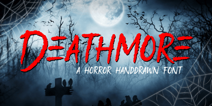 Proudly Presenting, Deathmore A Horror Handdrawn Font. Deathmore is perfect for any titles, logo, product packaging, branding project, megazine, social media, wedding, or just used to express words above the background. Deathmore also come with Multi-Lingual Support. Enjoy the font, feel free to comment or feedback, send me PM or email. Thank You!
 - Maple Street by Okaycat,
$29.00 Maple Street is a great looking traditional serif font composed by the Okaycat design team, Luke Turvey & Natsuko Hayashida, in 2014. Bold didone forms with structural seriffed detail combine at Maple Street to offer a cozy familiar style, without looking dated. This nicely balanced serif is designed to look outstanding for display or printed publication.
 - Murat Grotesque by Bülent Yüksel,
$69.00 "Murat Grotesque" is a sans serif font inspired by the "Impact" character. The corners were softened and many glyph forms were completely changed. It was transformed into a modern line, which is the result of the harmony of width and height, in particular to promote legibility in lowercase letters. You can enjoy using it...
 - Berliner Fraktur by Resistenza,
$49.00 Designed with a flat brush and inspired by the modern fraktur from Rudolf Koch, Berliner Fraktur is composed by broken strokes, adding a handmade feeling to this geometric kind of calligraphy. The font contains some interesting alternates and ligatures that make this type more real. We recommend to combine Berliner Frakture with: Turquoise Nautica
 - Bucinta by Goodigital13,
$20.00 It easily cooperating together For Magazine, Movies, or Book Titles. For Photography, Wedding Invitation, Restaurant Menu or T-shirt Design. For Flyers, Banner Ads, web and printing. From Food and Fashion to a Cosmetics product beautiful typographic harmony for a diversity of design projects, including logos & branding, wedding designs, social media posts, advertisements & product designs.
 - Avenir Arabic by Linotype,
$149.00 This Arabic extension to Adrian Frutiger’s Avenir typeface family was created by Nadine Chahine for Monotype. Avenir Arabic proudly incorporates a timeless geometric style with humanistic nuances that made Avenir so famous. Featuring six weights from Light to Black, Avenir Arabic supports OpenType features for Arabic, and includes Windows codepage 1256 Arabic character set support.
 - Kubera Serif by Gunjan,
$42.00 Kubera was designed to be a display and text face. It has six weights with same height. Kubera Serif is modernized letterform. It has square serif, high contrast stress, with large x height. Serifs are given soft corners, rather than pointy ones. Kubera Serif font family is designed by Gunjan Panchal based in India.
 - Edane by Arttype7,
$15.00 This font will have a grunge shape that gives a clean impression, and is accompanied by attractive ligatures. You can choose the shape of the letters that you want to convey through your brand logo, EDANE This font comes with all the caps, a hint of Japanese flavor embedded in the corners of the characters.
 - SG Gluper by Studio Gulden,
$25.00 SG Gluper - inspired by the OG Cooper Black typeface that is intended for display use. This retro serif font combination can handle many typographic uses but is best suited for headlines, branding, and logos. It has a multilingual feature that supports more than 200 languages. Gluper also has an alternate version including swashes and ligatures.
 - October Sweets by Chekart,
$17.00 October Sweets is a terribly playful and creepy font. It comes with all caps uppercase and lowercase characters, a set of punctuation marks, numbers, Cyrillic characters, an alternative set of characters and numbers, ligatures and multilingual support. Ideal for Halloween parties, horror film festivals, product packaging, T-shirts, book covers, quotes, posters, branding projects, etc.
 - Samy by Soda,
$20.00 Samy is pure warm in a rational world. Yet its features cover uses of any kind. From very thin to chubby weights, this typeface offers a wide range of styles. This work is composed of two subfamilies: Samy, which gives a more conventional font looking, and the Alt version, conveying more fun and joy.
 - Moore 003 by FSD,
$6.15Moore 003 was inspired by Henryk Tomaszewski's poster lettering for the Moore Exibition (Warsaw, Poland 1959). The headline "Moore" is composed of paper collage. The lettering, in Tomaszewski's vision, contrasts in ways that recall the contrast of Moore's sculptures. It was my intention to continue this research using lettering in the form of a typeface. - Bloody Night by LfarStudio,
$17.00 Halo! thank for your visit :) Bloody Night is a dark metal handwritten font with a horror feel and creepy impression. it looks stunning on movie title, book covers, photography, greeting cards, creepy quotes, and much more. This font is PUA encoded which means you can access all of the glyphs and swashes with ease!
 - Poria by Creativemedialab,
$22.00 Poria is a modern font with seven weight options, beautiful alternatives and dozens of unique monogram ligatures. The hallmark of Poria is the letter O which is wide compared to the other characters, so it becomes modern and attractive. Poria is suitable as a logo or title for fashion brands, cosmetics, magazines, and many more.
 - Asterx by Ingrimayne Type,
$7.95 In the 19th century typefaces with star-like serifs developed from the medieval type styles, retaining the sharp corners and peaks of some of the blackletter types but losing the flourishes on the upper-case letters. Asterx is in that tradition of star-footed typefaces, though it is not modeled on any particular one.
 - Tecna Building City by Descarflex,
$30.00 The Tecn@ BC (Building City) family's design was inspired by the Downtown of a Metropolis City surrounded by buildings and real estate structures. Each uppercase or lowercase character represents a building with a unique design, which when forming a word or in an entire piece of writing, the user would be composing their own city.
 - Morta by Michael Rafailyk,
$15.00 Morta is a handwritten unicase typeface with a slight calligraphic influence. Its design, like a centuries-old cold dark stones, has carved edges and polished corners, and represented by two styles: more legible “Brute” for general use, and more contrast “Grace” for large text size. Scripts: Latin, Greek, Cyrillic Languages: 480+ Hinting: Manual PostScript
 - Nure by FSD,
$39.00 Nure™ is a variable font family designed in 3 axes (Weight, Optical, Width) to cover all the graphic design needs. Thanks to 11 OpenType Stylistic Sets, Nure™ is one of the most flexible typefaces of all times. Every weight' set is composed by more than 1300 glyphs from Latin and Cyrillic encodings
 - Blackmourn by Allouse Studio,
$16.00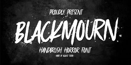 Proudly Presenting, Blackmourn A Handbrush Horror Font. Blackmourn is perfect for any titles, logo, product packaging, branding project, megazine, social media, wedding, or just used to express words above the background. Blackmourn also come with Multi-Lingual Support. Enjoy the font, feel free to comment or feedback, send me PM or email. Thank You!
 - Morena by ejhaa,
$20.00 Morena presents a calligraphy script font with captivating evolving characters, reminiscent of classic ornamental copper script infused with modern essence. It's meticulously crafted to emanate chic elegance. Morena entices with a smooth, clean, feminine, and glamorous allure, effortlessly readable due to its intricate letter connections. Multiple style options for letters further enhance its appeal.
 - Simple Nib by Attractype,
$10.00 Simple Nib is a simple, modern and elegant serif font. The corners of each letter are rounded, making them dynamic and eye-catching for any design project. The embedded standard features are enough to meet your standard typography needs. However, if you like this font and need additional features, please feel free to contact me.
 - Chuterolk by Namara Creative Studio,
$12.00 Modern sans serif font that is out of this world. A strong balance between strong pointed corners and smooth curves, Perfect for all purposes but especially for headlines. With 8 Variant to choose : Light, Light Italic, Regular, Italic, Rounded, Shadow, Bold and Bold Italic. This font also includes alternative glyphs, ligatures and multilingual support.
 - Headstone Roman JNL by Jeff Levine,
$29.00 Despite its macabre-sounding name, Headstone Roman JNL is not a novelty font for Halloween or horror movies. Instead, it's an attractive Roman typeface based on an example provided of a guide for stonecutters to use when cutting epitaphs into tombstones. Headstone Roman JNL is available in regular, oblique, condensed and condensed oblique versions.
 - Bleakfall by Allouse Studio,
$16.00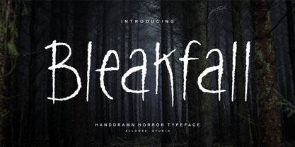 Proudly Present, Bleakfall a Handdrawn Horror Typeface. Bleakfall is perfect for any titles, logo, product packaging, branding project, megazine, social media, wedding, or just used to express words above the background. Bleakfall also come with Multi-Lingual Support. Enjoy the font, feel free to comment or feedback, send me PM or email. Thank You!
 - Radio Actor JNL by Jeff Levine,
$29.00 Bold and squared with rounded corners, the hand lettering found within the November, 1936 issue of Radio Mirror magazine really stands out. This stylized sans serif design, when used in poster displays or headline lettering, is attention-getting and drives the point home. Radio Actor JNL, is available in both regular and oblique versions.


