10,000 search results
(0.025 seconds)
- Manometer by Fontador,
$18.99 Manometer is a pneumatic ultra-black slab serif typeface with soft corners and fine counters.
 - Neustadt by URW Type Foundry,
$39.99 The Neustadt font family was originally designed as a corporate font for Sport 2000, one of the leading buying groups in the European Sport Retail Industry. After it has been successfully established, it is now available in a revised version for the general market. The Neustadt family is highly legible both in print and on screen. As part of the URW++ SelecType collection, Neustadt meets very high quality standards and is available in over 30 European languages. The characters have smooth curved spines and little contrast combined with a big x-height. The form is very functional and has no unnecessary details. These characteristics make Neustadt perfectly usable for many type applications like sign posting, headlines, texts and also for branding.
 - Bodebeck by Linotype,
$29.99 The Swedish designer/typographer Anders Bodebeck designed the Bodebeck type family in 2002. The family, which includes five different styles, is primarily intended for use as a titling, or display face, and belongs to the neo-transitional style of typefaces. Transitional style type first appeared in England during the late 1750s, when John Baskerville released his first sets of type. Bodeck bears similarities to another, later transitional style typeface as well - Eric Gill's Perpetua (originally released by the British Monotype Corporation in 1928). Like these two previous English stonecutters turned masters of typography, Anders Bodebeck has given us a modern re-interpretation of classic letterforms. Bodebeck, which is fitted with old style figures, is available in the following styles: Regular, Italic, Bold, Bold Italic, and Extra Bold."
 - Vtc-NueTattooScript - Personal use only

- Highand by Craft Supply Co,
$20.00 Highand – Gothic Font A Font of Horror Highand – Gothic Font encapsulates the essence of terror, designed meticulously to send spine-tingling shivers down your spine and evoke chilling emotions. Dreadful Display Furthermore, Highand’s unnerving aesthetics deliver an atmosphere of dread, creating an unforgettable and unsettling experience for your audience. It’s the perfect choice for spine-tingling displays that demand immediate attention. Terrifying Typography With every character, Highand conjures a feeling of impending doom. Its jagged edges and macabre curves create a nightmarish impression that lingers in the mind. Ideal for Horror-themed Projects Highand is tailor-made for horror-themed projects. Whether it’s for spine-chilling horror movie posters, eerie Halloween invitations, or haunting haunted house flyers, this font sets the eerie tone with sinister grace. In Conclusion Highand – Gothic Font is your sinister accomplice in design, evoking fear and suspense with every meticulously crafted letter. Embrace the darkness and plunge your audience into an abyss of fear. Make your displays truly terrifying with Highand’s chilling presence, ensuring an unforgettable and spine-tingling experience that leaves a lasting impression of horror.
 - Cinema Macabre by Wing's Art Studio,
$10.00 Cinema Macabre: Horror Fonts Torn from the Pages of Giallo A Hand-drawn Display Font for Creating the Most Diabolical Horror Titles This loose and inky brush font takes its inspiration from the classic Giallo film posters of the 1960s to 1980s - a cult cinematic subgenre beloved for its stylish visuals, haunting soundtracks and exploitation led marketing. It's a devilishly drawn design that aims to capture the feeling of vintage horror, preserving analogue details of old print while remaining versatile enough to work across a variety of digital designs. The Cinema Macabre font family boasts six fonts, each containing a unique set of uppercase and lowercase characters, as well as numerals, punctuation and language support. Add to this a host of custom ligatures, underlines and graphic elements and you have an essential toolbox for creating truly hand-made looking title designs. Cinema Macabre if a font that rewards experimentation by mixing all the various upper and lowercase alternatives, with interesting combinations waiting to be found and inspire terror across your own movie posters, book covers, albums and editorials. Few other fonts offer the versatility to create such diabolical designs! A Brief Introduction to Giallo: In popular cinema, Giallo is a genre of mystery fiction and thrillers often containing slasher, psychological horror, exploitation, supernatural and erotic elements. The term giallo (meaning yellow) derives from a series of pulp novels published by Mondadori from 1929 taking the name from its trademark yellow covers. The series consisted of Italian translations of mystery novels by well-known authors such as Agatha Christie, Edgar Allan Poe and Raymond Chandler. The popularity of these cheap paperbacks eventually established the word Giallo as a synonym in Italian for a mystery novel. The cinematic Giallo subgenre developed during the 1960-80s and are noted for their vivid cinematography, memorable soundtracks and inventive gore-filled scenarios. Key examples include Dario Argento's Suspiria, Tenebrae and Deep Red - stylish films that at once influenced the American slasher (see Black Christmas and Friday 13th) up to todays horror in Censor and Last Night In Soho.
 - Polina by GRIN3 (Nowak),
$16.00Polina (previously named Dobra) is a handmade, layered type family which includes several textures and shadows. Different font types can be created using various combinations of Polina fonts and colors. Language support includes Western, Central and Eastern European character sets, as well as Baltic and Turkish languages. - Theater Nouveau JNL by Jeff Levine,
$29.00 Sheet music from the 1911 stage production of the comic opera “The Enchantress” featured the hand lettered names of both the star and composer in a monoline Art Nouveau style. This sans serif type design is now available as Theater Nouveau JNL in both regular and oblique versions.
 - Outdoor Cafe JNL by Jeff Levine,
$29.00 The movie poster for the 1937 film “Cafe Metropole” served as the basis for Outdoor Cafe JNL, which is available in both regular and oblique versions. The extra bold, stylized letter forms with their rounded corners typify the wide variety of typographic styles the Art Deco period offered.
 - MD-Type Rounded by MD-Type,
$25.00 MD-Type Rounded is a modern, stylish font family. The family consists of five fonts (Regular, Bold, Light, Block, Black) which are formed by all capital letters. The strong and accented letters were rounded on the corners and therefore softened. The font family supports Turkish language as well.
 - Softrobo by Koval TF,
$10.00 Fine-built, straight but not official, with soft corners is suitable for short texts, placards and advertising. It was inspired by 1970s when people were mad about robots, space and so on. I decided to create a font as if it was a progressive font of the 1970s.
 - Interweave by K-Type,
$20.00 Interweave is a square display face with rounded corners, inspired by beefy fonts from the 60s and 70s such as Bullion and Deutsch Black. An alternating criss-cross effect is borrowed from Hunyady Gothic, the opposing lowercase a, e and s providing a basket weave or parquet floor appearance.
 - Ramp Age by PizzaDude.dk,
$20.00Ramp Age was originally made with a brush, but I wanted a more rough look to it. I manually traced the brush-strokes with short, straight lines, making the font more characteristic in its look. Can be used for grafitti things, but fits in the horror-genre as well! - Bungler by Bogstav,
$17.00 This font is a strange mixture of sweet strawberry cake and horrifying terror! :) Meaning that the font can be used for something pretty scary (such as a horror poster) or something quite innocent (like products for children) It resembles fat brushstrokes, but clearly it was drawn with a pen.
 - Barb by chicken,
$17.00 Heavy as hell, awkward, asymmetric, sort-of-gothic… Four alternates for every letter, carefully kerned together and nicely shuffled for you by OpenType apps… Blunt has the sharp corners ever so slightly rounded off for a softer look at large sizes. Wired chops everything up for an origami angle…
 - Shervington Engraved by Greater Albion Typefounders,
$18.00 Shervington Engraved is a re-drawing of our previous Shervington typeface, showing it as it appears hand engraved on copper-plate with a stylus, with the letter forms shaded in diagonally. It combines excellent clarity with a rustic distressed look, and is ideal for use on signage and headings.
 - Condell Bio Poster by Letritas,
$5.00 Condell Bio Poster is part of the bigger Condell family: a project that involves series of typographies that started to be conceived and developed since 2006. It also includes a bigger legibility version and a sans serif. Condell Bio is very versatile and can be used in the agroindustrial production. Thanks to its strongness and its charm, it can be used in different projects where a short and powerful message is required. For instance in a brand marketing campaign. The Condell project follows in terms of time the design of Comalle (a font also designed by Juan Pablo de Gregorio in 2006), but if we compare them, Condell seems to look for a major range of uses rather than a mere stylistic inspiration. And even if it keeps in its shape some organic forms, Condell seems to be much more similar to a sans serif traditional typography. Condell's fat and soft forms and its nice endings, inspired through spontaneous brush strokes, give it a very peculiar pleasant connotation. Its Italic (10 degrees inclination) have been produced singularly, not automatically calculated by the software. Condell Bio Poster is composed of 2 styles: the regular and the italic. Each one of them have 599 characters and is composed of 206 languages.
 - Bs Monofaked by Feliciano,
$37.92Monospaced become very popular among graphic designers. Nevertheless, I’ve noticed that in most cases that designers use monospaced typefaces is not because of their particular features caused by the strict rules of design — all characters share the same advanced width — rather because of it’s ‘electronic derived’ appearance. So, I decided to create a typeface that keeps the characteristics that, in my opinion attract designers to this particular sort of types, but deliberately break the main rule: characters do not share the same width — but they they look like they do! Characters are better balanced compared to truly monospaced types, giving more even typographic color while used in text setting. One weight might enough to please electronic type lovers. Designed in 2000. - Rothorn by ROHH,
$35.00 Rothorn™ is a modern, minimalist geometric sans with its own personality derived for subtle design details, such as cut diagonal corners, pointed t, very small contrast and closed aperture. The letterforms give the typeface a lot of charisma, keeping a very minimal, clear and well balanced look at the same time. Its powerful and sharp shapes together with the variety of weights from Hairline to Black make it a perfect choice for headlines and branding. Generous x-height, careful spacing and distribution of weights give it a color and legibility great for long paragraphs of text. Rothorn is a geometric member of a large type system including such families as Montreux Grotesk (Swiss-style grotesk), Lütschine (narrow headline family) and Conthey (narrow headline unicase family). The Rothorn family consists of 10 weights with corresponding italic styles, giving a total of 20 styles. Italic styles were hand drawn to get sharp and fine letter shapes. It includes a 2-axis variable font letting you adjust the weight and italic slant to your exact needs. The family has extended latin language support, as well as broad number of OpenType features, such as, case sensitive forms, ligatures, contextual alternates, lining, oldstyle, tabular and circled figures, slashed zero, fractions, superscript and subscript, ordinals, currencies and symbols.
 - Receipt by Funk King,
$5.00 Receipt is a composite font. Each glyph is composed of either the dollar or cent sign.
 - Taint by Suomi,
$25.00 Taint is a modular squarish font with round corners for headlines and shorter strings of text.
 - Cinematica by Underground,
$14.90 Cinematica was specially designed for film credits in communication pieces. Due to its space saving qualities, geometric elegance of its shapes, and eight wights; it allows a wide range of uses. Its geometry makes Cinematica able to harmonize and unify any text, incorporating the necessary signs for composition in English, Spanish, Italian, French, German and Portuguese. The Regular weight also incorporates statements that usually appear in film credits (such as "directed by", "produced by", etc.) that have been programmed as predetermined ligatures and can be accessed by typing a short sequence of signs to avoid typing the full phrase. To make the most of the alternatives proposed, use applications that support Open Type. Take a look at the User Guide.
 - P22 Cage by P22 Type Foundry,
$24.95 Based on the handwriting and sketches of American experimental composer John Cage, this set was produced in conjunction with The Museum of Contemporary Art in Los Angeles and the John Cage Trust. This unique collection includes 52 graphic extras culled from the composer's notes and scores, as well as the "Cage Silence" font inspired by Cage's seminal work 4' 33".
 - Mexifont by Peliken,
$12.00 OTF color font “Mexifont” Mexican National flag color creative letters and spanish national language symbols. Alphabet Mexico with capital letters, numbers, punctuation mark. You can use this font for design quotes prints on t-shirts, sport souvenirs, mexican food menu and other. OpenType-SVG Font was designed with Fontself Maker in Illustrator CC. Contains only uppercase letters and digits. WARNING Color fonts are pretty new technology - they currently show up in Photoshop CC 2017+, Illustrator CC 2018 and some Mac apps. Learn more about color font support on third-party apps here: https://www.colorfonts.wtf/
 - Dobro by Sudtipos,
$39.00 Strings vibrating against wood. Counterpoints. Strong beated rhythms and smooth flexible melodies. Repetitive sequences and syncopations. Sweeps and slides. Folk and tradition. That's how Dobro sounds. Inspired by the spirit of bluegrass music and the aesthetic of its wood type gig posters,this typeface explores certain concepts of rhythm and seeks to translate a piece of this universe into writing. Meant to be used in large sizes, Dobro is a 6-font set designed to work nicely together. It comes in 4 different weights, one color font with miscellaneous and connectors, plus frames and borders that pay tribute to vintage wood type catalogues. As an old company motto used to say: "Dobro means good in any language!" ––––––––––––––––––– IMPORTANT INFO ––––––––––––––––––– When you license Dobro you will download a pack with OpenType fonts but also a Color Font version of Dobro Drunk. (To use color fonts Photoshop CC 2017 /2018, Illustrator CC 2018 or QuarkXpress 2018 is required). If you create outlines in illustrator you can also modify the colors! Dobro Drunk BW OTF font (works like any font but is black & white.) Web files are only black and white until browsers support color fonts.
 - Horrifal by Khoir,
$15.00 Displays the appearance of a serif font that has a spooky impression but with elegant characteristics that make this horror-themed font different from other horror fonts, with the addition of sharp alternative letters that make the impression even more gripping so it is perfect for movie titles, posters, logotypes and many others. Thank you for seeing
 - Mr Halloween by Orenari,
$17.00 Boo! Welcome Halloween with Mr. Halloween font! Mr. Halloween font is specially designed for Halloween or another spooky yet horror occasion. This font has rough texture, so it will bring the creepy atmosphere in every glyph. It's really horror when your project didn't meet the perfect font. So let Mr. Halloween be friends with your design and craft projects.
 - Hantu by Tomatstudio,
$16.00 Create outstanding horror design with "Hantu" fonts, perfectly fit for your horror design and also unique alternative for casual designs if you want something different and eye catchy. for better result, adjust manually the kerning and baseline until it match with your design. Use "*" for dot effect and combine with regular fonts, it will make your design outstanding!
 - Megaverse VF by jpFonts,
$249.00 Megaverse VF Design 2023, Volker Schnebel JP-Fonts GmbH, Hamburg, Germany Megaverse VF opens up a universe that is beyond others. Not only its style is mega and the scope of the supported languages is beyond others, but the variety of variants opens up a design space that is unique. The complete family includes at least 90 fonts in 5 width levels from UltraCondensed to ExtraExpanded, each in 9 weights from Thin to Black, both upright and italic. It is a universal font that can be used for almost anything. From the official announcement or the informal letter to the letterpress and to the screen display as a corporate font: Megaverse is always convincing. Her character is quite graceful, but also neutral. She seems likeable, but also serious. She impresses with sharpness and precision and yet remains down-to-earth. Her wide range of variants is unique, both in terms of boldness and width. The very different forms of appearance fit together harmoniously as a whole, which gives the user an enormous freedom of design. Megaverse VF is a must-have for anyone who wants to keep adapting a typeface to different circumstances and who enjoys using variants that make the layout more colorful and perfect. All the advantages of the new variable font technology can be optimally applied with Megaverse VF, including optical scaling. Kerning, hinting and other technical requirements are carefully implemented so that the fonts work perfectly under any condition.
 - Kamuy by Andinistas,
$39.95 Kamui is a font designed by Carlos Fabian Camargo G. and used to write headlines. Its strategy makes it ideal for covers and advertisements with Japanese-style manga comics requiring latin style. Precisely its purpose was inspired by typographical classics such as Mistral by R. Excoffon and Zapfino by H. Zapf that then were diluted by separate strokes as blackletter calligraphy. However, high doses of miscegenation and lettering untimely torn between 50% esthetic and 50% legibility. That way his radical expression is highly profitable for composing and designing words and phrases with Eastern look. And more importantly, the writing seems drawn quickly with thin-tipped brush staining over a rough surface, from that process comes the idea of corroded outlines and changes in contrast. In conclusion, some diagonal strokes, horizontal, curved and vertical stand or hide from their simulation of scarcity or abundance of ink clots. That way each stroke seems inconsistent, footprint of the 423 brush drawing glyphs in Regular Kamuy. In that sense, the OpenType features included are: Standard Ligatures, Contextual Alternates, discretionary ligatures, swash, stylistic alternates, alternatives for titles, ordinals, fractions. And to end the Variable “Kamuy Dingbats” has is 52 fictitious drawings and zamurais.
 - Walbaum by Monotype,
$50.99 First designed in the early 1800s, Walbaum never achieved the audience or acclaim it deserved – despite its easy elegance, and sophisticated persona. It’s been fully restored for this expansive family, which includes 32 weights including ornaments and two decorative cuts. Walbaum offers the kind of warmth that’s missing from comparable typefaces such as Bodoni or Didot, feeling effortlessly approachable and legible. Monotype team Carl Crossgrove, Charles Nix and Juan Villanueva have adhered to designer Justus Erich Walbaum’s original intentions, also incorporating work by the designer’s son into some of its more extreme display weights – pushing the possibilities of Walbaum without compromising on its spirit. Text weights work well for the demands of digital environments, while decorative and display weights offer more dramatic, sculptural forms. Unusually, the family also includes a generous range of ornaments. From massive billboards, to micro-type on e-readers, Walbaum has it covered. The family is available as OpenType OTF font format, and includes over 600 glyphs with OpenType typographic features including small capitals, old style and lining figures, proportional and tabular figures, fractions and ligatures. Featured in: Best Fonts for Logos
 - Beast Maker by Remedy667,
$18.00 Unleash the beast with Beast Maker, the ultimate gritty horror font from Remedy667. Inspired by 1970s Giallo films and perfect for creating a powerful and sinister vibe, Beast Maker is an essential tool for any horror designer. Beast Maker is perfect for spooky posters and flyers, horror-themed video games and movies, or any project that needs an eerie touch. Beast Maker - because fear is always in fashion. Doubles Elimination for letters and numbers gives you a more natural look. All caps font design. Includes a Remedy667 Font Catalog PDF, all your favorite fonts in one handy catalog. Unleash the Beast Maker!
 - Swiss Folk Ornaments by Gerald Gallo,
$20.00 Swiss Folk Ornaments were inspired by old Swiss embroidery designs. Swiss Folk Ornaments - Critters & Things is composed of critters (animals) and other things, hearts, pitchers, and a basket. In the character set all critters face to the left. In the shift+character set, under each respective key, all critters face to the right. There are a total of 72 ornaments in this font. Swiss Folk Ornaments - Floral is composed of floral designs. There are a total of 56 ornaments in this font. Swiss Folk Ornaments - Geometric is composed of symmetrical geometric designs. There are a total of 42 ornaments in this font.
 - Monosketch by GRIN3 (Nowak),
$20.00 Monosketch is a hand-drawn font inspired by monospaced fonts like Andale Mono. Monosketch Layer and Monosketch Black can be used together by layering Monosketch Layer above a differently colored Monosketch Black. Language support includes Western, Central and Eastern European character sets, as well as Baltic and Turkish languages.
 - Psych Handlettering by Mysterylab,
$14.00 Here's a font system distilled from the lettering styles of a thousand vintage psychedelic rock albums and posters from the swingin' sixties. All of the grooviness, but perhaps twice the legibility of some of the more "far out" examples from the genre. This family features an extensive character set and multilingual glyphs, so you can say "Trippy, Man." in many languages. The three versions allow you to harmonize letter bodies and highlight strokes with the color palette of your project Once loaded on your system, the three versions of the font show in your menu as the following three "weights": Psych Handlettering Bold, Psych Handlettering Incised, and Psych Handlettering Highlight. The 3-alphabet collection works together seamlessly to allow you to assign one color to the body of the letter, and a second color to the inset highlight lines. Just copy your text block, paste in place, reassign the font to the "highlight" version, choose a complimentary color, and off you go.
 - Kerberos Fang by Hanoded,
$15.00 A creepy, blood-splattered horror font, made entirely with brushes and ink. Ideal for websites and halloween.
 - Embossed by Gerald Gallo,
$20.00 Embossed is a family of fonts whose characters are composed of squares that appear to be embossed.
 - Psychopath by DawnCreative.Id,
$12.00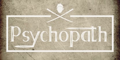 Psychopath is a display font with a katana effect. It'll match spooky, horror, and Halloween theme design.
 - Oorrnnoott by sugargliderz,
$44.00 This is a series that takes unfinished typefaces that were either previously ideated but not realized or were close to completion but left incomplete due to dissatisfaction with certain aspects, and brings them to completion. "Oorrnnoott" was originally a project named "Petitgothiquemignon" or "Sangoth". In the process of refining "Kropotokin", several ideas were incorporated into the design. Well, I say "incorporated," but it was designed on a whim, as usual. After all, it was started around 2005, and I don't usually leave notes or anything (which isn't the best habit), so I don't remember the emotions or thoughts behind its creation. Please consider this typeface as a very typical sans-serif font, as that is what I was aiming for when I excavated it this time. Please use it for body text, headlines, eye-catching designs, or whatever you like.
 - Whatzis JNL by Jeff Levine,
$29.00Whatzis JNL is a collection of over 85 decorative question marks gathered from the Jeff Levine font collection and assembled into one convenient file for use in specialty projects where ad copy is based on questions or curiosity. No need to search through dozens of fonts for your background images, as they're all here. Ads such as "Have a question about your insurance?," "What's New at Harper, Jones and Harper?" or "Ask Us! - We are the Experts!"... or signs saying "May We Help You?" benefit from some well placed display question marks - especially when printed in contrasting colors or screened-back in halftones.
