10,000 search results
(0.043 seconds)
- Cantiga by Isaco Type,
$19.00 Cantiga is a monophonic song or melody, sometimes repetitive, often with unpretentious themes. In the same simplicity, this font family combines robustness with some very fine details, with 44 versions for various purposes. Choose thinner (or thicker) versions for titles, and intermediate versions (normal, medium, etc.) to small sizes. Explore the condensed versions when you need to save space. Use the light versions for special cases in huge sizes. Cantiga intended to be your new "Swiss army knife" sans typeface. The Cantiga family consists of 2 widths (normal and condensed) with 11 weights each, plus their respective italic versions. The fonts are available in OpenType PS format and have extended character set to support CE, Baltic, Turkish as well as Western European languages.
 - Mamba by W Type Foundry,
$19.50 Mamba is inspired by Cooper Black.
 - Halloween Pumpkins by Voysla,
$9.00 Hey! Happy Halloween Pumpkins! 🎃🎃🎃 This is a family of colored fonts "Halloween Pumpkins" in four styles (regular, glowing with and without Halloween pumpkins). PLEASE NOTE that in order to work with color fonts, you will need one of the listed applications - Photoshop CC 2017, Illustrator CC 2018, or Procreate 4.3 or later. It is also supported by some web browsers and text editors. You can read more about color fonts at the link - http://www.colorfonts.wtf The font supports Latin letters, all the necessary symbols, numbers and a set of multilingual characters. There are also additional glyphs of various pumpkins, a knife and decorative elements. They are great for Halloween designs. In addition to the color font family, the set includes a monochrome font "Halloween Carved" without Halloween pumpkins in two styles.
 - Aaux Next Wide by Positype,
$22.00 When the original Aaux was introduced in 2002, I intended to go back and expand the family to offer more versatility. Years went by before I was willing to pick it up again and invest the proper time into building a viable and useful recut. Just putting a new designation and tweaking a few glyphs here and there would not do the designer or the typeface justice; instead, I chose to redraw each glyph's skeleton from scratch for the four main subsets of the super family along with their italics. Each glyph across the super family is 'connected at the hip' with each style—each character carries the no frills, simple architecture that endeared so many users to it. The new recut expands the family to an enormous 72 typefaces! The original has spawned Compressed, Condensed and Wide subsets—all with corresponding weights—for complete flexibility. Additionally, all of the original weight variants have all been incorporated within the OpenType shell: Small Caps and Old Style Figures are there along with new tabular figures, numerators and denominators, expanded f-ligatures and a complete Central European character set.
 - Aaux Next by Positype,
$22.00 When the original Aaux was introduced in 2002, I intended to go back and expand the family to offer more versatility. Years went by before I was willing to pick it up again and invest the proper time into building a viable and useful recut. Just putting a new designation and tweaking a few glyphs here and there would not do the designer or the typeface justice; instead, I chose to redraw each glyph's skeleton from scratch for the four main subsets of the super family along with their italics. Each glyph across the super family is 'connected at the hip' with each style—each character carries the no frills, simple architecture that endeared so many users to it. The new recut expands the family to an enormous 72 typefaces! The original has spawned Compressed, Condensed and Wide subsets—all with corresponding weights—for complete flexibility. Additionally, all of the original weight variants have all been incorporated within the OpenType shell: Small Caps and Old Style Figures are there along with new tabular figures, numerators and denominators, expanded f-ligatures and a complete Central European character set.
 - Aaux Next Cond by Positype,
$22.00 When the original Aaux was introduced in 2002, I intended to go back and expand the family to offer more versatility. Years went by before I was willing to pick it up again and invest the proper time into building a viable and useful recut. Just putting a new designation and tweaking a few glyphs here and there would not do the designer or the typeface justice; instead, I chose to redraw each glyph's skeleton from scratch for the four main subsets of the super family along with their italics. Each glyph across the super family is 'connected at the hip' with each style—each character carries the no frills, simple architecture that endeared so many users to it. The new recut expands the family to an enormous 72 typefaces! The original has spawned Compressed, Condensed and Wide subsets—all with corresponding weights—for complete flexibility. Additionally, all of the original weight variants have all been incorporated within the OpenType shell: Small Caps and Old Style Figures are there along with new tabular figures, numerators and denominators, expanded f-ligatures and a complete Central European character set.
 - Aaux Next Comp by Positype,
$22.00 When the original Aaux was introduced in 2002, I intended to go back and expand the family to offer more versatility. Years went by before I was willing to pick it up again and invest the proper time into building a viable and useful recut. Just putting a new designation and tweaking a few glyphs here and there would not do the designer or the typeface justice; instead, I chose to redraw each glyph's skeleton from scratch for the four main subsets of the super family along with their italics. Each glyph across the super family is 'connected at the hip' with each style—each character carries the no frills, simple architecture that endeared so many users to it. The new recut expands the family to an enormous 72 typefaces! The original has spawned Compressed, Condensed and Wide subsets—all with corresponding weights—for complete flexibility. Additionally, all of the original weight variants have all been incorporated within the OpenType shell: Small Caps and Old Style Figures are there along with new tabular figures, numerators and denominators, expanded f-ligatures and a complete Central European character set.
 - Touch Tone by Jeff Kahn,
$29.00 Touch Tone introduces a condensed lowercase and oblique italics to the uppercase font inspired by the "Dr. Strangelove" movie titles – designed by Pablo Ferro. Touch Tone's naive hand-drawn strokes rely on a quirky variable width-brush. They are looser, more textured, tactile, more informal, with quirky nervous lines. A family of four fonts: it includes two weights, light and medium, and both with roman and italics. All the fonts include the same patterns and ornaments. However, many of the “medium” font weight ornaments are beefed up to visually match. Touch Tone utilizes OpenType features. It imitates handcrafted lettering by including 2 glyphs for each U&lc letter (4 sets) – all kerned with care. This medley avoids a repetitious appearance so each sentence looks original and hand-drawn. The uppercase includes two widths – extra condensed and extended. Add whimsy and eccentricity by mixing the extra condensed caps with extended caps and the lowercase alphabet. Use the Contextual Alternates, or Stylistic Alternates features panel, or select the alternates in the Glyphs palette. Touch Tone includes oldstyle numerals, a variety of retro patterns, dingbats, speech bubbles, icons, banners, graphic arrows and ornaments. Each font includes 403 glyphs. Suitable for display or text and many European alphabets. Purchase both weights, roman and oblique italics to emphasize words. Touch Tone combines cool graphics and patterns with OpenType. Generously apply Touch Tone for added warmth and a "Rat Pack" groovin' message.
 - Fox Love by Fox7,
$16.00 Fox Love is a cute and fun color font. This font is your go-to for crafting cute greeting cards that express affection and warmth. Whether you’re a designer, a social media influencer, or someone with a penchant for creative expression. Fall in love with its authentic feel and use it to create gorgeous invitations, beautiful stationary art, eye-catching social media posts, and cute greeting cards. 🌺🌺 Learn more about color font support on third-party apps here: https://www.colorfonts.wtf/ 🌺🌺 🌺🌺 Please note that the Canva do not support color fonts! 🌺🌺
 - Prisom by Illuminaut Designs,
$10.00 I really wanted to make my own condensed typeface for memes and such. I think i have succeeded. This typeface is so average looking that no one would suspect that it is in fact very radical.
 - Linja by Fenotype,
$14.95 Linja is an elegant ultra condensed font. It's best for display use in magazines, books & posters. Linja font was originally designed in 2002. Now it's been remade with the complete character set and six different versions.
 - Hadrian LP by LetterPerfect,
$39.00 Hadrian Bold pushes the limits for an extra-condensed titling face. Though remaining in the tradition of the 20th-century 'grotesque' designs, its heavy verticality and tight spacing demand attention for headlines at virtually any size.
 - Lido STF by Storm Type Foundry,
$39.00Times with a Human Face: In my article of the same name which appeared in the magazine Font, volume 2000 I described the long and trying story of an order for a typeface for the Czech periodical Lidové noviny (People’s Newspaper). My task was to design a modification of the existing Times. The work, however, finally resulted in the complete re-drawing of the typeface. The assignment, which was on the whole wisely formulated, was to design a typeface which would enable “a smooth flow of information in the reader’s eye”, therefore a typeface without any artistic ambitions, from which everything which obstructs legibility would be eliminated. A year later Lidové noviny had a different manager who in the spring of 2001 decided to resume the cooperation. The typeface itself definitely profited from this; I simplified everything which could be simplified, but it still was not “it”, because the other, and obviously more important, requirement of the investor held: “the typeface must look like Times”. And that is why the above-mentioned daily will continue to be printed by a system version of Times, negligently adjusted to local conditions, which is unfortunately a far cry from the original Times New Roman of Stanley Morison. When I was designing Lido, the cooperation with the head of production of Lidové noviny was of great use to me. Many tests were carried out directly on the newspaper rotary press during which numerous weak points of the earliest versions were revealed. The printing tests have proved that the basic design of this typeface is even more legible and economical than that of Times. The final appearance of Lido STF was, however, tuned up without regard to the original assignment – the merrier-looking italics and the more daring modelling of bold lower case letters have been retained. The typeface is suitable for all periodicals wishing to abandon inconspicuously the hideous system typefaces with their even more hideous accents and to change over to the contemporary level of graphic design. It is also most convenient for everyday work in text editors and office applications. It has a fairly large x-height of lower case letters, shortened serifs and simplified endings of rounded strokes. This is typical of the typefaces designed for use in small sizes. Our typeface, however, can sustain enlargement even to the size appropriate for a poster, an information table or a billboard, as it is not trite and at the same time is moderate in expression. Its three supplementary condensed designs correspond to approximately 80% compression and have been, of course, drawn quite separately. The intention to create condensed italics was abandoned; in the case of serif typefaces they always seem to be slightly strained. I named the typeface dutifully "Lido" (after the name of the newspaper) and included it in the retail catalog of my type foundry. In order to prevent being suspected of additionally turning a rejected work into cash, Lido STF in six designs is available free of charge. I should not like it if the issuing of this typeface were understood as an “act out of spite” aimed against the venerable Times. It is rather meant as a reminder that there really are now alternatives to all fonts in all price categories. - Dufour by Scholtz Fonts,
$19.00 Dufour was named in honor of an art deco font called "Independent" designed in the 1930s by Collette and Dufour. "Dufour" is influenced by the original font, however, there are substantial differences: instead of small caps, a true lower case was created, the upper case character proportions and shapes have been greatly modified, and all missing characters have been created to make a truly modern font which nevertheless has all of the panache of the original. A related font is Collette, designed by Anton Scholtz, however, Dufour has a softer feel that is more true to the original art deco period. Dufour comes in four styles: Dufour Regular, Dufour Regular Outline, Dufour Condensed, and Dufour Condensed Outline. The font has been carefully kerned and best results are obtained if kerning is switched on. (All-caps passages work well.) It is best used to create a retro feel and in headings, subheads and in short passages of text. Very effective in marketing for products for children.
 - Singel by Fontfabric,
$35.00 Singel is a neoclassical serif with semi-condensed proportions. As a contemporary interpretation, this typeface combines the rationalist modulated stroke with an elegant silhouette and crisp serifs. The altogether splendid appearance of Singel, completed with a full set of Small Capitals and true form of italics makes it perfect for any luxurious and graceful design. Other aspects of its characteristics include the consistency of 10 styles from Light to Bold; a coverage of Extended Latin and Cyrillic with span for more than 130 languages; a flawless functionality and support of many OpenType features, such as localizations, tabular numerals, inferiors and superiors, numerators & denominators, fractions, case sensitivity etc. Features: • Over 900 glyphs in 10 styles (Light to Bold); • Extended Latin and Cyrillic for more than 130 languages; • Tall x-height and Semi-Condensed proportions; • High contrast and modulated stroke with vertical stress; • Neoclassical characteristics and moderate apertures; • Full set of Small Capitals; • True form of italics; • Coverage of multiple OpenType features; • Suitable for wide design purposes.
 - Diameter by Vishnu Sathyan,
$8.00 The idea of symmetry came to me when I was lookig for a geometric sans font. None of the things that I found did have the mathematically perfect symmetry. So, I went ahead and created one. I have used complex mathematical equations to get the perfect angle in every letter. Diameter comes with two styles square corner and rounded corner, each with regular and bold weights.
 - Lonesome Zombies by Gassstype,
$25.00 Hello Everyone, introduce our new product Lonesome Zombies Terrible Bloody Typeface Brush font Best for poster, horror poster, childrenbook, cartoon rough, comic and project that need horror vibes. Letters are made with brushes on Procreate. Then crafted carefully drawn into vector format. That is why Lonesome Zombies has Stylish and strong characteristic more natural look to your text with a more modern look to your text.
 - Cursed Parade by Senekaligrafika,
$12.00 "Cursed Parade" Has hard strokes and a signature styles that speak to instant scared sensations,it was inspired by horror and thriller movie “IT”. "Cursed Parade" will help you to create special and touching typographical design for your horror and dark projects, for branding, labeling, clothing, movie title, album cover, logos and many more. It is really universal and modern font. The owner of endless possibilities!
 - Bolt Display by SilverStag,
$19.00 Introducing Bolt Display – picture this: uppercase letters with rounded corners, inviting you in with a warm, approachable embrace. Or, if you're feeling adventurous, the outlined uppercase stylistic set that adds that contemporary edge to your work. On the flip side, lowercase letters with sharp corners confidently declare their presence, while the lowercase outlined stylistic set strikes the perfect balance between structure and artistic freedom.
 - Infection by Ronin Design,
$15.00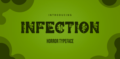 Infection is a horror and halloween font. Designed with a zombie virus touch will give a creepy impression, This font is ideal for labels, posters, or pretty much anything else that requires a creepy touch.
 - Retrio by Luxfont,
$18.00 Introducing Retrio. Original glyphs with echoed behind. As if the letters were moved, but the kinetic trail remained. Colored, gradient, with transparency or solid - many options in one family for any task and for every taste. The font will emphasize the style of the 20th century in illustration. Discos, electro music, records, nostalgia - these are the associations that this font family evokes, which is very important in design. At the same time, the Retrio font is not outdated, it was created taking into account modern trends in retro themes. A unique family in which there are both color and classic monochrome versions. Great versatility in use is provided by the many fonts in the set. Great for ad designs, posters, headlines and covers. Check the quality before purchasing and try the FREE DEMO version of the font to make sure your software supports color fonts. P.s. Have suggestions for color combinations? Write me an email with the subject "Retrio Color" on: ld.luxfont@gmail.com Features: - Free Demo font to check it works. - Uppercase and lowercase the same size. - With transparency and without. - Mega high-quality gradients in letters. - Kerning. IMPORTANT: - Multicolor version of this font will show up only in apps that are compatible with color fonts, like Adobe Photoshop CC 2017.0.1 and above, Illustrator CC 2018. Learn more about color fonts & their support in third-party apps on www.colorfonts.wtf -Don't worry about what you can't see the preview of the font in the tab "Individual Styles" - all fonts are working and have passed technical inspection, but not displayed, they just because the website MyFonts is not yet able to show a preview of colored fonts. Then if you have software with support colored fonts - you can be sure that after installing fonts into the system you will be able to use them like every other classic font. Question/answer: How to install a font? The procedure for installing the font in the system has not changed. Install the font as you would install the classic fonts. How can I change the font color to my color? · Adobe Illustrator: Convert text to outline and easily change color to your taste as if you were repainting a simple vector shape. · Adobe Photoshop: You can easily repaint text layer with Layer effects and color overlay. ld.luxfont@gmail.com
 - Art Topic JNL by Jeff Levine,
$29.00 Art Topic JNL is a round-cornered square sans serif in the Art Deco style, and was modeled from a 1930 WPA (Works Progress Administration) poster for the Federal Arts Project.
 - Ateknov by Twinletter,
$17.00 Introducing Ateknov, a retro condensed font that embodies classic elegance. This font is perfect for designers looking for a touch of nostalgia in their work. Ateknov features a clean and polished design with sharp edges and a condensed appearance that makes it a great choice for headlines, logos, and branding. Ateknov comes equipped with alternate characters and ligatures, each with a unique and beautiful design that adds depth and character to your projects. The font also supports multilingual characters, making it accessible to a global audience. Whether you’re creating a vintage-inspired design or a modern twist on a classic aesthetic, Ateknov is a versatile font that will elevate your work to the next level. Download it today and start exploring the possibilities. What’s Included : - File font - All glyphs Iso Latin 1 - Alternate, Ligature - Simple installations - We highly recommend using a program that supports OpenType features and Glyphs panels like many Adobe apps and Corel Draw so that you can see and access all Glyph variations. - PUA Encoded Characters – Fully accessible without additional design software. - Fonts include Multilingual support
 - Gumblery by PizzaDude.dk,
$15.00 A futuristic stylistic font with smooth curves, and rounded corners. Comes with more than 500 different ligatures that curl and swurl the letters in funky forms.
 - Caleuche Alt by RodrigoTypo,
$25.00 Caleuche Alt is a typeface which contains different weights and styles, especially for action, Comics, horror or suspense titles, in addition to containing alternatives and ligatures
 - Letterpress Helpers JNL by Jeff Levine,
$29.00 Letterpress Helpers JNL continues a series of vintage cartoons, border and corner elements, stock designs, sales helpers and other embellishments re-drawn from vintage source material.
 - Tablet Gothic by TypeTogether,
$35.00 Graphic designers of any nationality and background know very well that the art of composing titles correctly is not easy, Especially when it comes to periodical publications where there is need for both flexibility and graphic coherence. Tablet Gothic was originally engineered as a titling type family, meant to help designers working on publications that require output as hard copies and a variety of digital platforms at the same time. As such, it is a grotesque sans serif that looks to the future of publishing with a clear understanding of its history, and reminiscences that go back to nineteenth century Britain and Germany. Tablet Gothic delivers the sturdy, straightforward and clean appearance expected from a grotesque, but it allows itself a good measure of personality to make it stand out on the page. Its 84 styles –six series of condensation and seven weights in each series plus obliques– guarantee that, whatever the publication format is, there's a Tablet Gothic font that will do the job and perform well both technically and aesthetically. Furthermore, the rounder styles, Tablet Gothic Wide, Normal and Narrow achieved amazing results at very small sizes, producing a beautiful texture and highly readable text blocks. Tablet Gothic fonts can be purchased individually, by series or as a complete bundle (best value!)
 - Astoria Antique SG by Spiece Graphics,
$39.00 The ornamented and magnificent type design used with the color plates of Owen Jones' “The Grammar of Ornament” has served as a model for this nineteenth century typeface. Astoria Antique possesses an intricate and spidery-like quality. Its v-shaped wedge endings make it look like something straight out of an old curiosity shop. In addition, lowercase letters have been added for design convenience. Astoria Antique will make a great choice whenever a period or Victorian look is desired. Astoria Antique is also available in the OpenType Std format. Some new characters have been added to this OpenType version. Advanced features currently work in Adobe Creative Suite InDesign, Creative Suite Illustrator, and Quark XPress 7. Check for OpenType advanced feature support in other applications as it gradually becomes available with upgrades.
 - Blackheat by Almarkha Type,
$19.00 Blackheat is a bold, condensed sans with 4 styles inspired by the title of the sports poster. We designed it to look very energetic, taking into account the thickness and density of each glyph. Extra ligatures give you even more possibilities. This family is suitable for the titles, clothes, posters, magazines, brochures, packaging, websites and much more.
 - Dante Alighieri by RMU,
$35.00 From the great Schelter & Giesecke collection, Dante Alighieri is a splendid companion to Aldo Manuzio. With its rather condensed characters it makes an ideal body text font even for narrow columns. Dante Alighieri comes with the historical long s and swash letters of H and T. It can be used for all major West and Central European languages.
 - Bandiera Del Legno NF by Nick's Fonts,
$10.00 This typeface appeared in the William H. Page Woodtype specimen book as Gothic Tuscan Condensed Reversed—quite a mouthful. Banner elements appear in the brace and bracket positions, and reversed spaces can be found in the underscore and bar positions. Both versions of this font support the Latin 1252, Central European 1250, Turkish 1254 and Baltic 1257 codepages.
 - Abel Pro by MADType,
$39.00 Abel is a modern interpretation of the condensed flat-sided sans serif. Originally used for newspaper headlines and posters, this style can also be used for text on the web. Its angled terminals and spiked stems give it enough style to be unique at display sizes, while its mono-weight still works well at smaller text sizes.
 - Slivky by Slava Antipov,
$25.00 Slivky is a condensed rounded font family. It includes 6 styles: All Caps, All Caps Swash, Regular, Regular Swash, Small Caps, Small Caps Swash. Swash fonts have large capitals in the style of handwritten / script fonts. This cute rounded font is quite versatile due to the different styles. Good for logos, packaging, posters, advertisements and more.
 - Orion Chalk by Allouse Studio,
$16.00 Proudly Present, Orion Chalk, with Two Styles Solid & Scratch. Orion Chalk is a Condensed Chalkboard Font. Orion Chalk is perfect for product packaging, branding project, megazine, social media, wedding, or just used to express words above the background. Orion Chalk also come with multilingual support. Enjoy the font, feel free to comment or feedback, send me PM or email.
 - Artegra Slab by Artegra,
$29.00 Artegra Slab is the latest addition to the Artegra superfamily. It contains 54 fonts with over 1000 glyphs per font in condensed, normal and extended widths. With Cyrillic and Greek sets it supports more than a hundred languages. It’s based on the perfectionist geometric shapes of Artegra Sans, which makes it beautiful to look at and easy to read.
 - Vecta Serif by Wilton Foundry,
$29.00I think it is one of our most useful fonts in that it doesn't draw much attention to itself while it is quite refreshingly different. Almost all shapes in Vecta are rounded to provide a friendly effect. Proportions are somewhat condensed providing economic space usage. Vecta looks equally at home in headlines as well as body text. - Zokak Arabic by FarahatDesign,
$39.00 Zokak is a first-of-its-kind ultra condensed Arabic typeface designed for display uses. The name means an alley in Arabic which comes from its very narrow letters, which makes it perfect in small spaces. Zokak has two main styles, the default style and the tall one to give more diversity and to be suitable for more uses.
 - ITC Willow by ITC,
$40.99 Willow font was designed by Tony Forster, a fanciful font in the Viennese Secessionist style. The work of Scottish architect Charles Rennie Mackintosh inspired this condensed sans serif typeface with its rough edges and selection of alternate and ligature characters. Willow font revives the look of the arts and crafts of the late 19th and early 20th centuries.
 - Lion and Hare by Rook Supply,
$14.00 Lion & Hare is an ultra compressed, tall font family that portrays strength and power. The condensed characters maintain fairly square edges to give a more consistent geometric & industrial look to the font. The font family supports 27 languages and comes in 6 styles. Lion and Hare works fantastic for website headers, magazine layouts, logos, branding and much more.
 - Parkson by Rook Supply,
$18.00 Inspired by the grotesque fonts of the 19th century, Parkson is a tall sans serif typeface of 7 weights along with italic and several outline versions. The contemporary typeface aims to be one of the world's best condensed collection of fonts. Designed for optimum legibility, its clean, geometric look is perfect for logotypes, headers, titles and brochures.