10,000 search results
(0.042 seconds)
- Mirador by René Bieder,
$30.00 Mirador is a powerful neoclassical font family designed for various usages — ranging from editorial and corporate design to web, interaction and product design. It is a contemporary take on high contrast typefaces that have never gone out of style — defined by elegance, tradition and timelessness. Although Mirador seems to be a display font at first glance, its proportions and design reveal a powerful and characteristic workhorse when set in smaller sizes. Mirador comes in 10 weights with matching italics. It is equipped with ligatures, a large set of alternative glyphs and many more opentype features.
 - Korb by JCFonts,
$30.00 Korb is a rounded sans serif family of four styles. It features a narrow geometric construction inspired by DIN letter shapes along with more unusual details like open counters and smooth connections between shoulders and stems. This makes the family suitable for a variety of applications, from corporate design to signalization. The fonts, provided in OpenType format, include diacritics for most European languages, a set of arrows and a variety of OpenType features like stylistic alternates, case-sensitive forms, tabular figures, etc. Check the pdf specimen in the gallery tab for more info.
 - Bale by moretype,
$28.00 Originally developed as a part of a corporate identity, Bale is a warm and confident sans-serif font. With its generous counters and angled terminals Bale is a dependable work horse with enough flare to add interest to any typographical landscape. This hardworking font comes equipped with small caps, automatic fractions, proportional/tabular lining and old style figures and alternative glyphs and is the must for any typographic toolkit. Bale Mono is the monospaced companion of Bale. This Mono font brings a technical edge to the cool professionalism of Bale.
 - DARK PLACE_DEMO - Personal use only

- Dark Theater - Unknown license

- Opake by Ndiscover,
$36.00 Opake™ is an experimental typeface design that steps away from regular design conventions. Instead of basing the design on a calligraphic tool or geometric shapes, Opake™ is the result of the exercise of creating letters with a single continuous loop line. This unseen technique makes the overall design very unique. Though unconventional, the design resonates with some familiarity because of its calligraphic stroke terminations and some shape decisions that might resemble Cooper Black. In the end Opake™ is a cutting edge non-connecting script font, with a warm and happy feeling. Ideal for large headlines and general display use, but also branding, posters and apparel. If you like unconventional solutions and edgy design, Opake is the font to go for.
 - Allrounder Monument by Identity Letters,
$22.00 An inscriptional titling font for truly epic headlines. Allrounder Monument is an inscriptional, dignified member of the Allrounder superfamily. This all-caps typeface with delicate serifs was inspired by ancient inscriptions on columns, monuments, and buildings in Rome: letters as old as two millennia that radiate their own classic charm. Allrounder Monument picks up this atmosphere in order to create a typographic tool that lives up to contemporary demands. It infuses today’s designs with a hint of history and an air of exclusivity. Allrounder Monument is a timeless titling typeface. You might use it for posters, magazines, book covers, greeting cards, advertising or packaging work, and even signage. If you want an even more spectacular and exciting headline or title, additional Discretionary Ligatures and a Stylistic Set provide the necessary OpenType power to achieve this goal with ease. As Allrounder Monument is a part of the Allrounder superfamily, you can combine the three weights Book, Regular and Medium with the corresponding weights of Allrounder Grotesk. The Allrounder superfamily is a series of typefaces sharing the same color and horizontal metrics (cap height, small cap height and x-height): a typesetting system whose components match each other perfectly. Any other part of this design kit, e. g., Allrounder Grotesk or Allrounder Antiqua, may be easily combined with Allrounder Monument. Whenever you need a truly epic headline, Allrounder Monument is the best horse in your barn. Ad astra!
 - Deco Spring by Ingrimayne Type,
$10.00 DecoSpring is a decorative art-deco family that was inspired by one word in an advertisement in a 1978 edition of my local newspaper. I could not find a typeface that matched it so decided to create one, which became DecoSpring-Regular. It is caps only, with an alternative set of capitals on the lower-case keys. Characters with very thick stems invite interior decoration and I opted for floral decorations. DecoSpring-Flowers can be used alone or it can be layered on top of the regular style to create colored flowers. Changing the width of the bolder stem resulted in two more style, the light and thing styles. Another set of four styles, the Simple set, was formed by eliminating the split in the stems by merging the two parts. All the DecoSpring faces are display faces to be used in small doses, and especially the bolder ones, at large point sizes.
 - Roundup by Ingrimayne Type,
$10.00 The Roundup family was inspired by fonts from the late 19th century, though it is not based on any one of them. Roundup-Caps was the first of the group to be constructed. It has two sets of upper-case letters that have minor differences. It has reverse contrast, that is, the verticals are thinner than the horizontals. Unlike most of the "Old-West" fonts with reverse contrast, the serifs are not square but have an odd, rounded shape. Roundup-Regular replaced the second set of caps with lower-case letters. A bold style strengthens the vertical elements so that it no longer has reverse contrast. Both the regular and bold styles have matching oblique styles. Finally, there is a hollow version with a shadow to the lower right. This shadowed style has had its inside taken out, creating RoundUp-ShadowInside. The spacing is the same as RoundUpShadowed so it can be layered over RoundUpShadowed to easily create two-colored lettering.
 - Cinnamon Peach by Abbasy Studio,
$8.50 Let me introduce my first ever product on my shop. Cinnamon Peach - Layered Font After 2 years of learning how to create a fonts, learn about the anatomy of typography, features of the OpenType fonts, and all of the experience on my collaborations with many friends, Finally I just launched my first personal product with the name Cinnamon Peach. Cinnamon Peach is beauty combinations of layered font. It has a Serif and Script style inside. Both of them are layered font, which is you can express the style on both of it. You can add shadow, inline or hatch on Serif style. Changing the color of the other layer as just easy as change standard color of the fonts but it’s more deep in detail. On the Script style, I give you more freedom of choosing which style do you want, if you want a deep style of layer, you can choose regular and inside with different color. but if you want the outline style, it also available as a single fonts. Looks like on the display that I Created, You can see the most of combinations font in there are perfectly matched even on script version doesn’t include the Uppercase character. Because of the strong characteristic of this fonts you can see the combinations are great with or without layer, monochrome or multi color, pastel or watercolour. It’s great for posters, display, logos, header website, magazine, animation text, etc. Thank You very much, hope you enjoy this fonts !
 - Mirumir by Spacemotion,
$29.00 MIRUMIR is a variable display grotesk typeface which has latin, cyrillic and hebrew scripts. It comes in 16 weights and its matching italics It contains 451 characters. Designed with powerful opentype features in mind. Each weight includes extended language support (+ Cyrillic), fractions, tabular figures, arrows, ligatures and more. Perfectly suited for graphic design and any display use. It could easily work for web, signage, corporate, newspaper, display, magazines as well as for editorial design.
 - Knoo by ffeeaarr,
$11.00 Knoo is a bold typeface with some pretty futuristic characters. This version has new additional characters compared to the previous version.
 - Mayan by Grummedia,
$20.00Designed for a role-playing scenario, this alphabet was fun to create and fun to ‘translate’ when incorporated into replica stelae. - Gridiot by Peter Bain,
$10.00 Gridiot is a constructed, semi-serif, two-weight stencil family that expands an approach taken by Josef Albers. Intended for display or headline setting, it features chamfered or bevel-cut corners, used instead of curves. The individual letter components sometimes vary in depth, avoiding a strictly modular approach, while the widths are kept consistent. The lining figures provide a standard set of numbers, and the oldstyle figures align with the lowercase, encouraging lowercase-only setting. Currency and other useful numerical symbols are provided in both versions. The zero is intentionally lighter, following early Renaissance types; there are filled versions as stylistic alternates. While horizontal scaling distorts the relationship between verticals and horizontals in a typeface, since every chamfer in Gridiot is at 45°, changing the horizontal scaling of the type will affect all diagonals equally. When used at a large size, or for a just few words, Gridiot can be very tightly spaced. Remember, any idiot can design a typeface on a grid: Gridiot.
 - Carta S - Unknown license

- Alethia Next by Pepper Type,
$40.00 Alethia Next is a grotesque sans-serif typeface with high contrast in all weights. It has been designed to serve as a display typeface in various editorial projects, such as magazines or corporate brochures, as a sans-serif pair to serif types of modern style. Alethia Next comes in 7 weights + matching italics and upright italics, each supporting numerous Latin-based languages as well as major Cyrillic languages including Bulgarian local forms. It is packed with OpenType features like ligatures, small caps, and numerous alternatives.
 - Magnitudes by DuoType,
$29.00 Magnitude is a font inspired by classics like Eurostyle and Bank Gothic, with geometric characteristics and dynamics style. Designed to be used in a wide variety of applications such as advertising, corporate projects, branding and retail product design. The font is well-suited for headings, display use and short text. The Magnitudes family is available in 36 weights, ranging from Extra light to heavy, to condensed and expanded with matching italics . The font contains a character set of 401 characters supporting 206 different languages.
 - Miramonte by Ascender,
$29.99 Miramonte Pro was designed by Steve Matteson in 2006 as a friendly sans serif design suitable for user-interface design, corporate branding and publishing. The name means 'behold the mountains' in Spanish, suggesting the rustic, unrefined type design. Miramonte is based on Stanislav Marso's humanist sans serif released by Grafotechna in 1960. This revival includes a cursive style italic rather than a sloped roman. Miramonte Pro includes an extensive character set for publishing Central and Eastern European languages. Its OpenType features include proportional figures, and tabular figures.
 - Gandia by Jehoo Creative,
$25.00 Gandia is a true form of elegance and refinement. Curved corners give a soft yet bold impression. Inspired by the fast-growing vintage culture, this typeface can easily blend with modern retro design needs. With low contrast including the Cyrillic alphabet, it is very flexible to pair with other fonts. Gandia is perfect for various design needs such as magazines, posters, branding, clothes, quotes, web ui, social media posts, cover designs, Logo and many more. Comes with 8 Weights: Thin, Extralight, Light, Regular, Medium, Semibold, Bold, Extrabold. Equipped with attractive Opentype features Smallcaps, Discretionary Ligature vertical on Uppercase and Ss01, Ss02, Ligature on Lowercase and each font has more than 1300 glyph.
 - ITC Ellipse Neo by Typorium,
$30.00 The Typorium presents a new optimized and enriched version of ITC Ellipse which first appeared in 1996 in the International Typeface Corporation typeface library. ITC Ellipse Neo design has been lightly modified. Three weights have been added (light, Medium, Extra Bold, including Italics) to the original Regular and Bold styles. ITC Ellipse Neo is both modern and classic. Modern in the unusual shape based on the geometric ellipse form. And classic in the structure of some letters like the lower cases c, e, g, o, s. These letters alone could come from a traditional typeface, but they fit perfectly with the atypical rest of the alphabet giving it a present-day and traditional mix. Furthermore, the ellipse shape fits naturally in the italic styles, giving the font an organic and fluid feeling. ITC Ellipse Neo offers OpenType features such as alternate characters for upper and lower case, and an extended accented character set to support many languages. Five weights have been created for each style to offer a wide range of graphic possibilities in a tidy digital footprint. Designer: Jean-Renaud Cuaz Publisher: Typorium MyFonts debut: December 15, 2020 Le Typorium présente une nouvelle version optimisée et enrichie d'ITC Ellipse qui est apparue pour la première fois en 1996 dans la bibliothèque de caractères de l'International Typeface Corporation. Le design de ITC Ellipse Neo a été légèrement modifié. Trois graisses ont été ajoutées (léger, moyen, extra gras, y compris les italiques) aux styles originaux Regular et Bold. ITC Ellipse Neo est à la fois moderne et classique. Moderne dans le dessin inhabituel basé sur la forme géométrique de l’ellipse. Et classique dans la structure de certaines lettres comme les minuscules c, e, g, o, s. Ces lettres pourraient provenir d'une police de caractères traditionnelle, mais elles s'intègrent parfaitement avec le reste de l'alphabet plus insolite en lui donnant un mélange de modernité et de tradition. De plus, la forme de l'ellipse s'intègre naturellement dans les styles italiques, donnant à la police une sensation organique et fluide. ITC Ellipse Neo offre des fonctionnalités OpenType telles que des caractères alternatifs pour les capitales et les bas de casse, et un jeu de caractères accentués étendu pour prendre en charge de nombreuses langues. Cinq graisses ont été créés pour chaque style afin d'offrir un large éventail de possibilités graphiques pour une empreinte numérique rigoureuse.
 - MFC Monarchy Initials by Monogram Fonts Co.,
$19.95 The inspiration source for Monarchy Initials is the 1934 Book of American Types by American Type Founders. In that specimen book, they had created a sophisticated two color initial design they called "Stationers Initials" which was only available in metal type at 24, 36, and 48 points. This wonderfully detailed initial style is now digitally recreated and revived for modern use. Monarchy Initials is only capable of initial or single letter monograms due to its unique design. The two color aspect of the original design has been preserved and made accessible within all programs. The Capital character slots contain the background color glyphs, and the lowercase slots hold the outline art for the letters. You can choose a color, type a capital letter, then switch to black and type a lowercase letter for the two color effect, or just tpe a lowercase letter on its own. It's that easy! Download and view the Monarchy Initials Guidebook if you would like to learn a little more.
 - MFC Memoriam Initials by Monogram Fonts Co.,
$19.95 The inspiration source for Memoriam Initials is the 1934 Book of American Types by American Type Founders. In that specimen book, they had created a sophisticated two color initial design they called “University Initials” which was only available in metal type at 24, 36, and 48 points. This wonderfully detailed initial style is now digitally recreated and revived for modern use. Memoriam Initials is only capable of initial or single letter monograms due to its unique design. The two color aspect of the original design has been preserved and made accessible within all programs. The Capital character slots contain the background color glyphs, and the lowercase slots hold the outline art for the letters. You can choose a color, type a capital letter, then switch to black and type a lowercase letter for the two color effect, or just type a lowercase letter on its own. It’s that easy! Download and view the Memoriam Initials Guidebook if you would like to learn a little more.
 - Boxley by Shinntype,
$45.00 The original superellipse typefaces coincided with the emergence of the CRT (cathode ray tube) TV screen, but there is more than this visual analogy of high-tech in play, as the pumped up angularity of the curved components of the genre also informs the quality of set text. In particular, due to the straightness of the round letters’ side stems, there is a neat modularity of vertical letter spacing, which denotes authority, with precision, complementing the tautness of the face’s curves.
 - Campton by René Bieder,
$30.00 Campton is an unconventional typeface based on the first steps of the newly born sans serif genre in the early twentieth century. Its character draws inspiration from Gill Sans and Johnston Sans while combining it with contemporary elements. The result is a modern and unorthodox family that is perfectly suited for graphic design application ranging from editorial and corporate design to web and interaction design. Campton comes in nine weights with matching italics and is equipped with a wide range of opentype features.
 - Northwoods by Cultivated Mind,
$19.00 Northwoods is a simple, handwritten sans serif font family designed by Cindy Kinash. This family includes five weights and italics. Northwoods is a little different than most sans serifs being that it’s handwritten. You can use the fonts in multiple ways such as in design or textually. Try the bolder weights for display text and the lighter/italic weights for textual purposes. Northwoods is great for packaging, magazines, layouts, web design, corporate identity and marketing. Posters designed by Henry Barros.
 - Flowy by Typesketchbook,
$49.00 Flowy is a romantic and delicate type, made up of four sub-families. Brush, Script, and Condensed imitate freehand writing using different tools. In these families, you can choose the original version which embodies freehand styles, the Clean option which offers a clean-cut edge and is more suitable for corporate assignments, or Rust which changes the texture. Meanwhile, two options, Clean and Ink, come with the Sans type. The complete family has 29 individual typefaces that serve your projects every purpose.
 - Goneasi by Pandastock,
$12.00 Goneasi is classic fonts with visual elegance, smooth curves and beautiful ligatures clear, making your work look true and attractive. A very versatile font that works in both large and small sizes. This font is suitable for a wide variety of projects such as invitations, logo, branding, magazine, photography, card, product packaging, mugs, quotes, social media, wedding, poster, label, signature and more. Font which is perfect for all business sectors including personal projects, studio, corporate, creative agency, industrial, company, etc.
 - Musont by Pandastock,
$12.00 Musont is an elegant sans serif fonts with visual elegance, smooth curves, and beautiful ligatures clear, making your work look true and attractive. A very versatile font that works in both large and small sizes. This font is suitable for a wide variety of projects such as invitations, logos, branding, magazine, photography, card, product packaging, mugs, quotes, poster, labels, signatures, and more. Font which is perfect for all business sectors including personal projects, studio, corporate, creative agency, industrial, company, etc.
 - SPIDER GHOST by Letterafandi Studio,
$14.00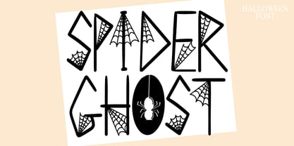 Spider Ghost is a Halloween decorative font. Add it to your Halloween crafts, horror movie posters, t-shirts and anything else that requires a spectacular look.
 - StoneWash by Scholtz Fonts,
$15.00 StoneWash is a funky, grunge font, with a monumental marble finish. The font combines an “old as the hills grunge” look with IN YOUR FACE, modern lines. It has a look of very old, washed out denim, about to disintegrate. StoneWash has all of the grunge characteristics: -- it’s dirty and corroded -- it’s coarse & broken -- it’s rough & pitted It also has the characteristics of an African style font: -- it’s ethnic -- it’s irregular -- it’s primitive -- it’s rustic -- it’s vibrant Use StoneWash for a great variety of applications: -- think advertisements - think flyers - think graffiti art - think posters - think magazine pages. You have to have StoneWash.
 - Yankee Doodle Boy JNL by Jeff Levine,
$29.00 In the early years of the 20th Century, singer-dancer-actor-composer-playwright George M. Cohan was known as "The Man Who Owned Broadway". In 1904, Cohan was enjoying success with his latest creation, "Little Johnny Jones". Cohan gave America what would become a number of iconic songs, and both he and his compositions were immortalized in the 1942 biographical film "Yankee Doodle Dandy" starring James Cagney. The Art Nouveau-influenced hand lettering of the title on the cover of the sheet music for "The Yankee Doodle Boy" was the model for its namesake digital typeface design and is available in both regular and oblique versions.
 - Song Merchant JNL by Jeff Levine,
$29.00 Although the early 1900s through the 1920s seemed to be the "Golden Age" of ridiculously long novelty song titles, it appears that even the decade of the 1940s had its fair share as well. Song Merchant JNL was modeled from the hand lettered [but exhausting] title of the sheet music for "Princess Poo-Poo-Ly Has Plenty Pa-Pa-Ya (and she Loves to Give it Away)". Despite the obvious double-entendre inferences of the title, the square block letters with rounded corners make for a useful headline font (even if the source material it was drawn from is quite forgettable). Available in regular and oblique versions.
 - Batrider by Runsell Type,
$16.00 Batrider is a Script Display font inspired by vintage lettering in old labels. It comes in two style: regular and textured. Batrider textured contains rounded corner and authentic textured for an organic printing look. Carefully made with perfectly horizontal vertical bezier handles. Every single letter contains beautiful alternates characters (stylistic set 1 - stylistic set 16) and features ligatures. Batrider is great for designs such as the logotypes, packaging, branding, quotes, business cards and more custom design. The features are uppercase, lowercase, numeral, punctuation and symbols, ligatures, alternates, multi-lingual support, PUA encoded. How to get access alternate glyphs with designing software to open type fonts, click here.
 - Notebug by PizzaDude.dk,
$15.00 Notebug looks like there was a bug playing around with an inky pen. Notebook with a bug = Notebug! Made with a hefty inky pen and quick strokes. You got 3 layers to play around with: Regular (the outline) Fill (The "inside" of the Regular version and Layer (best used as a background layer for Regular)
 - Ultimatum MFV by Comicraft,
$19.00 ALERT: Comicraft's Mad Font Scientist John Roshell and Lead Lab Assistant Drewes McFarling have applied an Unstoppable Force to our Immovable Font ULTIMATUM, successfully splitting it into a family of three fonts! Here’s the secret formula: ULTIMATUM MASS retains the dynamic details of the original with flat, angled corners; ULTIMATUM FORCE cooperates with your demands for a vertical slice of the action; and ULTIMATUM VELOCITY got tired of waiting for a compromise and cut across its horizontals. The complete family features three styles of eight weights for a total of 24 fonts, each with support for 221 languages including Western & Central Europe, Vietnamese & Cyrillic. Three Variable Fonts provide precise control of Weight & Italic slant. ULTIMATUM MASS FORCE VELOCITY is ideal for high performance car & truck branding, sports uniforms, video game graphics, college & university apparel, and any time you want to convey industrial strength and technological innovation.
 - Acid Bath by Bogusky 2,
$12.00Bold corroded font - skullphabet - Unknown license

- Cruickshank - Unknown license

- Shentox by Emtype Foundry,
$69.00 During a visit to London in 2008 I fell in love with the square font used on the British car number plates. I was immediately inspired to start working on this font and have been developing it intermittently ever since. Several more trips to London and the project evolved before it finally took off and became Shentox. Despite the starting point being inspired by simple, everyday car plates, the font soon evolved into something fine and very rich in detail. Even though the square genre is very restrictive, Shentox is a highly legible contemporary font with a full range of weights, useable not only as a display family for headlines and posters, but as a distinct, clean font family for branding and general editorial use (Especially magazines). It has been carefully drawn paying extra attention to the details, high end finishes that makes Shentox a safe font for use in large scale work. For example, the curves of every individual corner have been adjusted character by character to avoid the common problems encountered with square fonts (Eg. darker corners between weights or a visually inconsistent radius between the Upper and Lowercases as a result of copy/paste). Shentox italic, which has a 12 degree slant, has been corrected to avoid distortion when slanted. The radius of the upper-right and lower-left corners are more pronounced, giving it a more fluid Italic feel. Shentox is available in Open Type format and includes ligatures, tabular figures, fractions, numerators, denominators, superiors and inferiors. It supports Central and Eastern European languages. This type family consists of 14 styles, 7 weights (Thin, UltraLight, Light, Regular, Medium, SemiBold and Bold) plus italics. Shentox PDF
 - CamingoDos by Jan Fromm,
$45.00 CamingoDos is characterised by tight shapes, elliptical curves, subtle contrast and a strong, humanistic appearance: attributes that were all applied with particular care and attention for legibility. It comes in a wide range of seven weights from ExtraLight to Black which makes it perfectly suitable for editorial and corporate design. Furthermore it now has two additional related families: CamingoDos SemiCondensed and CamingoDos Condensed. CamingoDos comes with a Pro version that offers a rich set of expert typographic features like small caps, ligatures, stylistic alternates, different figure sets, arrows, fractions and ordinals.


