3,650 search results
(0.023 seconds)
- Arx by Superfried,
$32.50 Arx by Superfried is an elegant and intricate display typeface designed for use at large scale. Its Latin name - meaning citadel - connects with the classical features, whilst the phonetic pronunciation nods to the arcs which characterise each glyph. This caps typeface is available in two formats: fade and solid, each featuring two distinct character styles switched via the shift key. Fade features delicate incisions to add depth and the illusion of 3D shading to the arcs. Solid, as its name suggests, is a cleaner, flat alternative.
 - Boho Rose by Supfonts,
$15.00 Boho Rose is a new font, cute, elegant and handwritten. It is easy to read and looks like a hand-made writing. Boho Rose is great for decorating menus, postcards, cards or signs, and has correct kerning and letter spacing. It is prepared for serious work and for ordinary home use. Test it out below to see how it could look for your next project! Includes: Uppercase and lowercase Numbers and punctuation Foreign language support Ligatures Check out my blog: https://www.instagram.com/zloillev pinterest.com/dmitriychirkov7 Enjoy
 - Tendencies by HIRO.std,
$22.00 Tendencies – Graffiti Font This font describes culture, hip-hop, gravity, style, spray, road, travel, is easy to use and will bring good harmony when the letters are connected with alternate styles and paired with each other Tendencies has more than 489 Glyphs FEATURES - Ligatures - Stylistic Alternates - Uppercase - Lowercase - Numbering and Punctuations - Multilingual Support - Works on PC or Mac - Simple Installation USE Tendencies works great in any branding, board, logos, apparel, produk pagaking, magazines, label, films, stationary, poster, etc. and any projects that need street art taste.
 - Transat Text by Typetanic Fonts,
$29.00 Transat Text is a geometric sans serif typeface, and is the more rational sibling to the unabashedly Art Deco "Transat". Transat Text has a slightly taller x-height than its counterpart, making it easier to read at small sizes, but also performs admirably in larger display settings. Transat Text includes many OpenType features, such as ligatures, small capitals, case sensitive forms, stylistic alternates, arbitrary fractions, and a full complement of proportional, tabular, and oldstyle figures. The Transat Text family includes 5 weights plus optically-corrected obliques.
 - Black Orange by Flawlessandco,
$9.00 Black Orange is a Retro Serif Font. Journey back in time to the classic and timeless era of design with "Black Orange," a captivating retro serif font that exudes the essence of vintage charm. There's some connected letters and some alternates that suitable for any graphic designs. This font support for some multilingual. Also contains uppercase A-Z and lowercase a-z, alternate character, numbers 0-9, and some punctuation. If you need help, just write me! Thanks so much for checking out my shop!
 - Deandra by Flawlessandco,
$9.00 Deandra is a Familly Serif Font with 18 variant style, that gives a feel of Elegant font type. There's some connected letters and some alternates that suitable for any graphic designs such as branding materials, t-shirt, print, business cards, logo, poster, t-shirt, photography, quotes .etc This font support for some multilingual. Also contains uppercase A-Z and lowercase a-z, alternate character, numbers 0-9, and some punctuation. If you need help, just write me! Thanks so much for checking out my shop!
 - Grand Malefic by Flawlessandco,
$9.00 Grand Malefic is a Modern Serif with various alternates and ligatures, an updated blend of bohemian style. There's some connected letters and some alternates that suitable for any graphic designs such as branding materials, t-shirt, print, business cards, logo, poster, t-shirt, photography, quotes .etc This font support for some multilingual. Also contains uppercase A-Z and lowercase a-z, alternate character, numbers 0-9, and some punctuation. If you need help, just write me! Thanks so much for checking out my shop!
 - Might Makes Right Pro BB by Blambot,
$9.00 Might Makes Right Pro BB is an all-purpose comic book dialogue font inspired by Bronze Age comics. It’s designed to compliment a wide variety of art styles. The opentype version has autoligatures to swap out adjacent, identical letter pairs for a more organic look, and a wide variety of European characters are included. This Blambot classic comic book dialogue family has been updated with even more European characters, improved spacing and kerning, contextual alternate correction of errant serif-I, and a fourth weight, plain Bold.
 - AM Godina by Errea Type,
$10.00 Godina was born from the interest in learning and deepening in the basic forms and how they are combined to compose a typographic system. The name, a tribute to the town of La Almunia de Doña Godina, the town for which the author of the typography connects. La Almunia is a crossroads in the typography designer's travels, a link between his family and friends. It combines the scent of a straight and modular typeface with sinuous and curved shapes, which make it a fun and playful typeface.
 - Relevance by Chromatype Studio,
$20.00 Every Weight of font can create relevance for any purpose and feel, RELEVANCE is a geometric grotesque sans serif typeface that was created to connect that. done with modern appeal to blend with modern needs. Ranging from extra light to black weights, Relevance offers many possibilities to be applied in many graphic or editorial projects. The lighter weights are suitable for short paragraphs, and the heavier weights are perfect for headlines, perfectly suitable for display purposes such as book covers, web headlines, branding, or editorial.
 - Gistra by Zane Studio,
$18.00 Gistra - Modern Beauty Elegant Aesthetic Sans Serif - Expressive Feminine Branding Logo Font Gistra Sans Serif comes with several styles, Regular, Italic, Outline, Outline Italic, so you can use it to create the perfect typography design. It's perfect for your upcoming project. Such as luxury logos and branding, classy editorial designs, women's magazines, cosmetic brands, fashion promotions, art gallery branding, museums, architectural history, boutique branding, stationery design, blog design, modern advertising design, invitation cards, art quotes, home decoration , book titles/samples, special events, and more.
 - Finagle by Flawlessandco,
$9.00 Introducing "Finagle" - A Modern Handwritten Script Font. Unveil the beauty of modernity and the warmth of handcrafted charm with "Finagle," a contemporary handwritten script font that brings a touch of casual elegance to your designs. There's some connected letters and some alternates that suitable for any graphic designs such as branding materials, t-shirt, print, business cards, logo, poster, t-shirt, photography, quotes .etc This font support for some multilingual. Also contains uppercase A-Z and lowercase a-z, alternate character, numbers 0-9, and some punctuation.
 - Grindylow by Hanoded,
$15.00 In English folklore (in particular that of Yorkshire and Lancashire), Grindylow is a creature that dwells in rivers and lakes and is said to grab children who come too close to the water’s edge and drown them. It is thought the name Grindylow may be connected to the monster Grendel. Grindylow font does not grab children; it is a rather messy handmade brush font. I used a cheap brush and Chinese ink to create the glyphs. Comes with discretionary double letter ligatures for the lower case.
 - Mielle CF by Connary Fagen,
$25.00 Flowing like warm honey, Mielle® CF is a playful cursive script perfect for logos, signage, and posters. Automatic ligatures and contextual letters flow across Mielle's six weights. Mielle® CF pairs well with simple, elegant typefaces that won’t compete for visual attention, such as Artifex CF and Artifex Hand CF. Please note that some contextual glyphs may not appear in the generated previews, but will work correctly in the full typeface. All typefaces from Connary Fagen include free updates, including new features, and free technical support.
 - Jasmin by Vincenzo Crisafulli,
$29.00 Jasmin is a tribute to the ancient stories of The Thousand and One Nights, in which a main story serves as a connection for a series of other stories, just like all the other glyphs are derived from one of Jasmin's letters or from a sign. A graphic path in which we tried to combine the calligraphy designed with a quill with geometric research. Among the glyphs there is one referring to a letter from a famous font by Paul Renner, made by Fonderia Bauer in 1927.
 - Flawsome by Flawlessandco,
$9.00 Flawsome is a stylish and modern italic serif font that combines traditional serif elements with contemporary design features. There's some connected letters and some alternates that suitable for any graphic designs such as branding materials, t-shirt, print, business cards, logo, poster, t-shirt, photography, quotes .etc This font support for some multilingual. Also contains uppercase A-Z and lowercase a-z, alternate character, numbers 0-9, and some punctuation. If you need help, just write me! Thanks so much for checking out my shop!
 - Calligri by SummitType,
$25.00 Someday, as computers become the new medium for writing, the art of cursive handwriting will slowly become a lost art. Calligri seeks to preserve this endangered style with tastefully drawn letters that connect with each other in classical artistry. Calligri includes a full character set (UPPER and lower case), all punctuation, all special characters, Euro symbol, and all Latin Extended-A characters, making this font a perfect match for any project including personal messages or notes, holiday cards and newsletters, and wedding invitations and announcements.
 - Solantra by Stephen Rapp,
$44.00 Solantra is a solidly crafted handwritten script. I’ve long felt that beautiful writing is more pleasing to the eye than the more attention grabbing swashes and flourishes. That being said, both have their role in design and Solantra has a large slice of each. Solantra combines vintage style handwriting with all its quirks and English Roundhand of that same era. The result is a solid setting script filled with charm and personality. With default Adobe Illustrator settings for Ligatures and Contextual Alternates active, the vintage charm is in full display. Want to add more flair? There are loads of more embellished letters inside the full version. Solantro takes into account how scripts are actually written so that connections from letter to letter are more fluid and rhythmic than the average script font. In natural script/handwriting most letters end at the bottom right and move up to connect with the next. Some letters like o, v, and w, however; end at the top right. Rather than force these letters to dip down and go back up they should ideally connect from that upper right point. This is accomplished through a series of alternate letters and ligatures with extensive contextual feature programming. So, for example, you might get one version of a ligature in the middle of a word and a different one at the beginning or end of that word. Solantra also takes into account another often overlooked feature of natural handwriting. When you write you inevitably pick your pen up from the paper at times. This is often just to reposition the hand, but in the days of writing with dip pens this was also needed to attain a fresh supply of ink. Having these occasional breaks in connections makes the writing less static and more rhythmic. While the Basic versions are limited to a standard character set and several ligatures and alternates for better settings of text, the full pro versions contains 1292 glyphs and an abundance of features. Even with numbers there are options like Oldstyle numbers, fractions, and ordinals. Central European language support is included as well as some select ligatures that use accents. To see more on the technical aspects and instructions on using Solantra, please check out the user’s guide in the Gallery section. **Note: The Pro versions of Solantra which do not have the word “Basic” attached to the title, have everything in them. So if you license a Pro version there is no need to get the Basic versions.
 - DIN Next Arabic by Monotype,
$155.99 DIN Next is a typeface family inspired by the classic industrial German engineering designs, DIN 1451 Engschrift and Mittelschrift. Akira Kobayashi began by revising these two faces-who names just mean ""condensed"" and ""regular"" before expanding them into a new family with seven weights (Light to Black). Each weight ships in three varieties: Regular, Italic, and Condensed, bringing the total number of fonts in the DIN Next family to 21. DIN Next is part of Linotype's Platinum Collection. Linotype has been supplying its customers with the two DIN 1451 fonts since 1980. Recently, they have become more popular than ever, with designers regularly asking for additional weights. The abbreviation ""DIN"" stands for ""Deutsches Institut für Normung e.V."", which is the German Institute for Industrial Standardization. In 1936 the German Standard Committee settled upon DIN 1451 as the standard font for the areas of technology, traffic, administration and business. The design was to be used on German street signs and house numbers. The committee wanted a sans serif, thinking it would be more legible, straightforward, and easy to reproduce. They did not intend for the design to be used for advertisements and other artistically oriented purposes. Nevertheless, because DIN 1451 was seen all over Germany on signs for town names and traffic directions, it became familiar enough to make its way onto the palettes of graphic designers and advertising art directors. The digital version of DIN 1451 would go on to be adopted and used by designers in other countries as well, solidifying its worldwide design reputation. There are many subtle differences in DIN Next's letters when compared with DIN 1451 original. These were added by Kobayashi to make the new family even more versatile in 21st-century media. For instance, although DIN 1451's corners are all pointed angles, DIN Next has rounded them all slightly. Even this softening is a nod to part of DIN 1451's past, however. Many of the signs that use DIN 1451 are cut with routers, which cannot make perfect corners; their rounded heads cut rounded corners best. Linotype's DIN 1451 Engschrift and Mittelschrift are certified by the German DIN Institute for use on official signage projects. Since DIN Next is a new design, these applications within Germany are not possible with it. However, DIN Next may be used for any other project, and it may be used for industrial signage in any other country! DIN Next has been tailored especially for graphic designers, but its industrial heritage makes it surprisingly functional in just about any application. The DIN Next family has been extended with seven Arabic weights and five Devanagari weights. The display of the Devanagari fonts on the website does not show all features of the font and therefore not all language features may be displayed correctly.
 - DIN Next Devanagari by Monotype,
$103.99DIN Next is a typeface family inspired by the classic industrial German engineering designs, DIN 1451 Engschrift and Mittelschrift. Akira Kobayashi began by revising these two faces-who names just mean ""condensed"" and ""regular"" before expanding them into a new family with seven weights (Light to Black). Each weight ships in three varieties: Regular, Italic, and Condensed, bringing the total number of fonts in the DIN Next family to 21. DIN Next is part of Linotype's Platinum Collection. Linotype has been supplying its customers with the two DIN 1451 fonts since 1980. Recently, they have become more popular than ever, with designers regularly asking for additional weights. The abbreviation ""DIN"" stands for ""Deutsches Institut für Normung e.V."", which is the German Institute for Industrial Standardization. In 1936 the German Standard Committee settled upon DIN 1451 as the standard font for the areas of technology, traffic, administration and business. The design was to be used on German street signs and house numbers. The committee wanted a sans serif, thinking it would be more legible, straightforward, and easy to reproduce. They did not intend for the design to be used for advertisements and other artistically oriented purposes. Nevertheless, because DIN 1451 was seen all over Germany on signs for town names and traffic directions, it became familiar enough to make its way onto the palettes of graphic designers and advertising art directors. The digital version of DIN 1451 would go on to be adopted and used by designers in other countries as well, solidifying its worldwide design reputation. There are many subtle differences in DIN Next's letters when compared with DIN 1451 original. These were added by Kobayashi to make the new family even more versatile in 21st-century media. For instance, although DIN 1451's corners are all pointed angles, DIN Next has rounded them all slightly. Even this softening is a nod to part of DIN 1451's past, however. Many of the signs that use DIN 1451 are cut with routers, which cannot make perfect corners; their rounded heads cut rounded corners best. Linotype's DIN 1451 Engschrift and Mittelschrift are certified by the German DIN Institute for use on official signage projects. Since DIN Next is a new design, these applications within Germany are not possible with it. However, DIN Next may be used for any other project, and it may be used for industrial signage in any other country! DIN Next has been tailored especially for graphic designers, but its industrial heritage makes it surprisingly functional in just about any application. The DIN Next family has been extended with seven Arabic weights and five Devanagari weights. The display of the Devanagari fonts on the website does not show all features of the font and therefore not all language features may be displayed correctly. - DIN Next Cyrillic by Monotype,
$65.00DIN Next is a typeface family inspired by the classic industrial German engineering designs, DIN 1451 Engschrift and Mittelschrift. Akira Kobayashi began by revising these two faces-who names just mean ""condensed"" and ""regular"" before expanding them into a new family with seven weights (Light to Black). Each weight ships in three varieties: Regular, Italic, and Condensed, bringing the total number of fonts in the DIN Next family to 21. DIN Next is part of Linotype's Platinum Collection. Linotype has been supplying its customers with the two DIN 1451 fonts since 1980. Recently, they have become more popular than ever, with designers regularly asking for additional weights. The abbreviation ""DIN"" stands for ""Deutsches Institut für Normung e.V."", which is the German Institute for Industrial Standardization. In 1936 the German Standard Committee settled upon DIN 1451 as the standard font for the areas of technology, traffic, administration and business. The design was to be used on German street signs and house numbers. The committee wanted a sans serif, thinking it would be more legible, straightforward, and easy to reproduce. They did not intend for the design to be used for advertisements and other artistically oriented purposes. Nevertheless, because DIN 1451 was seen all over Germany on signs for town names and traffic directions, it became familiar enough to make its way onto the palettes of graphic designers and advertising art directors. The digital version of DIN 1451 would go on to be adopted and used by designers in other countries as well, solidifying its worldwide design reputation. There are many subtle differences in DIN Next's letters when compared with DIN 1451 original. These were added by Kobayashi to make the new family even more versatile in 21st-century media. For instance, although DIN 1451's corners are all pointed angles, DIN Next has rounded them all slightly. Even this softening is a nod to part of DIN 1451's past, however. Many of the signs that use DIN 1451 are cut with routers, which cannot make perfect corners; their rounded heads cut rounded corners best. Linotype's DIN 1451 Engschrift and Mittelschrift are certified by the German DIN Institute for use on official signage projects. Since DIN Next is a new design, these applications within Germany are not possible with it. However, DIN Next may be used for any other project, and it may be used for industrial signage in any other country! DIN Next has been tailored especially for graphic designers, but its industrial heritage makes it surprisingly functional in just about any application. The DIN Next family has been extended with seven Arabic weights and five Devanagari weights. The display of the Devanagari fonts on the website does not show all features of the font and therefore not all language features may be displayed correctly. - DIN Next Paneuropean by Monotype,
$92.99DIN Next is a typeface family inspired by the classic industrial German engineering designs, DIN 1451 Engschrift and Mittelschrift. Akira Kobayashi began by revising these two faces-who names just mean ""condensed"" and ""regular"" before expanding them into a new family with seven weights (Light to Black). Each weight ships in three varieties: Regular, Italic, and Condensed, bringing the total number of fonts in the DIN Next family to 21. DIN Next is part of Linotype's Platinum Collection. Linotype has been supplying its customers with the two DIN 1451 fonts since 1980. Recently, they have become more popular than ever, with designers regularly asking for additional weights. The abbreviation ""DIN"" stands for ""Deutsches Institut für Normung e.V."", which is the German Institute for Industrial Standardization. In 1936 the German Standard Committee settled upon DIN 1451 as the standard font for the areas of technology, traffic, administration and business. The design was to be used on German street signs and house numbers. The committee wanted a sans serif, thinking it would be more legible, straightforward, and easy to reproduce. They did not intend for the design to be used for advertisements and other artistically oriented purposes. Nevertheless, because DIN 1451 was seen all over Germany on signs for town names and traffic directions, it became familiar enough to make its way onto the palettes of graphic designers and advertising art directors. The digital version of DIN 1451 would go on to be adopted and used by designers in other countries as well, solidifying its worldwide design reputation. There are many subtle differences in DIN Next's letters when compared with DIN 1451 original. These were added by Kobayashi to make the new family even more versatile in 21st-century media. For instance, although DIN 1451's corners are all pointed angles, DIN Next has rounded them all slightly. Even this softening is a nod to part of DIN 1451's past, however. Many of the signs that use DIN 1451 are cut with routers, which cannot make perfect corners; their rounded heads cut rounded corners best. Linotype's DIN 1451 Engschrift and Mittelschrift are certified by the German DIN Institute for use on official signage projects. Since DIN Next is a new design, these applications within Germany are not possible with it. However, DIN Next may be used for any other project, and it may be used for industrial signage in any other country! DIN Next has been tailored especially for graphic designers, but its industrial heritage makes it surprisingly functional in just about any application. The DIN Next family has been extended with seven Arabic weights and five Devanagari weights. The display of the Devanagari fonts on the website does not show all features of the font and therefore not all language features may be displayed correctly. - One Mith by AZCRTV Studio,
$14.50 One Mith is a combination of two languages namely One (English) and Mith (Albanian) which means a myth which is a hope of the creation of this font which is no longer a myth anymore that we can make serif fonts. This font is included with a style signature font that will complement your design. This font is also very suitable in various types of designs especially designs that require feminine signature fonts such as designs for brand perfume, cosmetics, fashion, as well as women's magazines. Thankyou Abdul Azis
 - Magzo by HansCo,
$12.00 Magzo is specially designed for food logo brand identity and packaging design projects. Some other industries that are very suitable for this font are beauty cosmetic and handmade projects. Magzo consists of 16 fonts including: 7 normal, 7 italic and 2 alternate (semi Bold) normal and italic versions too. As a note, alternate characters and ligature only available in Magzo Alt regular and italic . You can see an example of using the Magzo Alt font on covers 1 and 3. Tutorial how to Install & use Alternate / Special Character : https://hanscostudio.com/tutorial/ Enjoy!
 - MollyO by Atlantic Fonts,
$28.00 MollyO font family is based on the original, reliably cool handwriting of illustrator (and dear friend), MollyO of mollyOcards. Like MollyO herself, this font is unique, unpretentious, and beautiful. Part printed and part script, it has the authentic connections and stops of a contemporary, casual font. For the truest handwritten feel, keep discretionary ligatures on, or turn them off where you want more evenness. MollyO is expressive in all-caps, available in two weights, and with effortless warmth and inky flow, will bring a wide range of creative projects to life.
 - Diamond Ring by Dharma Type,
$24.99 Diamond Ring is an Art Deco font inspired by Japanese designs for cosmetic packaging and posters used from the end of the 19th century to the early 20th. The most distinguishing characteristic is the diagonal parts of the glyphs. All diagonals have the same degree of the angle. By this elements, whole design of this font and typography with this font look like the shining of diamond ring during total solar eclipse. When you prefer more humanly letter form, please try our Yasashii that used in La La Land.
 - Artisoul Signature by Almeera Studio,
$15.00 Artisoul is a handwritten signature script with a classy & natural flow. This collection of script characters is perfect for personal branding. Artisoul works well for many applications. Everything from personal branding and wedding invitations to advertising could benefit from this signature font such as photographers signature, cosmetics, watermark, liquor labels, signage, and any type of signature-styled logo. Artisoul Signature is a must-have script that has a diverse set of alternates that will surely be used many times in various projects in the future. Thanks and happy design.
 - Caysa by Flawlessandco,
$9.00 Introducing "Caysa" - An Elegant Display Font. Unveil the extraordinary with "Caysa," an exquisite display font that redefines elegance with its distinct and unique design. There's some connected letters and some alternates that suitable for any graphic designs such as branding materials, t-shirt, print, business cards, logo, poster, t-shirt, photography, quotes .etc This font support for some multilingual. Also contains uppercase A-Z and lowercase a-z, alternate character, numbers 0-9, and some punctuation. If you need help, just write me! Thanks so much for checking out my shop!
 - Forest Hill by PeachCreme,
$20.00 Meet our brand new script font - Forest Hill! It is a modern casual font with a full set of easygoing letters, numerals, and punctuation. The main feature of this font is that the letters are not separated. Just look how all the letters connect one by one and form one whole piece of writing. Featuring fabulous beginning and ending lowercase swashes, Forest Hill was inspired by clean handwriting with a natural flow and works well for various designs from wedding stationery to Instagram quotes, modern logos, packaging, websites, and many more.
 - Love Conchetta by HIRO.std,
$17.00 Love Conchetta is a semi casual script font. This font describes about easy going, beautiful, feminist, elegant, dynamic, humanist, easy to use and will bring a good harmony when the letters are connected and paired each other. FEATURES - Support Opentype Features - Support Ligatures - Uppercase - Lowercase - Numbering and Punctuations - Multilingual Support - Works on PC or Mac USE Love Conchetta works great in any branding, logos, magazines, invitation, wedding designs, social media posts, advertisements, product packaging, product designs, label, photography, invitation, stationery, elegant brush, quotes and any projects that need handwriting taste.
 - Side Black by Zamjump,
$19.00 Side Back is a brush handwriting font following the correct writing rules in making brush letters. This font is a bit more unique because the lowercase style uses uppercase but there are some with lowercase style. Equipped with a ligature, and a wash to be used as a complement or sweetener to the design you make. very suitable for use in various designs, such as headers, websites, clothing, products, even for writing quotes. Congratulations on exploring your design using black side fonts. Included : - Multilingual support - Ligatures - Swash -character symbols
 - Stratic Script by Nootype,
$35.00Stratic Script is an elegant family of seven fonts, all based on handwriting. The main idea was to create a script font with almost no contrast, easy to use and quite legible. The design is flawless, every letter is carefuly connected to another, in all fonts. The 6 weights, which are very close to each other, allow the designer to choose precisely the weight he needs. It’s an ideal font for fashion magazines, posters, book covers, etc… This family contains OpenType features, such as Proportional Figure, Tabular Figures, Standard & Discretional ligatures. - Feels so Good by HIRO.std,
$16.00 Feels so Good is a semi casual script font. This font describes about girly, feminist, elegant, dynamic, humanist, easy to use and will bring a good harmony when the letters are connected and paired each other. FEATURES - Support Opentype Features - Support Ligatures - Uppercase - Lowercase - Numbering and Punctuations - Multilingual Support - Works on PC or Mac USE Feels so Good works great in any branding, logos, magazines, invitation, wedding designs, social media posts, advertisements, product packaging, product designs, label, photography, watermark, invitation, stationery, quotes and any projects that need handwriting taste.
 - Lindsey by Ascender,
$29.99 Lindsey Pro is a new handwriting style font with advanced OpenType features including alternative characters and ligatures. Lindsey Pro was created by Steve Matteson based on a teenager’s handwriting. It is a casual typeface design with irregular alignments and occasional connections. Lindsey is a fun font to use in a wide range of documents, from Valentine’s Day cards to invitations, memos, greeting cards, signs and correspondence. Lindsey Pro was developed to take advantage of the rich typographic OpenType features of applications Adobe Creative Suite, QuarkXPress 7, and Microsoft Expression.
 - Darlia Nephan by Bungletter,
$16.00 arlia Nephan is a beautiful script perfect for branding, wedding invitations, and other romantic projects. This love centered look makes it perfect for use in all your design projects be it logos, labels, packaging designs, blog titles, posters, wedding designs, social media posts, Instagram designs, etc. Font Features: Lowercase letters start and end swash up and down style 2 Styles Connect hearts Contains full set: -Uppercase -Lowercase -Alternative -Ligatures -Punctuation -Number -Multilingual support. I hope you enjoy this font. If you have any questions, feel free to message me :) Thank you for your purchase!
 - Dress Code by Larin Type Co,
$14.00 Dress Code is a modern sans-serif font family that includes 12 fonts: 2 styles - regular and round, each with 6 weights - extra light, light, regular, medium, semi bold and bold. Also included in this font are many alternatives that give you more options for creating your project. with them, you can be unique and experiment with your design. This font is easy to read and versatile, suitable for editorial tasks, creating logos, book and magazine covers, cosmetics, advertising, branding, wedding invitations, posters, postcards, labels, business cards, packaging and much more.
 - Roxale Story by Reyrey Blue Std,
$16.00 Introducing - Roxale Story. a new fresh & modern serif with smooth curves. It comes with elegant style, classy, and contrasts, with features and consist of regular, italic and calligraphy italic. Roxale Story is perfect for luxury logo and branding, classy editorial design, woman magazine, cosmetic brand, fashion promotional, art gallery branding, museum, historical of architectural, boutique branding, stationery design, blog design, modern advertising design, card invitation, art quote, home decor, book/cover title, special events and any more. Features : · All Uppercase and Lowercase · Number & Symbol · Supported Languages · Alternates and Ligatures · PUA Encoded
 - Jeullyta by Tigade Std,
$10.00 The name Jeullyta is taken from the Indonesian language but with modified pronunciation. The correct one is Jelita which means "Gorgeous". I named this font Jeullyta because it is gorgeous, from the initial process until the end product. It is a strong yet nice looking script font and can be considered a brush font too with the shadow on the body of each glyph. This font is suitable to be used for: Posters Advertisement Book Cover and much more It comes with hundreds of stylistic alternate glyphs to enhance the feel of your design. Enjoy!!
 - Manova by Flawlessandco,
$9.00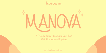 Introducing "Manova" - a friendly and approachable handwritten sans serif font that adds a touch of warmth and authenticity to your designs. There's some connected letters and some alternates that suitable for any graphic designs such as branding materials, t-shirt, print, business cards, logo, poster, t-shirt, photography, quotes .etc This font support for some multilingual. Also contains uppercase A-Z and lowercase a-z, alternate character, numbers 0-9, and some punctuation. If you need help, just write me! Thanks so much for checking out my shop!
 - Brannboll Stencil by Mans Greback,
$59.00 Brannboll Stencil is a script sport typeface. The baseball-style lettering was drawn by Mans Greback in 2020. It is a specialist stencil typeface, created primarily for laser cutters: All whitespaces are connected with the background, making it a lettering perfect for signs, jewellery, stencils and general cutting. It also comes with the additional, decorative style Brannboll Stencil Swash, which contains ten cool swashes to give the graphic extra expression. It has a very extensive lingual support, covering all European Latin scripts. The font contains all characters you'll ever need, including all punctuation and numbers.