10,000 search results
(0.054 seconds)
- Crumble Bakery by Timurtype,
$14.00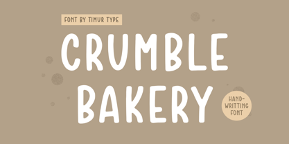 Introducing by Timur type Proudly Present, Crumble Bakery Crumble Bakery A Handwritten Font Crumble Bakery is perfect for product packaging, branding project, megazine, social media, wedding, or just used to express words above the background. Crumble Bakery also multilingual support. Enjoy the font.Thank you!
 - Simple Games by Timurtype,
$14.00 Introducing by Timur type Proudly Present, Simple Games Simple Games A Handwritten Script Font Simple Games is perfect for product packaging, branding project, megazine, social media, wedding, or just used to express words above the background. Aesthetica also multilingual support. Enjoy the font.Thank you!
 - Beblock by Garisman Studio,
$20.00 Introducing Beblock - Display Typeface Beblock combines attractive curves with a fresh urban edge and build with all caps letters; delivering a stylish script which is guaranteed to add an eye-catching appeal to your logo designs, brand imagery, quotes, product packaging, merchandise & social media posts
 - Manttulcuy Signature by Juncreative,
$15.00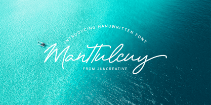 Manttulcuy Signature is a handwritten signature script with a natural & stylish flow, elegant and smooth. Manttulcuy is perfect for branding projects, logos, wedding designs, social media posts, advertisements, product packaging, product designs, labels, photography, watermark, invitations, stationery and any projects that needs a handwriting touch.
 - Almond Hunter by Timurtype,
$14.00 Introducing by Timur type Proudly Present, Almond Hunter Almond Hunter A Handwritten Font Almond Hunter is perfect for product packaging, branding project, megazine, social media, wedding, or just used to express words above the background. Almond Hunter also multilingual support. Enjoy the font.Thank you!
 - Sign And Design JNL by Jeff Levine,
$29.00Sign and Design JNL is a casual brush alphabet modeled after an Alf R. Becker design that appeared in Signs of the Times Magazine. Thanks to Tod Swormstedt of ST Media and the American Sign Museum for providing the reference material to make this font. - Vantagram by TEKNIKE,
$69.00 Vantagram is a modern display font. The typeface is made from basic square geometry. It is inspired by blackletter typefaces of the medieval period in Europe. The Vantagram name is a combination of two words derived from “vanta” French for boast and “gram” Greek for letter or that which is drawn. Vantagram is great for display work, quotes, titles, headings and posters.
 - GothicHorror by Ingrimayne Type,
$9.00 What would a typeface look like that used a gothic arch, a feature of medieval architecture, as its motif? I decided to find out and the result was not beautiful but frightful. GothicHorror uses a pointed arch almost everywhere that it can be used and is unlike anything else. It is ugly, but for some uses that ugliness is a virtue.
 - Kaprice NF by Nick's Fonts,
$10.00This unusual sans typeface was inspired by a serif face called Faust, designed by Albert Kapr for the Institut für Buchgestaltung in 1959. Its mix of medieval, Jugenstil and Bauhaus influences makes it an intriguing choice for your next project. Both versions of this font include the Unicode Latin 1252 and 1250 Central European character sets, with localization for Moldovan and Romanian. - Magnadens by JC Creation Design,
$10.00 Magnadens is a typography with thick, stylish lines that can be particularly suitable for headlines, posters and logos. The main peculiarity of this typography are the slightly arched stems on the edges, which gives it a solid base while maintaining a certain elegance. Some glyphs like the "h" and the alternative "n" or "m" bring a medieval connotation while remaining modern.
 - 825 Lettrines Karolus by GLC,
$20.00 We have created this font as a complement for the 825 Karolus. It is a set of decorated letters in the style of those used by the scribes during the early medieval era. It is inspired from a manuscript copy of "The Hobbit" (in Caroline style) that we obtained in the year 2000 as a present for our daughter’s 15th birthday.
 - Numis by Tyler Jamieson Moulton,
$11.00 Numis was born out of a coin collecting hobby. A quick survey of coins from the late medieval to modern periods to today led to this unicase design. The rounded corners and smoothed edges are meant to evoke a the slightly worn letterfaces found on old coins; a process that tends to bolden the text before being rubbed away completely.
 - Salzburger Plakat NF by Nick's Fonts,
$10.00A poster by Otto Baumberger for an Austrian winter sports festival in 1907 inspired this charming confluence of medieval and Art Nouveau influences. As such, its appeal is timeless, and well suited for storybook romances of all stripes. Both versions of the font include complete Latin 1252, Central European 1250 and Turkish 1524 character sets, with localization for Moldovan, Romanian and Turkish. - Crane Titling NF by Nick's Fonts,
$10.00This multipurpose display alphabet combines medieval-inspired uppercase letters drawn by famed book illustrator Walter Crane with charming, if somewhat quirky, lowercase letters by J. W. Weekes. The net effect is a typeface which can add style and warmth to any project. Both versions of this font include the complete Unicode 1252 Latin and Unicode 1250 Central European character sets. - Hellebore by Harvester Type,
$15.00 Hellebore is a font inspired by the logo and the game Mortal Shell itself. The font conveys the medieval era, the spirit of cutting weapons and dark fantasy. It is sinister, dark, dark, Gothic, rough and sharp. Perfect for logos, headlines, posters, banners. The font is named after the plant of the same name. The name conveys the font's mood.
 - MPI Arcadian by mpressInteractive,
$5.00 Arcadian was first produced in wood type around 1870 by William H. Page & Company. It is a semi-ornamented face based on a French Clarendon, with dots added to the median and the tops and bottoms of the letters. It has a distinctly “Old West” feel, and was likely used to add a little pizzazz to advertising and broadsides of the time.
 - Wolves and Ravens - Unknown license

- Bodiam by Hanoded,
$15.00 Two years ago I went on a camping holiday in England with my wife and (then two) small children. The first stop was a nature campsite near the village of Bodiam in East Sussex. My son wanted to see a real castle, so I figured Bodiam Castle was the 'realest' of them all! He loved it, as the castle had a moat, crenellated walls, a bunch of towers and a guy dressed up as a knight. Bodiam font is a rough didone-ish affair. It is all caps, but you can freely mix upper and lower case. It would be ideal for book covers, posters and maybe even for castles. Comes with a treasure chest of diacritics.
 - Carilliantine by Device,
$39.00 Carilliantine updates the organic curves of Art Nouveau typefaces typified by John F. Cumming's Desdemona, designed around 1886. A contemporary monoline sans reinterpretation rather than a more traditional serif, its high-waisted emphasis lends it an elegance and class. Carilliantine is replete with hundreds of two- and three-letter ligatures that bring a customised uniqueness to any headline. These are on by default, and can be toggled on or off in the Opentype palette of Adobe apps, or chosen individually according to taste from the Glyphs menu. Suitable for upmarket food packaging, wine labels, restaurants, folk bands, sword and sorcery trilogies, cosmetics and fashion brands that nod to the refinement of yesteryear, but are very much of today.
 - Tropical Lounge by Fenotype,
$19.00 Tropical Lounge is an interlocking display typeface inspired by the hand lettering in 60s pulp magazine covers. It’s filled with a playful and vibrant 60s vibe, as well as modern OpenType features. Contextual Alternates switch the previous letter depending on the following one, giving it a bouncy, jazzy feeling. Both lowercase and uppercase letters are capitals, but uppercase features a set of taller and wider letters. You can also mix and match uppercase and lowercase for a suitable combination. In addition, Tropical Lounge has a set of Swash and Stylistic Alternates that can be used for a larger variety. There are also lining numbers and a set of arrows and swooshes in lowercase Stylistic Set 1.
 - Mene One Mexicali by Handselecta,
$38.00This style mimics the flare or upward fade that comes with the use of a spray paint can, as the tops of the letters flare, and become wider. An original font style, named after the border town of Mexicali, this font style falls under the larger umbrella of what is called Cholo-graffiti style. Originally from New Jersey, MENE has made his home in, New York City. He had a brief albeit satisfying career of street bombing in the late 90s that saw its end with a brief encounter with the Vandal Squad. Now a family man, Mene has dedicated himself to the preservation and education of style in its many forms. - Cirkus Fantastiko by PizzaDude.dk,
$17.00 The other day I was at a market with my kids and they had this really retro kind of circus thing. The signs and posters there, were designed in a really sloppy and poor manner - but they all had a lot of naive charm! I was really fascinated by all these uneven letters and I was immediately inspired to do a font like that! And out of the magic hat comes...ta-da-da-da...Cirkus Fantastiko! Planning on throwing a party with a circus theme? Then Cirkus Fantastiko is ready to play the juggling clown while riding the elephant! Play around with the 3 different layers to create that low budget hand painted cirkus posters! :)
 - Rare Bird Specimen II by Rare Bird Font Foundry,
$100.00 RARE BIRD SPECIMEN II Specimen II is an elegant hand by Karla Lim of Written Word Calligraphy. It floats across the page on gossamer wings. Specimen II pairs well with classic typefaces like Baskerville, Garamond and Bodoni. OBSERVATIONS Specimen II is exquisitely delicate but not fragile. Best suited for unforgettable affairs. DEFINING CHARACTERISTICS Opentype programming, formal title & preposition wordart, 7 alternate ëandí options, Roman numerals, in and out-stroked letterforms at beginning and end of words, multiple alternate lowercase t cross-strokes, realistic double-letter ligatures, seamlessly connecting calligraphic letters, alternate capital letters, old style numerals, basic Latin encoding. POTENTIAL SIGHTINGS Wedding stationery suites, logo design, luxury product packaging, fragrance, wine labels.
 - Jorge by Galapagos,
$39.00(pronounced hor-hay) Some years ago my wife and I had our evening meal in a restaurant on what is called the northshore of Massachusetts. Of course, if you check a globe or map you'll see that the pilgrims needed a compass, it should have been called the eastshore as it's on the east end of the rectangle/hook we call the Commonwealth of Mass. In any event, the menu our waitress gave us was hand-lettered with shapes that I used to develop the 4 fonts called Jorge. When I brought the preliminary drawings into the office Steve Zafarana, a designer and cartoonist referred to them as Jorge's new design, the name stuck. - Komunikat FA by Fontarte,
$39.00 FA Komunikat is an experimental and geometrical typeface based on simple elements: a circle, it's parts and straight lines. The typeface communicate the spirit of future, dynamism and modernity. FA Komunikat design was based on the sketch of unique lettering from 1932 made by Władysław Strzemiński, Polish vanguard abstract painter, an artist and a typographer. Strzemiński claimed that modern economic letter forms should be standardized and based on lines and arches. He wrote that readability is a matter of habit and after a practice the new letter forms would be very well readable for everyone. In 2004 Artur Frankowski revived original design creating set of characters, widen up with numerals, punctuation marks and diactrics.
 - Mister Earl by Bitstream,
$29.99Mister Earl, released by Bitstream in 1991, was designed by Jennifer Maestre. Inspiration came from a page in a ‘how-to’ book published in the 1930s. Later versions of Extra Light, Light and Bold were added by Jim Lyles, with the help of Wally Petty. Mister Earl is named in honor of Earl Biscoe, a Bitstream designer who retired in the mid-1980s because of illness. In the winter of 1994–1995, Richard Stetler accidentally left a copy of Mister Earl outside his Alaska home... In the spring, amazed to discover the unfortunate font was still just about alive, he decided to release the result to a wider public as Snow Cap. - Shojumaru Pro by Stiggy & Sands,
$29.00 Shojumaru draws inspiration from a movie poster for a 1957 film titled Sayonara, starring Marlon Brando. It breaks the formula of a chop suey style by mixing chop suey and traditional letterforms to create a powerful and unique letterforms all its own. The "Split" style adds further dynamics to the visual language. An already SmallCaps style font, it includes additional SmallCaps features when SmallCaps is enabled in applications for a wider range of use. Opentype features include: - SmallCaps (standard) - Full set of Inferiors and Superiors for limitless fractions - Standard & SmallCaps figure sets - A Smallcaps feature (Stylistic Alternates) that converts all characters to a small caps format, including punctuation, numerals, and other figures.
 - Lalo Grotesk by Nois,
$18.00 Lalo Grotesk is made up of five weights, their slant versions and a two axis (weight and slant) Variable font. Lalo Grotesk is a grotesque typeface with characterful lowercase letters that are highly legible in large body texts, while the uppercase letters are wider to give a sense of speed in big size headlines. Its shapes are super readable, making the font ideal for use in web and editorial projects. It also have a big range of standard ligatures and icons. Lalo Grotesk font family will keep expanding and improving. Users will continue to receive free updates with technical and aesthetic improvements. Any suggestion will be welcome, don’t hesitate to contact us!
 - Audrey and Reynold by Ahmad Jamaludin,
$15.00 Introducing our new Wedding font, Audrey & Reynold! Audrey & Reynold is modern calligraphic font with contemporary, sophisticated accents. It is perfect for wedding branding, wedding invites and cards, and maybe for red wine label. Audrey & Reynold includes a full set of gorgeous uppercase and lowercase letters, numerals, a large range of punctuation and ligatures. Uppercase and lowercase include beginning and ending swashes, giving realistic hand-lettered style, that makes the font look fabulous! Audrey & Reynold have all multilingual support: Danish, English, French, German, Italian, Norwegian, Portuguese, Spanish, and Swedish. Note : The love symbol in the main cover is a modification, not included in the font Let me know if you have any other questions. Thanks and have a wonderful day!
 - Nouveau Artiste JNL by Jeff Levine,
$29.00 A sheet music edition of an early 1900s song entitled "You Taught Me How to Love You, Now Teach Me to Forget" was hand lettered in a free-form Art Nouveau style that combined varying line widths and character shapes. This unrestricted style of lettering was popularly embraced and revived by the hippie counterculture of the mid-1960s through the mid-1970s through their rock concert posters, record album covers and tee shirt graphics. It is now available digitally as Nouveau Artiste JNL. As a side note, a 1940s reprint of the sheet music was done in a popular metal typeface, which was also redrawn digitally and available as Elite Resort JNL [in both regular and oblique versions].
 - Sweet Treats by Jeff Levine,
$29.00 A piece of British sheet music for “You’re Sweeter than I Thought You Were” [from the 1935 film “Jack of All Trades” starring Jack Hulbert] provided inspiration for a digital typeface based on the credits for Hulbert and the film that rather than the song’s title. What’s interesting is the lettering style was influenced by Art Nouveau at a time when Art Deco was gaining in popularity. The result is Sweet Treats JNL, which is available in both regular and oblique versions. (According to Wikipedia, John Norman ‘Jack’ Hulbert (April 24, 1892 – March 25, 1978) was a British actor, director, screenwriter and singer, specializing primarily in comedy productions, and often working alongside his wife Cicely Courtneidge.)
 - Belle Helene by Studio Indigo,
$17.00 Belle Helene is a script and symbols font based on handwritten brush letters. The name is inspired by the famous french dessert with the same name (wine cooked pears with vanilla ice cream and chocolate syrup). This soft and smooth shaped font is suitable for restaurants, cafes, shops, bakeries, menus, wedding stationary or wherever a warm and informal feeling is required. It comes with open type features such as standard ligatures and alternate end/initial letters. The symbols font has 62 cute symbols to play around with to spice up your designs. Multilingual support is included for almost all European languages (Diacriticals). Please Note! Test the font in the Font Preview before purchase.
 - Linotype Sansara by Linotype,
$29.99Linotype Sansara, from Swiss designer Grégoire Poget, is part of the TakeType Library, chosen from the entries of the Linotype-sponsored International Digital Type Design Contest 1999 for inclusion on the TakeType 3 CD. This fun font is a type experiment behind whose oriental facade hide Arabic letters, recognizable only at second glance. This font displays generous, pointed ascenders and descenders as well as a bar-like emphasis on the upper third of the figures which connects lines and words and gives them a decorative look. Linotype Sansara reveals an astounding variety of details which bring to mind 1001 Arabian Nights, flowing gowns and snake charmers. This font is best for display in point sizes of 14 or larger. - Musty Scoot by Bogstav,
$15.00 Got a pair of jeans that goes well with both party and casual living? A shirt that would fit well to a Hollywood movie premiere and would be suitable to pick up the kids from the kindergarten? If so, you know exactly what I mean, when I say that the Musty Scoot font is suitable for anything! Well, almost anything...maybe not that highway sign, or that security sign at the airport!!! But suitable for anything for children, toys, adventures, handcraft, invitation, restaurants, playgrounds, libraries...etc etc Each letter has 7 slightly different versions, which automatically cycles as you type. There is even a version of right/left sided arrow to choose from!
 - ArTarumianKhachatur by Tarumian,
$40.00 This is a font imitating the stage of outline construction of letters using drawing tools - compass and ruler. It is very geometric (with auxiliary lines, axes, centers of circles, tangents, and conjugation of circles), although the circles are somewhat compressed from four sides. The second style, which plays the role of Bold style, is a hatched version of the Regular style. The font has very small elements that appear in a sufficiently large size, so it is better to use it for large compositions, in particular, advertisements, posters, large headings, etc. The family is named "Khachatur" after the name of the father of designer Ruben Tarumian — architect Khachatur Hakobyan, his first master.
 - Eagle Lake Pro by Stiggy & Sands,
$29.00 A Practical Calligraphic Hand. Eagle Lake Pro is based on the calligraphic lettering style known based on the practical Running Book Hand. It has shorter capitals that create a visually taller x-height lending to high legibility and fluidity. Classic, clean, and casual, Eagle Lake Pro fits a lot of design uses. The SmallCaps and extensive figure sets only work to further expand the usefulness of the typeface across a wider breadth of applications. See the 5th graphic for a comprehensive character map preview. Opentype features include: - SmallCaps. - Full set of Inferiors and Superiors for limitless fractions. - Tabular, Proportional, and Oldstyle figure sets (along with SmallCaps versions of the figures). - Stylistic Alternates for Caps to SmallCaps conversion.
 - Brute Sans by Wiescher Design,
$15.00 »Brute Sans« is a classic Sans typeface that looks like it has been designed by a chainsaw. »Brute Sans« looks really crude only in big sizes, the smaller the font gets the more it looks like any other Sans typeface. »Brute Sans« prints very fast, because there are no curves to compute, but that is just a side effect. »Brute Sans« is the typeface you should use if you need a really different look, since Sans typefaces tend by design to look very similar. This one is different. I always wanted to do this font, but then other projects crept up so I pushed »Brute Sans« to the end of the line. Enjoy!
 - Waters Titling by Adobe,
$35.00Waters Titling is the work of lettering artist Julian Waters, a multiple master typeface of classical calligraphic roman capitals. This broad-tipped pen design is related to other historically-based titling alphabets but offers a wider range of weights and widths, making it extremely versatile for movie titles, book jackets, posters, banners, calendars, etc. Waters Titling is based on the timeless Roman monumental inscription forms of almost 2000 years ago, but also has a touch of contemporary vigor and flair. The design displays a strong calligraphic thick/thin stroke weight contrast and flowing, subtly bracketed serifs. In lighter weights, Waters Titling is elegant and delicate, while the bolder weights offer a more substantial sparkle. - Economica Next by Underground,
$19.90 Economica Next is a redesign and expansion of the classic Economica typeface celebrating its tenth anniversary. This new version has a wider range of weights and was adapted to work in new digital environments. It was carefully designed to save space without loosing its legibility, it is used in several publications around the world and many important websites. It includes sixteen weights and a comprehensive set of characters that allows you to write in several languages. Economica Next is a typeface especially developed for web and app design in complex situations. It has been tested successfully for use in small sizes improving legibility. It is an ideal font for menus, tables, charts, etc.
 - Cristal True by Johannes Krenner,
$5.00 »Cristal True« is an elaborate matrix display font. It contains 645 letters per font style and some Open Type features: Different stylistic alternates, small caps, various font styles and different sets of numerals. It is monospaced and therefor easy to handle, if you want to simulate the look and feel of a LCD display. The basis of this font is a Union-Jack or sixteen-segment display (SISD). It is expanded by another 10 segments for a wider range of languages supported (this should cover all European regions). »Crystal True« is perfected for the quick, easy and precise use in modern graphic design applications. Try »Cristal Text« for more text-heavier usages.
