2,921 search results
(0.025 seconds)
- Copperplate Gothic by Tilde,
$39.75 - Copperplate Gothic by Linotype,
$40.99This American original was designed in 1901 by Frederic W. Goudy for the American Type Founders in Jersey City. Copperplate Gothic is an all caps font which looks like a sans serif at first glance. But closer examination reveals tiny, pointy serifs which almost seem to round off the letters. Designers rely on this font’s lofty and sublime impression and it is often seen in advertisements, but it has also made a place for itself in private and business correspondence and corporate design. The AB and BC designations in the style names refer to the relative sizes of the capitals and small capitals. - Copperplate Gothic Hand by Wiescher Design,
$39.50 The classic font as designed by F. W. Goudy for ATF in 1901, now in a hand-drawn version for a little bit of variation. Everybody else just offers another version of the same old Copperplate, but I now have a new rough one. Oh, just for the record, I have a couple of other versions of this font in my collection of the Copperplate Classic fonts. Your rough designer Gert Wiescher
 - Copperplate by URW Type Foundry,
$35.99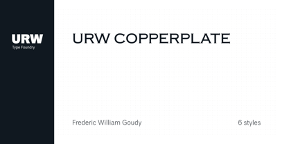
- 32 pages - Unknown license

- Abe - Unknown license

- Copperplate Alt by Wiescher Design,
$39.50 Copperplate Alt is the sister font to Copperplate Wide. The »Alt« version stands for alternative and has lowercase letters that are slightly smaller than the uppercase. It gives you another possibility to use this elegant typeface. Your forever inventive type designer - Gert Wiescher
 - Copperplate Script by CastleType,
$39.00 One of the more elegant script fonts available, this design is based on calligraphic handwriting called "Copperplate" because of the copper plates that it was etched into for reproduction. This face is not related to Copperplate [Gothic] by the American type designer, F.W. Goudy. The name Copperplate comes from the fact that writing masters used to hand-write their books and then send them to an engraver who recreated all the subtle details onto copper plates, which where then used to print the handwriting books.
 - Dylan Copperplate by Wiescher Design,
$29.00 Dylan-Copperplate is my newest addition to the ever growing family. The small flicks of the burin add an elegant touch to the solid font-design. Very handsome and useful for all kinds of invitations and business-cards as well as for classy advertising.
 - Copperplate New by Caron twice,
$39.00 Imagine America in the 1930s. A gangster flick with Al Capone, a crime novel featuring Philip Marlowe. Our hero in a fedora sits in a classy bar, orders a double bourbon, lights a cigar and eyes the evening paper. He turns the pages, reading about a bank heist over on Third Avenue, a scandal involving a baseball player, a small ad for a general practitioner and a large spread about a famous law firm. What do the bottle of booze and the majestic facade of the bank have in common? The elegant baseball uniform and trustworthy attorneys? - Copperplate Gothic - When Frederick William Goudy created his legendary typeface in 1901, it went on to literally become the symbol of early 20th century America. Tiny serifs, characteristically broad letterforms, and particularly bold titles decorated calling cards at 6-point size, enormous bronze-cast logos, newspaper headlines, restaurant menus and more. This was the golden age of Copperplate, lasting up until the arrival of die neue Typografie and monospaced grotesques in the 1960s. Then the typeface almost completely disappeared. It made a partial comeback with the advent of the personal computer; digitizations of varying quality appeared, and one version even became a standard font in Adobe programs. This may have played a role in Copperplate later being used in DIY projects and amateur designs, which harmed its reputation. Copperplate New has been created to revive the faded glory of the original design. Formally, the new typeface expands the existing weight and proportional extremes. The slight serifs are reduced even further, making the typeface sans-like at smaller point sizes and improving readability. In contrast, at large point sizes it retains all of its original character. Decorative inline & shadow styles have been added and both have been created in all five proportions, making it easy to adapt the typesetting to the format you need. Despite these changes and innovations, Copperplate New remains true to Goudy’s original design and represents a snazzy way to evoke a golden era in American culture. Specimen: http://carontwice.com/files/specimen_Copperplate_New.pdf
 - Copperplate Deco by Wiescher Design,
$39.50 Copperplate Deco is my sparingly decorated version of my Copperplate fonts. They can be used as standalone fonts. Yours once more very glitzy Gert Wiescher
 - Copperplate SB by Scangraphic Digital Type Collection,
$26.00Since the release of these fonts most typefaces in the Scangraphic Type Collection appear in two versions. One is designed specifically for headline typesetting (SH: Scangraphic Headline Types) and one specifically for text typesetting (SB Scangraphic Bodytypes). The most obvious differentiation can be found in the spacing. That of the Bodytypes is adjusted for readability. That of the Headline Types is decidedly more narrow in order to do justice to the requirements of headline typesetting. The kerning tables, as well, have been individualized for each of these type varieties. In addition to the adjustment of spacing, there are also adjustments in the design. For the Bodytypes, fine spaces were created which prevented the smear effect on acute angles in small typesizes. For a number of Bodytypes, hairlines and serifs were thickened or the whole typeface was adjusted to meet the optical requirements for setting type in small sizes. For the German lower-case diacritical marks, all Headline Types complements contain alternative integrated accents which allow the compact setting of lower-case headlines. - Copperplate SH by Scangraphic Digital Type Collection,
$26.00Since the release of these fonts most typefaces in the Scangraphic Type Collection appear in two versions. One is designed specifically for headline typesetting (SH: Scangraphic Headline Types) and one specifically for text typesetting (SB Scangraphic Bodytypes). The most obvious differentiation can be found in the spacing. That of the Bodytypes is adjusted for readability. That of the Headline Types is decidedly more narrow in order to do justice to the requirements of headline typesetting. The kerning tables, as well, have been individualized for each of these type varieties. In addition to the adjustment of spacing, there are also adjustments in the design. For the Bodytypes, fine spaces were created which prevented the smear effect on acute angles in small typesizes. For a number of Bodytypes, hairlines and serifs were thickened or the whole typeface was adjusted to meet the optical requirements for setting type in small sizes. For the German lower-case diacritical marks, all Headline Types complements contain alternative integrated accents which allow the compact setting of lower-case headlines. - Copperplate Modern by Wiescher Design,
$39.50 Copperplate Modern is my personal version of Copperplate with lowercase letters that contrast the standard rounded capitals. For good measure I designed a glitzy "Chrome" version for each weight. Yours very glitzy Gert Wiescher
 - Copperplate Wide by Wiescher Design,
$39.50 Copperplate Wide is remotely based on the traditional Copperplate typeface that can be seen on many business cards. I have completely redrawn the typeface in a much wider version and without those stubby little serifs. In the place of the lowercase letters I put a very slim version of the font to give you more options. You can either use the wide letters or the narrow ones – or – you can mix both to get something completely new. It works great! Your forever inventive type designer - Gert Wiescher
 - Copperplate EF by Elsner+Flake,
$35.00 - Copperplate Decorative by Intellecta Design,
$23.95a mixed fancy style font - Mic 32 New by moretype,
$25.00 Mic32 New is a revival of the of the original Mic32 released in 2004. Keeping its futuristic appeal, this popular font has been re-drawn from the ground up, with new spacing and kerning. A range of Opentype features have been added, and the new version includes small caps, tabular, proportional and old style numerals and ligatures.
 - AB Nirvana* - 100% free

- AB Majik - 100% free

- Ab Fangs - Unknown license

- AB Dent - 100% free

- AB Futurun - 100% free

- AB Exp - 100% free

- AB Engraved - 100% free

- AB Mindblock - 100% free

- AB UltraChic - 100% free

- Grov AB - Unknown license

- AB Barberian - 100% free

- AB Cave - 100% free

- AB FuBu - 100% free

- AB FatChic - 100% free

- Sliced AB - Unknown license

- AB Ticena by Andres Briganti,
$20.00 Elegant and idiosyncratic, AB Ticena is a display and extended typeface inspired by the ancient forms of Lombardic capitals. The sometimes quirky and capricious letterforms take their inspiration from medieval forms found in inscriptions and manuscripts where latin Roman capitals were taken to new stylistic and even extreme expressions. The ultra-wide horizontal proportions and its modulated, humanistic strokes gives it a more refined and contemporary edge. AB Ticena works best for logotypes, short and striking headlines, and editorial purposes. A set of ligatures and stylistic alternates is also available for selected characters and pairings.
 - AB One by AB Studio,
$23.99 AB One is a captivating sans-serif font family that effortlessly blends modern aesthetics with a dynamic, fluid formality inspired by the world of architecture. This versatile typeface offers three distinct weights, each carefully crafted to cater to a range of design needs. Key Features: Dynamic Fluidity: AB One embodies the dynamic essence of architectural forms, showcasing a graceful flow and a sense of movement. The font's letterforms possess an inherent flexibility that adds a touch of vibrancy to your designs, making it an excellent choice for contemporary projects that demand energy and liveliness. Sleek and Modern: The light weight of AB One radiates a modern, minimalist charm, perfect for creating a sleek and refined impression in your design projects. Its clean lines and well-balanced proportions ensure readability while evoking a sense of cutting-edge sophistication. Three Distinct Weights: The AB One font family offers three carefully crafted weights to provide versatility in your design work. Sans-Serif Elegance: As a sans-serif typeface, AB One represents a harmonious marriage of legibility and style. Its straightforward, elegant letterforms make it suitable for a wide range of applications, including branding, advertising, editorial design, and web interfaces. Inspired by Architecture: Drawing inspiration from the world of architecture, AB One captures the essence of structural elegance and sophistication. This font is an ideal choice for projects that require a touch of architectural finesse. Versatile Application: AB One's adaptability allows it to excel in a variety of design contexts. It seamlessly integrates with other design elements, providing a harmonious and engaging visual experience. AB One is a typeface that thrives on the principles of sleek modernity and architectural inspiration, making it a go-to choice for designers who seek to infuse their projects with a touch of dynamic fluid formality.
 - Gothic Gothic by Typeco,
$29.00Gothic Gothic is a fusion of old and new that is both Gothic and Gothic. In typography Gothic can refer to German Blackletter or Old English styles. Gothic can also mean block or sans serif style lettering. By combining and balancing the elements from both of these ideas we have created a contemporary extended block letter typeface. The Gothic Gothic family contains 2 companion fonts. Gothic Gothic Text is a more minimal variation that has a more roman looking style while still retaining some Blackletter feel. Gothic Gothic Black is a bolder version designed to tend more toward the Blackletter style of Gothic with more contrast of stroke and a few of the more unusual Blackletter forms thrown in for flavor. Gothic Gothic has been honored with an award of Excellence in Type Design from Association Typographique International (ATypI) in 2001. Typeco has updated this font and has released it as an expanded family. Gothic Gothic is a crepuscular family of 3 fonts - OL Gotham Gothic by Dennis Ortiz-Lopez,
$40.00 - Archive Copperplate Text by Archive Type,
$19.95Blackletter engraved display typeface. - 1751 GLC Copperplate by GLC,
$38.00 This family was inspired by an engraved plate from Diderot & Dalembert's Encyclopedia (publication beginning in 1751), illustrating the chapter devoted to letter engraving techniques. The plate bears two engravers names : "Aubin" (may be one of the four St Aubin brothers ?)and "Benard" ( which name is present below all plates of the Encyclopedia printed in Geneva ). It seems to be a transitional type, but different from Fournier or Grandjean. Small caps are included in fonts for TTF and OTF version, separate files are included in the family sets of the Mac TT version.
 - Archive Copperplate Head by Archive Type,
$19.95Engraved shaded display typeface.


Page 1 of 74Next page