10,000 search results
(0.064 seconds)
- Sierra by Linotype,
$29.99Sierra is an antiqua with a high x-height and generous, open counters. Many curves of the letters are almost right angles, which was particularly suited to the Digiset machines from Dr. Ing. Rudolf Hell, Kiel. The forms of Sierra with their flowing stroke contrast and half serifs have a calligraphic touch, which is especially highlighted in the italic weights. This is a graceful text type and its bold weights look almost like woodcuts. Sierra is an excellent choice for both texts and headlines. - SF Change by Sultan Fonts,
$19.00 Change is An Arabic text typeface for desktop applications. Change is freestyle Ruqah and a winner in Horouf Bilingual Typefaces Design Competition. The design is open, calligraphic, and very dynamic. This makes it suitable for large display sizes, especially in the area of advertising, while still functioning well as a text face. The font includes a matching Latin design and support for Arabic, Persian, and Urdu. It also includes proportional and tabular numerals for the supported languages. Change typeface comes with many opentype features.
 - Jules by DSType,
$45.00 At first glance, Jules, appears to be just one more Didonic variation, but a closer look starts revealing all the extraordinary features of this type family, specially designed for use in extremely big sizes. Jules reflect the last of the late 18th century and was inspired by several plates from a portuguese calligrapher named Antonio Jacintho de Araujo. Available in three different optical sizes: Big, Colossal and Epic, Jules has a plethora of ligatures and stylistic alternates, plus refined Italics and a super elegant Swashes version.
 - Dienstag Variable by insigne,
$100.00 Introducing Dienstag Variable, the latest addition to insigne's popular Montag family of fonts! With its extended sans-serif style, Dienstag boasts a sleek and sophisticated look that's perfect for a wide range of projects. Whether you're designing a website, creating branding materials, or producing print publications, Dienstag's refined elegance is sure to make a lasting impression. Compared to Montag, Dienstag has a slightly more formal feel, thanks to its lack of rounded terminators. But that doesn't mean it's any less versatile – in fact, Dienstag's four original weights have now been expanded to ten, giving you even more flexibility in your designs. With OpenType features that include simplified versions of many characters, you can easily create unique and eye-catching titles that stand out from the crowd. But Dienstag is just one part of the larger Montag superfamily, which also includes Mittwoch, and Donnerstag. Each font in this collection offers its own unique style and flair, giving you a wealth of options to choose from when it comes to your next project. Whether you're looking for a bold and dynamic font or a more refined and understated style, you're sure to find the perfect fit in the Montag family. So why wait? Check out Dienstag and the rest of the Montag superfamily today, and start creating designs that are sure to captivate and inspire! With its elegant style and versatile functionality, Dienstag is the perfect choice for designers who demand the best.
 - Aqueo by R9 Type+Design,
$38.00 Aqueo™ is a versatile display font family inspired by the cylindrical wireframe of a water glass. The one-sided round corner details added a contemporary feel to this unique typeface. It comes in 6 weights and 12 styles. To ensure the accuracy of the letterforms, we painstakingly drew a master set for each weight. And with over 1,350 glyphs each, Aqueo™ fonts support most Latin-based languages and feature an extensive set of stylistic alternates; The standard uppercase set takes more traditional forms, while the alternate uppercase set sports unorthodox lowercase forms. The standards exude confidence and dependability yet are friendly and approachable, and the alternates elicit more fun, quirky and whimsical. The More Opentype Features, the More Zing for Your Design Projects. Aqueo™ Display Sans Serif comes loaded with Opentype features such as case-sensitive marks, punctuations and mathematic symbols. It also has an extensive set of discretionary ligatures, stylistic alternates, and over 80 essential UX/UI icons, each in three design options. These various Opentype features help improve your user experience, streamline your workflow, and unlock a broader range of typography details you can choose for your design. If you’re looking for a unique contemporary typeface, try Aqueo™ on your packaging design, logo design, infographic, print design, store signages, and UX/UI projects today! To find out more about Aqueo™ Opentype features and type specimens, please visit https://r9typedesign.com/aqueo-font-features-specimen
 - Madera Variable by Monotype,
$229.99Malou Verlomme’s Madera is a typeface made strictly for graphic designers, created as an indispensable type toolbox that can meet the needs of both print and digital environments. Verlomme has drawn on his extensive experience creating bespoke type for major brands, and Madera is a “typographic synthesis” of this work. Although designed as a restrained sans serif, the typeface has some punchy personality – with sharpened apexes that inject flavour into the design, particularly in the darker weights and when set at all caps. Madera sits alongside fellow geometric designs such as Proxima Nova, Gotham or Avenir, offering a straight-talking tone of voice but with some extra bite. If you’re a large corporation, with a typeface being used in many different environments you want something that's just the right balance of visibility and legibility to sustain an extensive amount of communication.” “The design is very solid but it doesn’t go out of its way to attract attention,” explains Verlomme. “It still has a fair amount of warmth and personality, in a very understated manner. The Madera typeface family has 32 fonts: Upright, Condensed and Italics. It is available in OpenType CFF and TTF fonts formats. Each typeface contains over 650 glyphs with extensive Western, Central and Eastern European language support. It also supports OpenType typographic features like alternatives, ligatures and fractions. Madera Variables are font files which are featuring two axis and have a preset instance from Hairline to Extra Black. - FS Lola by Fontsmith,
$80.00 L-O-L-A Like the subject of the Kinks’ song, FS Lola is a little bit of both – a font with a rare combination of masculine and feminine. The font was inspired by the song, which itself was inspired by the night the Kinks’ manager spent dancing drunkenly in a Soho club with a beautiful woman... Or so he’d thought, until her stubble started to show halfway through the evening. Masculine/feminin Phil Garnham’s experience in designing FS Lola was similar to the one related by Ray Davies. Setting out to create a sans serif font, he realised along the way that he was actually dealing with a semi-serif. He went with it, though, and produced a font with the best masculine and feminine qualities: hard edges and corners tempered by shapes of softness and generosity, the outcome of what Phil calls an “organic” design process. “Initially, my designs were very graphic and hard but not very distinctive. By printing and redrawing the letters in pencil I achieved a softer and friendlier alphabet with a strong personality.” Broad Lola, as you’d expect, is very broad-minded. Available in five weights with italics – and fluent in central European languages – FS Lola offers a confident combination of feminine softness and male steeliness to any kind of design. As the song says, “It’s a mixed-up, muddled-up, shook-up world... except for Lola.
 - Quiroga Serif Pro by TipoType,
$29.00 Quiroga Serif began in 2007 with the name Quadratta Serif. This typography was designed for continuous text, legible at medium and small sizes, with great saving of space, optimized for 6, 8, 10 and 12 points. The morphology is a mix between tradition and innovation; it has a vertical axis, thick serifs, tall x-height, light modulation and a lot of internal space between letters: key to improve legibility at small sizes. Formally, my idea was to make a serif type that had a unique color, this is visible due to the light modulation. This is also complemented with the incorporation of not common, alternative signs. Some parts of the letters that are usually curb or diagonal where made horizontal (for example: a, q, p, etc.), this makes the eye of each character to be wide and unique. The serifs (wedge type) suffered diverse variations during the process. At the begining they where thicker and ended vertically, but this caused a great deal of printing errors. And so we decided to modify them by giving them an angle to avoid visible errors in medium and small sizes. The ch, and ll ligatures where rescued because they are a part of our current spanish alphabet. The historic ligatures and stylistic alternates give different options to users who want different alternatives within a text. The accentuation signs were composed in a middle line above all signs to avoid visual shock. We also gave plenty of importance to small caps numbers, mathematical signs and currency signs so that the could interact well.
 - Biblia Serif by Hackberry Font Foundry,
$24.95 This all started with a love for Minister. This is a font designed by Carl Albert Fahrenwaldt in 1929. In the specimen booklet there’s a scan from Linotype’s page many years ago. They no longer carry the font. I’ve gone quite a ways from the original. It was dark and a bit heavy. But I loved the look and the readability. This came to a head when I started my first book on all-digital printing written from 1994-1995, and published early in 1996. I needed fonts to show the typography I was talking about. At that point oldstyle figures, true small caps, and discretionary ligatures were rare. More than that text fonts for book design had lining OR oldstyle figures, lowercase OR small caps—never both. So, I designed the Diaconia family using the Greek word for minister. It was fairly rough. I knew very little. I later redesigned and updated Diaconia into Bergsland Pro—released in 2004. It was still rough (though I impressed myself). Now, with 4-font Biblia Serif family 13 years later, I’ve cleaned up, made the fonts more consistent internally, added more functional OpenType features, and brought the fonts into the 21st century. I used the 2017 set of features: small caps, small cap figures, oldstyle figures, fractions, lining figures, ligatures and discretionary ligatures. These are fonts designed for book production and work well for text or heads. Finally, in 2021, I went over the fonts entirely and remade them in Glyphs.
 - Safari Squad by Mix Fonts,
$13.00 Introducing SAFARI SQUAD, the bold and stylish font perfect for making a statement. With its solid and italicized design, this font is perfect for creating impactful and attention-grabbing headlines and logos. The unique selling point of SAFARI SQUAD is the quirky stylized animal print alternates for the uppercase and lowercase letters, which add a touch of personality and originality to your designs. These alternates give you the flexibility to switch up your design and make it stand out even more. For those who can’t access the alternates, SAFARI SQUAD SUB is the same font but using the alternates as the default, making it accessible for everyone. SAFARI SQUAD SUB also offers the same solid and italicized design, perfect for creating impactful and memorable designs that will leave a lasting impression. SAFARI SQUAD and SAFARI SQUAD SUB are perfect for a wide range of uses, from social media posts and website design to marketing materials and publishing projects. These versatile fonts are sure to make your content stand out, whether you’re creating a bold and striking headline or a unique and eye-catching logo. Make your designs stand out with SAFARI SQUAD and SAFARI SQUAD SUB, the bold and unique fonts that’s sure to elevate your design game. SAFARI SQUAD comes with the following glyphs: ABCDEFGHIJKLMNOPQRSTUVWXYZ abcdefghijklmnopqrstuvwxyz 0123456789 !@#$%^&*()`~♥✿•· ÷×+−±≈=≠≥≤[]<>:;'”,.\|/?{}“”‘’-–—_ …‚„©®™‹›«»°¹²³¡¿₱¢€£¥¶§† ÁÀÂÄȦÃÅĂĀĄÆĆĈČĊÇÐĐÉÈÊËĖĒĘḞǴĜǦḠĠĤȞḦḢ ÍÌÎÏĪĮĴḰǨŁḾṀŃÑŇÓÒÔÖÕŌŐØŒṔṖŔŘṘŚŜŠŞȘŤṪȚ ÚÙÛÜŨŮŬŪŰŲẂẀŴẄẆÝŶŸŹẐŽŻƵ áàâäȧãåăāąæćĉčċçðđéèêëėēęḟǵĝǧḡġĥȟḧḣ ıíìîïīįĵḱǩłḿṁńñňóòôöõōőøœṕṗŕřṙśŝšşșťṫț úùûüũůŭūűųẃẁŵẅẇýŷÿźẑžżƶ SAFARI SQUAD SUB comes with the following glyphs: ABCDEFGHIJKLMNOPQRSTUVWXYZ abcdefghijklmnopqrstuvwxyz 0123456789 !@#$%^&*()`~♥✿•· ÷×+−±≈=≠≥≤[]<>:;'”,.\|/?{}“”‘’-–—_ …‚„©®™‹›«»°¹²³¡¿₱¢€£¥¶§† ÁÀÂÄȦÃÅĂĀĄÆĆĈČĊÇÐĐÉÈÊËĖĒĘḞǴĜǦḠĠĤȞḦḢ ÍÌÎÏĪĮĴḰǨŁḾṀŃÑŇÓÒÔÖÕŌŐØŒṔṖŔŘṘŚŜŠŞȘŤṪȚ ÚÙÛÜŨŮŬŪŰŲẂẀŴẄẆÝŶŸŹẐŽŻƵ áàâäȧãåăāąæćĉčċçðđéèêëėēęḟǵĝǧḡġĥȟḧḣ ıíìîïīįĵḱǩłḿṁńñňóòôöõōőøœṕṗŕřṙśŝšşșťṫț úùûüũůŭūűųẃẁŵẅẇýŷÿźẑžżƶ
 - Darah Erc - Unknown license

- ITC Jambalaya by ITC,
$29.99The talented designer of the well-known Formata typeface, Bernd Möllenstädt was born on February 22, 1943 in Germany. He has lived in Westfalia, Berlin and Munich, Germany, and now permanently resides in Munich. From his earliest years he was interested in typography, first studying as a typesetter (1961-64) and then a student of graphic design (1964-1967). In 1967 Möllenstädt joined the Berthold typefoundry and his career as one of the leading type personalities began. One year after joining Berthold, he became the head of the type design department. For 22 years he worked as the head of that department, under the leadership of Günter Gerhard Lange. Upon Lange’s retirement in 1990, Möllenstädt ascended to the type directorship of Berthold where he was responsible for type design and font mastering. Möllenstädt designed two typeface for the Berthold Exklusiv Collection, Formata (1988) and Signata (1994). Under license from Berthold, Adobe marketed Formata as part of the Adobe Type Library. Formata is now one of the most successful sans serifs in the world, used both in American and European magazines, as well as newsletters in the Far East (Gulf New Kuwait). Formata also was chosen as the corporate typeface of Postbank, Allianz, VW Skoda, Infratest Burke, etc. In addition to his work for Berthold, Möllenstädt has lectured at local Munich schools on typography and graphic design, and designed corporate type identities and diverse logos for major corporations, including Allianz, Commerzbank, Mauser Officer and Hoepfner. Möllenstädt continues his association with Berthold as a designer. He most recently completed small caps and fractions for Formata. He also has substantially contributed to Berthold's Euro symbol program (e.g. adding the Euro symbol design-specific to the most popular families). Möllenstädt currently is working on a new Berthold Exklusiv design. - Matwin by Eyad Al-Samman,
$10.00 The idea behind designing ‘Matwin’ font was related to the youngest children of the designer namely the M-A fraternal twin. The name of the typeface (i.e., Matwin or M-A-Twin) was composed by merging three linguistic small syllables. The ‘-Twin’ syllable refers to the non-identical twin of the designer. The ‘M-’ and ‘A-’ syllables refer to the initial letters of the twin’s first names (i.e., Muhammad and Abdul-Wli) respectively. The typeface ‘Matwin’ has a personal trait which makes it as one of the most favorite fonts for the designer among his humble collection of fonts. Modestly, it is the designer’s handwriting and it has been designed to be added to the script font family known as brush un-joined. The brief process for having this typeface alive was done by firstly scanning the real script for each Latin letter, digit, symbol which were handwritten earlier by the designer himself. Then, the combination of these many scanned characters was manipulated using digital programs to produce at the end the complete typeface. The typeface has the essential glyphs comprising the character set required for most of the Latin, Western, and Eastern European languages including the Irish language. It combines +605 characters and this makes it as a pro font. It also entitles it to be applicable for usage in many languages of different communities and nations worldwide. ‘Matwin’ is dedicated for those who search for a genuine handwriting typeface with a natural touch and informal style to be added on their different published and produced products and services. It is more preferable when it is used in artistic, typographic, and other works using the lowercase letters or by mixing both upper- and lower-case letters. Moreover, the typeface is appropriate for any type of typographic and graphic designs in web, print, and other media such as boards and walls. It is also preferable to be used in the wide fields related to publications especially children-related ones, comics, printed or handwritten menus of cafeterias and restaurants at universities and public places, as well as other prints related to services and production industries. It also can create a very personal and friendly impact when used in headlines, books and novels’ covers, posters, titles, messages, envelopes addresses, grocery lists, postcards, ads, fliers, journals, paper arts, public notices, invitations, scrapbooks, notations, products’ surfaces for organic foods and juices, logos, medical packages related to children, Android applications, as well as products and corporates branding and the like. In a nutshell, ‘Matwin’ typeface fits without a glitch those (i.e., designers, typographers, publishers, artists, packagers, service providers, and so on) who have drastic and strong tendency towards imprinting their works with spontaneous and outlandish touches made by this typeface. Please, enjoy it extremely.
 - Scandinavia Brush by Mans Greback,
$69.00 Scandinavia Brush is a wild calligraphy font by Mans Greback, inspired by the untamed beauty of Nordic nature. It captures a rugged essence, with each stroke reflecting the raw energy and grace of natural environments. This brush-painted typeface is perfect for logos, handwritten designs, and tattoo art with its active and streetwise feel. Designed with a professional touch and high-quality craftsmanship, Scandinavia Brush comes in six versatile styles: Regular, Upright, Bold, Italic, and the combinations Bold Italic and Bold Upright. The range of styles allows you to create unique, expressive designs that capture the spirit of adventure, speed, and beauty. Use underscores _ anywhere in a word to make an underline swash. Example: Nord___ic Bru_sh Ideal for designer and art projects, or high-end handcrafted products, Scandinavia Brush brings a bold, authentic, and captivating touch to your creative endeavors. The font is built with advanced OpenType functionality and has a guaranteed top-notch quality, containing stylistic and contextual alternates, ligatures, and more features; all to give you full control and customizability. It has extensive lingual support, covering all Latin-based languages, from Northern Europe to South Africa, from America to South-East Asia. It contains all characters and symbols you'll ever need, including all punctuation and numbers. Mans Greback is a Swedish typeface designer with a passion for creating unique and versatile fonts. With an extensive background in design and typography, Mans has built a reputation for his meticulous attention to detail and prolific craftsmanship. His many fonts are widely used by designers around the world, making his work synonymous with creativity and innovation.
 - Escobeta One is an extraordinary and captivating display font created by the talented Spanish type designer, deFharo. This peculiar and unique typeface immediately draws attention with its distinctiv...
- Coco Gothic Pro by Zetafonts,
$39.00 Inspired by a biography of Coco Chanel and trying to capture the quintessential mood of classical fashion elegance, Cosimo Lorenzo Pancini designed Coco Gothic looking for the effect that the first geometric sans typefaces (like Futura, Kabel or the italian eponyms like Semplicità) had when printed on paper. The crisp modernist shapes acquired in printing charme and warmth through a slight rounding of the corners that is translated digitally in the design of Coco Gothic. This signature touch is enhanced by the inclusion of light humanist touches to the proportions of the letters, resulting in the unique mix that makes Coco Gothic one of our best sellers, with a look that is both contemporary and vintage. After six years from the original project (that has spawned in the meanwhile successful families like Cocogoose and Coco Sharp), we went back to the design to completely redraw and expand the original family, creating with a Pro version that has better on-screen readability, a wider weight range, variable type versions and more language coverage (with Coco Gothic Arabic adding a new script to the latin, greek and Cyrillic of the original). Coco Gothic Pro comes in three subfamilies, each with seven weights with matching italics and featuring an extended character set with open type support for small caps, ligatures, alternates, European languages, Greek and Cyrillic alphabets. The original, body-text optimised Coco Gothic and Coco Gothic Alternate subfamilies have been kept for compatibility with the previous version, while a new Coco Gothic Display subfamily has been developed with a complete redesign aimed at display usage, featuring tighter spacing and optimised letterforms. A distinguishing feature of Coco Gothic Pro is the inclusion of ten alternate historical sets that allow you to use the typeface as a true “typographic time machine”, selecting period letterforms that range from art deco and nouveau, to modernism and to eighties’ minimalism. Equipped with such an array of historical variants, Coco Gothic Pro becomes an encyclopedia of styles from the last century, ready to transform itself and adapt to the mood of your text.
 - Senella Script by Aktab Studio,
$16.00 Senella is a script font with more than 350 characters and covers several languages based on the Latin alphabet; the whole font design has also been completed with extensive alternates, ligatures and swashes sets. Senella is suitable for any design project, vintage, fashion, branding, print design and whatever design you want Thank you for visits and happy branding !
 - Badona by gravitart,
$29.95 Badona is a custom typeface which is applicable for web, print especially for magazines, brochures, posters, flyers and motion graphics. Both weights are perfect for logos (light size has an elegant look and the regular one gives a unique feel). Regular size is also applicable for text. Badona has 232 glyphs and supports Turkish and West European languages.
 - Eshajori by Zenmurai,
$25.00 Eshajori is an elegant and soft serif font. The primary challenge in designing this font was finding a balance between complexity and simplicity, while ensuring it could be used on both computer screens and in print. Another challenge was achieving harmony between the characters, punctuation, and numerals, creating a visually appealing and playful visual vocabulary overall.
 - Quitador Sans by Linotype,
$57.99 The Quitador™ Sans family is a fresh and distinctive design with roots that go back to the original Quitador typeface. Like its slab serif relative, the Quitador Sans suite of typefaces is large with several weights of roman and italic designs, making it an excellent choice for a wide variety of print and on-screen projects.
 - Alstoria by Bombastype,
$35.00 Alstoria is a Bold Serif Display font. Suitable for your projects like branding, packaging, printing, header, and many more. Contains 320+ glyphs and 10 ligatures. You could check the full glyph map at this link. This font also contains many swash alternates option to play. Works well for vintage and modern style like you see in our preview images.
 - Siriella by Nathatype,
$29.00 Siriella is a beautiful handwritten font. It brings an attractive typeface. Made for any professional projects. The font is suitable for any project like logo, t-shirt printing, wedding invitations, and greeting cards to social media quotes, branding, and more! Outstanding in a wide range of contexts. Featured : Standard Ligatures Stylistic Sets Multilingual Support PUA Encoded Numerals and Punctuation
 - Peanut Crunch by Hanoded,
$15.00 I really like peanuts! My family and I often eat an Indonesian snack called Rempeyek, which is a deep fried, battered peanut cracker and I was probably craving one when I made this font. Peanut Crunch is a hand painted display font. It comes with some alternates and a bunch of ligatures for you to play around with.
 - Hypercrack by Invasi Studio,
$19.00 Introduction of our new collection of playful doodle font styles. The Hypercrack Handwritten all-caps Font with scribbles styles font. Also, Hypercrack has a unique stylistic alternates character. So you can create a combination of whatever you want! This font is perfect for your display project for headlines, quotes, editorial design, print posters, and much more.
 - Tropicalia Type by danni.creative,
$22.00 Thx for checking out Tropicalia Type! This hand written display font gives a tropical feeling to any project. Perfect for logos, product packaging, posters, cards, printed quotes, t-shirt design and whatever your imagination holds. Tropicalia Type comes with a complete set of uppercase and lowercase alternates, which can easily be accessed through the glyphs panel. Enjoy!
 - La Arista by Kaer,
$19.00 ‘La Arista Del Sol’ it's the mountains climbing route. I've created this font family to transfer adventure and romantic mood. I believe La Arista is very useful in printing and for web. * Regular, italic and pattern styles * Uppercase and lowercase * Numbers * Ligatures * Punctuation * Multilingual support Please feel free to request to add characters you need: kaer.pro@gmail.com
 - Jasson Gillen by Din Studio,
$29.00 Introducing Jasson Gillen Font. Made with naturally handwritten, it will make your design project more beautiful. This font is suitable for any design like branding, quotes, t-shirt printing and etc. Features: Accents (Multilingual characters) Beautiful ligatures Stylistics set PUA encoded Numerals and Punctuations Customer support I hope you enjoy it !!Thanks for visiting and purchasing my font.
 - Martian B by Deltatype,
$49.00 Martian B is a sans-serif based typeface, inspired from industrial signs with semi-modular structure, suitable for using in wide ranged. Available in nine weights from Thin to ExtraBlack. Use well with sign into small print or web which support many languages with extended latin glyphs with standard of Adobe Latin 4 and world ready supported.
 - MVB Magnesium by MVB,
$39.00Mark van Bronkhorst's MVB Magnesium is based on his impressions of a style of lettering often seen on early 20th century hand-painted signage. With its thick-thin strokes and angled terminals, MVB Magnesium is a warmer, less common alternative whenever one might use a sans serif in all-caps. It is available in two widths. - Arch Creek JNL by Jeff Levine,
$29.00Arch Creek JNL is Jeff Levine's all-caps re-interpretation of a classic typeface of the past; Beton. Clean lines and slab serifs make this design a wonderful display face for attention-getting headlines. The beautiful watercolor print used in the font flag is by a good friend of Jeff's - Miami artist Michael George, and is used by permission. - Night Delivery by Kitchen Table Type Foundry,
$15.00 Since I live in a hamlet without any facilities whatsoever, I order a lot online. Most deliveries are done during daytime, but some companies prefer to deliver my stuff at night. When I was drawing out the glyphs for this font (using my Chinese ink and a broken paint stirrer), the door bell rang. It was a Night Delivery…
 - Snowmany Snowmen by Comicraft,
$19.00Snow, Snow, Thick, Thick Snow! Sweetly and simply illustrated by the lovely 'Lilou', Our Snowmany Snowmen font features fifty (count 'em) hilarious Snowmen, perfect for creating Seasonal Greetings for homemade Christmas Cards, decorating your children's 'Thank You' letters -- or just print them out for your kids to color while Uncle Frank's shovelling snow out of the driveway! - Boedimant by Fype Co,
$14.00 Pleased to introduce you to Boedimant new grunge display font! The letterforms have slight quirks to them, giving this bold sans-serif display font a perfect imperfection. You can use it for making special event logos, such as a skateboard or off-road bike races. This unique font is perfect for posters, T-shirt prints, and other promo designs.
 - Brigned by Krafted,
$10.00 Want to give your brand image a modern and chic twist? Whether you're a trendsetter or a conventional, we have what you need. Introducing Brigned - A Modern Serif Font. From logo design to digital and print media, Brigned creates a lasting impression and charm. Give it a try and see how a beautiful font can make all the difference.
 - NorB Chalk by NorFonts,
$28.00 NorB Chalk is a handwritten text font with an angled fat chalk style. You can use this font with any word processing program for text and display use, print and web projects, apps and ePub, comic books, graphic identities, branding, editorial, advertising, scrapbooking, cards and invitations and any casual lettering purpose… or even just for fun!
 - The City Burn by Alien,
$40.00 The City Burn, formerly called "The city burn night after night and we spray-paint the walls", was especially designed for Mad Skills Mag issue#3 Urban Flavour. It needed to be street, and urban, so I made a stencil font. It’s used by Fox5 tv for the rant TV show, the website infected.com, Fried chillies TV, and others!
 - Burdigala X Sans by Asgeir Pedersen,
$24.99 Burdigala X Sans is an open and spacious typeface, ideal for larger amounts of (printed) texts in brochures, magazines and books. Being wider than usual, it works especially well in media intended for on-screen reading, such as in Pdf-documents, e-books, applications and so on. Burdigala is the ancient Roman name of the city of Bordeaux France.
 - Gellatio by Din Studio,
$25.00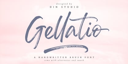 Gellatio is a chic Brush Font. It will make your design project more beautiful. This font is suitable for any design like branding, fashion, print templates, quotes, wedding and more. Features : 88 Beautiful Alternates 6 Beautiful Ligatures 52 Swashes PUA encoded Multi-lingual Support Numerals and Punctuation (OpenType Standard) Full Support Thanks for visiting and purchasing my font.
 - Burlingame by Monotype,
$50.99 The Burlingame™ typeface family from Carl Crossgrove is a sturdy typeface with open, clear shapes that offer high legibility, even in constrained digital settings, or in challenging print environments such as tiny pharmaceutical labels. The design performs with strength and grace at any size. It’s a multifaceted, multipurpose typeface family – a perfect addition to the Monotype® library.
 - Pecattes by Prioritype,
$15.00 A brush font with a script theme that can make your project maximized. Moreover, it is equipped with several attractive alternatives and swashes. Can be used in various print or digital media such as product packaging, content display, social media promotion, broadcasts and many more. Features: -Uppercase -Lowercase -Numeral -Punctuation -Multilingual -Alternate -Swash Don't hesitate to support now!
