10,000 search results
(0.041 seconds)
- Cartage Stencil JNL by Jeff Levine,
$29.00 The sheet music for the title song of the 1960 movie "Exodus" had the name hand lettered in a block stencil style with rounded corners and narrow "rails" [the breaks between the stencil parts]. Loosely based on this design and working from just the six letters of the title, Cartage Stencil JNL is available as a digital font in both regular and oblique versions.
 - Cardamon by Linotype,
$50.99 “My goal in creating the Cardamon family,” says Brigitte Schuster of her first design, “was to make an unobtrusive serif typeface which, at the same time, has a determined and straightforward demeanor.” “I wanted to design a typeface with sharp edges and corners,” explains Schuster. “I was influenced by the angularities in Vojtěch Preissig‘s “Antiqua” and “Cursive” in addition to Oldřich Menhart‘s “Menhart” typeface.”
 - Yuko by Thinkdust,
$10.00 Big, bold and with attitude to spare, no-one better get in the way of Yuko when it’s got something to say. Although it’s a gentle giant really, Yuko has a lot of opinions and it won’t go without being heard. Yuko is most effective when you need to say something loudly and with attitude to get people’s attention, especially if you’re competing for space.
 - Black Blocker by Sign Studio,
$10.00 This is Black Blocker, a font that can make contrast to the text. Having a corner of the box on the inside that becomes unique. It is suitable for posters, titles,banding, tags, quotes and more. Developed from the sans-syerif family makes it easy to apply to designs. Reach many languages with Adobe CE standards (over 331 characters). Take it to make your design be different.
 - Quatsity by Ingrimayne Type,
$5.00 Quatsity is a squarish or boxy serifed font with rounded corners. Quatsity is is suitable for titles or signage and legible enough for small blocks of text. Quatsity-Light was constructed in 1995 by blending two very different faces, a typeface very similar to Kwersity (with low contrast) and one similar to Qwatick (with high contrast). The other seven styles were added in 2020.
 - Zooja by Aerotype,
$48.00 Zooja™ and Zooja Light have alternates for every capital and lowercase letter, consecutive characters are controlled with the OpenType Ligature feature. Zooja Elements & Borders has 90+ fun decorative doodads, borders and corners that play well with the fonts. Zooja Catchwords has 60+ hand drawn word glyphs and Zooja Banners & Patterns has 17 repeatable patterns and 50+ banner and frame elements to help pull it all together.
 - People Talk JNL by Jeff Levine,
$29.00 A title card with cast credits for the 1935 movie “The Whole Town’s Talking” (starring Edward G. Robinson and Jean Arthur) formed the basis for People Talk JNL. The hand lettered names were done in a slightly condensed slab serif – mostly rectangular in shape with rounded corners. A few characters take on their own unique appearance. People Talk JNL is available in both regular and oblique versions.
 - Mosscave by Dora Typefoundry,
$15.00 Mosscave is designed to crate an impactful and stylish visual impression, combining attractive curves. Mosscave provides a style that is guaranteed to add a compelling appeal to your logo design, brand image, quotes, product packaging, merchandise, social media posts, and more! It also supports multilingual and PUA encoded! If you need anything else, just shoot me at the email at: doratypefoundry@gmail.com Hope you enjoy it.
 - Bylander by Mans Greback,
$59.00 Bylander is a stateful serif typeface. With robust, heavy letterforms reminiscent of a foundry's hammer hitting molten metal, and an unpaired weight, Bylander's characters seem forged from the core of the Earth. Its rounded corners whisper tales of smoothened river stones, and its gentle curves combined with its industrial mass makes Bylander a paradox; both intimidating in its boldness and welcoming in its approach.
 - Tme by bb-bureau,
$65.00 Tme, new lineal — Tme is an update of Sl (T = S + 1, m = l + 1 and e for natural logarithm), drawn in 2006 for the University of Arts Saint-Luc de Tournai. Its geometrical drawing is based on the directions of the hexagon, a scrupulously followed constraint which confers on some glyphs a very particular drawing. in light, regular and bold language: all latin glyphs
 - HGB Info by HGB fonts,
$21.00 HGB Info is a display typeface for my Linotype Nautilus Monoline. This came about while working on the corporate design for the municipality of Weissach im Tal. Shorter ascenders and descenders and a broader letter shape result in more compact word images. The ups and downs are cut vertically. This works particularly well in large degrees. This is the area of application on signage and information systems.
 - Tallings by Grontype,
$14.00 TALLINGS is a bold modern, urban-condensed font, inspired by street urban poster that combines the classic and modern style. TALLINGS will be best suited for creating logotypes, branding, headlines, corporate identities, Invitation card, and other graphic design elements. TALLINGS Features: Bold condensed font Punctuation & Characters Ligatures and alternates Glyphs included superscript & Symbol Currencies Multilingual Thankyou for picking up this font. Happy creating! Regard, Grontype
 - Algoria by Sealoung,
$15.00 Algoria is a functional sans serif that includes open character openings, a uniform distribution of white and black, and excellent readability. The general neutrality of the font patterns is not without elegance, and all the details of the typeface are crafted with mathematical precision and love. Typographic designs are developed for the widest possible range of tasks that any quality corporate font must accomplish.
 - Bernhard Blackletter by RMU,
$25.00 Bernhard Blackletter can be compared to a tuba, adding its deep bass sound to the orchestra of blackletter fonts. This font contains a bunch of useful ligatures, and to access all, it is recommended to activate both Standard and Discretionary Ligatures. You find the round s on the # key, and typing the combination N-o-period and activating the OT feature Ordinals gets you the numero sign.
 - Etelka Slab by Storm Type Foundry,
$39.00 Etelka Slab is a slab-serif variation of Stormtype's Etelka. In the process of adding serifs are applied some arched elements to emphasize its unique character. The usual range of OpenType functions is present as well as multi-lingual capability. You can use Etelka Slab wherever you intended to put Etelka, but with even sharper, louder expression. It shines in corporate identity and branding.
 - The Prayh font, crafted by the talented Niclas Hjelm, is a remarkable testament to the fusion of traditional calligraphic styles with contemporary design sensibilities. This font stands out due to it...
- The "MAWNS Rock" font, created by the talented Swedish typeface designer Måns Grebäck, is a striking example of versatility and artistic expression within typography. This particular font is a part o...
- FF Info Pict by FontFont,
$62.99 Erik Spiekermann, working in collaboration with Ole Schäfer, originally designed FF Info® Display for use in the context of wayfinding systems. The variants FF Info™ Text and FF Info™ Correspondence were developed later for text setting and office communication. FF Info Display The sober and clear forms of the sans serif FF Info Display have been deliberately molded to make them perfect for use on wayfinding systems. The font by Ole Schäfer and Erik Spiekermann not only takes the problem of lack of space into account - it is some 15% narrower than comparable typefaces - the characters have also been designed to ensure they remain legible even in adverse conditions for reading. As text on signs often contains words with which readers are unfamiliar and which are thus deciphered letter for letter rather than perceived as whole words, it is essential to provide for a clear differentiation between glyphs. Additional serifs on the lowercase "i" and uppercase "I" and a small arch on the terminal of the lowercase "l" ensure that it is possible to readily discriminate between these particularly problematic letters. Moreover, sharp corners on glyphs can also make it difficult to read signs with backlighting or when driving past. The rounded corners of FF Info Display counteract this effect and make sure that the character forms remain well defined.FF Info Display is available in five carefully coordinated weights, from Regular to Bold. In the corresponding italic variants, the letters appear overall more rounded while the lowercase "a" has a closed form and the "f" has a descender. Also included among the glyphs of FF Info Display are several ligatures and arrow symbols. Pictograms with different themes that complement the typeface are also available in four weights. FF Info Text Thanks to his know-how gained through designing other typefaces, Erik Spiekermann became aware that fonts created for use in problematic environments can be used in many different situations. In smaller point sizes, FF Info Display cuts a fine figure when used to set longer texts. So Spiekermann carefully reworked FF Info Display to produce FF Info Text, a font perfected for use in this context. Not only can the characters be more generously proportioned, certain features, such as additional serifs to aid with the differentiation of problematic letters, are also no longer necessary in textual surroundings. The upright styles have a double-story "g" while Spiekermann has added oldstyle figures and small caps. FF Info Correspondence FF Info Correspondence has also been designed for setting block text although it recalls the style of old typewriter characters and is specifically intended for use in office communication. The characters of this third member of the family are thus more formal, without rounded terminals but with rectangular punctuation marks. The narrower letters are provided with large serifs to give them more space although, at the same time, this reduces the differences in terms of letter width among the alphabet. In contrast with its two siblings, FF Info Correspondence has only three weights, each with corresponding italic.The three styles of the FF Info super family cover an extensive range of potential applications. If the different kerning is adjusted manually, the three styles harmonize happily with each other and can be readily used in combination to set, for example, headlines and texts and also creative display options.
 - Ghost Town by Comicraft,
$19.00 The Gold Rush is over, the prospectors have made their fortune and the mine has been worked out! The inhabitants of Boomtown USA have moved on -- the saloon is dry, the sheriff has hung his hat and the only visitors to the local whorehouse are tumbleweeds. Yeah, the buildings remain -- hollowed out husks carrying memories of bar room brawls, high noon shootouts and high stake poker games between outlaws -- but if you take a walk down the street be careful not to kick up too much dust... Turn the corner and you might see Ol' Toothless Joe standing on the corner sucking on a bottle of whiskey... And don't walk too slowly past the storefront of the undertaker -- that guy made his living putting strangers like you in a wooden overcoat from sunrise to sundown. Spooks and Spectres linger everywhere... there's a sign just down the road -- didn't you see it? "Ghost Town! Abandon Hope all who Enter Here!"
 - Silver Streak by Swell Type,
$20.00 Inspired by the streamlined lettering of trains, cars and advertisements from the 1930s and 1940s, Silver Streak is a font family that combines Art Deco elegance with refined craftsmanship and modern features. Silver Streak's contrasting strokes and tastefully rounded corners conjure an era of refined, vintage elegance. An extravagant palette of 25 weights — from gracefully tall and thin to commandingly wide and heavy, along with a variable font for unlimited options between — provide unforgettable branding possibilities for luxury items ranging from jewelry, clothing and perfume to the sleek badges of high performance sports cars. Features: Five widths from Compressed to Extended Each with five weights from Light to Heavy Complete family includes a Variable font for precise control of weight and width Support for 223 languages, including Western & Central Europe, Russian Cyrillic, Serbian/Macedonian, Ukranian and Vietnamese Alternate hook-cornered capitals (accessible as Opentype Discretionary Ligatures) Alternate round-topped A in two versions, each with international accents (accessible as Stylistic Alternates)
 - Bihext by Ingrimayne Type,
$10.00 The letters of Bihext fit into the trapezoids formed by bisecting hexagons from the top corner to the bottom corner. Because these trapezoids have two orientations, there are two sets of characters and the typeface was designed assuming that the user would want to alternate these two character sets. The alternating of characters is done automatically with the OpenType feature of contextual alternatives (calt) in applications that support it. The typeface is monospaced with very tightly letter spacing. If the letter spacing seems too tight, consider alternating colors to make the individual letters stand out as an alternative to loosening the letter spacing. Almost certainly the user will need to adjust line spacing if more than one line of text is used. The family includes an outline style that can be used in a layer above the filled style. A decorative, display face, Bihext is too difficult to read to be used for long text.
 - Ico Phone by Setup,
$19.95 Ico Phone is a set of 115 symbols depicting anything that happens on the screen of a regular mobile phone. To name a few, there are Bluetooth and sync icons, signal bars, battery statuses, media playback icons, USB symbol, lock icon as well as a wifi signal strength indicator. The style of Ico is inspired by the look of symbols used on the classic monochrome LCD displays. The symbols are monolinear with rounded corners, composed of a smallest possible number of elements. In addition, the rounded style is accompanied by a second style with sharp corners and more detailed drawing. All symbols of Ico share the same width, making the font compatible with the LCD typeface ION. Together, they are the perfect sollution for LCD style typography. Ico Phone is a part of a larger set. Have a look at the other available Ico fonts and don't forget to check back soon for even more additions.
 - Alpha Flight Solid - Unknown license

- Alpha Flight Small Caps - Personal use only

- TOMO Joseph by TOMO Fonts,
$12.00 Joseph is a slab-serif face designed by TOMO. With a wood type look - letterpress print, this fatty comes in handy when is time to design an informal —yet strong—looking communication piece. Imagine this typeface on a T-shirt, even a mug! Sweet.
 - Grufy by Stefani Letter,
$12.00 Grufy is an awesome bold and fun display font that will look stunning on any poster flyer or print. It will put a modern twist on any design project with its urban charm. Use this font for your designs and explore its endless possibilities.
 - Arupala Grotesk by Jetsmax Studio,
$15.00 Arupala Grotesk is a Grotesk font this versatile typeface will grab readers’ Attention. This font was inspired by a character named H. Aroepala. This font is suitable for both formal and informal events and is also suitable for various types of print and digital media.
 - Wagner Silhouette NF by Nick's Fonts,
$10.00This roly-poly, rollicking display font is based on a design from the 1946 book Blue print text book of sign and show card lettering by Charles Louis Henry Wagner, who seems to have had an aversion to combination words (like blueprint, textbook and showcard). - AS Nerd by Ten Waffle Studio,
$6.00 AS Nerd is a contemporary brush script. AS Nerd is a beautiful typeface that mimics true handwriting closely. Use AS Nerd, and your documents will look stunningly beautiful from now on. Perfect for printing your personal thoughts be they silly, pensive or absolutely nonsense!
 - Simply Happy by Seemly Fonts,
$14.00 For stationery, logos, t-shirts, print design, website headers, photo frames, flyers, music album covers, posters, image sliders, and much more, Simply Happy is a handwritten typeface that works beautifully. Your favorite creative ideas will come to life when you add this typeface to them.
 - Kerad by Lemonthe,
$12.00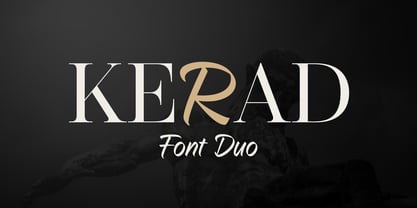 Kerad Font Duo is a captivating combination of modern serif and handwritten font, both seamlessly mixable to create a unique and appealing impression. It is suitable for various design projects such as logos, branding, packaging design, web design, titles, posters, printing, advertising, and much more.
 - Pheonies by Yumna Type,
$16.00 Pheonies is a handwritten font with a natural and unique design will make your project more beautiful. The font is suitable for your branding project, printing, logos dan wedding. Included: Pheonies (OTF) Features: Beautiful Ligatures Alternates Multilingual Support PUA encoded Numeral and Punctuation by Yumnatype
 - Crimson Skyline by Hanoded,
$15.00 Crimson Skyline is a thin brush font. I used a pencil and Chinese ink to paint the letters. Crimson Skyline comes with double letter ligatures for the lower case letters. And the name? Well, it just has a nice ring to it. That’s all!
 - Stonehouse by Scriptorium,
$12.00Stonehouse is based on samples of Art Nouveau title lettering, adapted and expanded into a complete titling font. It has a nice intermediate weight ideal for titles on the web or in print, especially for section or topical headers within a body of text. - VVDS Pacifica by Vintage Voyage Design Supply,
$18.00 Pacifica – hand lettered elegant bold script for decorative typography inspired by American branding typography from end of XX century. Comes with different variates – filled, highlighted or pressed. Perfectly for headers, signs, logos, prints, etc. Comes with ending and some middle alternates and some standard ligatures.
 - Quacks by Gassstype,
$29.00 Hello Everyone, introduce our new product Font QUACKS This Is Rough Display Font.This is a Textured Natural Style and classy style with a clear style and dramatic movement. This font QUACKS is great for your next creative project such as logos, printed quotes, invitations, cards,
 - Alterous Text by ZetDesign,
$15.00 Alterous is made for a bold impression on each of your works. This font can be used for title and text display so it is suitable for all types of designs, whether posters, flyers, banners, t-shirts, screen printing, magazines, newspapers, logos, and others.
 - Lavaman by Chank,
$49.00Lavaman was created by Chank Diesel in 1995 as a custom font for the Cartoon Network's Space Ghost Coast to Coast web site. This font represents the printed voice of the talk show's surly backstage engineer, who is a man made of molten lava. - Evening Gown JNL by Jeff Levine,
$29.00 Evening Gown JNL comes from the lettering displayed on a printed ad for the fictional "Gowns by Roberta" in a scene in the 1935 film of the same name. "Roberta" starred Fred Astaire and Ginger Rogers and was based on the successful 1933 stage play.
 - Quelline by Maulana Creative,
$14.00 Introducing Quelline Font. Are you looking for a bold handlettering decorative font that has a medieval gothic feeling? We can help! Try to download our Quelline Font. Suitable to use for any occasion such as book, logo, print, game, event, music, invitation and others. Thanks!

