5,517 search results
(0.02 seconds)
- Deja Rip by Anatoletype,
$33.00 DejaRip is a contemporary, neutral, all-purpose sans-serif. It is modest and inconspicuous thanks to its basic, natural shapes; yet it lends a remarkable sense of clarity and accuracy to the overall design. DejaRip was originally designed for a mobile phone interface. Although it was eventually developed into a much more versatile family, DejaRip remains particularly readable on screen. The DejaRip family is an ideal solution for corporate design. DejaRip’s extended character set includes Unicode Latin Extended A and B, as well as full support of Cyrillic. Small caps for all languages are also included.
 - Neue Frutiger Vietnamese by Linotype,
$29.00 Neue Frutiger Vietnamese''' was developed by a team of designers and font engineers from the Monotype Studio under the direction of Monotype type director Akira Kobayashi. The family is available in 10 weights from Ultra Light to Extra Black, with matching italics. Neue Frutiger Vietnamese embodies the same warmth and clarity as Adrian Frutiger's original design, but allows brands to maintain their visual identity, and communicate with a consistent tone of voice, regardless of the language. It is part of the Neue Frutiger World collection, offering linguistic versatility across environments – suited to branding and corporate identity, advertising, signage, wayfinding, print, and digital environments.
 - Ainda by Resistenza,
$45.00 We always had a crush for multilinear fonts and a great love story with script types. So we decided to bring them together and create Ainda. A new multiline script font based on and English copperplate skeleton. A modern approach to classic flourished scripts, designed with a slanted angle that gives dynamism and creates a ribbon effect when the lines come together in the connections, adding depth and perspective. Ainda family includes 2 weights, Regular & Bold. This Display font will light your layout with a contemporary and elegant flair. Highly recommend to use it on big sizes.
 - Object by Fontador,
$24.99 Object is a geometric sans serif especially designed for contemporary typography and comes with 8 weights from ultralight to black plus handslanted obliques. A large x-height not only creates space for smaller sizes, but also lends Object an open and generous character for print and screen. Many OpenType features including 642 ligatures, contextuel alternates, inits and stylistic set built into all cuts. The font contains 1.118 glyphs with a wide range of flexibility for Latin language support for every typographical needs. Object is a contemporary geometric typeface, special for logotypes, brands, magazines and corporate design.
 - Bionik by Fontador,
$24.99 Bionik is a squarish serif, especially designed for contemporary typography on print and screen. The super ellipse-based forms and high x-height allow large and open letterforms, perfectly adapted to the pixel grid on screen. With light rounded corners Bionik provides a soft and friendly atmosphere. The font contains 6 weights from ExtraLight to ExtraBold plus true italics. 944 glyphs include 218 ligatures, small caps, tabular, old style, fractions …, and a wide range of flexibility for latin language support for every typographical needs. Bionik is a contemporary serif typeface, special for logotypes, brands, magazines and editorial.
 - Isotonic by Emtype Foundry,
$69.00 Isotonic started out as a spin-off with the idea of creating a text oriented version of Ciutadella, it has since taken on a life of its own. Building on a foundation that has proven to work very well, we decided to open the counters and increase the x height. Even though it is not strictly a text font, it works surprisingly well in body sizes and screens. The soft corners gives charm, closeness and an appropriate voice for sports, science, tech, economy etc. Learn more about the design process of Isotonic at the Emtype’s Blog.
 - PF Synch Pro by Parachute,
$79.00 An industrial strength slab-serif typeface which performs equally well with headlines as well as longer text. It differs from the stiff almost mechanical structure of other slabs, by introducing distinct letterforms in characters like ‘f’, ‘r’ and managing at the same time to combine effectively the typeface’s round parts with deep cuts and sharp inner corners, which add an interesting character to this otherwise contemporary series. PF Synch Pro consists of 4 fonts from black to regular. It is loaded with 3 special OpenType features and offers multilingual support for all European languages including Greek and Cyrillic.
 - Badbad by DYSA Studio,
$19.00 Badbad is a monoline script font. This another collection of script is perfect for your next personal branding project, excellent for "Logotype". Badbad have a smooth edges, so this font gives an authentic handcrafted feel style. Badbad is perfect choice for people looking for clean, modern, minimalist, elegant, beauty design styles. Suitable for almost any graphic designs such as logo, branding materials, business cards, gift cards, t-shirt, cover, thumbnail, print, poster, photography, quotes .etc sans-serif, legible, geometric, clean, sans, modern, display, grotesque, corporate, branding, magazine, contemporary, text, headline, elegant, sans serif, grotesk, advertising, classic, swiss, poster, logo, editorial, technical, logotype
 - Baroque Mortale by Letterhead Studio-YG,
$45.00 Letterhead Studio makes both fonts and design with own fonts. The studio is started in 1998 by Yuri Gordon, Valery Golyzhenkov and Olga Vassilkova. We work in graphic design, branding and type design. Our collection of Cyrillic fonts includes more than 330 faces, generally it is display fonts. Letterhead is one of leading developers of custom-made fonts, lettering and digital calligraphy in Russia. Among clients of studio are magazines like Rolling Stone, Esquire, GQ, Empire, Interni, Harpers Bazaar. Also we develop corporate fonts, more often for banks. Letterhead co-operated with Gazprombank, Rosbank, the Alpha-group, Trust, Menatep, Orgres-Nordea and others.
 - Modica by Monotype,
$25.99 Modica is a strong and agile Geometric Sans type family comprising 18 fonts. This typeface began life as “Meccanica” – a quirky, heavy, engineering typeface, that later evolved into the more conservative “Technica” type family. And now, the typeface has been distilled down to its simplest and most perfect form to become “Modica”. Modica is a nimble typeface that can handle a multitude of applications – everything from body copy to retail fashion to corporate identities... why not put Modica to task today? Key features: • 9 weights in Roman and Italic • Full European character set (Latin only) • 450+ glyphs per font.
 - Edgewater by cm5dzyne,
$16.00Initially created for use in a logo and with a limited number of characters, Edgewater evolved into a full typeface suitable for everything from projects requiring a space-age, futuristic feel to logotype for the most refined, conservative corporations. Edgewater was joined in November, 2008, by Edgewater Hairline, which supports more than 30 languages and is especially attractive in larger point sizes. The hairline version also is a nice complement to the other fonts in the Edgewater series, though still striking enough to stand on its own as the dominant visual in a virtually unlimited number of displays. Timeless, unique and flexible. - Authority by RetroSupply Co.,
$19.00 Inspired by public fonts in New York in the 1970s. Authority pays tribute to the almost unnoticed but powerful effect type have on our lives. From waiting on a cold morning to catch the 307 to Morton West High School, to the rain and snow worn stencil on a postal box. Public typography is a part of the little spaces in your lives where life actually happens. Government designed fonts were chosen to communicate authority and help grease the gears of the day-to-day grind. Authority beckons back to these days with it's mildly condensed feel, squared corners and weight presence.
 - Oxine Display by FoxType,
$20.00 Introducing Oxine Display new generation Typeface with 7 Weights. Oxine Typeface created with the vision of to attract the audience to your brand . The finest details of this typeface are methodically and mathematically created. Oxine is created with all the tasks of a corporate font and also for the usage in a variety of projects, including branding, logos, titles, headlines, servers, posters, screens, display, digital ads, and everything else. We are putting a lot of effort on this font as a long-term project. The Typeface includes Seven Weights. ExtraLight, Light, Regular, Medium, SemiBold, Bold and ExtraBold
 - VLNL Gaufre by VetteLetters,
$35.00 VLNL Gaufre is a pixel-based font with holes designed by Donald Roos. Each character is built on a grid of doughnut-like elements, which makes it look like a kind of dried dog food, or Belgian waffles. Despite the grid Gaufre still has enough warmth due to the doughy, slightly rounded corners. And because it’s prepared with a hot waffle iron of course. The end result is a merry, chunky typeface that smells of doughnut. Use it for logos or headlines, just add butter and sugar or, better still, top it with whipped cream and cherries. Yummie!
 - Triplepass by Shapovalov Fonts,
$10.00 Triplepass is a narrow grotesque with 3 styles: normal, with cut corners and a stencil shape. The font has a retro character, contains both humanistic rounded designs and modern smooth alternatives. The font is suitable for logos, large headlines, posters, signs, prints, font compositions, as well as for sports-related layouts where clear numbers and space savings are needed. Triplepass contains extended Latin, Cyrillic, fractions, ligatures and two icons of a basketball. It contains OpenType features: liga, numr, dnom, calt, ss01, ss02. The font is also case sensitive, has fractions, currency signs including the rouble sign.
 - Orlando Smith by Meutuwah,
$20.00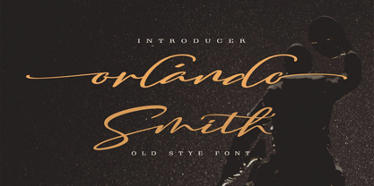 Hello Font Lovers... Orlando Smith is another lovely modern calligraphy typefaces, which is combining the style of classic calligraphy with an modern style. combines from copperplate to contemporary typeface with a dancing baseline, modern and elegant touch. including initial and terminal letters, alternates, and ligatures. Can be used for various purposes.such as headings, logos, wedding invitation, t-shirt, letterhead, signage, lable, news, posters, badges etc. To enable the OpenType Stylistic alternates, you need a program that supports OpenType features such as Adobe Photoshop, Adobe Illustrator, Adobe Indesign, Corel Draw, and More!!! Thank you for your purchase...
 - Agentic by Artisticandunique,
$55.00 Agentic Serif font family has 18 styles and multi-language support. It is ideal for creating your articles thanks to its easy readability. The combination of sharp corners and soft turns in the characters offers alternatives to create different moods in your projects. You can create creative and stylish designs with combinations of upper and lowercase letters in the title and text. This font helps you discover the best mood for your projects, from body text to big headlines, classic to modern and bold looks. Well suited for books and magazines, magazine covers, editorials, headlines, websites, logos, invitations, branding, advertisements and more.
 - Syabil by Eko Bimantara,
$16.00 Syabil is a sans serif font family designed by Eko Bimantara. This font crafted with the intention to present a clean, legible, multipurpose that easy to read wether it on screen or print. Fit for all purposes; Text, display, headline, print, corporate identity, logo, branding, product, infographic, photography and other application and medium. This font consist of 9 weight; Thin, Light, Book, Regular, Medium, SemiBold, Bold, ExtraBold and Heavy with each weight paired by italic. Also including Latin Plus language support with more than 11.700 glyphs in all weight which make this font contain broad language support.
 - Hercules by Storm Type Foundry,
$26.00Where Modern is too fragile and Century too boring, Hercules comes with its elegant forms and, at the same time, with sufficient firmness to be usable for longer texts. In its heavy, bold designs it approaches Falstaff, while in the light ones it has some features which are taken over from Didot or from Modern. The text designs have been corrected for small sizes. The range of its use is, therefore, quite extensive - from dictionaries and technical literature through magazines to art posters and advertising materials. Suitable combination: Splendid Quartett (especially recommended), Excelsor Script, Plagwitz, but also Zeppelin and Compur. - Gautters Mickey by Creative17studio,
$18.00 Introducing : "Gautters Mickey" is a unique modern serif font. comes with a large selection of alternative characters and ligatures. The distinctive shape of each character makes this font even better for any design, both personal and corporate. Create your own unique design by using this font. very suitable for formal and informal use. Available in two types of styles: regular & italic. Features : 1. standard character set 2. multilingual support 3. numbers and punctuation marks 4. many ligatures and alternatives What are you waiting for, get this premium font right away. Free updates. Any questions? just ask. Thank you
 - Mramor Pro by Storm Type Foundry,
$52.00 The Mramor family first appeared in the Stormtype catalogue in 1994. The first sketch arose in 1988 through the narrowing of Roman capitals. It has uniform width proportions and, above all, original lower-case letters, unprecedented with Roman Capitals. The text designs are discontinued since they were replaced by the related Amor Serif family (along with its -sans version). Now, Mramor has “only” 10 designs that each include true small caps, Cyrillics and a rich variety of figures, ligatures and alternates. Mramor excels in corporate identity or bottle-label design, also whenever there is a need for a “classic” looking face.
 - Vivala Marbod by Johannes Hoffmann,
$29.00 Vivala-Marbod is a versatile serif font that boasts a wide range of features and styles. With ten styles and 545 glyphs, the Marbod enables a wide range of applications. Whether subtle headings or easy-to-read body text, Marbod offers the necessary versatility. A set of symbols with fractional numerals, scientific numerals, and matching arrows makes them particularly suitable for informative design. Advanced language support makes it ideal for international projects. In addition to the upright font, Marbod contains a well-developed italic. This is great for making posters, brochures, and corporate designs that need to be precise and stylish.
 - Hammer and Tongs by Komet & Flicker,
$10.00 Hammer & Tongs works great for all kinds of branding projects, advertising, websites, packaging, and posters – essentially anywhere you need bold, strong communication. Inspired by the lettering found on military vehicles, this font works great for headlines and is effective for short blocks of body copy. H&T also has a strong retro industrial/athletic vibe and works well for modern-vintage style designs. This font is available in two styles: a Hard version with sharp, crisp edges and a Soft version with rounded corners. Both styles include a complete set of numbers, punctuation marks, and extended characters.
 - English Script by Linotype,
$40.99English Script Regular is a typeface made in the manner of English Copperplate, a kind of writing that was very popular in England during the 18th Century. Also referred to as English Round Hand, the style was promulgated by various writing masters, who published copybooks of their handwriting for students to use as guides. The style has remained popular to this day, and almost no sort of font is more readily identifiable with the ideas of formal," "old fashioned," "traditional," or "high society." English Script Regular is the perfect choice for use on wedding invitations and other announcements." - TE Sara Modern by Tharwat Emara,
$20.00 Its one of the SARA modern ( Arabic – LATIN – URDO) fonts, a spontaneous free line characterized by beauty and speed of reading. To be used in advertisements, writing titles, magazines, cartoons, films, serials, comics and plays. SARA MODERN font is one of the ( Arabic – LATIN – URDO) fonts. It is the most common font and is written in most Arab countries because it has the potential to be written in a narrow space when compared to other Arabic fonts. It is used in the titles of books, magazines, daily newspapers, commercials, banners, advertising, holiday cards, newspaper headlines, Introduction to students.
 - Ermou by TEKNIKE,
$199.00 Ermou is a display monospace font. The typeface has a distinct geometry using sharp angled corners as a tribute to writing and carvings of Ancient Greece. The name is derived from Ermou Street (Οδός Ερμού) or “Street of Hermes” named after the Ancient Greek messenger God and "the bringer of good luck" Hermes (Ἑρμῆς). The famous street was one of the first roads designed in modern Athens, Greece. Today Ermou is Athens’ commercial heart and top ten most expensive retail streets in the world. Ermou is great for team sports, display work, invitations, writing, architecture, fashion, posters, titles and headings.
 - Gaspo Slab by Latinotype,
$26.00 Gaspo Slab is a fresh slab serif typeface that features esthetically pleasing curves, strong serifs, ample counters, humanist proportions and ink traps. The result is a very functional font with a contemporary design and highly readable at small sizes. Gaspo Slab consists of 7 weights, from Ultra Light to Black, with matching italics. This family comes with a 434-character set that includes European diacritics, tabular figures, alternative characters, numerators and fractions, making it possible to use the font in 128 different languages. The font is well-suited for headlines, medium-length text, magazines, newspapers, advertising, corporate use and product design.
 - ZionTrain Pro by AndrijType,
$39.00 Originally ZionTrain was built as a (probably first in Cyrillic!) navigation typeface for the Kharkiv identity project and Kharkiv subway and airport navigation systems. We wanted comprehensible, distinctive letterforms, that can help everybody on the way from Babylon to Zion. The project was used in Kharkiv promotion at homeland and abroad, but was rejected by the new government. As a corporate typeface it was used for a few cultural projects. Now it is equipped with Slavic Cyrillic and Monotonic Greek and has special Stencil faces especially for low-budget navigations (don't forget to get your own Stencil Medium for free!).
 - Centim by Tour De Force,
$25.00 Centim is contemporary sans with sharp top endings of stems that give a bit technical charm to typeface. With a squarish look, it can be used widely in all modern publications or become a part of an corporate identity. In smaller sizes, Centim offers good readability due to its simple and good balanced lines. Centim is available in Regular and Bold weights, as an ideal high-contrasted combination where all characteristics of the typeface are purely effective. Centim is the archaic Serbian word for Centimeter, a word that was mostly used in tailoring during XIX and XX century.
 - Mahardika by Lemon Studio Type,
$10.00 Mahardika is a Retro Sport sans Serif family with variable font technology, and its axis weight range spreads from Light to black forms. Flexible and adaptable, it is 100% Latin Plus, Supporting 219 Latin-based languages, which are spoken in different 212 countries. This font is suitable for any project. Great for graphic design and any display use. It can easily work for web, signage, corporate as well as editorial designs. Jantur Type has 9 weights with a total of 9 styles. and legibility makes it suitable for any kind of text application, from brand design to extensive text layouts.
 - Excessa by DePlictis Types,
$33.00 Meet EXCESSA!! a new futuristic and modular typeface family directly evolved from my previous released, AREON FLUX. Comparing it to his cousin, EXCESSA inherit most of the glyphs but a certain large group of letters are designed with a more obvious curvature that creates a slightly different visual dialog. It cames also in the same 3 styles as it’s predecessor: Athletic, Medium and Heavy. His more dynamic and modular structure makes it an excellent choice for designs that needs a futuristic, technical, unusual and sci-fi touch. It also supports most of the latin based languages, kyrillic and greek as well.
 - Narin by Ahmet Altun,
$19.00 Narin Font Family is a geometric sans design with rounded corners which seems much softer and eye-pleasing even though it still has geometric and straight borders. The family comes in six weights with regular and italic forms. Narin Font Family is legible from very small size to very large ones. It is suitable for letterpress and also long texts. With the small caps, all fonts can be used to create great and gorgeous works like logos, texts, presentations, t-shirts etc. and can be used to create the pressworks such as posters, magazines and books. The word "Narin" means "graceful" in Turkish.
 - Umberland Slab by Sharkshock,
$115.00 Umberland Slab is an attractive family available in 3 different weights with italics. There’s a particular emphasis on simple geometric shapes and the way they interact with tall vertical strokes. Smooth curves and sharp angles blend together in a pleasing symmetry. Stroke widths are given variable degrees of contrast but serifs are consistent and heavy handed. Spacing is on the tight side with some lowercase pairs quite snug against each other. Umberland Slab would work well in small blocks of text, corporate logos, menus, or signage. This family is equipped with European accents/diacritics for international support, fractions, alternates, and ligatures.
 - ArchiType by Archiness,
$10.00 With the famous and much used Eurostile and Bank Gothic in my mind I wanted to design a mono-line font as simple and legible as possible. A square with rounded corners, i.e., the letter ‘o’ as its basis. From there on back to basics, so straights remained simple straights with 90° endings, whatever the angle. Numbers are monospaced. The result seems to be a pleasantly balanced and neutral font. Excellent for display purposes and surprisingly legible in even small sizes. This perhaps typical approach by an architect led to the name of the font: ArchiType.
 - Kapra Neue Pro by Typoforge Studio,
$39.00 Kapra Neue Pro is a younger sister of Kapra Neue – he was the #1 bestselling Grotesque Sans released in 2017 on MyFonts and grandson of Kapra. Now you really have a lot of options to choose! New family is full of everything – 96 weights contain a wide range of instances, from Condensed to Expanded, everything with rounded corners or with sharp ones. Now, font has also: small caps, cyrillic script, and old-style figures. Kapra Neue Pro is inspired by a “You And Me Monthly” magazine, published by National Magazines Publisher RSW "Prasa” in Poland, from May 1960 till December 1973.
 - Neue Frutiger Arabic by Linotype,
$79.00 Neue Frutiger Arabic was created by Nadine Chahine and a team of designers and font engineers from the Monotype Studio, under the direction of Monotype type director Akira Kobayashi. The family is available in 10 weights from Ultra Light to Extra Black. Neue Frutiger Arabic embodies the same warmth and clarity as Adrian Frutiger's original design, but allows brands to maintain their visual identity, and communicate with a consistent tone of voice, regardless of the language. It is part of the Neue Frutiger World collection, offering linguistic versatility across environments – suited to branding and corporate identity, advertising, signage, wayfinding, print, and digital environments.
 - Prospera by Alphabets,
$17.95Prospera was designed without reference to existing roman faces. In its initial form, development was partially supported by a grant from the National Endowment for the Arts (Design Project Grant), as a design for use on 'low-res' digital output devices. Early releases had simplified detail in cross-bars and serifs, and hand-tuned bitmaps. As an original design, Prospera draws on principles of letterform developed during my studies of lettercarving (in Wales with Ieuan Rees) and Roman proportion. The design is idiosyncratic, perhaps more akin to Gill's Perpetua than to the monotonous corporate flavors so prevalent today. - Bigante by Vibrant Types,
$29.00 Bigante is a big, giant superfamily with two variants: Solid and Inline, offering six weights and seven widths. Its constructed design interprets rounded corners as three 30° angles, resulting in edged terminals and twelve-sided dots. While it sounds functional, this rounded-like semi-serif enhances the appearance, creating a friendly aesthetic. The lowercase alphabet features a high x-height. For versatile use in display and advertising, the multitude of fonts enables flexibility. Captivating with a linear structure, it associates with modern architecture, tactical sports, space travel, and futuristic technology. The character set of 780 glyphs supports 410 Latin languages.
 - FP København Sans by Fontpartners,
$35.00 Copenhagen has been in need of a typeface that unites the city’s many visual expressions. The three designers Morten Rostgaard Olsen, Henrik Birkvig and Ole Søndergaard have designed and developed the typeface FP København. Now available from MyFonts in 44 styles: Serif & sans serif, uprights & italics, small caps, pictos-characters, stencils, sprayed style, OT-features, ligatures, contextual alternates etc. The shapes of the letters are inspired by the city’s culture and the visual environment and design in Denmark in the 20th century. It is relatively low and wide as the city itself and with rounded corners that give it a warm visual mood.
 - Riga by Ludwig Type,
$45.00 Riga is a space-saving and legible typeface designed to work equally well on paper and on the computer screen. Its personality is clear and practical, yet warm and polite. Riga is suitable for a wide range of typography such as editorial, websites, packaging and corporate design. Economical proportions, high x-height and open letter forms guarantee good performance in narrow columns and tight headlines. Riga is exceptionally readable at small point sizes and elegant at larger ones. Riga comes in 18 styles and weights and contains a large number of OpenType features. For small sizes on screen Riga Screen is also available.