10,000 search results
(0.104 seconds)
- Mo' Funky Fresh by ITC,
$29.99Mo' Funky Fresh is the work of New York designer David Sagorski. It is an all capital typeface which includes a set of alternative capitals, compatible symbols and lively illustrations. Mo' Funky Fresh brings to mind sunny days, tiki bars, surfboards and cool drinks and is a great choice for headlines requiring a vital, energetic look. - Paper Sting Stencil by PizzaDude.dk,
$17.00 I made Paper Sting using an inky pen. There is a great variation in the stroke width, which gives a very lively handmade feeling. Paper Sting comes in two versions: Regular and Stencil - mix them for cool realistic results. Of course there is multi-lingual support as well as contextual alternates, which means 5 different versions of each letter.
 - Zeitgeist by Monotype,
$29.99With Zeitgeist, designer Michael Johnson explored the limitations of early digital technology: the letters are built up in the style of low resolution bitmaps. The design was completely carried out on-screen. In additional to the standard lettershapes, the Zeitgeist family comes with a range of engaging and colorful alternative letters and swash characters for enhanced attention. - Slogan by Linotype,
$29.99Helmut Matheis originally designed Slogan for the Ludwig and Mayer type foundry in Frankfurt, Germany. Slogan is an informal script of medium weight, with some variation in color. Its caps are flowing and the lowercase letters are close fitting. A lighter, more upright companion was designed by Helmut Matheis as well; its design is named Charme. - Trochera by Sardiez,
$20.00 The agressive moves, the lateral spurs and the heavy leaf endings of Trochera resemble the silvan plants behavior giving it a very expressive and festive personality. Its features make Trochera very useful for flamboyant and colorful purposes, but it is also attractive in black and white, the saturation of the ornaments will give an appealing texture to headings.
 - Linotype Reducta by Linotype,
$29.99Linotype Reducta is a part of the Take Type Library, selected from contestants of Linotype’s International Digital Type Design Contests of 1994 and 1997. It was designed by Austrian artist Herbert O. Modelhart with only a small number of constant form elements. The cool and technical Linotype Reducta is intended exclusively for headlines in large point sizes. - Recess Brush by Gassstype,
$25.00 Hello Everyone, Introduce our new collection, Recess Brush is Rough Display Brush Font and Ligature Brush Font. Recess Brush Font is a Strong Style and classy style, inspired by famous logos of Technology and brands that have very strong characteristics, this font is great for your creative projects such as watermark on photography, and perfect for logos & branding, invitation,advertisements,product designs, stationery, wedding designs,label ,product packaging, special events or anything that need handwritting taste. That is why Recess Brush has charming, authentic and relaxed characteristic ,strong ,cool more natural look to your text with a more natural look to your text. You can activate Ligature OpenType panel.
 - Kathmandu by Volcano Type,
$19.00Kathmandu, the Nepalese capital in the foothills of the Himalayas, is not like any other city. That's why Kathmandu Bold is not like any other font going by the name of a town, either: This font is not as digital as Chicago but not as solid as Aachen. Kathmandu Bold's capital letters are slightly irregular, giving the font its unique character, which is extended and more black than bold. Everyone who has hitherto regarded "naïve" and "cool" as being an oppositional pair should check out this font by Ingo Juergens. For special needs, such as foreign languages, there is a host of special characters. - Jandys by Alit Design,
$10.00 Introducing Jandys Typeface which has a fast dry brush and elegant style. So it looks natural, like handwritten. This font is best used for your design project that has the concept of elegant, cool and fun. Can also be applied to the design of a logotype, header website, make some lettering a quote, t-shirt design, wedding card design etc. Jandys has two font styles that are similar but different, namely Jandys Dua and Jandys Swash, a dry brush formatted like a used font. Jandys Typeface deserve to be in your fonts collections, because it is unique, elegant and has many options of alternative glyphs.
 - Erghon by Rotterlab Studio,
$17.00 Erghon is a handwritten font with quick dry strokes and a signature style. It's perfect for branding projects, homeware designs, product packaging or simply as a stylish text overlay to any background image or posters. Erghon has an entire alternate glyph set. This is accessible simply by their own separate font file - just install this as normal and select 'Erghon Swash' , ‘Erghon' or ‘Erghon’ in your text-tool. Erghon includes 2 Font files: 1. Erghon Regular - A handwritten script font containing upper & lowercase characters, numerals and a large range of punctuation. 2. Erghon Swash - A set of 26 hand-drawn swashes, with cool touch to underline your text set in Erghon.
 - MFC Viper Monogram by Monogram Fonts Co.,
$19.95 The inspiration source for Viper Monogram is the 1934 Book of American Types by American Type Founders. Found in that specimen book, was a sophisticated two-color monogram design called Hollywood Combination Initials, which was available in limited size metal castings. This wonderful monogram style is now digitally recreated, revived, and updated for modern use! Viper Monogram supports one and two letter monograms, but due to its super condensed style works best for three letter monograms. The default typing style for Viper Monogram is an all horizontal all caps setup which can be used for headlines and titling. Type in Capitals for an outline effect, lowercase for a solid effect. By enabling OpenType Contextual Alternates, you can type diagonal top-aligned monograms up to three letters. By typing in all lowercase, and layer a copy of the lowercase with Stylistic Alternates enabled, you can create a two-color effect. Viper Monogram is available in Pro format Opentype fonts only due its unique setup. Download and view the MFC Viper Monogram Guidebook if you would like to learn a little more.
 - Aeolus Pro by DBSV,
$50.00 Aeolus Pro is a second attempt at writing a monoline style. Completed after many design transformations. And here (as in KhamaiPro) attempted to provide a different visual design with style as Staccato: (dashed line) Rail: (double line) Tribe: (triple line) and finally a New style Shadow. Also (Bold, BoldItalic) has the advantage of involving between styles… (Rail, RailItalic, Tribe, TribeItalic, Shadow and ShadowItalic) for example: …you have a text frame with some text or one word or one letter with Bold or BoldItalic style with e.g. (color blue), if you duplicate the text frame or duplicate the Layer (as is, without shifting position - text) and you make changes ONLY (the Style* and color of text) in second text frame, would have the effect of filling the gap at the following styles... *(Rail, RailItalic, Tribe, TribeItalic, Shadow and ShadowItalic) you can see the presentation of the photo “Multiplex”. This series of 20 fonts with 624 glyphs each is composed and includes true italics and supports Latin, Greek and Cyrillic.
 - Brandon Grotesque by HVD Fonts,
$40.00 Brandon Grotesque is a sans serif type family of six weights plus matching italics. It was designed by Hannes von Döhren in 2009/10. Influenced by the geometric-style sans serif faces that were popular during the 1920s and 30s, the fonts are based on geometric forms that have been optically corrected for better legibility. Brandon Grotesque has a functional look with a warm touch. While the thin and the black weights are great performers in display sizes the light, regular and medium weights are well suited to longer texts. The small x-height and the restrained forms lend it a distinctive elegance. Brandon Grotesque is equipped for complex, professional typography. The OpenType fonts have an extended character set to support Central and Eastern European as well as Western European languages. Brandon Grotesque won the TDC2 Award, 2011.
 - Marioline Barnard by Asd Studio,
$14.00 Introducing my Marioline Barnard Script, a passionatly crafted fancy script. Marioline Barnard script fully meets my expectations for a script that gives you luxurious vibes as much as casual vibes, elegant but simple, strong but light vibes. Marioline Barnard comes with beautiful uppercase and lowercase alternates (up to 11 level alternates, ligatures include), and swashes. Marioline Barnard has Multilingual support (Western European characters) and works with following languages: English, French, Italian, Portuguese, German, Swedish, Norweigan, Danish, Dutch, Finnish, Indonesian, Filipino, and Malay. Marioline Barnard is modern script font, every single letters has been carefully crafted to make your text looks beautiful. With modern script style this font will perfect for many different project, example: invitations, greeting cards, posters, name card, quotes, blog header, branding, logo, book cover, fashion, apparel, letter, logotypes, wedding invitations, product labels, and clothing product, stationery and more. Thank you.
 - Sweet Gothic by Sweet,
$39.00 Sweet Gothic is a 2009 addition to the Sweet Collection of engraved lettering styles from the 20th Century. Sweet Gothic Light is closely based on lettering from an engravers pattern from the early 1900s that was used for tracing letterforms with the engraving machine (pantograph) to make steel engraving plates. The design is related to many similar engravers gothics developed in the early 1900s, but as each engraving house created by hand their own patterns for popular styles of the time, there is variation among the models. Sweet Gothic offers contrast in stroke weight and its unique personality. The bolder weights are new designs, based on the characteristics of the Light. A serif variant (Sweet Gothic Serif) has also been developed to expand the usefulness of the family, offering an alternative to Copperplate Gothic. As such, most of the fonts are new designs, yet may seem familiar and ubiquitous given their model. The fonts offer two sizes of figures and monetary symbols: one set is intended for use with upper- and lowercase settings; the second set is the same height as the small caps.
 - Sweet Gothic Serif by Sweet,
$39.00Sweet Gothic Serif is a 2009 addition to the Sweet Collection of engraved lettering styles from the 20th Century. It is a serif variant of Sweet Gothic. Sweet Gothic Light (without serifs) is closely based on lettering from an engravers pattern from the early 1900s that was used for tracing letterforms with the engraving machine (pantograph) to make steel engraving plates. The design is related to many similar engravers gothics developed in the early 1900s, but as each engraving house created by hand their own patterns for popular styles of the time, there is variation among the models. Sweet Gothic offers contrast in stroke weight and its unique personality. The bolder weights are new designs, based on the characteristics of the Light. Sweet Gothic Serif has been developed to expand the usefulness of the Sweet Gothics, offering an alternative to Copperplate Gothic. As such, most of the fonts are new designs, yet may seem familiar and ubiquitous given their model. The fonts offer two sizes of figures and monetary symbols: one set is intended for use with upper- and lowercase settings; the second set is the same height as the small caps. - Basic Commercial Soft Rounded by Linotype,
$29.99 Basic Commercial is a font based on historical designs from the hot metal typeface era. It first appeared around 1900, and was created by type designers whose names have not been recorded but whose skills cannot be overlooked. This typeface's design has been popular among groups and movements as diverse as the Bauhaus, Dadaism, and the masters of Swiss/International-Style typography. It influenced for a variety of later grotesque fonts, such as Helvetica and Univers. Basic Commercial was distributed for many years in the United States under the name Standard Series. The typeface worked its way into many aspects of daily life and culture; for instance, it became the face chosen for use in the New York City subway system's signage. The Basic Commercial's font family members have a clear and objective design. Their forms exhibit almost nothing unusual, but remain both lively and legible nonetheless. Perhaps for this reason, Basic Commercial's design has been popular with graphic designers for decades. To read more about the history of typefaces like Basic Commercial, visit our font feature, The Sans Serif Typefaces. In addition several weights of this typefamily are available as soft rounded versions."
 - Neuarc by CozyFonts,
$25.00 Neuarc Font Family This is the 20th font family of CozyFonts Foundry, established 10 years ago in 2012 with the release of Aladdin Bold. Neuarc is based loosely on arcs and curves, hence it’s naming. As shown in one of the font posters that serves to showcase this font, a collage of rough sketches is displayed as the poster’s background. These hand drawn pencil drawings were worked and reworked and The final drawings were scanned and built in Adobe Illustrator and transferred to glyph windows, glyph by glyph, in Fontlab 8. The 5 styles, so far, are reminisscent of The Art Deco Era of Design between the 1030s and 1950s. Neuarc also has it’s own footprint with several characters that stand out, eg. A, 8, &, B, ?, $, 5, w, x, a, c, e, etc. giving the reason for the ’Neu’ in the naming. These letterforms & Numbers work extremely well in monograms. Each styles has it’s own personality. From the ultra chic Light style to the dominant cool Bold style, this family maintains a uniform legibility at small to large sizes. Meant primarily for display uses, Neuarc works well for posters, logos, headlines, packaging, branding, signage for a myriad of applications. The Neuarc Deco style font will work well in titles and numbers of any application.
 - Leona by Autographis,
$39.50 Leona is a handwritten script, that has been tweaked here and there to make it more smooth.
 - Caitiff by Gustav & Brun,
$20.00 Caitiff is a unique hand drawn serif. It includes about 25 ornaments to compliment your text and a couple of stylistic alternatives to your capital letters. Caitiff Slanted is an oblique version of Caitiff. Caitiff is a decorative typeface. You can use Caitiff in any setting; children's books, beer labels, organic food packages, menus... the sky is your limit!
 - Astralaga by SG Type,
$19.00 Elegant, graceful, and timeless. Astralaga is a versatile font family with a timeless, classic appeal, over 50 alternates & ligatures and multilingual support. Every letter has been hand-drawn and crafted with the upmost care. The variety of weights provide a range of choices that will help you find the best typographic character for your project. All 5 weights are well-suited for large display uses and high impact headlines. The available stylistic alternates and ligatures offer a number of different options that give your project a unique look. This high contrast serif typeface features a total of 1850 glyphs and offers comprehensive language support. THE 5 WEIGHTS OF ASTRALAGA Astralaga Light – very delicate and elegant Astralaga Regular – a classic beauty with gorgeous shapes Astralaga Medium – a great midground between lights and bolds Astralaga Semibold – high contrast and high impact Astralaga Bold – pure boldness and elegance FEATURES 5 weights High contrast 40 ligatures per weight 11 alternate glyphs per weight 1850 glyphs Comprehensive language support OpenType features: Access All Alternates, Discretionary Ligatures, Fractions, Kerning, Standard Ligatures, Stylistic Alternates, Stylistic Set 1, Superscript
 - Beret by Linotype,
$29.99Brazilian designer Eduardo Omine designed his Beret family of typefaces in an attempt to create a warm counterpart to the clean, minimalist sans serif of the 20th Century. The most individual characteristics of Beret are the terminals at the ends of its vertical strokes. They are slightly bent", simulating a subtle flare. Like many classic sans-serif typefaces (e.g., the original Syntax and Univers), this family does not include true (calligraphic) italics. Instead, a masterful set of obliques has been created. As Stanley Morison articulated in the early 1920s and 30s, these slanted versions of the regular "roman" faces may even work better when one wishes to emphasize certain words or passages within a text. The Beret family of typefaces is suitable for numerous applications, in both text and display sizes. The following nine fonts make up the family's design: Beret Light, Beret Light Italic, Beret Book, Beret Book Italic, Beret Regular, Beret Medium, Beret Medium Italic, Beret Bold, and Beret Bold Italic. Beret was awarded an Honorable Mention in the 2003 International Type Design Contest, sponsored by the Linotype GmbH." - CA Cula by Cape Arcona Type Foundry,
$40.00 CA Cula is standing in the tradition of cool tempered sans serif typefaces like DIN. But at a closer look it reveals a tendency towards rounder reading-friendly forms. The denaturalized ink traps give CA Cula a very special and individual look in display sizes, whereas in smaller sizes the positive aspects of huge ink traps show effect. The text looks clean and bright without black dots in the typographic image. This makes CA Cula suitable even for longer text, while the bold weight makes pretty cool headlines. The choice of weights aims at an easy straight forward use. A set of five well balanced weights ought to be enough to cover most needs without throwing the typographer into questions like: demibold or semibold? If you are looking for the extra kick, look out for CA Cula Superfat.
 - Rosella by Monotype,
$50.99 The Rosella™ family, by Sabina Chipară, is an elegant and playful suite of typefaces that are ideal for book covers, social announcements, packaging and posters. Inspired by late 19th century engravers typefaces that mimic the delicate and ornate hairlines of steel and copperplate engraving, the family’s foundation is built on the dramatic Solid design and then expands to Deco, Engraved, Flourish, Hatched and Inline styles. Rosella also takes to color like the beautiful Australian parrot it is named after. Words set in the typeface come alive when vibrant colors, or tinted backgrounds become part of their plumage. While modern as today, the design also has a quiet antique vibe that brings an understated refinement to a variety of hardcopy projects. Rosella is a typeface for those times you need a design that stands out from the crowd – but with grace and composure.
 - Flashes by profonts,
$39.99Flashes is a striking display font based on Enric Crous-Vidal's design from 1953. Unger redesigned the font based on artwork from old font books, and extended the character set to cover not only standard Western but also the Central European character set. It has been a tremendous amount of meticulous work to digitize and edit all the flashes! - Fabrice by Fabulous Rice,
$30.00 Fabrice is a font based on my handwriting, which has been reworked to be turned into a font. I write differently with each pen I use, and this font corresponds to my handwriting while using a pen I refill myself with special inks. It contains a wide range of characters, and will be readable anywhere, yet different!
 - Amerio by Subectype,
$15.00 Amerio is a rough font that was made by Subectype Studio. It features a brush made feel and looks so fun. Every single letter has been naturally hand written, making this typeface unique. It was scanned and put together as a font. The font suits best for big headlines, logos, posters, book cover, quotes and much more.
 - Sheila Hudson by Crowntype Studio,
$14.00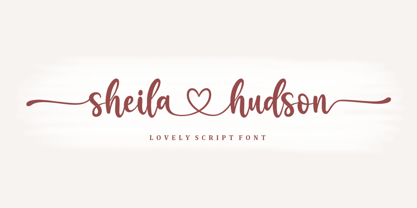 Sheila Hudson is modern script font, where every single letter has been carefully crafted to make your text look beautiful. With a modern script style, this font will perfect for many different project such as: quotes, blog headers, posters, weddings, branding, logos, fashion, apparel, letters, invitations, stationery, and more. This font includes alternate glyphs and beautiful swirls.
 - Catty Funny by Yoga Letter,
$15.00 Catty Funny is a cute and unique type of display font. The decoration in this font is very easy to use, because it has been specially designed so that it is easy to use. This font is perfect for promoting pet food, for writing posters, mugs, t-shirt designs, comic covers, book covers, logos, branding, banners, and more.
 - Lime Squash by Epiclinez,
$18.00 Bold, playful, and fresh - the lime squash font will make your design stand out from the rest. This fun, bold font will give your work an added creativity boost, whether for a logo, product packaging, or a headline. With its unique style that has been carefully crafted, the lime squash font is perfect for any creative project.
 - Univers Next Cyrillic by Linotype,
$49.00 Linotype Univers is a completely reworked version of the original Univers typeface family designed by Adrian Frutiger in 1957. After a long process of painstakingly detailed revision, Frutiger and the design staff at Linotype completed this large joint project in 1997. The result: a brilliant and cohesive font family of 63 weights and styles including the 4 monospaced typewriter weights. All the existing weights were completely redrawn, with careful attention paid to making the proportions more consistent with each other and improving fine details such as curves and thick-to-thin stroke ratios. The family was expanded from 27 to 63 weights, providing a much larger framework to graphic designers for choosing just the right style. The bold and condensed weights were reworked for improved legibility and on-screen application. The stroke weights were revised for consistency within each face as well as in relationship to the other weights. By following Frutiger's original designs, the humanist character of the sans serif Univers now comes through more distinctly. The systemized numbering system has also been updated. With its sturdy, clean forms Univers can facilitate an expression of cool elegance and rational competence. In fact, the strong familial relationships between all the styles and weights make it a serviceable choice for large graphic design projects that require versatility with consistency. Frutiger was successful in staying true to his initial aims; the new Linotype Univers does indeed work in longer texts as well as for display settings. In 2010 the typeface family was extended and renamed into a more logical naming of "Univers Next" to fit better in the Platinum Collection naming.
 - Univers Next Paneuropean by Linotype,
$89.00 Linotype Univers is a completely reworked version of the original Univers Univers typeface family designed by Adrian Frutiger in 1957. After a long process of painstakingly detailed revision, Frutiger and the design staff at Linotype completed this large joint project in 1997. The result: a brilliant and cohesive font family of 63 weights and styles including the 4 monospaced typewriter weights. All the existing weights were completely redrawn, with careful attention paid to making the proportions more consistent with each other and improving fine details such as curves and thick-to-thin stroke ratios. The family was expanded from 27 to 63 weights, providing a much larger framework to graphic designers for choosing just the right style. The bold and condensed weights were reworked for improved legibility and on-screen application. The stroke weights were revised for consistency within each face as well as in relationship to the other weights. By following Frutiger's original designs, the humanist character of the sans serif Univers now comes through more distinctly. T he systemized numbering system has also been updated. With its sturdy, clean forms Univers can facilitate an expression of cool elegance and rational competence. In fact, the strong familial relationships between all the styles and weights make it a serviceable choice for large graphic design projects that require versatility with consistency. Frutiger was successful in staying true to his initial aims; the new Linotype Univers does indeed work in longer texts as well as for display settings. In 2010 the typeface family was extended and renamed into a more logical naming of "Univers Next" to fit better in the Platinum Collection naming.
 - Ah, Bubblii, the font that seems to dance right off the page! Designed by the ever-imaginative Philip Lanier, it's the typographical equivalent of a bubble bath — fun, light, and so effervescent, you...
- Vacaciones - Personal use only

- La Pejina ffp - Personal use only

- f2 Tecnocratica - Personal use only

- Jolgoria in Town - Personal use only

- Tabaiba wild ffp - Personal use only

- Sinkin Sans Narrow by K-Type,
$20.00 Sinkin Sans Narrow is a simple, pleasantly proportioned and easy to read sans-serif, available in all 9 standard web weights, 100 to 900, plus italics, so the face is a comprehensive illustration of the CSS web font numerical scale. Sinkin Sans fonts are designed with tiny, inconspicuous notches that sink into verticals at the intersections of strokes, adding highlights to congested corners. The incisions make right angles appear sharper and improve definition in more intricate characters. Sinkin Sans Narrow inherits the enviable clarity and readability of the luxuriously wide original family. The Narrow typeface, however, is designed to economise on space within busy web pages and has been sensitively condensed for maximum legibility. Each weight of Sinkin Sans Narrow is supplied with a free Italic.
 - Stoutface - Personal use only


