10,000 search results
(0.042 seconds)
- Mukoji by Imoodev,
$20.00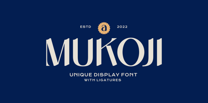 Mukoji is unique elegant font with visual elegance, smooth curves, and beautiful ligatures clear, making your work look true and attractive. A versatile font that works in both large and small sizes. This font is suitable for a wide variety of projects such as invitations, logos, branding, magazine, photography, card, product packaging, mugs, quotes, poster, labels, signatures, and more. A font that is perfect for all business sectors including personal projects, studio, corporate, creative agency, industrial, company, etc.
 - Grilock by Nathatype,
$29.00 Prepare to embark on a typographic journey through the past with Grilock, an uppercase display font that merges vintage looks. The thickness of each letter is uneven, giving them a reminiscent of vintage handcrafted signage. The relatively sharp corners of Grilock provide visual contrast against the uneven thickness, resulting in a font that is both striking and memorable. In addition, Grilock gives ornaments as a special bonus. Grilock fits in posters, logos, branding materials, and many more.
 - Coltan Gea by deFharo,
$11.00 Coltan Gea is a Slab Serif typographic family with 6 Weights plus the italic versions all include small capital letters and cryptocurrency symbols. It is a geometric, minimalist typeface, with neo-grotesque modulations and slightly rounded corners. The typeface has alternative letters and numbers, small caps and advanced OpenType functions. The proportions, metrics and kerning I have configured meticulously for a perfect reading in any size. The complete package includes the roman version in VariableFont format.
 - Kiddo by EPtackArts,
$3.00 Kiddo is a whimsical, handwritten font family created for use along side children's media. It pairs nicely with Monterrat and other neat, rounded sans serif fonts. It looks great with brightly colored, soft illustrations to create lively layouts full of movement. The characters are simple and easy to read as to not compete with the semi-inconsistent baselines and stroke weights. The line variations add a lot of character to the typeface that really compliments a good story.
 - Hello Malike by Imoodev,
$20.00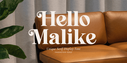 Hello Malike is beautiful serif fonts with visual elegance, smooth curves, and beautiful ligatures clear, making your work look true and attractive. A versatile font that works in both large and small sizes. This font is suitable for a wide variety of projects such as invitations, logos, branding, magazine, photography, card, product packaging, mugs, quotes, poster, labels, signatures, and more. A font that is perfect for all business sectors including personal projects, studio, corporate, creative agency, industrial, company, etc.
 - Youtesh by Imoodev,
$12.00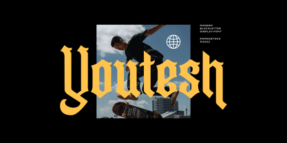 Youtesh is vintage retro fonts with visual elegance, smooth curves, and beautiful ligatures clear, making your work look true and attractive. A very versatile font that works in both large and small sizes. This font is suitable for a wide variety of projects such as invitations, logos, branding, magazine, photography, card, product packaging, mugs, quotes, poster, labels, signatures, and more. A font that is perfect for all business sectors including personal projects, studio, corporate, creative agency, industrial, company, etc.
 - Bokar by Pelavin Fonts,
$25.00 I am inspired by imagery that technology has rendered obsolete. I treasure anachronistic packaging and design which has somehow evaded obliteration by focus groups.I especially admire the packaging for A&P coffee brands Eight O'Clock, Red Circle and Bokar whose eccentric yet elegant typography harkens back to an earlier, less complicated era. The font Bokar is my nod of appreciation to those robust and full-bodied blends spared from the bland, tasteless scourge of corporate branding.
 - Salin by Hurufatfont,
$19.00 Salin is a modern sans serif font family with a geometric and humanist touch. Salin has totally 20 fonts with 10 weights and their appropriate italics. It contains rich opentype features. Includes extended language support, fractions, table figures, arrows, ligatures and more for each weight. Ideal for corporate identity, poster, brochure, orientation signs, and all kinds of graphic design works. “Salin News" and "Salin News Italic” are specially made for long paragraph texts which are written with small sizes.
 - Matrike by Pandastock,
$12.00 Matrike is vintage fonts with visual elegance, smooth curves, and beautiful ligatures clear, making your work look true and attractive. A very versatile font that works in both large and small sizes. This font is suitable for a wide variety of projects such as invitations, logos, branding, magazine, photography, card, product packaging, mugs, quotes, poster, labels, signatures, and more. A font that is perfect for all business sectors including personal projects, studio, corporate, creative agency, industrial, company, etc.
 - Mistont by Pandastock,
$12.00 Mistont is beautiful serif fonts with visual elegance, smooth curves and beautiful ligatures clear, making your work look true and attractive. A very versatile font that works in both large and small sizes. This font is suitable for a wide variety of projects such as invitations, logo, branding, magazine, photography, card, product packaging, mugs, quotes, poster, label, signature and more. Font which is perfect for all business sectors including personal projects, studio, corporate, creative agency, industrial, company, etc.
 - Vokrad by Imoodev,
$20.00 Vokrad is modern vintage font with visual elegance, smooth curves, and beautiful ligatures clear, making your work look true and attractive. A very versatile font that works in both large and small sizes. This font is suitable for a wide variety of projects such as invitations, logos, branding, magazine, photography, card, product packaging, mugs, quotes, poster, labels, signatures, and more. A font that is perfect for all business sectors including personal projects, studio, corporate, creative agency, industrial, company, etc.
 - Riemish by Pandastock,
$12.00 Riemish is blackletter font with visual elegance, smooth curves, and beautiful ligatures clear, making your work look true and attractive. A very versatile font that works in both large and small sizes. This font is suitable for a wide variety of projects such as invitations, logos, branding, magazine, photography, card, product packaging, mugs, quotes, poster, labels, signatures, and more. Font which is perfect for all business sectors including personal projects, studio, corporate, creative agency, industrial, company, etc.
 - Salacious by PizzaDude.dk,
$18.00 Salacious is my soft/rough all-caps font, inspired by both comics and grafitti. The weight and width of the letters varies a bit. Not in a disturbing way, but more in a lively and organic way. I've added 5 (slightly) different versions of each letter (which automatically cycles as you type!) The letter shapes are a bit rough, due to the fact that they are handmade, and all corners are rounded, which gives a nice soft look!
 - Hello Hoeask by Imoodev,
$12.00 Hello Hoeask is display fonts with visual elegance, smooth curves and beautiful ligatures clear, making your work look true and attractive. A very versatile font that works in both large and small sizes. This font is suitable for a wide variety of projects such as invitations, logo, branding, magazine, photography, card, product packaging, mugs, quotes, poster, label, signature and more. Font which is perfect for all business sectors including personal projects, studio, corporate, creative agency, industrial, company, etc.
 - Stamen by Wordshape,
$20.00 Stamen is the answer to a big question: What would happen if one tried to create a typeface that was ‘out of time’? If a type designer was to turn off the internet and put away the type specimens and just try to explore limbic, phantom history, what might that look like? No slavish explorations of the past. No gropings toward the future. No exhaustive core sample of the contemporary. Instead, using what one remembers of history and our collective vision of the future (usually a future imagined from the past) and channeling that into something that is, hopefully, new… The Bentons meet Frutiger for a Manhattan on a space station while Matthew Carter sways to the sweet sounds of the chorale that occasionally played through the halls of Stephenson Blake. This smear of implicit history expressed without explicit reference—this is Stamen: a family of 12 typefaces with a ton of alternate characters. The bold weight was designed for the LP “I Thought the Future Would Be Cooler” ( http://ittfwbc.com/ ) by the band YACHT in response to their request for a typeface that was ‘lost in time’, and refers to neither strict historical models nor purely futuristic forms. I built a small family out from there. It works well in text, but just as well for display setting. I think you’ll enjoy using it.
 - Main Street by FontMesa,
$25.00 Main Street is a revival of the old font Soutache, the original version of this decorative alphabet was created in 1873 by Julius Herriet, a type designer active during the period marked by the Western expansion. Main Street with its split serifs and ornate scrollwork reflects the romantic splendor of the old west from fancy garb and Cowboy Saddles to Ice Cream Parlors and painted window signage. Main Street goes one step further by creating a base fill font which can be placed behind the regular Main Street font giving this font more of an inline appearance. You will need an application that allows layering of your fonts in order to take advantage of FontMesa Fill fonts.
 - Saginaw - Unknown license

- Laban - 100% free

- SF Foxboro Script - Unknown license

- SF Cartoonist Hand - Unknown license

- Dream Script by Lián Types,
$49.00 One of my dreams as a type-designer was making a good looking chancery cursive. Full of life, like some of the best calligraphers around the world do on their artworks. With Julian Waters, John Stevens and Denis Brown (just to name a few of them) (1) chancery, or italic script, was transformed into a new, exciting and very fresh style of calligraphy mainly at the end of 20th Century. Dream Script may be that dream named above made true. I have been practicing chancery in the way I learnt from those calligraphers for many years now. Making a font out of my ink-sketches was a tough work, since they were closer of -being art- than of -being type-. However, this font rescues many aspects of handmade calligraphy: You have to look at it really close to notice it is actually a font, and that was one of my goals. The secret of a good looking chancery is on its subtle details: pen angle is constantly changing, even on the strokes which seem straight. Capitals and swashes have to be done a little faster than lowercase letters. The rhythm has to be even, in spite of its playful look. The fact that makes Dream look alive is that it has many alternates per glyph. This makes each word look unique like it happens in calligraphy: you will find alternates for the beginning/ending of a word/phrase, some for the middle of it, some interchangeable. Also, to accompany the script, you will find Dream Caps, which was inspired in the eternally beautiful trajan capitals. Place them like I did on the posters and you will have great results for sure. The font works great in small, middle and big sizes and can be a great selection for magazines, wedding invitations, perfumes, and posters. Close your eyes, and Dream with me... TECHNICAL Dream Script Pro is the most complete style, it contains all the alternates and ligatures (OT programmed, better if you use Adobe applications) If you plan to use the font for text, be sure to activate the less decorative capitals, which are placed in the “salt” group of alternates. Dream Script Standard has less glyphs than the Pro one, it contains just some ligatures for a better legibility. (OT programmed, better if you use Adobe applications) NOTES (1) Not only are they great artists, but also good people, who are always willing to share with their students all what they know. I would also like to thank Ricardo Rousselot, whose work inspired me this time to make “The Dream Script” exlibris; and to Alisara Tareekes, a very talented friend which international calligraphy conferences gave me: She kindly helped me with some tips to make this font better.
 - Caslon #3 by Linotype,
$29.99The Englishman William Caslon (1672–1766) first cut his typeface Caslon in 1725. His major influences were the Dutch designers Christoffel van Dijcks and Dirck Voskens. The Caslon font was long known as the script of kings, although on the other side of the political spectrum, the Americans used it as well for their Declaration of Independence. The characteristics of the earlier Renaissance typefaces are only barely detectable. The serifs are finer and the axis of the curvature is almost or completely vertical. The overall impression which Caslon makes is serious, elegant and linear. Next to Baskerville, Caslon is known as the embodiment of the English Baroque-Antiqua and has gone through numerous new interpretations, meaning that every Caslon is slightly different. American Type Founders presented a Caslon in 1905 which is true to the forms of the original. This font is relatively wide and comes complete with small caps and old style figures. - Abigail Adams by Three Islands Press,
$39.00 “My Dearest Friend” is how she began nearly all her letters to her husband, John. I refer, of course, to Abigail Smith Adams, first Second Lady and second First Lady of the United States. Her famous correspondence with John Adams produced nearly 1,200 letters over a span of some 40 years, leaving us with a priceless record of early American life — from household routines to war and politics to expressions of personal worry and devotion. Although Abigail’s was not the loveliest hand, I found it sure and expressive, as befitting her extraordinary sway and intelligence; it also carries a genuine flavor of the period. In making the font I focused chiefly on her handwriting from the 1780s and ’90s, when she’d taken to using a disconnected cursive, which struck me as distinctive and alluring. The OpenType release of Abigail Adams has scores of ligatures, standard and contextual alternates, lining and old-style figures, cross-outs, ink blots, and full Latin language support.
 - Grand Slam SG by Spiece Graphics,
$39.00 Grand Slam is based on an old cardwriting style known as Poster Gothic. This dynamic letterstyle was used in the heyday of the Hollywood movie poster because of its powerful and snappy appeal. The face is of uniform thickness and made as wide as possible without interfering with legibility. Its vertical strokes seem to be thickened slightly where normal serifs would be. It is interesting to note that another group of tiny little serifs populate the entire design. Grand Slam comes with a complete set of alternates including small caps and small figures. A lowercase has been added for greater versatility. Grand Slam is now available in the OpenType format. In addition to small caps, lining figures, oldstyle figures, petite lining figures, and swashes, this expanded OpenType version contains some new stylistic alternates. These advanced features work in current versions of Adobe Creative Suite InDesign, Creative Suite Illustrator, and Quark XPress. Check for OpenType advanced feature support in other applications as it gradually becomes available with upgrades.
 - Black Seashore by Great Studio,
$17.00 Black Seashore is a script typeface with noble and vintage looks. Created in response to current graphic design trends. Inspired by classic labels, vintage packaging, and old sign paintings. This Black Seashore will add a touch of worldly knowledge to your artwork, Classic nuance is perfect for those of you who need fonts for especially the types of logos, clothing, signage, branding, packaging, advertising, and more. I have designed a number of examples, so you can see how it can be used. Black Seashore also has many alternatives for ascender, descenders, swash, and ligature. It also has several options for tail and underline. To provide a number of good possibilities to play and make some unique designs. Black Seashore is equipped with: • Uppercase, lowercase letters, numbers, punctuation & symbols • Multilingual support • Alternative style • Stylistic Set 01 - Stylistic Set 014 • Swash • Ligature If there are problems, questions, or anything about my font, please send an email to greatstudi92@gmail.com
 - Samaritan by Comicraft,
$49.00 It's another beautiful day in scenic Astro City, home of post modern gods and ordinary mortals alike. Look into the sky and perhaps you'll get a glimpse of everyone's favorite man of the hour, if not the man of tomorrow... SAMARITAN! Relocated to Vertigo Comics in 2013, the ASTRO CITY series continues to tell the stories of people like you and me living in a world of super heroes like Winged Victory, Jack in the Box, the Honor Guard and Samaritan. In honor of the relaunch, Comicraft's JG Roshell has taken the original fifties style Astro City font apart, remastered it, expanded the international character set and given it a whole new secret identity – Samaritan. Everything old is new again. Pax Purists -- the SAMARITAN fonts come with our First Family of ASTRO CITY fonts, as published alongside the Image ASTRO CITY title in 1995. See the families related to Samaritan: Samaritan Tall & Samaritan Lower .
 - CAL Bodoni Palazzo by California Type Foundry,
$47.00 The Greatest Caps Of The Greatest Font Designer Bodoni's Most Beautiful Display Caps, Finally Available in Digital This font is the largest display caps that Bodoni ever made, painstakingly handcarved and now digitized to wow in any situation. It is one of the most beautiful fonts for whenever you need a stunning all caps display. The obvious and easy choice over tired standards like Trajan, Palazzo will be a highlight in your font collection. Bodoni Palazzo was updated in 2021 to include Small Caps and other new features. Previously only included the "old style" figures (top); Now with lining figures to better match all caps, and small caps numbers to match the small caps. CAL Bodoni Palazzo is a member of our Origin Series. Origin Fonts are designed to be true to the original designer's intentions and fonts. Our Bodoni origin fonts ARE Bodoni fonts, not imitations or interpretations. They were drawn by Bodoni, our team just expanded it for modern use.
 - 161 Vergilius by GLC,
$38.00 This font was inspired by the rare manuscript Roman Quadrata used by an unknown scribe to inscribe a copy of the Roman poet Virgil’s GEORGICS, somehwere around 161 to 180 AD. Only a few sheets have survived, now preserved by different libraries around the world. In creating this font, we have adapted it for contemporary users, making differences between U and V; I and J (which made no difference at all to ancient Latin scribes) and naturally adding the glyphs for Thorn, Oslash, Lslash, W, Y, as well as the usual accented characters and punctuation, none of which existed at the time. Only capitals are present in the original; but we have provided alternates: so alternating each character A-Z/a-z will give a pleasant appearance of manual script. We have added the Roman numerals “I V X L C D M” in the OTF/TTF versions usable as “Old Style Numerals” alternates.
 - JAF Facit by Just Another Foundry,
$42.00 Facit is a contemporary sans serif text face. It is designed to be a highly legible and flexible font that does not draw the attention to itself. Instead of being original by itself it is the result of a careful examination of ancient as well as modern formal concepts. “It is by definition impossible to design an un-conventional typeface. Type is pure convention, this is why we can read each other’s written words”, says its designer Tim Ahrens. However, rather than generating an average, existing principles were consciously combined into a unique design solution: The word ‘Facit’, in its German version, means ‘conclusion’. The fonts are provided in OpenType format. Each font contains 720 glyphs. Technically, they follow the Adobe Pro fonts and provide the same glyph set and OpenType functionality. OpenType features include ligatures, true small capitals, superiors, inferiors, numerators and denominators. Every font contains old style and lining figures, both in a proportional and a tabular design. For some letters there alternate characters.
 - Aldine 401 by ParaType,
$30.00Aldine 401 is a Bitstream version of Bembo type family. It was designed on the base of artwork of Francesco Griffo for Aldus Manutius. Originally the font appeared in “De Aetna” in 1495 — the book by Pietro Bembo about his journey to Mount Etna. Griffo’s design was one of the first old style typefaces followed by Garamond. It was the forerunner for the standard text types in Europe for the next two centuries. A modern version of Bembo was designed at Monotype under the supervision of Stanley Morison in 1929. Aldine 401 is still very popular in book design due to its well-proportioned classic letterforms and lack of peculiarities. Italic was based on the handwriting of Giovanni Tagliente. Books and other texts set in Aldine 401 can encompass a large variety of subjects and formats because of its classical beauty and high readability. Cyrillic version was developed by Isabella Chaeva and released by ParaType in 2008. - Cohort by insigne,
$22.00 Cohort is a strong and crisp geometric sans serif. Cohort uses a rounded rectangle as its central motif. Although the geometric design is minimalistic, Cohort has a variety of unique letterforms that keep the design from being too predictable and maintains a bit of beautiful nuance with plenty of legibility. Cohort's six different weights give it a great deal of versatility, from its sharp and potent black weight to the fresh and razor sharp thin. Cohort can be used for logotypes, headlines or short blocks of text. Cohort includes many useful OpenType features, including a set of upright italic swash alternates, ligatures, small caps, fractions and old style figures, sharper and more unique counterforms and simplified characters for titling. OpenType-capable applications such as the Adobe suite or Quark can take full advantage of automatically replacing ligatures and alternates. This family also includes the glyphs to support a wide range of latin based languages.
 - Plinc Hasler Circus by House Industries,
$33.00 Hasler Circus packs amusement park, Old West, folk art, and tattoo shop all into one colorful font. Characteristic of reverse-contrast faces, Hasler Circus swaps the weight of its stems and serifs creating an unexpected yet charming rhythm. The font also features an added bonus: split stroke endings to crank up the flavor. Inject a dose of novelty into toy packaging, candy wrappers, cook books, vintage signs, or festival marketing. Drawn in the 1950s for Photo-Lettering, Inc. by influential British designer and typographer Charles Hasler, Circus was digitized by Erik van Blokland in 2011, with a helping hand from Ken Barber. HASLER CIRCUS CREDITS: Typeface Design: Charles Hasler Typeface Digitization: Erik van Blokland, Ken Barber Typeface Production: Ben Kiel Like all good subversives, House Industries hides in plain sight while amplifying the look, feel and style of the world’s most interesting brands, products and people. Based in Delaware, visually influencing the world.
 - PGF Qualta by PeGGO Fonts,
$24.00 "Qualta" was initially designed in 2017 as a submission for a type design assignment while at typography school, originally launched under Alt-A Foundry, "PGF Qualta" was developed specially for Publishing Agency under the supervision of Peggo Fonts Foundry, now with a complete Small Caps set, classic and old style numeric figures, lining and tabular forms, scientific and fractional notation set, arrows set, light parenthesis set. Set on producing a geometric sans, it started with the circular form drawn from a 50s television screen. The bloated shape gave an illusion of protrusion and so much open space to the rounded letters. A broken stem was then added to the lowercase to provide a notch that allowed the typeface legibility in smaller sizes. The typeface was then developed into eight cuts with their corresponding italics. The lower case g includes a variation with a transitional link derived from the upper case Q’s tangent tail. Qualta’s original concept was designed by Isabel Gatuslao and was developed by Pedro Gonzalez.
 - Bum Steer JNL by Jeff Levine,
$29.00 In older American slang, a "bum steer" is a bad tip, some bad advice or being sent in the wrong direction (to name a few examples). Bum Steer JNL was modeled from some playful hand lettering found on a piece of early 20th Century sheet music entitled "When Uncle Joe Plays a Rag on His Old Banjo". It's very possible that "Hobo" (a popular type design of the time) was a strong influence on the sheet music's style of title lettering. It seems that songwriters in those bygone days were prone to cramming as many words from a line of their song into the title itself. Another such example of a wordy song title which coincidently is in keeping with the theme of a "bum steer" (pun intended) is a novelty number from 1915: "Cows May Come and Cows May Go but the Bull Goes on Forever" (words by Vincent Bryan, music by Harry Von Tilzer). [It's kind of self-descriptive, don't you think?]
 - Brevia by HVD Fonts,
$40.00 Type designer Hannes von Döhren created Brevia, a soft sans-serif type family consisting of seven weights plus matching italics. The fonts have a hint of a brushed feeling and come across as casual and friendly. Nevertheless Brevia’s architecture is straight, making it perfect for longer texts. Because of its large x-height, it also performs well in very small sizes. Brevia’s heavier weights are slightly more curved and have an eye-catching appearance. They unfold their strength especially in greater sizes. This contemporary type family is intended to be used in applications like Cosmetics, Service, Food and Advertising–basically everywhere a pleasant feeling should be conveyed. Brevia is equipped for highly professional use. The OpenType fonts have an extended character set to support Central and Eastern European as well as Western European languages. Each font includes small caps, fractions, old style-, lining-, tabular numbers, scientific superior/inferior figures and a set of arrows.
 - Phrasa by Arrière-garde,
$12.00 Phrasa is a robust humanist sans-serif typeface family which will carry you through most of your design needs. Designed for legibility, she truly shines in running text. However her solid (yet elegant) construction allows for usage in such settings as branding or signage. Phrasa's most prominent features are: 13 weights, from hairline to black Moderate x-height Large apertures Modern capitals proportions Designed for readability… … without sacrificing good looks True Italics Small capitals Adobe Latin 3 language range Cyrillic alphabet Old-style and tabular figures The idea behind Phrasa was to create a stylish typeface but with legibility in mind. The inspiration came from history, namely from two of the most legible typefaces known: Garamond and Gill Sans. The new typeface boasts a smooth, easy-on-the-eyes texture which allows the reader to simply sink into the text. It also posses a set of true italics to compliment it. Phrasa has a broad linguistic range, spanning from extended latin alphabet to cyrillic.
 - Uniform Rounded by Miller Type Foundry,
$25.99 Uniform Rounded is a type family based on the 2014 Miller Type Foundry release, Uniform. This superfamily is comprised of three widths (regular, condensed, and extra condensed) each with six weights. The result is a fun and playful typeface that is extremely versatile and is a great asset for any project on any medium. Uniform Rounded is a multi-width geometric type family designed around the circle. The O of the Regular width is based on a circle, the O of the Condensed width is based on 1.5 circles stacked (with straight sides) and the O of the Extra Condensed width is based on two circles stacked with straight sides as well, and all other characters are derived from this initial concept. This unique idea creates a remarkably fresh type family that bridges the gap between circular geometric typefaces and condensed straight-sided typefaces. Uniform Rounded also includes many opentype features like Old Style Figures, Tabular Lining Figures, Alternate characters, Ligatures and more.
 - Kidwriting Pro by Corradine Fonts,
$20.00 Kidwriting is a hand-drawn font, originally released in 2007. Now, we are proud to present a totally redrawn and improved font: Kidwriting Pro, which include not just a softer appearance but also an extended set of characters and new typographic features that makes it a professional tool. The childlike appearance of Kidwriting Pro allows to apply it to any child related project like teaching material or games. It effectively recreate the charming and somehow bumbling qualities of a child’s handwriting, but is balanced enough for comfortable reading. Kidwriting Pro has many Open Type features such as Old Style figures, discretionary ligatures, ordinals and fractions. Composed of more than 500 glyphs, Kidwriting Pro supports Western European, Central/Eastern European, Baltic, Turkish and Romanian Languages. Kidwriting Pro is complemented with a set of 62 selected dingbats which evoque the children world. And the best: it comes also in the same five weights to match completely with each one of the fonts.
 - OCR A Tribute by Linotype,
$57.99OCR-A was originally designed in 1968 as a machine-readable alphabet. Its functionality was its most important element, instead of its design. Over the following decades, the typeface has become popular in the design world nevertheless. But typographically pleasing results are often hard to come by, due to the original design’s “non-design design”, as well as its undeveloped character set. In 2006, Miriam Röttgers revised and extended OCR-A, creating OCR A Tribute. OCR A Tribute is a typeface family comprising of two versions: one in which the glyphs have been proportionally-spaced, and another that is monospaced. In the monospaced version, all glyphs have the same width, like the letters in the original OCR-A font do. Both versions of OCR A Tribute contain complete character sets and expert glyphs, as well as lining and old style figures. Now you can rest easy, and finally use this classic design for display purposes and headlines! - Ressonant by Octopi,
$9.00 With reference to the Type Heritage Project, this font (designer unknown) was cut by Henry Brehmer of New York for the Dickinson Type Foundary of Boston in c1879 and had the original trade name of Renaissant. John F. Cumming later cut a light-face derivative called “Artistic.” A history of the un-patented face can be found at the Type Heritage Project website. Ressonant has a full character set as well as ligatures, superiors, inferiors, numerators, denominators, old style figures, and auto-fractions. There are also alternate caps for N and M as in the original, and, unlike the original, comes in four weights. This font is a documented revival of a 19th-century typeface. The year, country, designer and/or foundry of origin will be published in a series of textbooks entitled “The Type Heritage Project.” Volume I explores quintessential Victorian faces, a spectacular trove of innovative gems; you can see samples by clicking the Type Heritage Project link above.


