10,000 search results
(0.037 seconds)
- Swarha by Gumpita Rahayu,
$18.00 Built in 1930 - 1935 by Dutch architect Wolff Schoemaker, the Swarha Islamic Building was originally used as a lodging for the honoured guest country and the journalists for Asia-Africa Conference in 1955. This building has an important role as one of Bandung historical art deco heritage, with the art deco typefaces styles on it's singage in this building, giving it a more classic west and east taste. Wolff Schoemaker was trying to combine the elements between eastern and western culture in design. One of his works was the Swarha Islamic Building in a circular design with rounded and high dynamic angle. Unfortunately the Swarha Islamic Building has been abandoned and and less attentioned by the local people itself to preserve this historic building. So I'm trying to raise the value of the historical heritage by creating this typefaces. This typefaces was inspired by the Swarha Building characteristic itself with its solid construction and dynamic, by adding classic taste on each characters. Available in two styles, Neue and Rounded represents the classic architectural Swarha Islamic Building styles with tropical Bandung Art Deco taste. This typeface is highly usable as a display type for your designs, and will fit with movie titles, magazines, your classic shops logo and signage designs, or you can use this typefaces as your web pages headlines. The characters of this typefaces are only in uppercase style, but it built with small caps on the lowercase featured, and additional Opentype Features were loaded, some stylistic alternates, accessible catchwords in the discretionary ligatures, and standard ligatures.
 - LunchBox by Kimmy Design,
$25.00 LunchBox is a uniquely hand-drawn typeface that gives infinite customizable options and a fully authentic look. Using Lunchbox’s OpenType features gives access to over 1,500 different characters. Contextual alternatives give each letter 4 different character styles, all cycling through each other to ensure that no two letters ever show up together. There is also a custom set of small caps, each with 4 style variations as well. Stylistic alternatives give an extra hand-drawn flourish, loop and slight variation, also with 4 different styles per letter. Discretionary ligatures pertain to both regular all caps Lunchbox as well as stylistic alternatives. It takes special letters and gives a unique interaction with the characters around them, giving your design a unique and personalized look. Swashes also have four style variations to both the regular and stylistic alternatives, as well as lowercase letters with ascenders and descenders. All of these options are available in Light, Regular and Bold and can be purchased with Lunchbox Ornaments for an extra element. If you do not use Opentype but are using a program that includes a full glyph panel, you will be able to access each of the style variations you want. Enjoy!
 - The Youth’s Companion by Coffee Bin Fonts,
$20.00This font was inspired by lettering found on an old newsprint periodical from the 19th century. - Ptilia MF by Masterfont,
$59.00 This font family, of 3 weights, was inspired by old hand painted signs in Tel Aviv.
 - Aurora CW by FSD,
$50.00Strong experimental remix of a quite old typeface named Aurora. Inspired by Cornel Windlin 1990s artworks. - Teutura by Maciej Świerczek,
$15.00 Teutura is a geometric, modern display font inspired by old blackletter typefaces (e.g. Fraktur, Gutenberg Textura).
 - Soap Box by Coffee Bin Fonts,
$20.00This font was inspired by lettering found on an old soap box from the 19th century. - Hawksmoor by Device,
$39.00 Hawksmoor is a digital font that preserves the worn and inky idiosyncrasies of old woodblock type.
 - Prospector JNL by Jeff Levine,
$29.00 Prospector JNL is based on a lettering example found in an old Speedball-pen lettering handbook.
 - Aurora Nintendo by FSD,
$2.46 Strong experimental remix at the edge of the typography of a quite old typeface called Aurora.
 - Inkarus by Scratch Design,
$10.00 Introducing Inkarus a playful font with a bold and all uppercase characters style. This font is perfect for posters designs, packaging, logotype, title, label, print ads, gift card, magazine title, movie title, sign, and the beautiful and curvy shape will give your designs that alternative look to your creative work looks innovative. Amazing curvy was hand-drawn and make the outlines look irregular and beautiful. This font has a lot of hand-lettered looks and the characters give a retro or urban feel. Inkarus has a serif style but can collaborate with sans-serif style together because the modern bold sans serif typeface has been the alternatives and ligatures of this font. Combine that bold shapes together will make your work a more unique, retro attitude. Ligatures Inkarus has 32 ligatures that you can turn on via the glyphs panel in Adobe applications. The ligatures make a innovative difference in the look of this font. It switches out between serif and sans serif styles that make your designs look still unity. Opentype The Alternatives and Ligatures use OpenType features. First, you will need a design app to access these options an application such as Adobe Photoshop, Illustrator, or InDesign. Alternatives All lowercase a,d,e,h, I, j,k,l,m,n, p,r, t, r you can switch out letters for other and makes your design look more like hand-lettering and innovative although you using in a repetitive way. Inkarus font includes; All uppercase characters 32 ligatures option Support for multi-languages characters Punctuation, Symbols, and Numbers Alternative lowercase characters ( a,d,e,h, I, j,k,l,m,n, p,r, t, r ) The font format is OTF So what you are waiting for? Grab it fast this font and make your innovative design. If you have any questions drop me a message.
 - Nympha by Onrepeat,
$30.00 Nympha Family Features: 4 Styles 2 Weights Over 800 characters per style (3200 in total) Up to 10 stylistic variations for each character (!) European Language Support Hundreds of Ligatures, Swashes and Stylistic Alternates Old Numerals True Italics & Much More Trailer: https://vimeo.com/471556131 Nympha is an elegantly crafted and luxuriously exuberant serif typeface, exuding femininity and glamour but also a side of exquisity. Its hard contrast and refined details, along with its opulent swashes and voluptuous curves, create a beautiful and powerful statement to any typographic composition, mixing glamour with a contemporary aesthetic. One could say Nympha has two distinct, yet connected, personalities in the form of two stylistic sets of characters: a contemporary and elegant one and an exquisite and unusual one, both can (and should) be mixed to achieve surprising results. Nympha offers a vast amount of swashes, alternates and ligatures, featuring up to 10 stylistic variations for each character, making it possible to generate endless compositions with ease. Available in 4 styles, 2 weights, offering over 3200 characters. Visit https://www.behance.net/gallery/106734865/Nympha-Typeface/ for a full walkthrough of everything Nympha has to offer.
 - Devinyl by Nootype,
$35.00 Devinyl is a monolinear typeface family which mixes different styles. The typeface is entirely composed in capital. The uppercase is inspired by old grotesk from late 19th and the lowercase is a humanist-sans. This is a monoline typeface and the variety of style make it perfect for magazine and poster design. Download the PDF here. Devinyl comprises a family of 8 styles, from the art-deco inspired ‘line’ to the ‘stencil’, often used in street art. All the fonts share the same base. Devinyl family supports Latin and Cyrillic, all these languages are covered: Latin language support: Afrikaans, Albanian, Asturian, Azeri, Basque, Bosnian, Breton, Bulgarian, Catalan, Cornish, Corsican, Croatian, Czech, Danish, Dutch, English, Esperanto, Estonian, Faroese, Filipino, Finnish, Flemish, French, Frisian, Friulian, Gaelic, Galician, German, Greenlandic, Hungarian, Icelandic, Indonesian, Irish, Italian, Kurdish, Latin, Latvian, Lithuanian, Luxembourgish, Malagasy, Malay, Maltese, Maori, Moldavian, Norwegian, Occitan, Polish, Portuguese, Provençal, Romanian, Romansch, Saami, Samoan, Scots, Scottish, Serbian, Slovak, Slovenian, Spanish, Swahili, Swedish, Tagalog, Turkish, Walloon, Welsh, Wolof Cyrillic language support: Adyghe, Avar, Belarusian, Bulgarian, Buryat, Chechen, Erzya, Ingush, Kabardian, Kalmyk, Karachay-Balkar, Karakalpak, Kazakh, Komi, Kyrgyz, Lak, Macedonian, Moldovan, Mongol, Permyak, Russian, Rusyn, Serbian, Tatar, Tofa, Tuvan, Ukrainian, Uzbek
 - Fry Pro by omtype,
$37.00 The typeface Fry was developed in 2008 specially for the Sky-Fish company (fish and seafood dealer). This type is designed for small texts and has a friendly and a fairytale historic flavor. Fry takes the openness and dynamism of humanistic sans serif, the simple and softness of lubok’s letters (primitive style) and the fluidity of shallow marine fry. Despite its funny style, Fry works well even in the 5 point size. In large sizes Fry demonstrates its originality, vivacity and softness, in the small characteristics become less visible, and Fry’s readability becomes more important. This makes the typeface suitable for many tasks of typography. The typeface includes extended set of Latin, Cyrillic and Greek, old style and lining figures, historical alternates and special local features. The combination of lubok’s aesthetics and funny dynamic forms make a nature of Fry. Fry was exhibited on Svjato Cyrillic (Kharkov, Ukraine) festival in 2008. It was awarded for excellence in type and graphic design at Modern Cyrillic 2009 competition. Also it received the second prize in display category at Granshan 2011. Fry was selected among 50 typefaces for the Call for type exhibition in the Gutenberg museum (2013).
 - Kongress by Tipo Pèpel,
$24.00 Kongress is a typeface that includes all that is needed for building a proper corporate identity. The design relies on the use of straight lines and a squarish structure for the characters, which provides the text with a compact appearance. This feature helps to save space when required by the typographic composition. The design is also defined by wide counterforms and clean cuts for the strokes. All of this helps the shapes to adapt better to digital environments. Nevertheless, Kongress is not another techno typeface. The slight modulation of the strokes—especially in the italic letterforms—and the large apertures for most characters result in what we will call a techno-humanist style. The squarish structure of a techno-font blends with the calligraphic modulation of a humanist sans serif typeface.
 - Cyan Neue by Wilton Foundry,
$29.00 Cyan Neue is a substantial update variation to the original Cyan we launched in 2006. Most notably the contrast has decreased making it more contemporary. Many glyphs have been improved especially in the italics. The design of Cyan Neue was inspired by features found in classic Roman. It shows a preference for geometric Roman proportions while incorporating open centers (B,P,R) and compact serifs. The characters stay true to the same features as the capitals, resulting in an unusually distinctive style. There are many subtle details in Cyan Neue that become more interesting in display sizes, for instance the subtle curves in the serifs and the overall smoothness. Cyan Neue is a robust font that will exceed your expectations. Cyan Neue is clearly ideal for headlines, inscriptions, publications, annual reports, corporate identities, packaging.
 - PGF Elyss Sans by PeGGO Fonts,
$29.00 To see more technical details download PDF specimen document: https://peggofonts.com/pdf/PGF-Elyss-Sans_%28Specimen-2023%29.pdf PGF Elyss Sans is based on its previous family relative PGF Elyss Roman. With clean and modern lines, but preserving the original Roman style, created to be in labels, invitation, website design, digital graphics, book headlines & titles, brochures, newspaper and magazines design, logotypes, branding and corporate design and much more. In seven weights with more than 900 glyphs each, and ready for more than 200 languages. Including: Standard and Discretionary Ligatures Contextual Alternates Scientific and fractional forms Lining, OldStyle and Tabular figures (Numerals, Mathematical operators and Currency Symbols) SmallCaps (alphabet, numerals and symbols) Social Network & Letter alike symbols Localized language customization (for Azeri, Crimean Tatar, Tatar, Kazakh German, Dutch, Polish, Catalan, Romanian, Moldavian and Turkish)
 - FS Ostro by Fontsmith,
$80.00 Cosmopolitan Elegance Named after a southerly wind that blows over the Mediterranean Sea, FS Ostro breathes warmth into letterforms with their roots in colder, stark Modern typefaces. FS Ostro is a typeface imbued with balanced and sophisticated elegance. It’s discerning and sensitive, self-assured but understated. One for the well-travelled reader. Thoughtful contrast FS Ostro draws inspiration from a wide range of sources, such as 19th century British Scotch Roman designs, Italian modern style typefaces and highly contrasted display Spanish examples. Its text version offers a consistent rhythm and robust texture that is easy on the eye. This elegant, cosmopolitan typeface is characterised by its thoughtfully modulated contrasts between thick and thin, sharp angles, and sophisticated curves. Exaggerated touches in display “What is more restrained and sober in text, becomes purposefully prominent and more detailed in display,” says Fontsmith designer Alessia Mazzarella. These exaggerated details for the display version can be seen in the letter terminals, such as those in the ‘a’ and ‘g’ and the tail of the ‘Q’, as well as in the set of numerals, fractions, arrows, borders and ornaments, which can be used to build decorative framing elements. Fluid italics The less rigid and curvaceous italics of modern style typefaces were the inspiration for FS Ostro’s own subtle, flowing italic styles. The letterforms are confident and fluid, creating an overall sense of refinement and modernity.
 - ION A by Setup,
$19.95 ION A is a part of the ION superfamily, which consists of 3 families: condensed (ION A), normal (ION B) and wide (ION C), each having a compelling range of 10 weights. Styles Thin to Black have 436 glyphs supporting more than 70 Latin-based languages and the three heaviest weights, named U1, U2 and U3 have 94 basic glyphs. ION glyphs are based on the classic 7-segment display, but for readability and aesthetic reasons, some alphabetic characters don't follow this matrix strictly. In case you like things in order, don't worry, there's a stylistic set that replaces all characters with their strict alternatives. The special characters, such as #, @ or % are composed of special segments, but are designed to fit seamlessly within the whole character set. ION was designed with the needs of contemporary graphic design in mind. There are alternative characters, discretionary ligatures, slashed zero, superior & inferior numbers, fractions, ordinals and three handy stylistic sets. The ten styles of ION A are accompanied with a special 11th style called Cells, allowing you to design a special underlying layer of black or outlined cells. This way you can create various containers and boxes for your text, highlight what's important or go wild and draw a space invader, using the cells as building blocks. Learn more about the OpenType features and Cells at www.urtd.net/ion.
 - FS Ostro Variable by Fontsmith,
$119.99Cosmopolitan Elegance Named after a southerly wind that blows over the Mediterranean Sea, FS Ostro breathes warmth into letterforms with their roots in colder, stark Modern typefaces. FS Ostro is a typeface imbued with balanced and sophisticated elegance. It’s discerning and sensitive, self-assured but understated. One for the well-travelled reader. Thoughtful contrast FS Ostro draws inspiration from a wide range of sources, such as 19th century British Scotch Roman designs, Italian modern style typefaces and highly contrasted display Spanish examples. Its text version offers a consistent rhythm and robust texture that is easy on the eye. This elegant, cosmopolitan typeface is characterised by its thoughtfully modulated contrasts between thick and thin, sharp angles, and sophisticated curves. Exaggerated touches in display “What is more restrained and sober in text, becomes purposefully prominent and more detailed in display,” says Fontsmith designer Alessia Mazzarella. These exaggerated details for the display version can be seen in the letter terminals, such as those in the ‘a’ and ‘g’ and the tail of the ‘Q’, as well as in the set of numerals, fractions, arrows, borders and ornaments, which can be used to build decorative framing elements. Fluid italics The less rigid and curvaceous italics of modern style typefaces were the inspiration for FS Ostro’s own subtle, flowing italic styles. The letterforms are confident and fluid, creating an overall sense of refinement and modernity. - ION C by Setup,
$19.95 ION C is a part of the ION superfamily, which consists of 3 families: condensed (ION A), normal (ION B) and wide (ION C), each having a compelling range of 10 weights. Styles Thin to Black have 436 glyphs supporting more than 70 Latin-based languages and the three heaviest weights, named U1, U2 and U3 have 94 basic glyphs. ION glyphs are based on the classic 7-segment display, but for readability and aesthetic reasons, some alphabetic characters don't follow this matrix strictly. In case you like things in order, don't worry, there's a stylistic set that replaces all characters with their strict alternatives. The special characters, such as #, @ or % are composed of special segments, but are designed to fit seamlessly within the whole character set. ION was designed with the needs of contemporary graphic design in mind. There are alternative characters, discretionary ligatures, slashed zero, superior & inferior numbers, fractions, ordinals and three handy stylistic sets. The ten styles of ION C are accompanied with a special 11th style called Cells, allowing you to design a special underlying layer of black or outlined cells. This way you can create various containers and boxes for your text, highlight what's important or go wild and draw a space invader, using the cells as building blocks. Learn more about the OpenType features and Cells at www.urtd.net/ion.
 - ION B by Setup,
$19.95 ION B is a part of the ION superfamily, which consists of 3 families: condensed (ION A), normal (ION B) and wide (ION C), each having a compelling range of 10 weights. Styles Thin to Black have 436 glyphs supporting more than 70 Latin-based languages and the three heaviest weights, named U1, U2 and U3 have 94 basic glyphs. ION glyphs are based on the classic 7-segment display, but for readability and aesthetic reasons, some alphabetic characters don't follow this matrix strictly. In case you like things in order, don't worry, there’s a stylistic set that replaces all characters with their strict alternatives. The special characters, such as #, @ or % are composed of special segments, but are designed to fit seamlessly within the whole character set. ION was designed with the needs of contemporary graphic design in mind. There are alternative characters, discretionary ligatures, slashed zero, superior & inferior numbers, fractions, ordinals and three handy stylistic sets. The ten styles of ION B are accompanied with a special 11th style called Cells, allowing you to design a special underlying layer of black or outlined cells. This way you can create various containers and boxes for your text, highlight what’s important or go wild and draw a space invader, using the cells as building blocks. Learn more about the OpenType features and Cells at www.urtd.net/ion.
 - Minigap by Gravitype,
$19.90 Minigap is a geometric sans serif family that has a minimal height difference between upper and lower case. In other words for those who are into typography, it has a very high x-height. The choice was made to finally have a typeface that could appear very neat, reducing ascending and descending parts of the glyphs (b, d, g, j, l, ...) that could interfere with the lines above and below. All of that without going to extremes in a unicase style but also without renouncing to a great legibility. This aesthetic, in fact, translates into a pleasant visual effect that creates well-defined lines and enhances the layout, looking excellent also on small screens. The pointed corners of capital letters and numbers have been kept even in the heavier styles, to give consistency to the family. Stylistic alternates are included: “i” and “j” can be set to the x-height, to have a more common aesthetic; by default they are set in the lower version, fitting better the purpose of this typeface. the two-story “a” is also available, to give you one more customizable option and extend the range of use. Minigap is available in 14 styles (7 uprights + matching italics), has OpenType features and supports multiple languages. The Regular weight is offered for free, try it!
 - Think Straight by HIRO.std,
$20.00 Think Straight a Bold Display Font. This font describes about fun, dynamic, street style, headline, pleasure, humanist, easy going, and easy to use. FEATURES - Uppercase and Lowercase letters - Support Opentype Features - 89 Ligatures - Numbering and Punctuations - PUA Encoded Characters - Multilingual Support - Works on PC or Mac USE Think Straight works great in any branding materials, logotype, poster, print, headline, t-shirt, packaging, magazine etc. Enjoy using! Thanks.
 - Bacca la Hurra by Ilhamtaro,
$17.00 BACCA LA HURRA is a vintage font in the style of sign painting, characterized by bold strokes and squares. Consisting of Uppercase, Lowercase, Numerials and Punctuations, this font is perfect for vintage food packaging designs or other vintage branding. To enable the OpenType Stylistic alternates, you need a program that supports OpenType features such as Adobe Illustrator CS, Adobe Indesign & CorelDraw X6-X7. Cheers!
 - Monotype Clarendon by Monotype,
$40.99The first Clarendon was introduced in 1845 by R. Besley & Co, The Fan Street Foundry, as a general purpose bold for use in conjunction with other faces in works such as dictionaries. In some respects, Clarendon can be regarded as a refined version of the Egyptian style and as such can be used for text settings, although headline and display work is more usual. - Lusto by Inumocca,
$20.00 Lusto display typeface , come from mexican style and atmosphere. Bold, Powerfull and unique glyphs character. with some unique Alternates for covering your Project, like Branding, Movie Title, Headline Letter, Bookcover or Book Content, Magazine cover, Poster, Quotes Lettering, Logos, and more your project design. - Unique glyphs - Multilingual Characters - UPPERCASE - Lowercase - Numeric - Symbol - Punctuation Character - Ligature - Stylistic Alternates (ss01, ss02, ss03, ss04, ss05) inumocca type Studio
 - Beauty Modelina by Agny Hasya Studio,
$9.00 Beauty Modelina is a Modern Stylish Serif Display Font with a Decorative, and Elegant Style Come in 2 (two) weights (regular & bold) including slants, and is created with Stylistic Alternates and Ligatures. Perfect for your design projects like logos, branding, advertising, product designs, stationery, photography, art quotes, wedding designs, fashion designs, and more. Featured with Uppercase and Lowercase, Numeral and Punctuation, Multilingual Support, and Opentype Features.
 - Suidae by vve.type,
$49.99 Suidae is a fat font family, combined from 3 different style. It's fresh, friendly, fun and full of surprises waiting for you to be discover!. It is also a great mix of boldness and cuteness, so it definitely captures attention while keeping the minimal form of letters. Plus, Suidae is an effective font family for creating amazing headlines, logos & posters with a custom-made feeling.
 - Quirkily by Sarid Ezra,
$15.00 Quirkily is a crooked serif family with natural and organic feels! Contain 6 fonts. Including Light-Regular - Bold with an italic each style. You can use this font for every project. Suitable for branding logo, a classic theme, and also for text. This font family also support multilingual, number and symbol. If you bored with a casual serif, maybe this font is for you!
 - Big Bright by loryn ipsum,
$14.00 Meet Big Bright, a (very) tall sans serif inspired by some photo of a vintage mid-century furniture catalogue I saw on instagram. It's perfect for logos, headings and posters. Big Bright has a vintage edge yet and modern feel and can sway from soft and gentle to striking and bold depending on how it's styled. Hope you have big love for Big Bright
 - Kingfish by Fype Co,
$16.00 Kingfish is a perfectly playful display font with sweet ligatures. Inspired by hand lettering marker pen with bold, thick and strong style. The unique characteristics of kingfish make it suitable for logotype, packaging, branding, heading, poster, apparel, title, and more kids content. With a set of ligature characters make your have many choices to be creative. It brings joyful and happiness to all of us.
 - Hambare by Differentialtype,
$10.00 Hambare is a sans serif font family that is bold, elegant, and futuristic. Its clean lines and balanced proportions make it an ideal choice for digital and print designs, ensuring readability and visual impact. Hamabare comes with six styles that you can mix and match. Add it to any design to provide the flexibility and visual impact you need to take your designs to the next level!
 - Delarosa by Agny Hasya Studio,
$9.00 Delarosa is a Modern Serif Display Font with Retro Vintage Style yet Decorative, and Elegant Come in 2 (two) weights (regular & bold) including slants, and is created with Stylistic Alternates and Ligatures. Featured with Uppercase and Lowercase, Numeral and Punctuation, Multilingual Support, and Opentype Features. Perfect for your design projects like logos, branding, advertising, product designs, stationery, photography, art quotes, wedding designs, fashion designs, and more.
 - Pulp Magazine JNL by Jeff Levine,
$29.00 For a pulp magazine called Spicy Western Stories, it was unusual that the January 01, 1939 issue had its cover title hand lettered in an extra bold Art Deco style rather than Western influenced lettering. This did not stop the lettering from being used as the design model for a digital type revival. Pulp Magazine JNL, is available in both regular and oblique versions.
 - Blue (Not) Mono by Volcano Type,
$35.00 As a binary system, at the junction to two antagonist drawings, the Blue (Not) Mono typeface is a hybrid between the monospace and the humanistic sans-serif families. Declined to several variants and weights: a true monospace and a proportional one, a roman and italic style, bold and the main purpose is obviously to maintain in the same time a calligraphic identity, and a computing legacy.
 - Dash Horizon Stripe by Anomali Creative,
$19.99 Dash Horizon is a new sporty, modern and fresh script with a bold, strong style making this font look extreme, strong, and tough for any awesome project that needs a sporty look. Dash Horizon features the distinct impression of speed. It works well in vintage racing posters, automotive t-shirts, motorcycle events, garage signs, kid's cards, esport logos, race numbers, extreme sports and more.
 - Unison Pro by Type Juice,
$19.00 Unison Pro is an extended sans serif typeface. The family includes 8 fonts with stylised caps and a rounded version for each. Unison has bold and light minimal extended glyphs making it great for headers, logos, posters, titles and much more. The stylised caps included allow users creative control for creating unique typography. 8 Fonts Total 4 Font Styles Stylised Caps Multilingual Over 1700 Glyphs
 - ID Grotesk by ID Typeface,
$20.00 ID Grotesk is a contemporary typeface that combines modern design with a classic feel. Its unique inktraps add an intriguing touch, enhancing both aesthetics and legibility. Suitable for various projects, ID Grotesk is a versatile choice that brings a fresh twist to traditional typography. ID Grotesk boasts a comprehensive collection of 14 styles, including Thin, Light, Book, Regular, Medium, Semibold, Bold, and their corresponding italic variants.
 - Sedhayu by Kulokale,
$19.00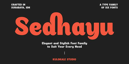 Sedhayu is a modern and bold sans serif font. It has a unique style and will give your design a friendly and expressive look. Sedhayu is perfect for many different projects such as logos and branding, invitation, stationery, wedding designs, social media posts, advertisements, product packaging, product designs, labels, photography, watermark, special events or anything. We hope you enjoy the font and have fun! Thank You.