10,000 search results
(0.511 seconds)
- Cosmic Age - Unknown license

- Teleprinter - Unknown license

- Savu by Hiekka Graphics,
$18.00 Savu is a hand-lettering font in four styles: regular, bold, condensed and condensed bold. It is recommended for use as a display typeface.
 - Tomcat by Trim Studio,
$8.00 The Tomcat Bold is a playful display font. It comes in a regular and bold style which will give your design a fun touch.
 - Liberation Mono - 100% free

- Liberation Serif - 100% free

- Liberation Sans - 100% free

- Benz Grotesk by Sign Studio,
$24.00 Benz Grotesk can be used to style text that requires attention in a sentence but still has subtlety. We try to keep every corner well proportioned. With more than 400 characters, we hope that Benz Grotesk can support a fairly complete language. Has a fairly high detail with inktrap on some corners of the body. This font will help you when designing posters, headlines, product branding, logotypes, minimalist typography and more.
 - Business Letter JNL by Jeff Levine,
$29.00 One of the text fonts showcased within the pages of the John Ryan Foundry (Baltimore, MD) specimen book from 1894 is a squared type face with rounded corners called “Geometric”. The original design has been updated slightly by substituting straight lines for the inner corner curves to add a small contemporary touch to a classic alphabet from the 19th century. Business Letter JNL is available in both regular and oblique versions.
 - Burnest by Adam Fathony,
$10.00 In collaboration with Renov Olivian who was experienced with hand-drawn lettering for a project. We've decided to create Vintage Inspirated Fonts with strong identity for an outdoor design, camping, wild, journey, adventure, masculine, and etc. Burnest Comes with 3 Weight, Thin, Light and Regular. On each Weight have 3 different style, Clean (sharp corner), Round (Rounded Corner), and Rough (Rough Version). 9 Fonts in Total for completing your design style.
 - ITC Motter Corpus by ITC,
$40.99ITC Motter Corpus was designed by the Austrian type designer Othmar Motter in 1993 to combine the display advantages of a sans serif extra bold design with the legibility of a roman weight. The Motter Corpus is available in the weights regular and condensed regular. The capitals with their strong strokes display slight irregularities and natural looking outlines. When used in very large point sizes the tiny serifs become noticeable. Distinguishing characteristics of this typeface are the unusual design of the g with its upward reaching ear and that of the capital C, whose curve ends in an angular stroke in its upper third. Almost, but not quite, a sans serif, the typeface has diminutive serifs which, along with its modulated weight contrasts, make ITC Motter Corpus remarkable legible in display applications and will give text a nostalgic feel. A similar typeface is Linotype Bariton. - Punk Rocker by Fenotype,
$18.00 PunkRocker is a bold condensed sans-serif with three versions and plenty of attitude. PunkRocker is awesome for creating strong tight square text boxes that scream for attention: it’s ideal for movie posters, single covers, as a supertool for fast graphic design. PunkRocker has three versions: Regular which is “clean”, Rough which has the worn-out appearance of a punk-poster or a gig poster that has been outside too long, and Stamp which has rugged outlines and print texture inside characters. Textured versions of PunkRocker have double characters for every standard character: Contextual Alternates will automatically replace any double letter with alternate that has different texture to avoid repetition and keep the appearance more authentic. You can also access these alternates by turning on Stylistic Alternates or via glyph palette. PunkRocker is PUA encoded so you can access extra glyphs in most graphic design softwares.
 - React by RagamKata,
$16.00 React is a classy, bold upper and lowercase typeface that looks incredible in both large and small settings. Best used as a display for headings and logos, React clean lines and smooth curves give any project an extra touch of class. A serif modern and classic typeface that has own unique style & modern look. This typeface is perfect for an elegant & luxury logo, book or movie title design, fashion brand, magazine, clothes, lettering, quotes, and so much more. Features: - Lowercase and Uppercase - Beautiful Alternates - Numerals & Punctuation - Accented characters - Multilingual HOW TO ACCESS ALTERNATE CHARACTERS Open glyphs panel: In Adobe Photoshop go to Window – glyphs In Adobe Illustrator go to Window - Type – glyphs I really hope you'll get pleasure using Reactfont and it will be perfect addition to your font collection! Contact me with an inbox message If you have any question. Thank you and enjoy!
 - Ryo Gothic PlusN by Adobe,
$79.00Ryo Gothic is a new Japanese sans serif (or gothic) kana typeface design. Created by Adobe type designer Ryoko Nishizuka , the typeface has a bright and speedy calligraphic touch and can be used to compose readable body text, as it gives a calm and well-controlled color to the typeset page. Supplied in OpenType format, each Ryo Gothic font includes hiragana, katakana and some punctuation marks and should be combined with the kanji and other glyphs in existing Japanese gothic typefaces that contain full character sets. This typeface family is available in seven weights--extra light, light, regular, medium, bold, heavy, and ultra heavy--which allow end users to select the best-matching weight for their favorite full-set Japanese gothic typeface. Creative professionals using the Japanese version of Adobe InDesign may use that program's Composite Font tool to easily combine Ryo Gothic with other typefaces. - Stapel by ParaType,
$30.00 Stapel is a contemporary closed sans serif with sci-fi looking forms and eloquent, thin stroke joints. The superfamily consists of three subfamilies of different width: Normal, Narrow and Condensed. Each subfamily contains seven weights with corresponding true italics. Additionally, there are several extra wide bold styles. All these styles work perfectly in headings and short display texts. Another important subfamily is Stapel Text which includes upright and italic styles of lower contrast and more generous spacing. Text styles are great for body text in small and medium point sizes. Most styles include alternate characters, proportional and lining figures, math symbols, fractions, currency signs and case-dependent punctuation. A wide range of styles and typographic features makes Stapel ideal for use in brand identity, infographics and all kinds of designs related to technology, science, finance, politics or sports. Stapel was designed by Alexander Lubovenko and released by Paratype in 2020.
 - Lakone by Locomotype,
$20.00 Lakone is a modern serif font that brings a touch of sophistication to your designs. With its narrow character and sleek aesthetics, Lakone is the perfect choice for titles and headlines that demand attention. But Lakone offers more than just good looks. With its extensive set of Opentype features, including dozens of ligatures, swashes, and alternatives, this font empowers you to unleash your creativity and elevate your typography game. These features provide you with endless possibilities to customize your designs and add that extra touch of elegance. Stand out from the crowd with Lakone. Whether you're designing a magazine cover, a logo, or a website, this font will captivate your audience and leave a lasting impression. Don't settle for ordinary typography when you can have the allure and versatility of Lakone. Get ready to elevate your design projects and make a bold statement with this modern serif font.
 - Royal Lodge by Putracetol,
$28.00 Royal Lodge - Display Sans Serif Font. Royal Lodge font makes for more fun, trendy and more lively. This font is inspired by the extra bold font style and well balanced curves.This font has a surprise from alternate that will make your work even more beautiful. This font is perfect for a professional touch which makes it even more unique and classic. But this font is also suitable for logos, branding, greeting cards, invitation cards, advertisements, titles, healines, book titles, stickers, packaging, quotes, posters, t-shirts/apparel, billboards and others. The alternative characters were divided into several Open Type features such as Swash, Stylistic Sets, Stylistic Alternates, Contextual Alternates, and Ligature. The Open Type features can be accessed by using Open Type savvy programs such as Adobe Illustrator, Adobe InDesign, Adobe Photoshop Corel Draw X version, And Microsoft Word. This font is also support multi language.
 - Hansplatz Grotesk by Heypentype,
$20.00 Hansplatz Grotesk is a sans serif type family of nine weight. Influenced by Akzidens Grotesk, Hansplatz typeface bring a new approach to this utilitarian style of grotesk. With more square proportions rather than geometric style, Hansplatz grotesk aimed to ease typesetting job when arranging a words or paragraph easily. A wide range of weight gives flexibility to every design project, hansplatz fit nicely to grid-system because of proportions. Furthermore Hansplatz Grotesk supplied with smart Opentype scripting to assist typesetter and designer very easily to Hansplatz feature. Hansplatz Grotesk truly a utilitarian, workhorse, neutral, and of course faceless. But, it makes the work done quickly. For display use, Hansplatz Grotesk Black to Semi-Bold is recommended, for paragraph heavy design, use regular and light weight. To spice up, adding Hairline or extra-light weight will make a design execution looks great and catchy but not intimidating.
 - SF Proverbial Gothic - Unknown license

- SF Arch Rival Extended - Unknown license

- SF Chrome Fenders - Unknown license

- SF Minced Meat - Unknown license

- SF Slapstick Comic - Unknown license

- SF Shai Fontai - Unknown license

- SF Intoxicated Blues - Unknown license

- SF Square Root - Unknown license

- Brink by 4RM Font,
$23.00 Inspired by the modern world, the Brink font appears with an extra expanded style combined with geometric letterforms, making this font look stylish, this font is included in the display font category that is suitable for use in graphic design, especially those with futuristic themes.
 - Shauqy by MC Creative,
$5.00 Shauqy is a font with a modern Calligraphy look and energetic. With extra attention to quick strokes and sharp details, is ready and perfectly fit for your logo designs, music projects & social media posts, event poster, brand imagery, product packaging, handwritten quotes, merchandise, etc.
 - Latisha Script by madjack.font,
$17.00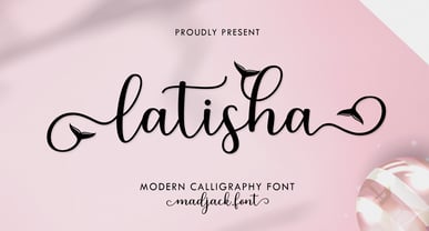 Latisha Script is a modern calligraphy design including Regular. This font is casual and pretty with EXTRAS. Can be used for various purposes. such as logos, product packaging, wedding invitations, branding, headlines, signage, labels, signatures, book covers, posters, quotes, and many more. Thank you, enjoy.
 - Quick Posty by Papermode Co,
$17.00 Quick Posty is a rugged handwitted font inspired by natural brush typography. Written in rapid motion using a slightly dry brush pen. This will give you a fresh and elegant design. Quick Posty comes with uppercase and lowercase numbers and Extras Swash. Included multilingual support
 - Mancave SRF by Stella Roberts Fonts,
$25.00 Mancave SRF is the perfect font for the ultimate party Neanderthal. Holding court in his den with a case of beer, wide screen TV and all of his sports buddies, he is safe and secure in his lair. Bold, brash and angular, this typeface was designed for Stella Roberts fonts by Jeff Levine. The net profits from my font sales help defer medical expenses for my siblings, who both suffer with Cystic Fibrosis and diabetes. Thank you.
 - Fred by E-phemera,
$20.00The Fred family is based on the casual hand lettering of Fred G. Cooper: cover artist, cartoonist, and letterer for Life magazine in the 1920s and '30s. His relaxed style captures the flavor of the Roaring Twenties, and the digital font was developed for use in the credits and title cards for a 1920s-style silent movie, The Call of Cthulhu. In an effort to keep the hand-lettered look, the OpenType font has numerous discretionary ligatures and contextual alternates, along with fleurons and ornaments. - Roca by My Creative Land,
$29.00 Initially started as an extension to Praline MCL, Roca transformed into a new font family - influenced by the same fonts as Praline - Windsor and Cooper Black - the hits of 60s and 70s – with a hint of Bookman. Created in 2 styles and 6 weights that can be mixed and match, it contains 24 fonts including alternates and true italics . It is full of OpenType features – stylistic alternates and ligatures. This multilingual font family supports most of the European languages as well as Cyrillic ones (Russian and Ukrainian).
 - Tarocco by MAC Rhino Fonts,
$18.00 Tarocco is a typical book face with good readability and rather tall x-height. The origin for this typeface is found in Nordisk Antikva. A typeface especially constructed with attention for the Swedish language. Waldemar Zachrisson was determined to realize his ideas and in 1906 he began to cooperate with the foundry Genzsch & Heyse, based in Hamburg. Some influences of Jugendt can be found and the typeface were released in 1910. It became rather popular until around 1930. The MRF version includes 7 weights all together.
 - Hand Writing of Janina by TypoGraphicDesign,
$19.00 The typeface Hand Writing of Janina is designed from 2021 for the font foundry Typo Graphic Design by Janina Fels & Manuel Viergutz. The character of the handwritten script typeface is rough, ruggend and raw. With state-of-the-art OpenType-Feature (like Contextual Alternates (calt) and Stylistic Alternates (salt)). Each uppercase and each lowercase letter has automatically alternated two variations to bring humanly-random characteristics of handwriting to life. 4 font-styles (Book, Bold, Dark & Icons) with 786 glyphs (Latin 3) incl. 100+ decorative extras like icons, arrows, catch words, dingbats, emojis, symbols, geometric shapes (type the word #LOVE for ♥︎ or #SMILE for ☺ as OpenType-Feature dlig) and stylistic alternates. For use in logos, magazines, posters, advertisement plus as webfont for decorative headlines. The font works best for display size. Have fun with this font & use the DEMO-FONT (with reduced glyph-set) FOR FREE! Font Specifications ■ Font Name: Hand Writing of Janina ■ Font Styles: 4 font-styles (Book, Bold, Dark, Icon) + DEMO (with reduced glyph-set) ■ Font Category: Display Script for headline size ■ Font Format:.otf (Mac + Win, for Print) + .woff (for Web) ■ Glyph Set: 786 glyphs (Latin 3 incl. decorative extras like icons) ■ Language Support: 93 languages: Afrikaans, Albanian, Asu, Basque, Bemba, Bena, Breton, Catalan, Chiga, Colognian, Cornish, Croatian, Czech, Danish, Dutch, Embu, English, Esperanto, Estonian, Faroese, Filipino, Finnish, French, Friulian, Galician, Ganda, German, Gusii, Hungarian, Inari Sami, Indonesian, Irish, Italian, Jola-Fonyi, Kabuverdianu, Kalenjin, Kamba, Kikuyu, Kinyarwanda, Latvian, Lithuanian, Lower Sorbian, Luo, Luxembourgish, Luyia, Machame, Makhuwa-Meetto, Makonde, Malagasy, Maltese, Manx, Meru, Morisyen, Northern Sami, North Ndebele, Norwegian Bokmål, NorwegianNynorsk, Nyankole, Oromo, Polish, Portuguese, Quechua, Romanian, Romansh, Rombo, Rundi, Rwa, Samburu, Sango, Sangu, Scottish Gaelic, Sena, Serbian, Shambala, Shona, Slovak, Soga, Somali, Spanish, Swahili, Swedish, Swiss German, Taita, Teso, Turkish, Upper Sorbian, Uzbek (Latin), Volapük, Vunjo, Walser, Welsh, Western Frisian, Zulu ■ Design Date: 2021 ■ Type Designer: Janina Fels, Manuel Viergutz
 - Serpentine by Image Club,
$29.99Dick Jensen (USA) designed Serpentine, is a contemporary-looking display font, for the Visual Graphics Corporation in 1972. With the rise of digital typesetting and desktop publishing, this typeface quickly became both popular and ubiquitous. This dynamic, wide, boxy design is identifiable via tiny triangular swellings at the stroke endings - what might be called semi-serifs. Serpentine is available in six different font styles: Light, Light Oblique, Medium, Medium Oblique, Bold, and Bold Oblique. Serpentine" is a greenish rock that sometimes resembles a serpent's skin, and is often used as a decorative stone in architecture. Though this font doesn't seem at all snaky or sinuous, it does have an architectural, stone-like solidity. The subtle, almost non-existent curves and semi-serifs keep it from being too stern or cold. Although the underlying strokes of each weight are similar, the six members of the Serpentine font family all present their own individual personalities. Serpentine Light lends itself well to text for onscreen displays, for instance, while the numbers from typeface's heavier weights are seen around the world on soccer jerseys! Additionally, the oblique styles convey a streamlined sense of speed, furthermore lending Serpentine well to sport and athletic applications (especially the faster, high-speed varieties). Because of its 1970s pedigree, Serpentine has come to be known as a genuine "retro" face. This makes the typeface even more appropriate for display usage, in applications such as logo design, magazine headlines, and party flyers. If you like Serpentine, check out the following similar fonts in the Linotype portfolio: Copperplate Gothic (similar serifs) Eurostile (similar width) Princetown (another "athletic" font) Insignia (similar "techno" feeling)" - Serpentine by Linotype,
$29.00Dick Jensen (USA) designed Serpentine, is a contemporary-looking display font, for the Visual Graphics Corporation in 1972. With the rise of digital typesetting and desktop publishing, this typeface quickly became both popular and ubiquitous. This dynamic, wide, boxy design is identifiable via tiny triangular swellings at the stroke endings - what might be called semi-serifs. Serpentine is available in six different font styles: Light, Light Oblique, Medium, Medium Oblique, Bold, and Bold Oblique. Serpentine" is a greenish rock that sometimes resembles a serpent's skin, and is often used as a decorative stone in architecture. Though this font doesn't seem at all snaky or sinuous, it does have an architectural, stone-like solidity. The subtle, almost non-existent curves and semi-serifs keep it from being too stern or cold. Although the underlying strokes of each weight are similar, the six members of the Serpentine font family all present their own individual personalities. Serpentine Light lends itself well to text for onscreen displays, for instance, while the numbers from typeface's heavier weights are seen around the world on soccer jerseys! Additionally, the oblique styles convey a streamlined sense of speed, furthermore lending Serpentine well to sport and athletic applications (especially the faster, high-speed varieties). Because of its 1970s pedigree, Serpentine has come to be known as a genuine "retro" face. This makes the typeface even more appropriate for display usage, in applications such as logo design, magazine headlines, and party flyers. If you like Serpentine, check out the following similar fonts in the Linotype portfolio: Copperplate Gothic (similar serifs) Eurostile (similar width) Princetown (another "athletic" font) Insignia (similar "techno" feeling)" - ITC Stone Sans II by ITC,
$45.99 The ITC Stone Sans II typeface family is new from the drawing board up. Sumner Stone, who designed the original faces in 1988, recently collaborated with Delve Withrington and Jim Wasco of Monotype Imaging to update the family of faces that bears his name. Sumner was the lead designer and project director for the full-blown reworking – and his own greatest critic. The collaborative design effort began as a relatively simple upgrade to the ITC Stone Sans family. As so often happens, however, the upgrade proved to be not so simple, and grew into a major design undertaking. “My initial intent,” recalls Sumner, “was to provide ITC Stone Sans with even greater versatility. I planned to add an additional weight, maybe two, and to give the family some condensed designs.” As Sumner began to look more closely at his twenty-year-old typeface, he decided that it would benefit from more extensive design improvements. “I found myself making numerous refinements to character shapes and proportions,” says Sumner. “The project scope expanded dramatically, and I’m pleased with the final result. The redesign has improved both the legibility and the overall appearance of the face.” The original ITC Stone Sans is part of the ITC Stone super family, along with ITC Stone Serif and ITC Stone Informal. In 2005 ITC Stone Humanist joined the family. All of these designs have always offered the same three weights: Medium, Semibold, and Bold – each with an italic counterpart. Over time, Stone Sans has emerged as the godfather of the family, a powerful design used for everything from fine books, annual reports and corporate identity programs, to restaurant menus, movie credits and advertising campaigns. ITC Stone Sans, however, lacked one attribute of many sans serif families: a large range of widths and weights. “These fonts had enjoyed great popularity for many years – during which graphic designers repeatedly asked for more weights and condensed designs in the family,” says Sumner. “Their comments were the impetus.” ITC Stone Sans II includes six weights ranging from an elegant Light to a commanding Extra Bold. An italic counterpart and suite of condensed designs complements every weight. In all, the new family encompasses 24 typefaces. The ITC Stone Sans II family is also available as a suite of OpenType Pro fonts, allowing graphic communicators to pair its versatile design with the capabilities of OpenType. These fonts offer automatic insertion of ligatures, small caps and use-sensitive figure designs; their extended character set also supports most Central European and many Eastern European languages. ITC Stone® Sans II font field guide including best practices, font pairings and alternatives.
 - Sesame Street - Unknown license

- Contract by resource.studio,
$25.00 A New Typographic workhorse with robust round over corner curvature construction. Rounded condensed sans serif. 331+ Characters Upper & Lowercase Adobe Latin 3 - CE


