10,000 search results
(0.033 seconds)
- Sackers Script by Monotype,
$40.99Sackers Roman is an engraver, all-capitals family for invitations and stationery. The letters have strong contrast between thin and thick strokes. See also Sackers Gothic, Sackers Square Gothic, Sackers Script, and Sackers Classic Roman. - Ounce by Typomancer,
$26.00 Ounce is a didone typeface, a combine of high-contrast and rounded characteristic gives a unique feeling. Ounce comes with various weights from Light to Black and two options for Italic. Especially, headline for display.
 - Sackers Classic Roman by Monotype,
$29.99Sackers Roman is an engraver, all-capitals family for invitations and stationery. The letters have strong contrast between thin and thick strokes. See also Sackers Gothic, Sackers Square Gothic, Sackers Script, and Sackers Classic Roman. - Ghazal by Fo Da,
$40.00 Ghazal is a display Arabic font with High contrast mainly used for headlines, it comes in single weight. This font is an excellent choice for all kinds of creative projects such as branding and advertising.
 - Desire Black by Evo Studio,
$17.00 Desire black typeface is designed by Evo Studio. A display typeface with bold and bold contrasts. You'll love using the many alternative options and binders, perfect for creating great designs like logos, heads or titles.
 - JP Hand - 100% free

- Archequare by Midtype,
$26.00 Archequare is a square font made with geometric shapes by adding a slight curve to the font to make it more varied and specifically designed for text content, long sentences such as mechanical instructions. However, Also useful for display, titling, captions by their sophisticated glyph shapes and their eye-catching geometry
 - Maggies Luck by Gleb Guralnyk,
$15.00 Hello! Introducing a layered display font — Maggie's Luck. It's a vintage style bold typeface with layered feature. Maggie's Luck Font has five "fonts-layers" for more convenient recoloring. This font has a multilingual support (check out a screenshot with available letters and signs). Thank you and wish you a peaceful sky!
 - Valgan by Patria Ari,
$15.00 Valgan is a bold, slanted, all-capital display font designed to energize sport-themed apparel and related content. Its dynamic style exudes power and motion, making it perfect for team logos, jerseys, posters, and event branding. Versatile and contemporary, Valgan ensures your designs command attention and convey the spirit of competition.
 - Space Show by David Engelby Foundry,
$25.00 Space Show and tell. This font is the no-nonsense choice in your design of clear and big display typography for many types of media – infographics, websites, menu cards, posters, web banners, logo, signs etc. The font has ligatures, unique alternates, hybrid and oldstyle numerals – and specially designed subscripts and superscripts.
 - Serba by Sealoung,
$15.00 Serba is a fun, unique look serif display. With a modern look, it looks perfect when paired with a conventional serif/sans serif. It can be used for mastheads, posters, business identity and just about anything else. The all-inclusive also includes the complete set: All caps Multilingual character Number Punctuation
 - Unitext Variable by Monotype,
$155.99Unitext Variable Regular is a single font file that features one axis: Weight. TFor your convenience, the Weight axis has preset instances from Hairline to Black. This Roman (upright) font is provided as an option to customers who do not need Italics, and want to keep file sizes to a minimum. - Landscape Alphabet by Celebrity Fontz,
$24.99A set of charming letters of the alphabet combining picturesque landscapes with inventive lettering. This entrancing and uniquely inventive font depicts a beautiful and decorative alphabet representing an idyllic era now gone. Includes one set of A-Z ornamental initials conveniently assigned to both the upper and lower case alphabet characters. - Kendrick by Monotype,
$15.99 A heavy-set but lively font, Kendrick’s dense strokes were hand-painted using a thick wet brush. This all-caps set of letters is bold but brushy, textured and expressive; fun but very much meaning business. Kendrick is streetwise and no-nonsense, but with a big cheesy grin to boot.
 - Roundup by Ingrimayne Type,
$10.00 The Roundup family was inspired by fonts from the late 19th century, though it is not based on any one of them. Roundup-Caps was the first of the group to be constructed. It has two sets of upper-case letters that have minor differences. It has reverse contrast, that is, the verticals are thinner than the horizontals. Unlike most of the "Old-West" fonts with reverse contrast, the serifs are not square but have an odd, rounded shape. Roundup-Regular replaced the second set of caps with lower-case letters. A bold style strengthens the vertical elements so that it no longer has reverse contrast. Both the regular and bold styles have matching oblique styles. Finally, there is a hollow version with a shadow to the lower right. This shadowed style has had its inside taken out, creating RoundUp-ShadowInside. The spacing is the same as RoundUpShadowed so it can be layered over RoundUpShadowed to easily create two-colored lettering.
 - Litto by VladB,
$12.00 The name of the font is taken from the concept "Littoral zone" - this is the part of the sea that is close to the shore. The width of the shore varies as a result of the tides. Hence the idea of my font family — changing the width of a character from condenced to extra expanded. Litto is a modern sans serif geometric font, includes upper and lower case characters, Latin and Cyrillic. Graphically, the characters have uniform thickness for all family.
 - Fetrina by Youthlabs,
$17.00 Fetrina is inspired by 90s trends which are made to still look modern, Fetrina uses contrasting circles to emphasize flexibility and flexibility in designing, Fetrina is suitable for brand headlines, marketing materials and other design needs.
 - Lev Serif by TypeFaith Fonts,
$15.00 Lev is a slab serif font, the rectangular serifs and the straight angled shoulders and links contrasting the curves and loops. Lev Serif is characterized by thick, block-like serifs. Lev contains 12 high quality fonts.
 - Apollonius by Typogama,
$25.00 Apollonius is a high contrast, display typeface designed by Michael Parson. Packed with Opentype features, this single weight font offers a whole range of options that designers can explore and play with to create stunning layouts.
 - Londonderry Air NF by Nick's Fonts,
$10.00 An elegant face with dashing swash caps, based on an old American Type Founders typeface called Canterbury. The Opentype version of this font supports Unicode 1250 (Central European) languages, as well as Unicode 1252 (Latin) languages.
 - Typogravure by Jonahfonts,
$40.00 A family with a retro feel with 12 styles in 6 weights, for both headlines and body text use as well editorial and corporate design from advertising to packaging and digital design. Supports Central/European languages.
 - Nickel Box NF by Nick's Fonts,
$10.00 No mystery here—it's a larrupin' good lighter version of the original Whiz-Bang Woodtype goody, Dime Box. Both versions of this font support the Latin 1252, Central European 1250, Turkish 1254 and Baltic 1257 codepages.
 - Leveller NF by Nick's Fonts,
$10.00 A typeface from the 1883 MacKellar, Smiths and Jordan specimen book, called Roundhead, offered the pattern for this rollicking headline face. Both versions support the Latin 1252, Central European 1250, Turkish 1254 and Baltic 1257 codepages.
 - Strassenmeister NF by Nick's Fonts,
$10.00 A long-lost gem from Herbert Thannhaeuser named "Buik" provided the inspiration for this classic Deco-era face. Both versions of this font support the Latin 1262, Central European 1250, Turkish 1254 and Baltic 1257 codepages.
 - Snob by Juraj Chrastina,
$39.00 Snob is a high-contrast display face with a touch of luxury. It represents a classy typeface with a fashion magazine style. You can easily combine Snob with Ambassador, which was the base for creating Snob.
 - Aorytha by Namara Creative Studio,
$20.00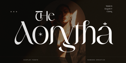 Modern display typeface with beautiful contrast. Decorative details on each character maintain its classy composure. Perfect for logo/branding identity, headline, wedding invitation, poster, and more, to create a project with a classy and luxury touch.
 - RMU Magnet by RMU,
$35.00 Based upon remnants of the Ludwig & Mayer font Magnet, first released in 1951, this Italian-style design was completely redrawn and extended for most main European languages, West and Central, plus a character set for Turkish.
 - Iron Lake by Alphabet Agency,
$15.00 Iron Lake is inspired by the pioneer era. The font has a decorative slab serif that really gives the font its vintage western look. The font works great for vintage, western, country, outdoors and rural themes.
 - Well Said Black NF by Nick's Fonts,
$10.00 This commanding typeface is based on Welling Black, a Fotostar offering from the 1970s. Equally well suited for headlines and subheads. Both versions support the Latin 1252, Central European 1250, Turkish 1254 and Baltic 1257 codepages.
 - Janger by Creativemedialab,
$18.00 Introducing Janger, a bold and fun display font. Janger features a reverse contrast style with a retro and psychedelic look that’s simply ideal for design such as posters, t-shirts, branding, heading, titles and many more
 - Olden Daze NF by Nick's Fonts,
$10.00 Another gem found in the pages of "Alphabets A to Z": rustic and rollicking fun in one face. Both versions of this font support the Latin 1262, Central European 1250, Turkish 1254 and Baltic 1257 codepages.
 - Flamenco Inline by ITC,
$29.99Flamenco is the work of British artist Tony Geddes. Its versatile display style has an inline contour decoration and a controlled yet casual appearance. Flamenco will guarantee visual excitement across a vast range of advertising applications. - Stigsa Display by Seniors Studio,
$25.00 Stigsa Display is a high-contrast typeface inspired by transitional and contemporary typefaces. A vertical stress with sharp serifs, delicate and legible. Stigsa Display family consist of 35 fonts: 7 weigths and 5 widths. With 1143 glyphs each. Stigsa Display family with various styles will be an handy tool for a wide variety of designs. The typeface high contrast designed for use in big text sizes and medium sizes. Via the OpenType features allow for the implementation of typographic niceties such as small caps, tabular figures and oldstyle figures, ligatures, case-sensitive, fractions and extended language support.
 - Rever by ParaType,
$30.00 Rever is an experimental typeface by a young designer Sasha Smirnov. It clearly alludes to 19th century typefaces with reverse contrast, but still the character shapes are as simple and geometric as possible. Rever answers the question “What can a reverse-contrast typeface look like today?” Its set of styles is non-traditional: in addition to a regular one, there are also an oblique (slanted to the left, not to the right!) and a stencil styles. The typeface can work for typographic experiments of any kind -- web, print or motion design. The font was released by Paratype in 2019.
 - Ragiel by Greentrik6789,
$16.00 Ragiel is an elegant and classy serif font, inspired by a didone-style font with high contrast and upright axes. With high contrast it will be very suitable for display needs such as posters, advertisements, logos, billboards, covers, labels, and various types of display designs. Ragiel is equipped with uppercase and lowercase characters that support multi-language, and comes in 3 styles and 3 weights in each style to add aesthetics to your artwork. We hope you enjoy this font, and don't hesitate to leave a comment or message if you have problems or questions. Thank you :)
 - Mezzotint CF by Connary Fagen,
$25.00 Mezzotint CF is a daring and playful display typeface perfect for logotypes, posters, and editorial use. High-contrast strokes, flared serifs, aqueous connections, and inky terminals give Mezzotint CF its striking and rakish personality. Includes roman and italic sets across a single bold weight, with wide language support, optional ligatures, OpenType alternates, and more. Mezzotint CF pairs well with a contrasting, simple geometric sans-serif like Greycliff CF; for maximum effect, try a large difference in typeface size between the two. All typefaces from Connary Fagen include free updates, including new features, and free technical support.
 - Roscha by Luhop Creative,
$14.00 Roscha is a fully reconsidered high contrast transitional serif, which is perfectly adapted to modern realities and requirements. When starting this project, we wanted to try to draw a modern serif with the precisely verified shapes, high contrast and detailed elaboration of each character. Roscha is perfect for use in magazines, in the fashion industry, in the branding of premium goods and services. Roscha is quite versatile and suitable for use both in headings and in text arrays. In addition, we have done manual hinting in the typeface, and now it can be used with a clear conscience in the web and applications.
 - Glitzy by Ingrimayne Type,
$9.95 Glitzy is a caps-only font with extreme contrast. It was inspired by Art Deco typefaces, especially Broadway by Morris Fuller Benton, but Glitzy is not an attempt to reproduce that typeface. The letters on the lower-case keys differ slightly from the letters on the upper-case keys. The large black interiors invite decoration and the family includes four faces with interior decoration. These four faces with interior decoration can be used in layers with the base font to add color to lettering. (OakPark is a another attempt to do high-contrast lettering with an Art Deco feel.)
 - Kenac by Latinotype,
$29.00 Kenac is an elegant, fresh and modern serif typeface, with unusual yet functional shapes, that combines characteristics of Roman type with elements of calligraphy and Victorian style. Its singular modulation and contrast between thick and thin strokes make it look great in titles. In order to ensure ease of use, the Kenac family includes only 5 weights while its matching italics provide contrast and make the font a harmonic choice for continuous text. Kenac has a unique appearance that makes it ideal for editorial design such as book covers and magazine website's headers as well as brand identity design.
 - Iwan Zaza Arabic by Zaza type,
$29.00 Iwan Zaza is a high-contrast modern Arabic typeface designed by Ahmed Zaza. The design is inspired by the Kufi calligraphic style and influenced by the Naskh style. Iwan balances classic and contemporary tastes with wide open counters and short ascenders and descenders that minimize the hight. And has a high - contrast between the vertical and the horizontal to line up in harmony with Latin. And openType alternates and ligatures set. This makes it suitable for branding, editorial, packaging and advertising. Iwan features five weights from Light to Black, and supports OpenType features for Arabic, and has a wide glyph set.
