10,000 search results
(0.023 seconds)
- Mastel Gerling by madeDeduk,
$14.00 Mastel Gerling is a modern handwritten Brush. This font perfect for poster design, book covers, merchandise, fashion campaigns, newsletters, branding, advertising, magazines, greeting cards, album covers, and quote designs and more. Feature Uppercase & Lowercase Number & Symbol International Glyphs Multilingual support Alternative Ligature Thanks so much for checking out my shop and feel free to drop us a message any time and follow my shop for upcoming updates
 - SugarBoo by Inumocca,
$20.00 SugarBoo is A Reverse-Contrast letterform , Modern look, Fresh, eyecatching, strong character and power full. The Typeface comes with Stylistic Set Combinations Exellent typeface to use for covering your Project, like Branding, Movie Title, Headline Letter, Bookcover or Book Content, Magazine cover, Poster, Quotes Lettering, Logos, and more your project design. - Unique glyphs - Multilingual Characters Support - UPPERCASE - Lowercase - Numeric - Symbol - Punctuation Character - Stylistic Set inumocca type Studio
 - Laguna Vintage by Aiyari,
$25.00 Introducing Laguna Font Collection. Inspired from American motor inn signs and vintage restaurant signs in 50s-70s. Laguna comes with open type features such stylistic alternates, stylistic sets, contextual alternates & ligatures. Also available in variable font format. Laguna Font Collection is best uses for headings, Logo type, quotes, apparel design, invitations, flyer, poster, greeting cards, product packaging, book cover, printed quotes, cover album, movie, etc
 - Moho by John Moore Type Foundry,
$40.00 Moho is a broad family of types inspired by the burgeoning modernism of the early twentieth century. Moho introduces an unconventional style in the form of his glyphs which aims to impregnate the text compounds thus a distinctive aesthetic sobriety and elegance while creating a flow of practical reading. The Moho family consists of a wide range of various weights. Thought for innovative text composition, Moho covers all shades of Medium, Regular, Light, ExtraLight to delicate Thin. Moho has a square shape letter style, provided with a competent OpenType programming for Moho OT family and basic functions for Moho Std family. Among the family characteristics OT has features such as small caps for letters and numbers, stylistics alternates, swash letters where "t" is extend over others, giving the typeface that particular style ideal for headlines, ligatures for pairs and triplets of letters, fractions and ordinals. In addition, each comes with its weight set italics. Moho has a character set to compose texts in European languages of east and west with over 600 glyphs. Moho is a letter in resonance for general topics like sports, art. technology trends, fashion, tourism and transport. There exist two groups of Moho Family OT = Full OpenType Features and full set of glyphs Std= Basic OpenType Features and less glyphs
 - Montgova Script by Mercurial,
$22.00 Say hello to Montgova! a lovely elegant calligraphy with adorable ornaments. more than 120 included Opentype Stylish Alternate letters and ligatures, allow you to mould your type design any way you like:) It also includes a fancy little bonus ornaments font. A delicate modern calligraphy script ideal for weddings, elegant branding like greeting cards, sublimation, wedding invitation, branding materials, business cards, quotes, posters, aheadings, signature, logos, t-shirt, letterhead, signage, lable, news, posters, badges and adding a lovely feel to your projects What's new ? This font is equipped with Latin pro. which covers various languages in the world with a wider range and can be used easily. For Opentype capable software ( Photoshop CC or any version of Illustrator/ Indesign), Montgova also comes with Opentype features such as access to all the alternate letters and double letter ligatures. And this Font has given PUA unicode (specially coded fonts). so that all the alternate characters can easily be accessed in full by a craftsman or designer. Don't forget to check out other cool fonts on our store and wait for new fonts. Follow our shop for upcoming updates including additional glyphs and language support. feel free to send me a message, comment, like and share. Thanks
 - Trump Gothic Pro by Canada Type,
$39.95 Trump Gothic is a reconception of ideas from Georg Trump's seminal 1955 Signum typeface and its later reworking (Kamene) by Czech designer Stanislav Marso. Originally cobbled together for a variety of film projects in the late 1990s and early 2000s, the Trump Gothic family was made available for the general public in 2005. Shortly thereafter, it became a common sight in movie credits, on posters and magazine covers, in fashion branding and on corporate web sites. Though countless attempts have been made to emulate it, its unique totality and attractiveness to layout designers was never really topped. Its appeal is largely due to its double-duty toolbox: An economic functionality that allows it to pack large amounts of information in small spaces, and a clear, modular aesthetic that gives it the ability to emphasize short text in large sizes, all without sacrificing legibility or giving in to dated or over-rehashed industrial gothic forms. The typeface was redrawn, refitted, optimized and greatly expanded in 2013, and the result is Trump Gothic Pro, a multiscript family of six fonts, each containing over 1020 glyphs and a wealth of OpenType features, including small caps, caps-to-small-caps, stylistic alternates, unicase/monocase alternates, fractions, ordinals, class-based kerning, and support for Latin, Cyrillic and Greek locales.
 - Pykes Peak by Sentinel Type,
$30.00Pyke's Peak is a spirit type descended from Paeleoflex: The Angel of the Odd. Wraith-like forms mix Roman inscriptional letters with an ar'deco theme for an ethereal graphic art effect. Suitable for magazines and editorial design, book jackets & interiors, posters & broadsides, art & craft objects and other things needing a touch of the extraordinary. Over 500 extra characters give Pyke's Peak unusual range and ability. Mirror capitals, phantom forms, dot phantoms, "superposed" (overlapping) ligatures, capitalized ligatures and fitted pairs for hours of trippy rub-down arcadian magic. Includes hanging numerals, lining numerals, full punctuation, standard math & monetary symbols. Accented characters for Latin 1 and Latin 2 cover the following languages: Albanian, Catalan, Danish, Dutch, English, Estonian, Finnish, French, German, Icelandic, Italian, Norwegian, Spanish and Swedish. Available in OpenType format only. Pykes Peak comes in two versions: (1) Pyke's Peak the full-blown OpenType version with over 500 extra characters, (2) Pyke's Peak Zero, the zero cost version with full Latin 1 & 2 character set but no extra characters. Pyke's Peak Zero is free to download, is licensed for commercial and personal (non-profit) use, and may be embedded on webpages using the CSS @font-face property. This typeface is dedicated to Australian musician James "Jock" Paull, who is a free spirit. - Achates by Karandash,
$29.00 Good, faithful Achates… Named after the trusty Trojan that followed Aeneas throughout his adventures, Achates is a humanist sans workhorse well suitable for broad range of design projects. Its soft, delicate and almost cursive shapes define warm and friendly typeface that is legible and easy on the reader's eye. Following into the footsteps of its namesake, it is humble, informal yet stable and trustworthy. Ideally suited for advertising and packaging, editorial and publishing, logo, branding and creative industries, poster and billboards, small text and signage as well as web and screen design. Achates provides a broad range of advanced typographical features such as language localization, alternates, stylistic alternates, extended ligatures, fractions and case-sensitive forms. It comes with a complete figure range set of old-style, lining and tabular figures. The family has extensive multilingual support, covering more than 70 Latin-based languages and specially designed Cyrillic with Bulgarian and Russian localization. As Achates was a humble hero, a devoted friend and faithful companion to Aeneas on his journey to greatness, so this font can be your trusty sidekick on your creative path. The marvelous Agate is also named after the Trojan hero. It is considered as the stone to call on for support when you need stability and grounding in your life. Along with its supportive energy, the Agate stone has been long admired for its incredible beauty. So… a Trojan hero or a thing of beauty – it is up for you to decide… or just maybe both!
 - Altura by Jonahfonts,
$35.00 Uncommon-serifs with common Glyphs. Recommended for posters, titles, book covers, books, greeting cards, signage, packaging, invitations, magazine articles and advertising.
 - Number 515 by Wooden Type Fonts,
$20.00 A display style, with protuding bulb round ends at the serifs and mid-points, very bold, lower case originally not designed.
 - Lettergical by Ingrimayne Type,
$14.95 The lower case of Lettergical is a mixture of several medieval styles and the upper case is a variant of Lombardic.
 - Fun And Games JNL by Jeff Levine,
$29.00 Fun and Games JNL was redrawn from the lettering found on the cover of a 1935 Speedball® Lettering Pen book.
 - Choob Stripes by Aah Yes,
$2.95Choob Stripes is reminiscent of pipes and tubes, and other mechanical works. Upper Case has the small circle, lower case doesn't. - Number5 Reg by Wooden Type Fonts,
$15.00 A William Page font, a variation of the William Page 500 font, with wider lower case, more clearly worked upper case.
 - Novia by VladB,
$12.00 Novia is a modern sans serif geometric font, includes upper and lower case characters, Latin, Cyrillic, Latin Extended symbols and other.
 - Cupcake Mystery by Bogstav,
$17.00 Who took the last cupcake? It's a mystery! This lovely cookie Is made out of crunchy handmade lines, and comes with 7 different versions of each letter - these automatically cycles as you type. Pretty lovely, if you ask me! On top of all this, Cupcake Mystery has multilingual support! Enjoy!
 - Christmas Neighborhood by Mvmet,
$15.00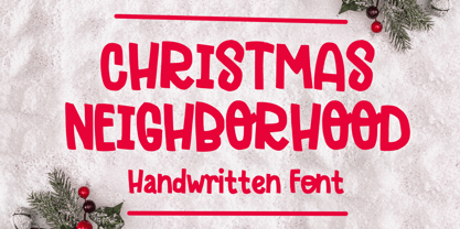 Christmas Neighborhood is your perfect stylish Christmas font. You can use it for anything ranging from t-shirts, kids’ book designs, and greeting cards to stickers and posters, or anything that needs a casual touch. Fall in love with its incredibly versatile style, and use it to create lovely designs!
 - Winter Quarter by Mvmet,
$12.00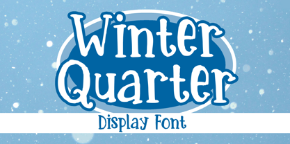 Winter Quarter is your perfect winter and season font. You can use it for anything ranging from t-shirts, kids’ book designs, and greeting cards to stickers and posters, or anything that needs a casual touch. Fall in love with its incredibly versatile style, and use it to create lovely designs!
 - Sweet Cane Comic by Mvmet,
$15.00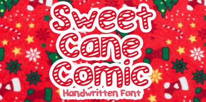 Sweet Cane Comic is a festive Christmas font. You can use it for anything ranging from t-shirts, kids’ book designs, and greeting cards to stickers and posters, or anything that needs a casual touch. Fall in love with its incredibly versatile style, and use it to create lovely designs!
 - Retro Candy by Mvmet,
$10.00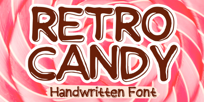 Retro Candy is a cool retro style candy display font. You can use it for anything ranging from t-shirts, kids’ book designs, greeting cards, stickers, and posters, or anything that needs a casual touch. Fall in love with its incredibly versatile style, and use it to create lovely designs!
 - Xmas Bubbles by Mvmet,
$18.00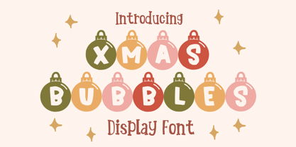 Xmas Bubbles is a cool ornamental Christmas display font. You can use it for anything ranging from t-shirts, kids’ book designs, and greeting cards to stickers and posters, or anything that needs a casual touch. Fall in love with its incredibly versatile style, and use it to create lovely designs!
 - Christmas Kringle by Mvmet,
$16.00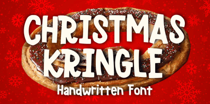 Christmas Kringle is a fun and festive Christmas display font. You can use it for anything ranging from t-shirts, book designs, and greeting cards to stickers and posters, or anything that needs a casual touch. Fall in love with its incredibly versatile style, and use it to create lovely designs!
 - AmpleAlt by Soneri Type,
$50.00 AmpleAlt is a alternate version derived from Ample type family. AmpleAlt is a display type family, optical mono linear and a bit squarish in nature. It has smooth curve instead of sharp angle formed by the junction of two strokes, which is a prominent feature of its design. It is designed to be a little eye-catching yet legible. It has clear and distinguishable letterforms, which helps to elaborate and emphasis the message. It is graphically strong and command viewer's attention. The overall appearance of type is suitable in setting it as heading, title, headline, etc. The type family consists of six weights viz. Thin, ExLight, Light, Regular, Medium and Bold. Considering the nature of this type family, italics have been excluded. AmpleAlt is designed by Aakash Soneri in the year 2014.
 - Nolan by Kastelov,
$55.00 The idea behind Nolan is to create emotional response due to its inviting character and legibility. It is ideal for headlines, presentations, product signage and bespoke logotypes. Due to the structure of the letters, Nolan can also stand its ground in body text, although this is not its primary purpose. Nolan is created slightly wider than what is to be expected from a typical sans font, yet not to the point of being considered a wide typeface. This uniqueness lends the family an air of originality while adhering to already established standards in the creation of contemporary sans typefaces. Nolan has a large x-height, so as to deliver a better punch and be legible at a glance . Its clean and modern lines are reminiscent of architectural aesthetic.
 - Altra Two by Hackberry Font Foundry,
$24.95AltraTwo is a complete redraw of a family based on a tracing of a clip art font from an old printed book. The AltraTwo family adds italic, black, and black italic. I liked the gentle calligraphic look. Consider it a sans serif with style. This is a typical NuevoDeco OpenType pro font with caps, lowercase, small caps, lining, oldstyle, and small cap figures, numerators, denominators, fractions, swashes, and so on. There aren't many unusal ligatures for this one, though. It does have the Latin 2 character set or what Adobe calls CE, Central European characters. Altra has been my preferred header face for sevral years. it also works very well for body copy. I usually use it for my contrasting tip and quote paragraphs with Bergsland Pro as my normal body copy. - AmpleSoft by Soneri Type,
$50.00 AmpleSoft is a softer version derived from Ample type family. AmpleSoft is a display type family, optical mono linear and a bit squarish in nature. It has smooth curve instead of sharp angle formed by the junction of two strokes, which is a prominent feature of its design. It is designed to be a little eye-catching yet legible. It has clear and distinguishable letterforms, which helps to elaborate and emphasis the message. It is graphically strong and command viewerís attention. The overall appearance of type is suitable in setting it as heading, title, headline, etc. The type family consists of six weights viz. Thin, ExLight, Light, Regular, Medium and Bold. Considering the nature of this type family, italics have been excluded. AmpleSoft is designed by Aakash Soneri in the year 2014.
 - Jet by Brownfox,
$39.99 Jet is an assertive italic sans that anticipates the return of the simpler, optimistic times when progress was considered positive and forward seemed to be the only way to go. It may have felt right at home in the mid-1970s, the time of Sc-Fi, synthetics and disco, yet it unmistakably belongs to the present. Its dynamic sturdy forms and angular tapering of some horizontal forms convey movement and edgy impatience for change, with a few re-imagined details, like the reversed slant on top of the lowercase t and the atypical round counter of the lowercase a, showing a new hope for the bygone optimism. Available in five weights in Latin and Cyrillic, supporting many languages, with stylistic alternates and two sets of figures. Designed by Gayaneh Bagdasaryan and Vyacheslav Kirilenko, 2020
 - Outright Horror by Wing's Art Studio,
$10.00 This new addition to my Video Store font series takes a scratched lettering style and pairs it with a wildly spontaneous brush font with horrific effect! Given life by an unknowable hand, this font clawed into the misty midnight inspired by retro horror movies, ghost stories and unsettling fireside tales. A boiling pot of misspent youth reading Edgar Allen Poe, M.R. James and H.P. Lovecraft. Outright Horror comes with an all-caps scratched style font with a subtly controlled Art Deco feel and a contrasting brush font that ramps up the fear! Consider it’s Regular style the skeleton that holds the Bold creeping flesh, ready for some horrific Halloween designs! It also comes with numerals, punctuation, language support, custom underlines and automatic ligatures. Contents: Outright Horror Regular Outright Horror Bold Underlines
 - Clear Sans by Positype,
$29.00 Clear Sans™ is a… wait for it… rational geometric sans serif. It is intended to fill a niche… to provide an alternative to the somewhat based-on-vernacular signage, somewhat geometric sans. I hear the word vernacular thrown around too much and too loosely. If a typeface is based in the vernacular, based on hand-painted or hand-crafted signage, then it should be based on the movements of the hand, retain that warmth and not on a pretty geometric model. For me, clean, geometric and precise doesn't have to be cold and expressionless. The original skeleton was hand-painted in 2008 to help determine and inform my decisions going forward. The typeface was completed shortly afterwards at the behest of an old friend for their identity. As usual, I expanded it, but considered retiring it since there were so many things similar out there. Years later, I had a chance to rediscover it and came to the conclusion that it could be improved, expanded in a logical and useful way, and introduced. I would be lying if I didn't admit that the rise of webfonts and embedded type in applications influenced many of the decisions I made about reworking Clear Sans™. Completely new Text and Screen fonts were developed that utitlize larger x-heights, space-saving widths, logical (and simplified) weight offerings… to name a few alterations. Even the pricing of each variant was considered to produce a more reasonable and simple solution for the developer, designer, professional and novice. Clear Sans™ is a departure from my previous sans serifs, but the influences of Aaux Next, Akagi Pro and Halogen are evident. Enjoy a light-hearted mini-site devoted to Clear Sans™
 - Clear Sans Text by Positype,
$25.00 Clear Sans™ is a… wait for it… rational geometric sans serif. It is intended to fill a niche… to provide an alternative to the somewhat based-on-vernacular signage, somewhat geometric sans. I hear the word vernacular thrown around too much and too loosely. If a typeface is based in the vernacular, based on hand-painted or hand-crafted signage, then it should be based on the movements of the hand, retain that warmth and not on a pretty geometric model. For me, clean, geometric and precise doesn't have to be cold and expressionless. The original skeleton was hand-painted in 2008 to help determine and inform my decisions going forward. The typeface was completed shortly afterwards at the behest of an old friend for their identity. As usual, I expanded it, but considered retiring it since there were so many things similar out there. Years later, I had a chance to rediscover it and came to the conclusion that it could be improved, expanded in a logical and useful way, and introduced. I would be lying if I didn't admit that the rise of webfonts and embedded type in applications influenced many of the decisions I made about reworking Clear Sans™. Completely new Text and Screen fonts were developed that utitlize larger x-heights, space-saving widths, logical (and simplified) weight offerings… to name a few alterations. Even the pricing of each variant was considered to produce a more reasonable and simple solution for the developer, designer, professional and novice. Clear Sans™ is a departure from my previous sans serifs, but the influences of Aaux Next, Akagi Pro and Halogen are evident. Enjoy a light-hearted mini-site devoted to Clear Sans™
 - Clear Sans Screen by Positype,
$21.00 Clear Sans™ is a… wait for it… rational geometric sans serif. It is intended to fill a niche… to provide an alternative to the somewhat based-on-vernacular signage, somewhat geometric sans. I hear the word vernacular thrown around too much and too loosely. If a typeface is based in the vernacular, based on hand-painted or hand-crafted signage, then it should be based on the movements of the hand, retain that warmth and not on a pretty geometric model. For me, clean, geometric and precise doesn't have to be cold and expressionless. The original skeleton was hand-painted in 2008 to help determine and inform my decisions going forward. The typeface was completed shortly afterwards at the behest of an old friend for their identity. As usual, I expanded it, but considered retiring it since there were so many things similar out there. Years later, I had a chance to rediscover it and came to the conclusion that it could be improved, expanded in a logical and useful way, and introduced. I would be lying if I didn't admit that the rise of webfonts and embedded type in applications influenced many of the decisions I made about reworking Clear Sans™. Completely new Text and Screen fonts were developed that utitlize larger x-heights, space-saving widths, logical (and simplified) weight offerings… to name a few alterations. Even the pricing of each variant was considered to produce a more reasonable and simple solution for the developer, designer, professional and novice. Clear Sans™ is a departure from my previous sans serifs, but the influences of Aaux Next, Akagi Pro and Halogen are evident. Enjoy a light-hearted mini-site devoted to Clear Sans™
 - Anger & Wrath by Omaikraf Studio,
$10.00 Introducing "Anger Style": Unleash the Power of Emotion Are you ready to harness the raw energy of emotions and bring them to life in your designs? Look no further than "Anger Style," an electrifying and dynamic font that will leave a lasting impact on your audience. Designed by our team of expert font designers, "Anger Style" is a captivating blend of intensity, power, and expressiveness. Possible Design Uses: "Anger Style" is a font that excels in making a bold statement. Its commanding presence and fiery nature make it perfect for various design applications, including: Headlines and Titles: Grab your audience's attention and make a lasting impression with powerful headlines that demand to be noticed. Logos and Branding: Infuse your brand identity with passion and intensity, creating a memorable and distinct visual presence. Posters and Flyers: Advertise events, concerts, or special promotions with eye-catching designs that embody rebelliousness and energy. Book Covers: Create striking covers that captivate readers and convey the emotional depth of your story or message. Apparel and Merchandise: Add an edgy touch to your clothing designs, making a statement that resonates with your target audience. Unique Qualities: What sets "Anger Style" apart from other fonts is its ability to evoke a wide range of emotions, not just anger. It transcends its name, allowing you to express passion, determination, and rebellion through your designs. Its versatility lies in its bold strokes and sharp edges, which convey a sense of intensity and power. By choosing "Anger Style," you gain access to a font that embodies the very essence of raw human emotion. Font Pairing: "Anger Style" pairs exceptionally well with other fonts that complement its intensity and create harmonious combinations. Consider combining it with: "Bold Sans Serifs": The clean lines and strong presence of a bold sans serif font can enhance the impact of "Anger Style," creating a balanced and eye-catching composition. "Elegant Script Fonts": To add a touch of contrast and sophistication, pairing "Anger Style" with an elegant script font can create a visually engaging and dynamic design. Functional Aspects: "Anger Style" offers a range of functional aspects designed to enhance your creative possibilities: Styles: "Anger Style" is available in bold and regular styles, allowing you to emphasize different levels of intensity within your designs. Character Sets: The font includes an extensive character set, covering uppercase and lowercase letters, numbers, punctuation marks, and special characters. This ensures versatility and legibility across various design projects. Special Features: "Anger Style" includes stylistic alternates and ligatures, providing you with additional design options and allowing you to create a truly customized and unique look.
 - Zahran by NamelaType,
$19.00 Zahran is a lovely Latin and Arabic handwritten script, Inspired by modern calligraphy style. This style is a challenge for me in designing Arabic letters, I tried joining Arabic on one side so that the baseline shape is dynamic. Come with many feature; Stylistic alternate, character variant (cv01 to cv12), ligatures, multilingual characters, begining and ending swash, and lovely connecter for lowercase, that can be accessed with opentype feature. Zahran is perfect for branding project, product packaging, tile, logo, wedding, quotes and where ever you need lovely design.
 - Joyful Reason by Sipanji21,
$15.00 Joyful Reason is a delightful and charming Display font that exudes a sense of love and cuteness. With its gentle and playful strokes, this font captures the essence of affection and tenderness. Each letter carries a unique and whimsical touch, resembling handwritten notes filled with love. Joyful Reason is perfect for adding a romantic and joyful touch to various design projects, such as greeting cards, invitations, social media posts, and more. Its lovely and cute characteristics make it an ideal choice for expressing heartfelt emotions in a visually appealing way.
 - Shark - 100% free

- Q Typ by Funk King,
$5.00 Q Typ is a quirky little fun font inspired by those lovely cotton sticks.
 - Augenblick by Etewut,
$20.00 I'm glad to introduce Augenblick! My new font fits to your design be it wedding invitation, corporative Identity or bottle of wine. Send flowers to your lover with a card signed with Augenblick, and see what happens! It has multi language support, so, please use your mother tongue. Good luck & be happy!
 - Amellia by Haksen,
$12.00 Hello Font lovers, I just released my new font with the name "Amellia" "Amellia" is one of beauty script font with many alternate fonts. WHAT YOU GET? - Amellia otf with many alternates. As You can see in the preview. You will make many of version in every letters. Thanks for visited. Happy Designs
 - ITC Cinderella by ITC,
$29.99Some typefaces are staid, somber design tools. Then again, there's ITC Cinderella from Patricia Lillie: a typeface that's light-footed as a ballerina and joyful as a child at play. “There is a group of display faces that I simply love. Type that just seems to dance, type that makes me smile, designs that, when I see them, I say, "Boy, do I wish that was one of mine" says Lillie. “Although I never wanted to imitate these designs, when Cinderella started to emerge, I felt like it was the closest I've come to that quality.” ITC Cinderella projects gaiety and freedom. Capitals harmonize with a lowercase that bounces along with a lively, carefree attitude. Stroke weight stress is, well, all over the place. Curlicues abound. This delightful design is just that: brimming with delight. - Varisse Variable by AVP,
$79.00 Varisse spans over two centuries of type design and draws its inspiration from well-loved classics that are as fresh today as they were when they were created. The range stretches from a quintessential 18th century transitional serif to an uncompromising 20th century sans. Think Baskerville, think Gill. The idea was to create a family that shared similar forms and the same vertical metrics, allowing them to be mixed to provide impact and readability as required. With a generous x-height and a host of options, Varisse Variable is ideally suited to branding, packaging, magazines and editorial. It also provides a wealth of opportunity in website presentation. The variable axes of weight and serif allow selection of styles from sans light to serif heavy with all the options in between.
