10,000 search results
(0.039 seconds)
- Spencerian Palmer Penmanship Pro by Intellecta Design,
$38.90 The concepts of Spencerian Palmer Penmanship PRO come from the Palmer’s Penmanship guides and calligraphy manuals from XIX century. This enhanced OpenType version has complete set in Latin alphabet with Central European, Vietnamese, Baltic and Turkish complete resources with all diacritic signs and punctuation marks plus extra characters belonging this ranges. Spencerian Palmer Penmanship PRO presents you with extra sets of stylistic alternates, swashes, ornaments, tails (to artistic increase any letter of this font) and plus over of 120 contextual alternates solutions - ligatures providing a lot of letterform variations that make this type family looks like a real handwriting on a page or the exact fancy text you wish. Over 500 glyphs which you have total access using software such as InDesign, Illustrator, QuarkXpress and others.
 - Aloha Script by Borges Lettering,
$49.95 Aloha! Veteran Sign Painter Pierre Tardif and Lettering Artist Charles Borges de Oliveria have teamed up to bring you these fun to use brush fonts. Aloha Script comes in two flavors: Aloha Script and Aloha Script Casual. Both fonts contain the same lowercase, alternates, and ligatures – the difference is in the capitals. By mixing both fonts you can create a variety of unique logos. Aloha Scripts Casual can be set in all caps for greater emphasis on captions. Both fonts contains over 100 alternate characters, as well as an assortment of ligatures, swashes and underlines. With over a year and a half in development, Aloha is bound to please. Great for logo design, signs, posters, culinary food packaging and so much more. Aloha!
 - Kinetika by Kastelov,
$40.00 Kinetika is a geometric sans serif family that comes in 20 weights, including uprights and matching italics. The idea behind Kinetika was to create a very impactful display type family that would be perfect for branding — to do so it needed to have large x-height, distinctive and legible letterforms as well as friendly characters. In summary the font family is ideal for a variety of cases including advertising, branding, motion design, editorial, packaging and most importantly websites. Each font features 800+ finely crafted glyphs, smart quotes, tabular figures, beautiful old-style figures, over 20 stylistic sets made to ease your typesetting process as well as subscripts, superscripts, fractions, and more. Language support is quite extensive, including Cyrillic and extended Latin alphabets, with over 125+ languages supported.
 - Sugar Bitter by Supersemarletter,
$10.00 Sugar Bitter is a flowing and lovely handwritten font, created with the help of a beautiful brush pen. Fall in love with its incredibly versatile style and use it to create gorgeous wedding invitations, beautiful stationary art, eye-catching social media posts, and much more! Provide ligatures with special make the design letter looks incredible. Honestly it works perfectly for headlines, logos, posters, packaging, T-shirts and much more. Font Features : • Regular version • Character set A-Z in uppercase and lowercase • Ligatures in Lowercase and special • Alternates option • Numerals & Punctuation • Accented Characters • Multiple Languages Supported Recommended to use in Adobe Illustrator or Adobe Photoshop with opentype feature. If you have questions, just send me a message and I'm glad to help.
 - Codeline Mono by VP Type,
$29.00 Codeline Mono is a friendly monospaced typeface designed to appear more modern, softer and less formal than the usually robotic and strict mono fonts. Unique and highly versatile, this family includes over 400 glyphs in each of its twelve styles (six weights and six obliques). While great at all the typical mono use cases where a technical look is needed, Codeline also creates an ease of reading not commonly found in mono typefaces. This duality makes it a perfect fit for other uses in the role of a uniquely technical yet remarkably breathable display font. The character set implemented in Codeline Mono ensures full support for over 100 languages by including an extensive list of localized forms, precomposed accented letters and modifiers.
 - Graublau Sans Pro by FDI,
$49.00 The design of Graublau Sans Pro took Georg Seifert over 5 years. With 7 weights and over 1000 glyphs per style, Graublau Sans is a type family that suits all typographic tasks. The regular styles have a rather clean and neutral appearance. The italics on the other hand, have a vivid design based on handwriting. For the use in headlines or logotypes Graublau Sans Pro offer 6 additional display styles with rounded corners and tighter spacing. Beside the typical western codepages, Graublau Sans Pro also supports Greek, Cyrillic, CE (Central European) and Turkish. There are also several sets of figures available: oldstyle figures and lining figures (both proportional and tabular), small caps figures, fraction figures, subscript and superscript figures and figures inside circles.
 - Portmeirion No.6 by Greater Albion Typefounders,
$14.50 Portmeirion No.6 started life as an experiment by our designer, who was exploring the possibilities of a completely 'over-the-top' display Roman face, bringing in elements of Tuscan and 'Circus' design, along with anything else he felt like. He's instilled a little more discipline in the finished result...but just ever so little. We have Fred Stevens, a regular reader of our website to thank for the name. He's comment on seeing a preview of the design was 'Over the top, Italianesque decorative and intriguing. add some 60's TV and voila Portmeirion.' Why No.6-well you'd need to know a bit about 1960s television to understand that, but we'll give you a hint..."Where am I?"..."In the village".
 - Reallova by Garisman Studio,
$20.00 The name Reallova comes from the idea of true love. Love your great work! Captivatingly display, Reallova provides a bold touch, lots of fun, and brush effect that will add a natural look to your design. This font is very suitable for book titles, posters, quotes, t-shirt designs, logo types, templates, banners, flyers, headline titles, and more. Reallova supports in 23 languages, including: Afrikaans Albanian Catalan Croatian Czech Danish Dutch English Estonian Finnish French German Hungarian Icelandic Italian Norwegian Polish Portuguese Slovak Slovenian Spanish Swedish & Zulu. The benefits of Reallova: - Simple installation - Support for MAC and PC - Can be used in a variety of graphic software: Adobe Illustrator, Photosop, Corel Draw, and others. - Natural texture - MültÎlÌñgûål Súppõrt (23 languages) - PUA Encoded - Ligatures
 - Didot Display by Canada Type,
$24.95 In spite of its name, this font family embodies the ultimate classic modern advertising typeface, rather than concern itself with revivalism or Didone authenticity. Naturally the spirit of the original Didot faces still exists in this family, but over twelve years of work on it have made it more fitting to the luxurious expression of our day and age, rather than nineteenth century Europe. Upscale and stylish, Didot Display is an essential tool for any designer involved in magazines, books, tasteful music, or overall luxury packaging that requires clean and large classic typography with an unmistakable modern spin. We recommend the use of Didot Display at 48 points and over. For 12-48 pt. use, check out its sister family, Didot Headline.
 - Arsapia by URW Type Foundry,
$49.99 Michael Hoffmann manufactures digital fonts for 30 years. At URW++ he contributed to the technological progress. Over the years, he also specialized in the ideal representation of fonts on screen and the complex assembly of international fonts with scripts of all countries. In his latest project he put the emphasis on developing a highly readable typeface. Less interested in the design as in the functionality of this typeface, he designed Arsapia which he has now installed as a system font on all his computers. Michael Hoffmann studied Japanology at the University of Hamburg and traveled in the early years of his professional activity frequently to Japan, there to train the IKARUS font production tools to Japanese customers. In his spare time he plays guitar or golf depending on the weather. The typeface Arsapia has been designed in such a way that all three font styles Light, Regular and Bold have the same width. When a user therefore opts for the use of Arsapia Light, even though he has already written his text in Regular, nothing changes with respect to the letter tracking. When choosing the Bold for emphasis: Nothing changes except the blackness of the letters. A font change does not engender unwanted line and page breaks of itself. All letters can be clearly distinguished from each other. 1 l I O 0 are all different. For programmers and lovers of monospaced fonts Michael Hoffmann has developed a fourth typeface: Arsapia Mono. This is the perfect terminal font.
 - Calvino by Zetafonts,
$39.00 In designing the Calvino typeface family Andrea Tartarelli set himself the challenge to follow the principles expressed by the Italian writer Italo Calvino in his masterpiece Six memos for the next millenium. Exactitude and visibility are translated typographically through the reference to sixteen century garalde typography and its controlled, highly legible letterforms. To balance this formal rigour, lightness and quickness were added by letting the design be inspired by the calligraphic hand, following the lesson of Gudrun Zapf. The idea of multiplicity was kept central, developing Calvino in a range of weights encompassing both display and text use cases, and then expanding the design space with the inclusion of a display sub-family, Calvino Grande, to provide users with a full typographic palette to cover all editorial needs. Sharing the same formal structure, Calvino Grande sports condensed proportions, sharper details and tighter metrics. Both Calvino and Calvino Grande are complemented with a set of italic letterforms, with differences in design and slant to better work at different point size. All the 34 weights of the Calvino family come with a extended Latin and Cyrillic charset, covering over two hundred languages, and all equipped with a wide range of open type features including positional numerals, alternate forms, and stylistic sets. Four variable typefaces are also included in the full package, for any need of fine-tuning the typeface grade of weight. Special thanks go to Laurène Girbal for the help in developing the regular weight. • Suggested uses: Calvino aims to provide users with a full typography palette to cover all editorial needs. Perfect for contemporary branding and logo design, dynamic packaging and countless other projects. • 38 styles: 9 weights + 9 italics, 2 different styles + 4 variable fonts. • 779 glyphs in each weight. • Useful OpenType features: Access All Alternates, Contextual Alternates, Case-Sensitive Forms, Glyph Composition / Decomposition, Discretionary Ligatures, Denominators, Fractions, Kerning, Standard Ligatures, Lining Figures, Localized Forms, Mark Positioning, Mark to Mark Positioning, Alternate Annotation Forms, Numerators, Oldstyle Figures, Ordinals, Proportional Figures, Stylistic Alternates, Scientific Inferiors, Stylistic Set 1, Stylistic Set 2, Stylistic Set 3, Stylistic Set 4, Subscript, Superscript, Tabular Figures, Slashed Zero • 203 Languages supported (extended Latin and Cyrillic alphabets): English, Spanish, Portuguese, French, Russian, German, Javanese (Latin), Turkish, Italian, Polish, Afaan Oromo, Tagalog, Sundanese (Latin), Filipino, Moldovan, Romanian, Indonesian, Dutch, Cebuano, Malay, Uzbek (Latin), Kurdish (Latin), Swahili, Hungarian, Czech, Haitian Creole, Hiligaynon, Afrikaans, Somali, Zulu, Serbian, Swedish, Bulgarian, Shona, Quechua, Albanian, Catalan, Ilocano, Kikongo, Kinyarwanda, Neapolitan, Xhosa, Tshiluba, Slovak, Danish, Finnish, Norwegian, Sicilian, Sotho (Southern), Kirundi, Tswana, Sotho (Northern), Belarusian (Latin), Turkmen (Latin), Lombard, Lithuanian, Tsonga, Jamaican, Dholuo, Galician, Low Saxon, Waray-Waray, Makhuwa, Bikol, Kapampangan (Latin), Aymara, Ndebele, Slovenian, Tumbuka, Venetian, Genoese, Piedmontese, Swazi, Zazaki, Latvian, Nahuatl, Silesian, Bashkir (Latin), Sardinian, Estonian, Afar, Cape Verdean Creole, Occitan, Tetum, Oshiwambo, Basque, Welsh, Chavacano, Dawan, Montenegrin, Walloon, Asturian, Kaqchikel, Ossetian (Latin), Zapotec, Frisian, Guadeloupean Creole, Q’eqchi’, Karakalpak (Latin), Crimean Tatar (Latin), Sango, Luxembourgish, Samoan, Maltese, Tzotzil, Fijian, Friulian, Icelandic, Sranan, Wayuu, Papiamento, Aromanian, Corsican, Breton, Amis, Gagauz (Latin), Māori, Tok Pisin, Tongan, Alsatian, Kiribati, Seychellois Creole, Võro, Tahitian, Scottish Gaelic, Chamorro, Greenlandic (Kalaallisut), Kashubian, Faroese, Rarotongan, Sorbian (Upper Sorbian), Karelian (Latin), Romansh, Chickasaw, Arvanitic (Latin), Nagamese Creole, Saramaccan, Ladin, Kaingang, Palauan, Sorbian (Lower Sorbian), Drehu, Wallisian, Aragonese, Mirandese, Tuvaluan, Xavante, Zuni, Montagnais, Hawaiian, Marquesan, Niuean, Yapese, Vepsian, Bislama, Hopi, Megleno-Romanian, Creek, Aranese, Rotokas, Tokelauan, Mohawk, Warlpiri, Cimbrian, Sami (Lule Sami), Jèrriais, Arrernte, Murrinh-Patha, Kala Lagaw Ya, Cofán, Gwich’in, Seri, Sami (Southern Sami), Istro-Romanian, Wik-Mungkan, Anuta, Cornish, Yindjibarndi, Noongar, Hotcąk (Latin), Meriam Mir, Manx, Shawnee, Gooniyandi, Ido, Wiradjuri, Hän, Ngiyambaa, Delaware, Potawatomi, Abenaki, Esperanto, Folkspraak, Interglossa, Interlingua, Latin, Latino sine Flexione, Lojban, Novial, Occidental, Old Norse, Slovio (Latin), Volapük.
 - Le Mano by Afkari Studio,
$13.00 "Le Mano" is a captivating serif display font that seamlessly blends classic elegance with modern sophistication. Crafted with precision, its graceful strokes and refined serifs exude a sense of timeless charm, making it a versatile choice for various design projects. This font commands attention with its distinctive and carefully balanced letterforms, each meticulously designed to offer a harmonious flow and readability. The deliberate spacing and clean lines ensure clarity, even at larger sizes, while maintaining a graceful presence in smaller text. Features: - Uppercase, Lowercase, Number, and Punctuation - Standard and Special Ligatures and alternates - Works on PC & Mac - Simple installations - Accessible in Adobe Illustrator, Adobe Photoshop, Adobe InDesign, and even works on Microsoft Word - Fully accessible without additional design software - Multilingual Support, ä, ö, ü, Ä, Ö, Ü, ß, ¿, and ¡. Utilizing this font for titles, headings, or focal points within a design can create a unique juxtaposition that captures attention and adds a touch of sophistication to the fun and spooky theme. If you're looking to insert "Le Mano" into your designs for these themes, consider experimenting with its application in headlines, titles, accent text, horror theme, and horror font, leveraging its elegant yet slightly haunting aesthetic to amplify the overall feel of the design.
 - FF DIN Slab Variable by FontFont,
$419.99 FF DIN: the famous, faithful and first revival of DIN 1451. FF DIN originates in the lettering models from the German standard DIN 1451, and is considered the perfect standard typeface due to methodical and engineered design. FF DIN Slab is a robust compliment to the FF DIN family. Designed by Antonia Cornelius and Albert-Jan Pool, it offer designers tools to create greater rhythm and design depth. FF DIN Slab’s proportions have been meticulously aligned with its Sans origins, offering the perfect balance between positive and negative space. The serifs are assertive, sturdy and balanced, they are engineered to emphasis a strong horizontal flow through text, a grounded utility and assurance in headlines. The result of this attention to detail is a typeface that harmonizes beautifully with other FF DIN styles. Pushing font technology to its limits, FF DIN Slab is also available as a Variable font. Allowing creatives to design hyper specific variations which thrive in any design space, and even seamlessly animate movement from one state to the next. FF DIN Slab distinctively carries on its parent’s DNA, speaks the same native language — but with a strong peculiar dialect. It expands the DIN family worthily — independent but integrated — and opens totally new possibilities of uses with the whole DIN family.
 - Baskerville by Linotype,
$40.99John Baskerville (1706-1775) was an accomplished writing master and printer from Birmingham, England. He was the designer of several types, punchcut by John Handy, which are the basis for the fonts that bear the name Baskerville today. The excellent quality of his printing influenced such famous printers as Didot in France and Bodoni in Italy. Though he was known internationally as an innovator of technique and style, his high standards for paper and ink quality made it difficult for him to compete with local commercial printers. However, his fellow Englishmen imitated his types, and in 1768, Isaac Moore punchcut a version of Baskerville's letterforms for the Fry Foundry. Baskerville produced a masterpiece folio Bible for Cambridge University, and today, his types are considered to be fine representations of eighteenth century rationalism and neoclassicism. Legible and eminently dignified, Baskerville makes an excellent text typeface; and its sharp, high-contrast forms make it suitable for elegant advertising pieces as well. The Linotype portfolio offers many versions of this design: ITC New Baskerville® was designed by John Quaranda in 1978. Baskerville Cyrillic was designed by the Linotype Design Studio. Baskerville Greek was designed by Matthew Carter in 1978. Baskerville™ Classico was designed by Franko Luin in 1995." - Athelas Arabic by TypeTogether,
$89.00 Athelas Arabic, created by talented Iranian designer Sahar Afshar, is an elegant typeface for fine digital and printed books — perfect for Arabic literature’s captivating forms. Originally designed independently, it worked entirely on its own and yet already seemed a good fit for Athelas. So it was decided to give Athelas Arabic a thorough reworking to make them appropriate companions while maintaining the natural aesthetic qualities of Arabic. First, the Arabic letter sizes were readjusted so as to not appear larger next to the Latin, then weight and contrast were changed in the same way. Finally, the spacing and connections in the Arabic were considered to achieve comparable colour as the Latin in a block of text. Ultimately, both the Latin and Arabic are graceful designs based on classic proportions, prioritising the beauty, tranquility, and fluid nature of the wordsmith’s art. With extensive Middle Eastern language coverage and the expected OpenType features, Athelas Arabic is the counterpart for which Athelas Latin, Greek, and Cyrillic have been waiting. The graceful, elegant curves of the Athelas heritage have remained a hallmark in each script. With this release it will only gain a wider and quite appropriate audience. The complete Athelas family has been optimised for today’s varied screen uses, along with our entire catalogue.
 - Digot 03 by Fontsphere,
$16.00 DIGOT 03 is an innovative two-font family that blends minimalism and geometric precision to create a visually striking and modern design. These fonts are perfect for those seeking a clean and contemporary look for their projects. --- Usage Recommendations DIGOT 03 is a font that thrives in environments where simplicity and clarity are valued. It works exceptionally well in both digital and print formats. Consider using DIGOT 03 in the following situations: Web Design: DIGOT 03 can add a touch of modernity to website designs, providing a clean and contemporary experience for users. Poster Design: Whether creating event posters or advertising material, DIGOT's bold and eye-catching letterforms make it a perfect choice for grabbing attention. Logo Design: This font, despite its very experimental approach, can help establish a strong and memorable brand identity. Its simplicity allows the logo to be easily recognizable and versatile across various marketing channels. Iconography: As DIGOT 03 is built upon geometric principles, it excels in creating visually appealing icons and symbols that follow the same minimalist style. --- DIGOT 03 is the perfect font for designers and creatives who appreciate simplicity and have a keen eye for detail. With its unique minimalist geometric style, DIGOT offers endless possibilities for creating clean and impactful designs.
 - Frutiger Capitalis by Linotype,
$29.00Frutiger Capitalis Regular and Outline belong to the group of typefaces for the Linotype’s Type Before Gutenberg project. However, they are not based on direct historical sources. At first glance, they may seem related to the roman type Capitalis Monumentalis, but upon closer examination, the fonts reveal a vitality unknown to the characters the Romans etched in stone. Frutiger confesses that creating Capitalis was “a liberation”. After working on so many sophisticated and meticulously designed typefaces, Frutiger Capitalis was a breath of fresh air. Stylistically, Frutiger Capitalis Outline forms a bridge to Frutiger Capitalis Signs, a whole universe of its own. Frutiger Capitalis Signs is a personal cosmos of symbols, many are immediately “legible”, others leave room for interpretation. Some of the symbols are the product of Frutiger’s imagination, such as his “Life Signs” — soft, hand drawn figures whose lines have no apparent beginning or end, creating both interior and exterior spaces, new forms emerging at each glance. These contoured drawings have accompanied Frutiger throughout his professional life, a fantasy garden which has provided an important balance to his many years of disciplined typeface design. Yet he does not consider himself an artist. Frutiger says he simply “wants to tell stories, to draw thin lines, create contours of signs; that is my style”. - FF DIN Slab by FontFont,
$50.99FF DIN: the famous, faithful and first revival of DIN 1451. FF DIN originates in the lettering models from the German standard DIN 1451, and is considered the perfect standard typeface due to methodical and engineered design. FF DIN Slab is a robust compliment to the FF DIN family. Designed by Antonia Cornelius and Albert-Jan Pool, it offer designers tools to create greater rhythm and design depth. FF DIN Slab’s proportions have been meticulously aligned with its Sans origins, offering the perfect balance between positive and negative space. The serifs are assertive, sturdy and balanced, they are engineered to emphasis a strong horizontal flow through text, a grounded utility and assurance in headlines. The result of this attention to detail is a typeface that harmonizes beautifully with other FF DIN styles. Pushing font technology to its limits, FF DIN Slab is also available as a Variable font. Allowing creatives to design hyper specific variations which thrive in any design space, and even seamlessly animate movement from one state to the next. FF DIN Slab distinctively carries on its parent’s DNA, speaks the same native language — but with a strong peculiar dialect. It expands the DIN family worthily — independent but integrated — and opens totally new possibilities of uses with the whole DIN family. - Baskerville Classico by Linotype,
$29.99John Baskerville (1706-1775) was an accomplished writing master and printer from Birmingham, England. He was the designer of several types, punchcut by John Handy, which are the basis for the fonts that bear the name Baskerville today. The excellent quality of his printing influenced such famous printers as Didot in France and Bodoni in Italy. Though he was known internationally as an innovator of technique and style, his high standards for paper and ink quality made it difficult for him to compete with local commercial printers. However, his fellow Englishmen imitated his types, and in 1768, Isaac Moore punchcut a version of Baskerville's letterforms for the Fry Foundry. Baskerville produced a masterpiece folio Bible for Cambridge University, and today, his types are considered to be fine representations of eighteenth century rationalism and neoclassicism. Legible and eminently dignified, Baskerville makes an excellent text typeface; and its sharp, high-contrast forms make it suitable for elegant advertising pieces as well. The Linotype portfolio offers many versions of this design: ITC New Baskerville® was designed by John Quaranda in 1978. Baskerville Cyrillic was designed by the Linotype Design Studio. Baskerville Greek was designed by Matthew Carter in 1978. Baskerville™ Classico was designed by Franko Luin in 1995." - Baskerville LT by Linotype,
$40.99 John Baskerville (1706-1775) was an accomplished writing master and printer from Birmingham, England. He was the designer of several types, punchcut by John Handy, which are the basis for the fonts that bear the name Baskerville today. The excellent quality of his printing influenced such famous printers as Didot in France and Bodoni in Italy. Though he was known internationally as an innovator of technique and style, his high standards for paper and ink quality made it difficult for him to compete with local commercial printers. However, his fellow Englishmen imitated his types, and in 1768, Isaac Moore punchcut a version of Baskerville's letterforms for the Fry Foundry. Baskerville produced a masterpiece folio Bible for Cambridge University, and today, his types are considered to be fine representations of eighteenth century rationalism and neoclassicism. Legible and eminently dignified, Baskerville makes an excellent text typeface; and its sharp, high-contrast forms make it suitable for elegant advertising pieces as well. The Linotype portfolio offers many versions of this design: ITC New Baskerville® was designed by John Quaranda in 1978. Baskerville Cyrillic was designed by the Linotype Design Studio. Baskerville Greek was designed by Matthew Carter in 1978. Baskerville™ Classico was designed by Franko Luin in 1995."
 - Philadelphian by FontMesa,
$29.00 Philadelphian is a revival of a MacKellar, Smiths & Jordan font from 1867 by the same name. The regular version with shadow outline was the only style that was offered in 1867. We've taken the original design further by creating two additional weights of medium and bold plus plain black versions. The medium and bold weights are unique because only the horizontal strokes increase in thickness while the vertical strokes remain the same in each weight. Philadelphian Nite is the plain black version of this font family, Nite is the casual spelling of the word Night meaning dark or black. In the late 1800's Philadelphian was a very popular typeface which can be seen on many billheads and letterheads through the early 1900's. If you're looking for a western style font that doesn't look like any other then Philadelphian is the right choice. While the name doesn't remind you of the cowboy genre we've kept the original name for historical reasons because this font was so popular in its day. We plan on going forward with a weathered version of Philadelphian which will be released under a southwestern style name. With Philadelphian we've decided to set the complete family price to an amount that may be considered on sale all of the time.
 - Monotype Baskerville by Monotype,
$29.99 John Baskerville (1706-1775) was an accomplished writing master and printer from Birmingham, England. He was the designer of several types, punchcut by John Handy, which are the basis for the fonts that bear the name Baskerville today. The excellent quality of his printing influenced such famous printers as Didot in France and Bodoni in Italy. Though he was known internationally as an innovator of technique and style, his high standards for paper and ink quality made it difficult for him to compete with local commercial printers. However, his fellow Englishmen imitated his types, and in 1768, Isaac Moore punchcut a version of Baskerville's letterforms for the Fry Foundry. Baskerville produced a masterpiece folio Bible for Cambridge University, and today, his types are considered to be fine representations of eighteenth century rationalism and neoclassicism. Legible and eminently dignified, Baskerville makes an excellent text typeface; and its sharp, high-contrast forms make it suitable for elegant advertising pieces as well. The Linotype portfolio offers many versions of this design: ITC New Baskerville® was designed by John Quaranda in 1978. Baskerville Cyrillic was designed by the Linotype Design Studio. Baskerville Greek was designed by Matthew Carter in 1978. Baskerville™ Classico was designed by Franko Luin in 1995."
 - Astronef Std Super by Typofonderie,
$59.00 The Astronef Super borrows from the charm of retro-futuristic universes. Without concessions, and even radical, the Astronef Super, declined in three styles, pushes the weight limits as far as possible systematically while preserving a unique design. Using the Astronef Super in large size is a real pleasure, it is a very identifiable typeface family, recognizable immediately. Undeniably, choosing the Astronef Super in your designs is not insignificant. This typeface used in large sizes will strengthen your graphic identities. Background The Astronef Super could be considered as the “Spin-off” of the Astronef currently being designed, that will offer an important variation of styles. Of course the Astronef, is wiser in his drawing, it places himself in the tradition of the Univers more than the Helvetica. Genesis and the creative process The idea for an Astronef Super comes from an excerpt from a 60s TV show which shows a logo in the background with a very bold S and this super thin in the middle. The Astronef is already modular in its design. The brief then becomes simple for the Super: accentuate the strongest weights of the Astronef by minimizing the counterform that will remain constant for the three styles. It is the mass effect that maintains the overall cohesion of the Astronef Super family.
 - Plate Gothic by Monotype,
$29.00Around the turn of the twentieth-century, Steel and copper plate engraving was the most sophisticated and expensive method for producing business cards, stationery, and formal announcements. In engraved printing, the image is incised, or engraved into a hard, flat plate. Ink is applied to the plate, and then wiped off; leaving only the ink that is trapped below the surface in the incised areas. When the paper is pressed against the flat plate, the ink is drawn out of these areas and transferred to the paper. The results are twofold: printing which sits above the surface of the paper, and the reproduction very delicate lines and shapes. For business and formal printing, engraved printing was, and is, considered the best. The problem is that not everybody can afford the best. Type foundries, in the early 1900s, figured that if they could produce a typeface for traditional printing, which had appearance of engraving, they would be able to satisfy the needs of those forced to live with modest printing budgets. Engravers faces were born. Fredric Goudy’s Copperplate Gothic was one of the most popular. Plate Gothic is a version of this style updated for digital technology. It has all the charm and charisma as the metal type and yet is perfect for today's needs. - Caslon Black by ITC,
$29.99The Englishman William Caslon punchcut many roman, italic, and non-Latin typefaces from 1720 until his death in 1766. At that time most types were being imported to England from Dutch sources, so Caslon was influenced by the characteristics of Dutch types. He did, however, achieve a level of craft that enabled his recognition as the first great English punchcutter. Caslon's roman became so popular that it was known as the script of kings, although on the other side of the political spectrum (and the ocean), the Americans used it for their Declaration of Independence in 1776. The original Caslon specimen sheets and punches have long provided a fertile source for the range of types bearing his name. Identifying characteristics of most Caslons include a cap A with a scooped-out apex; a cap C with two full serifs; and in the italic, a swashed lowercase v and w. Caslon's types have achieved legendary status among printers and typographers, and are considered safe, solid, and dependable. A few of the many interpretations from the early twentieth century were true to the source, as well as strong enough to last into the digital era. Caslon Black was designed by Dave Farey in the ITC library. - Baskerville LT Cyrilic by Linotype,
$29.99John Baskerville (1706-1775) was an accomplished writing master and printer from Birmingham, England. He was the designer of several types, punchcut by John Handy, which are the basis for the fonts that bear the name Baskerville today. The excellent quality of his printing influenced such famous printers as Didot in France and Bodoni in Italy. Though he was known internationally as an innovator of technique and style, his high standards for paper and ink quality made it difficult for him to compete with local commercial printers. However, his fellow Englishmen imitated his types, and in 1768, Isaac Moore punchcut a version of Baskerville's letterforms for the Fry Foundry. Baskerville produced a masterpiece folio Bible for Cambridge University, and today, his types are considered to be fine representations of eighteenth century rationalism and neoclassicism. Legible and eminently dignified, Baskerville makes an excellent text typeface; and its sharp, high-contrast forms make it suitable for elegant advertising pieces as well. The Linotype portfolio offers many versions of this design: ITC New Baskerville® was designed by John Quaranda in 1978. Baskerville Cyrillic was designed by the Linotype Design Studio. Baskerville Greek was designed by Matthew Carter in 1978. Baskerville™ Classico was designed by Franko Luin in 1995." - Rival Sans by Mostardesign,
$25.00 A sans serif with a dynamic look for complex typographic work. Rival Sans is a sans serif font family possessing many strengths. Its 32 fonts and 2 styles, make Rival Sans a very versatile family and suitable for many graphic design projects such as branding, signage, editorial creation, advertising, packaging, broadcasting or logo creation. With the endings cut at 10 degrees and sharp cuts on the top of the stems of certain characters (like the l, b or the d) Rival Sans gives dynamism and readability to the lengthiest of editorial content. This beveled font design also gives rhythm to a text's sentences as well as a very functional look. All these design details give this new font family a modern, energetic and humanistic look. Rival Sans also has many powerful OpenType features such as case sensitivite forms, small capitals, old style and tabular figures, slashed zero, ligatures, fractions,and alternative characters to give personality to graphic design projects. Designed also for complex editorial content, this typeface has a powerful home kerning system called "Pro Kerning". With more than 2500 pairs of glyphs and many languages, Pro Kerning optimizes headlines, subtitles, texts as well as long paragraphs in real time. In addition to these extended features, the italic styles of this fonts family have been drawn as fully-fledged styles with different designs from their regular version so that the italic texts look like calligraphic phrases. Rival Sans has an extended character set with over 930 glyphs. This family covers over 130 languages from Western Europe, Eastern Europe and Central Europe. In addition to all the features of its kind, Rival Sans is part of a very complete "type system" with style variants such as the serif version Rival Serif or the slab version Rival Slab. With all these typefaces, you have 62 styles to make your own vibrant and professional graphics or web creations while maintaining consistency in your creations.
 - One Mith Script - Personal use only

- Withrose by Sakha Design,
$14.00 Withrose is a romantic and elegant handwritten font. Its distinct and well rounded letters make this font a masterpiece. Fall in love with its incredibly versatile style and use it to create spectacular designs! Withrose is PUA encoded which means you can access all of the glyphs and swashes with ease!
 - Cavalier by Erik Bertell,
$19.95 Cavalier is a bold and extravagant headline typeface. Drawing inspiration from the iconic Lubalin classic, ITC Serif, Cavalier maintains in its design an approach more geometric and slightly cleaner. Equipped with plenty over 100 discretionary ligatures, Cavalier makes for a striking headline font, yet capable of legibility even in longer texts.
 - Amarylli Blossom by Balpirick,
$15.00 Amarylli Blossom is a sweet, soft hand-lettered handwritten font. The playful rounded characters make it the perfect font for creating stunning designs. Fall in love with its authentic feel and use it to create gorgeous wedding invitations, beautiful stationary art, eye-catching social media posts, and cute greeting cards.
 - AndrijScript Cyrillic by AndrijType,
$36.00 The glyphs of AndrijScript typeface are based on usual calligrapher's handwriting, my own native Cyrillic. This strange mix of freedom and professionalism looks vivid but a bit elegant. In three very different weights it has some ligatures and contextual alternatives for more natural look. All you need is love, you know ;)
 - Angela Cute by Sipanji21,
$16.00 Angela is a Cute and charm script font with a relaxed theme, featuring a lovely style. No matter the topic, but this font is awesome for every kids or child project, this font will be an incredibly asset to your fonts’ library, as it has the potential to elevate any creation.
 - Mireille by TypeThis!Studio,
$54.00Mireille is a typographic homage to french culture. Your journey through gourmet food, classical music, opera and wine tours over 100 romantic alternates and ligatures that allow you to add outstanding elegance to your typography. Take care: you might have a crush on this typeface – La vie, c’est beau! www.typethis.studio - Autopilot by Juncreative,
$19.00 Autopilot is an elegant and flowing handwritten font. It is PUA encoded which means you can access all of the glyphs and swashes with ease! It maintains its classy calligraphic influences while feeling contemporary and fresh. Fall in love with this font and bring your projects to the highest levels!
 - The Songket by Lemonthe,
$13.00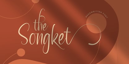 The Songket is a lovely and delicate script font that exudes elegance and class. This font was particularly crafted for those who need a beautiful and refreshing look to their designs. The Songket is PUA encoded which means you can access all of the amazing glyphs and ligatures with ease!
 - Amoure Brides Couple Font by Panatype Studio,
$7.00 Amoure Brides Couple Font is a pairing font between sans serif and handwritten script, These two couple lovely fonts would be perfect to combine in your design. This combination creates an elegant and romantic impression. Suitable for digital invitation, wedding design, fashion design, logo, business cards, branding materials, quotes, etc.
 - Posterizer KG Rounded by Posterizer KG,
$40.00 Posterizer Kg Rounded, is basically rounded version of Egyptian, Slab Serif font Posterizer Kg. By adding rounded corners on serifs, the strict form disappears, in that way, the font gets softer form. Posterizer Kg Rounded is useful for sweet themes like cookies, puppies, love, joy, or some other similar things.
 - Hearts by kapitza,
$29.00 Hearts contains 70 groovy heart illustrations and repeat patterns. It’s great for designing unique and personal t-shirts, greeting cards, gifts and even wrapping paper. You can use individual characters as illustrations and create repeat patterns and borders by selecting a character and pressing the same key over again. Easy!
 - Sweet Brittany Script by Letterfreshstudio,
$15.00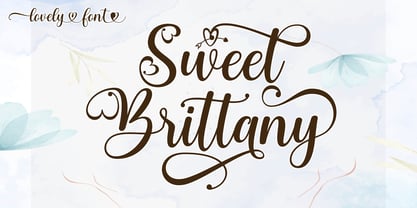 Sweet Brittany Script! Fresh modern lovely font with decorative characters and dancing baseline. So beautiful on invitations such as crafts, greeting cards, branding materials, business cards, quotes, posters and other design concepts. Features: Ligature Style set Basic Latin A-Z and a-z Number International symbols include punctuation fastener Thank you.
