10,000 search results
(0.037 seconds)
- AI by Yuanchen Jiang,
$30.00 The typeface "AI" is designed base on the new relationship between Human and machine. Reflecting the concept of "Ghost in the shell" which contains typeface features from both Sans-serif and Serif font.
 - Aperta by Stefano Giliberti,
$15.00 Adita is a font family that elevates the content of its characters. It supports 113 languages, features a total of 467 glyphs and includes an italicized version for each of the 5 weights.
 - Meghan by Akrtype Studio,
$15.00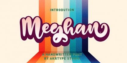 Meghan Smooth Handwritten Font is a casual and elegant handwritten font. Meghan Smooth Handwritten Font will look outstanding in any context, whether it’s being used on busy backgrounds or as a standalone headline!
 - Quaint 235 by Bejeletter,
$16.00 Quaint 235 is a regular and slant font with a modern concept with a bold typeface, good for products and very suitable for use as a display font and also as a header.
 - The Black Shapes by Intellecta Design,
$15.90 The Black Shapes" are a collection of decorative single forms good to use as background of graphic design projects, like covers of books, headpieces at books and magazines, cd-covers, and many others.
 - Blak by Extratype,
$40.00 Blak belongs to the type series designed by Íñigo Jerez for the defunct magazine Suite . This chubby typeface now has a second life in our collection. Use it with confidence for big statements.
 - Deluta by Dharma Type,
$14.99 You can not find such a lovely, unique and funny blackletter. Enjoy and have fun with this font. There are two other fonts designed by in the same concept. -Xesy -Ekistra -Deluta Black
 - Redemption by Turtle Arts,
$20.00Redemption is inspired by religious doomsday flyers that have been photocopied so many times that they take on a very stressed and jaded look. A look that usually reflects their content quite well! - Allista by Typefactory,
$14.00 Allista is a fancy handwritten font, carefully handcrafted to become a true favorite. This font will look outstanding in any context, whether it’s being used on busy backgrounds or as a standalone headline!
 - Hyang Soo by Phoenix Group,
$9.00 Hyang soo type face is a collection of fonts with the theme of love and affection, this font is made like handwriting in everyday life, which makes this font close to our lives.
 - Celtics Modern by Dharma Type,
$14.99 Inspired from ancient Celtic lettering such like insular-half-uncial. New interpretation of Celtic letters bring a whole new feel to old letterings. At the same time, the font has handwritten-style glyphs as if they were handwritten same as the ancient letters.
 - Preta by Lián Types,
$39.00 Preta, portuguese for a very pure kind of black, has its name very related to its concept: I wanted to make the fattest/darkest script ever. People who follow my work may notice its forms are very related to works of my past (1) but this time the challenge was to be very cautious with the white spaces between letters. Not only I followed some rules and ductus of the copperplate style of calligraphy but also I took a lot of inspiration in posters of the early Art Nouveau (specially in Alfred Roller of the Vienna Secession) where letters forms looked like black squares if not looked from a close distance. With Preta, I wanted to achieve that same idea of “darkness” and thanks to the always welcomed question -what if?- the font grew a lot. The result is a very fat font, that looks delicious. Due to possible customer needs, I designed Preta Small, so it can be used in smaller sizes. Preta Ao Sol (which literally means under the sun!) is a style with those lovely tiny details to give the sensation of bright. Preta Ao Sol Solo was made to be used as a layered font with Preta. Finally, Preta Capitals serves as a company for Preta. Hope you enjoy the font as much as I did when designing it: The fact that it’s full of alternates, swashes, ligatures and swirls makes it really pleasurable at the moment of using it. Give it a try and dance with Preta! TIPS For better results, use Preta with the ‘standard ligatures’ feature activated. NOTES (1) Beatle in 2014. Seventies in 2015.
 - River Stone by Yumna Type,
$16.00 It may be difficult to find a font with characters and legibility rates when creating impactful visual designs. Amid the abundance of ordinary font options, the branding and marketing processes can remain stagnant because the absence of unique fonts will increase the risk of your visual designs getting blended with other people’s designs and be left forgotten. For that reason, we would be glad to introduce you to River Stone, a font to give you assistance to create prominent visual designs quickly and easily. River Stone is an uppercased display font in textured letter shapes with which it shows firm, eye-catchy impressions. The font’s textures can add dimensions to the letters’ displays and live up the design nuances. With the use of uppercases, this font is capable of protruding the desired messages and make the design displays more attractive. Its unique shapes will affect the legibility rate of the font, therefore, you need to use this font for big text sizes for a better legibility reason. In addition, this font provides you a clipart as a bonus and you can make use of the available features here as well. Features: Multilingual Supports PUA Encoded Numerals and Punctuations River Stone fits best for various design projects, such as brandings, posters, banners, headings, magazine covers, quotes, printed products, merchandise, social media, etc. Find out more ways to use this font by taking a look at the font preview. Thanks for purchasing our fonts. Hopefully, you have a great time using our font. Feel free to contact us anytime for further information or when you have trouble with the font. Thanks a lot and happy designing.
 - Enixe by Foyezes,
$15.00 This font has the same uppercase and lowercase letters with some modifications on the uppercase letters. I included the modified letters to use however you like.
 - MEGA SLANT LINE by TypoGraphicDesign,
$19.00 CONCEPT/CHARACTERISTICS This strikingly bold, black and extended 3D font reminiscent of sci-fi films and experimental typeface design. The font acts as a chain of ligatures and thus receives a unique aesthetic. The unique letter forms are in sharp contrast to other fonts and thus stand out as a unique selling point. APPLICATION AREA Posters, music cover, book cover, logos, as a headline font for magazines or websites … TECHNICAL SPECIFICATIONS Headline Font | Display Font | Sci-Fi Font »Mega Slant Line« OpenType Font with 303 glyphs – alternative letters and ligatures (with accents & €) & 2 styles (regular & 3d) KONZEPT/BESONDERHEITEN Diese auffällig plakative, fette und breitlaufende 3D Schrift erinnert an Sci-Fi Filme und ist experimentelle Schriftgestaltung. Die Schrift wirkt wie eine Kette aus Ligaturen (Buchstabenverbindungen) und erhält somit eine ganz eigene Ästhetik. Die sehr eigenen Buchstabenformen werden sich deutlich von anderen Schriften abheben und somit als Alleinstellungsmerkmal herausstechen. Der Fluss ergiebt sich aus den EINSATZGEBIETE Plakate aller Art, Musik Cover, Buchcover, für Logos und Wortmarken, als Displayschrift für Zeitschriften oder Websites… TECHNISCHE INFORMATIONEN Headline Font | Display Font | Sci-Fi Font »Mega Slant Line« OpenType Font with 303 glyphs – alternative letters and ligatures (with accents & €) & 2 styles (regular & 3d)
 - Kamasunday by Alit Design,
$21.00 Introducing Kamasunday Dynamic Blackletter, a typeface that seamlessly blends the timeless elegance of blackletter script with a modern, dynamic twist. This font is a perfect fusion of tradition and innovation, offering an impressive array of 837 meticulously crafted glyphs, ligatures, and alternates that will elevate your designs to new heights. Key Features: Dynamic Wave Design: Kamasunday Dynamic Blackletter features a captivating wave-like design that adds a sense of movement and energy to your text. Each character flows seamlessly into the next, creating a visually stunning and cohesive text. Modern Elegance: This font embodies the essence of modern elegance, making it perfect for a wide range of design projects, from branding and packaging to invitations and posters. Extensive Glyph Set: With a whopping 837 glyphs at your disposal, you have access to a vast selection of characters, including uppercase and lowercase letters, numerals, punctuation, and a variety of special characters, ensuring your design needs are met with versatility. Ligatures: Kamasunday Dynamic Blackletter includes an extensive set of ligatures, allowing you to achieve a more fluid and natural look in your text. These ligatures create seamless connections between characters for a polished and sophisticated appearance. Alternates: The font offers an abundance of alternate characters and swashes, giving you the creative freedom to experiment and customize your text. These alternates add an extra layer of uniqueness to your designs. Versatile Usage: Whether you're designing a vintage-inspired logo, a Gothic-themed poster, or a contemporary Music event poster, Kamasunday Dynamic Blackletter adapts beautifully to various design contexts. Timeless Appeal: While embracing modernity, this font retains the timeless charm of traditional blackletter script, making it a versatile choice for projects that demand a touch of history and sophistication. Elevate your design projects with Kamasunday Dynamic Blackletter, where the past and present merge into a harmonious typographic masterpiece. This font promises to breathe life into your creative visions, making your designs stand out with its unique style and extensive character set.
 - CAL Bodoni Ferrara by California Type Foundry,
$47.00 Bodoni Ferrara™ Fashionable, Luxury Heritage: The Original Bodoni Ferrara Sculpted from hi-res photos and scans of Bodoni's original Ferrara Font—his 1818 Manuale Tipografico and 1768 specimens. It has never before been available. This cut of Bodoni specially selected by Dave Lawrence from rare book specimens. Part of the California Type Foundry Origin Series. 3 Display Fonts in One!! And 6+ style mixes. Bodoni's 1st Draft - Transitional Serif Bodoni was often inspired by French type designs. His first draft of Ferrara was inspired by Pierre Simon Fournier. But Bodoni added his own Italian sensibilities. Bododni’s first, transitional style can pair with humanist sans, and transitional fonts. Bodoni's Rework - Modern Serif Later, Bodoni reworked Ferrara to match the later neo-classic style or modern serif of Firmin Didot¹. Bodoni’s modern style can pair with geometric sans, grotesque sans, neo-grotesque sans, gothic sans, copperplate script, . Informal On™ - Informal Mode by CAL Type Foundry This can pair with “infant” fonts. Geometric sans, and other sans or serifs with one-storied a’s. + Bodoni’s Tivoli a for another option! Works great with Fournier¹ fonts and grotesques, since the terminals will match. Font Pairing Guide This font includes a 78 page Ferrara Pairing Guide. This book shows you 131 pairings with text fonts. 47 pairings with subheader fonts! We want to help you get more out of your font collection. Design Features • Subtle forward angle (0.5-1.5°) makes Ferrara more lively and engaging than most Bodoni or Didot fonts. • Round curves make this font feel letter-pressed. • Bodoni's original tall x-height and slightly condensed proportions: great for headlines, where space is at a premium. • Better uppercase. Uppercase punctuation for design apps. • Proportional oldstyle and lining figures, both modern style and transitional numbers. Every pair of numbers is kerned for display sizes: no unsightly gaps! • Multiple special symbols for whenever you need a design to pop, including 3 of Bodoni’s amazing ampersands. Language Features Latin standard for western European and other languages. +Advanced support for: German, French, Spanish, Portuguese, Italian, and French. Special, uppercase umlauts for titles! Compare to metal Bauer¹ Bodoni! Special context kerning for French, Spanish, Portuguese, Italian, and French, to allow better better words like L'Angelique & “¿Nosotros?”. This kerning gets rid of unsightly gaps between “¿ and other combinations. Can’t Find the Pairing Guide? Can't find the pairing guide? Google “California Type Foundry” and grab the pairing guide. Get another free pro font while you’re there! Ferrara: many sizes, styles, moods and situations. It's a classic, fashionable font for display, headlines, and titles. Grab Ferrara today! ----------- ¹Trademarks of their respective owners. Ferrara™ is a trademark of the California Type Foundry.
 - Amaro by Autographis,
$39.50 Amaro is the Italian word for bitter (amaro) herbal drinks like Ramazotti, Averna and a trillion lesser known ones. These liquors were the literal base for this elaborate set of four fonts. Each has different uppercase letters and some of the lowercase letters vary as well. Amaro-A, B, and C can be mixed freely. The Amaro-D has underlining swashes in two different lengths, the uppercase has the shorter underlines and the lowercase the longer ones. I throw these in for free and the entire set is very reasonably priced. Enjoy and cheers to you!
 - Mantequilla JNL by Jeff Levine,
$29.00 Some unusual hand lettering was found on the cover of the 1924 edition of a Spanish language novel by Joaquin Belda entitled “La Hora del Abandono” ("The Time of Abandonment"). The title was created as all lower case characters in a semi-serif style reflecting the dawn of the Art Deco movement. A new set of capital letters was created for this digital revival, along with the numbers, punctuation and other necessary glyphs. Mantequilla JNL is available in both regular and oblique versions. For those unfamiliar with the Spanish language, Mantequilla (pronounced mon-tay-key-yuh) means butter.
 - Urbana by César Puertas,
$24.00 Urbana is a contemporary, naturally condensed sans-serif typeface inspired by the traditional lettering found in Colombian city buses. A mixture of influences reminiscent of modernism, hand lettering, cluttered spaces and improvisation are the source of its unique forms. Urbana was designed to save space and catch the reader’s attention while keeping a high legibility in virtually all situations. Urbana is recommended for setting headlines and short paragraphs in newspapers and magazines or wherever graphic designers need to save space. Its distinctive shapes also help designers to produce easy-to-recognize logos and work as an ideal companion of visual identity systems.
 - Solid Stencil JNL by Jeff Levine,
$29.00 In 1962, the late Robert Libauer of the Stenso Lettering Company (of Baltimore, MD) revised two of his popular stencil lettering guides to offers users two choices: “traditional” stencil letters and numbers and "solid" letters for tracing and coloring. Solid Stencil JNL was modeled from one of those lettering guides, and contains all of the character anomalies found within that vintage stencil.
 - fracaso by LomoHiber,
$18.00 fracaso is an experimental font and was inspired by abstract / cubism artworks. My initial goal was to made it have a rather surreal and fancy mood. I painted the glyphs with seamless strokes and achieved an unusual style by developing an individual form for each glyph. So, due to contrasting various letter height and form each word have a unique, catchy, surreal rhythm. You may want to have fracaso font if you need to make a design with an abstract, surreal look for music / art subject. Great fit for posters, covers, clothes prints, packaging, logos, and everything you want to grant a fancy artistic mood. Features: Carefully tuned kerning (preview above doesn't always show it correctly) 3 Font styles each fits better for different design style Stylistic Alternates for each small letter and digit (mostly for the "original" and "dirty ends" style) Contextual Alternates for small letter and digit pairs; for punctuation depending on a glyph height 10 Standard and 7 Stylistic (Discretionary) ligatures for most common letter pairs Wide Latin language support (Western European, Central European, South Eastern European) If you have some issues or questions, please let me know: lhfonts@gmail.com Hope you'll enjoy using fracaso!
 - Selfie by Lián Types,
$37.00 ATTENTION CUSTOMERS :) There's a new Selfie available, have a look here; Selfie Neue is better done and more complete in every aspect. However, you can stay here if you still prefer the classic version. -But first, let me take a Selfie!- said that girl of the song and almost all of you at least once this year. While some terms and actions get trendy, some font styles do it too. It wouldn't be crazy to combine these worlds, in fact it happens often. Selfie is a connected sans serif based in vintage signage scripts seen in Galerías of Buenos Aires. These places are, in general, very small shopping centres which pedestrians sometimes use as shortcuts to get to other parts of the city. Their dark corridors take you back in time, and all of a sudden you are surrounded by cassettes, piercings, and old fashioned cloth. For some reason, all these shops use monolined geometric scripts. Surely, neon strings are easier to manipulate when letterforms have simple shapes. My very first aim with Selfie was to make a font that would serve as a company to those self-shot pictures that have become so popular nowadays. However, the font turned into something more interesting: I realised it had enough potential to stand-alone. Selfie proves that geometry itself can be really attractive. In this font, elegance is not achieved with the already-known contrast between thicks and thins of calligraphy, but with the purity of form. Its curves were based in perfectly shaped circles which made the font easy to be used at different angles (some posters show it at a 24.7º angle) without having problems/deformities. In addition to its nice performance when used over photographs, the font can be a good option for packaging and wedding invitations. TIPS Adding some lights/shadows between letters will for sure catch the eye of the viewer: Words will look as if they were made with tape/strings; so trendy nowadays. Try using Selfie at a 24.7º angle so that the slanted strokes become perfectly vertical. Having the decorative ligatures feature (dlig) activated is a good option to see letters dance. TECHNICAL It is absolutely recommended to use this font with the standard ligatures feature (liga) activated. It makes letters ligate perfectly and also improves the space between words.
 - Recycled by Kerry Colpus Designs,
$25.00 Recycled was created by creating letters from bits of recycled materials such as cardboard, newspapers etc. and then taking parts of those letters to create new letters.
 - Blacker Mono by Zetafonts,
$39.00 Blacker mono was developed out of a brief by Isabella Ahmadzadeh, by Cosimo Lorenzo Pancini and Francesco Canovaro for the editorial project "A beautiful mistake" by OFFF Tlv in 2022. It is a monospaced version of our typeface Blacker, bringing its "evil serif" aesthetics in the realm of typewriter and coding typefaces. In designing these, usually the letterforms are deformed to better fill the space, but in Blacker Mono only the serifs are modified to balance letters, while letter skeletons are kept consistent with the ones of the original Blacker family. This gives the typeface an uneven, unexpected rhythm, underlined by the unusual choice of providing three optical sizes and some extreme display weights - both uncommon choices in monospaced fonts. The resulting typefamily is thought for use in editorial situations where readability must be married by a strong personality, and is complemented by all the wide array of Open Type features that are present in all Blacker variants, from positional numerals to small case letters and alternates.
 - Censorship JNL by Jeff Levine,
$29.00 Censorship JNL joins the wide array of stencil-themed fonts from Jeff Levine. An advantage to this particular design is the larger amount of stencil sections per letter or number. When used with a plotter/cutter, stencils in excess of 12 inches high can be cut into masking material without the cut-out characters becoming floppy or unstable.
 - Wasabi by Positype,
$20.00 Remastered in 2019. Wasabi is the re-imagining of my very first release, Iru. Like Iru, Wasabi was heavily influenced by the monument lettering style, Vermarco. The simple, geometric forms allowed for small lettering sizes to be sandblasted cleanly and has been a monument lettering workhorse for decades… the only issue centered around the lack of a lowercase or any other letters beyond the 26 uppercase glyphs and the numerals. Wasabi solves this with the same simple, efficient line reminiscent of the old Vermarco while bringing it into the 21st century. Visual and optical incongruities of the original uppercase were replaced with new interpretations for the capital letters, a new lowercase and small caps were produced and the original single weight alphabet was replaced with six new weights. Wasabi has several ‘lighter’ weights primarily because the thin lines and simple transitions produce very elegant relationships… and I wanted to make sure those relationships could be explored regardless of the scale of letter. Stylistic Alternates show up through the upper, lowercase and small cap glyphs that attempt to simplify these shapes even more when the opportunity arises. Wasabi is as much a utilitarian typeface as it is a headline face. This realization led to the decision to produce a companion Condensed version shortly after the initial regular weights were developed and tested; so, try them all!
 - Wasabi Condensed by Positype,
$20.00 Remastered in 2019. Wasabi is the re-imagining of my very first release, Iru. Like Iru, Wasabi was heavily influenced by the monument lettering style, Vermarco. The simple, geometric forms allowed for small lettering sizes to be sandblasted cleanly and has been a monument lettering workhorse for decades… the only issue centered around the lack of a lowercase or any other letters beyond the 26 uppercase glyphs and the numerals. Wasabi solves this with the same simple, efficient line reminiscent of the old Vermarco while bringing it into the 21st century. Visual and optical incongruities of the original uppercase were replaced with new interpretations for the capital letters, a new lowercase and small caps were produced and the original single weight alphabet was replaced with six new weights. Wasabi has several ‘lighter’ weights primarily because the thin lines and simple transitions produce very elegant relationships… and I wanted to make sure those relationships could be explored regardless of the scale of letter. Stylistic Alternates show up through the upper, lowercase and small cap glyphs that attempt to simplify these shapes even more when the opportunity arises. Wasabi is as much a utilitarian typeface as it is a headline face. This realization led to the decision to produce a companion Condensed version shortly after the initial regular weights were developed and tested; so, try them all!
 - Renault MN - Unknown license

- Wanted Poster Caps - Unknown license

- Sanity Wide - Unknown license

- AT Move Wyggle by André Toet Design,
$39.95 WYGGLE is a dynamic (capital) font taken from my Alphatool project. It’s an interesting typeface which can be used for interior and/or exterior (3D projects). Concept/Art Direction/Design: André Toet © 2017
 - Rebel Train Goes by Dharma Type,
$14.95 Based on retro vinyl records in the middle of 20th century. There are three other fonts designed by in the same concept. -Word From Radio -African Elephant Trunk -Moon Star Soul -Rebel Train Goes
 - Henita by Sabrcreative,
$25.00 Welcome to Sabr Creative, your destination for exceptional fonts that infuse elegance into your designs. Introducing Henita, a collection of exquisite elegant script fonts designed to bring sophistication and charm to your creative projects.
 - Bandelwerk by 2D Typo,
$32.00 Collection of ribbon geometrical ornaments, that were popular in Europe in the 16th and 17th centuries in the age of Mannerism. The given ornaments can be attributed to the styles of strapwork of bandelwerk.
 - Backstay by Ali Hamidi,
$14.00 Backstay is a casual and relaxed single line script font. It matches any branding project such as logos, t-shirt printing, creative products, and more. It will look extraordinary in a variety of contexts.
 - Gerando by ArimaType,
$18.00 Gerando is a cool and adaptable display font. Add this modern font to each of your favorite designs and make them instantly stand out. If you have questions, please contact us at arimatype@gmail.com
 - Fugal by Pedroglifos,
$10.00 Fugil is a high-contrast flared-serif humanist typeface with art nouveau influences for elegante and edgy projects. Perfect for identity of many sorts, from concerts, festival names, art exhibitions, films and even products.
 - Astronauts In Trouble by Comicraft,
$49.00 AiT/Planet Lar publisher and writer, Larry Young loves The Space Program. Next time you see him at a comic convention just ask him about any one of the Moon Landings and you'll see.
 - Aquacia by Coniglio Type,
$9.95A stencil font you won't find anywhere else. Part of Market LTD, a collection of limited faces, mostly alpha-numeric and some just plain numeric, used primarily in retail and display situations and titling.


