10,000 search results
(0.039 seconds)
- Labyrinthus Rounded by Cerri Antonio,
$30.00 Labyrinthus Rounded is a multiline decorative font that works very well for identity logos, posters and 3D-works. It continues the tradition of the precedent Labyrinthus but with a softer rounded impact. It's interesting to note that with it it's possible to play with the multiline concept to create endless overlapping geometric creations.
 - Celtiva Florance by GuseType,
$12.00 Celtiva Florance is a display serif font. This font is perfect for various designs especially classic, retro and vintage style. this font also good for your project like logotypes, magazine headlines, posters, cover albums and much more. Celtiva Florance provides a collection of glyphs include numeral & symbols, multilingual support, alternative glyphs & ligatures.
 - Adorne by Aestherica Studio,
$9.00 Adorne is a handwritten script with a natural & stylish flow. This collection of scripts is perfect for personal branding. Adorne is a handwritten script is perfect for branding projects, logo, wedding designs, social media posts, advertisements, product packaging, product designs, label, photography, watermark, invitation, stationery and any projects that need handwriting taste.
 - Conundrum by Atom,
$14.00 Conundrum is a cool, rough brush font, quickly painted on paper, so it looks natural and organic. If you want a font character that is unique and different than others, Conundrum is worth a try. With this bold concept it would be suitable if used for movie titles, magazine titles, covers, posters, etc.
 - Albion's Engraved Black by Greater Albion Typefounders,
$15.00 Albion’s Engraved Black is a tribute to the Banknote Engraver’s art - it is a heavily constructed black letter face assembled of diagonal shading. Another splendid Black letter display face, ideal for formal or less formal use.
 - Fixed by Produce,
$29.00 Every letters in this font family has a fix width. It has a softer take on the typical monospace fonts. The constraint has create an interesting and playful look on letters especially the extra long ones.
 - New Thin Roman JNL by Jeff Levine,
$29.00 The 1912 publication "Essentials of Lettering" has an example of a hand lettered, condensed spurred serif design called "Compressed Roman". This is now available digitally as New Thin Roman JNL in both regular and oblique versions.
 - Snack Shop JNL by Jeff Levine,
$29.00Snack Shop JNL draws its basic influence from the capital letters of Jeff Levine's Two Reeler JNL, but is a bolder, outline design - looking more like sign lettering than a title font from a silent movie. - Gentle Ghostly by Supfonts,
$19.00 Gentle Ghostly will be perfect for halloween lettering, beautiful frame for your home, book covers, greeting cards, logos, marketing, magazines or anything that requires cute handwritten lettering :) What's inside: - Gentle Ghostly Script - Multilingual support - Cricut support
 - Alina by Melvastype,
$35.00 Alina is a laid-back condensed script font. Alina includes OpenType ligatures to all lowercase double letters to make them subtly differ from each other. So Alina feels a little bit more hand lettered and lively.
 - Ony by Cuda Wianki,
$20.00 Ony font was made by cutting letters in cardboard and printing them on paper. This non-perfect printing was used to get heavy, dirty letters. Font has alternate characters so it can imitate real printed words.
 - Christmas Garden by Yoga Letter,
$18.00 "Christmas Garden" is a beautiful and unique handwritten font. This font is equipped with uppercase letters, lowercase letters, numerals, punctuation, alternates, multilingual support, and ligatures. Very suitable for Christmas, weddings, winter, Valentine's, engagements, invitations, and others.
 - Rocktopus by Okaycat,
$24.50 Rocktopus is a minimal fat blocky letter font. Each letter is designed for simplicity and maximum style points. Check it out! Rocktopus is extended, containing West European diacritics & ligatures, making it suitable for multilingual environments & publications.
 - Stencil Plate JNL by Jeff Levine,
$29.00 A brass stencil hand cut to mark the tops of oil drums yielded the lettering for Stencil Plate JNL. The font emulates the retro feel of the unique letter forms found in the original antique design.
 - Shopkeeper JNL by Jeff Levine,
$29.00Shopkeeper JNL derives its unusual letter forms from impressions made from a vintage rubber stamp sign and chart printing set. Originally an outline font, the letters are rendered solid in the digital version for more versatility. - Pen Gothic JNL by Jeff Levine,
$29.00 Pen Gothic JNL emulates lettering made with a round nib lettering pen, and is loosely based on some text found on the popular 1918 song "Ja-Da". The font is available in regular and oblique versions.
 - Morning Mood by Tanincreate,
$12.00 Morning Mood Script is a handwritten font reflecting calligraphy lettering. It includes numbers, punctuation, alternates, ligatures, supports other languages. It is perfect for adding a hand lettered style to your stationery, headlines, branding and wedding invitation.
 - Palma by FaceType,
$10.00 Handwriting fonts have a great disadvantage when it comes to double letters: they look fake. With Palma come loads of ligatures for double letters to make your design look authentic (as shown on the image above).
 - 112 Hours by Device,
$9.00 Rian Hughes’ 15th collection of fonts, “112 Hours”, is entirely dedicated to numbers. Culled from a myriad of sources – clock faces, tickets, watches house numbers – it is an eclectic and wide-ranging set. Each font contains only numerals and related punctuation – no letters. A new book has been designed by Hughes to show the collection, and includes sample settings, complete character sets, source material and an introduction. This is available print-to-order on Blurb in paperback and hardback: http://www.blurb.com/b/5539073-112-hours-hardback http://www.blurb.com/b/5539045-112-hours-paperback From the introduction: The idea for this, the fifteenth Device Fonts collection, began when I came across an online auction site dedicated to antique clocks. I was mesmerized by the inventive and bizarre numerals on their faces. Shorn of the need to extend the internal logic of a typeface through the entire alphabet, the designers of these treasures were free to explore interesting forms and shapes that would otherwise be denied them. Given this horological starting point, I decided to produce 12 fonts, each featuring just the numbers from 1 to 12 and, where appropriate, a small set of supporting characters — in most cases, the international currency symbols, a colon, full stop, hyphen, slash and the number sign. 10, 11 and 12 I opted to place in the capital A, B and C slots. Each font is shown in its entirety here. I soon passed 12, so the next logical finish line was 24. Like a typographic Jack Bauer, I soon passed that too -— the more I researched, the more I came across interesting and unique examples that insisted on digitization, or that inspired me to explore some new design direction. The sources broadened to include tickets, numbering machines, ecclesiastical brass plates and more. Though not derived from clock faces, I opted to keep the 1-12 conceit for consistency, which allowed me to design what are effectively numerical ligatures. I finally concluded one hundred fonts over my original estimate at 112. Even though it’s not strictly divisible by 12, the number has a certain symmetry, I reasoned, and was as good a place as any to round off the project. An overview reveals a broad range that nonetheless fall into several loose categories. There are fairly faithful revivals, only diverging from their source material to even out inconsistencies and regularize weighting or shape to make them more functional in a modern context; designs taken directly from the source material, preserving all the inky grit and character of the original; designs that are loosely based on a couple of numbers from the source material but diverge dramatically for reasons of improved aesthetics or mere whim; and entirely new designs with no historical precedent. As projects like this evolve (and, to be frank, get out of hand), they can take you in directions and to places you didn’t envisage when you first set out. Along the way, I corresponded with experts in railway livery, and now know about the history of cab side and smokebox plates; I travelled to the Musée de l’imprimerie in Nantes, France, to examine their numbering machines; I photographed house numbers in Paris, Florence, Venice, Amsterdam and here in the UK; I delved into my collection of tickets, passes and printed ephemera; I visited the Science Museum in London, the Royal Signals Museum in Dorset, and the Museum of London to source early adding machines, war-time telegraphs and post-war ration books. I photographed watches at Worthing Museum, weighing scales large enough to stand on in a Brick Lane pub, and digital station clocks at Baker Street tube station. I went to the London Under-ground archive at Acton Depot, where you can see all manner of vintage enamel signs and woodblock type; I photographed grocer’s stalls in East End street markets; I dug out old clocks I recalled from childhood at my parents’ place, examined old manual typewriters and cash tills, and crouched down with a torch to look at my electricity meter. I found out that Jane Fonda kicked a policeman, and unusually for someone with a lifelong aversion to sport, picked up some horse-racing jargon. I share some of that research here. In many cases I have not been slavish about staying close to the source material if I didn’t think it warranted it, so a close comparison will reveal differences. These changes could be made for aesthetic reasons, functional reasons (the originals didn’t need to be set in any combination, for example), or just reasons of personal taste. Where reference for the additional characters were not available — which was always the case with fonts derived from clock faces — I have endeavored to design them in a sympathetic style. I may even extend some of these to the full alphabet in the future. If I do, these number-only fonts could be considered as experimental design exercises: forays into form to probe interesting new graphic possibilities.
 - Homework by DAAZ,
$9.00 Homework font was specially conceived/designed for teaching cursive writing. This resource allows tutors and parents to create worksheets for individual or class teaching. Associated with the dashed version of the font, students can learn and exercise their handwriting abilities. All capital letters, excluding I, F, T and P, link to any following small letter: the sequence of the previous letter stroke always follows the angle of the initial stroke of the subsequent letter. This, in the real world, means that words built with the font can be handwritten without having to lift the pen from the paper (except to cross t and f and dot i and j) or interrupt the writing flow. All the letters are base aligned and all small letters have the same ‘x’ height in order to fit a ruled worksheet. Homework font letter stroke widths are uniform in order to emulate regular pens. Homework font also mimics genuine handwriting, making it useful for online stores gift cards, thank you cards and all applications where a real world feel is desired. The Homework font also performs well on long texts.
 - Renouveau by Intellecta Design,
$25.00 Intellecta in partnership with Monocracy Types (Paulo W) presents “Renouveau”. Renouveau : taste the feeling of vintage typography. Inspired by the old letters at classic Victorian Era into the first decades of the XX century. This is a multi use typeface with over 600 glyphs which comes with wide variation of letters, accessible via OpenType features. A display typography in addition to your design arsenal. Suits for any project : labels, t-shirt design, typographic quotes, posters, packaging, wedding invitations, headlines, logo and branding, web, magazine covers, editorial design, print posters, signage, window shop design. It works beautifully for branding and advertising. Using the many ornamental forms and alternates you can create realistic headers. This display font has all standard character letters such as capital letters and lowercase letters, currency figures, numerals, punctuation. As well a complete multi-lingual support, to another languase systems from Europe and Asia countries. Althought a victorian style typeface, we keep simple the shape of the letters, to avoid the extravaganza from that epoch. You will get special capital letters and lowercases when you activate the alternate features or can choose alternatively manually on your software feature, like adobe illustrator, corel and others.
 - Richard Starkings by Comicraft,
$39.00 A NEW HOPE! You begged with us..! You pleaded with us..! But we decided to release the official Richard Starkings font anyway! Huh? WHAT? You heard that line before? Where? Hmm... on this very site...? Well, yes, the Hedge Backwards font is all fine and dandy and does resemble the lettering legerdemain of comic book lettering robot, Richard Starkings... but has it been tweaked over the years to better suit the writing stylings of ELEPHANTMEN creator and writer, Richard Starkings? Has it been refurbished and digitally remastered by ELEPHANTMEN designer and Comicraft Secret Weapon, John JG Roshell? Hmm? No? Well then... here it is, retooled, reimagined and reStarkingsed...ah, what the hell, we started from scratch! This ain't no Greedo Shoots First -- you won't have to keep your pasty '70s VHS recordings of previous Richard Starkings Fonts inside a concrete bunker. Because any other font that claimed to be the official Richard Starkings font would have been called The Official Richard Starkings Font, would it not?
 - FingerSpeller BF by Bomparte's Fonts,
$40.00 Many years ago I studied American Sign Language in an effort to better communicate with some friends of mine within the deaf community. I found ASL to be a beautifully expressive language from a vibrant and active culture. Out of that attempt came this stylized depiction of the manual alphabet used in finger-spelling. Until recently it had only existed in analog form, born of pen and ink on paper. So now I'm glad to say it’s turned digital. Typing a period (.) will reveal the sign for “I Love You” (a combination of the letters I, L and Y), which fits nicely within the shape of a heart. Holding down the shift key while again typing period (greater symbol) will reveal the heart in its filled-in form, which can serve as an underlay. Use these in an application that supports layering in order to create different color combinations. There’s a stylistic alternate letter “S” and an “OO” ligature which can be accessed in OpenType-savvy apps.
 - Maat by Wordshape,
$20.00 Maat is a modular geometric stencil display font that includes a number of modular pattern characters, and can be used to create designs that echo early Modernism by merely applying letters, patterns and color. Maat is a loose interpretation of a hand lettered alphabet by the late Dutch designer Jurrian Schrofer called Sans Serious which was included in Wim Crouwel's publication Letters of Maat. It is inflected with a bit of influence from British designer Ken Garland's similar lettering form the cover of his textbook, The Graphics Handbook. Maat derives its name from the title of Couwel's booklet.
 - Cochocib Script Latin Pro by Saffatin.co,
$29.00 Introducing my Cochocib Script, with a soft style and has an elegant nuances, classy and natural. Perfect to get a more charismatic impression or unique touch to your projects and branding, greeting cards, wedding, banner, name card, lettering, fonts pairing, etc. Come with swash letter, ligatures, uppercase and lowercase alternates that you can combine every letter perfectly. Also easy to use with any program with opentype feature support. Including: - Cochocib Script Latin Pro OTF - Cochocib Script Latin Pro TTF This font support accent letters of Central Europa, Western (À Â Æ È Ë ã ä æ è...) Thank you!
 - Eckhardt Relaxed JNL by Jeff Levine,
$29.00 Eckhardt Relaxed JNL was modeled from an example of a casual, hand lettered alphabet from a page of a vintage textbook. This style of freehand lettering always lends itself well to posters, show card and sign work, but is equally at home in ad design or titling. The typeface is an addition to the group of type styles inspired by sign lettering, and is named for Jeff Levine's good friend, the late Al Eckhardt; whose shop turned out quality hand lettering from 1959 until his passing in 2005. Eckhardt Relaxed JNL is available in both regular and oblique versions.
 - The overthinkers by Joanne Marie,
$26.00 The overthinkers is a semi script hand lettering font for all of your hand lettering designs! With two sets of uppercase glyphs, three sets of lowercase and over 230 ligatures no two words will be same! So your designs will truly look hand lettered. With so much choice be careful not to overthink your designs ;). This font is perfect on it’s own or you may like to use it with your existing hand lettering fonts. Go ahead and try it out - it’ll compliment any design! It’s perfect for merchandise and food packaging, book designs, logos and much more.
 - Adinda Melia by Subectype,
$17.00 Adinda Melia is a lovely modern calligraphy font with with a touch of handwriting style. This font is perfect for creating signature logos and watermarks for photography studio or wedding invitation. Adinda Melia includes full set of beautiful hand lettered uppercase and lowercase letters, numerals, a large range of punctuation and ligatures. All lowercase letters include beginning and ending swashes, giving realistic hand-lettered style. In order to use the beautiful swashes, you need a program that supports OpenType features such as Adobe Illustrator CS, Adobe Photoshop CC, Adobe Indesign and Corel Draw. Thank You Subectype studio
 - Glitzy by Ingrimayne Type,
$9.95 Glitzy is a caps-only font with extreme contrast. It was inspired by Art Deco typefaces, especially Broadway by Morris Fuller Benton, but Glitzy is not an attempt to reproduce that typeface. The letters on the lower-case keys differ slightly from the letters on the upper-case keys. The large black interiors invite decoration and the family includes four faces with interior decoration. These four faces with interior decoration can be used in layers with the base font to add color to lettering. (OakPark is a another attempt to do high-contrast lettering with an Art Deco feel.)
 - Good Day by Fontop,
$11.00 Welcome my new hand lettered, cute and decorative font Good Day. The font family includes two fonts – Regular and Italic – both with Latin multilingual uppercase letters, lowercase letters, numbers and basic punctuation. With so many stylistic alternates and swashes it’s easy to create cute designs and signs for wedding branding, quotes, ads, logos, prints, social media texts, blogs, and so much more. Swashes are controlled by adding 0/1/2 before or after any letter while alternates can be chosen from the glyphs panel in Adobe apps. Really very easy to use! Both OTF and TTF are included for each font.
 - Hub by ParaType,
$25.00Designed by Gennady Fridman and released by ParaType in 2008. Hub represents so called block letter handwriting style, which becomes more and more usual and nowadays replaces traditional cursive handwriting. One of the reasons for these changes is an often requirement in official forms to write in block letters. Some forms contain even stricter rule – to write in capital letters. Hub was designed to meet these requirements and includes small caps instead of lower case letters. It’s recommended for use in advertising and display typography and especially when you need to show a sample of properly filled bureaucratic form. - Raindrop by Great Lakes Lettering,
$30.00 Raindrop is a fun and flirty typeface that pulls inspiration from editorial illustration. Each letter was carefully crafted to feel hand made and give the appearance of custom lettering. Through a variety of stylistic alternates and pairings, Raindrop is the perfect typeface choice for projects that aim for a one-of-a-kind feel when hiring a lettering artist isn't an option. Raindrop is made up of three separate styles being serif, sans, and script. The ability to pair styles together will add texture and personality to your design, leaving the viewer wondering: lettering or type?
 - Coma by Volcano Type,
$19.00 Originally designed by Alois Ganslmeier as a Billboard-Font, the Coma Font was later developed into a complete typeset with capitals and small letters, Cyrillic letters, Greek letters and Hebrew letters by Andy Jörder and Jörg Herz. The Coma Font is a massive constructed font which can be used for headlines. When only typed in capitals it gives the impression of blocks for there are no ascenders or descenders. The font comes alive because of its massive appearance, its edgy form and the opulence impression when used line-by-line. Not without reason, the font is named “dick und eckig”.
 - Advertiser JNL by Jeff Levine,
$29.00Advertiser JNL is a simple A-Z only font used to make retro-styled titles and names. Based on a popular style of retail signage from the 1950s and 1960s, alternating keystrokes will create a contrast of positive and negative letters. The capital letters have the alphabet in white on black boxes, the lower case have the black letters alone—with the white space conforming to the width of the black boxes. In a pinch, the boxed characters can also be used as initial caps. For a more complete character set with the same style of lettering, use DuBois Block JNL. - Actium by Type Mafia,
$45.00 Actium is a contemporary multilingual sans serif typeface developed to help perfect typography automatically. Type Mafia has focussed on words with odd combinations of capital letters and numbers, such as product names and postal codes such as WD40 and H1N5, jump out of the text. They sit awkwardly together as the numerals have been designed to work with the lowercase, not the uppercase letters – affecting readability.To fix this Type Mafia invented Smart Capo™. Smart Capo™ Smart Capo is a feature that automatically activates once you type an uppercase letter together with a number. When a capital letter is sat next to a numeral, Smart Capo converts the letter to a mid-cap — a contemporary alternative to small caps — and the default old-style numeral to a lining numeral. Actium’s mid-caps and lining numerals have been designed with the same height (between cap and x-height) so they sit comfortably next to each other and fit more harmoniously into text. Smart Capo applies equal attention to capitalised words without any numbers, such as NAVO and USA, and are also automatically set into mid-capitals. Working on its own, Smart Capo saves time and money for the typographer — taking the pain out of text formatting — and makes it a more pleasurable experience for the reader. This feature is made possible by the use of ‘contextual alternates’, an OpenType feature used in modern font software, working with a set of characters specially designed at mid-cap height. By default these changes automatically take place so it doesn't need to be switched on, it will just work. Actium Actium’s design has an unusual diagonal contrast — much more common in a serifed face than in a sans serif — giving it more bite. The typeface looks elegant when set in large sizes and remains very legible when shown in small sizes. The family consists of six weights in two styles, making a dozen fonts. Weights range from light to black in roman and true italic. All fonts are fully loaded with functional elements. Actium boasts an extended Latin character set and with Greek. This means a wide range of Western languages are supported: perfect for use in bilingual publications and packaging. For numerals, each font includes old-style and lining figures in both proportional and tabular widths, with superiors and inferiors. These allow you to select the right set of numbers for the right task.
 - Brookelyn by Arendxstudio,
$20.00 Brookelyn - Script Font with a natural & stylish flow. This collection of scripts is perfect for personal branding. this works well for many applications. Everything from personal branding & wedding invitations to advertising could benefit from this collection of signature font Features : • Character Set A-Z • Numerals & Punctuations (OpenType Standard) • Accents (Multilingual characters) • Ligature Multilingual Support : Afrikaans, Albanian, Asu, Basque, Bemba, Bena, Catalan, Chiga, Cornish, Danish, English, Estonian, Faroese, Filipino, Finnish, French, Friulian, Galician, German, Gusii, Icelandic, Indonesian, Irish, Italian, Kabuverdianu, Kalenjin, Kinyarwanda, Low German, Luo, Luxembourgish, Luyia, Machame, Makhuwa-Meetto, Makonde, Malagasy, Malay, Manx, Morisyen, North Ndebele, Norwegian Bokmål, Norwegian Nynorsk, Nyankole, Oromo, Portuguese, Romansh, Rombo, Rundi, Rwa, Samburu, Sango, Sangu, Scottish Gaelic, Sena, Shambala, Shona, Soga, Somali, Spanish, Swahili, Swedish, Swiss German, Taita, Teso, Vunjo, Zulu There it is! I really hope you enjoy it !
 - Brocades by Edignwn Type,
$16.00 The font collection is called "Brocades", it is a crafted display with vintage themes. These collections contain monoline script, sans serif stencil and serif stencil. Every font comes with 4 style typefaces (regular, rounded, rough and stamp). Brocades give more extras 2 pack illustrations (animals and motorcycle). This script font includes 3 sets alternates and swashes. The Brocades matches apply in some designs such as the logotype, poster, label, badge, packaging, apparel, branding, and more custom design. Brocades features : 4 style typefaces (regular, rounded, rough and stamp) Uppercase, lowercase, numeral, symbol, punctuation, alternate and swash in monoline script All-caps, numeral, symbol and punctuation in sans serif and serif font Multilingual PUA Encoded Brocades includes : 14 fonts (script, sans serif, serif and dingbat) 52 illustrations in dingbat Thank you for your support and choosing us.
 - F2F Frontpage Four by Linotype,
$29.99The Face2Face (F2F) series was inspired by the techno sound of the mid-1990s, personal computers and new font creation software. For years, Alexander Branczyk and his friends formed a unique type design collective, which churned out a substantial amount of fresh, new fonts, none of which complied with the traditional rules of typography. Many of these typefaces were used to create layouts for the leading German techno magazine of the 1990s, Frontpage. Branczyk and his fellows would even set in type at 6 points, in order to make it nearly unreadable. It was a pleasure for the kids to read and decrypt these messages! F2F Frontpage Four is one of 41 Face2Face fonts included in the Take Type 5 collection from Linotype GmbH. Branczyk designed 16 of these himself." - Arpona Sans by Floodfonts,
$49.00 Arpona Sans is a contemporary sans serif family inspired by the work of Edward Johnston and Eric Gill for London Underground. As well as its serif companion Arpona it is a symbiosis of different design concepts. Arpona Sans combines the esthetics of a geometric Sans with the usefulness of the humanist concept and the calm of the modernist proportions. Arpona Sans is a good choice for editorial design, branding, app design and web design – a workhorse well readable even in running text on screen. The family has nine weights, ranging from Thin to Black plus corresponding italics. Each style includes 590 glyphs supporting all western-, eastern- and central-european languages including four sets of figures and various currency symbols. If you want to go into details visit the microsite: https://www.floodfonts.com/arponasans
 - Southbound by Arendxstudio,
$18.00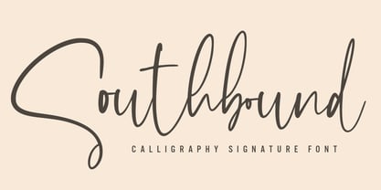 Southbound Font with a natural & stylish flow. This collection of scripts is perfect for personal branding. this works well for many applications. Everything from personal branding & wedding invitations to advertising could benefit from this collection of signature font Features : • Character Set A-Z • Numerals & Punctuations (OpenType Standard) • Accents (Multilingual characters) • Ligature Multilingual Support : Afrikaans, Albanian, Asu, Basque, Bemba, Bena, Catalan, Chiga, Cornish, Danish, English, Estonian, Faroese, Filipino, Finnish, French, Friulian, Galician, German, Gusii, Icelandic, Indonesian, Irish, Italian, Kabuverdianu, Kalenjin, Kinyarwanda, Low German, Luo, Luxembourgish, Luyia, Machame, Makhuwa-Meetto, Makonde, Malagasy, Malay, Manx, Morisyen, North Ndebele, Norwegian Bokmål, Norwegian Nynorsk, Nyankole, Oromo, Portuguese, Romansh, Rombo, Rundi, Rwa, Samburu, Sango, Sangu, Scottish Gaelic, Sena, Shambala, Shona, Soga, Somali, Spanish, Swahili, Swedish, Swiss German, Taita, Teso, Vunjo, Zulu There it is! I really hope you enjoy it