10,000 search results
(0.042 seconds)
- Air Conditioner - Personal use only

- Easy Rider - Personal use only

- Kerater - Personal use only

- Xéfora - Personal use only

- Alexis Italic - Unknown license

- Chopin-Bold - Unknown license

- Fmiring Campotype One - Personal use only

- Derradeira - Personal use only

- Saintharpy - Unknown license

- Berolina - 100% free

- Just Me Again Down Here - Personal use only

- CAITLYN - Unknown license

- River Avenue - Unknown license

- Semiramis - Unknown license

- Oblata Kurrenta - Unknown license

- Not His Angel - Unknown license

- Eat More Chocolate - Personal use only

- Fountain Pen Frenzy - 100% free

- Burgundian - Unknown license

- Eutemia III - Unknown license

- Divine - Unknown license

- kallot - Unknown license

- Autorich Sans by Typia Nesia,
$20.00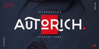 Autorich Sans is a display sans font, comes with 2 set of upper case (allcaps), 58 ligatures and some alternate. Great for brand identity, poster design, website / display, editorial, and more. **FEATURES :** * Basic A-Z * Numbers * Symbols * Stylistic Alternates * Standard Ligatures * Discretionary Ligatures * Oldstyle Figures * PUA Encode * Multilingual support Thank you for your purchase! and hope you're having fun with Autorich Sans ! Happy creating! Typia Nesia Studio
 - Elbjorg - Unknown license

- Lust Didone by Positype,
$49.00 Lust Didone’s character set was expanded as well during the redraw and update, the Italics were separated and reimagined anew from the universal italics in the original offering. Lust Didone also includes the new Fine optical size with complementing Italics for each size as well. And, yes, more swashes. The Lust Collection is the culmination of 5 years of exploration and development, and I am very excited to share it with everyone. When the original Lust was first conceived in 2010 and released a year and half later, I had planned for a Script and a Sans to accompany it. The Script was released about a year later, but I paused the Sans. The primary reason was the amount of feedback and requests I was receiving for alternate versions, expansions, and ‘hey, have you considered making?’ and so on. I listen to my customers and what they are needing… and besides, I was stalling with the Sans. Like Optima and other earlier high-contrast sans, they are difficult to deliver responsibly without suffering from ill-conceived excess or timidity. The new Lust Collection aggregates all of that past customer feedback and distills it into 6 separate families, each adhering to the original Lust precept of exercises in indulgence and each based in large part on the original 2010 exemplars produced for Lust. I just hate that it took so long to deliver, but better right, than rushed, I imagine.
 - Lust by Positype,
$49.00 Lust’s original masters were completely redrawn, expanded, with a new optical size added based on customer requests. Lust now sports 6 fonts, instead of the original 4: Standard, Display, Fine, and complementing Italics. The character set has been expanded as well to include more OpenType features and more swashes. The Lust Collection is the culmination of 5 years of exploration and development, and I am very excited to share it with everyone. When the original Lust was first conceived in 2010 and released a year and half later, I had planned for a Script and a Sans to accompany it. The Script was released about a year later, but I paused the Sans. The primary reason was the amount of feedback and requests I was receiving for alternate versions, expansions, and ‘hey, have you considered making?’ and so on. I listen to my customers and what they are needing… and besides, I was stalling with the Sans. Like Optima and other earlier high-contrast sans, they are difficult to deliver responsibly without suffering from ill-conceived excess or timidity. The new Lust Collection aggregates all of that past customer feedback and distills it into 6 separate families, each adhering to the original Lust precept of exercises in indulgence and each based in large part on the original 2010 exemplars produced for Lust. I just hate that it took so long to deliver, but better right, than rushed, I imagine.
 - ALT Jun by ALT,
$10.00 Jun Script is a geometric script font.
 - Bellagio NF by Nick's Fonts,
$10.00This family, in normal and bold weights, is based on Advertisers Gothic, designed by Robert Wiebking for Barnhart Brothers & Spindler in 1917. The original might be considered a transitional design between Art Nouveau and Art Deco; this version accentuates the Deco traits, adding a thick-and-thin treatment not found in the original. The large x-height and short descenders allow for compact, commanding headlines with a carefree charm, a.k.a. bell'agio. Both versions of the font include 1252 Latin, 1250 CE (with localization for Romanian and Moldovan). - Bohy by wkklee,
$25.00Bohy was a candidate when it was felt there was a need for a "house font" to start a design service. Its readability can be relied on to clearly display the most creative or obscured names, yet the adherence to a chosen system of construction to achieve this consistency also make the Bohy characters stubbornly distinguishable from most other font sets if you were to group it under geometric, or technical typeface, or some other categories it should belong (it is considered more constructivist, not humanist, etc...). - Noise Maker by Bogstav,
$15.00 Can noise be a beautiful sound? Well, I guess...because the other day when I was playing the good old Bleach album by Nirvana (which I consider lovely grunge music!) my wife yelled "Could you stop that noise?!" - and I answered "What noise?!" - ha-ha-ha! Anyway, I finished this font while listening to that particular lovely noise, and I knew that this crunchy, grungy, handmade and full of contextual alternates and multilingual font had to be named something with the word "noise" in it!
 - Love Song JNL by Jeff Levine,
$29.00 Love songs are the perennials of music, outlasting all other popular fads and styles that come and go. The 1920s through the 1940s is considered by some to be the Golden Age of the American love song. Thousands upon thousands of copies of popular sheet music sold, and the cover lettering and art on many titles were from some of the finest illustrators of their time. Love Song JNL recreates the Art Deco-flavored design found on one such piece of sheet music from the 1930s.
 - HT Pizzeria by Dharma Type,
$19.99 Ht Pizzeria is strong looking script for eye-catching part. Holiday Type Project offers retro hand drawing scripts. Inspired by retro script on shopfront lettering, wall paint advertisements in Italy around 1950s. Check out the script fonts from Holiday Type!
 - Crostini by Scholtz Fonts,
$19.00 Crostini was designed as a fun-filled, vigorous brush script, originally intended for restaurant logos and menus. As it evolved, I realized that it was more versatile than I'd thought - great for feminine, girly media as well as for more “in your face” marketing. While the characters are bold and dramatic, they are also feminine and rounded. Crostini contains all the accented characters used in the major European languages. Use Crostini for invitations, scrap-booking, advertising media, fashion media, restaurant media, food media, greeting cards - it’s great fun!
 - Mocacino by Arkalandara,
$120.00 The elegant handwritten font for this brand exudes sophistication and timeless charm. Its strokes are fluid and graceful, reminiscent of a skilled calligrapher's penmanship. The letters are carefully crafted with a balance of curves and straight lines, creating a harmonious and refined look. The font maintains a moderate size, allowing for readability without sacrificing the delicate details that make it elegant. Each letter flows seamlessly into the next, creating a sense of continuity and grace. The spacing between characters is thoughtfully considered, striking the right balance between openness and cohesion.
 - Rika by Thinkdust,
$10.00 Rika is a combination of supposedly male and female characteristics, combining together to create a beautifully realised, high impact, condensed typeface. The tall but well-built characters are softened with smooth curves and a mixing in of thin lines, so that the sharpness of many condensed fonts is brought under control. Suave in its application, Rika is all professionalism and elegant showmanship, great for both headlines and text. Rika comes with support for a number of languages, as well as specifically designed glyphs, and its uses might be considered limitless.
 - Linotext by Linotype,
$29.99Linotext was designed by Morris Fuller Benton in 1901 and first appeared with the name Wedding Text with American Type Founders in Jersey City, where its metal forms were cut by hand. The font was so popular that its forms soon began appearing with other font foundries under different names, Elite Kanzlei with D. Stempel AG, Comtesse with C.F. Rühl, etc. Its ornamental forms are not considered very legible by today’s standards and Linotext should therefore be used for headlines and short texts in point sizes 12 or larger. - Mafuta by Scholtz Fonts,
$19.00Mafuta is a round, happy font, named for the Zulu word for "fat". In tribal societies in Africa, where food was often scarce and almost never easily come by, it was considered desirable to appear "well fed". Roundness was a symbol of high status in the tribe, and a sign of wealth. The up-beat, bold outline of the font celebrates the confidence of people who feel comfortable being who they are. The font manages to be both contemporary and African. It is best used for posters and for headings. - Hiruko Stencil by Thinkdust,
$10.00 Building on Hiruko’s success, Hiruko Stencil continues the tradition of minimalism and clarity with support for a wide range of languages. Cut in such a way that each character works well with those surrounding it, this font is created with an understanding that even the most minor seeming things can make a big difference. The thick nature of the font makes it work wonderfully at larger sizes, but thanks to the carefully considered cuts in each letter, it remains incredibly legible even when shrunk down, so it’s useful in whatever you intend to craft.
 - Franklin Gothic by URW Type Foundry,
$39.99 By 1915, all the major foundries offered families of sans serifs, sometimes called Gothic in the USA. Franklin was a response suitable for countries in the vanguard of the machine age. Designed by Morris Benton in 1903-1912, Franklin has preserved its own personality ever since. The ITC Franklin Gothic font family is a redrawing by ITC that keeps the original strength intact, meeting the demand for a strong typeface. ITC Franklin Gothic is better read in display sizes and considered a standard in the newspaper and advertising fields.
 - Solitas Contrast by insigne,
$39.00 This sleek, high contrast typeface means business, but it looks great on any project, no matter how big or small. Solitas Contrast was developed because existing high contrast sans options were neither modern nor crisp. This design challenge was solved through a series of typefaces: the original low-contrast Solitas, its serifed cousins, and now a high contrast sans—each carefully considered for an organic and free flowing look. It evokes a Dutch or european feel. Solitas Contrast is a modern, clean sans-serif with a distinctive style and impact.


