10,000 search results
(0.296 seconds)
- Behetem Lachok MF by Masterfont,
$59.00 This classic title font has a wide proportion and minor contrast to make it the ideal choice for headlines.
 - Athena by Solotype,
$19.95This beautiful old design was originated at the Connor Foundry, New York, about 1888. Ideal for the small "in between" lines in modern versions of Victorian job printing. - Ciutadella Rounded by Emtype Foundry,
$69.00 Ciutadella Rounded is not only a font with soft corners, it has a real rounded terminal across all the weights. It was a challenge to achieve a rounded effect in close counters characters, especially in the heaviest weights where there is less space available to accommodate the round ending. Suitable to be used across a wide range of applications, from identity systems to publications. It is available in Open Type format and includes Alternate Characters (‘a’, ‘t’ and ‘&’), Ligatures, Tabular Figures, Fractions, Numerators, Denominators, Superiors and Inferiors. It supports Central and Eastern European languages. The type family consists of 10 styles, 5 weights (Light, Regular, Medium, SemiBold and Bold) plus italics. For more details see the PDF. See also Ciutadella and Ciutadella Slab.
 - Jacques Pro by FoxType,
$12.00 Jacques Pro Display is a Brand New Elegant Typeface with a powerful font family. It has a dependable and uncompromising style, with controlled letterforms and modern touches. It looks amazing in logos, magazines, and movies. Mackenzie Font would be perfect for branding, headlines, Captions, paragraphs, and posters. The various weights allow you to experiment with a wide range of applications. It's created to make an impression without sacrificing its beauty and readability. It's shown a clean, minimalist, warmth, quirky, yet still purposed to be versatile The Typeface includes Eight Weights - Thin, ExtraLight, Light, Regular, Medium, SemiBold, Bold and ExtraBold Numerals and extended punctuation (200+ Glyphs). Expert kerning and quality crafting. Thank you for taking the time to look into the font.
 - Cottorway by FoxType,
$10.00 Cotterway Display is a Brand New Elegant Typeface with a powerful font family. It has a dependable and uncompromising style, with controlled letterforms and modern touches. It looks amazing in logos, magazines, and movies. Cotterway Font would be perfect for branding, headlines, Captions, paragraphs, and posters. The various weights allow you to experiment with a wide range of applications. It's created to make an impression without sacrificing its beauty and readability. It's shown a clean, minimalist, warmth, quirky, yet still purposed to be versatile The Typeface includes Six Weights - Light, Regular, Medium, SemiBold, Bold and ExtraBold. Numerals and extended punctuation (200+ Glyphs). Expert kerning and quality crafting. TTF, OTF and WebFonts Included. Thank you for taking the time to look into the font.
 - Glot by Wordshape,
$20.00 Glot is a ten-member flared terminal sans serif family of typefaces based on a mix of proportions of Roman square capitals and hyper-readable sans serifs. Glot comes in five weights with matching true italics: Light, Regular, Medium, Bold and Black. The Glot family has a wide range and is incredibly functional, working well for longer texts as well as display typography. After designing the house typefaces for a handful of the most predominant multi-player online games out there, we decided that it was time to bring the battlefield to the people. Glot comes armed with ample language support (Central, Eastern, and Western European) and OpenType ornamental spiked alternate characters for when one needs a hint of danger.
 - Pericano Display by FoxType,
$12.00 Pericano Display is a Brand New Elegant Slab Serif Typeface with a powerful font family. It has a dependable and uncompromising style, with controlled letterforms and modern touches. It looks amazing in logos, magazines, and movies. Pericano Font would be perfect for branding, headlines, Captions, paragraphs, and posters. The various weights allow you to experiment with a wide range of applications. It's created to make an impression without sacrificing its beauty and readability. It's shown a clean, minimalist, warmth, quirky, yet still purposed to be versatile. The Typeface includes Six Weights - Thin, ExtraLight, Light, Regular, Medium, and SemiBold. Numerals and extended punctuation (200+ Glyphs). Expert kerning and quality crafting. Thank you for taking the time to look into the font.
 - Lucaria by Jehoo Creative,
$19.00 Lucaria is a modern serif typeface that combines classic design with contemporary details. The most distinctive feature of Lucaria is its strong shape on the edges, which gives the font a bold and commanding presence. This design element is complemented by the wide characters, which provide ample space for legibility and readability. The combination of these features makes Lucaria a great choice for displays and headlines. This versatile font family is available in seven weights, including Light, Regular, Medium, Semibold, Bold, Extrabold, and Black, as well as a variable font for added flexibility. The variable font option allows designers to customize the weight makes Lucaria an ideal choice for a range of design projects, including branding, packaging, and editorial layouts.
 - Extragraph Display by duestype,
$35.00 Extragraph Display is a contemporary geometric mono typeface in five weights (xtra slim, slim, medium, large, xtra large). Originally based on a circle and a square, Extragraph Display shifts from ordinary into extravagant letter forms. For each character, numerous alternates come in nine steps, pushing the idea of common and unconventional shapes with each set further. The key feature of Extragraph Display is a massive variety of alternates. Choose from a wide range of 9 Stylistic Sets, multi-language support, geometric symbols, arrows or get the full expression of Extragraph Display with a exclusive customised font randomizer (OTF). Purposefully used, Extragraph Display allows the user to create unique typographic compositions with a huge amount of options to combine and play with.
 - Oldburg Display by FoxType,
$12.00 Oldburg Display is a Brand New Elegant Typeface with a powerful font family. It has a dependable and uncompromising style, with controlled letterforms and modern touches. It looks amazing in logos, magazines, and movies. Oldburg Font would be perfect for branding, headlines, Captions, paragraphs, and posters. The various weights allow you to experiment with a wide range of applications. It's created to make an impression without sacrificing its beauty and readability. It's shown a clean, minimalist, warmth, quirky, yet still purposed to be versatile The Typeface includes Five Weights - Light, Regular, Medium, SemiBold and Bold. Numerals and extended punctuation (200+ Glyphs). Expert kerning and quality crafting. TTF, OTF and WebFonts Included. Thank you for taking the time to look into the font.
 - Glot Round by Wordshape,
$20.00 Glot Round is a ten-member flared terminal sans serif family of typefaces based on a mix of proportions of Roman square capitals and hyper-readable sans serifs with slightly rounded corners. Glot Round comes in five weights with matching true italics: Light, Regular, Medium, Bold and Black. The Glot family has a wide range and is incredibly functional, working well for longer texts as well as display typography. After designing the house typefaces for a handful of the most predominant multi-player online games out there, we decided that it was time to bring the battlefield to the people. Glot Round comes armed with ample language support (Central, Eastern, and Western European) and OpenType ornamental spiked alternate characters for when one needs a hint of danger.
 - Generis Slab by Linotype,
$29.00The idea for the Generis type system came to Erik Faulhaber while he was traveling in the USA. Seeing typefaces mixed together in a business district motivated him to create a new type system with interrelated forms. The first design scheme came about in 1997, following the space saving model of these American Gothics. Faulhaber then examined the demands of legibility and various communications media before finally developing the plan behind this type system. Generis’s design includes two individually designed styles; each of with is available with and without serifs, giving the type system four separate families. Each includes at least four basic weights: Light, Regular, Medium, and Bold. Further weights, small caps, old style figures, and true italics were added to each family where needed. The Generis type system is designed to meet both optical criteria and the highest possible measure of technical precision. Harmony, rhythm, legibility, and formal restraint make up the foreground. Generis combines aesthetic, technical, and economic advantages, which purposefully and efficiently cover the whole range of corporate communication needs. The unified basic form and the individual peculiarity of the styles lead to Generis’ systematic, total-package concept. The clear formal language of the Generis type system resides beneath the information, bringing appropriate typographic expression to high-level corporate identity systems, both in print and on screen. The condensed and aspiring nature of the letterforms allows for the efficient setting of body copy, and the economic use of the page. A range of accented characters allows text to be set in 48 Latin-based languages, offering maximal typographic free range. This previously unknown level of technical and design execution helps create higher quality typography in all areas of corporate communication. Optimal combinations within the type system: Generis Serif or Generis Slab with Generis Sans or Generis Simple. - Generis Serif by Linotype,
$29.00The idea for the Generis type system came to Erik Faulhaber while he was traveling in the USA. Seeing typefaces mixed together in a business district motivated him to create a new type system with interrelated forms. The first design scheme came about in 1997, following the space saving model of these American Gothics. Faulhaber then examined the demands of legibility and various communications media before finally developing the plan behind this type system. Generis’s design includes two individually designed styles; each of with is available with and without serifs, giving the type system four separate families. Each includes at least four basic weights: Light, Regular, Medium, and Bold. Further weights, small caps, old style figures, and true italics were added to each family where needed. The Generis type system is designed to meet both optical criteria and the highest possible measure of technical precision. Harmony, rhythm, legibility, and formal restraint make up the foreground. Generis combines aesthetic, technical, and economic advantages, which purposefully and efficiently cover the whole range of corporate communication needs. The unified basic form and the individual peculiarity of the styles lead to Generis’ systematic, total-package concept. The clear formal language of the Generis type system resides beneath the information, bringing appropriate typographic expression to high-level corporate identity systems, both in print and on screen. The condensed and aspiring nature of the letterforms allows for the efficient setting of body copy, and the economic use of the page. A range of accented characters allows text to be set in 48 Latin-based languages, offering maximal typographic free range. This previously unknown level of technical and design execution helps create higher quality typography in all areas of corporate communication. Optimal combinations within the type system: Generis Serif or Generis Slab with Generis Sans or Generis Simple. - Generis Simple by Linotype,
$39.00The idea for the Generis type system came to Erik Faulhaber while he was traveling in the USA. Seeing typefaces mixed together in a business district motivated him to create a new type system with interrelated forms. The first design scheme came about in 1997, following the space saving model of these American Gothics. Faulhaber then examined the demands of legibility and various communications media before finally developing the plan behind this type system. Generis’s design includes two individually designed styles; each of with is available with and without serifs, giving the type system four separate families. Each includes at least four basic weights: Light, Regular, Medium, and Bold. Further weights, small caps, old style figures, and true italics were added to each family where needed. The Generis type system is designed to meet both optical criteria and the highest possible measure of technical precision. Harmony, rhythm, legibility, and formal restraint make up the foreground. Generis combines aesthetic, technical, and economic advantages, which purposefully and efficiently cover the whole range of corporate communication needs. The unified basic form and the individual peculiarity of the styles lead to Generis’ systematic, total-package concept. The clear formal language of the Generis type system resides beneath the information, bringing appropriate typographic expression to high-level corporate identity systems, both in print and on screen. The condensed and aspiring nature of the letterforms allows for the efficient setting of body copy, and the economic use of the page. A range of accented characters allows text to be set in 48 Latin-based languages, offering maximal typographic free range. This previously unknown level of technical and design execution helps create higher quality typography in all areas of corporate communication. Optimal combinations within the type system: Generis Serif or Generis Slab with Generis Sans or Generis Simple. - Generis Sans by Linotype,
$29.00The idea for the Generis type system came to Erik Faulhaber while he was traveling in the USA. Seeing typefaces mixed together in a business district motivated him to create a new type system with interrelated forms. The first design scheme came about in 1997, following the space saving model of these American Gothics. Faulhaber then examined the demands of legibility and various communications media before finally developing the plan behind this type system. Generis’s design includes two individually designed styles; each of with is available with and without serifs, giving the type system four separate families. Each includes at least four basic weights: Light, Regular, Medium, and Bold. Further weights, small caps, old style figures, and true italics were added to each family where needed. The Generis type system is designed to meet both optical criteria and the highest possible measure of technical precision. Harmony, rhythm, legibility, and formal restraint make up the foreground. Generis combines aesthetic, technical, and economic advantages, which purposefully and efficiently cover the whole range of corporate communication needs. The unified basic form and the individual peculiarity of the styles lead to Generis’ systematic, total-package concept. The clear formal language of the Generis type system resides beneath the information, bringing appropriate typographic expression to high-level corporate identity systems, both in print and on screen. The condensed and aspiring nature of the letterforms allows for the efficient setting of body copy, and the economic use of the page. A range of accented characters allows text to be set in 48 Latin-based languages, offering maximal typographic free range. This previously unknown level of technical and design execution helps create higher quality typography in all areas of corporate communication. Optimal combinations within the type system: Generis Serif or Generis Slab with Generis Sans or Generis Simple. - Sybilla by Karandash,
$19.95 Sybilla is a robust, but friendly, humanist slab serif well suitable for broad range of design projects. A true workhorse and superb text type family, Sybilla was especially designed with legibility in mind. Its soft almost cursive shapes and generous internal spaces define a slab serif that is easier on the reader’s eye and help establish a feeling of warmth and friendliness. The type family consists of eight weights with complimentary italics. While the Light, Book, Regular and Medium weights are great performers for body text, the Thin, Bold and Heavy weights make an excellent choice for headlines. Also there is the specially designed Ultra weight if extra punch is needed. Sybilla has extensive multilingual support and specially designed Cyrillic that works harmoniously with its Latin counterparts - a perfect choice for design projects that need both writing systems running side by side.
 - VTCKomixationHand - Unknown license

- Amole by Gatype,
$14.00 The Amole font style comes with great character. Ideal for invitations, name tags, handwritten quotes, product packaging, merchandise, social media and greeting cards. It contains a complete set of lowercase and uppercase letters, a wide variety of punctuation marks, numbers, and supports multi-language. This package is fully accessible to craftsmen or designers. Amole also provides several binding and style alternatives for lowercase characters, accessible in the Adobe Illustrator Glyphs panel, or under Stylistic Alternates in the Adobe Photoshop OpenType panel.
 - Patrick Oklahoma by Grezline Studio,
$18.00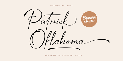 Patrick Oklahoma is a handwritten signature script font. This font has a luxurious and stylish feels that is perfect for fashion-related design. Patrick Oklahoma font is also usable in a wide range of works such as logos, covers, posters, quotes, product packaging, merchandise, social media and much more! Feature : - Alternate Glyphs - Multilingual Language - Works on PC & Mac - Simple installations - Accessible in the Adobe Illustrator, Adobe Photoshop, Adobe InDesign, even works on Microsoft Word. Thank you! Grezline Studio - Akhmad Reza Fauzi
 - Syakaila Script by Bejeletter,
$10.00 This is our newest product called Syakaila Script. The alternative characters were divided into several OpenType features such as Title and Swash. Syakaila can be used for wide ranges of application, such as wedding design, logo, invitations, social media posts, clothing, invitation, poster, cafe/resto sign, and many others. Features: Syakaila Script Regular Syakaila Script Italic OpenType features (Titling and Swash) Ligatures Multilingual glyphs - spread your message globally AÀÁÂÃÄÅCÇDÐEÈÉÊËIÌÍÎÏNÑOØÒÓÔÕÖUÙÜÚÛWYÝŸÆßÞþ Fonts: You can use any software that fonts can be used on it
 - Freik by Maulana Creative,
$13.00 Freik is a wide strong headlines display sans font. With bold sharp edge stroke, fun character with a bit of ligatures and alternates. To give you an extra creative work. Freik font support multilingual more than 100+ language. This font is good for logo design, Social media, Movie Titles, Books Titles, a short text even a long text letter and good for your secondary text font with sans or serif. Make a stunning work with Freik font. Cheers, Maulana Creative
 - Portsilk by Maulana Creative,
$12.00 Portsilk is wide clean round sans display font, inspired by legendary Eurostile. Bold stroke, fun character with a bit of ligatures and alternates. To give you an extra creative work. Portsilk font support multilingual more than 100+ language. This font is good for logo design, Social media, Movie Titles, Books Titles, a short text even a long text letter and good for your secondary text font with script or serif. Make a stunning work with Portsilk font. Cheers, Maulana Creative
 - Pierce Jameson by Grezline Studio,
$20.00 Pierce Jameson is a display font family with vintage aesthetic. This font was created to give your headlines and logotype projects a stylish touch. Pierce Jameson font is also usable in a wide range of works such as logos, covers, posters, quotes, product packaging, merchandise, social media and much more! Combine them to make your creative projects become more authentic! Feature : - Multilingual Language - Works on PC & Mac - Simple installations - Accessible in the Adobe Illustrator, Adobe Photoshop, Adobe InDesign, even works on Microsoft Word.
 - Riclose Serif by Dora Typefoundry,
$19.00 Riclose is a set of two modern and classy fonts. With stylish serif fonts and free-flowing handwritten font script companions,They blend very well. Riclose offers beautiful typographic harmonies for a wide variety of design projects, including logos & branding, wedding designs, social media posts, advertising & product designs. This type of family has become the work of true love, making it as easy and fun as possible. I really hope you enjoy it! Thank you and have a nice day.
 - Leonardo Sans by Factory738,
$10.00 Leonardo Sans is a modern sans serif with a geometric touch. It comes in 10 weights, clean and modern caps, thereby creating more variability. Designed with powerful opentype features in mind. Each weight includes extended language support, fractions, tabular figures, arrows, ligatures and more. Perfectly suited for graphic design and any display use. It could easily work for web, signage, corporate as well as for editorial design. 10 Weights (Thin, UltraLight, Light, Regular, Medium, SemiBold, Bold, ExtraBold, Black, Heavy) Oblique font is available Numbers & Punctuation Extensive Language Support Thanks for looking, and I hope you enjoy it. Check out Newgate which is a great pair for Leonardo Sans.
 - Lubeck by FoxType,
$15.00 Introducing Lubeck Display, new generation Typeface with 3 Weights. Lubeck Typeface created with the vision of to attract the audience to your brand . The finest details of this typeface are methodically and mathematically created. Lubeck is created with all the tasks of a corporate font and also for the usage in a variety of projects, including branding, logos, titles, headlines, servers, screens, display, digital ads, and everything else. We are putting a lot of effort on this font as a long-term project. The Typeface includes Three Weights. Light, Regular and Medium Features: Numerals, extended punctuation & Basic Symbols(200+ Glyphs). Expert kerning and quality crafting. Uppercase Letters & Lowercase Letters.
 - Tighten - Personal use only

- Blue Goblet Drawn by insigne,
$5.00 This best selling series has now been extended to include a new member, Blue Goblet Drawn. Blue Goblet is hand-drawn by the artist, Cory Godbey, and is organic, charming and exuberant. Characters bounce and dance above and below the baseline and x-height, making this a whimsical and fun script. Not only is Blue Goblet Drawn a excellent choice, it also is also a versatile member of a wide family of different fonts. You can use it side by side with the original Blue Goblet fonts, and there are a wide range of ornaments available in the supplemental ornament sets--over 370 illustrations! These illustrations include doodley frames, lovely florals and other text ornaments that can be inserted into your text and resized at will. This makes the Blue Goblet series a great pick when you want a type system for a very unique and consistent look. The Blue Goblet series also continues to expand, making any of these family members a valuable investment for the future. Blue Goblet Drawn comes in three weights and three widths in each weight, with complementary italics for maximum impact for a total of eighteen pro fonts. The compact thin weights are delicate and tall, while the Regular has just enough heft for those situations where subtlety doesn't work. If you don't need the professional features, there are three stripped down fonts that include only the basic character set! Blue Goblet Drawn also includes auto-replacing ligatures that make it appear that the script was drawn by the artistís own hand--just for you! Blue Goblet Drawn also includes a wide variety of alternates that can be accessed in any OpenType enabled application. Blue Goblet includes over 190 additional glyphs and is loaded with features including an even more unique alternate alphabet. Included are swash alternates, style sets, old style figures and small caps. Please see the informative PDF brochure to see these features in action. OpenType enabled applications such as the Adobe suite or Quark can take full advantage of the automatic replacing ligatures and alternates. This family also includes the glyphs to support a wide range of languages. Blue Goblet Drawn is a great choice for friendly display type in children's books, packaging, organic packaging or other unique applications. Use Blue Goblet whenever you want to inject a handmade sense of fun and whimsy to your designs. Give the Blue Goblet series a whirl today!
 - Sancoale Gothic by insigne,
$35.00 In comparison to the powerful and commanding original, Sancoale Gothic is a more sober version of Sancoale. The medium contrast between thick and thin strokes makes for a typeface that stands out with striking clarity in longer texts, yet is very readable. This new addition to the Sancoale family is a perfect alternative if you want to use a different style than the original family. Using the utmost care and restraint, the designer strove to avoid overbearing futurism in favor of a typeface with clean lines and clear forms. Show your customers the world with Sancoale Gothic, a versatile sans with a wide range of styles, from delicate thins to bold, hefty weights that dominate the page and screen with confidence and futuristic flair. A fresh, friendly voice for all kinds of uses, from corporate statements to fashion, Sancoale Gothic is a versatile sans with a wide range of styles, from delicate thins to bold, hefty weights that dominate the page and screen with confidence and futuristic flair. Sancoale Gothic has a distinct personality, which allows you to create a wide range of projects, including posters and websites. The Sancoale Gothic fonts come in many varieties, so you can go with a light or thick weight, depending on what fits your project best. With their sweeping curves, the heavy fonts are meant for huge headings on posters and websites. The Sancoale Gothic family is made up of 48 distinct styles, with 660 glyphs and supports 70 languages, allowing you to communicate with your customers all over the world. Small Capitals and other OpenType features abound! The design is sleek with no stems or spurs in the default character set, but OpenType alternates have alternates with stems. OpenType capable applications such as Quark or the Adobe suite can take full advantage of the automatically replacing ligatures and alternates. The superfamily offers an array of optical sizes, contrasting weights, and contrasting optical sizes to discover the right balance, contrast, and optical size for your design. Prepare to be blown away by Sancoale Gothic’s smooth curves and captivating allure. Sancoale Gothic is perfect for both a contemporary and forward looking style. Sancoale Gothic is both practical and unique, in a standalone capacity or with the companion Sancoale fonts. Use it to make an impact today.
 - Sablon by Roman Cernohous Typotime,
$29.00 Solid all caps display font with a hint of retro expression. Wide language support including complete set of Cyrillic characters.
 - PF Centro Serif Pro by Parachute,
$79.00 Centro Serif Pro is an award-winning typeface. It received a Gold Award from the European Design Awards 2008 and an Excellence Award from the International Type Design Competition 2009 as part of the Centro Pro type system. This large series of 40 fonts with 1519 glyphs each is composed of three superfamilies (serif, sans and slab), includes true italics and supports Latin, Greek and Cyrillic. According to the jury of the European Design Awards “...Centro Pro is an almost ‘invisible’ typeface with distinct personality, it has legibility as its main attribute and is ideal for a wide range of design works. It does not attract any unnecessary attention, but rather serves its purpose. A rare case of contemporary type family working across three alphabets. Centro Pro meets an ever-growing demand for such typefaces among pan-European companies and institutions”. Centro Pro has become very popular among printed media and is ideal choice for newspapers, magazines and corporate applications. Furthermore every font in this series has been completed with 270 copyright-free symbols, some of which have been proposed by several international organizations for packaging, public areas, environment, transportation, computers, fabric care and urban life.
 - PF Centro Slab Pro by Parachute,
$79.00 Centro Slab Pro is an award-winning typeface. It received a Gold Award from the European Design Awards 2008 and an Excellence Award from the International Type Design Competition 2009 as part of the Centro Pro type system. This large series of 40 fonts with 1519 glyphs each is composed of three superfamilies (serif, sans and slab), includes true italics and supports Latin, Greek and Cyrillic. According to the jury of the European Design Awards “...Centro Pro is an almost ‘invisible’ typeface with distinct personality, it has legibility as its main attribute and is ideal for a wide range of design works. It does not attract any unnecessary attention, but rather serves its purpose. A rare case of contemporary type family working across three alphabets. Centro Pro meets an ever-growing demand for such typefaces among pan-European companies and institutions”. Centro Pro has become very popular among printed media and is ideal choice for newspapers, magazines and corporate applications. Furthermore every font in this series has been completed with 270 copyright-free symbols, some of which have been proposed by several international organizations for packaging, public areas, environment, transportation, computers, fabric care and urban life.
 - PF Centro Sans Pro by Parachute,
$79.00 Centro Sans Pro is an award-winning typeface. It received a Gold Award from the European Design Awards 2008 and an Excellence Award from the International Type Design Competition 2009 as part of the Centro Pro type system. This large series of 40 fonts with 1519 glyphs each is composed of three superfamilies (serif, sans and slab), includes true italics and supports Latin, Greek and Cyrillic. According to the jury of the European Design Awards “...Centro Pro is an almost ‘invisible’ typeface with distinct personality, it has legibility as its main attribute and is ideal for a wide range of design works. It does not attract any unnecessary attention, but rather serves its purpose. A rare case of contemporary type family working across three alphabets. Centro Pro meets an ever-growing demand for such typefaces among pan-European companies and institutions”. Centro Pro has become very popular among printed media and is ideal choice for newspapers, magazines and corporate applications. Furthermore every font in this series has been completed with 270 copyright-free symbols, some of which have been proposed by several international organizations for packaging, public areas, environment, transportation, computers, fabric care and urban life.
 - Arsena by Apostrof,
$50.00 The font Arsena was designed for a contest on the creation of modern Ukrainian business font "Arsenal" and awarded the 3rd prize. A little squared figure which is enlightened from the middle, unobvious, but the existing modular grid, simplified, but not a primitive design of letters, mathematically defined optimum inclination angle, counterbalanced ratio of thickness, an optimum spacing and a manual kerning - all of this is for the best reproduction in any conditions as well as for the maximum clarity and readability. Asymmetric slab serifs make the font Ukrainian and at the same time have a modern and dynamic look. Besides its highlighting function, Italics also have an independent assignment. The Italics are made under calligraphic traditions in a modern style of mono-thickness (but optically compensated) and in particular, in combination with alternative initials of the same style and it is relevant to use it in a private letter, or in the design of the official greetings, etc. It is also promoted by four typographic ornamental motives. Due to the above-mentioned qualities this font can be used successfully for a wide range of tasks - from business to mass media, publishing, advertising and accidental.
 - VTCKomixationSCBold - Unknown license

- VTC NightOfTheDrippyDeadOuttie - Unknown license

- VTC NightOfTheDeadCorruptCaps - Unknown license

- VTCKomixationCaps - Unknown license

- VTC NightOfTheWackedDead - Unknown license

- VTC NightOfTheDrippyLowCaps - Unknown license


