4,240 search results
(0.02 seconds)
- Bollek by Pandastock,
$12.00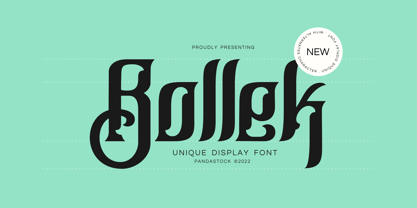 Bollek is unique fonts with visual elegance, smooth curves and beautiful ligatures clear, making your work look true and attractive. A very versatile font that works in both large and small sizes. This font is suitable for a wide variety of projects such as invitations, logo, branding, magazine, photography, card, product packaging, mugs, quotes, poster, label, signature and more. Font which is perfect for all business sectors including personal projects, studio, corporate, creative agency, industrial, company, etc.
 - Biscuit Pro by Kustomtype,
$30.00 Biscuit is a rounded unique typeface, clearly and easy readable with upper- and lowercase. Perfectly applicable for big or bold tekst pages. This font family has an excellent legibility - both in print and on the web - and an optimized kerning. Biscuit is intentionally designed to be used as a display typeface in publications, packaging and al of your artwork and design. It's warm and cosy character suits extraordinary well for modern or vintage typography and corporate design.
 - Husr Necian by Imoodev,
$20.00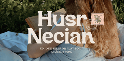 Husr necian is luxury serif fonts with visual elegance, smooth curves, and beautiful ligatures clear, making your work look true and attractive. A versatile font that works in both large and small sizes. This font is suitable for a wide variety of projects such as invitations, logos, branding, magazine, photography, card, product packaging, mugs, quotes, poster, labels, signatures, and more. A font which is perfect for all business sectors including personal projects, studio, corporate, creative agency, industrial, company, etc.
 - Kelluhan by Pandastock,
$12.00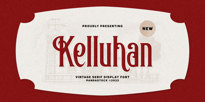 Kelluhan is a vintage typeface with visual elegance, smooth curves, and beautiful ligatures clear, making your work look true and attractive. A very versatile font that works in both large and small sizes. This font is suitable for a wide variety of projects such as invitations, logos, branding, magazine, photography, card, product packaging, mugs, quotes, poster, labels, signatures and more. A font that is perfect for all business sectors including personal projects, studio, corporate, creative agency, industrial, company, etc.
 - Mukoji by Imoodev,
$20.00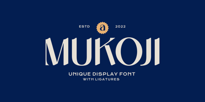 Mukoji is unique elegant font with visual elegance, smooth curves, and beautiful ligatures clear, making your work look true and attractive. A versatile font that works in both large and small sizes. This font is suitable for a wide variety of projects such as invitations, logos, branding, magazine, photography, card, product packaging, mugs, quotes, poster, labels, signatures, and more. A font that is perfect for all business sectors including personal projects, studio, corporate, creative agency, industrial, company, etc.
 - Belgia by HansCo,
$15.00 Here come our latest product with sans serif typeface called Belgia. This font has the characteristics of a rounded shape on each side. Besides this font is perfect for those of you who are looking for font with bold and rounded but still look classy. You can use it on corporate branding, logo, document, social media design, presentation, print design, web, etc. This typeface is comes in uppercase, lowercase, punctuation, symbols, numerals, etc also support multilingual.
 - Hello Malike by Imoodev,
$20.00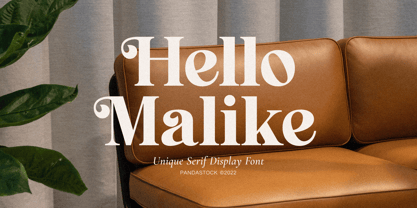 Hello Malike is beautiful serif fonts with visual elegance, smooth curves, and beautiful ligatures clear, making your work look true and attractive. A versatile font that works in both large and small sizes. This font is suitable for a wide variety of projects such as invitations, logos, branding, magazine, photography, card, product packaging, mugs, quotes, poster, labels, signatures, and more. A font that is perfect for all business sectors including personal projects, studio, corporate, creative agency, industrial, company, etc.
 - Youtesh by Imoodev,
$12.00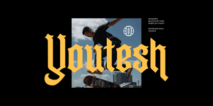 Youtesh is vintage retro fonts with visual elegance, smooth curves, and beautiful ligatures clear, making your work look true and attractive. A very versatile font that works in both large and small sizes. This font is suitable for a wide variety of projects such as invitations, logos, branding, magazine, photography, card, product packaging, mugs, quotes, poster, labels, signatures, and more. A font that is perfect for all business sectors including personal projects, studio, corporate, creative agency, industrial, company, etc.
 - Bokar by Pelavin Fonts,
$25.00 I am inspired by imagery that technology has rendered obsolete. I treasure anachronistic packaging and design which has somehow evaded obliteration by focus groups.I especially admire the packaging for A&P coffee brands Eight O'Clock, Red Circle and Bokar whose eccentric yet elegant typography harkens back to an earlier, less complicated era. The font Bokar is my nod of appreciation to those robust and full-bodied blends spared from the bland, tasteless scourge of corporate branding.
 - Pawirot by Pandastock,
$12.00 Pawirot is display font style with visual elegance, smooth curves and beautiful ligatures clear, making your work look true and attractive. A very versatile font that works in both large and small sizes. This font is suitable for a wide variety of projects such as invitations, logo, branding, magazine, photography, card, product packaging, mugs, quotes, poster, label, signature and more. Font which is perfect for all business sectors including personal projects, studio, corporate, creative agency, industrial, company, etc.
 - Salin by Hurufatfont,
$19.00 Salin is a modern sans serif font family with a geometric and humanist touch. Salin has totally 20 fonts with 10 weights and their appropriate italics. It contains rich opentype features. Includes extended language support, fractions, table figures, arrows, ligatures and more for each weight. Ideal for corporate identity, poster, brochure, orientation signs, and all kinds of graphic design works. “Salin News" and "Salin News Italic” are specially made for long paragraph texts which are written with small sizes.
 - Contamination by Kenn Munk,
$42.00Vowels produce 'end-characters'. These are used whenever a string of symbols start or end. Consonants make 'middle-characters'. Numerals are zero-width characters. these can be used whenever you feel like it, they will float above and below the string of symbols. Puncuation adds extra spice. Hold down 'shift' and you get the individual symbols mirrored. (very useful with the vowels.) Check my website for a more graphic representation and play, for gods sake, play! - Kelpt Sans by Typesketchbook,
$55.00 Kelpt Sans is an altered modified from the form of the original Kelpt typeface. Designed to be more Corporate, the font family has flat terminals that harmonizes with sharp corners. With all of these features, “Kelpt Sans” is a prominent, eye-catching and unique typeface. It comes with 9 weights with 2 Hight options in order to suit for a multifunctional usage, especially for cooperative work, such as website, magazine, editorial, publishing, as well as packaging.
 - Matrike by Pandastock,
$12.00 Matrike is vintage fonts with visual elegance, smooth curves, and beautiful ligatures clear, making your work look true and attractive. A very versatile font that works in both large and small sizes. This font is suitable for a wide variety of projects such as invitations, logos, branding, magazine, photography, card, product packaging, mugs, quotes, poster, labels, signatures, and more. A font that is perfect for all business sectors including personal projects, studio, corporate, creative agency, industrial, company, etc.
 - Mistont by Pandastock,
$12.00 Mistont is beautiful serif fonts with visual elegance, smooth curves and beautiful ligatures clear, making your work look true and attractive. A very versatile font that works in both large and small sizes. This font is suitable for a wide variety of projects such as invitations, logo, branding, magazine, photography, card, product packaging, mugs, quotes, poster, label, signature and more. Font which is perfect for all business sectors including personal projects, studio, corporate, creative agency, industrial, company, etc.
 - Vokrad by Imoodev,
$20.00 Vokrad is modern vintage font with visual elegance, smooth curves, and beautiful ligatures clear, making your work look true and attractive. A very versatile font that works in both large and small sizes. This font is suitable for a wide variety of projects such as invitations, logos, branding, magazine, photography, card, product packaging, mugs, quotes, poster, labels, signatures, and more. A font that is perfect for all business sectors including personal projects, studio, corporate, creative agency, industrial, company, etc.
 - Riemish by Pandastock,
$12.00 Riemish is blackletter font with visual elegance, smooth curves, and beautiful ligatures clear, making your work look true and attractive. A very versatile font that works in both large and small sizes. This font is suitable for a wide variety of projects such as invitations, logos, branding, magazine, photography, card, product packaging, mugs, quotes, poster, labels, signatures, and more. Font which is perfect for all business sectors including personal projects, studio, corporate, creative agency, industrial, company, etc.
 - JAF Herb by Just Another Foundry,
$59.00 Herb is based on 16th century cursive broken scripts and printing types. Originally designed by Tim Ahrens in the MA Typeface Design course at the University of Reading, it was further refined and extended in 2010. The idea for Herb was to develop a typeface that has the positive properties of blackletter but does not evoke the same negative connotations – a type that has the complex, humane character of fraktur without looking conservative, aggressive or intolerant.
 - Stenka by Katatrad,
$39.00 Stenka is a sans-serif stencil typeface that stand for display typeface to use in any typographic situation. It has his own unique style in expressed perfect condensed forms. Stenka is an ideal font family for display, print, corporate identity, mobile devices, magazine cover, signage, and web design creation, with a set of ligatures and alternative characters for your design in any layout. The family has 4 weights ranging from Light to Black and their italic.
 - Hello Hoeask by Imoodev,
$12.00 Hello Hoeask is display fonts with visual elegance, smooth curves and beautiful ligatures clear, making your work look true and attractive. A very versatile font that works in both large and small sizes. This font is suitable for a wide variety of projects such as invitations, logo, branding, magazine, photography, card, product packaging, mugs, quotes, poster, label, signature and more. Font which is perfect for all business sectors including personal projects, studio, corporate, creative agency, industrial, company, etc.
 - Brignell Sunday by IB TYPE Inc.,
$40.00 BRIGNELL SUNDAY is an eight font family designed by Ian Brignell. A relaxed, easy-reading companion for any day of the week. A clean, modern, friendly sans serif characterized by an open style with occasionally rounded corners, occasional curved junctures on diagonals and a slightly sloped lower case A. Brignell Sunday was born in 2006 and was inspired by corporate custom font ideas Ian designed for an LG Electronics sub-brand called Best Shop. Extended Latin set.
 - VTC-FreehandTattooOne - Personal use only

- VTC-BadEnglischOne - Personal use only

- Darah Erc - Unknown license

- ITC Jambalaya by ITC,
$29.99The talented designer of the well-known Formata typeface, Bernd Möllenstädt was born on February 22, 1943 in Germany. He has lived in Westfalia, Berlin and Munich, Germany, and now permanently resides in Munich. From his earliest years he was interested in typography, first studying as a typesetter (1961-64) and then a student of graphic design (1964-1967). In 1967 Möllenstädt joined the Berthold typefoundry and his career as one of the leading type personalities began. One year after joining Berthold, he became the head of the type design department. For 22 years he worked as the head of that department, under the leadership of Günter Gerhard Lange. Upon Lange’s retirement in 1990, Möllenstädt ascended to the type directorship of Berthold where he was responsible for type design and font mastering. Möllenstädt designed two typeface for the Berthold Exklusiv Collection, Formata (1988) and Signata (1994). Under license from Berthold, Adobe marketed Formata as part of the Adobe Type Library. Formata is now one of the most successful sans serifs in the world, used both in American and European magazines, as well as newsletters in the Far East (Gulf New Kuwait). Formata also was chosen as the corporate typeface of Postbank, Allianz, VW Skoda, Infratest Burke, etc. In addition to his work for Berthold, Möllenstädt has lectured at local Munich schools on typography and graphic design, and designed corporate type identities and diverse logos for major corporations, including Allianz, Commerzbank, Mauser Officer and Hoepfner. Möllenstädt continues his association with Berthold as a designer. He most recently completed small caps and fractions for Formata. He also has substantially contributed to Berthold's Euro symbol program (e.g. adding the Euro symbol design-specific to the most popular families). Möllenstädt currently is working on a new Berthold Exklusiv design. - Generis Slab by Linotype,
$29.00The idea for the Generis type system came to Erik Faulhaber while he was traveling in the USA. Seeing typefaces mixed together in a business district motivated him to create a new type system with interrelated forms. The first design scheme came about in 1997, following the space saving model of these American Gothics. Faulhaber then examined the demands of legibility and various communications media before finally developing the plan behind this type system. Generis’s design includes two individually designed styles; each of with is available with and without serifs, giving the type system four separate families. Each includes at least four basic weights: Light, Regular, Medium, and Bold. Further weights, small caps, old style figures, and true italics were added to each family where needed. The Generis type system is designed to meet both optical criteria and the highest possible measure of technical precision. Harmony, rhythm, legibility, and formal restraint make up the foreground. Generis combines aesthetic, technical, and economic advantages, which purposefully and efficiently cover the whole range of corporate communication needs. The unified basic form and the individual peculiarity of the styles lead to Generis’ systematic, total-package concept. The clear formal language of the Generis type system resides beneath the information, bringing appropriate typographic expression to high-level corporate identity systems, both in print and on screen. The condensed and aspiring nature of the letterforms allows for the efficient setting of body copy, and the economic use of the page. A range of accented characters allows text to be set in 48 Latin-based languages, offering maximal typographic free range. This previously unknown level of technical and design execution helps create higher quality typography in all areas of corporate communication. Optimal combinations within the type system: Generis Serif or Generis Slab with Generis Sans or Generis Simple. - Generis Serif by Linotype,
$29.00The idea for the Generis type system came to Erik Faulhaber while he was traveling in the USA. Seeing typefaces mixed together in a business district motivated him to create a new type system with interrelated forms. The first design scheme came about in 1997, following the space saving model of these American Gothics. Faulhaber then examined the demands of legibility and various communications media before finally developing the plan behind this type system. Generis’s design includes two individually designed styles; each of with is available with and without serifs, giving the type system four separate families. Each includes at least four basic weights: Light, Regular, Medium, and Bold. Further weights, small caps, old style figures, and true italics were added to each family where needed. The Generis type system is designed to meet both optical criteria and the highest possible measure of technical precision. Harmony, rhythm, legibility, and formal restraint make up the foreground. Generis combines aesthetic, technical, and economic advantages, which purposefully and efficiently cover the whole range of corporate communication needs. The unified basic form and the individual peculiarity of the styles lead to Generis’ systematic, total-package concept. The clear formal language of the Generis type system resides beneath the information, bringing appropriate typographic expression to high-level corporate identity systems, both in print and on screen. The condensed and aspiring nature of the letterforms allows for the efficient setting of body copy, and the economic use of the page. A range of accented characters allows text to be set in 48 Latin-based languages, offering maximal typographic free range. This previously unknown level of technical and design execution helps create higher quality typography in all areas of corporate communication. Optimal combinations within the type system: Generis Serif or Generis Slab with Generis Sans or Generis Simple. - Generis Simple by Linotype,
$39.00The idea for the Generis type system came to Erik Faulhaber while he was traveling in the USA. Seeing typefaces mixed together in a business district motivated him to create a new type system with interrelated forms. The first design scheme came about in 1997, following the space saving model of these American Gothics. Faulhaber then examined the demands of legibility and various communications media before finally developing the plan behind this type system. Generis’s design includes two individually designed styles; each of with is available with and without serifs, giving the type system four separate families. Each includes at least four basic weights: Light, Regular, Medium, and Bold. Further weights, small caps, old style figures, and true italics were added to each family where needed. The Generis type system is designed to meet both optical criteria and the highest possible measure of technical precision. Harmony, rhythm, legibility, and formal restraint make up the foreground. Generis combines aesthetic, technical, and economic advantages, which purposefully and efficiently cover the whole range of corporate communication needs. The unified basic form and the individual peculiarity of the styles lead to Generis’ systematic, total-package concept. The clear formal language of the Generis type system resides beneath the information, bringing appropriate typographic expression to high-level corporate identity systems, both in print and on screen. The condensed and aspiring nature of the letterforms allows for the efficient setting of body copy, and the economic use of the page. A range of accented characters allows text to be set in 48 Latin-based languages, offering maximal typographic free range. This previously unknown level of technical and design execution helps create higher quality typography in all areas of corporate communication. Optimal combinations within the type system: Generis Serif or Generis Slab with Generis Sans or Generis Simple. - Generis Sans by Linotype,
$29.00The idea for the Generis type system came to Erik Faulhaber while he was traveling in the USA. Seeing typefaces mixed together in a business district motivated him to create a new type system with interrelated forms. The first design scheme came about in 1997, following the space saving model of these American Gothics. Faulhaber then examined the demands of legibility and various communications media before finally developing the plan behind this type system. Generis’s design includes two individually designed styles; each of with is available with and without serifs, giving the type system four separate families. Each includes at least four basic weights: Light, Regular, Medium, and Bold. Further weights, small caps, old style figures, and true italics were added to each family where needed. The Generis type system is designed to meet both optical criteria and the highest possible measure of technical precision. Harmony, rhythm, legibility, and formal restraint make up the foreground. Generis combines aesthetic, technical, and economic advantages, which purposefully and efficiently cover the whole range of corporate communication needs. The unified basic form and the individual peculiarity of the styles lead to Generis’ systematic, total-package concept. The clear formal language of the Generis type system resides beneath the information, bringing appropriate typographic expression to high-level corporate identity systems, both in print and on screen. The condensed and aspiring nature of the letterforms allows for the efficient setting of body copy, and the economic use of the page. A range of accented characters allows text to be set in 48 Latin-based languages, offering maximal typographic free range. This previously unknown level of technical and design execution helps create higher quality typography in all areas of corporate communication. Optimal combinations within the type system: Generis Serif or Generis Slab with Generis Sans or Generis Simple. - The London font, designed by the talented Jovanny Lemonad, is a distinctive typeface that captures the essence of modernity and elegance. Envision a font that effortlessly combines the historic charm...
- Zacatecas 1914 - Personal use only

- ChrisMaster - Personal use only

- Rabiosa - Personal use only

- Caminata One - Personal use only

- Cags Hetonal by Imoodev,
$20.00 Cags Hetonal is a rounded sans serif font with visual elegance, smooth curves, and beautiful ligatures clear, making your work look true and attractive. A very versatile font that works in both large and small sizes. This font is suitable for a wide variety of projects such as invitations, logos, branding, magazine, photography, card, product packaging, mugs, quotes, poster, labels, signatures, and more. A font that is perfect for all business sectors including personal projects, studio, corporate, creative agency, industrial, company, etc.
 - Akoher by Imoodev,
$20.00 Akoher is a vintage display font with visual elegance, smooth curves, and beautiful ligatures clear, making your work look true and attractive. A very versatile font that works in both large and small sizes. This font is suitable for a wide variety of projects such as invitations, logos, branding, magazine, photography, card, product packaging, mugs, quotes, poster, labels, signatures, and more. A font that is perfect for all business sectors including personal projects, studio, corporate, creative agency, industrial, company, etc.
 - HS Dream by Hiba Studio,
$50.00 HS Dream is based on some modern lines of Kufi calligraphy which supports Arabic, Persian. The typeface has been optimized for corporate identity work and modern projects when a contemporary and simple look is requested. It is an Opent type Arabic font and features four stylistic sets. This font consists of four weights (light, regular, medium and bold) which can constitute a striking addition to the library of Arabic fonts models that meet the purposes of various designs for all taste.
 - P22 Typewriter by IHOF,
$24.95 This font is not overly distressed, nor is it overly clean. It is a typewriter font. It is perfect when you want a document to look like it was made on a typewriter. This font is primarily based on the typewriter used for a typographic conference document from 1966 in Mainz Germany. The model and age of the typewriter used is not known. Additional characters were sourced from other vintage typewriters and others were designed to complete the full character set.
 - Eskos Display by Pesotsky Victor,
$10.00 Eskos Display is a bright and eye-catching headline set. It is designed specifically to attract attention and be the base of the composition. It is deliberately diagonal and gives a sharp oblique texture to the texts. Such an exciting font will be perfect for posters, headlines on media sites or magazines, and it can also be the base for a corporate identity. The font supportsBasic Latin, Cyrillic and more than 100 languages all together. Eskos Display was designed by Viktor Pesotsky.
 - Bell Centennial by Bitstream,
$29.99 Designed specifically for AT&T by Matthew Carter at Mergenthaler to replace Bell Gothic with a typeface that made effective use of digital typesetting technology, Bell Centennial gets several more lines per page than Bell Gothic, reduces calls to information because of its significantly higher legibility under adverse printing conditions, saving AT&T many millions of dollars per year. Although intended for use at small sizes, Mazda UK used Bell Centennial at huge sizes to striking effect in a mid-1990s ad campaign.


