4,240 search results
(0.018 seconds)
- HiSky - Unknown license

- Rykers Pram - Unknown license

- Westminster - Unknown license

- Times Eighteen by Linotype,
$29.00In 1931, The Times of London commissioned a new text type design from Stanley Morison and the Monotype Corporation, after Morison had written an article criticizing The Times for being badly printed and typographically behind the times. The new design was supervised by Stanley Morison and drawn by Victor Lardent, an artist from the advertising department of The Times. Morison used an older typeface, Plantin, as the basis for his design, but made revisions for legibility and economy of space (always important concerns for newspapers). As the old type used by the newspaper had been called Times Old Roman," Morison's revision became "Times New Roman." The Times of London debuted the new typeface in October 1932, and after one year the design was released for commercial sale. The Linotype version, called simply "Times," was optimized for line-casting technology, though the differences in the basic design are subtle. The typeface was very successful for the Times of London, which used a higher grade of newsprint than most newspapers. The better, whiter paper enhanced the new typeface's high degree of contrast and sharp serifs, and created a sparkling, modern look. In 1972, Walter Tracy designed Times Europa for The Times of London. This was a sturdier version, and it was needed to hold up to the newest demands of newspaper printing: faster presses and cheaper paper. In the United States, the Times font family has enjoyed popularity as a magazine and book type since the 1940s. Times continues to be very popular around the world because of its versatility and readability. And because it is a standard font on most computers and digital printers, it has become universally familiar as the office workhorse. Times™, Times™ Europa, and Times New Roman™ are sure bets for proposals, annual reports, office correspondence, magazines, and newspapers. Linotype offers many versions of this font: Times™ is the universal version of Times, used formerly as the matrices for the Linotype hot metal line-casting machines. The basic four weights of roman, italic, bold and bold italic are standard fonts on most printers. There are also small caps, Old style Figures, phonetic characters, and Central European characters. Times™ Ten is the version specially designed for smaller text (12 point and below); its characters are wider and the hairlines are a little stronger. Times Ten has many weights for Latin typography, as well as several weights for Central European, Cyrillic, and Greek typesetting. Times™ Eighteen is the headline version, ideal for point sizes of 18 and larger. The characters are subtly condensed and the hairlines are finer. Times™ Europa is the Walter Tracy re-design of 1972, its sturdier characters and open counterspaces maintain readability in rougher printing conditions. Times New Roman™ is the historic font version first drawn by Victor Lardent and Stanley Morison for the Monotype hot metal caster." - Times Europa LT by Linotype,
$29.99In 1931, The Times of London commissioned a new text type design from Stanley Morison and the Monotype Corporation, after Morison had written an article criticizing The Times for being badly printed and typographically behind the times. The new design was supervised by Stanley Morison and drawn by Victor Lardent, an artist from the advertising department of The Times. Morison used an older typeface, Plantin, as the basis for his design, but made revisions for legibility and economy of space (always important concerns for newspapers). As the old type used by the newspaper had been called Times Old Roman," Morison's revision became "Times New Roman." The Times of London debuted the new typeface in October 1932, and after one year the design was released for commercial sale. The Linotype version, called simply "Times," was optimized for line-casting technology, though the differences in the basic design are subtle. The typeface was very successful for the Times of London, which used a higher grade of newsprint than most newspapers. The better, whiter paper enhanced the new typeface's high degree of contrast and sharp serifs, and created a sparkling, modern look. In 1972, Walter Tracy designed Times Europa for The Times of London. This was a sturdier version, and it was needed to hold up to the newest demands of newspaper printing: faster presses and cheaper paper. In the United States, the Times font family has enjoyed popularity as a magazine and book type since the 1940s. Times continues to be very popular around the world because of its versatility and readability. And because it is a standard font on most computers and digital printers, it has become universally familiar as the office workhorse. Times™, Times™ Europa, and Times New Roman™ are sure bets for proposals, annual reports, office correspondence, magazines, and newspapers. Linotype offers many versions of this font: Times™ is the universal version of Times, used formerly as the matrices for the Linotype hot metal line-casting machines. The basic four weights of roman, italic, bold and bold italic are standard fonts on most printers. There are also small caps, Old style Figures, phonetic characters, and Central European characters. Times™ Ten is the version specially designed for smaller text (12 point and below); its characters are wider and the hairlines are a little stronger. Times Ten has many weights for Latin typography, as well as several weights for Central European, Cyrillic, and Greek typesetting. Times™ Eighteen is the headline version, ideal for point sizes of 18 and larger. The characters are subtly condensed and the hairlines are finer. Times™ Europa is the Walter Tracy re-design of 1972, its sturdier characters and open counterspaces maintain readability in rougher printing conditions. Times New Roman™ is the historic font version first drawn by Victor Lardent and Stanley Morison for the Monotype hot metal caster." - Times Ten by Linotype,
$40.99In 1931, The Times of London commissioned a new text type design from Stanley Morison and the Monotype Corporation, after Morison had written an article criticizing The Times for being badly printed and typographically behind the times. The new design was supervised by Stanley Morison and drawn by Victor Lardent, an artist from the advertising department of The Times. Morison used an older typeface, Plantin, as the basis for his design, but made revisions for legibility and economy of space (always important concerns for newspapers). As the old type used by the newspaper had been called Times Old Roman," Morison's revision became "Times New Roman." The Times of London debuted the new typeface in October 1932, and after one year the design was released for commercial sale. The Linotype version, called simply "Times," was optimized for line-casting technology, though the differences in the basic design are subtle. The typeface was very successful for the Times of London, which used a higher grade of newsprint than most newspapers. The better, whiter paper enhanced the new typeface's high degree of contrast and sharp serifs, and created a sparkling, modern look. In 1972, Walter Tracy designed Times Europa for The Times of London. This was a sturdier version, and it was needed to hold up to the newest demands of newspaper printing: faster presses and cheaper paper. In the United States, the Times font family has enjoyed popularity as a magazine and book type since the 1940s. Times continues to be very popular around the world because of its versatility and readability. And because it is a standard font on most computers and digital printers, it has become universally familiar as the office workhorse. Times™, Times™ Europa, and Times New Roman™ are sure bets for proposals, annual reports, office correspondence, magazines, and newspapers. Linotype offers many versions of this font: Times™ is the universal version of Times, used formerly as the matrices for the Linotype hot metal line-casting machines. The basic four weights of roman, italic, bold and bold italic are standard fonts on most printers. There are also small caps, Old style Figures, phonetic characters, and Central European characters. Times™ Ten is the version specially designed for smaller text (12 point and below); its characters are wider and the hairlines are a little stronger. Times Ten has many weights for Latin typography, as well as several weights for Central European, Cyrillic, and Greek typesetting. Times™ Eighteen is the headline version, ideal for point sizes of 18 and larger. The characters are subtly condensed and the hairlines are finer. Times™ Europa is the Walter Tracy re-design of 1972, its sturdier characters and open counterspaces maintain readability in rougher printing conditions. Times New Roman™ is the historic font version first drawn by Victor Lardent and Stanley Morison for the Monotype hot metal caster." - Times Ten Paneuropean by Linotype,
$92.99In 1931, The Times of London commissioned a new text type design from Stanley Morison and the Monotype Corporation, after Morison had written an article criticizing The Times for being badly printed and typographically behind the times. The new design was supervised by Stanley Morison and drawn by Victor Lardent, an artist from the advertising department of The Times. Morison used an older typeface, Plantin, as the basis for his design, but made revisions for legibility and economy of space (always important concerns for newspapers). As the old type used by the newspaper had been called Times Old Roman," Morison's revision became "Times New Roman." The Times of London debuted the new typeface in October 1932, and after one year the design was released for commercial sale. The Linotype version, called simply "Times," was optimized for line-casting technology, though the differences in the basic design are subtle. The typeface was very successful for the Times of London, which used a higher grade of newsprint than most newspapers. The better, whiter paper enhanced the new typeface's high degree of contrast and sharp serifs, and created a sparkling, modern look. In 1972, Walter Tracy designed Times Europa for The Times of London. This was a sturdier version, and it was needed to hold up to the newest demands of newspaper printing: faster presses and cheaper paper. In the United States, the Times font family has enjoyed popularity as a magazine and book type since the 1940s. Times continues to be very popular around the world because of its versatility and readability. And because it is a standard font on most computers and digital printers, it has become universally familiar as the office workhorse. Times™, Times™ Europa, and Times New Roman™ are sure bets for proposals, annual reports, office correspondence, magazines, and newspapers. Linotype offers many versions of this font: Times™ is the universal version of Times, used formerly as the matrices for the Linotype hot metal line-casting machines. The basic four weights of roman, italic, bold and bold italic are standard fonts on most printers. There are also small caps, Old style Figures, phonetic characters, and Central European characters. Times™ Ten is the version specially designed for smaller text (12 point and below); its characters are wider and the hairlines are a little stronger. Times Ten has many weights for Latin typography, as well as several weights for Central European, Cyrillic, and Greek typesetting. Times™ Eighteen is the headline version, ideal for point sizes of 18 and larger. The characters are subtly condensed and the hairlines are finer. Times™ Europa is the Walter Tracy re-design of 1972, its sturdier characters and open counterspaces maintain readability in rougher printing conditions. Times New Roman™ is the historic font version first drawn by Victor Lardent and Stanley Morison for the Monotype hot metal caster." - Times by Linotype,
$40.99In 1931, The Times of London commissioned a new text type design from Stanley Morison and the Monotype Corporation, after Morison had written an article criticizing The Times for being badly printed and typographically behind the times. The new design was supervised by Stanley Morison and drawn by Victor Lardent, an artist from the advertising department of The Times. Morison used an older typeface, Plantin, as the basis for his design, but made revisions for legibility and economy of space (always important concerns for newspapers). As the old type used by the newspaper had been called Times Old Roman," Morison's revision became "Times New Roman." The Times of London debuted the new typeface in October 1932, and after one year the design was released for commercial sale. The Linotype version, called simply "Times," was optimized for line-casting technology, though the differences in the basic design are subtle. The typeface was very successful for the Times of London, which used a higher grade of newsprint than most newspapers. The better, whiter paper enhanced the new typeface's high degree of contrast and sharp serifs, and created a sparkling, modern look. In 1972, Walter Tracy designed Times Europa for The Times of London. This was a sturdier version, and it was needed to hold up to the newest demands of newspaper printing: faster presses and cheaper paper. In the United States, the Times font family has enjoyed popularity as a magazine and book type since the 1940s. Times continues to be very popular around the world because of its versatility and readability. And because it is a standard font on most computers and digital printers, it has become universally familiar as the office workhorse. Times™, Times™ Europa, and Times New Roman™ are sure bets for proposals, annual reports, office correspondence, magazines, and newspapers. Linotype offers many versions of this font: Times™ is the universal version of Times, used formerly as the matrices for the Linotype hot metal line-casting machines. The basic four weights of roman, italic, bold and bold italic are standard fonts on most printers. There are also small caps, Old style Figures, phonetic characters, and Central European characters. Times™ Ten is the version specially designed for smaller text (12 point and below); its characters are wider and the hairlines are a little stronger. Times Ten has many weights for Latin typography, as well as several weights for Central European, Cyrillic, and Greek typesetting. Times™ Eighteen is the headline version, ideal for point sizes of 18 and larger. The characters are subtly condensed and the hairlines are finer. Times™ Europa is the Walter Tracy re-design of 1972, its sturdier characters and open counterspaces maintain readability in rougher printing conditions. Times New Roman™ is the historic font version first drawn by Victor Lardent and Stanley Morison for the Monotype hot metal caster." - Conectiva by JVB Fonts,
$25.00 A font face with cyber, spatial, and virtual connotations that offers a decisive futuristic and techno spirit. Inspired by geometric forms from visual tendencies in the early 2000s, it was used once in corporate identity. Originally created in 1998, it remained unpublished by its author until today. It is now offered with many improvements. With one alternate for H and more diacritics and ligatures and extended range glyphs, Conectiva can be used in titles and display text that require a futuristic and dynamic style. Conectiva 2.0 has been arranged and improved with more glyphs and new OpenType features (Fractions, discretional and standard ligatures, slashed zero and more new stylish alternates). This upgrade includes 4 new weight variables (Light, book, bold and extrabold). Recommended for games, presentations, or any graphic pieces that reveal and need futuristic, techno, and/or Sci-fi style.
 - Juvelo - 100% free

- Nebula by Muksal Creatives,
$17.00 Nebula is a modern display font that captivates with its futuristic design and striking aesthetics. Created with a combination of geometric elements and artistic touches, Nebula features sharp lines and smooth contours, exuding an elegant and contemporary impression. When you encounter Nebula, your eyes are immediately drawn to its unique characteristics. This font combines creative geometric shapes with innovative typographic elements, creating an outstanding and attention-grabbing appearance. Each letter in Nebula is meticulously crafted, showcasing a perfect blend of clarity and creativity.The strength of Nebula lies in its perfect balance between boldness and sophistication. With various weights and thicknesses, this font allows you to express messages in an engaging and impressive manner. In other words, Nebula has the ability to emanate a distinct power and impression for every design project you undertake. Moreover, Nebula is versatile and adaptable to various design contexts. Whether you use it in advertisements, posters, logos, or other media, this font will deliver exceptional visual appeal. Its clarity and legibility ensure that your intended message remains clear, while its unique character adds a captivating and distinctive touch.
 - Kolaron by IbraCreative,
$17.00 Kolaron – A Modern Condensed Sans Serif Font Kolaron is a contemporary condensed sans-serif font that effortlessly blends sophistication with modernity. Its sleek and streamlined design features condensed letterforms that exude a sense of efficiency and space optimization, making it an ideal choice for projects where legibility and style are paramount. The font’s clean lines and geometric shapes contribute to a polished and professional appearance, making it versatile for a range of applications, from corporate branding to editorial design. Kolaron’s balanced letter spacing and subtle yet distinctive details showcase a meticulous attention to typographic detail, ensuring a harmonious and eye-catching visual experience across various mediums. Whether used for headlines, signage, or digital interfaces, Kolaron stands as a testament to the elegance achievable in contemporary typography. Kolaron is perfect for branding projects, logo, wedding designs, social media posts, advertisements, product packaging, product designs, label, photography, watermark, invitation, stationery, game, fashion and any projects. Fonts include multilingual support for; Afrikaans, Albanian, Czech, Danish, Dutch, English, Estonian, Finnish, French, German, Hungarian, Italian, Latvian, Lithuanian, Norwegian, Polish, Portuguese, Slovak, Slovenian, Spanish, Swedish.
 - Dodgenburn - Unknown license

- Shalom - Unknown license

- Lugatype by Tkachev,
$- This font family will be the best solution for posters, signage, magazine, product branding, corporate branding, logos and titles.
 - Cambirela by Sea Types,
$15.00 Inspired by Santa Catarina mountains, the shapes of the characters refers to the winding contour of the mountain Cambirela.
 - Square by Philippe Souza,
$15.00 A decorative font, plain and simple. Ordered and square. Inspired by space. It can be used easily with contour.
 - Conigen by Yukita Creative,
$14.00 Conigen Modern is a modern typeface that looks both futuristic and contemporary. The lines are sharp and clean with an aerodynamic shape that exudes a modern and technologically advanced feel. Perfect for technology design and branding. There are 12 fonts from Regular to Black and italic fonts are also available
 - Balania by Sabrcreative,
$25.00 Welcome to Sabr Creative, your source for artistic fonts that captivate the eye and enhance your designs. Introducing Balania, a stunning script swash font that exudes elegance and flair. Crafted with precision, Balania is designed to add a touch of sophistication to your projects, from wedding invitations to branding materials.
 - Valgan by Patria Ari,
$15.00 Valgan is a bold, slanted, all-capital display font designed to energize sport-themed apparel and related content. Its dynamic style exudes power and motion, making it perfect for team logos, jerseys, posters, and event branding. Versatile and contemporary, Valgan ensures your designs command attention and convey the spirit of competition.
 - Insecticide by Arkalandara,
$110.00 Insecticide Infused with a laid-back charm, our casual handwriting captures the essence of relaxed authenticity. Effortlessly stylish, each stroke exudes approachable warmth, making it the perfect choice to connect with your audience on a personal level. Embrace a brand identity that feels as comfortable as your favorite pair of jeans
 - The Songket by Lemonthe,
$13.00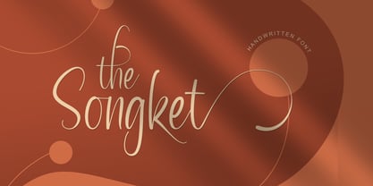 The Songket is a lovely and delicate script font that exudes elegance and class. This font was particularly crafted for those who need a beautiful and refreshing look to their designs. The Songket is PUA encoded which means you can access all of the amazing glyphs and ligatures with ease!
 - Elkdale by Matteson Typographics,
$19.99 Elkdale is an Antique Tuscan typeface based on a series of wood types designed in the 19th century. Elkdale exudes the impactful ornamental designs found in posters, newspapers and signage of the day. With its wide complement of weights and widths, Elkdale should fill any space with attention-grabbing delight.
 - Larome by Gholib Tammami,
$17.00 Larome font is a serif font that possesses a truly unique style. This font is combined with lowercase characters that feature graceful curves, resulting in a distinctive and captivating style. Larome font is well-suited for display purposes and for branding products that exude an elegant, unique, and antique ambiance.
 - Brvsheed by Mofr24,
$10.00 Introducing Brvsheed, a modern handwritten font that exudes uniqueness with its brushed texture. With both Regular and Italic styles, it's a versatile choice for posters, marketing, T-shirt design, and more. Its multilingual support enhances its usability, while its distinctive look adds flair to titles, YouTube thumbnails, and gaming graphics.
 - Dundee Castle NF by Nick's Fonts,
$10.00An offering by lettering artist Harvey Hopkins Dunn for the 1930 classic, American Alphabets, provided the inspiration for this graceful, engaging typeface. Use it liberally to exude elegance, or to turn on the charm. Both versions of the font include 1252 Latin, 1250 CE (with localization for Romanian and Moldovan). - Fanhen by Twinletter,
$15.00 Fanhen Black font is our newest font. Blackletters have long been used in the design of posters, invitations, and packaging to provide a bold and classic look that exudes style and elegance. as well as this font when you use it will cause that effect in each of your projects.
 - Bake Sans by S6 Foundry,
$15.00 Bake Sans is a captivating contemporary typeface that exudes style and personality. Crafted with modern and distinctive shapes and curves, this font offers the perfect visual consistency for your branding and communication projects. Elevate your designs with Bake Sans and make a lasting impression. Ideal for logos, websites, and marketing materials.
 - Beautyca California by Letterena Studios,
$9.00 Beautyca California is a lovely and delicate script font that exudes elegance and class. This font was particularly crafted for those who need a beautiful and refreshing look to their designs. Beautyca California is PUA encoded which means you can access all of the amazing glyphs and ligatures with ease!
 - CAC Lasko Condensed - Unknown license

- CAC Krazy Legs - Unknown license

- Goudy Bookletter 1911 - 100% free

- Thorne Shaded - Unknown license

- ASM by Extratype,
$40.00 The initials ASM represent the acronym of the Santa Monica Arts cultural center located in Barcelona, Spain, where this typeface, with the same name, has served as the custom corporate typeface since 2008 till today (2013). ASM is an energetic monospaced with extreme legibility consisting of two original weights, with an underlined version – used on some of corporate applications – all with their corresponding italics.
 - Jokerman by ITC,
$40.99Jokerman is the work of British designer Andrew Smith. It is a wild and energetic font that is effective when set in all caps, or as mixture of caps and lowercase. Included are a number of alternate letters and funky forms. Jokerman is a fanciful display font that exudes excitement and vitality. - Crab Labs by Mightyfire,
$15.00 Crab Labs exudes a refined and modern aesthetic, characterized by its sleek and minimalistic design. This typeface features slender, unembellished letterforms that convey a sense of elegance and simplicity. The absence of serifs, or decorative strokes, imparts a clean and contemporary appearance, making it well-suited for a variety of design applications.
 - Kirha by Twinletter,
$15.00 Introducing our newest gothic font called Kirha blackletter font, presenting a vintage and elegant style. With a classic typeface, this font evokes confident elegance with striking details on each side of the lettering. Use this font to enhance visual projects that require a bold classic look that exudes style, elegance, and strong personality.
 - Amondels by Fikryal,
$25.00 Introducing Maldives – The Epitome of Luxury and Elegant Impression in Typography. With a captivating and assertive grace, this sans-serif font exudes unparalleled beauty in all caps. Each letter is meticulously crafted to convey a potent yet unpretentious essence in every presentation. Maldives seamlessly marries simplicity and sophistication, resulting in extraordinary visual harmony.
 - Wolfsburg Castle by Unitype Studio,
$29.00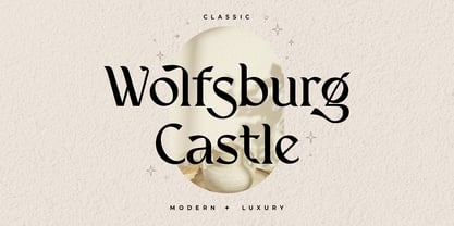 Introducing Wolfsburg Castle, a timeless Serif font that exudes classic elegance and modern sophistication. With its luxurious and stylish design, this font is perfect for adding a touch of refinement to your projects. Whether you're creating branding materials, wedding invitations, or editorial designs, Wolfsburg Castle will captivate your audience with its regal charm.
 - Chrone by Genetype,
$21.00 Introducing Throne Serif Typeface: Unleash Masculine Elegance Experience the epitome of masculine sophistication with Throne Serif – a font designed to embody strength and refinement. From commanding headlines to timeless logos, its bold serifs exude confidence. Elevate your designs with a touch of masculine charm – explore Throne Serif and make a bold statement today.


