10,000 search results
(0.047 seconds)
- Luckangle by Balpirick,
$15.00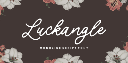 Luckangle is a Monoline Script Font. Luckangle is a lovely and delicate script font that exudes elegance and class. This font was particularly crafted for those who need a beautiful and refreshing look to their designs. Luckangle also multilingual support. Enjoy the font, feel free to comment or feedback, send me PM or email. Thank you!
 - Goldie Boxing by Balpirick,
$15.00 Goldie Boxing is a Bold Brushed Handdrawn Font. Goldie Boxing is a bold display font with an autumn theme. Add this chunky lettered font to your designs and notice how it makes them come alive! Goldie Boxing also multilingual support. Enjoy the font, feel free to comment or feedback, send me PM or email. Thank you!
 - Insomniac by Hanoded,
$15.00 Insomniac is a tall, narrow, handwritten typeface. A little rough, a little shaky, a little uneven. The idea for this font came to me in the middle of the night - hence the name. Insomnia is an all caps font, but upper and lower case differ and glyphs can be freely interchanged. Comes with a diacritics dream team.
 - Belanda by Subectype,
$13.00 Introducing the new "Belanda" font, a monoline script font. For those of you who are needing a touch of clean monoline handwritten Font, chic and modernity for your designs, this font was created for you! If there's anything else you are unsure of feel free to pop me a message :) That's it! Have fun using Belanda Fonts!
 - Magic Romance by Zeenesia Studio,
$19.00 Introducing Magic Romance Magic Romance is a modern and elegant serif font. Magic Romance is well-suited for advertising, branding, logotypes, packaging, titles, headlines and editorial design. We hope you enjoy the font, please feel free to comment if you have any thoughts or feedback. Or email me at zeenesia@gmail.com. Thanks for purchasing and have fun!
 - Violetail by Balpirick,
$15.00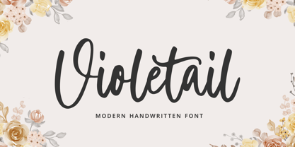 Violetail is a Modern Handwritten Font. Violetail Modern is an elegant and dainty handwritten font that features sweet and delicate swashes. This original look will appeal to a wide range of crafty ideas, from letterheads and titles, to stationery. Violetail also multilingual support. Enjoy the font, feel free to comment or feedback, send me PM or email. Thank you!
 - Horror Corps by Allouse Studio,
$16.00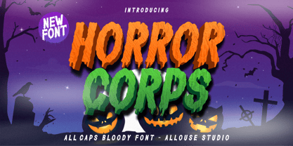 Proudly Presenting, Horror Corps a Handdrawn All Caps Bloody Font. Horror Corps is perfect for any titles, logo, product packaging, branding project, megazine, social media, or just used to express words above the background. Horror Corps also come with Multi-Lingual Support. Enjoy the font, feel free to comment or feedback, send me PM or email. Thank You!
 - Blackbone by Balpirick,
$15.00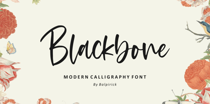 Blackbone is a Modern Calligraphy Font. Blackbone is a lovely and delicate script font that exudes elegance and class. This font was particularly crafted for those who need a beautiful and refreshing look to their designs. Blackbone also multilingual support. Enjoy the font, feel free to comment or feedback, send me PM or email. Thank you!
 - Guardian Circus by Balpirick,
$15.00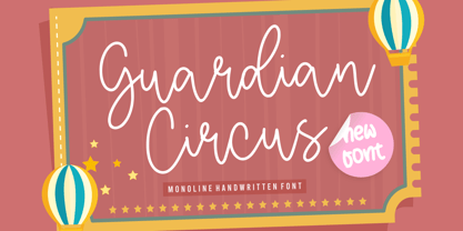 Guardian Circus Font. Guardian Circus is a Monoline Handwritten Font. Guardian Circus is a sweet, thin and natural handwritten font. It looks friendly and adaptable and it will certainly enhance each and every one of your designs. Guardian Circus also multilingual support. Enjoy the font, feel free to comment or feedback, send me PM or email.
 - Houstonfield by PeachCreme,
$19.00 Houstonfield is not another script font suitable for any project. Add a touch of luxe and elegance to your project. This font is perfect for signature logos, modern invitation, wine labels and many more. Swipe the preview to get some inspiration. If you have any other questions, feel free to drop me a message:) Happy designing, Gulya
 - Hungry Zombie by Hanoded,
$15.00 I’ve never been one for zombies and all that. I did watch a couple of seasons of The Walking Dead, but after the 2.000.000th zombie got whacked, I had enough. When I made this font, it gave me a zombie feeling. One thing I learned from watching TWD was that zombies are always hungry. There you have it!
 - OL America The Beautiful by Dennis Ortiz-Lopez,
$40.00 Oh Beautiful, for Spacious Skies, for Amber Waves of Grain This font was designed to honor the Land of My Birth, The United States of America, a Nation that has given me the Freedom to be what I want to be, to Create what I feel fit to create and to Live in Peace. God Bless America!
 - Gecko Moria by Allouse Studio,
$16.00 Proudly Presenting, Gecko Moria a Horror Handdrawn Font. Gecko Moria is perfect for any titles, logo, product packaging, branding project, megazine, social media, or just used to express words above the background. Gecko Moria also come with Multi-Lingual Support. Enjoy the font, feel free to comment or feedback, send me PM or email. Thank You!
 - IMAN RG by LGF Fonts,
$10.00 This type of Richard Gans, has always seemed very striking, despite having the complexity of the sources extrusion, has its own personality, and readability unusual for this type of letters. Use it for composing posters, programs or logos was very common at the time. My father, Antonio Lage Parapar, typographer by profession, who composed the texts, which not only had it for profession, but he liked to do, always he spoke of sources and decorative elements of the type foundry Richard Gans, as well as other foundries, especially those that required the mender of them, exercised creator, many of these types they have already been recovered by professionals and companies with excellent results. I've been surrounded by these movable type, and the occasional catalog unfortunately lost. One of those guys that has always struck me visually speaking was the type IMAN Richard Gans, the typographer and more of German origin arrived in Spain, back in 1874, also a pioneer. This work to revive the type mentioned, as well as create non existing glyphs between documents and parts I've been finding, is and has been a personal pleasure all I want serve as a tribute to my father (of aopodo curiously "Richard"), the only sadness it has not been completed. Richard Gans, arrived in Spain in 1874 as a representative of several European factories. then liaised with journalistic and publishing companies, which led him knowledge required of the first sector art. In 1878 he created a center importer gadgets graphic arts and three years later he created his own type foundry. The first rotary newspaper ABC, very famous and the most advanced of the time, the brand manufactured Richard Gans.
 - Ramolina Script by Mega Type,
$14.00 Ramolina Script is an elegant calligraphy script font that comes with lovely alternates character. a mixture of from copperplate calligraphy with handlettering style. Designed to convey style elegance. Ramolina is attractive like a smooth, elegant, clean, feminine, sensual, glamorous, simple and highly legible typeface. Its classic style is perfect to be applied in any type of formal pieces such invitations, labels, certificate, menus, Logos, fashion, make up, stationery, letterpress, romantic novels, magazines, books, greeting / wedding cards, packaging, badges etc. Ramolina Script features 400+ glyphs and 200+ alternative characters. including multiple language support. With OpenType features with stylistic alternates, ligatures and swash characters, that allows you to mix and match pairs of letters to fit your design. To enable the OpenType Stylistic alternates, you need a program that supports OpenType features such as Adobe Illustrator CS, Adobe Indesign & CorelDraw X6-X7, Microsoft Word 2010 or later versions. (Windows), Font Book (Mac) or a software program such as PopChar (for Windows and Mac). How to access all alternative characters using Adobe Illustrator: https://www.youtube.com/watch?v=XzwjMkbB-wQ How to use stylistic sets fonts in Microsoft Word 2010 or later versions: https://www.youtube.com/watch?v=NVJlZQ3EZU0 There are additional ways to access alternates / swashes, using the Character Map (Windows), Nexus Font (Windows) Font Book (Mac) or a software program such as PopChar (for Windows and Mac). How to access all the alternative characters, using the Windows Character Map with Photoshop: https://www.youtube.com/watch?v=Go9vacoYmBw If you need help or advice, please contact me by e-mail "megatype04@gmail.com" Thank you for your purchase & Happy Designing!
 - Wiggles - Unknown license

- Squealer Embossed - Unknown license

- Wobbles - Unknown license

- Wibbles - Unknown license

- Birka by Linotype,
$29.99Birka is the first typeface I designed from scratch. It took a whole year of my weekend and evening hours and is the typeface that teached me everything I know about type design. It is easy too see that I had Garamond in mind when drawing it. Birka is beautiful" was the comment of the well known Swedish designer Bo Berndal when he first saw it. That comment gave me the courage to design more and more typefaces. In a Danish article about Scandinavian type design, Birka was taken as example of a typical Swedishness in typography. I am not sure what the writer had in mind, but it surely sounded well. Birka has its name from the ancient Viking town Birka, whose remains are found not far away from Stockholm. Birka was released in 1992." - Quinter by Picatype,
$15.00 Quinter is inspired by the writing on the vintage beer labels from the good old days, but still has a strong modern appearance. It come with 2 types of styles. Each combination has been carefully crafted to make your design look better. Ideal for product names, packages, labels, old-fashioned coffee shops, bars and everything with special characteristics in the past. This combination allows you to easily build beautiful vintage designs in a short amount of time. To enable the OpenType Stylistic alternates, you need a program that supports OpenType features such as Adobe Illustrator CS, Adobe Indesign & CorelDraw X6-X7, Microsoft Word 2010 or later versions. We hope you enjoy the font, please feel free to comment if you have any thoughts or feedback. Or simply send me a PM or email me at picatypestudio@gmail.com. Thanks for purchasing and have fun!
 - Simply Harmony by Pen Culture,
$14.00 Proudly present "Simply Harmony -Vintage Monoline Font" Simply Harmony comes with 2 styles that have their own characteristics. Simply Harmony Regular : has a clean and elegant style. This font has a more modern feel, so you can apply it to modern-themed projects. Simply Harmony stamp: this font has a rough style both in the middle and the edges of each letter, this font has a vintage feel and can be applied to various needs. This font has 114 awesome alternates and has 311 total glyphs, there are various kinds of alternates that you can use as you wish. I really hope you enjoy it – please do let me know what you think, comments & likes are always hugely welcomed and appreciated. More importantly, please don’t hesitate to drop me a message if you have any issues or queries. Thank you
 - Vagebond by Characters Font Foundry,
$17.50 Vagebond is a monoline family in three widths, Condensed (C), Normal (N), and Extended (XT). With Vagebond I was inspired by a very old television I once saw on a junkyard. I wanted to create a typeface with round edges that would fit within the 4 x 3 proportion of the screen. It had to be monoline, because that gives it a very simplistic and minimalistic look. Having created the XT width I felt it needed the both complementing widths to make it complete. The Condensed version, for me, is the funky rounded version of the DIN. I love DIN, but it sometimes feels just a bit to ‘normed’ for me. Vagebond C brings in a bit more personality. Although Vagebond looks kinda ‘oldstyle’, it works very well in futuristic designs. It feels best in combination with a super futuristic 3d object.
 - Cavendic by Delaga Studio,
$15.00 Cavendic is a Minimalist Modern Elegant vintage font with beautiful ligatures, tons of special alternative glyphs, ornament, and multilingual support. It's a very versatile font that works great in large and small sizes. Elegant Karin is perfect for branding projects, Logo design, Clothing Branding, product packaging, magazine headers, or simply as a stylish text overlay to any background image. ------------------------------------------------------- Features: All caps Stylistic Alternates & Ligatures Numerals & Punctuation Accented characters Multiple Languages Supported PUA Encoded ----------------------------------------------------------- HOW TO ACCESS ALTERNATE CHARACTERS Open glyphs panel: In Adobe Photoshop go to Window - glyphs In Adobe Illustrator go to Type - glyphs --------------------------------------------------------------------------- Follow my shop for upcoming updates including additional glyphs and language support. And please message me if you want your language included or If there are any features or glyph requests, feel free to send me a message, I would like to update it.
 - Rogsant by Delaga Studio,
$79.00 Rogsant is a Minimalist Modern Elegant font with beautiful ligatures, tons of special alternative glyphs, ornament, and multilingual support. It's a very versatile font that works great in large and small sizes. Elegant Rogsant is perfect for branding projects, Logo design, Clothing Branding, product packaging, magazine headers, or simply as a stylish text overlay to any background image. ------------------------------------------------------------------------------ Features: All caps Stylistic Alternates & Ligatures Numerals & Punctuation Accented characters Multiple Languages Supported HOW TO ACCESS ALTERNATE CHARACTERS PUA Encoded ------------------------------------------------------------------------- Open glyphs panel: In Adobe Photoshop go to Window - glyphs In Adobe Illustrator go to Type - glyphs ----------------------------------------------------------------------------------- Follow my shop for upcoming updates including additional glyphs and language support. And please message me if you want your language included or If there are any features or glyph requests, feel free to send me a message, I would like to update it
 - IM FELL French Canon - Unknown license

- P22 Tyndale by IHOF,
$24.95Quill-formed roman/gothic with an olde-worlde flavor. Some background in the designer's own words: "A series of fonts came to mind which would be rooted in the medieval era -for me, a period of intense interest. Prior to Gutenberg's development of commercial printing with type on paper in the mid-1400s, books were still being written out by hand, on vellum. At that time, a Bible cost more than a common workman could hope to earn in his entire lifetime. Men like William Tyndale devoted their energies to translating the Scriptures for the benefit of ordinary people in their own language, and were burned to death at the stake for doing so. Those in authority correctly recognized a terminal threat to the fabric of feudal society, which revolved around the church. "This religious metamorphosis was reflected in letterforms: which, like buildings, reflect the mood of the period in which they take shape. The medieval era produced the Gothic cathedrals; their strong vertical emphasis was expressive of the vertical relationship then existing between man and God. The rich tracery to be seen in the interstices and vaulted ceilings typified the complex social dynamics of feudalism. Parallels could be clearly seen in Gothic type, with its vertical strokes and decorated capitals. Taken as a whole, Gothicism represented a mystical approach to life, filled with symbolism and imagery. To the common man, letters and words were like other sacred icons: too high for his own understanding, but belonging to God, and worthy of respect. "Roman type, soon adopted in preference to Gothic by contemporary printer-publishers (whose primary market was the scholarly class) represented a more democratic, urbane approach to life, where the words were merely the vehicle for the idea, and letters merely a necessary convenience for making words. The common man could read, consider and debate what was printed, without having the least reverence for the image. In fact, the less the medium interfered with the message, the better. The most successful typefaces were like the Roman legions of old; machine-like in their ordered functionality and anonymity. Meanwhile, Gutenberg's Gothic letterform, in which the greatest technological revolution of history had first been clothed, soon became relegated to a Germanic anachronism, limited to a declining sphere of influence. "An interesting Bible in my possession dating from 1610 perfectly illustrates this duality of function and form. The text is set in Gothic black-letter type, while the side-notes appear in Roman. Thus the complex pattern of the text retains the mystical, sacred quality of the hand-scripted manuscript (often rendered in Latin, which a cleric would read aloud to others), while the clear, open side-notes are designed to supplement a personal Bible study. "Tyndale is one of a series of fonts in process which explore the transition between Gothic and Roman forms. The hybrid letters have more of the idiosyncrasies of the pen (and thus, the human hand) about them, rather than the anonymity imbued by the engraving machine. They are an attempt to achieve the mystery and wonder of the Gothic era while retaining the legibility and clarity best revealed in the Roman form. "Reformers such as Tyndale were consumed with a passion to make the gospel available and understood to the masses of pilgrims who, in search of a religious experience, thronged into the soaring, gilded cathedrals. Centuries later, our need for communion with God remains the same, in spite of all our technology and sophistication. How can our finite minds, our human logic, comprehend the transcendent mystery of God's great sacrifice, his love beyond understanding? Tyndale suffered martyrdom that the Bible, through the medium of printing, might be brought to our hands, our hearts and our minds. It is a privilege for me to dedicate my typeface in his memory." - Posterama by Monotype,
$40.99 The Posterama™ typeface family contains 63 fonts and is a true journey through space and time. Designed by Jim Ford, each Posterama family contains 7 weights from Thin to Ultra Black, in 9 distinct families. What makes Posterama so unique and versatile are the eight alternative display families. By making use of a collection of alternative glyphs, Posterama sets an evocative flavor to visualize an entire century of futuristic reference points from art, architecture, poster design and science fiction into one family. Posterama Text is the base family. It has the most robust character set including upper and lowercase glyphs and pan-European language support (including Greek and Cyrillic). Note: all the other Posterama variants described below do not have lowercase letters or Greek and Cyrillic support. Posterama 1901 recalls the decoratively geometric style of Art Nouveau from the turn of the 20th century. Letterforms such as the slender, snaking ‘S’, the high-waisted ‘E’ and the underlined ‘O’ revive the spirit of Charles Rennie Mackintosh and the designers of the Viennese Secession. Posterama 1913 pays homage to the Armory Show, or 1913 Exhibition of Modern Art, which brought the revolutionary work of European artists such as Picasso, Duchamp and Kandinsky to the US for the first time to the shock and astonishment of press and public. Near-abstract, angular characters such as the ‘A’, ‘E’ and ‘N’ hint at cubism’s jagged and clashing planes. Posterama 1919 uses a small, but important, variation to set a tone when the Bauhaus was founded, and the surge in radical European typography that followed. The straight-sided, roundheaded ‘A’ adds a flavor of 1919 – this style of ‘A’ can still be seen in the Braun logo, designed in 1934. Posterama 1927 captures the year of Metropolis, The Jazz Singer and Paul Renner’s pioneering, geometric Futura typeface from 1927, which had a profound influence on design in the US and Europe. Posterama 1933 – With its low-waisted, sinuous designs, the Posterama 1933 typeface family echoes lettering of the Art Deco period, which in turn had its roots in Art Nouveau, the key influence on Posterama 1901. The two fonts make a great team and can be used interchangeably. Posterama 1945 features a few Cyrillic characters to conjure up an era when Russian art and political posters made their mark in cold war propaganda, espionage and also giant aliens and monsters. Posterama 1984 takes its typographic influences from George Orwell’s classic novel, publicity for the dystopian action and sci-fi movies (Blade Runner, Videodrome and Terminator) and games like Space Invaders and Pac-Man that made an impact at that time. Posterama 2001 was inspired by Stanley Kubrick’s science fiction masterpiece, which made extensive use of the Futura typeface. Posterama 2001 finds its cosmic orbit with its nosecone-style ‘A’ from NASA’s much-missed ‘worm’ logotype. There’s an echo, too, in Bauhaus designs from as early as 1920, whose minimalist, geometric lettering also featured a crossbar-less ‘A’.
 - Sanggria by DM Studio,
$25.00 The Sanggria Calligraphic Font is a beautifully crafted typeface that exudes elegance and sophistication. With its graceful, flowing letterforms and intricate details, this font adds a touch of timeless beauty to your designs, making it perfect for wedding invitations, formal correspondence, branding, and other projects that require a sense of refinement and artistry. Features: Calligraphic Elegance: The Sanggria Font is designed in a classic calligraphic style that embodies grace and sophistication. Its flowing, cursive letterforms create an aura of timeless beauty, making it ideal for projects that require an elegant and artistic touch. Intricate Details: The font's intricate details and delicate flourishes add an extra layer of artistry to your typography. It captures the essence of traditional calligraphy, bringing a sense of craftsmanship and refinement to your designs. Versatile Application: This font is versatile and well-suited for various design projects that aim to evoke a sense of elegance and style. Use it in wedding invitations, formal documents, branding materials, packaging, and more to infuse your designs with a touch of classic beauty. Uppercase and Lowercase Letters: The font includes both uppercase and lowercase letters, providing flexibility and creative freedom in your designs. Mix and match the cases to create visually appealing and harmonious typography. Ligatures , Stylistic Alternates and Swashes: The Sanggria Font offers a selection of ligatures, stylistic alternates and Swashes that enhance the visual interest of your text. These special characters create unique connections between letters and alternate forms, allowing you to create sophisticated and personalized typography. Punctuation and Symbols: In addition to the alphabet, the Sanggria Font includes a comprehensive set of punctuation marks, numerals, and common symbols. This ensures consistency and ease of use when incorporating the font into your design projects. Easy to Use: Installing and utilizing the Sanggria Calligraphic Font is hassle-free. It is compatible with both Windows and Mac operating systems and seamlessly integrates into popular design software such as Adobe Photoshop, Illustrator, and InDesign. This ensures a smooth and efficient design workflow. Elevate your designs with the timeless beauty of the Sanggria Calligraphic Font. Let its graceful, flowing letterforms and intricate details bring an aura of elegance and sophistication to your wedding invitations, formal documents, and branding materials. Embrace the artistry of this font and create designs that exude classic beauty and refinement.
 - Fleur Bleue by DM Studio,
$30.00 The Fleur Bleue Beautiful Romantic Font is a graceful and elegant typeface that encapsulates the beauty and romance of delicate flowers. With its flowing letterforms and intricate details, this font brings a touch of sophistication and romance to your designs, making it perfect for wedding invitations, love letters, branding, and other projects that require a touch of enchantment. Features: Romantic and Elegant Style: The Fleur Bleue Font exudes a romantic and enchanting aesthetic. Its graceful letterforms and delicate details create an air of elegance and beauty, making it ideal for projects that require a touch of romance and sophistication. Beautiful Floral Design: The font’s intricate details and floral elements add a touch of enchantment and whimsy to your typography. It captures the essence of delicate flowers, bringing a sense of natural beauty to your designs. Versatile Application: This font is versatile and well-suited for various design projects that aim to evoke emotions of love and romance. Use it in wedding invitations, love letters, branding, packaging, and more to add a touch of beauty and enchantment to your designs. Uppercase and Lowercase Letters: The font includes both uppercase and lowercase letters, providing flexibility and creative freedom in your designs. Mix and match the cases to create visually appealing and harmonious typography. Stylistic Alternates: The Fleur Bleue Font offers a selection of stylistic alternates that enhance the visual interest of your text. These special characters create unique connections between letters and alternate forms, allowing you to create beautiful and captivating typography. Punctuation and Symbols: In addition to the alphabet, the Fleur Bleue Font includes a comprehensive set of punctuation marks, numerals, and common symbols. This ensures consistency and ease of use when incorporating the font into your design projects. Easy to Use: Installing and utilizing the Fleur Bleue Font is hassle-free. It is compatible with both Windows and Mac operating systems and seamlessly integrates into popular design software such as Adobe Photoshop, Illustrator, and InDesign. This ensures a smooth and efficient design workflow. Infuse your designs with the grace and romance of the Fleur Bleue Beautiful Romantic Font. Let its flowing letterforms and intricate details bring a touch of sophistication and enchantment to your wedding invitations, love letters, and branding. Embrace the timeless beauty of this font and create designs that evoke feelings of love and admiration.
 - Krul by Re-Type,
$99.00 ‘Krul’ is a typographic interpretation of the lettering style created by Dutch letter painter Jan Willem Joseph Visser at the end of the 1940s, which decorated the traditional brown bars of Amsterdam. In the beginning, these letters were strongly associated with the pubs connected to the Amstel brewery, given that Visser was the company’s official painter. As the years passed, the style became increasingly popular, and various business owners in Amsterdam and other Dutch and Belgian cities also commissioned its use. In the 1970s and 1980s, Leo Beukeboom, another talented letter painter, continued and expanded this lettering tradition while employed under the Heineken brand. Much of his work can still be found in the Jordaan and De Pijp neighborhoods in Amsterdam. The Amsterdamse Krulletter, or Amsterdam’s curly letter, is strongly inspired by the calligraphic works of the 17th century Dutch writing masters, of which Jan van den Velde was a central figure. However, distinct characteristics of this style, for example, its unusual and beautiful ‘g’, originate from a model that was published by Johannes Heuvelman in 1659, which J. W. J. Visser referenced. Typographic circles have somehow overlooked the Amsterdamse Krulletter and its heritage. The Dutch calligraphic hands preceded and influenced the formal English penmanship which has inspired numerous typefaces in the Copperplate style. In contrast, the models from van den Velde, Heuvelman, and Jean de la Chambre, among others, are a missing chapter in Dutch typographic history, and had never been turned into typefaces until now. Conscious of the cultural and identity issues that arise in reviving a unique style, and concerned about the speed with which the lettering style was disappearing, Ramiro Espinoza focused the project of designing ‘Krul’ on digitally recreating the calligraphic complexity of these beautiful letters. Created through several years of research, ‘Krul’ is not a direct digitization of the Amsterdamse Krulletter, but instead, an interpretation that incorporates numerous alternative characters absent in the original model, and improves upon details where necessary, resulting in an optimal performance on the printed page. The typeface is presented in Open Type format, with an abundance of intricate ligatures, fleurons, and swashes, which permit the creation of numerous calligraphic effects. The very high contrast and rhythm of the strokes in this typeface make it especially suited for media applications conveying a sense of elegance and sophistication. Designers of feminine magazines, advertisements, and corporate identities within the fragrance and fashion industries will find in this typeface to be an extremely useful and appropriate resource.The great Amsterdamse Krulletter is finally back, and we are proud to make it available to you.
 - Times New Roman PS Cyrillic by Monotype,
$67.99In 1931, The Times of London commissioned a new text type design from Stanley Morison and the Monotype Corporation, after Morison had written an article criticizing The Times for being badly printed and typographically behind the times. The new design was supervised by Stanley Morison and drawn by Victor Lardent, an artist from the advertising department of The Times. Morison used an older typeface, Plantin, as the basis for his design, but made revisions for legibility and economy of space (always important concerns for newspapers). As the old type used by the newspaper had been called Times Old Roman," Morison's revision became "Times New Roman." The Times of London debuted the new typeface in October 1932, and after one year the design was released for commercial sale. The Linotype version, called simply "Times," was optimized for line-casting technology, though the differences in the basic design are subtle. The typeface was very successful for the Times of London, which used a higher grade of newsprint than most newspapers. The better, whiter paper enhanced the new typeface's high degree of contrast and sharp serifs, and created a sparkling, modern look. In 1972, Walter Tracy designed Times Europa for The Times of London. This was a sturdier version, and it was needed to hold up to the newest demands of newspaper printing: faster presses and cheaper paper. In the United States, the Times font family has enjoyed popularity as a magazine and book type since the 1940s. Times continues to be very popular around the world because of its versatility and readability. And because it is a standard font on most computers and digital printers, it has become universally familiar as the office workhorse. Times?, Times? Europa, and Times New Roman? are sure bets for proposals, annual reports, office correspondence, magazines, and newspapers. Linotype offers many versions of this font: Times? is the universal version of Times, used formerly as the matrices for the Linotype hot metal line-casting machines. The basic four weights of roman, italic, bold and bold italic are standard fonts on most printers. There are also small caps, Old style Figures, phonetic characters, and Central European characters. Times? Ten is the version specially designed for smaller text (12 point and below); its characters are wider and the hairlines are a little stronger. Times Ten has many weights for Latin typography, as well as several weights for Central European, Cyrillic, and Greek typesetting. Times? Eighteen is the headline version, ideal for point sizes of 18 and larger. The characters are subtly condensed and the hairlines are finer." - Times New Roman Seven by Monotype,
$67.99In 1931, The Times of London commissioned a new text type design from Stanley Morison and the Monotype Corporation, after Morison had written an article criticizing The Times for being badly printed and typographically behind the times. The new design was supervised by Stanley Morison and drawn by Victor Lardent, an artist from the advertising department of The Times. Morison used an older typeface, Plantin, as the basis for his design, but made revisions for legibility and economy of space (always important concerns for newspapers). As the old type used by the newspaper had been called Times Old Roman," Morison's revision became "Times New Roman." The Times of London debuted the new typeface in October 1932, and after one year the design was released for commercial sale. The Linotype version, called simply "Times," was optimized for line-casting technology, though the differences in the basic design are subtle. The typeface was very successful for the Times of London, which used a higher grade of newsprint than most newspapers. The better, whiter paper enhanced the new typeface's high degree of contrast and sharp serifs, and created a sparkling, modern look. In 1972, Walter Tracy designed Times Europa for The Times of London. This was a sturdier version, and it was needed to hold up to the newest demands of newspaper printing: faster presses and cheaper paper. In the United States, the Times font family has enjoyed popularity as a magazine and book type since the 1940s. Times continues to be very popular around the world because of its versatility and readability. And because it is a standard font on most computers and digital printers, it has become universally familiar as the office workhorse. Times?, Times? Europa, and Times New Roman? are sure bets for proposals, annual reports, office correspondence, magazines, and newspapers. Linotype offers many versions of this font: Times? is the universal version of Times, used formerly as the matrices for the Linotype hot metal line-casting machines. The basic four weights of roman, italic, bold and bold italic are standard fonts on most printers. There are also small caps, Old style Figures, phonetic characters, and Central European characters. Times? Ten is the version specially designed for smaller text (12 point and below); its characters are wider and the hairlines are a little stronger. Times Ten has many weights for Latin typography, as well as several weights for Central European, Cyrillic, and Greek typesetting. Times? Eighteen is the headline version, ideal for point sizes of 18 and larger. The characters are subtly condensed and the hairlines are finer." - LFT Iro Sans by TypeTogether,
$49.00 Milan-based Leftloft studio developed LFT Iro Sans, an expansive family that solves the significant, wide-ranging challenges of branding, wayfinding, pictographic language, and complex editorial use. LFT Iro Sans began as the clear and welcoming wayfinding project of San Siro stadium in Milan. Over time many other styles and weights have been added. LFT Iro Sans never finds itself outmatched by the task at hand. The primary aim was to design a technical typeface that was readable in any low visibility condition, for instance in a poorly lit area with awkward wall shapes and overhangs. This worked well for stadium and large lettering use, but other problems also needed to be addressed, such as complementary iconography. A location developer was left mixing — clashing, really — one type family with a different family of icons, resulting in a cobbled-together look which diluted the brand and the experience. They set out to radically simplify and clarify each shape and its meaning, accepting uniqueness as part of the final visual language. LFT Iro Sans pictograms answers the need for having a consistent and large group of icons, perfectly suited to the text typeface. As it concerns public spaces, this didn’t exist before. LFT Iro Sans incorporated a branding project too, so they decided to let LFT Iro Sans go out on a limb and created a unicase style that demands attention. Each unicase letter is a combination of the lowercase and capital form, quite noticeable in the ‘i’, ‘m’, ‘t’, and unique ‘d’ and ‘b’, balanced by more restrained forms of ‘a’, ‘s’, ‘c’, and ‘e’. LFT Iro Sans is not only a technical typeface, but, thanks to letters’ proportions, can also be used for editorial purposes. Assertive and economical in stature, the text weights are clear and assured. And a display version for headlines in Ultralight and Heavy (with italics) was developed for stunning headlines. For enthusiasts of every stripe, LFT Iro Sans can be a brand’s rallying cry with its arresting unicase, be a developer’s go-to pictogram choice, or set the most demanding editorial text in digital or print. With its many OpenType features, simplified pictogram commands (even available in Apple’s Pages and Microsoft Word), and a total of 30 targeted family members, LFT Iro Sans is a brilliant, easy choice. As with the rest of the TypeTogether catalogue, the complete LFT Iro Sans family, designed by Lefloft and developed by Octavio Pardo, has been optimised for today’s varied screen uses.
 - Galderglynn Esquire by Typodermic,
$11.95 Welcome to the world of Galderglynn Esquire. This typeface is a celebration of the sans-serif types from the 1800s, with a unique twist that sets it apart from the rest. Galderglynn Esquire is not just a simple revival of a specific typeface, but rather, it’s a concoction of them all. With a bold personality and a distinct voice, Galderglynn Esquire is full of inconsistencies that make it stand out. It’s as if the letters have a mind of their own, dancing and shifting on the page. This typeface is perfect for those who want to add a touch of whimsy to their designs. And speaking of designs, Galderglynn Esquire has a variety of numerals to choose from. Whether you need standard, monospaced, old-style, inferior, or superior numerals, Galderglynn Esquire has got you covered. It’s a typeface that’s as versatile as it is unique. But don’t take our word for it, try it out for yourself. Galderglynn Esquire comes in seven weights and italics, giving you even more options to play with. And if you prefer a more well-behaved version of this typeface, check out Galderglynn 1884. With Galderglynn Esquire, you’re not just getting a typeface, you’re getting a piece of history. This typeface pays homage to the sans-serif types of the past. It’s a typeface that’s as timeless as it is modern, perfect for designers who want to create something truly unique. So why settle for the ordinary when you can have the extraordinary with Galderglynn Esquire. Most Latin-based European, and some Cyrillic-based writing systems are supported, including the following languages. A Afaan Oromo, Afar, Afrikaans, Albanian, Alsatian, Aromanian, Aymara, Bashkir (Latin), Basque, Belarusian (Latin), Bemba, Bikol, Bosnian, Breton, Bulgarian, Cape Verdean, Creole, Catalan, Cebuano, Chamorro, Chavacano, Chichewa, Crimean Tatar (Latin), Croatian, Czech, Danish, Dawan, Dholuo, Dutch, English, Estonian, Faroese, Fijian, Filipino, Finnish, French, Frisian, Friulian, Gagauz (Latin), Galician, Ganda, Genoese, German, Greenlandic, Guadeloupean Creole, Haitian Creole, Hawaiian, Hiligaynon, Hungarian, Icelandic, Ilocano, Indonesian, Irish, Italian, Jamaican, Kaqchikel, Karakalpak (Latin), Kashubian, Kikongo, Kinyarwanda, Kirundi, Komi-Permyak, Kurdish (Latin), Latvian, Lithuanian, Lombard, Low Saxon, Luxembourgish, Maasai, Macedonian, Makhuwa, Malay, Maltese, Māori, Moldovan, Montenegrin, Ndebele, Neapolitan, Norwegian, Novial, Occitan, Ossetian, Ossetian (Latin), Papiamento, Piedmontese, Polish, Portuguese, Quechua, Rarotongan, Romanian, Romansh, Russian, Sami, Sango, Saramaccan, Sardinian, Scottish Gaelic, Serbian, Serbian (Latin), Shona, Sicilian, Silesian, Slovak, Slovenian, Somali, Sorbian, Sotho, Spanish, Swahili, Swazi, Swedish, Tagalog, Tahitian, Tetum, Tongan, Tshiluba, Tsonga, Tswana, Tumbuka, Turkish, Turkmen (Latin), Tuvaluan, Uzbek (Latin), Venetian, Vepsian, Võro, Walloon, Waray-Waray, Wayuu, Welsh, Wolof, Xhosa, Yapese, Zapotec Zulu and Zuni.
 - Times New Roman WGL by Monotype,
$67.99 In 1931, The Times of London commissioned a new text type design from Stanley Morison and the Monotype Corporation, after Morison had written an article criticizing The Times for being badly printed and typographically behind the times. The new design was supervised by Stanley Morison and drawn by Victor Lardent, an artist from the advertising department of The Times. Morison used an older typeface, Plantin, as the basis for his design, but made revisions for legibility and economy of space (always important concerns for newspapers). As the old type used by the newspaper had been called Times Old Roman," Morison's revision became "Times New Roman." The Times of London debuted the new typeface in October 1932, and after one year the design was released for commercial sale. The Linotype version, called simply "Times," was optimized for line-casting technology, though the differences in the basic design are subtle. The typeface was very successful for the Times of London, which used a higher grade of newsprint than most newspapers. The better, whiter paper enhanced the new typeface's high degree of contrast and sharp serifs, and created a sparkling, modern look. In 1972, Walter Tracy designed Times Europa for The Times of London. This was a sturdier version, and it was needed to hold up to the newest demands of newspaper printing: faster presses and cheaper paper. In the United States, the Times font family has enjoyed popularity as a magazine and book type since the 1940s. Times continues to be very popular around the world because of its versatility and readability. And because it is a standard font on most computers and digital printers, it has become universally familiar as the office workhorse. Times?, Times? Europa, and Times New Roman? are sure bets for proposals, annual reports, office correspondence, magazines, and newspapers. Linotype offers many versions of this font: Times? is the universal version of Times, used formerly as the matrices for the Linotype hot metal line-casting machines. The basic four weights of roman, italic, bold and bold italic are standard fonts on most printers. There are also small caps, Old style Figures, phonetic characters, and Central European characters. Times? Ten is the version specially designed for smaller text (12 point and below); its characters are wider and the hairlines are a little stronger. Times Ten has many weights for Latin typography, as well as several weights for Central European, Cyrillic, and Greek typesetting. Times? Eighteen is the headline version, ideal for point sizes of 18 and larger. The characters are subtly condensed and the hairlines are finer."
 - Times New Roman by Monotype,
$67.99 In 1931, The Times of London commissioned a new text type design from Stanley Morison and the Monotype Corporation, after Morison had written an article criticizing The Times for being badly printed and typographically behind the times. The new design was supervised by Stanley Morison and drawn by Victor Lardent, an artist from the advertising department of The Times. Morison used an older typeface, Plantin, as the basis for his design, but made revisions for legibility and economy of space (always important concerns for newspapers). As the old type used by the newspaper had been called Times Old Roman," Morison's revision became "Times New Roman." The Times of London debuted the new typeface in October 1932, and after one year the design was released for commercial sale. The Linotype version, called simply "Times," was optimized for line-casting technology, though the differences in the basic design are subtle. The typeface was very successful for the Times of London, which used a higher grade of newsprint than most newspapers. The better, whiter paper enhanced the new typeface's high degree of contrast and sharp serifs, and created a sparkling, modern look. In 1972, Walter Tracy designed Times Europa for The Times of London. This was a sturdier version, and it was needed to hold up to the newest demands of newspaper printing: faster presses and cheaper paper. In the United States, the Times font family has enjoyed popularity as a magazine and book type since the 1940s. Times continues to be very popular around the world because of its versatility and readability. And because it is a standard font on most computers and digital printers, it has become universally familiar as the office workhorse. Times?, Times? Europa, and Times New Roman? are sure bets for proposals, annual reports, office correspondence, magazines, and newspapers. Linotype offers many versions of this font: Times? is the universal version of Times, used formerly as the matrices for the Linotype hot metal line-casting machines. The basic four weights of roman, italic, bold and bold italic are standard fonts on most printers. There are also small caps, Old style Figures, phonetic characters, and Central European characters. Times? Ten is the version specially designed for smaller text (12 point and below); its characters are wider and the hairlines are a little stronger. Times Ten has many weights for Latin typography, as well as several weights for Central European, Cyrillic, and Greek typesetting. Times? Eighteen is the headline version, ideal for point sizes of 18 and larger. The characters are subtly condensed and the hairlines are finer."
 - Times New Roman Small Text by Monotype,
$67.99In 1931, The Times of London commissioned a new text type design from Stanley Morison and the Monotype Corporation, after Morison had written an article criticizing The Times for being badly printed and typographically behind the times. The new design was supervised by Stanley Morison and drawn by Victor Lardent, an artist from the advertising department of The Times. Morison used an older typeface, Plantin, as the basis for his design, but made revisions for legibility and economy of space (always important concerns for newspapers). As the old type used by the newspaper had been called Times Old Roman," Morison's revision became "Times New Roman." The Times of London debuted the new typeface in October 1932, and after one year the design was released for commercial sale. The Linotype version, called simply "Times," was optimized for line-casting technology, though the differences in the basic design are subtle. The typeface was very successful for the Times of London, which used a higher grade of newsprint than most newspapers. The better, whiter paper enhanced the new typeface's high degree of contrast and sharp serifs, and created a sparkling, modern look. In 1972, Walter Tracy designed Times Europa for The Times of London. This was a sturdier version, and it was needed to hold up to the newest demands of newspaper printing: faster presses and cheaper paper. In the United States, the Times font family has enjoyed popularity as a magazine and book type since the 1940s. Times continues to be very popular around the world because of its versatility and readability. And because it is a standard font on most computers and digital printers, it has become universally familiar as the office workhorse. Times?, Times? Europa, and Times New Roman? are sure bets for proposals, annual reports, office correspondence, magazines, and newspapers. Linotype offers many versions of this font: Times? is the universal version of Times, used formerly as the matrices for the Linotype hot metal line-casting machines. The basic four weights of roman, italic, bold and bold italic are standard fonts on most printers. There are also small caps, Old style Figures, phonetic characters, and Central European characters. Times? Ten is the version specially designed for smaller text (12 point and below); its characters are wider and the hairlines are a little stronger. Times Ten has many weights for Latin typography, as well as several weights for Central European, Cyrillic, and Greek typesetting. Times? Eighteen is the headline version, ideal for point sizes of 18 and larger. The characters are subtly condensed and the hairlines are finer." - Anger & Wrath by Omaikraf Studio,
$10.00 Introducing "Anger Style": Unleash the Power of Emotion Are you ready to harness the raw energy of emotions and bring them to life in your designs? Look no further than "Anger Style," an electrifying and dynamic font that will leave a lasting impact on your audience. Designed by our team of expert font designers, "Anger Style" is a captivating blend of intensity, power, and expressiveness. Possible Design Uses: "Anger Style" is a font that excels in making a bold statement. Its commanding presence and fiery nature make it perfect for various design applications, including: Headlines and Titles: Grab your audience's attention and make a lasting impression with powerful headlines that demand to be noticed. Logos and Branding: Infuse your brand identity with passion and intensity, creating a memorable and distinct visual presence. Posters and Flyers: Advertise events, concerts, or special promotions with eye-catching designs that embody rebelliousness and energy. Book Covers: Create striking covers that captivate readers and convey the emotional depth of your story or message. Apparel and Merchandise: Add an edgy touch to your clothing designs, making a statement that resonates with your target audience. Unique Qualities: What sets "Anger Style" apart from other fonts is its ability to evoke a wide range of emotions, not just anger. It transcends its name, allowing you to express passion, determination, and rebellion through your designs. Its versatility lies in its bold strokes and sharp edges, which convey a sense of intensity and power. By choosing "Anger Style," you gain access to a font that embodies the very essence of raw human emotion. Font Pairing: "Anger Style" pairs exceptionally well with other fonts that complement its intensity and create harmonious combinations. Consider combining it with: "Bold Sans Serifs": The clean lines and strong presence of a bold sans serif font can enhance the impact of "Anger Style," creating a balanced and eye-catching composition. "Elegant Script Fonts": To add a touch of contrast and sophistication, pairing "Anger Style" with an elegant script font can create a visually engaging and dynamic design. Functional Aspects: "Anger Style" offers a range of functional aspects designed to enhance your creative possibilities: Styles: "Anger Style" is available in bold and regular styles, allowing you to emphasize different levels of intensity within your designs. Character Sets: The font includes an extensive character set, covering uppercase and lowercase letters, numbers, punctuation marks, and special characters. This ensures versatility and legibility across various design projects. Special Features: "Anger Style" includes stylistic alternates and ligatures, providing you with additional design options and allowing you to create a truly customized and unique look.
 - Times New Roman PS Greek by Monotype,
$67.99In 1931, The Times of London commissioned a new text type design from Stanley Morison and the Monotype Corporation, after Morison had written an article criticizing The Times for being badly printed and typographically behind the times. The new design was supervised by Stanley Morison and drawn by Victor Lardent, an artist from the advertising department of The Times. Morison used an older typeface, Plantin, as the basis for his design, but made revisions for legibility and economy of space (always important concerns for newspapers). As the old type used by the newspaper had been called Times Old Roman," Morison's revision became "Times New Roman." The Times of London debuted the new typeface in October 1932, and after one year the design was released for commercial sale. The Linotype version, called simply "Times," was optimized for line-casting technology, though the differences in the basic design are subtle. The typeface was very successful for the Times of London, which used a higher grade of newsprint than most newspapers. The better, whiter paper enhanced the new typeface's high degree of contrast and sharp serifs, and created a sparkling, modern look. In 1972, Walter Tracy designed Times Europa for The Times of London. This was a sturdier version, and it was needed to hold up to the newest demands of newspaper printing: faster presses and cheaper paper. In the United States, the Times font family has enjoyed popularity as a magazine and book type since the 1940s. Times continues to be very popular around the world because of its versatility and readability. And because it is a standard font on most computers and digital printers, it has become universally familiar as the office workhorse. Times?, Times? Europa, and Times New Roman? are sure bets for proposals, annual reports, office correspondence, magazines, and newspapers. Linotype offers many versions of this font: Times? is the universal version of Times, used formerly as the matrices for the Linotype hot metal line-casting machines. The basic four weights of roman, italic, bold and bold italic are standard fonts on most printers. There are also small caps, Old style Figures, phonetic characters, and Central European characters. Times? Ten is the version specially designed for smaller text (12 point and below); its characters are wider and the hairlines are a little stronger. Times Ten has many weights for Latin typography, as well as several weights for Central European, Cyrillic, and Greek typesetting. Times? Eighteen is the headline version, ideal for point sizes of 18 and larger. The characters are subtly condensed and the hairlines are finer."


