10,000 search results
(0.065 seconds)
- ITC Florinda by ITC,
$29.99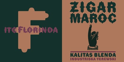 ITC Florinda was designed by Luis Siquot in 1997 and consists exclusively of capital letters. The basic forms were influenced by old favorites like Franklin Gothic, but Siquot ornamented the classic forms with symmetrical knobs which look like pieces of lead left over after pouring the forms. This gives the figures a playful, constructed look. When used in a text, the horizontal lines seem to come together to draw a fine line through the middle of the lines of text, giving it an ornamented character. ITC Florinda should be used exclusively for headlines or display.
 - Labrat - Unknown license

- Kulturista by Suitcase Type Foundry,
$39.00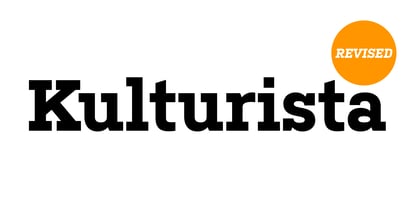 Kulturista is an unmistakeable linear slab serif typeface with pronounced rectangular serifs. The drawings are based on the sans-serif Nudista typeface, and Kulturista also inherits Nudista’s distinctive narrowed character proportions, range of weights and glyph sets. The italics are inclined sufficiently, and have the same width and colouring as the plain styles. They aren’t just a mechanically-slanted version of the basic styles, as is often the case for typefaces derived from geometrical images — a whole range of characters have their own drawn variants, which greatly strengthens their highlight function. The italics are therefore an equal partner for the roman styles. Kulturista is definitely a good choice for a headline typeface for magazines and book covers. The range of boldness can come in handy when editing sections, headlines and supplements. The typeface understandably proves itself as a healthy foundation for a unified visual style, and holds up at display sizes as well as on shorter texts.
 - ITC Adderville by ITC,
$29.99On a cold winter's night, George Ryan, of Galápagos Design Group, began musing on the possibilities for a “truly original” sans serif typeface. What came out of his musing, and his always-present sketchpad, was ITC Adderville, a typeface whose visual impact is immediate and strong. Ryan explains how he did it: “The rounded ends of its strokes and their skewed baseline contact create an illusion of dancing feet. The tops of lowercase stems emit serif buds, suggesting transition into or out of the serifed form. The spear-like lowercase stroke terminators, along with other distinctive elements such as the stylized reticulation of the lowercase 'g' segments, the salute of that same character's spur, and the bold, non-self-conscious 'i' and 'j' dots, all contribute to the playful and unique nature of this design.” The result is a friendly, lively type family whose graduated weights -- book, medium, and heavy -- lend themselves especially well to use at small display sizes and in short blocks of text. - yorkville - Unknown license

- Decalcomania JNL by Jeff Levine,
$29.00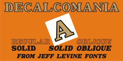 Decalcomania JNL is based on examples of gold and black water-applied initial decals made by the Transfer Monogram Company of Chicago circa the 1940s. It is presumed the patterns for the letters were hand cut, possibly explaining the variations in line widths and character shapes. These eccentricities were left intact and followed through to the other characters in order to represent a more "authentic" digital version of these vintage decals. Decalcomania JNL is available in both the regular (outline) version, and a solid black version, as well as obliques of both styles.
 - Heinz by Wiescher Design,
$39.50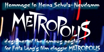 Heinz is inspired by the poster design of Heinz Schulz-Neudamm for Fritz Lang’s famous silent movie Metropolis. Heinz Schulz-Neudamm did quite a lot of work for the German branches of big American movie companies like 20th Century Fox or MGM. His most famous work is probably the title lettering for the Metropolis movie. The original drawing for that poster sold in 2005 in London for 398.000 Pound Sterling (approx. US $ 600.000). I designed a completely new font in the feeling of Heinz’s lettering. Enjoy. Yours historically, Gert Wiescher
 - School Project JNL by Jeff Levine,
$29.00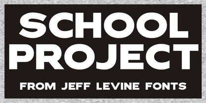 A set of self-adhesive poster board letters once made by the E-Z Letter Stencil Company and sold under the name "Quik Stik" was the model for School Project JNL. Ironically, the line was discontinued because they did not stick very well - the weight of the cardboard caused the letters (which used a rubber cement type of glue) to pull away from the surface they were mounted to. Unlike vinyl self-adhesive letters (which were formulated for indoor or outdoor use) these cardboard sets were relegated to indoors only; further restricting their usability.
 - SF Chromium 24 SC - Unknown license

- SF Espresso Shack Condensed - Unknown license

- SF Port McKenzie Extended - Unknown license

- SF Groove Machine ExtUpright - Unknown license

- SF Zero Gravity Condensed - Unknown license

- SF Burlington Script SC - Unknown license

- SF Arch Rival Extended - Unknown license

- SF Groove Machine Extended - Unknown license

- SF Groove Machine Upright - Unknown license

- Robo OS by OS CORP,
$9.00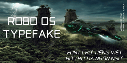 Robot OS CORP AI Wrote version: 2.0 is the first version, including 340 characters, there are 4 types of handwriting that are: Regular (Regular); Italic (Italic); Bold (Bold); Bold Italic (Bold Italic). The sturdy, strong, robot-like design is the idea to design this typeface
 - Stove Plate JNL by Jeff Levine,
$29.00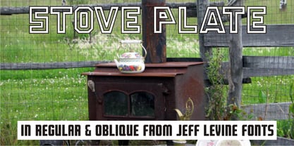 An old printer's advertising cut for Red Star Oil Stoves yielded a typeface that was both vintage and somewhat techno at the same time. Originally drawn as a slanted logo, the individual letters had an array of chamfered, angled and flat sides combined with a bold outline. This font is available in both vertical and oblique versions.
 - Epic Story by Olivetype,
$18.00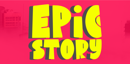 Introducing Epic Story, the perfect typeface for your next big project. This fun, playful font is the right choice for creating bold headlines. With its unique character, Epic Story is sure to make a statement. And it's great for logotypes and branding too. So if you're looking to add some personality to your next project, look no further than Epic Story. Epic Story font includes : Standard Latin All Caps Numbers, symbols, and punctuations Multilingual Support. Fully accessible without additional design software Simple Installations Works on PC & Mac Thank You.
 - DR Krokodila by Dmitry Rastvortsev,
$30.00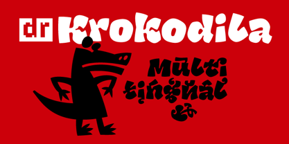 Type DR Krokodila was awarded an Honor Diploma for Excellence in Type Design at the International Type Design Competition Modern Cyrillic 2009 (Moscow, 2009).
 - Bodrum Stencil by Bülent Yüksel,
$19.00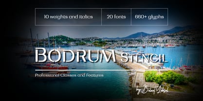 Bodrum Collection: 1- Bodrum Sans 2- Bodrum Sweet 3- Bodrum Stencil 4- Bodrum Slab 5- Bodrum Styte 6- Bodrum Soft Bodrum Stencil is a stencil serif type family. Designed by Bülent Yüksel in 2018/19. The font, influenced by style serifs, popular in the 1920s and 30s, is based on optically corrected geometric forms for better readability. Bodrum Stencil is not purely geometric; it has vertical strokes that are thicker than the horizontals, an “o” that is not a perfect circle, and shortened ascenders. These nuances aid in legibility and give "Bodrum Stencil" a harmonious and sensible appearance for both texts and headlines. Bodrum Stencil provides advanced typographical support for Latin-based languages. An extended character set, supporting Central, Western and Eastern European languages, rounds up the family. The designation “Bodrum Stencil 14 Regular” forms the central point. "Bodrum Stencil" is available in 10 weights (Hair, Thin, Extra-Light, Light, Regular, Meduim, Bold, Extra-Bold, Heavy and Black) and 10 matching italics. The family contains a set of 650+ characters. Case-Sensitive Forms, Classes and Features, Small Caps from Letter Cases, Fractions, Superior, Inferior, Denominator, Numerator, Old Style Figures just one touch easy In all graphic programs. Bodrum Stencil is the perfect font for web use.
 - Bodrum Soft by Bülent Yüksel,
$19.00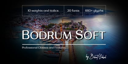 You can download Bodrum Soft PDF Type Specimen here . "Bodrum Soft" is a rounded sans serif type family, designed by Bülent Yüksel in 20018/19. The font, influenced by serif styles that were popular in the 1920s and 30s, is based on optically corrected geometric forms for a better readability. "Bodrum Soft" is not purely geometric; it has vertical strokes that are thicker than the horizontals, an “o” that is not a perfect circle, and shortened ascenders. These nuances helps the legibility and gives "Bodrum Soft" an harmonious and sensible appearance for both texts and headlines. Bodrum Soft provides advanced typographical support for Latin-based languages. An extended character set, supporting Central, Western and Eastern European languages, rounds up the family. “Bodrum Soft 14 Regular” forms the central point. "Bodrum Soft" is available in 10 weights (Hair, Thin, Extra-Light, Light, Regular, Medium, Bold, Extra-Bold, Heavy and Black) and 10 matching italics. The family contains a set of 650+ characters. Case-Sensitive Forms, Classes and Features, Small Caps from Letter Cases, Fractions, Superior, Inferior, Denominator, Numerator, Old Style Figures can be accessed with one simple touch in all graphic programs. Bodrum Soft is the perfect font for web use. I hope you enjoy using it!
 - Megar by Viaction Type.Co,
$20.00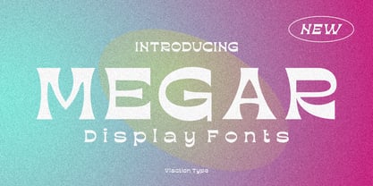 Megar is a display font with a bold retro feel and available in 2 styles, regular & oblique. It is suitable to complement your work with a retro or pop art theme. Megar is sold at affordable prices and you will get lots of bonus background gradient & gradient shapes. Get this font right now! Don't miss this product from us! Also check out our other products. Viaction Type
 - Tinakori by Hendriks Studio,
$26.00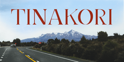 Inspired by a bustling village within Aotearoa New Zealand’s capital city of Wellington, Tinakori is an elegant and sophisticated serif font that invokes art deco, classical art and thin balletic structures. It’s been a passion project that’s finally come to fruition. The simple italic and bold versions help accentuate the individuality of the serif which is precise but holds a fluidity that makes it feel inventive.
 - Omletta by Invasi Studio,
$17.00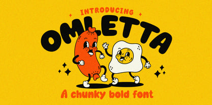 This chunky rounded bold font is not only fun and playful but also incredibly versatile. Whether you're working on food product branding, creating a display headline, or designing packaging for your latest project, Omletta font will surely bring a smile to your face. With its bold and rounded design, Omletta font is perfect for creating eye-catching designs that demand attention. It's perfect for brands that want to make a bold statement and stand out from the crowd. Plus, with its support for Latin multilingual, you can use Omletta font for all of your international design projects. So what are you waiting for? Add some fun and excitement to your next project with Omletta font. With its playful and youthful tone, this font is perfect for creating unique and memorable designs. Whether you're designing for a food brand or a fun event, Omletta font is the perfect choice to help you capture the essence of your project. Get ready to make your designs pop with this bold and playful font!
 - Life Support - 100% free

- LT Asus Print - 100% free

- Alternate Gothic by Linotype,
$20.99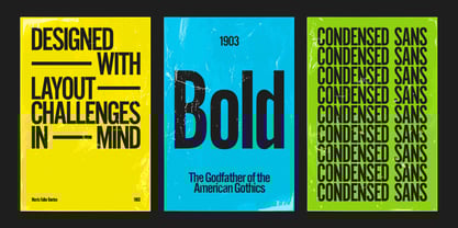 Alternate Gothic was designed by Morris Fuller Benton for American Typefounders Company in 1903. All three weights of Alternate Gothic are bold and narrow. In fact, this face is essentially a condensed version of Benton’s other well-known sans serif types, Franklin Gothic and News Gothic. In the early twentieth century, the modern concept of type “families” had not yet been formed — and though Benton designed these sans serifs to harmonize with each other, the foundry gave them different names. Robust, dark, and coolly competent, Alternate Gothic is a good choice when strong typographic statements must fit into tight spaces. As a modern usage, it is currently the font of YouTube’s homepage logo.
 - Sonus by Hoftype,
$39.00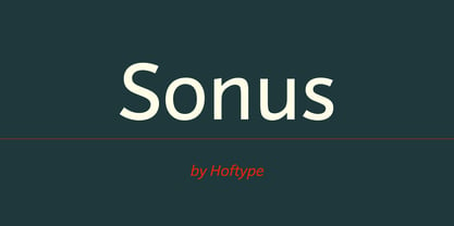 Sonus – a new monoline family with dynamic-flow drive. Influenced by early English sans serifs - Powerful and energetic but with some classical features. Its firm structure makes it great for text and demonstrates its lively linearity in displays. Sonus comes in 16 styles, in OpenType format and with extended language support. All weights contain standard ligatures, proportional lining figures, tabular lining figures, proportional old style figures, lining old style figures, matching currency symbols, fraction and scientific numerals and arrows.
 - Mangan by Hoftype,
$49.00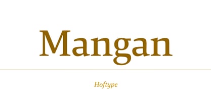 Mangan is a new text face which combines classical rationality with contemporary design. Mangan appears dynamic, elegant, vivid and provides a high standard of functionality. The Mangan family comprises 14 styles and is well suited for ambitious typography. It comes in OpenType format with extended language support. All weights contain small caps, ordinals, ligatures, proportional lining figures, tabular lining figures, proportional old style figures, lining old style figures, matching currency symbols, fraction- and scientific numerals, and arrows.
 - Sixta by Hoftype,
$39.00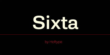 Sixta, a new monoline face with a classical background, has comfortable proportions and a puissant appearance. Although it has plenty of movement and is eventful, its discreet stroke ductus makes it excellent both for text and display. Sixta comes in eight weights, in OpenType format and with extended language support for more than 40 languages. All weights contain proportional lining figures, tabular lining figures, proportional old style figures, lining old style figures, matching currency symbols, fraction- and scientific numerals.
 - Anaglyph by Luxfont,
$18.00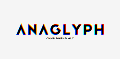 Introducing incredible COLOR ANAGLYPH font. Unique font family with anaglyph stereo effect - a novelty in the field of color fonts. Inspired by global trends in contemporary design with a touch of retro 90s, electric music and minimalistic purity of glyphs. Truly a reflection of modern POP culture. Font is ideal in entertainment design. Night club poster design, fashionable business card, website title, magazine illustration - there are countless options for using it. Font family has two thicknesses - bold & regular, 3 types of stereo effect, 2 font colors with stereo effect (black and white). Font consists of letters of the same height without division into uppercase and lowercase glyphs. This font family is based on the Regular & Bold fonts Boldini - which means that if necessary you can combine these two families and they will be absolutely stylistically identical and complement each other. Check the quality before purchasing and try the FREE DEMO version of the font to make sure your software supports color fonts. Features: Free Demo font to check it works. 36 OTF SVG fonts in the family 2 thicknesses: Bold, Regular 3 types of stereo anaglyph effect 6 font colors with stereo effect Kerning IMPORTANT: - OTF SVG fonts contain vector letters with gradients and transparency. - Multicolor OTF version of this font will show up only in apps that are compatible with color fonts, like Adobe Photoshop CC 2017.0.1 and above, Illustrator CC 2018. Learn more about color fonts & their support in third-party apps on www.colorfonts.wtf - Don't worry about what you see all fonts in black and not in multicolor in the tab “Individual Styles” - all fonts are working and have passed technical inspection, but not displayed in multicolor they, just because the website MyFonts is not yet able to show a preview of colored fonts. Then if you have software with support colored fonts - you can be sure that after installing fonts into the system you will be able to use them like every other classic font. Question/answer: How to install a font? The procedure for installing the font in the system has not changed. Install the font as you would install the classic OTF | TTF fonts. How can I change the font color to my color? · Adobe Illustrator: Convert text to outline and easily change color to your taste as if you were repainting a simple vector shape. · Adobe Photoshop: You can easily repaint text layer with Layer effects and color overlay. ld.luxfont@gmail.com
 - Office Typewriter by Ana's Fonts,
$16.00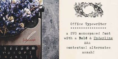 Office Typewriter SVG font is a monospaced typewriter font in two styles: Regular and Underlined, and two weights: Regular and Bold. It is a SVG font in which each glyph is an image (instead of a vector). This means the typewriter texture could be captured in an extremely realistic way. In addition, each glyph has 3 variations that appear "randomly" via contextual alternates. This makes it versatile and fun to use in modern and vintage designs alike. This font is also very legible at a wide range of sizes (although it looks better at small and medium sizes, as the image can become blurry at larger font sizes), and looks great in both long or short texts, in digital collages, branding and packaging, social media posts, logotypes, etc. The Office Typewriter SVG font family includes: Office Typewriter font, in Regular and Bold weights Office Typewriter Underline, in Regular and Bold Office Typewriter Misprints, with assorted misprints, doodles, circles and underlines Software requirements for the SVG font: Photoshop CC2017+ // Illustrator CC2018+
 - Rabento by Mans Greback,
$59.00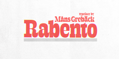 Rabento is an original serif family, with articulate and big letterforms. The typeface was drawn and created by Mans Greback between the years 2018-2021, and is designed to assure a unique and confident character to any headline, logotype or title. A display typeface made for large text displays, it is still clear and legible. With great contrast, this lettering has precise hairline thin horizontal parts, a bold and expressive outline and fat slab serifs. It has traditional traits, but a new and modern design, which together makes for an impactful and notable type setting. Rabento is provided in six high-quality styles: Regular, Italic, Bold, Bold Italic, Black & Black Italic. The font is built with advanced OpenType functionality and has a guaranteed top-notch quality, containing stylistic and contextual alternates, ligatures and more features; all to give you full control and customizability. It has extensive lingual support, covering all Latin-based languages, from North Europe to South Africa, from America to South-East Asia. It contains all characters and symbols you'll ever need, including all punctuation and numbers.
 - Frant - Unknown license

- SF Slapstick Comic - Unknown license

- SF Minced Meat - Unknown license

- SF Shai Fontai - Unknown license

- SF Intoxicated Blues - Unknown license


