8,862 search results
(0.035 seconds)
- Compacta by ITC,
$39.00 Compacta is the work of Fred Lambert and is reminiscent of the extremely narrow, sans serif stencilled fonts of the 1920s, then intended as titles or headlines for magazines and posters. The characters of all cuts are narrow and the space between letters is very small. The white spaces between strokes are perceived almost as only small white stripes and dots which stand out from the black bands of the lines of text. Compacta is not meant for longer texts but is impressive in titles and headlines.
 - Compact - 100% free

- Compact by ParaType,
$25.00 The typeface was designed at ParaType (ParaGraph) in 1991 by Vladimir Yefimov. Based on Anons by Gennady Baryshnikov. An extra condensed sans serif. For use in advertising and display typography. The decorative styles were added in 1997 by Alexander Tarbeev.
 - Compacta SB by Scangraphic Digital Type Collection,
$26.00 Since the release of these fonts most typefaces in the Scangraphic Type Collection appear in two versions. One is designed specifically for headline typesetting (SH: Scangraphic Headline Types) and one specifically for text typesetting (SB Scangraphic Bodytypes). The most obvious differentiation can be found in the spacing. That of the Bodytypes is adjusted for readability. That of the Headline Types is decidedly more narrow in order to do justice to the requirements of headline typesetting. The kerning tables, as well, have been individualized for each of these type varieties. In addition to the adjustment of spacing, there are also adjustments in the design. For the Bodytypes, fine spaces were created which prevented the smear effect on acute angles in small typesizes. For a number of Bodytypes, hairlines and serifs were thickened or the whole typeface was adjusted to meet the optical requirements for setting type in small sizes. For the German lower-case diacritical marks, all Headline Types complements contain alternative integrated accents which allow the compact setting of lower-case headlines.
 - Compacta SH by Scangraphic Digital Type Collection,
$26.00Since the release of these fonts most typefaces in the Scangraphic Type Collection appear in two versions. One is designed specifically for headline typesetting (SH: Scangraphic Headline Types) and one specifically for text typesetting (SB Scangraphic Bodytypes). The most obvious differentiation can be found in the spacing. That of the Bodytypes is adjusted for readability. That of the Headline Types is decidedly more narrow in order to do justice to the requirements of headline typesetting. The kerning tables, as well, have been individualized for each of these type varieties. In addition to the adjustment of spacing, there are also adjustments in the design. For the Bodytypes, fine spaces were created which prevented the smear effect on acute angles in small typesizes. For a number of Bodytypes, hairlines and serifs were thickened or the whole typeface was adjusted to meet the optical requirements for setting type in small sizes. For the German lower-case diacritical marks, all Headline Types complements contain alternative integrated accents which allow the compact setting of lower-case headlines. - Compacta MT by Monotype,
$29.00 Compacta is the work of Fred Lambert and is reminiscent of the extremely narrow, sans serif stencilled fonts of the 1920s, then intended as titles or headlines for magazines and posters. The characters of all cuts are narrow and the space between letters is very small. The white spaces between strokes are perceived almost as only small white stripes and dots which stand out from the black bands of the lines of text. Compacta is not meant for longer texts but is impressive in titles and headlines.
 - Contacta by Linotype,
$29.00Linotype Contacta is part of the Take Type Library, which features winners of Linotype’s International Digital Type Design Contest. Ralf Weissmantel designed this font to display no stroke contrast at all. Instead of using conventional letter forms, Contacta is a more designed-oriented font, with some characters recognizable only in context, not necessarily at first glance. The technical, unconventional forms look almost like a maze, especially when set together. This font is not suitable for text but makes a unique impression in logos and headlines. - Compania by Letterhend,
$19.00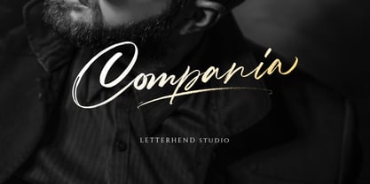 Compania is a luxury signature script. The natural hand writing feel make this font stand out. This font is perfect for logos, magazines, books, greeting / wedding cards, packaging, fashion, make up, stationery, novels, labels or any type of advertising purpose. Features : uppercase & lowercase numbers and punctuation multilingual support ligatures alternates PUA encoded We highly recommend using a program that supports OpenType features and Glyphs panels like many of Adobe apps and Corel Draw, so you can see and access all Glyph variations. Email us to letterhend@gmail.com if you need something! Happy Designing!
 - Impacta by Linotype,
$29.99Linotype Impacta is part of the Take Type Library, which features the winners of Linotype’s International Digital Type Design Contest from 1994 to 1997. Dutch artist Marc Lubbers designed Impacta with little contrast between strokes, rather, he depended on the slope of the strokes to give his font character. Impacta can be used in small or large point sizes and its constructed forms bring a modern feel to graphic design. - Compita by Studio Buchanan,
$12.00 Compita is a Neo-Grotesk(ish) typeface that started life as a love-letter to Berthold's classic. But for every rigid, Neue-Haasism, there exists an equal and opposite amount of humanist attributes – along with a deliberate dose of creative license. It has some over-emphasised features and terminal endings which help to create its friendly personality, but sits them on a slightly condensed overall width. Together they help balance each other out, creating a face that feels both affable and professional. Aff-essional perhaps? The character set contains everything the modern day designer needs, including diacritic support for over 30 languages. And It’s packed full of the usual opentype features (that most will probably ignore) – Small caps, multiple number sets, and discretionary ligatures, to name just a few. Whether it’s deployed as a display face, or as the dependable choice for text, Compita is useable across multiple disciplines. Set in online, on screen or in print – it’s proof that not everything has to be Montserrat or Raleway...
 - Corbert Compact by The Northern Block,
$- A compact geometric sans serif typeface influenced by Bauhaus and the early modernist era. Precise shapes are optically adjusted to create a clear, natural typeface with excellent legibility across various applications. Corbert compact is part of the popular Corbert type system; other widths include Normal, Condensed and Wide. Details include over 590 characters; OpenType features consist of five variations of numerals, including inferiors, superiors, fractions, alternative lowercase a, e and g, and language support covering Western, South, and Central Europe.
 - Solido Compact by DSType,
$40.00 Solido is a very versatile and usable type system with five widths: Solido, Solido Constricted, Solido Condensed, Solido Compressed and Solido Compact, in a total of 35 fonts with many of alternate characters.
 - Intellecta Grotesca Compacta by Intellecta Design,
$25.00a bold and grotesque sans serif typeface - !The Black Bloc - Unknown license

- Brainless Thoughts Compact - Unknown license

- FF Dax Compact by FontFont,
$59.99 German type designer Hans Reichel created this sans FontFont in 2004. The family has 6 weights, ranging from Light to Black and is ideally suited for editorial and publishing and small text. FF Dax Compact provides advanced typographical support with features such as ligatures, alternate characters, case-sensitive forms, fractions, super- and subscript characters, and stylistic alternates. It comes with a complete range of figure set options – oldstyle and lining figures, each in tabular and proportional widths. This FontFont is a member of the FF Dax super family, which also includes FF Dax and FF Daxline.
 - Adora Compact PRO by preussTYPE,
$53.90 German type designer Ingo Preuss created this sans Super-family between 2010 and 2015. The family has 84 weights, ranging from Light to Ultra in Normal, Compact, Condensed and Compressed (including italics). It comes in OpenType format with extended language support. All weights contain ligatures, superior characters, proportional lining figures, tabular lining figures, proportional old style figures, lining old style figures, matching currency symbols, fraction- and scientific numerals and matching arrows. The “Adora PRO family” is ideally suited for advertising and packaging, editorial and publishing, logo, branding and creative industries, poster and billboards, small text, wayfinding and signage as well as web and screen design.
 - Compact Hebrew MF by Masterfont,
$59.00 This font family is your best choice when you want to effortlessly make your brochure or signs stand out!
 - Slab Compact JNL by Jeff Levine,
$29.00 Slab Compact JNL was based on the printed title found on the box cover of a 1950s-era word games set called “Lex-O-Grams” and is available in both regular and oblique versions.
 - Blah Blah Blah by Comicraft,
$49.00 It Had to Happen! Here Comes The World's Greatest Comic Book Font! It's A Collector's Item Classic! It's One of Comicraft's Greatest! You Wanted Our Silver Age Style Font -- last seen in the Pulse Pounding Pages of DC's SUPERBOY and Marvel's FLASHBACK titles -- and Now You've Got It! Three Thrilling Feature-Length Fonts! They're the Strangest Sans Serif Fonts of All! Proof Yet Again That This is Indeed the Comicraft Age of Comics! Etcetera, etcetera, etcetera, Blah Blah Blah...
 - Dee Dee by TipografiaRamis,
$39.00 This is a second edition of Deedee type family, originally designed in 2011. Deedee is a geometric sans serif typeface family of ten styles with extended support for most Latin languages plus Cyrillic. Revisions in this edition included minor adjustments to glyph shapes and improved kerning tables. The typeface is ideal for use in display sizes and is quite legible in the text.
 - Black - Unknown license

- Bloc - Personal use only

- Blackness by Letterara,
$12.00 Blackness is a strong original handwritten font with a unique feel. Natural and elegant, cursive, legible script font which can be used on a wide variety of designs such as headlines, titles, headings, logos, branding, posters, books, and any other creative design. It will add a unique spark to any design project that you wish to create! This font is PUA encoded which means you can access all of the amazing glyphs and ligatures with ease!
 - Blanc by Latinotype,
$26.00 Blanc is a functional humanist sans typeface with a marked personality and great style that make it ideal for use in headlines. Blanc is an ode to neutrality: a geometric face characterised by low contrast between thick and thin strokes with calligraphic features that emphasise specific glyphs. Blanc comes with 8 weights and an inline version that make it well-suited for headings and subheadings, corporate designs, advertising, publishing, etc.
 - Blau by Wilton Foundry,
$19.00 Designed with a hand-chiseled feel, Blau’s sculpted characters add a refined personality to a wide range of brand, corporate, product and service applications. Highlighting the sculpted theme, inkwell treatment variations are prevalent throughout Blau, with several key glyphs that are stenciled for increased legibility. This sturdy, typographic workhorse shines when a slightly unorthodox typographic approach is required — a prime choice for distinctive and dynamic logotype use. The Blau family is available in Light, Light Italic, Regular, Italic, Bold and Bold Italic. The name Blau was chosen to celebrate the color Blue (or Blau in German, Blaauw in Dutch, Bleu French, Blå in Norwegian, Swedish & Danish, Blua in Esperanto, Blár in Icelandic) Blue is nature’s color for water, sky, mountains and glaciers. Blue is embraced as the color of heaven and authority, denim jeans and corporate logos. Surveys in the US and Europe show that blue is the color most commonly associated with harmony, faithfulness, confidence, distance, infinity, the imagination, and cold. In US and European public opinion polls, it is the most popular color, chosen by both men and women as their favorite color. Another very popular Wilton Foundry font in the “blue” family is “Cyan” and “Cyan Neue”.
 - Alacant by Eurotypo,
$28.00 Alacant is a family of slab serif fonts composed of seven weights and their versions in italics. One of the most characteristic advantages of this font is its particularly square shape, very short descenders, open counter-forms and precise kerning that provides a very good visual impact and clear legibility.
 - Black by Runsell Type,
$16.00 Black font is perfect for many of your projects like logos & branding, photography, invitations, watermarks, advertisements, product designs, stationery, wedding designs, labels, product packaging, special events and much more.
 - Blak by Extratype,
$40.00 Blak belongs to the type series designed by Íñigo Jerez for the defunct magazine Suite . This chubby typeface now has a second life in our collection. Use it with confidence for big statements.
 - Blaq by Resistenza,
$39.00 Inspired by Henry W. Troy, BLAQ is a new version of Trojan Text not available as font. Is an ornamental blackletter alphabet. Works great in headlines and other ‘masculine’ like design settings. The Victorian Gothic or Neo-Gothic is an architectural movement that began in the 1740s in England. Its popularity grew rapidly in the early nineteenth century. The revived Gothic style was not limited to architecture. We recommend to combine Blaq with: Turquoise Nautica
 - Bloc by ParaType,
$30.00 Designed at ParaType in 1997 by Tagir Safayev for advertising and display typography. Based on Block of H. Berthold, 1908 by Heinz Hoffmann. A bold sans of a typical German pattern.
 - Black by Intellecta Design,
$16.90a gothic bold typeface - Blancs by 4RM Font,
$30.00 Blancs font is created with the utmost value of aesthetics and classy aura, with an anatomical feature that is geometrical, with an extended style. This font is suitable for use in graphic design, especially those with futuristic themes
 - See - Unknown license

- Peex - Unknown license

- Peex - Unknown license

- Peex - Unknown license

- Bee by URW Type Foundry,
$35.00
- Dee by Chantra,
$18.00The Dee font family started from letter "d" and "e" followed by the rest of the letters. "Dee" is Thai word mean "Good" in English that is the source of this font name. The Dee XTS style has alternate stroke ends relative to the Dee XT style. It is included as a bonus style in the Dee Regular Set and Dee Complete packages. - Bla Bla by S6 Foundry,
$25.00 Bla Bla is a contemporary serif typeface inspired by brutalist forms, featuring large open counters, curved, round forms, creating a modern & elegant glyph set. The organic curves with gentle repetitions create powerful and harmonious forms. Designed to be a stylish modern family it is perfect for communication and branding projects.


Page 1 of 222Next page